The network for creativity
Join 1.25M professional creatives like you
Connect with clients, get discovered, and run your business 100% commission-free
Creatives on Contra have earned over $150M and we are just getting started
Back to feedPost
Taste Test

Exploring two directions for the same concept.
Which one feels stronger?👀
One leans into strong typography to grab attention instantly.
The other shifts focus to visual storytelling with a more immersive feel.


14 voted
16%
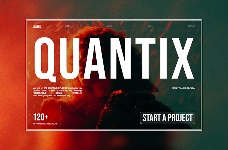
72 voted
84%
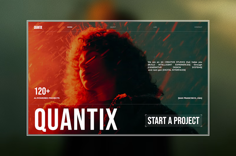
86 votes
Closed

Visual First

focus on message delivering, hence go with the visual first 😃

Bold definitely hits stronger on first impression.



In this Age, Show don't Tell 🚀


Visuals always do the heavy lifting in communication

Awesome work

Nice work

other option?


Nice

Visual First is much better for me.

Both are great but I am keen to Visual First.

I think both designs are fine, but the style depend on your brand or business personality type.


Great work

"Visual first" is better, How about you try "Bold Type Focus" but the text "QUANTIX" is below the face, so the face can be seen clearly while other elements move up. What do you think?

The poll numbers (84% for Visual First) align perfectly with what we typically see in landing page A/B tests.
From an analytics perspective, the "Bold Type" version creates friction, the massive "QUANTIX" text competes directly with your "Start a Project" CTA. In the "Visual...

Amazing!

Both of them are awesome, but the second one is bold. So 2
The network for creativity
Join 1.25M professional creatives like you
Connect with clients, get discovered, and run your business 100% commission-free
Creatives on Contra have earned over $150M and we are just getting started
Related posts

Designed a hero section for Monolith, an independent design studio crafting digital legacies
I am still available for design gigs: https://calendly.com/book-a-15mins-call/theframerdude
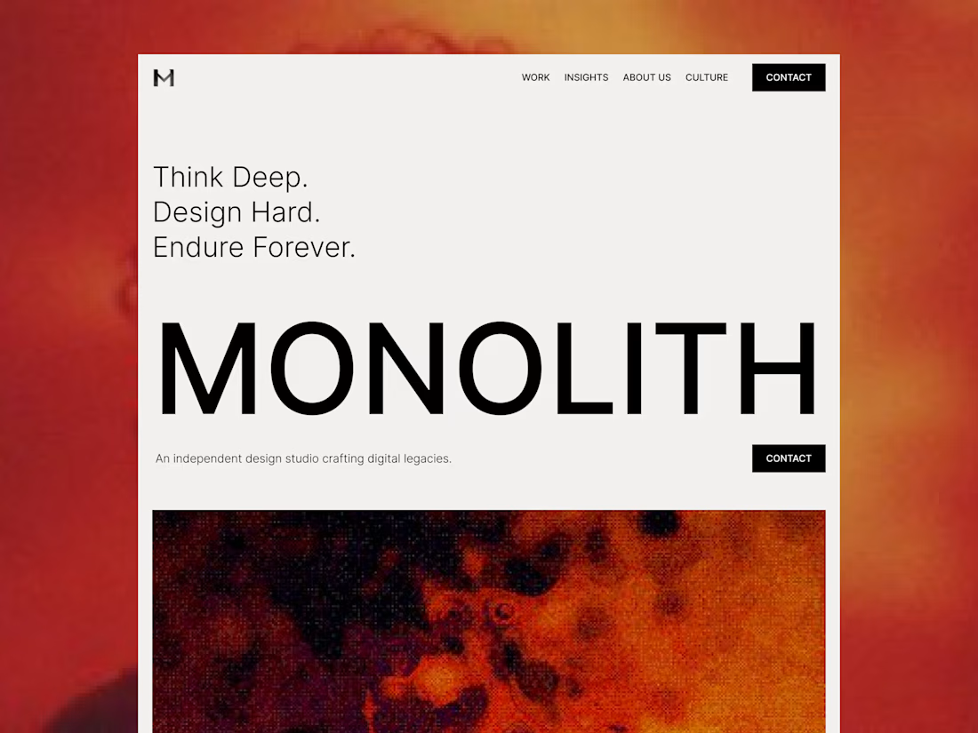

This is amazing brooo, like I love the layout even though the full preview is unavailable it already gives these nice layout vibe

Innovation in Action: A look at @OrbixStudio's 'Weekly Shots'
This week, we're proud to share a snapshot of our diverse capabilities, from strategy-led UI/UX for social platforms, healthcare, and real estate applications to impactful branding and captivating digital illustrations.
Our team is dedicated to crafting experiences that not only look exceptional but also deliver tangible results and user value.
Explore how our strategic design approach translates across various industries. We're always keen to discuss how thoughtful design can elevate your next project.

Your feature block layout on the left panel is handled beautifully.

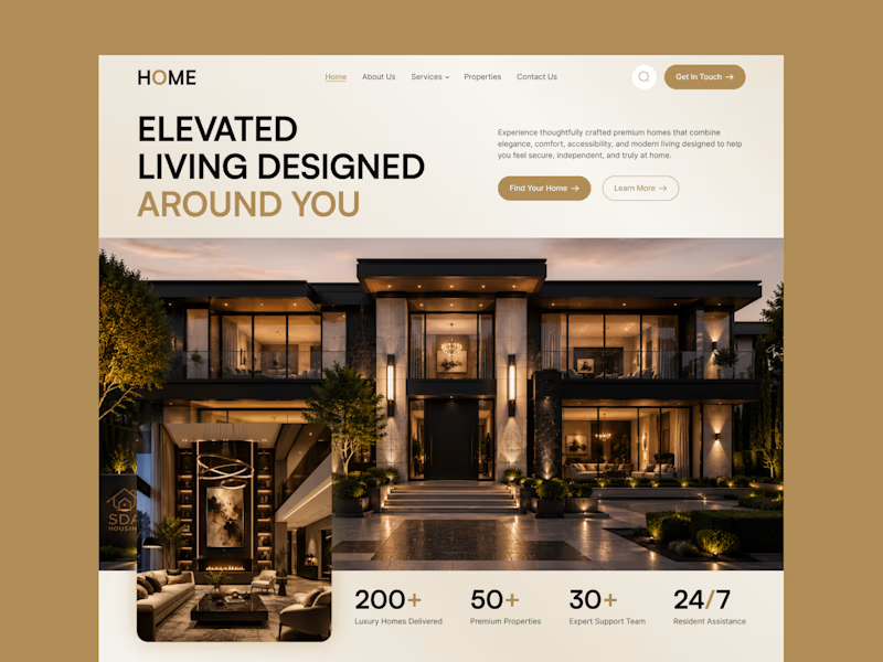
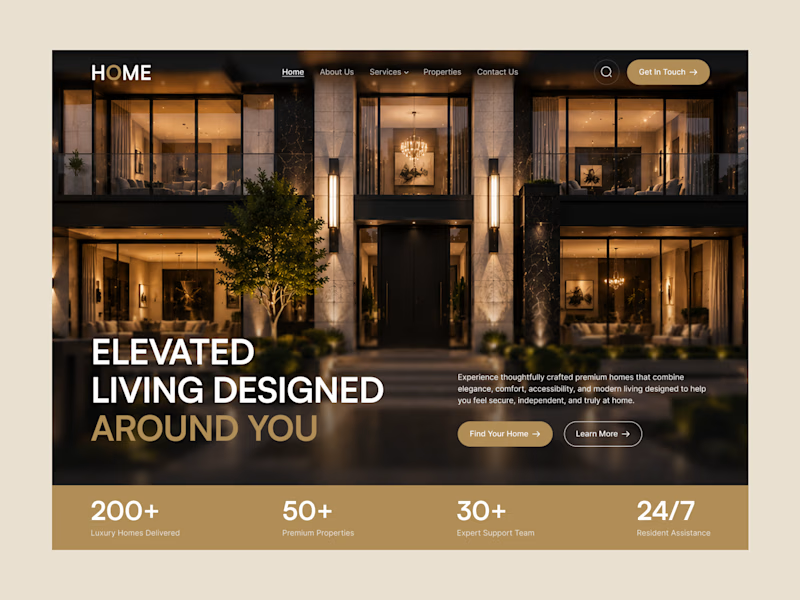
I prefer this option B because it makes the brand feel luxurious




Trending

Claude
Claude has entered the design space. How are you using Claude Design?

Contra University
Learn from expert creatives how to earn more using next-gen AI tools.
creativeaiflow
Creative AI workflows are evolving. What tools do you use, and what are their strengths and weaknesses?
portfolioreview
The best portfolios tell a story, not just show a grid. Share yours for feedback.
freelancerlife
Freelancer life is wins, pivots, and everything in between. What’s yours right now?