
max
Orbix Studio
UX-led product design & dev agency for b2b saas and AI
- $10k+
- Earned
- 106
- Followers
A brand identity isn't finished when the logo is locked. It's finished when it can speak in any tone and still sound like itself.
This is the extended motion system for Arcova, a full content series built on the same identity foundation, designed to flex across messaging without ever losing recognition. Environmental and social responsibility frameworks. Architecture and investment imagery. Bold statements like "What we build today is what stands tomorrow."
Olive green, deep forest, and clean white surfaces rotate depending on the message, but the house mark and typography system stay constant, the anchor that ties every card back to one brand.
This is what a real identity system looks like in motion: consistent enough to be unmistakable, flexible enough to carry a dozen different conversations.
Does this feel like a brand that could carry an entire content calendar on its own? 👇
Tools: Figma / Jitter
#BrandIdentity #MotionDesign #BrandSystem #VisualIdentity #BrandingDesign #ContraFreelance #CreativeDirection #DesignSystem
1
9
241
A great restaurant makes you hungry before you even sit down. The website should do the same.
Puredish is a restaurant web design built for Elysian Bistro, an organic dining experience in the heart of Brooklyn where classic French cuisine meets modern American flavors. The design brief was simple: make people want to book a table before they finish scrolling.
Deep forest green hero with bold retro typography. Warm cream sections that feel as inviting as the dining room itself. Opening hours, a structured menu with pricing, food photography that earns its placement, and an about section that gives the brand a personality before a guest ever walks through the door.
Truffle risotto at $24. The burger is at $28. Every dish is presented with the same care the kitchen gives it.
This is what restaurant web design looks like when the food is the hero and the design knows to stay out of its way.
Does this make you want to make a reservation? 👇
Tools: Figma · Jitter
#WebDesign #RestaurantDesign #UIDesign #FoodUI #LandingPage #ContraFreelance #BrandDesign #OrganicFood
2
249
Architecture has always started with imagination. Arcus was designed to make that the easy part.
Arcus is an AI-powered rendering platform built for architects and designers who need to visualize ideas faster than a traditional workflow allows. The landing page had to communicate that instantly a deep dark canvas, a cinematic 3D building render glowing against a night-sky hero, and a product UI that shows exactly what's possible before the user ever signs up.
Image to image. Text to image. Image to video. Upscale. The tool panel sits quietly in the corner, letting the rendered architecture command the screen.
Render settings. Generation controls. Aspect ratios. Image counts. Everything a professional needs, packaged into an interface that feels like the future of the industry rather than another tool added to the stack.
Best AI for the Architecture. The headline sets the bar. The design clears it.
Does this feel like a product that changes how architects work? 👇
Tools: Figma · Jitter
#AIDesign #WebDesign #SaaSUI #LandingPage #DarkUI #ArchitectureAI #ContraFreelance #ProductDesign
1
243
Some industries sell products. Blue Gulf sells a feeling, and the website had to deliver it before a single boat was clicked.
This full-length web design for Blue Gulf General Contracting was built around one truth: when someone is looking for a high-end yacht, they're not shopping. They're dreaming. The design starts in the open ocean and never lets go: cinematic boat photography, a dark canvas that makes every hull and waterline glow, and a layout that moves like the sea itself.
5300+ fleet options. 3000+ satisfied clients. 120+ destinations. 83+ crew. 9200+ nautical miles covered. The numbers tell the story the design makes you feel it.
Services grid, featured listings with pricing, benefits breakdown, client testimonials, boat tips and insights, and a full FAQ every section earns its place on a page this long without ever losing momentum.
High-end design with unlimited creativity. That was the brief. This was the answer.
Does this feel like a website that could sell a dream? 👇
Tools: Figma , Jitter
#WebDesign #LuxuryDesign #UIDesign #LandingPage #MarineDesign #ContraFreelance #YachtDesign #HighEndUI
0
237
Moving cargo across the world is complex enough. The website shouldn't be.
Shipflow is a logistics platform built for businesses that move goods at scale from containers to last-mile delivery. The landing page was designed to match the weight and reliability of what the brand actually does. A full-bleed cargo ship hero that puts you on the ocean before you read a word. Bold marquee typography. Orange CTAs that cut through the dark with exactly the right amount of urgency.
Global Reach. Custom Solution. Technology-Driven. Proven Expertise. Four pillars, each given space to breathe rather than compete.
The "Let's Get Your Cargo Moving" section closes the page the same way a good handshake closes a deal: direct, confident, and ready to act.
Trusted by businesses worldwide. The design had to earn that line.
Does this feel like a logistics brand you'd trust with a thousand containers? 👇
Tools: Figma · Jitter
#WebDesign #LogisticsDesign #UIDesign #LandingPage #BrandDesign #ContraFreelance #ProductDesign #FreightTec
0
178
Every football fan thinks they can build a better team. This app finally lets them prove it.
This fantasy football league app was designed for fans who don't just watch the game; they manage it. From joining a league and running a mock draft to tracking live scoreboards and monitoring key player activity, every screen was built to keep the competition as sharp as the sport itself.
League management spread across too many screens. Scoreboard updates that arrive too late to matter. No clear view of how your roster stacks up against the opposition. Team activity feeds that bury the plays that actually changed the game.
A cinematic onboarding that sets the stakes from the first tap. League hub with Top Leagues, live scoreboard, and real-time team activity feed. CBF League matchup view with full quarter-by-quarter scoring grid. Key player comparison side by side: Armchair QB vs. Pigskin Junkies, roster depth at a glance. Mock draft mode and season play accessible from one screen.
A fantasy football experience that moves at the speed of the NFL. Dark. Competitive. Built for the fan who takes it seriously.
Designing a fantasy sports platform, league management app, or sports SaaS that needs to feel this considered? Let's build it together.
#FantasyFootball #SportsAppDesign #MobileDesign #DarkUI #AppDesign #ContraFreelance #UIDesign #ProductDesign
Tools: Figma · Jitter
0
196
Draft day separates the casual fans from the obsessed. The app should too.
This fantasy sports draft app was designed for league managers and players who treat draft day like game day every pick deliberate, every second counted, every stat visible before the clock runs out.
Draft boards with no urgency. Player stats buried behind slow navigation. No real-time pressure to sharpen decision-making. Friend invites that feel like an afterthought. Mock drafts that don't simulate the real thing closely enough.
League view with 15-round draft setup and CPU autopick fallback. Mock draft mode with friend invites and live claim slots. A live draft room where "YOUR TURN" hits in coral red with a 1:34 countdown timer. Position filters across QB, RB, WR, TE, and D/ST. Player cards showing ADP, points, rush yards, and receiving stats side by side. Team, queue, and chat tabs that keep the whole league in one place.
A draft experience that puts the pressure back where it belongs on the pick, not the interface. Dark. Fast. Built for the obsessed.
Designing a fantasy sports platform, sports SaaS, or competitive gaming app that needs to feel this considered? Let's build it together.
#SportsAppDesign #FantasySports #MobileDesign #DarkUI #AppDesign #ContraFreelance #UIDesign #ProductDesign
Tools: Figma · Jitter
1
196
Freelance work has always been scattered. The tools built to manage it never brought it all together.
Fobework is a project management app designed for freelancers, agencies, and remote teams who need every active project, tracked hour, team member, and client contract visible the moment they open the app. Every screen built to feel as focused and professional as the work it supports.
Project status buried across multiple tools. Hours tracked in spreadsheets with no visual clarity. Client profiles disconnected from active work. No single view that shows what's due, what's in progress, and what's already shipped.
14 active projects tracked across To Do, In Progress, In Review, and Complete. 90:35 hours logged this week with per-project time breakdowns. Freelancer profiles with ratings, total earnings, skill tags, and portfolio repositories. New contracts flow directly from a team member's profile. Project cards showing progress bars, due dates, priority levels, and assigned team members at a glance.
A workspace that makes the chaos of freelance feel controlled, visible, and ready to scale. Dark. Precise. Built for the way modern teams actually work.
Designing a project management tool, freelance platform, or productivity SaaS that needs to feel this considered? Let's build it together.
#ProductDesign #MobileDesign #DarkUI #ProjectManagement #FreelanceApp #UIDesign #ContraFreelance #SaaSDesign
Tools: Figma · Jitter
0
186
Going out has always been social. The app built around it rarely felt that way.
This nightlife discovery app was designed for people who don't just attend events; they experience them together. Rooftop parties, live concerts, and Friday night vibes surfaced by what's trending, who's going, and how close it is, all in one dark, immersive mobile experience.
6,181 people going tonight. No way to know which events your friends are attending. Ticket confirmations lost in email threads. No sense of the venue's energy before you arrive. Discovery that feels like browsing, not choosing.
Live event feed with trending and tonight filters. Friend attendance is visible on every event card. Venue detail pages with real-time crowd count, ratings, and "going again" percentages. Featured Tonight grid ranked by proximity and popularity. A full digital e-receipt with QR code, ticket ID, early bird status, and one-tap PDF download.
A social nightlife experience that starts on your phone and carries all the way to the door. Dark. Live. Built for the night.
Designing an events app, social discovery platform, or ticketing experience that needs to feel this alive? Let's build it together.
#MobileDesign #NightlifeApp #DarkUI #AppDesign #UIDesign #ContraFreelance #EventApp #SocialApp
Tools: Figma · Jitter
0
168
Finding events nearby has always been easy. Finding them beautiful has never been.
This event discovery app was designed for people who live for the next experience: concerts, sports finals, cinema, and social gatherings all surfaced by location, category, and date without a single moment of friction.
Scattered event listings with no visual hierarchy. Ticket details buried behind multiple taps. No sense of what's happening today versus this week. Calendar views that feel like spreadsheets instead of schedules.
Nearest events filtered by week with full venue photography. Category tabs that switch context instantly. Event detail pages with host profiles, door times, and a single "Buy Ticket" CTA. A December calendar view where every upcoming event anchors to its exact time slot. Popular events ranked with pricing visible before you click.
A mobile experience that makes discovering and booking events feel as exciting as attending them. Dark. Focused. Always live.
Designing an events platform, ticketing app, or social discovery product that needs to feel this considered? Let's build it together.
#MobileDesign #EventApp #DarkUI #AppDesign #UIDesign #ContraFreelance #TicketingApp #UIUXDesign
Tools: Figma · Jitter
0
148
AI tools are everywhere. Very few of them feel like they were designed.
Anox AI was built to be the exception. A clean white canvas, fluid 3D orb visuals that shift and breathe, and an assistant interface that opens with "Hello, Alex. How can I help you today?" are warm, personal, and immediately useful.
The onboarding doesn't overwhelm. The chat surface doesn't get cluttered. The image generation screen lets the output speak of a glass orb in wedding whites and lavender, rendered beautifully, ready to download in one tap.
This is what AI product design looks like when the experience matches the intelligence behind it.
Does this feel like an AI app you'd actually open every day? 👇
Tools: Figma
#AIAppDesign #MobileDesign #UIDesign #AIProduct #AppDesign #ContraFreelance #AITool #ProductDesign
0
168
Running a venue means watching a hundred things at once. The app should make that feel effortless.
Club Manager was designed for exactly that: a dark, high-energy mobile dashboard where venue operators can track check-ins, live moments, event analytics, and revenue without ever leaving the screen they're on. Friday Night Live is pulling 892 check-ins and $2,840 in revenue. Saturday Groove is trending at +8.5 a day. All visible, all actionable.
The Overview keeps the pulse. Analytics tells the full story. Events show what's coming next.
Three tabs. Everything a venue manager needs on a Friday night at 10 PM.
Does this feel like the app nightlife was missing? 👇
Tools: Figma
0
166
Investing $10,000 should feel like a decision, not a task.
This investment app screen was designed around that moment, the confirmation step, where a user is about to commit real money. Every element was placed to reduce friction and build confidence at the same time. Payment method selection, preset amount chips, a clear total, and a single confirm button that earns its blue.
No clutter. No second-guessing. Just a clean path from intent to action.
Because the best fintech UI doesn't just look trustworthy; it feels it.
Does this flow make you feel confident hitting "Confirm to invest"? 👇
Tools: Figma
0
154
Build Faster. Scale Smarter. One Platform for Everything. That wasn't just the hero headline — it was the entire product promise this dashboard was designed to deliver on.
That was the thinking behind ClarityAI, a SaaS workspace platform designed to simplify workflows, boost productivity, and give teams everything they need to grow without switching between five different tools.
Most productivity SaaS platforms either overwhelm users with features on day one or feel so stripped back that teams outgrow them in a month. The result is a product that gets adopted and abandoned in the same quarter.
ClarityAI built the depth into the simplicity.
Meetings, Calendar, Projects, Analytics, Ask AI, Client Relations, Idea Hub, Growth Plans a sidebar that organizes an entire business without a single wasted menu item.
Because a platform promising to be everything a team needs should feel like it on the very first login.
What's the one SaaS dashboard feature that makes a product feel indispensable rather than just useful? 👇
1
254
Growing a forest starts with one tree. Growing a community starts with one story. Sunrise Plant was designed to do both.
That was the thinking behind Sunrise Plant, a tree planting and environmental impact platform designed to make every joyful act of planting feel personal, trackable, and genuinely connected to real change in the world.
Most sustainability platforms feel like donation pages with better photography. No community. No story. No reason to come back after the first contribution.
Sunrise Plant built the meaning into every section.
A vibrant sky-blue hero bursting with fruit tree photography and a single orange CTA, Plant a Tree Now. Impact stats that speak in human terms: trees planted, families supported, African regions impacted. A leaderboard turning individual action into community momentum. And "Trees with Names, Trees with Stories" because every tree planted here belongs to someone.
What's the one feature that would make you actually stay connected to an environmental platform long after your first contribution? 👇
0
243
Invest with Confidence, Grow with Purpose. That wasn't just the hero headline; it was the entire design philosophy behind Vestilo.
That was the thinking behind this investment platform, a portfolio management and trading experience designed to make building wealth through tailored strategies and smart automation feel as trustworthy as the tagline promises.
Most investment platforms either intimidate new investors with complexity or underwhelm experienced ones with oversimplification. The result is a product that fits nobody perfectly and converts visitors into users reluctantly.
Vestilo built the confidence into the landing experience itself.
A deep navy cosmic hero that opens with the product promise front and center, Get Started Today and Request a Demo, sitting side by side, letting the visitor choose their own level of commitment before a single feature is explained.
The embedded dashboard mockup does the selling; the copy never has to cover the total portfolio across crypto, gold, silver, stocks, and funds. Portfolio performance chart with timeframe toggles. Allocation donut showing type, positions, deep dives, regions, and sectors. All visible before the first scroll, all communicating that this is a platform built for serious investors who want the full picture.
Portfolio, Trade, My Balance, History, News: a navigation that tells the complete product story in five words.
Because a platform promising confidence and purpose needs a landing page that delivers both before the signup button is clicked.
What's the one design decision that makes an investment platform feel trustworthy before a user creates an account? 👇
1
245
Take Control of Your Stock. Our all-in-one fintech platform helps you track spending, grow savings, and invest with confidence.
Finance Made Simple For Everyone. Real-time balance updates, automated savings tools, secure digital payments, multi-device synchronization, and instant monthly reports.
From Budgeting to Investing, We've Got You Covered. Getting Ahead with Money Has Never Been This Simple.
Built for Simplicity. Designed for Growth. Payno combines budgeting, banking, and investing into one elegant platform that keeps you financially confident every day.
Trusted by Smart Investors and Everyday Savers. Users say Payno transformed how they manage money: simple, smooth, and powerful all in one place.
0
164
Designing spaces that define luxury deserves a website that does the same.
That was the thinking behind Eloria luxury interior design platform built for studios that transform spaces into refined living experiences. Every section earns the next scroll without ever raising its voice.
Most interior design websites showcase work. Eloria sells a feeling Timeless Interiors, Elevated Living before a single project is clicked. Commercial Spaces, Bespoke Furniture, Lighting Curation, and Art & Decor organized under one editorial system that breathes at every section.
Warm cream palette, rich interior photography, and serif typography that treats every listing like a private showing rather than a portfolio grid.
What's the one design detail that makes a luxury website feel earned rather than just expensive? 👇
2
412
Finding your perfect stay should feel like the beginning of the trip, not a task before it.
That was the thinking behind StayGo a hotel booking platform connecting travelers with city escapes, tropical resorts, and beachside retreats at the best price, with the least friction.
Most booking platforms feel like search engines. StayGo feels like a recommendation from someone who actually knows where you should go. Fairmont, Bulgari, Hilton, Rosewood trusted brands anchoring a platform that leads with destination photography and closes with a community of travelers sharing real experiences.
Dark cinematic hero. Warm amber CTAs. A story section that earns trust before the first search is typed.
What's the one booking platform feature that would make you actually enjoy the hotel search process? 👇
1
377
A digital agency that builds experiences driving growth needs a website that proves it from the first pixel.
That was the thinking behind Vertex a full-service digital agency website designed to make brands feel the growth promise before they've read a single case study.
Most agency websites say they drive results. Vertex opens with "We Build Digital Experiences That Drive Growth" in heavy condensed type, backs it with acquired brands, a star rating, and globally delivered client proof all above the fold, all working before the scroll begins.
Deep black canvas. Neon yellow accents. Red urgency. A responsive design that carries the same energy from laptop to mobile without losing a single point of impact.
What's the one section of an agency website that makes or breaks a potential client's decision to reach out? 👇
1
377
Speed is more than motion. It's intelligence in action. That wasn't just the brand line it was the entire design brief.
That was the thinking behind Veloxia an AI-powered sports performance platform designed to make intelligent analytics and motion tracking feel as powerful on screen as the athletes it was built to serve.
Most sports tech websites look like they were designed for investors, not athletes. Dense copy, generic stock photography, and a visual language that communicates nothing about the performance edge the product actually delivers.
Veloxia built the intensity into every section.
A hero that opens with "Sports AI Unleash Its Power" in heavy condensed black type no soft entry, no gentle introduction, just the product promise delivered at full force. Full-bleed athlete photography from football to sprinting to football training. Social proof that speaks the athlete's language Championships Own, customized programs for every sport and skill level.
The about section shifts the tone without losing the energy cream background to deep black, bold white type carrying the philosophy: "Speed Is More Than Motion. It Is Intelligence In Action." Real training photography anchors the message in physical reality.
The Discover section, the numbers, the Viktoria Series every scroll earns the next one without ever breaking the athletic momentum the design built from the opening frame.
Because a platform built for peak performance should feel like it's already running at full speed before the first click.
What's the one design decision that makes a sports brand feel credible to a serious athlete?
1
358
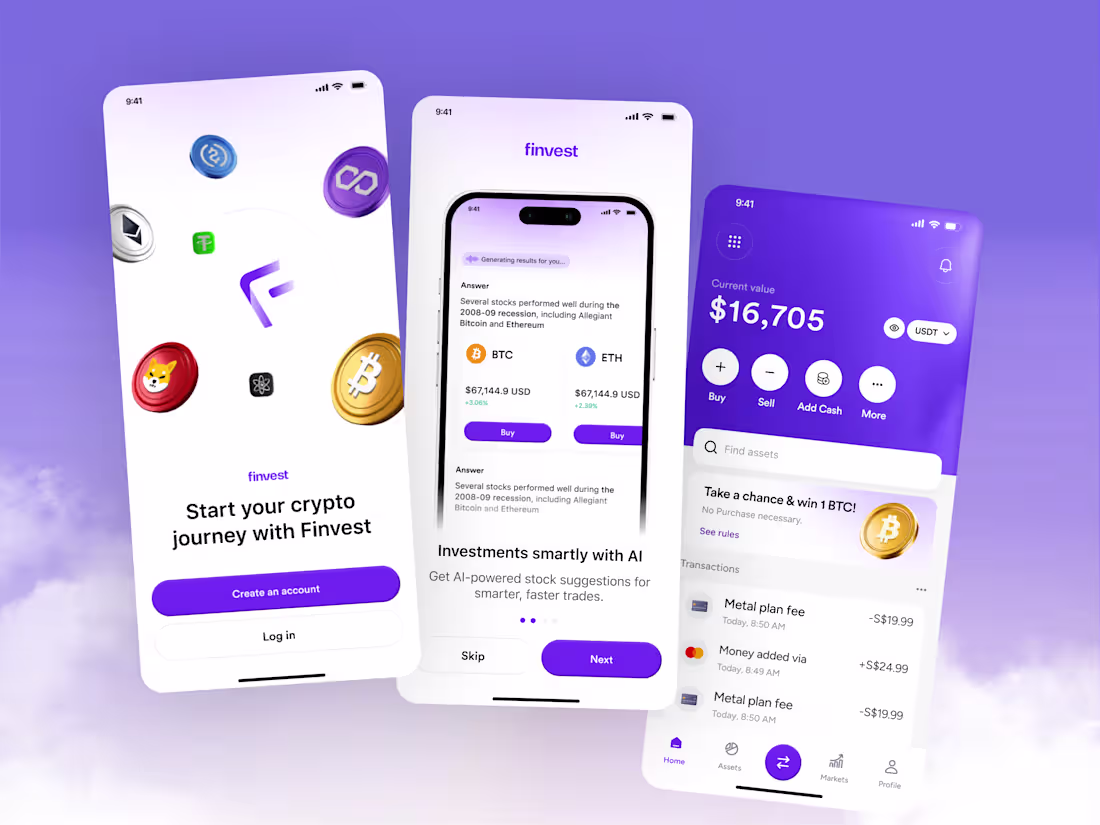
Crypto has a first impression problem. Too complex, too fast, too much assumed knowledge from the very first screen. Finvest was designed to fix that across every single flow.
That was the thinking behind this complete crypto wallet experience: an onboarding, AI insight, and portfolio management system built around the idea that every type of investor deserves a tool that meets them exactly where they are.
Most crypto apps design for the experienced trader and leave everyone else to figure it out alone. The result is an industry full of people who want to invest but never quite start.
Finvest built the confidence into the journey.
A splash screen opening with floating 3D coin assets, BTC, ETH, Shiba, and Tether, before a single account exists. An AI onboarding screen generating real investment answers in real time, surfacing which stocks performed through the 2008 recession, and placing a buy button directly below the insight that earned the tap.
The home dashboard closes the loop with the current USDT portfolio value front and center; Buy, Sell, Add Cash, and More in one clean action row; asset search; a win-a-BTC promotion; and live transaction history all inside one confident purple and white workspace.
Three screens. One complete journey. From the first open to the first investment, there is no confusion, no abandonment, and no moment where a user feels lost.
Because the crypto market doesn't wait. The app that gets someone started fastest wins.
What's the single screen in a crypto app that determines whether a new user stays or leaves forever? 👇
0
313
Here's your contra post for Finvest AI Assistant:
What if your investment app could answer the question you were too embarrassed to Google?
That was the thinking behind the Finvest AI assistant, a voice-powered financial insight layer built into the crypto wallet experience for investors who want guidance, not just graphs.
Most fintech apps give you data and leave you alone with it. Current value, top movers, and portfolio performance are all visible; none of it is explained. The gap between seeing your numbers and knowing what to do with them is where most investors lose confidence.
Finvest put an AI in that gap.
A home screen that shows current portfolio value, weekly movement, today's top movers in BTC and ETH, and available assets all before the AI is even opened. One tap surfaces a voice assistant that listens, reads Finvest Finance data in real time, and responds to questions like "I want recession-proof stocks" with actual insight, not a redirect to a help article.
The voice UI does something most financial AI features never attempt: it makes asking for help feel natural rather than like admitting defeat.
Purple gradient assistant screen. Animated listening orb. Real-time data reading indicator. A conversational interface that treats every question like it deserves a real answer.
Because the smartest investment tool isn't the one with the most data. It's the one that helps you understand what the data means.
What financial question would you ask an AI assistant the moment you opened your investment app? 👇
0
318
Buying crypto should take seconds, not a tutorial. That's the flow this design was built around.
That was the thinking behind the Finvest transaction experience, a buy, sell, convert, and withdraw flow designed to make every crypto action feel as straightforward as sending a text message.
Most crypto transaction flows hide the actual purchase behind currency selectors, fee disclosures, confirmation screens, and wallet addresses that mean nothing to someone who just wants to own their first ETH.
Finvest stripped it back to what actually matters.
A clean action menu: Buy, Sell, Convert, Exchange, Deposit, P2P, and Withdraw, each with a single line description that removes every excuse not to tap. A searchable crypto list showing Bitcoin, Ethereum, Dogecoin, USD Coin, Polygon, and MANA with live CAD prices and percentage movements visible before the selection is made.
The Buy Crypto screen closes the gap completely: the USD to ETH conversion rate is visible instantly, the available balance is displayed, fees are included in the final amount, and a numeric keypad that makes entering an amount feel like unlocking a phone.
One rate. One amount. One Proceed button. That's the entire purchase flow.
Because the difference between someone who invests in crypto and someone who meant to is almost always a friction point that should never have existed.
What's the one step in a crypto purchase flow that loses the most users right before they commit?
2
360
The hardest part of crypto isn't the market. It's the moment you open an app for the first time and have no idea where to begin. That's the problem Finvest was built to solve.
That was the thinking behind this crypto wallet, a mobile investment experience built around the idea that starting your crypto journey should feel as confident as continuing one.
Most wallet apps drop new users into a dashboard full of charts, tickers, and terminology that means nothing until you already know what you're doing. The result is an onboarding experience that filters out exactly the people who need the most guidance.
Finvest built the intelligence into the flow.
A splash screen that opens with floating 3D coin assets, BTC, ETH, Shiba, Tether, and more before a single account is created. An AI onboarding screen that generates investment suggestions in real time, surfaces performance insights, and puts a Buy button one tap below the insight that earned it.
The home dashboard completes the picture: current USDT value front and center, Buy, Sell, Add Cash, and More in one action row, asset search, and transaction history all living in one clean purple and white workspace.
Because the best time to understand crypto was yesterday. The second best time is the moment this app opens.
What's the one onboarding decision that makes or breaks a crypto app for first-time investors? 👇
1
342
Booking a doctor is only one part of the healthcare experience. This appointment flow was designed around everything patients need before the visit actually begins.
Most healthcare apps stop after confirmation screens. Patients are left searching for insurance details, uploading documents manually, or forgetting important preparation steps before the appointment day.
This flow simplifies that entire process.
The Appointment screen keeps everything in one place visit details, checklist progress, calendar actions, directions, and insurance information are all accessible without overwhelming the user.
The checklist experience breaks preparation into simple actions like uploading ID cards, adding medical insurance, and completing forms. Small tasks. Clear progress. Less stress before the visit.
The final confirmation interaction closes the loop with a lightweight success state that reassures the patient their appointment is fully organized and ready.
Every screen was designed to reduce friction, improve clarity, and make healthcare preparation feel less complicated.
Tools: Figma for Design
What’s the most frustrating part of preparing for a doctor appointment online? 👇
0
307
Most healthcare apps make booking feel harder than the appointment itself.
This Doctor Profile & Booking flow was designed to remove that friction with a clean, trust-focused experience from profile to confirmation.
Clear doctor information, lightweight booking confirmation, and a reassuring success screen help patients move from “I need help” to “appointment booked” without confusion.
Three screens. One seamless healthcare experience.
What’s the most frustrating part of booking a doctor online? 👇
0
295
Most people avoid booking a doctor because the process feels like work. This search flow was designed to fix that in three screens.
That was the thinking behind this healthcare search experience a Find Care flow built around the idea that getting from "I need help" to "appointment booked" should never require more thought than the condition that sent you there.
Most healthcare search flows dump a list of filters, specialty dropdowns, and insurance fields on a patient before they've even typed a single word. The result is abandonment before the first search is complete.
This flow removed every unnecessary step.
Find Care opens with three inputs: condition, location, and date. Nothing else. Specialty categories from Dental to Cardiology to Brain to Optometry give direction without demanding it.
The search screen does the thinking for you. Popular specialties surfaced instantly. Primary Care, Dentist, Dermatologist, Optometrist, OB-GYN, and Allergist are all visible before the keyboard finishes loading. Smart text suggestions reduce the gap between intent and result.
The date picker closes the loop: clean calendar, single-tap selection, and no friction between choosing a day and moving forward.
Three screens. One complete journey. Zero reasons to abandon.
What's the single step in a healthcare booking flow that loses the most users? 👇
0
290
Finding the right doctor shouldn't feel harder than the condition you're trying to treat.
That was the thinking behind this healthcare booking app designed to make finding, evaluating, and booking a doctor feel as simple and trustworthy as any other modern service.
Most healthcare apps overwhelm patients with clinical information or strip out the details that actually build booking confidence. The result is an interface people abandon before finding the help they need.
This app built trust into every screen.
Clean white canvas. Minimal black typography. Three fields on the Find Care screen condition, location, date and one Continue button. Specialty categories from Dental to Cardiology to Brain to Optometry visible before a single search is typed.
Doctor cards with live availability slots, ratings, and hourly rates make comparison effortless. The Doctor Profile completes the journey experience, patient count, reviews, and a single Book Now CTA that removes every reason to hesitate.
Because booking a doctor should feel like something worth doing, not something worth avoiding.
What's the one friction point most healthcare apps never fix? 👇
0
287
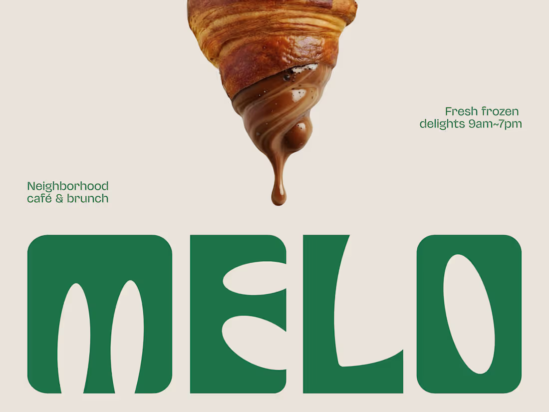
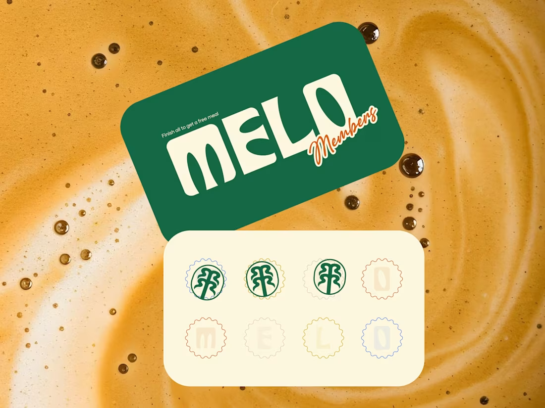
The best café brands don't introduce themselves. They just feel familiar from day one.
Most neighborhood café brands hide behind generic coffee cup icons, overused script fonts, and a color palette that could belong to a yoga studio or a juice bar or literally anything else. The logo promises character. The brand delivers nothing you'd remember by the time you reach the door.
Melo made familiarity the whole brief.
A custom palm tree emblem encircled in a clean oval, organic, architectural, impossible to mistake for anything else. Deep forest green across three environments: cream, burnt green, and dark olive, each one feeling as considered as the last. A rounded wordmark so confident it can fill an entire poster at display scale and still feel warm rather than loud. And right there on the campaign visual, a caramel-dripping croissant melted into the letterforms, like the food and the brand were always the same thing.
That's not just a logo system. That's a place people recognize before they even read the name.
Because a neighborhood spot that earns a place in someone's morning deserves a brand that feels just as inevitable.
What makes a café logo feel like it actually belongs to a place? 👇
2
4
320
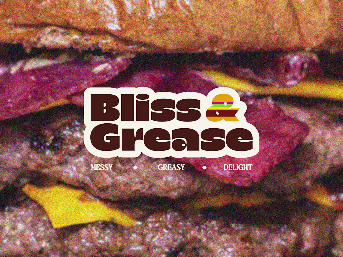
Some brands try to look appetizing. Bliss & Grease decided to look exactly like what it is.
Most burger joints hide behind polished food photography, clean white packaging, and a brand voice that pretends eating a double cheeseburger is somehow a refined experience. The menu promises indulgence. The brand delivers corporately.
Bliss & Grease built the honesty into the name itself.
Chunky retro wordmark with enough swagger to fill a wall. Deep chocolate brown, warm cream, and a rainbow-striped burger icon that nods to the 70s without getting lost in nostalgia. Grainy film-textured photography that makes the meat look exactly as messy and magnificent as it actually is. And right there under the logo, in three words: Messy. Greasy. Delight.
That's not just a brand line. That's a permission slip for everyone who stopped apologizing for what they actually want to eat.
The sticker-style logotype treatment, grain overlay, and macro burger photography turn a brand identity into something that feels like it belongs on a late-night food truck and a vintage concert poster at the same time.
Because a burger that owns every greasy, glorious bite deserves a brand with exactly the same energy.
What's the most honest thing a food brand has ever said about its own product? 👇
0
296
Every cafe looks the same these days. Melo decided that was everyone else's problem.
Most neighborhood cafes hide behind kraft paper textures, overused coffee bean icons, and a logo that could belong to any shop on any street in any city. The vibe promises warmth. The brand delivers nothing memorable.
Melo built the personality into every single touchpoint.
Bold rounded wordmark with enough character to own a takeaway cup at arm's length. Deep forest green paired with warm cream is grounded, inviting, and unmistakably its own. A hand-drawn palm tree emblem that feels like a neighborhood landmark rather than a corporate asset. And right there on the loyalty card, in plain sight, is "Finish all to get a free meal."
That's not just a punch card. That's a reason to come back eight times.
The scallop-edged stamp system, script members' lettering, and floating cup mockup turn everyday cafe collateral into something people actually want to hold onto, photograph, collect, and show their friends.
Because a neighborhood cafe that feels like a second home deserves a brand that feels just as warm.
What's the cafe branding detail that makes you choose one spot over another? 👇
0
285
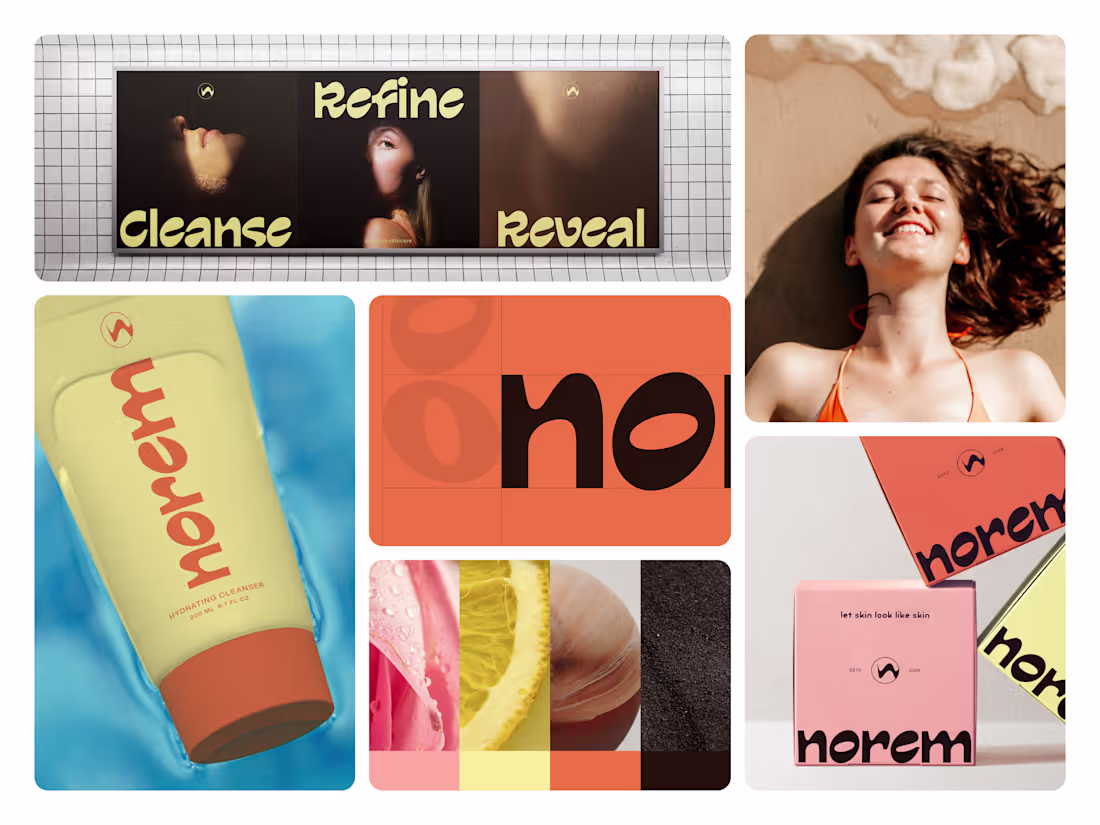
Skincare branding has a confidence problem. Nobody fixed it until Norem did.
Most beauty brands hide behind clinical whites, sterile packaging, and ingredient lists that read like a lab report. The bottle promises transformation. The shelf presence delivers nothing.
Norem built the confidence into the brand itself.
Bold rounded wordmark. A palette that feels sun-kissed rather than synthetic warm terracotta orange, pale butter yellow, or deep espresso brown. Real skin. Real texture. Real ingredients visible in every campaign frame. And right there on every package, in plain sight, is "let skin look like skin."
That's not just a tagline. That's the entire brand philosophy in five words.
The oversized typography, unapologetic color blocking, and three-word campaign Cleanse. Refine. Reveal. Turn a cleanser tube into a shelf presence that stops people mid-aisle before they even read the label.
Because skincare that's actually honest about what it does deserves a brand that's just as honest about who it's for.
What's the boldest brand decision you've seen on a beauty product? 👇
0
274
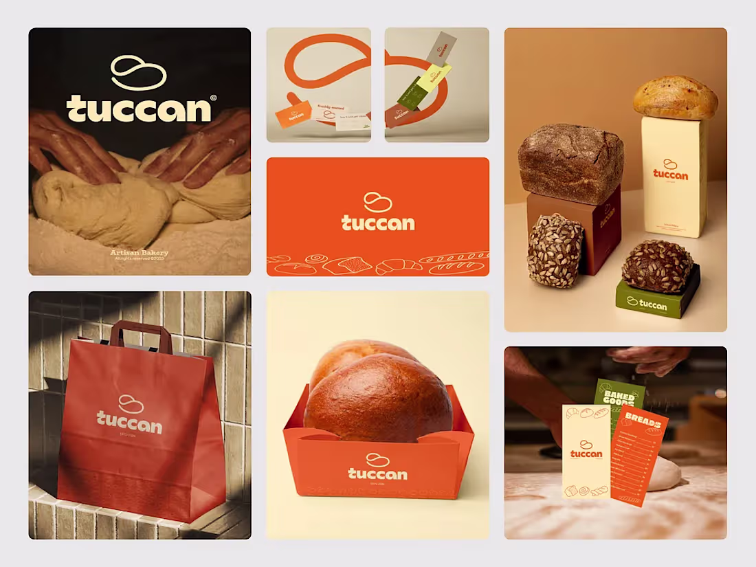
Great bakery brands don’t just package food. They package comfort, warmth, and familiarity.
Tuccan was created to bring a modern identity into artisan baking through bold orange tones, soft typography, and a simple symbolic mark inspired by flowing dough shapes. The system feels clean and contemporary while still connected to the handmade nature of fresh bread.
From takeaway bags and bread trays to packaging and print materials, every touchpoint was designed to feel warm, inviting, and instantly recognizable on the shelf.
Because the best food branding makes people hungry before the first bite even happens.
What’s your favorite detail in bakery branding, packaging, logo, or color palette? 👇
4
342
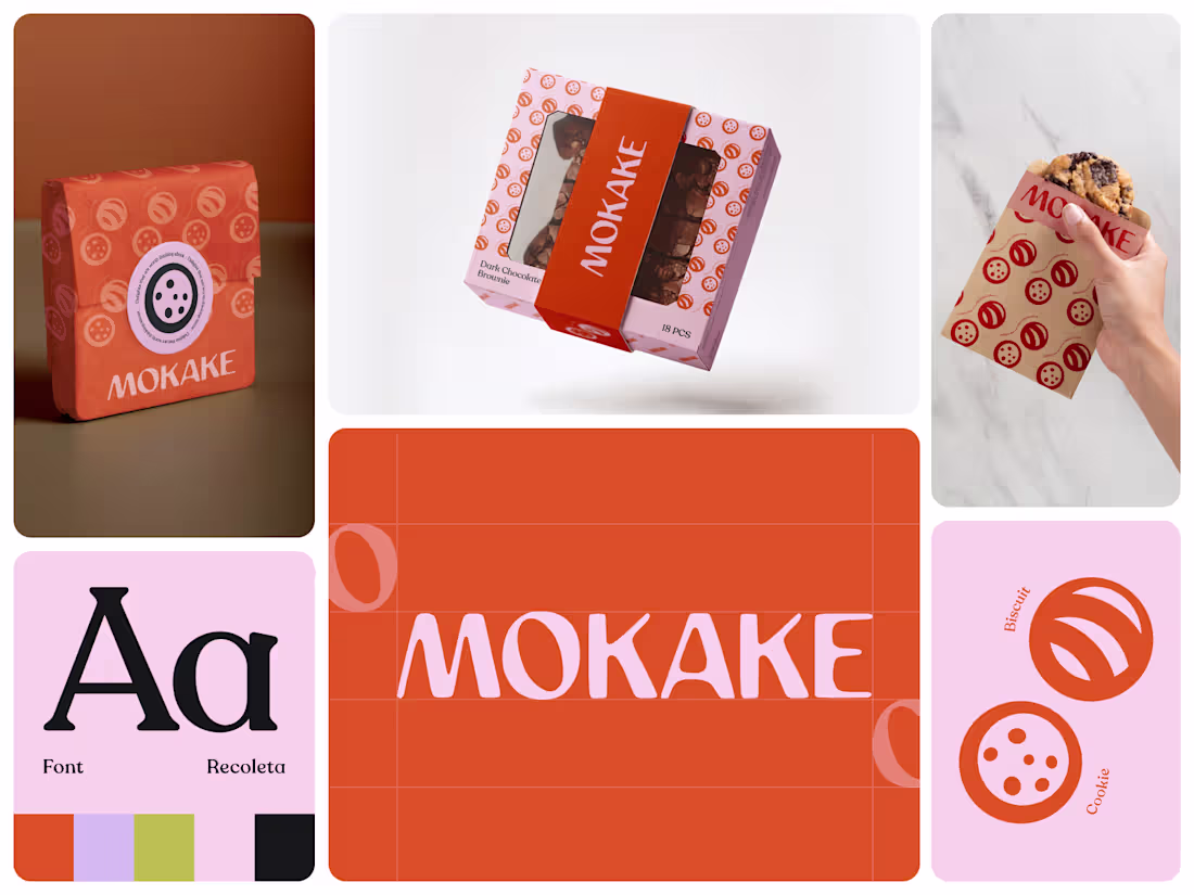
Sweet brands are easy to make look playful. Making them feel memorable is harder.
MOKAKE was built to feel like a modern bakery brand with personality baked into every surface, from the packaging wrap to the takeaway experience in someone’s hand.
Most dessert brands lean on predictable pastel aesthetics or overloaded illustrations. The result usually feels generic, temporary, and forgettable after the first purchase. MOKAKE takes a cleaner direction. Bold orange tones paired with soft lavender create a visual system that feels energetic without becoming noisy. Warm enough for cookies and brownies, sharp enough to stand out on a crowded shelf.
The identity revolves around a simple circular symbol language inspired by biscuits, chocolate chips, and baked textures. Repeated across wraps, boxes, sleeves, and print materials, the pattern creates instant recognition without needing excessive decoration.
Typography plays a huge role in the personality too. The custom wordmark feels soft, rounded, and slightly imperfect in a way that mirrors handmade bakery products while still keeping the brand contemporary and scalable across packaging systems.
From a floating brownie box mockup to a simple cookie sleeve held in one hand, every touchpoint was designed to make the product feel gift-worthy before the first bite even happens.
Because in food branding, packaging isn’t just protection. It’s appetite, memory, and marketing all happening at the same time.
What’s the first thing that makes you trust a bakery brand: packaging, color, typography, or the overall experience? 👇
0
290
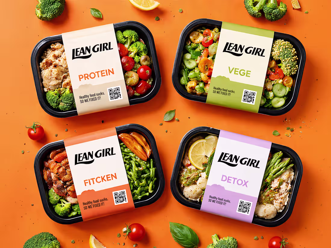
Healthy food has a branding problem. Nobody fixed it until Lean Girl did.
That was the thinking behind this packaging identity, a food brand designed to say out loud what every health-conscious person has thought at least once while staring at a sad, overpriced salad.
Most healthy food brands hide behind wellness language, muted earth tones, and aspirational photography that looks nothing like what's actually inside the box. The packaging promises transformation. The meal delivers disappointment.
Lean Girl built the honesty into the brand itself.
Bold condensed wordmark. Four SKUs with four distinct color personalities Protein in warm amber, Vege in fresh olive green, Fitcken in energetic coral, Detox in calm lavender. Real food photography visible through every tray. And right there on every label, in plain sight, is "Healthy food sucks. SO WE FIXED IT."
That's not a tagline. That's a brand promise backed by what's actually inside the packaging.
The vibrant orange campaign backdrop, fresh ingredient scatter, and QR code integration turn a meal prep container into a shelf presence that stops people mid-aisle and earns the scan before the purchase.
Because food that's actually good for you deserves packaging that's actually honest about it.
What's the boldest brand voice decision you've seen on a food product? 👇
0
287
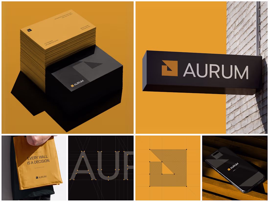
Every wall is a decision. The brand representing it should feel like one too.
That was the thinking behind Aurum a real estate brand identity designed to communicate precision, authority, and architectural confidence from the very first touchpoint.
Most property brands look like they were designed to avoid risk. Safe colors. Forgettable marks. Typography that could belong to any industry. Nothing that makes a high-value buyer feel like they've found something worth trusting.
Aurum took the opposite position.
Warm amber gold against deep charcoal black. A geometric logomark built on architectural grid logic, a square bisected by directional movement, precise enough to feel engineered, bold enough to own any surface it lands on. Business cards that feel like a brand statement before they're even read. A street-level sign that stops people. A tote carrying a philosophy, not just a logo.
The construction grid, letterform architecture, and mobile splash screen prove the same identity scales from a pocket-sized card to a building-mounted sign without losing a single point of clarity.
Because property buyers make decisions based on trust, and trust starts with how a brand presents itself before the conversation even begins.
What's the single design decision that makes a real estate brand feel premium rather than just polished? 👇
1
289
The best fitness tool isn't the one with the most features. It's the one athletes actually open every single morning.
That was the design principle behind this AI-powered fitness dashboard built around the idea that tracking calories, workouts, nutrition, and streaks should feel motivating, not overwhelming.
Most fitness dashboards collect data and nothing else. Athletes, coaches, and health-conscious people deserve better than a generic interface that feels like a spreadsheet with a logo.
This dashboard built the experience to match the motivation.
Deep forest green and clean white canvas. An AI assistant is ready the moment you open it. Calorie progress, streak tracking, nutrition score, featured workouts, daily schedule, and community feed: every section working together as one unified fitness ecosystem.
Workout reminders, sleep reminders, and hydration alerts are all visible without opening a single sub-menu.
Because showing up deserves a tool that makes it feel worth it before the first rep.
What's the one feature most fitness apps completely overlook for real daily use? 👇
0
273
A fashion brand lives and dies by its details. The backend should be no different.
That was the design principle behind the Wink customer management dashboard, a backend experience built with the same monochrome precision as the brand it serves.
Most e-commerce operation tools are designed for utility and nothing else. The team managing real customers, real orders, and real revenue every day deserves better than a generic interface that contradicts everything the brand stands for on the outside.
Wink built the inside to match the outside.
Clean white canvas. Sharp black typography. A sidebar organizing Catalog, Finances, Customers, Marketing, Analytics, and Sales Channels every section exactly where an operations team needs it, nothing they don't.
The customer table says everything: name, location, order count, and total spent. No unnecessary charts. No dashboard bloat. Just precise, scannable data presented the way a premium fashion brand presents everything it touches.
Because operations teams deserve a tool that respects the brand as much as the customer does.
What's the one thing most e-commerce dashboards get completely wrong for fashion brands? 👇
0
275
What if managing crypto portfolios felt as clean as the interface you're looking at right now?
That was the core question behind Finvest, a crypto investment dashboard designed for traders who need BTC, ETH, Dogecoin, and US dollar positions visible, manageable, and actionable from a single screen.
Most crypto dashboards are either overwhelmed with charts or undersell the data that actually drives decisions. The result is a tool traders tolerate rather than trust.
Current balance is visible the moment you open it. Investment portfolios for BTC, ETH, and trending coins with total shares and return rates side by side. Transaction history in progress, Complete across Bitcoin, Dogecoin, Ethereum, US Dollar, and USD Coin all in one scannable table. Fast crypto withdrawals. This week is trending with Dogecoin, Bitcoin, and Ethereum price movements. All inside a clean white dashboard that makes $5,723 feel completely in control.
The lavender-purple brand backdrop, crisp white dashboard canvas, and coin-color iconography do something most fintech tools never attempt: they make a complex multi-asset portfolio feel genuinely manageable.
What's the one dashboard feature most crypto platforms get completely wrong?
0
262
What if a fashion e-commerce dashboard felt as editorial as the brand it was built for?
That was the core question behind Wink, a monochrome fashion e-commerce platform designed for a brand that lives by one rule: timeless over trendy.
Most fashion dashboards prioritize inventory management over brand experience. The result is a backend that contradicts the frontend, a premium storefront connected to a generic operations tool.
A dashboard system built in the same visual language as the brand itself. Pure black. Clean white. Bold condensed typography. The same identity that works on a shopping bag and a billboard works just as naturally inside the product management workflow.
Every data table, product card, order status, and analytics widget was designed to feel like it belongs to a fashion house not a generic SaaS tool.
Because the people managing a brand like Wink deserve an experience as considered as the one their customers get.
What's the one dashboard element most SaaS tools get completely wrong for fashion brands? 👇
0
261
Most health dashboards show you numbers. This one tells you what to do with them right down to "Take A Breath Now."
A modern health records dashboard designed to make medical analytics, fitness metrics, and wellness insights feel clear and genuinely personal. Built for clinicians, coaches, and individuals managing their complete health picture in one workspace.
Designed in Figma with a clean white and neon green interface that keeps complex health data easy to act on. Tracker analytics, oxygen levels, heart rate, calories, workouts, breath coaching, and blockchain-verified wellness metrics all in one calm, readable layout.
The same structure adapts easily for medical SaaS, personal wellness apps, fitness tracking, or AI healthcare products. Every section designed to balance clinical precision with human warmth.
Really happy with how the crisp white canvas, neon green accents, and human anatomy visuals turned complex medical data into something that actually feels good to open every morning.
Would love to hear your thoughts on the UI direction. 👀
UX Design | Health Tech | Dashboard UI | SaaS Platform
Tools: Figma, Jitter
0
324
Your portfolio shouldn't require three tabs and a spreadsheet to understand. That's the problem CashPanel was built to solve.
The dashboard combines candlestick trading charts, AI assistant integration, portfolio value tracking, spending overview, and transfer history into a workflow that feels both sophisticated and highly functional.Designed in Figma with a soft blue-white interface, a clean modular layout, and a data hierarchy that keeps complex portfolio analytics effortless to act on.
The real strength of the system is intelligence. The same structure adapts easily for crypto trading platforms, stock portfolio tools, DeFi dashboards, or personal finance SaaS products. From the live BTC/USDT market ticker to the GPT-powered AI assistant answering, "Where should I focus trading?" every section was designed to balance data depth with decision-making clarity.
Would love to hear your thoughts on the UI direction. 👀
UX Design | Crypto Dashboard | Portfolio Management | SaaS Platform
Tools: Figma, Jitter
0
310
A modern real estate analytics dashboard designed to make property sales, listings, and cash flow feel clear, actionable, and effortless. Built for agencies and property teams handling real estate, cars, market listings, and jobs in one unified workspace.
Designed in Figma with a soft teal and white interface, a clean modular layout, and a data hierarchy that keeps complex property analytics easy to scan. The dashboard combines sales performance tracking, property overview tables, cash flow revenue charts, sales target progress, and active report management into a workflow that feels both precise and highly functional.
The real strength of the system is flexibility. The same structure adapts easily for real estate agencies, vehicle marketplaces, rental management platforms, or multi-category listing tools. From the weekly sales analytics bar chart to the compact KPI widgets, every section was designed to balance data density with visual calm.
Really happy with how the teal accent system, clean white canvas, and spacious card layout created a dashboard that handles 435 total properties and 46,246 property views without ever feeling overwhelming.
Would love to hear your thoughts on the UI direction. 👀
UX Design | Real Estate | Dashboard UI | SaaS Platform
Tools: Figma, Jitter
0
305
Healthcare has always been complex. The dashboards built around it never made it feel any simpler until now.
CareNest is a healthcare management dashboard designed for clinicians, wellness coaches, and care teams who need every patient insight, appointment, and alert visible the moment they log in. Every interaction built to feel as calm and precise as the care it supports.
Overwhelming appointment lists. Critical alerts buried in noise. Patient flow with no visual clarity. Provider availability that takes too long to find.
Wellness progress tracking with daily and weekly views. Stress and recovery balance mapped across the full week. HRV and glucose biomarker monitoring. Patient flow capacity at a glance. Healthcare provider availability visible instantly. Aria, your personal AI assistant, answers clinical questions in real time.
A dashboard experience that matches the precision and calm that healthcare professionals need every single day. Clear. Actionable. Ready to scale.
Designing a healthcare platform, medical SaaS, or wellness dashboard that needs to feel this considered? Let's build it together.
8
15
519
Your portfolio speaks before you do. We made sure it says the right thing.
From a complex set of architectural firm requirements to a seamless web experience that makes every building feel as permanent and intentional as the headline says, "Architecture is Forever.
Architecture firms don't lose clients to bad buildings. They lose them to bad first impressions. Artego was built to make sure that never happens again. 4 Beds, 2 Baths, 2,570 Sq. Ft. 5-star testimonials from real clients. An about section that leads with purpose, thoughtful design, and lasting impact and a blog that keeps the conversation going long after the first visit.
We wanted to move away from the cold, image-dump layouts of traditional architecture websites and build something that actually feels as considered as the homes it represents.
Curious what you think about the UI direction. 👀
UX Design | Architecture | Web Design | Real Estate
0
297
Most energy company websites talk about the future. Arvora was built to make it feel like it's already here.
We’re building the technology to power complex renewable energy platforms with a seamless web experience, making clean, sustainable energy feel accessible, credible, and worth choosing today.
Limitless clean renewable energy wasn't just the headline; it was the entire design brief. 650 clients worldwide. 99% customer satisfaction. Wind farms, solar fields, and a mission built around meaningful impact through design, strategy, and innovation all working together in one platform that makes going green feel like the obvious choice.
We wanted to move away from the corporate, data-heavy layouts of traditional energy websites and build something that actually feels as expansive and optimistic as the future it represents.
Curious what you think about the UI direction. 👀
UX Design | Renewable Energy | Web Design | Landing Pag
0
284
A great dental experience starts long before you sit in the chair. It starts the moment you land on the website.
From a complex set of dental platform requirements to a seamless web experience that makes finding a dentist, understanding treatments, and booking an appointment feel completely stress-free.
Dental care that puts the patient at ease before they walk through the door. A platform where treatments, specialists, reviews, and appointment booking all live together in one warm, approachable experience designed to remove anxiety, not add to it.
We wanted to move away from the sterile, text-heavy layouts of traditional dental websites and build something that actually feels as comfortable as the care it represents.
From the first scroll to the booking confirmation, every pixel was designed to replace anxiety with confidence.
Curious what you think about the UI direction. 👀
UX Design | Healthcare | Dental | Web Design
0
294
A social app built around the idea that connection goes beyond scrolling; it's about capturing real moments and sharing them live.
Using proximity, moods, and real-time experiences, we translated an entire social world into a clean, immersive visual interface.
Capture Best Moments. Share Them Live. That wasn't just the headline; it was the entire design brief in four words.
Still one of my favorite social experiences I've had the chance to build.
Curious, what's one app feature that made you actually want to put your phone down and go live something worth sharing?
4
15
371
Most healthcare websites make you feel like you're filling out a form before you've even found a doctor. Medinest was built to change that.
From a complex set of medical platform requirements to a seamless web experience that makes finding a doctor, booking an appointment, and trusting your healthcare provider feel completely effortless.
𝗧𝗵𝗲 𝗰𝗼𝗻𝗰𝗲𝗽𝘁:
Your health deserves a platform as professional as the doctors on it. Ratings. Reviews. Specialties from cardiology to pediatrics to post-COVID rehabilitation all surfaced instantly. A monthly healthcare report updated for full transparency. Every patient receives an accurate diagnosis and effective treatment, and the design communicates that before a single word is read.
We wanted to move away from the cold, form-heavy layouts of traditional medical websites and build something that actually feels warm, trustworthy, and human from the very first scroll.
Curious what you think about the UI direction. 👀
UX Design | Healthcare | Web Design | Doctor Appointment Platform
0
262
Most financial platforms make you feel like you need a degree to use them. Coinova was built for everyone who just wants their money to make sense.
From a complex set of smart financial platform requirements to a seamless web dashboard that makes managing, growing, and protecting money feel completely effortless.
𝗧𝗵𝗲 𝗰𝗼𝗻𝗰𝗲𝗽𝘁:
One smart platform. Every financial action you need. Savings Progress with Rate, Efficiency, and Engagement meters. Financial Performance Overview: Sales, Revenue. Smart Management System. Secure syncing is all readable in under a second, all working together as one unified financial command center.
We wanted to move away from the cluttered, number-heavy interfaces of traditional financial platforms and build something that actually feels intelligent and calm to open every morning.
Curious what you think about the UI direction. 👀
UX Design | Fintech | Web Dashboard | SaaS Platform
0
252
Most architecture websites show you buildings. Artego shows you the people behind them.
From a complex set of architectural firm requirements to a seamless web experience that makes a forward-thinking Chicago studio feel as human as the homes they build.
𝗧𝗵𝗲 𝗰𝗼𝗻𝗰𝗲𝗽𝘁:
Solar energy that speaks to humans. Live energy tracking; high-efficiency installation showcases; and nationwide testimonials all in a visual hierarchy that turns complex renewable data into one clear decision: switch.
We build buildings, but better. That wasn't just a headline; it was the entire design brief in five words. A team page that leads with faces, not credentials. A process section built around creativity, sustainable collaboration, and personal touch. A studio identity that feels honest before it feels impressive.
We wanted to move away from the cold, portfolio-heavy layouts of traditional architecture websites and build something that actually feels like a conversation, not a credential wall.
Really proud of how the deep charcoal black, warm terracotta building photography, and clean editorial team cards create a sense of trust and approachability. "Work that holds up" never looked this personal.
Curious what you think about the UI direction. 👀
UX Design | Architecture | Web Design | Agency Website
0
253
Switching to solar shouldn't feel like a science project. That's the problem Solence was built to solve.
From a complex set of renewable energy platform requirements to a seamless landing page experience that makes going solar feel as simple as making any other smart decision.
Solar energy that speaks humans. Live energy tracking, high-efficiency installation showcases, and nationwide testimonials all in a visual hierarchy that turns complex renewable data into one clear decision: switch.
We wanted to move away from jargon-heavy energy websites and build something that actually feels trustworthy from the first scroll.
Really proud of how the sky blue palette, bold typography, and wind turbine photography make "Switch to solar today, start saving tomorrow" feel inevitable.
Curious what you think about the UI direction. 👀
UX Design | Solar Energy | Landing Page | Web Design
0
239
Nobody books a kashta, a desert chalet, or a night under the stars because it was easy to find. We built the app that makes it easy.
From a complex set of unique accommodation requirements to a seamless mobile experience that makes discovering extraordinary stays feel completely effortless.
The world has incredible places to stay. The problem was never availability it was discoverability. This app surfaces the stays most platforms bury, organizes them by tier, pins them on a live dark map with real pricing, and makes saying yes feel inevitable.
Curious what you think about the UI direction. 👀
UX Design | Travel App | Booking UI | Mobile App
1
259
Your money moves fast. Your app should too.
From a tangled set of multi-currency wallet requirements to a frictionless mobile experience that makes every financial action send, receive, invest, convert feel like it takes exactly one tap.
Most wallets store money. Unipay moves it. The entire product was built around one question "what does a person actually need in the 30 seconds they open their finance app?" Balance visible instantly. Contacts one tap away. Currency conversion without leaving the screen. Spending history that tells a story without making you read a report. Every screen answers that question and nothing else.
The goal was ruthless simplicity without sacrificing a single feature.
Curious what you think about the UI direction. 👀
UX Design | Fintech | Digital Wallet | Dark UI
0
249
Real-time tracking for people whose job is making sure nothing goes wrong. Every pin on this map has a name behind it.
From a complex set of executive protection requirements to a seamless mobile experience that makes live mission tracking feel precise, calm, and completely in control.
Security shouldn't feel chaotic. One dark-mode map dashboard, live agent locations, real-time mission tracking, and instant location sharing are all built for executive protection officers who need zero margin for error and zero seconds of confusion.
We wanted to move away from the cluttered, consumer-grade map interfaces of traditional tracking tools and build something that actually feels purpose-built for high-stakes field operations.
Really proud of how the deep black map canvas, neon green location pulses, and "Start Sharing Location" CTA create a sense of tactical precision; every pin on this map matters.
Curious what you think about the UI direction. 👀
UX Design | Security Tech | Tracking App | Dark UI
0
249
Most banking apps show you your balance. This one shows you what to do with it.
From a complex set of Islamic finance requirements to a seamless mobile experience that makes managing money feel purposeful, clear, and completely aligned with values.
Faith-based finance shouldn't feel like a compromise. One dark-mode dashboard Wallet, Payments, Savings, Donation, Fatwa all Shariah-compliant, all feeling as modern as any leading fintech app on the market.
We wanted to move away from the outdated, compliance-heavy interfaces of traditional Islamic banking apps and build something that feels as premium as any leading fintech product on the market today.
Really proud of how the deep forest green palette, cyan accent transfers, and neon investment progress bars create a sense of calm financial confidence and purposeful design for purposeful money.
Curious what you think about the UI direction. 👀
UX Design | Islamic Fintech | Mobile App | Dark UI
0
242
Most farming tools are built for farmers. Agrova was built for the farmer standing in the field at 6AM.
From a complex set of agricultural platform requirements to a seamless mobile experience that makes smart, data-driven farming feel accessible to everyone from small farms to large-scale operations.
Agriculture hasn't changed. The tools around it have. Agrova bridges that gap, bringing smart technology, sustainable insights, and data-driven crop performance into one platform that speaks the farmer's language, not the developer's. 50K+ farmers already trust it. The design had to earn that trust before a single feature was explained.
We wanted to move away from the cluttered, jargon-heavy interfaces of traditional farming software and build something that actually feels empowering to open every single morning.
Really proud of how the deep earth tones, golden yellow CTAs, and real field photography create a sense of trust and growth. "Growing Smarter. Farming Better." felt like the only possible headline.
Curious what you think about the UI direction. 👀
UX Design | AgriTech | Mobile App | SaaS Platform
0
240
Nobody remembers a paper business card. They remember the person who didn't need one.
From a complex set of professional networking requirements to a seamless experience that makes sharing your entire professional identity feel as easy as a tap.
𝗧𝗵𝗲 𝗰𝗼𝗻𝗰𝗲𝗽𝘁:
A digital business card app that puts your professional presence in one smart profile. It features all social links in one place, direct connection sharing, recent contacts management, and a visual hierarchy that turns networking into something people actually enjoy 36+ connected, 5 active social links, all in under a second.
We wanted to move away from the scattered, link-in-bio workarounds of traditional networking tools and build something that actually feels professional to hand over every single day.
Really proud of how the clean white canvas, neon green accent, and social platform grid create a sense of modern professionalism all the right people, all in one place.
Curious what you think about the UI direction. 👀
UX Design | Networking App | Digital Business Card | Mobile UI
0
232
Finding a home should feel exciting. Not exhausting. That's the problem Aurex Living was built to solve.
From a complex list of property search requirements to a seamless user flow that makes finding your next home feel like browsing a luxury magazine.
𝗧𝗵𝗲 𝗰𝗼𝗻𝗰𝗲𝗽𝘁:
A real estate app that puts the buyer, renter, and seller back in the driver's seat. It features location-based property listings, instant Rent/Buy/Sell switching, and a visual hierarchy that turns property data into confident decisions 1200 sq ft, 3 Beds, 3 Washrooms, 1 Garage, all readable in under a second.
We wanted to move away from the cluttered, filter-heavy layouts of traditional real estate apps and build something that actually feels premium to use every single day.
Really proud of how the warm cream palette, editorial property photography, and clean card-based layouts create a sense of trust and calm $5,864.00 never looked this inviting.
Curious what you think about the UI direction. 👀
UX Design | Real Estate | Mobile App | Property UI
2
8
630
We brought this fully functional gamified location app to life with a focus on play and real-world exploration.
From a complex list of gamification requirements to a seamless experience that makes stepping outside feel like loading into a game.
𝗧𝗵𝗲 𝗰𝗼𝗻𝗰𝗲𝗽𝘁:
A location-based social app that puts the player back in the driver's seat. It features a real-time 3D isometric city map, XP and Coin rewards tied to real movement, and a visual hierarchy that turns your neighborhood into a quest zone worth exploring.
We wanted to move away from the flat, utility-first design of traditional map and event apps and build something that actually feels exciting to open every day.
Really proud of how the sky-blue isometric world, floating 3D buildings, and glassmorphism filter tabs create a sense of adventure and discovery from the very first screen.
Curious what you think about the UI direction. 👀
UX Design | Gamification | Mobile App | Location Based
1
254
A modern fashion e-commerce brand designed to feel editorial, minimal, and instantly covetable across every surface it lands on.
Designed in Figma with a pure black and white system, a custom geometric wordmark with a signature wink detail, and an understated-luxury visual language that owns every touchpoint. Billboard advertising, shopping bags, mailer boxes, editorial campaign cards, and logo construction grids the same identity holds elegance at any scale.
The monochrome palette of pure white, warm gray, and deep black does the heavy lifting timeless and fashion-forward without ever feeling trend-dependent.
"Shop Smarter, Live Better. Casual Elegance." That's not just the tagline. That's the brief we designed from.
Would love to hear your thoughts on the brand direction. 👀
Brand Identity | Fashion Branding | Ecommerce | Packaging Design
Tools: Figma, Jitter
1
2
288
A luxury yacht brand identity designed to feel free, premium, and built for people who chase horizons across every surface it sails on.
Designed in Figma with a deep navy and electric cyan system, a bold modern wordmark, and a freedom-first visual language that owns every touchpoint. Website UI, billboard advertising, staff uniforms, ID badges, mobile apps, and event signage: the same identity holds authority on every wave.
The deep black, pure white, and electric cyan palette does the heavy lifting aspirational and adventurous without ever feeling overcrowded or loud.
"Chase the Horizon. Leave Stress Behind. Step Into Freedom." That's not just the tagline. That's the brief we designed from.
Really proud of how the cyan brand block, luxury yacht photography, and bold all-caps typography created a brand that feels as powerful on a street billboard as it does on a staff t-shirt.
Would love to hear your thoughts on the brand direction. 👀
Brand Identity | Luxury Branding | Yacht & Marine | Visual Identity
Tools: Figma, Jitter
0
272
A luxury skincare brand identity designed to feel pure, grounded, and quietly unforgettable across every surface it graces.
Designed in Figma with a warm peach, sage green, and earthy terracotta system; an organic crown logo mark; and a nature-first visual language that commands trust instantly. Product photography, Instagram social cards, 3D stone logo environments, color palette storytelling, and campaign editorials the same identity holds luxury at every touchpoint.
The peach, sage, moss green, and warm brown palette does the heavy lifting naturally and premium without ever feeling clinical or cold.
"Experience the Essence of Purity. Luxury in Every Drop." That's not just the tagline. That's the brief we designed from.
Really proud of how the organic crown symbol, earthy stone textures, and soft editorial photography created a skincare brand that feels as pure as the ingredients it promises.
Would love to hear your thoughts on the brand direction. 👀
Brand Identity | Skincare Branding | Luxury Packaging | Visual Identity
Tools: Figma, Jitter
0
270
A modern job platform brand and UI designed to make connecting talent with opportunity feel human, warm, and effortless across every touchpoint.
Designed in Figma with a mint green and soft pastel system, fluid U-arrow logo construction, and a people-first visual language that feels nothing like a traditional recruitment platform. Logo grid, job match cards, video interview UI, color palette, and celebration moments: the same identity holds clarity at every screen.
The mint green, lavender, coral, and sky blue palette does the heavy lifting, approachable and professional without ever feeling corporate or cold.
Really proud of how the logo construction grid, soft pastel UI cards, and the video call screen came together into a brand that feels as warm as the people using it.
Would love to hear your thoughts on the brand direction. 👀
Brand Identity | Job Platform | UI Design | Product Branding
Tools: Figma, Jitter
0
264
A luxury jewelry brand identity designed to feel timeless, sensual, and impossible to forget across every surface it graces.
Designed in Figma with a deep black and warm gold system, an editorial script-serif wordmark, and an elegance-first visual language that commands attention instantly. Hero typography, product photography integration, brand stationery, and a Nessyn Sentry typeface pairing the same identity holds luxury at any scale.
The black silk texture, champagne gold palette, and star motif do the heavy lifting sophisticated and feminine without ever feeling overdone.
"Crafting Timeless Beauty For You." That's not just the tagline. That's the brief we designed from.
Would love to hear your thoughts on the brand direction. 👀
Brand Identity | Luxury Branding | Logo Design | Visual Identity
Tools: Figma, Jitter
0
281
A bold real estate brand identity designed to make Buildea feel trustworthy, modern, and built for the future across every surface it lands on.
Designed in Figma with a deep navy and electric green system, a geometric cubic logo mark, and an authority-first visual language that owns every touchpoint. Brand stationery, website UI, environmental signage, and architectural photography the same identity holds weight at any scale.
The dark teal and sharp green palette does the heavy lifting, professional and forward-thinking without ever feeling cold.
"Build Your House for Future Life." That's not just the tagline. That's the brief we designed from.
Would love to hear your thoughts on the brand direction. 👀
Brand Identity | Real Estate | Logo Design | Visual Identity
Tools: Figma, Jitter
0
282
A bold brand identity designed to make Mivon feel ambitious and impossible to ignore across every surface it lands on.
Designed in Figma with an electric purple and coral-red system, custom geometric wordmark, and a confidence-first visual language that owns every touchpoint. Billboard signage, 3D logo mockups, interior wall branding, social cards the same identity holds authority at any scale.
The palette of electric purple, mint green, sky blue, and coral does the heavy lifting energetically and aspirationally without ever feeling overdone.
"Elevating Standards, Redefining Success." That's not just the tagline. That's the brief we designed from.
Would love to hear your thoughts on the brand direction. 👀
Brand Identity | Logo Design | Visual Identity | Brand System
Tools: Figma, Jitter
0
284
A modern event management brand experience designed to make every celebration feel curated, premium, and unforgettable. Built for agencies and event teams handling weddings, corporate events, social gatherings, and experiential activations under one unified identity.
Designed in Figma with a deep purple and gold brand system, bold typographic hierarchy, and an emotion-first visual language that makes Diabox instantly recognizable across every touchpoint. The brand combines a geometric logo mark, rich event photography integration, color palette storytelling, and UI glimpses into a brand world that feels both celebratory and highly professional.
The real strength of the system is flexibility. The same identity adapts effortlessly for luxury weddings, large-scale corporate events, beachside social gatherings, or children's celebrations from the bold "Your Dreams, Our Canvas" hero messaging to the compact logo mark, every element was designed to balance warmth with premium visual authority.
Really happy with how the deep purple, golden yellow, and burnt orange palette created a brand that feels festive and trustworthy at the same time without ever feeling over-designed.
Would love to hear your thoughts on the brand direction. 👀
Brand Identity | Event Management | Visual Design | Logo Design
Tools: Figma, Jitter
0
281
Most real estate dashboards feel overloaded before you even click anything.
We designed this one to feel clear from the very first screen.
That’s the direction we built around.
- Property analytics simplified into visual insights
- Sales, revenue, and listings organized with clear hierarchy
- Clean card-based layouts for faster scanning
- Warm orange gradients to create energy without distraction
- A modern SaaS experience built for daily decision-making
The goal wasn’t just to display data.
It was to make property management feel faster, smoother, and more intuitive.
From reports to analytics, every section was designed to reduce friction and improve clarity.
This is real estate SaaS design built for usability first.
Tool: Figma, Jitter
💬 What’s the first feature you’d add to a dashboard like this?
0
270
We designed this futuristic healthcare dashboard with a focus on clarity, prevention, and patient-centered insights.
From complex health metrics to an interface that feels calm, readable, and easy to navigate in real time.
The concept:
A smart medical monitoring platform that transforms raw health data into meaningful visual insights. It combines organ visualization, cardiovascular tracking, pulse monitoring, and personalized wellness indicators into one seamless experience.
We wanted to move away from overwhelming medical systems and create something that feels intuitive, modern, and reassuring for both patients and healthcare professionals.
Really proud of how the soft glassmorphism UI, clean spacing, and medical-inspired color palette create a balance between innovation and trust.
Curious what you think about this healthcare UI direction. 👀
Healthcare Dashboard | Medical UI | Health Monitoring
#healthcareui #dashboarddesign #productdesign #uidesign
0
292
A modern real estate management experience designed to make property operations feel clear, premium, and effortless. Built for agencies and property teams handling listings, analytics, appointments, and sales in one unified workspace.
Designed in Figma with a soft neutral interface, bold contrast system, and spacious modular layout that keeps complex property data easy to scan. The dashboard combines performance analytics, interactive property cards, listing management tables, and integrated map tracking into a workflow that feels both elegant and highly functional.
The real strength of the system is flexibility. The same structure can easily adapt for luxury real estate, rental management, hospitality platforms, or property investment tools. From the large visual property showcase to the compact analytics widgets, every section was designed to balance clarity with premium visual presentation.
Really happy with how the monochrome palette and clean spacing helped create a calm, high-end dashboard experience without sacrificing usability.
Would love to hear your thoughts on the UI direction. 👀
UX Design | Real Estate | Dashboard UI | SaaS Platform
Tools: Figma, Jitter
9
13
546
We brought this workforce management landing page to life with a focus on clarity and instant trust.
The concept:
A SaaS HR platform that makes diversity, compliance, and workforce growth feel manageable from day one. Attendance tracking, payroll, performance, scheduling, and time-off all visible in one clean dashboard preview that sells the product before a single feature is clicked.
Built in Figma & animated in Jitter. Every section, stat, and dashboard detail was designed to convert, not just impress.
Really proud of how the soft lavender background, bold blue typography, and the embedded dashboard mockup create a landing page that feels both trustworthy and modern.
Building a SaaS product, HR tool, or workforce platform?
👉 Let's design it together ..
Curious what you think. 👀
UX Design | SaaS UI | HR Tech | Landing Page
Tools: Figma, Jitter
0
302
We brought this payments dashboard to life with one goal make every transaction feel under control.
The concept:
A fintech payments inbox where completed, overdue, and scheduled statuses are readable in under a second. Bill uploads, recipient management, wire drawdowns, and ACH authorizations everything a finance team needs, nothing they don't.
Built in Figma & animated in Jitter. Designed around real finance workflows, not just how it looks.
Really proud of how the deep charcoal mockup and crisp white canvas make something as dense as a payments inbox feel effortless to navigate.
Building a fintech or expense management product?
👉 Let's design it together..
Curious what you think. 👀
UX Design | Fintech | Payments UI
Tool: Figma, Jitter
0
284
We brought this fully functional AI command center dashboard to life with a focus on clarity and total operational control.
From a complex set of AI infrastructure requirements to a seamless command experience that makes managing agents, servers, and automations feel completely effortless.
The concept:
A next-gen AI ops dashboard that puts engineering and automation teams in full control. It features real-time agent activity tracking, live server status monitoring, connected tools management, and a visual hierarchy that turns complex infrastructure data into instant, actionable insights: 12 automations running, 98% success rate, all at a glance.
We wanted to move away from the cluttered, developer-only interfaces of traditional server dashboards and build something that actually feels powerful yet approachable to use every single day.
Built in Figma & animated in Jitter. Every agent state, server metric, activity feed filter, and tool toggle was designed with real AI workflow complexity in mind, not just how it looks, but how it performs under live operational pressure.
Building an AI product, SaaS ops tool, or agent management platform?
Let's design it together.
Curious what you think about the UI direction. 👀
UX Design | AI Dashboard | SaaS UI | B2B Product
Tools: Figma, Jitter
0
279
We brought this fully functional finance management dashboard to life with a focus on clarity and total financial control.
From a complex set of account management requirements to a seamless user flow that makes tracking balances, transactions, and cards feel completely effortless.
The concept:
A fintech dashboard that gives users a real-time bird's-eye view of their entire financial life. It features a live income vs. expense curve chart, multi-account card management, instant transaction history, and a recent contacts panel all in one clean, unified workspace.
We wanted to move away from the fragmented, tab-heavy experience of traditional banking dashboards and build something that actually feels good to open every morning.
Built in Figma & animated in Jitter. Every data state, card interaction, and chart tooltip was designed with real user behavior in mind, not just how it looks, but how it performs under real financial complexity.
Tools: Figma, Jitter
Building a fintech product, wealth management tool, or banking dashboard? Let's design it together.
Curious what you think about the UI direction. 👀
UX Design | Fintech | Dashboard UI | B2B SaaS
0
279
We brought this fully functional fintech payments dashboard to life with a focus on clarity and control.
From a complex list of financial requirements to a seamless user flow that makes managing business payments feel effortless.
The concept:
A fintech dashboard that puts finance teams back in the driver's seat. It features a full payments inbox with real-time status tracking, bill upload and send money workflows, and a visual hierarchy that turns transaction data into instant clarity: completed, overdue, scheduled, all at a glance.
We wanted to move away from the bloated, number-heavy layouts of traditional finance tools and build something that actually feels good to work in every single day.
Really proud of how the clean white canvas, soft green status badges, and structured data rows create a sense of trust and calm without sacrificing a single feature.
Tools: Figma, Jitter
Curious what you think about the UI direction. 👀
UX Design | Fintech | Dashboard UI | B2B SaaS
0
283
AVANO | E-commerce Shopping Web Design
Most online stores feel transactional: a product grid, a price tag, and a cart icon with nothing in between that makes browsing feel intentional or curated. Shoppers who want a premium experience end up buying from brands that just happened to have better photography, not better design.
We designed AVANO, a warm-toned lifestyle e-commerce website built for multi-category retail brands who want product curation, trust signals, and a seamless shopping journey without the cold, clinical feel of a standard Shopify template.
𝗪𝗵𝗮𝘁 𝘄𝗲 𝗳𝗼𝗰𝘂𝘀𝗲𝗱 𝗼𝗻:
Hero Section: Full-bleed editorial fashion photography with "Elevate Your Everyday Shopping with AVANO" lifestyle positioning established before a single product price is shown.
Product Grid with Discount Flags: Modern Fit Top $24 · Terra Stone Table Lamp $49 · Natural Care Set $29 Sale ribbons on corner badges draw the eye without disrupting the premium aesthetic.
Trust Block: "Trusted by thousands of AVANO shoppers every day" with 50K+ Happy Shoppers · 45+ Cities Served · 98% Customer: three numbers that answer every new visitor's biggest unspoken question.
Product Detail Card: Nourish Body Care Set at $32 with a clean carousel and bold "Add To Cart" CTA; purchase decision reduced to one confident tap.
Navigation Architecture: Home · Shop · Exclusive Offers · Best Sellers · Contact: five tabs that cover every buyer intent from discovery to deal-hunting.
Built for lifestyle retail brands, DTC product companies, and multi-category e-commerce businesses building confidence-first shopping experiences that convert browsers into repeat buyers.
Tools: Figma, Jitter
1
1
291
BrewLab | Specialty Coffee Brand & E-commerce Web Design
Most coffee-brand websites look like a generic food: stock photos, a product grid, and a checkout button with nothing in between that makes you smell the roast or feel the ritual. Buyers who want to find their perfect coffee end up guessing based on a bag image and a vague tasting note.
We designed BrewLab, a rich dark-mode e-commerce website built for specialty coffee brands and roasters who want product storytelling, category clarity, and brand personality without blending into every other café landing page online.
𝗪𝗵𝗮𝘁 𝘄𝗲 𝗳𝗼𝗰𝘂𝘀𝗲𝗱 𝗼𝗻:
Hero Section: "COFFEE LIFE'S BEGINNING" in full-viewport bold type over a steaming pour-shot appetite appeal and brand attitude delivered before a single product is seen.
Bean Match Quiz CTA: "Your next favorite coffee may be hiding in plain sight. Take our quiz to get matched with the perfect beans." Personalization is built into the conversion path, not left as an afterthought.
Product Category Strip: Shop Bundles · Shop Capsules · Dark Roast · Medium Roast · Shop Five organic buying intentions are covered in one scannable row so every type of coffee buyer finds their entry point fast.
Quality Proof Block: "BrewLab's attention to quality is unmatched. Every bag is consistently excellent, and the freshness is remarkable," a named customer testimonial placed mid-page where purchase hesitation peaks.
Brand Manifesto: "We Believe Coffee Is More" with script overlay emotional positioning that elevates BrewLab from a product seller to a coffee culture brand.
Built for specialty coffee roasters, DTC food brands, and café e-commerce businesses building taste-first web experiences that turn browsers into loyal subscribers.
Tools: Figma, Jitter
Let's build something better. 👋
3
1
296
ARYNZA | Creative Studio Portfolio & Brand Strategy Web Design
Most freelance portfolio sites feel like a résumé with images attached, no voice, no editorial weight, and no reason to believe the person behind it can actually move a brand forward. Clients looking for a serious creative partner skip past forgettable portfolios in seconds.
We designed ARYNZA, a typographic-forward portfolio website built for creative directors, brand strategists, and multidisciplinary designers who want service depth, portfolio confidence, and studio identity without looking like a theme download.
𝗪𝗵𝗮𝘁 𝘄𝗲 𝗳𝗼𝗰𝘂𝘀𝗲𝗱 𝗼𝗻:
Hero Typography: ARYNZA in full-viewport bold type with "Creative Precision · Chicago, USA · @2025" location, era, and attitude communicated before a single scroll.
Service List: UI UX Design · Motion Graphics · Branding · Web Design & Development · Graphic: five disciplines listed cleanly on the hero so the right clients qualify themselves immediately.
Brand Statement: "Crafting impactful digital experiences through innovative design and strategy that inspire audiences and drive brand growth" positioned as a strategic partner, not just a visual executor.
Client Logo Strip: Portals · Alt+Shift · Chromatools · Constellation · Codecraft five brand partners on a bold red bar anchoring credibility between hero and portfolio.
Graphic Design Panel: Print Design · Digital Assets · Illustrations listed alongside full-bleed editorial imagery specialisms shown in context, not buried in a services page.
Portfolio Works: Motion Design, Branding Design, and Editorial Photography Previews Labeled Chicago, USA. Work is shown with geography and discipline, giving each piece professional context.
Built for creative directors, brand studios, and multidisciplinary designers building authority-first portfolio experiences that attract serious clients.
Tools: Figma, Jitter
Let's build something better. 👋
0
277
Flowrix | Creative Agency Services Web Design
Most agency websites list services in bullet points and call them a brand. Potential clients who want to hire a design partner end up scrolling through generic grids with no personality, no proof, and no reason to trust the team behind the work.
We designed Flowrix, a bold dark-mode agency portfolio website built for creative studios and digital agencies who want service clarity, social proof, and editorial presence without looking like a template.
𝗪𝗵𝗮𝘁 𝘄𝗲 𝗳𝗼𝗰𝘂𝘀𝗲𝗱 𝗼𝗻:
Hero Section: Fluid gradient mesh background with the "Flowrix Helps You Turn Your Work Into Something People Remember" identity and promise landed in one line before anything else loads.
Service Dropdown: UI UX Design · Development · Website Design · Motion Design surfaced directly on the hero; visitors self-select their need without hunting through a nav menu.
Availability Signal: A "Available For This Project" green dot live on the hero is one small detail that removes the biggest hesitation a potential client has before reaching out.
Social Proof Numbers: 23+ Design Awards · 200+ Project Delivery · 20K Satisfied Clients three stats that answer credibility before the About section is even read.
Portfolio Preview: Full-bleed editorial photography with "View" hover overlays work shown as art direction, not just deliverables.
Built for creative agencies, design studios, and freelance teams building authority-first portfolio web experiences that convert visitors into clients.
Tools: Figma, Jitter
Let's build something better. 👋
1
1
277
BRUT | Speaker Brand E-commerce Web Design
Most audio brand websites treat every product the same: a grid of images, a price, and an add-to-cart button with nothing in between to make you feel the sound. Buyers who want to invest in premium speakers end up making a $200 decision based on a thumbnail and a spec sheet.
We designed BRUT, a dark-mode e-commerce web experience built for audio brands and speaker manufacturers who want product storytelling, collection architecture, and conversion-focused design without looking like every other tech store.
𝗪𝗵𝗮𝘁 𝘄𝗲 𝗳𝗼𝗰𝘂𝘀𝗲𝗱 𝗼𝗻:
Hero Section: Full-bleed macro product shot with the BRÜT speaker as the only focal point "Built for people who care about raw power, clean design, and sound you can feel" doing the selling before the scroll begins.
Product Navigation: Portable · Smart · Bass Boost · Limited four category tabs that segment buyers by listening identity, not just spec preference.
Speaker Collection Grid: SoftTone, BRÜT SlimPro, AirRise, and BRÜT FlatWave are displayed in a clean four-card layout with distinct silhouettes, making each model instantly identifiable at a glance.
BRÜT Black Series One: Dedicated dark-section feature for BRÜT One at 4,000 deep bass · Matte black · Long battery · Compact sound flagship product given its own editorial moment.
Brand Introduction Block: "From deep bass performance to crisp studio-grade clarity," positioned as a sound experience brand, not just a hardware seller.
Built for audio brands, consumer electronics companies, and premium product startups building desire-first e-commerce web experiences.
Tools: Figma, Jitter
Let's build something better. 👋
1
1
252
Ownly | Real Estate & Property Discovery Web Design
Most real estate websites list properties and stop there no trust signals, no process clarity, no reason for a first-time buyer to feel confident enough to make a move. Buyers and sellers who want a guided experience end up bouncing between Zillow, a local agent's site, and Google just to answer basic questions.
We designed Ownly, a full-featured real estate web platform built for global property buyers, sellers, and investors who want property discovery, agent trust, and transaction transparency without the overwhelm of traditional listing sites.
𝗪𝗵𝗮𝘁 𝘄𝗲 𝗳𝗼𝗰𝘂𝘀𝗲𝗱 𝗼𝗻:
Hero Section: Full-bleed residential photography with type, price, and area filters pre-loaded. Buyers start a real search within five seconds of landing.
Featured Properties Carousel: Coastal Retreat $7,200 · Bayview Luxury $6,500 · Sunset: $5,500 bed, bath, and sqft on every card so buyers self-qualify before clicking.
How It Works: Eco-Friendly Homes → Prime City Locations → Community Living → Sustainable Architecture are four steps that make the buying journey tangible, not abstract.
Social Proof: Named testimonials from a Homebuyer, Investor, and Seller with roles visible trust is built on real identities, not anonymous stars.
FAQ Accordion: Five objections answered before a lead contacts the team; fees, authenticity, international transactions, and viewings all covered.
Articles Section: SEO-driven guides embedded directly into the platform to build organic trust and drive return visits.
Built for real estate agencies, proptech startups, and global property platforms building confidence-first web experiences for buyers and sellers across borders.
Tools: Figma, Jitter
Let's build something better. 👋
1
1
251
Finorix | Smart Finance Management & Investment Tracking Web Design
Most finance apps overwhelm users with numbers the moment they log in no hierarchy, no guidance, and no sense of where to look first. People who want a clear picture of their money end up juggling their bank app, a budgeting spreadsheet, and a separate investment tracker, with nothing talking to each other.
We designed Finorix, a bold fintech web and mobile platform built for everyday users who want balance tracking, investment analytics, and financial growth visibility without the complexity of traditional banking dashboards.
𝗪𝗵𝗮𝘁 𝘄𝗲 𝗳𝗼𝗰𝘂𝘀𝗲𝗱 𝗼𝗻:
Hero Section: "Get Your Finances Under Control In Minutes" on a deep green gradient with "Unlock your financial potential" pre-headline trust and urgency are established before a single feature is explained.
Dashboard Home Screen: Financial balance at $4,167,159.00 with expense and income snapshots visible at a glance the full money picture in the first scroll of the app.
Statistics Screen: Novice, Savvy, and Builder financial profiles with a donut chart and trend line — users understand where they stand without reading a single paragraph.
Balance Check & Data Analytics Panels: Main balance at $73,800 with a full-year bar chart from Apr to Dec. Long-term financial patterns are made readable in one view.
Features Block: Management, Data Protection, and "Saving Money Isn't As Hard As You Think" benefits framed around confidence and security, not just features.
Social Proof Strip: "Trusted By Innovative Companies" with five brand logos credibility anchored mid-page before the features section begins.
Built for fintech startups, personal finance platforms, and investment apps building clarity-first digital money experiences.
Tools: Figma, Jitter
Let's build something better. 👋
0
258
AgroPulse | Smart Farm Management & Agro-Automation Design
Most farm management tools are built for desks, not fields complex dashboards that don't translate to a farmer standing in the sun with a phone. Growers who want real-time control end up switching between weather apps, irrigation timers, and livestock trackers with no single source of truth.
We designed AgroPulse, a clean iOS farm companion app built for modern farmers who want drone control, soil monitoring, and automation management without leaving one screen.
𝗪𝗵𝗮𝘁 𝘄𝗲 𝗳𝗼𝗰𝘂𝘀𝗲𝗱 𝗼𝗻:
Hero Landing Page: "Farming Made Simple, Smart & Fully Connected" with a vibrant illustrated landscape with drones, wind turbines, solar panels, and livestock all visible before the user scrolls once.
Dashboard Home: A personalized welcome for Shohanur Rahman, live soil status marked "Optimal," and weather at "Sunny 28°C" critical field data surfaced in the first two seconds of opening the app.
Quick Actions Block: Automation Status showing all systems running and Drone Control to start or monitor active drone tasks. High-stakes farm decisions reduced to two taps.
Navigation Architecture: Features, How It Works, Automation, and AI Systems are all accessible from a clean floating navigation with technical depth without overwhelming first-time visitors.
Download CTA: A a single bold "Get The App" button on the landing page and "Download the App" mid-hero conversion-focused layout with no distractions competing for the click.
Built for agri-tech startups, smart farming platforms, and rural technology companies building field-first mobile experiences.
Tools: Figma, Jitter
Let's build something better. 👋
1
1
262
Cycleverse | Smart Bike Tracking & Cycling Community Mobile App Design
Most cycling apps track your ride and stop there no community, no challenges, no reason to open the app on rest days. Riders who want accountability end up stitching three apps together to get what one platform should provide.
We designed Cycleverse, a clean iOS cycling companion app built for everyday riders who want ride tracking, community challenges, and social connection without switching apps.
𝗪𝗵𝗮𝘁 𝘄𝗲 𝗳𝗼𝗰𝘂𝘀𝗲𝗱 𝗼𝗻
Activity Dashboard: 102.56 km across 14 activities this week, 12 hours 40 mins total, and a ride frequency heatmap weekly performance readable in one glance.
Ride Card: Banding Bicycle 12.54 KM, 1:12:35, 5:45/KM pace, 1,566.2 kcal burned full session stats in one scannable card.
Community Screen: 450K+ Happy Riders with full-bleed cyclist photography scale and social proof before any feature is explained.
Motivation Challenges: "Join Motivation Challenges For Every Cyclist" with digital badge rewards; consistency is built into the product, not left to willpower.
Refer A Rider & Testimonials: Share a link panel, Nabila Sultana community quote, and 4.5/5 rating. Trust is built through named riders, not generic stars.
Built for fitness app startups, cycling platforms, and sports community apps building habit-first mobile experiences.
𝗧𝗼𝗼𝗹𝘀: Figma, Jitter
Let's build something better.
1
257
Livento | Smart Home Automation Mobile App Design
Most smart home apps look like control panels dense, technical, and intimidating before a single device is connected. The product never feels as intelligent and elegant as the hardware sitting on the shelf.
We designed Livento, a clean iOS mobile app and responsive landing page for a smart home automation platform built for modern homeowners who want device control, real-time monitoring, and setup to feel as premium as the product itself.
𝗪𝗵𝗮𝘁 𝘄𝗲 𝗳𝗼𝗰𝘂𝘀𝗲𝗱 𝗼𝗻
Security Onboarding Screen: Smart camera product photography on black with "Enterprise-grade security designed to protect your home data" trust established before the first device is paired.
Control Your Home Screen: Full-bleed lifestyle photo of a woman managing her home from a tablet. "Smart, Safe, and Secure" orange card and "Control Your Home" headline are benefit-led, not feature-led.
Smart Features Grid: 4 capability cards Smart Automation, Real-Time Monitoring, Voice & App Control, and AI-Powered Decisions, each with a one-line description and icon on a warm taupe background.
Device Linking Screen: 36% connecting progress indicator with "Linking : Press and hold the reset button for 5s" instruction setup guidance built into the UI; no manual needed.
Footer & Contact Screen: Dark LIVENTO footer with navigation, Manchester/Washington location, newsletter subscribe field, social links, and contact details; full brand close on mobile.
Built for smart home startups, IoT product companies, and consumer electronics brands launching mobile-first automation platforms.
𝗧𝗼𝗼𝗹𝘀: Figma, Jitter
0
251
Zevoa Super App UI Design for Ride, Food, and Delivery Services
Most multi-service apps bury half their features three taps deep users open the app for a ride and never discover the grocery, payment, or delivery services sitting right behind the home screen.
We designed Zevoa, a clean iOS super app built for everyday users who need ride-hailing, food delivery, package sending, and payments in one place without hunting through menus.
𝗪𝗵𝗮𝘁 𝘄𝗲 𝗳𝗼𝗰𝘂𝘀𝗲𝗱 𝗼𝗻
Home Dashboard: $1,430.67 wallet balance with Pay, Top Up, and More actions; 8 service icons (ZeRide, ZeCar, ZeFood, ZeSend, ZeMart, ZePay, ZeTransit, More); and a Zevoa Plus 25% grocery promo, everything one tap from the home screen.
GoSend Delivery Screen: A flat organic 100% promo banner, pickup and where-to-send fields, 2 vouchers applied, and two feature cards, "1 Hour Guaranteed Delivery" and "Ruang Belajar" seller community service benefits, are visible before the address is typed.
Delivery Details Screen: Map with "Tap to the map" pin, work address (1000 Jefferson Dr SW, Washington DC), landmark field, recipient name and phone inputs, and package type selector (Food, Books, Document) all on one form before Save.
Wallet Integration: Balance, Pay, and Top Up are visible on the home screen. Payments surfaced as a core feature, not a hidden tab.
Bottom Nav: Home, Promo, Activity, and Message are four tabs covering the full user lifecycle from discovery to transaction history.
Built for super app startups, on-demand delivery platforms, and multi-service mobile app teams building all-in-one urban lifestyle tools.
Tools: Figma, Jitter
0
257
Zemart | Grocery Shopping Mobile App UI Design
Most grocery apps make you search through dozens of categories before finding what you need: no smart promotions, no fast product discovery, and no way to see what's under your budget without filtering through hundreds of items.
We designed Zemart, a clean iOS grocery shopping app built for everyday shoppers who want to find food and household items fast, see real prices upfront, and add to the cart without friction.
𝗪𝗵𝗮𝘁 𝘄𝗲 𝗳𝗼𝗰𝘂𝘀𝗲𝗱 𝗼𝗻
• Home Feed: Location set to New York with a 20% plan upgrade banner, product rows, and a "Everything Below $20" section for promotions and budget browsing without a single filter tap.
• Category Pills: Dairy, Fruits & Vegetables, Meat & Poultry, and Snacks 100 products sorted into 4 tappable categories with discount badges visible before opening any listing.
• Product Cards: Beng-Beng Chocolate and Clevo UHT Strawberry are shown with weight, price, and a quick-add + button to add to the cart without opening the product page.
• Product Details: Chitato Supreme Cheese Potato Chips 68g at $11.00 (20% off, 4.5★, fast delivery) with a quantity stepper and promo warning; every purchase decision is answered on one screen.
• Bottom Nav: Explore, Search, and Purchases are three tabs; nothing is buried deeper than one tap.
Built for grocery delivery startups, food e-commerce platforms, and retail app teams building fast mobile shopping experiences.
𝗧𝗼𝗼𝗹𝘀: Figma, Jitter
0
259
Split Bill & Payment Confirmation Flow UI Design
Group payments for events always fall apart after the ticket is bought. Someone pays full price, chases friends for their share, and manually tracks who still owes what. No event app handles the split inside the same flow.
We designed Momento's split bill and payment confirmation screens for a live events platform that needed group cost sharing, payment tracking, and confirmation to feel as simple as sending a message.
𝗪𝗵𝗮𝘁 𝘄𝗲 𝗳𝗼𝗰𝘂𝘀𝗲𝗱 𝗼𝗻
• Split the Bill Screen: Intra Fee Football Tournament ($2,000 due 28/02/2026) shared with 5 people Sarah Mo (You) at $1,180 / 59%, Cameron Williamson at $300 / 15%, and Jenny Wilson at $400; each person's share is shown with an editable amount and a visual bar indicating their percentage.
• Bill Split Summary: Design Hackathon 2024 Split Amount 6,000, Due Date 08/05/2024, Shared with 05 People check all details in one confirmation card before payment.
• Share Split Link: Copyable URL (instant.com/-RadioHead_Concertsplit_Bills) friends added to the split without needing the app.
• Reminder Notification Toggle: "Turn On Reminder Notification" with a pink toggle for active payment due date surfaced as an opt-in reminder, not a buried setting.
• Payment Complete Screen: 3D phone illustration with "Payment: Your payment has been successfully paid!" and a black "View Ticket" CTA closure delivered with a visual moment, not just a text confirmation.
Built for social app founders, event platform startups, and fintech teams building group payment experiences inside lifestyle or ticketing apps.
𝗧𝗼𝗼𝗹𝘀: Figma, Jitter
0
238
Event Booking & Payment Flow | Mobile App UI
Checkout is where most event apps lose users. Unclear ticket tiers, hidden fees, and too many steps between selection and confirmation push people out before they pay.
We designed Momento's full booking and payment flow for a live events platform that needed ticket selection, group splitting, and payment confirmation to feel fast and obvious, not like filling out a form.
𝗪𝗵𝗮𝘁 𝘄𝗲 𝗳𝗼𝗰𝘂𝘀𝗲𝗱 𝗼𝗻
Ticket Selection Screen: Standard ($1,000) and VIP Pass ($3,000) with +/− steppers and a live $3,000 total updating before the Buy Ticket CTA appears.
Split Bill System: A group payment option built directly into the flow. Friends split the cost without leaving the app or switching to a calculator.
Bottom Sheet Payment: Payment options surface as a bottom sheet; users decide quickly without losing event context behind them.
Price Transparency: Base price, service fee, and taxes are broken out line by line before a single confirmation tap no surprises at checkout.
Confirmation Screen: Booking confirmed with clear next-action copy closure delivered inside the app, no redirect, and no ambiguity.
𝗗𝗲𝘀𝗶𝗴𝗻 𝗔𝗽𝗽𝗿𝗼𝗮𝗰𝗵
Progressive disclosure keeps each step focused on one decision at a time, familiar patterns throughout, and strong visual hierarchy so date, host, and price are always the first things a user sees. The bottom sheet interaction keeps context intact while enabling fast decisions.
𝗢𝘂𝘁𝗰𝗼𝗺𝗲
A checkout flow that reduces drop-off by making ticket selection, group splitting, and payment confirmation feel like three taps not three screens of friction.
Tools: Figma, Jitter
1
233
Live Events Mobile App UI Design
A modern and intuitive mobile app UI designed to help users discover, explore, and book live events effortlessly. This concept focuses on creating a seamless experience from browsing events to purchasing tickets while maintaining a visually engaging and user-friendly interface.
𝗪𝗵𝗮𝘁 𝗪𝗲 𝗗𝗲𝘀𝗶𝗴𝗻𝗲𝗱
⌙ Onboarding experience with a strong visual hook
⌙ Event discovery dashboard with location-based suggestions
⌙ Event details screen with clear hierarchy and ticket options
⌙ Smooth navigation system for quick access to key features
⌙ Clean and modern UI with a focus on usability and clarity
Design Approach
The goal was to simplify how users interact with event platforms. I used minimal layouts, strong typography, and intuitive components to reduce friction and improve decision-making speed. The design emphasizes clarity in pricing, event information, and actions like booking tickets.
𝗞𝗲𝘆 𝗙𝗲𝗮𝘁𝘂𝗿𝗲𝘀
⌙ Smart event discovery with categorized browsing
⌙ Clear event details with time, location, and host info
⌙ Easy ticket selection and checkout flow
⌙ Visually engaging cards and imagery
⌙ Consistent design system for scalability
𝗧𝗼𝗼𝗹𝘀 𝗨𝘀𝗲𝗱:
Figma | jitter
0
229
Momento | Social Event Discovery & Expense Sharing Mobile App
Most event apps show you what's happening but stop there: no ticket buying, no expense splitting, no way to coordinate with friends without jumping to three other apps.
We designed Momento, a clean iOS event discovery and social planning app built for friend groups who want to find events, buy tickets, and split costs without leaving one screen.
𝗪𝗵𝗮𝘁 𝘄𝗲 𝗳𝗼𝗰𝘂𝘀𝗲𝗱 𝗼𝗻
Onboarding Screen: Full-bleed street café photography with "Share Expenses Instantly With Friends" headline and subtitle value proposition visible before the first tap.
Discover Feed: Location is set to Dhaka, Bangladesh, with a Popular Events section showing Lunch Party (Dec 16, ICCB, $1,200, 8 Going) and an Ongoing Splits tracker showing Intra Fee Football Tournament ($2,000 due 28/02/2024) events and expenses on one screen.
Event Details Screen: Lunch Party at ICCB on July 03, 2026, 09:00 PM–12:00 AM with host Ronald Richards, Google Maps link, 8 going count, standard ticket ($1,000) and VIP pass ($3,000) quantity selectors, and a pink "Buy Ticket" CTA at $3,000 total.
Bottom Navigation: Discover, Map, + (create), Calendar, Profile five actions, with a center-anchored add button in a black pill.
Typography & Color: A clean white surface with black type and a single pink accent on the primary CTA; nothing competes with the event photography.
Built for social app founders, event platform startups, and lifestyle app teams building friend-first mobile experiences.
If your platform needs a mobile app that connects discovery, ticketing, and expense splitting in one flow, this is the kind of work we do.
Tools: Figma, Jitter
1
220
Silhou | Sportswear Brand Identity & Visual System Design
Most sportswear brands either copy the big three or go so minimal they disappear on a retail shelf. The identity never holds from a hang tag to a flagship store display.
We designed Silhou's full brand identity system for a sportswear label that needed a geometric, performance-driven visual language strong enough to carry across apparel, accessories, packaging, and retail environments.
𝗪𝗵𝗮𝘁 𝘄𝗲 𝗳𝗼𝗰𝘂𝘀𝗲𝗱 𝗼𝗻
Wordmark Design: "SiL HOU" in a custom geometric sans-serif with a split layout, upper and lower case mixed deliberately, creating a mark that reads as a logo shape, not just a name.
Brand Color System: Deep navy purple and white are two colors held consistently across every touchpoint from towel weave to retail box.
Apparel Mockups: A long-sleeve performance top in navy with a chest wordmark and black cap identity tested on the body at a lifestyle photography scale.
Hang Tag & Label: A barcode hang tag on black ribbed fabric brand detail is present at the smallest product touchpoint.
Towel & Resistance Band Mockups: A woven wordmark pattern on a gym towel and resistance band identity extended into training accessories without losing legibility.
Retail Box & In-Store Display: A tall product box with a full wordmark and apparel visual packaging designed for retail shelves and e-commerce unboxing.
Tote Bag: Canvas tote with "Aligned. Shaped. Outlined." tagline and large wordmark brand voice and visual identity carried into everyday use.
Built for sportswear startups, activewear labels, and athletic lifestyle brands entering retail or DTC markets.
Tools: Figma, Jitter
0
241
OpenHaus | Healthcare Brand Identity & Signage System Design
Most healthcare brands feel clinical and cold before a patient walks through the door. The visual identity does nothing to reduce anxiety or communicate that care is actually accessible here.
We designed OpenHaus's full brand identity system for a healthcare provider that needed to feel open, trustworthy, and human from a street-level billboard to a second-floor wayfinding sign.
What we focused on
Logo Construction: A house icon built from a roofline and three stacked bars; a geometric grid is visible in the construction slide, and every anchor point is deliberate and documented.
Wordmark & Typeface: "OpenHaus" in a custom rounded sans-serif letterform with Bezier curves shown at full zoom, a typeface built for legibility at signage and screen scale.
Brand Color System: Deep teal and mint green on white, clinical enough to signal healthcare and warm enough to signal welcome.
Outdoor Billboard Mockup: A street-level poster with medical staff photography and the "Immediate Care. Anytime." tagline, brand voice, and visual identity tested at pedestrian scale.
Architectural Wayfinding Sign: A wall-mounted frosted lightbox with "2nd Floor" directional and OpenHaus wordmark identity extended into the physical space patients navigate daily.
Built for healthcare clinics, urgent care providers, medical startups, and hospital networks that need a brand patients trust before they step inside.
Tools: Figma, Jitter
0
236
Consafe | Construction Company Brand Identity Design
Most construction companies use the same hard-hat-and-crane logo that makes every firm look identical on a job site hoarding or a fleet vehicle. The brand never communicates scale, trust, or quality before a single conversation happens.
We designed a full visual identity system for a construction brand that needed to feel structural and authoritative, built to hold across signage, workwear, vehicles, and digital.
𝗪𝗵𝗮𝘁 𝘄𝗲 𝗳𝗼𝗰𝘂𝘀𝗲𝗱 𝗼𝗻
Wordmark & Icon Mark: Bold geometric logomark built from structural forms angles and weight that reference construction without being literal about it.
Brand Color System: Deep charcoal, safety orange, and white are three colors that work on dark site hoardings, hi-vis workwear, and clean digital surfaces.
Site Hoarding Mockup: Full-scale construction hoarding with brand-applied identity tested at the scale where it matters most.
Vehicle Livery Mockup: A branded fleet truck or van with a wordmark and color blocking moving a brand presence across every job site.
Hard Hat & Workwear Mockup: Logo on PPE and site uniform brand consistency from the boardroom to the build.
Stationery & Business Card: Letterhead, card, and envelope identity held at the smallest touchpoint.
Built for construction firms, civil engineering companies, property developers, and building contractors that need a brand that looks as solid as the structures they build.
Tools: Figma, Jitter
0
233
Luxe Charm | Luxury Jewelry Campaign Visual & Brand Hero Design
Most jewelry campaign visuals put the product on a plain surface and call it done. The image never creates a world around the piece so the brand stays forgettable even when the jewelry is beautiful.
We designed Luxe Charm's hero campaign visual for a luxury jewelry brand that needed one image to carry the full brand feeling across social ads, landing pages, and campaign launches.
𝗪𝗵𝗮𝘁 𝘄𝗲 𝗳𝗼𝗰𝘂𝘀𝗲𝗱 𝗼𝗻
Hero Wordmark Placement: "LUXE CHARM" in white serif with a crown icon mark centered in a forest canopy logo positioned as part of the scene, not dropped on top of it.
Forest & Bokeh Environment: Deep emerald green woodland with golden light bokeh, a natural setting chosen to connect the brand to organic luxury without a studio backdrop.
Hero Product Staging: The green velvet jewelry box is open with an emerald pendant necklace, matching drop earrings, and a diamond-set ring three pieces styled together on moss-covered bark.
Floral Composition: Pink roses, lavender blooms, peonies, and white florals surrounding the product. The color palette was pulled from the jewelry stones, not added on top.
Color Harmony: Emerald green, champagne gold, blush pink, and lavender. Every element in the frame reinforces the brand color system.
Built for luxury jewelry brands, fine accessories labels, and premium gifting companies launching seasonal campaigns.
Tools: Figma, Jitter
0
230
Luxe Charm | Luxury Jewelry Brand Identity & Social Media Design System
Most jewelry brands use the same white-background product shots that make every piece look identical on a feed. Nothing communicates the feeling of wearing the jewelry, just the object sitting alone on a surface.
We designed Luxe Charm's full brand and social content system for a luxury jewelry label that needed editorial photography direction, a rich color palette, and packaging design that all felt like the same world.
𝗪𝗵𝗮𝘁 𝘄𝗲 𝗳𝗼𝗰𝘂𝘀𝗲𝗱 𝗼𝗻
Brand Color System: Deep teal green, champagne gold, and black are three colors held across packaging, social cards, logo marks, and campaign photography.
Hero Campaign Card: "Jewelry That Charms, Moments That Last" in editorial serif type over a teal and diamond-pattern background brand tagline and product photography composed as one visual.
Logo Mark: Minimal crown icon in gold on teal built for embossed packaging, social avatars, and watermark use.
Packaging Mockup: A dark teal gift box with a gold crown emboss and ribbon physical brand touchpoint matching the digital identity.
Editorial Photography Direction: Two model portraits with statement earrings and necklaces, with the "Sparkle with Confidence, Shine with Luxe Charm" tagline integrated directly into the image.
3D Precious Metal Asset: Gold sculptural jewelry render with "Crafting Stories in Precious Gems" campaign visual for hero banners and paid ads.
Tools: Figma, Jitter
1
232
Pixora | Gaming Brand Identity & Visual Content System
Most gaming brands lean on generic neon and dark gradients that look like every other title on the market. Nothing makes the brand memorable once the screen goes dark.
We designed Pixora's full visual identity system for a pixel-art gaming brand that needed to feel cinematic, collectible, and instantly recognizable across social content, 3D assets, and campaign visuals.
What we focused on
Logo & Wordmark: A pixel-style icon mark with "PIXORA" in bold pixel typeface on purple built to read at icon size and billboard scale.
3D Character Art: Two hero characters, a cinematic duo in tactical gear for the "Enter The Pixelverse" campaign and a solo pixel-art fighter with neon purple energy hands for key art.
3D Logo Mark: A glass-rendered pixel icon in blue neon identity extended into a dimensional brand asset for motion and merch use.
Campaign Taglines: "Gaming Redefined, Pixel By Pixel" and "Level Up Your Play With Pixora" are two distinct brand voice directions tested across card and poster formats.
Color System: Deep purple, hot pink, cyan blue, and black are four colors held consistently across dark campaign cards, 3D renders, and character art.
Social Content Grid: Full 9-panel Behance/portfolio layout with characters, logo, tagline cards, and 3D assets brand packaged for launch-ready content.
Tools: Figma, Jitter
0
228
Coffea Roasters | Coffee Brand Identity & Social Media Design System
Most coffee brands either go too rustic or too corporate. Neither feels like somewhere you actually want to spend time, and the visual content never makes the product look as good as it tastes.
We designed Coffea Roasters' full brand and social content system for a specialty coffee roaster that needed a visual identity warm enough for food photography and strong enough for print and packaging.
𝗪𝗵𝗮𝘁 𝘄𝗲 𝗳𝗼𝗰𝘂𝘀𝗲𝗱 𝗼𝗻
Logo & Wordmark: Forest green and gold on white "Coffea Roasters Since 2020" with a circular stamp mark built for cup, bag, and packaging use.
Product Menu Cards: Latte ($12.95) and Wow Biscuit ($4.95) are styled as individual social cards with price, product name, and photography composed for Instagram and menu board use.
Brand Color System: Forest green, warm cream, and caramel gold are three colors that hold across dark backgrounds, light cards, and product photography.
Cup & Packaging Mockup: branded paper cup with a circular logo in a live espresso machine shot identity tested in a real café environment.
Mockup: Agn Card: Caramel splash visual with a branded cup designed for social ads and promotional content.
"Bean Lover" Brand Story Card: Typography-led panel with coffee origin copy and brand voice established alongside visual identity.
Tools: Figma, Jitter
0
222
Cardboard Stage | Creative Agency Branding & Visual Identity System
Most creative agencies look the same before you see a single piece of work. The brand itself never communicates the energy or edge the studio actually brings.
We designed Cardboard Stage's full visual identity system for a motion-first creative agency that needed a brand as dynamic as the content it produces. PP Neue Machina Inktrap is the primary typeface; black and white are the base, and orange is the single disruptive accent. Every decision made to hold across digital, print, and physical touchpoints.
𝗪𝗵𝗮𝘁 𝘄𝗲 𝗳𝗼𝗰𝘂𝘀𝗲𝗱 𝗼𝗻
Primary Typeface: PP Neue Machina Inktrap bold, sharp-edged, and futuristic; chosen for modern branding and innovation-driven design.
Poster System: Black editorial posters with orange block accents "Showcasing Dynamic Visual Content" tested at billboard scale with street photography.
Type & Grid Slide: "A Dynamic, Forward-Thinking Type and Grid System" structure is documented for consistent rollout across all brand applications.
Merch Mockup: Cap with clean wordmark placement and brand identity legible at small size on physical product.
Outdoor Signage: Street-scale billboard and poster mockups with real photography integration, identity verified beyond the screen.
Motion Reel & Deck: Brand packaged into a presentation and video format for client delivery and new business pitches.
𝗧𝗼𝗼𝗹𝘀: Figma, Jitter
0
222
OpsPulse | AI Agent Monitoring & Compliance Tracking Dashboard Design
AI teams running multiple agents have no single place to watch token usage, cost, latency, and compliance status without jumping between logging tools and spreadsheets. Most AI ops dashboards surface raw logs with no cost forecasting or policy visibility, so budget overruns and compliance gaps only show up after the damage is done.
We designed OpsPulse, a clean AI control room dashboard built for AI ops teams and platform engineers who need full agent oversight on one screen. A soft glassmorphism surface with a yellow-green ambient glow keeps the interface calm under dense data. Tokens, cost, success rate, latency, compliance, and live agent runs are all visible without a single tab switch.
𝗪𝗵𝗮𝘁 𝘄𝗲 𝗳𝗼𝗰𝘂𝘀𝗲𝗱 𝗼𝗻
4 KPI Cards: Token usage 2.4M (+18%), cost $127 (+15%), success rate 97.3% (+2.4%), P95 latency 234ms (-12%). Agent health is readable in one row with sparkline bars per card.
Compliance Pulse Gauge: Policy Coverage at 94% with three policies : Data Privacy (DAT-001) Active, Approval Gates (APR-002) Active, Security Training (SEC-003) Draft compliance gaps visible before an audit.
30-Day Cost Forecast: $3,890 projected spend with an unused 60%, used 30%, and reserved 45% budget bar and an 87% confidence score overspend risk is visible before the month closes.
Live Run Streams: Claims-Checker (2.5s, Live), KYC-Validator (12s, Live), Fraud-Monitor (3.8s, Closed), and Swift-Analyzer (12s, Live) agent status and latency are traceable in real time.
Getting Started Checklist: 4-step onboarding at 30% complete; workspace created, agent deployed, data connectors, and approval workflows still pending setup; gaps visible on the home screen.
Tools: Figma, Jitter
0
234
Transaction Management Dashboard Design for Agency Finance Tracking
Finance teams at agencies are reconciling transactions by cross-checking bank statements, spreadsheets, and accounting tools separately and then manually matching receipts to each line. Most transaction dashboards show raw lists with no status visibility, so Completed, Pending, and Cancelled items all look the same until you open each one.
We designed Orbix Studio Team's Transactions page, a clean finance dashboard built for agency finance teams and accountants who need full transaction visibility without leaving one screen. White table on a dark chrome frame, colorful gradient summary cards at the top, and color-coded status badges per row the state of every payment is readable before you read a single number.
𝗪𝗵𝗮𝘁 𝘄𝗲 𝗳𝗼𝗰𝘂𝘀𝗲𝗱 𝗼𝗻
3 Summary Cards: Net: +$2,844.00 USD, Money: +$4,234.00 USD, Money Out: -$1,123.00 USD. Month-to-date cash position visible in one row with gradient color coding per card.
Transaction Table: Google Workspace ($129.00) and Google PTE. LTD. ($289.00) entries across Checking ...23456 and ...13425 accounts are recurring vendor payments traceable by account and method.
Status Badges: Completed (green), Cancelled (red), and Pending Review (orange) inline per row payment state, readable without opening a single record.
GL Code Column: 5663 654 is shown per transaction accounting code visible directly in the table for faster reconciliation.
Filter Bar: Data Views, Filters, Date, Keywords, and Amount dropdowns plus Export. All large transaction logs narrowed in seconds.
Match Receipts CTA: The top-right button for receipt reconciliation is one action, always reachable without scrolling.
Tools: Figma, Jitter
0
238
Sociafy | Social Media Analytics Dashboard Design for Multi-Platform Performance Tracking
Social media managers are pulling numbers from four different platform dashboards just to build one weekly report. Existing analytics tools either lock cross-platform data behind expensive plans or surface it in tables with no visual context, leaving growth trends invisible until it's too late to act.
We designed Sociafy, a clean analytics dashboard built for social media managers and CEO assistants who need every platform's performance in one view. A white surface with coral and purple accents keeps the data visual without feeling like a spreadsheet. Followers, engagement, reach, sentiment, and optimal posting time all on one screen no tab switching, no CSV hunting.
What we focused on
4 KPI Cards: Total Followers (132,540 +8%), Total Engagement (48,920 +12%), Total Reach (1.8M +10%), and Total Impressions (3.2M +6%) top-line growth readable in one row.
Audience Growth Trend: A 6-month bar chart with a March callout showing 5,100 Gained vs 920 Lost net growth vs churn is visible in one bar.
Audience Insights Chart: Age breakdown across 18–20 (35%), 25–34 (50%), 35–44 (16%), and 45+ (7%) target demographics visible without a filter.
Audience Sentiment Donut: Positive 72%, Neutral 20%, Negative 8% comment health is readable at a glance without reading a single review.
Platform Performance Table: Instagram (54K followers, 430K reach (+9%)); Facebook (38K, 310K (+6%)); TikTok (22K, 520K (+8%)); LinkedIn (12K, 120K +4%) cross-platform comparison in one row per platform.
Optimal Posting Time Heatmap: A 7-day grid from 12am to 9pm with coral intensity showing peak engagement windows and the best posting times visible without guessing.
Tools: Figma, Jitter
0
237
Cashly | Finance Dashboard Design for Budget & Expense Tracking
Most people managing personal finances are jumping between a banking app, a spreadsheet, and a budgeting tool just to answer one question: Where did my money go this month? Existing finance apps either oversimplify or drown users in raw transaction data with no visual context.
We designed Cashly, a clean finance dashboard built for individuals and CEO-level users who need a full money picture on one screen. A coral-red accent on a white surface keeps the data warm and readable, not clinical. Balance, income, expenses, cash flow, spending breakdown, and budget tracking are all visible without leaving the home view.
𝗪𝗵𝗮𝘁 𝘄𝗲 𝗳𝗼𝗰𝘂𝘀𝗲𝗱 𝗼𝗻
4 KPI Cards: Total Balance ($24,500 +8%), Monthly Income ($8,200), Monthly Expenses ($5,400 -3%), and Savings Growth ($2,800 toward $5,000 goal) top-line health readable in one row.
Income vs. Expenses Chart: A 6-month line chart with an Apr 12 tooltip showing the income ($7,200) vs. expense ($4,800) trend direction visible without reading a single number twice.
Cash Flow Bar Chart: Monthly net cash flow Jan–Jun with March highlighted in coral; the problem month stands out without a filter.
Spending Breakdown Donut: 6 categories, Rent 27%, Food 19%, Shopping 15%, Others 12%, Utilities 10%, Transport 8% expense distribution at a glance.
Latest Transactions Table: Figma Pro (-$8,200), YouTube (-$15), Lassy Chester (+$8,200), and Coffee (-$60) with date, type, and Complete/Pending/Failed status badges; every recent activity is traceable.
Budget Planner: Food 70%, Entertainment 90%, Shopping 75% progress bars; overspending risk visible before the month ends.
Tools: Figma, Jitter
0
242
Wink | Customer Management Dashboard UI for E-Commerce SaaS
Store owners have no fast way to see which customers are spending the most or how many orders each has placed without exporting data or digging through order logs. Most CRM tables inside e-commerce platforms hide spend totals behind individual profile clicks, slowing down every retention decision.
We designed Wink's Customers page as a clean 3-column table built for store managers who need buyer value visible at a glance. White surface, no color noise, full name and address per row; every customer is traceable in seconds without opening a single profile.
𝗪𝗵𝗮𝘁 𝘄𝗲 𝗳𝗼𝗰𝘂𝘀𝗲𝗱 𝗼𝗻
Customer Table: 7 buyers listed with full name and street: Rhonda Rhodes (Annapolis Junction, MD), Autumn Phillips (Gilbert, AZ), Kimberly Mastrangelo (New Orleans, LA), and more real people, real locations, no placeholders.
Orders Column: Per-customer order count visible inline. Autumn Phillips leads with 6 orders; James Hall shows 1 order. Purchase frequency is readable without a filter.
Total Spent Column: Lifetime spend per customer shown directly is Autumn Phillips at $1,104,715 and Rhonda Rhodes at $972,767; high-value buyers are identifiable in one scan.
Search Bar: Full-width customer search at the top; specific buyers found instantly across large lists.
Sort by Last Created: The default sort keeps the newest customers at the top; recent activity always surfaces first.
Tools: Figma
0
238
Wink | E-Commerce SaaS Product Catalog Design for Inventory Management
Store owners managing large catalogs lose time scrolling through disorganized product lists with no clear status or stock visibility. Most e-commerce backends mix published and hidden products in the same view with no fast way to sort, search, or act on a specific item.
We designed Wink's Products page as a clean catalog table built for store managers handling multi-SKU inventories daily. A white table surface, green published badges, and a tight 4-column layout (Product, Status, Price, and Inventory) keep every listing scannable in seconds. 16 pages of products, 6 per view, with pagination and A-Z sorting built in.
𝗪𝗵𝗮𝘁 𝘄𝗲 𝗳𝗼𝗰𝘂𝘀𝗲𝗱 𝗼𝗻
Product Table: 6 listings visible per page: Nike Air Max ($300), Adidas Ultraboost ($200), Nike Air Super Max ($350), Converse Chuck Taylor All Star ($420), Vans Old Skool ($300), and Nike Air Jordan ($250) with real product photos, names, and prices in one row.
Status Badges: Green "Published" and grey "Hidden" labels per row live vs. inactive products are separated at a glance without filtering.
Inventory Column: "100 stock for 1 variant" shown per product stock health, readable without opening each listing.
Search + Sort Bar: Full-width search field with "Show All Products" filter and "Sort by name A-Z" toggle makes large catalogs navigable in seconds.
Pagination: Page 1 of 16 with 6 data points per page controls bulk catalog browsing without overwhelming the table.
Add Product CTA: Single black button, top right one clear action, always reachable.
Tools: Figma, Jitter
0
243
Wink | E-Commerce SaaS Onboarding Design for Store Setup Flow
Most store setup flows dump every field on the founder at once language, payments, security, store name, all on one overwhelming screen. New users stall, skip critical steps, or abandon setup entirely before they ever launch.
We designed Wink's onboarding flow as a clean 4-step setup screen built for first-time store owners who need a guided start without friction. The left panel holds the full step map; the right panel shows only what's needed for the current step. White surface, no distractions, one decision at a time.
𝗪𝗵𝗮𝘁 𝘄𝗲 𝗳𝗼𝗰𝘂𝘀𝗲𝗱 𝗼𝗻
4-Step Progress Panel: Preferences, Name, Payments, and Security are listed on the left; users see the full journey without feeling buried in it.
Shop Preferences Form: Language (English), Country (United States), and Currency (USD) in three clean dropdowns the three decisions every store needs before anything else.
Split Layout: Step tracker left, active form right. Context and action are always visible together without scrolling.
Skip Logic: Steps 3 and 4 explicitly allow skipping, reducing abandonment for founders not ready to set up payments on day one.
Save and Continue CTA: Single black button, bottom right, one clear next action per step, nothing competing with it.
Tools: Figma, Jitter
0
235
Wink | E-Commerce SaaS Dashboard Design for Online Store Management
Store owners jump between tabs to find numbers that should live in one place. Most e-commerce backends bury revenue, orders, and activity three clicks deep. By the time you find the data, the moment to act on it has passed.
We designed Wink, a clean SaaS dashboard built for e-commerce founders who need a full store snapshot on one screen. Light surface, structured grid, black data labels, everything reads fast. Performance, revenue, products, and recent activity are all visible without a single tab switch.
𝗪𝗵𝗮𝘁 𝘄𝗲 𝗳𝗼𝗰𝘂𝘀𝗲𝗱 𝗼𝗻
Overview Panel: Total Views (5,094), Visits (794), Conversion Rate (78%), and Orders (1,234) in one grid; no scrolling needed.
Revenue Chart: $14,020,110 total revenue is plotted across a full year with a $387.54 daily peak callout trend and detail in one view.
Products Panel: 6 listings with Active, Expired, and Sold Out statuses; stock health is readable at a glance.
Recent Activities: Live purchase log with named customers and timestamps; nothing missed between sessions.
Shop Advisor: A contextual Black Friday alert surfaced on the home screen, no hunting through notifications.
Sidebar Nav: 8 sections from Catalog to Analytics, full store control, always one click away.
Tools: Figma, Jitter
0
232
LuxTrail | Luxury Luggage E-commerce Website Design
Premium luggage brands selling online are stuck on the same white-background product grid that every budget bag retailer uses. A $300 hard-case suitcase sits next to a $30 duffel with identical card layouts, and the craftsmanship story disappears entirely. Most travel gear e-commerce sites treat the product page as a spec list; by the time a buyer reaches the size selector, they've lost the feeling that made them click in the first place.
𝗧𝗵𝗲 𝗦𝗼𝗹𝘂𝘁𝗶𝗼𝗻:
We designed LuxTrail, a luxury luggage e-commerce website built for premium travel gear brands selling to design-conscious frequent travelers. The layout uses a full-bleed dark hero with deep red ambient lighting. The red Hard Case Suitcase floats center stage on a spotlight base while color swatches, size selectors, and product descriptors orbit the hero without crowding it. No flat product grid, no spec table, no losing the premium feel between the hero and the add-to-cart.
𝗪𝗵𝗮𝘁 𝘄𝗲 𝗳𝗼𝗰𝘂𝘀𝗲𝗱 𝗼𝗻:
Hero Product Stage: A red suitcase centered on a dark background with an oversized "Journey Safer" display type product and brand promise share the same visual axis before any scrolling.
Color Selector: Five color dot swatches (pink, red, orange, green, and lime) pinned to the top-right of the hero colorway switching without leaving the product view.
Suitcase Size Panel: Red card with small / medium / large radio selectors and three size variants shown as product thumbnails; size decision made inside the hero, no separate product page required.
Hard Case Suitcase Descriptor: Left-panel copy "Scratch-resistant, durable, and ultra-protective, perfect for any outdoor activity" product benefit stated alongside the hero shot, not buried in a tab.
100% Authentic Products Card: Bottom-left lifestyle card with model and sticker-covered luggage authenticity signal and aspirational use case on the same screen as the product.
Navigation: Menu / Shop / About are left-aligned, with Model / Contact / Explore Collection right-aligned as a pill CTA clean split nav that keeps the hero uncluttered.
Tools: Figma,jitter
0
255
Creativo Studio Agency Website Design
Most creative agency websites look exactly like the generic templates; they warn clients against stock hero images, a services grid, and a contact form that could belong to any studio in any city. When a brand lands on your agency site looking for a partner, they need to feel the work before they read a single word; most agency websites make them read first and feel nothing.
𝗧𝗵𝗲 𝗦𝗼𝗹𝘂𝘁𝗶𝗼𝗻:
We designed Creativo Studio, a creative agency website built for design studios and branding agencies that need their own site to sell the work as confidently as the work sells itself. The layout splits a black-to-red gradient left panel against a full-bleed oval portrait on white, dark editorial typography on the left, and raw photography on the right, with nothing in between competing for attention. No portfolio grid on the homepage, no lengthy about section, no case study hunting before the agency's personality lands.
𝗪𝗵𝗮𝘁 𝘄𝗲 𝗳𝗼𝗰𝘂𝘀𝗲𝗱 𝗼𝗻:
Split Layout Hero: Black-to-red gradient left panel with "CREATIVO STUDIO" display type against a white right panel with an oval-cropped portrait, two visual worlds on one screen, tension that holds attention.
Display Type Pairing: "CREATIVO" in white bold and "STUDIO" in grey. Weight contrast between the two words creates hierarchy without a subheading doing the work.
Red Gradient Base: Black fading to deep red toward the footer with "USER-CENTERED DESIGN APPROACH" spaced, tracking brand philosophy embedded in the layout itself, not in an About section.
Social Proof Strip: 4.9 Rating with five orange stars and 500+ clients—two trust signals in one line, no testimonial carousel needed.
Services List: Branding & Identity * UI/UX Design * Graphic Design * Product & Packaging Design four bullet lines, scope clear in under five seconds.
Dual CTA: Contact Us button on the left panel; View Our Work underlined link on the portrait panel two visitor intents served from the same hero without a nav dropdown.
Tools: Figma, jitter
0
250
IntelliCore | AI Technology Platform Website Design
AI platform companies launching online are competing on a page that looks identical to every other dark-mode SaaS : blue gradients, a robot illustration, and three bullet points that say nothing a competitor couldn't copy. Most AI technology websites spend the hero explaining what AI is instead of making the visitor feel the scale and confidence of the platform they're about to trust with their business workflows.
𝗧𝗵𝗲 𝗦𝗼𝗹𝘂𝘁𝗶𝗼𝗻:
We designed IntelliCore, an AI technology platform website built for enterprise AI companies and B2B SaaS startups positioning themselves as the serious option in a crowded market. The layout uses a near-black deep blue base with a photorealistic AI humanoid dominating the center. "IntelliCore" in oversized electric blue type anchors the bottom while capability callouts and trust signals orbit the hero without crowding it. No feature grid above the fold, no paragraph copy before the brand lands, no visual timidity in a category that rewards confidence.
𝗪𝗵𝗮𝘁 𝘄𝗲 𝗳𝗼𝗰𝘂𝘀𝗲𝗱 𝗼𝗻:
Hero AI Visual: A full-bleed photorealistic humanoid robot with glowing blue eye accents center stage. Brand personality is communicated through imagery before a word is read.
Display Type Lockup: "IntelliCore" in oversized electric blue across the hero base, brand name, and accent color fused into one typographic statement.
Headline Stack: "Empowering The Future With Artificial Intelligence" left-aligned in bold white claim positioned against the robot's face for maximum visual tension.
Capability Tags: Advanced AI Technology / Reliable Performance / Scalable For Any Business in a bracket-framed three-line list platform positioning in fifteen words, no paragraph needed.
Value Proposition Panel: "Automation of workflows, enhanced decision-making, and accelerated growth" is bracket-framed top-right with 5,000+ Users, stat ROI case, and social proof on the same card.
Secure & Privacy-Focused Card: Bottom-right thumbnail card with AI imagery and label "enterprise trust signal" embedded in the hero without a dedicated security page.
Bracket Navigation: [Home] [About] [Feature] [Pricing] with bracket punctuation, a typographic detail that carries the tech aesthetic into the nav without a single icon.
Tools: Figma
0
239
Energy Management SaaS Landing Page Design
Enterprise energy managers evaluating AI platforms are landing on technical documentation pages and feature grids that assume they already understand the product, $3,240 in potential savings and 2.4 tons of CO₂ reduction buried three scrolls deep behind marketing copy. Most energy SaaS websites either talk to engineers or talk to sustainability reports; neither speaks to the facility manager, who needs to justify the purchase by Friday.
The Solution:
We designed Optivolt AI, a B2B energy management SaaS landing page built for facility managers and sustainability leads evaluating AI-powered energy platforms. The layout pairs a sky-blue hero with an embedded dashboard previewing real operational metrics (1,245 kWh, $3,240 saved, 87% efficiency) visible before the first scroll. No separate product tour, no hunting for use cases, and no reading a whitepaper to understand what the platform actually does.
What we focused on:
Hero Section: "Smarter Energy Decisions. Lower Costs. Cleaner Future." with Get a Demo and View Dashboard CTAs two distinct user intents served from one screen.
Embedded Dashboard Card: Welcome Back Saleh Ahmad Total Energy : 1,245 kWh / Energy Cost Saved $3,240 / Carbon Emission Reduced 2.4 tons CO₂ / Efficiency Score 87% — ROI visible inside the hero before a demo is booked.
Solutions Grid: Advanced Energy Analytics Dashboard / AI Optimization & Insights / Smart Energy Infrastructure Mapping / Automated Reporting & Forecasting four platform capabilities in labeled screenshot cards, scope clear without reading descriptions.
About Section: System-Driven Intelligence and Built for Scalability Efficiency feature cards with solar and wind photography and platform positioning grounded in real infrastructure, not abstract icons.
Use Case Cards: Commercial Buildings and Retail & Campus Networks are two distinct buyer segments shown with architectural photography; the right buyer self-identifies without a separate pricing page.
Integrations Section: "Optivolt Integrates Seamlessly Across Your Energy Systems." Third-party compatibility was signaled without a full integrations page.
Tools: Figma, Jitter
0
244
Livento | Smart Home Hub & IoT Platform Website Design
Smart home brands selling hardware online are competing with Amazon product listings and spec sheet pages that make every device look identical. The intelligence behind the product never comes through, and a premium home automation hub ends up looking like a $30 wireless speaker. Most IoT platform websites lead with feature lists and app screenshots; neither communicates what it actually feels like to have a home that responds to you.
The Solution:
We designed Livento, a smart home hub and intelligent automation platform website built for homeowners and IoT brands selling premium connected home devices. The layout pairs a clean white editorial hero with a full-bleed black security section. Product photography carries the premium positioning, while four capability callouts (Smart Automation, Real-Time Monitoring, Voice & App Control, and AI-Powered Decisions) replace a spec table. No hunting through product pages, no reading a manual to understand the value, no disconnect between the hardware's design and the website selling it.
What we focused on:
Hero Section: White background with a "A Smarter Home That Understands You" serif headline, Explore Features and How It Works CTAs, and hero product shot, platform promise, and device design land together before any scrolling.
Four Capability Callouts: Smart Automation / Real-Time Monitoring / Voice & App Control / AI-Powered Decisions in a two-by-two grid alongside the device close-up features, explained in eight words each, no bullet overload.
Trusted & Secure Section: Full-bleed black panel with security camera, hub, and lifestyle photography "Privacy-first architecture designed to protect user data" and "Enterprise-grade security" copy grounded in real product shots, not icons.
Smart Home Hub Feature Card: "Your Smart Home Hub: Intelligent, Elegant,, and Built for Everyday" with a View Product CTA alongside a warm orange-based lamp product shot secondary device introduced without a separate product page.
Control Your Home Panel: "Manage your smart home effortlessly from your phone; stay connected, informed, and in control" with the orange shield security badge app control and security positioned together on one card.
User Testimonial Strip: Two user quotes "Creating smarter mornings with personalized routines" and "Controlling lights, security, and energy with intelligent automation" social proof in plain words; no star ratings needed.
Trust Stat: 245K+ visible at page base scale, signaled in one number without a dedicated social proof section.
Tools: Figma, Jitter
0
222
Agrova | Smart Farming Platform Website Design
Farmers and agribusiness operators searching for modern farming solutions online are landing on outdated government portals and generic SaaS pages that bury precision tools under marketing language, crop management, irrigation systems, and pest monitoring scattered across separate products with no unified entry point. Most AgTech websites either talk to investors or talk over farmers; neither builds the trust needed to hand over land management decisions to a data platform.
𝗧𝗵𝗲 𝗦𝗼𝗹𝘂𝘁𝗶𝗼𝗻:
We designed Agrova, a smart farming and agricultural technology platform website built for modern farmers and agribusiness operators managing yield, sustainability, and crop health at scale. The layout pairs dramatic field photography with clean white data sections. 10K+ Acres Farmed, 30% Yield Improvement, and 50K+ Farmers Trust Us anchor credibility, while solution cards (Precision Farming, Smart Irrigation, and Pest & Disease Monitoring) map directly to real operational problems. No hunting across separate product pages, no investor-speak, no losing the farmer in a feature list.
𝗪𝗵𝗮𝘁 𝘄𝗲 𝗳𝗼𝗰𝘂𝘀𝗲𝗱 𝗼𝗻:
Hero Section: Full-bleed tractor field photography with a "Growing Smarter Farming Better" headline, Get Started CTA, 24/7 Technical Support badge, and a "Trusted by 50K Farmers" social proof strip. Platform credibility is established before the first scroll.
Trust Bar: Slack / Dropbox / Webflow / Spotify / Remessa partner logos sit below the hero enterprise credibility signaled in one row without a dedicated partnerships page.
Impact Stats Row: 10K+ Acres Farmed / 30% Yield Improvement / 50K+ Farmers Trust Us in a three-column stat block platform scale readable at a glance, no case study required.
Complete Solutions Grid: Precision Farming (GPS-guided equipment, 500+ acres support) / Smart Irrigation Systems / Pest & Disease Monitoring three solution cards with photography and Learn More links, each maps to a specific farm operation problem.
Sustainable Practices Feature Card: Full-bleed aerial field card with Agri-Tech / Smart Feeds / Eco-Farming tags and Farmer Approach / Smart Technology / More Yield photo strip sustainability positioning and technology proof on the same section.
Three-Step Process Strip: Analyze Your Farm / Plan Smarter / Monitor & Optimize "Simple steps. Smart technology. Real results for farmers" closes the page with a process that makes the platform feel approachable, not complex.
Tools: Figma
0
223
Runova | Sports Training & Community Platform Website Design
Athletes training for their next race or championship are jumping between a workout app, an event calendar, and a gear store, none of which know anything about each other. Most sports platform websites lead with generic stock photography and a membership CTA, never connecting training tools, community stories, and equipment in one place that actually feels built for a serious athlete.
The Solution:
We designed Runova, a sports training and community platform website built for athletes, teams, and fitness centers managing training, events, and gear in one place. The layout pairs a full-bleed badminton court hero with clean white editorial sections. AI training callouts, facility listings, and product grids sit in sequence so every visitor type finds their entry point without hunting. No separate pages for gear, facilities, and events; everything connects on one scroll.
What we focused on:
Hero Section: Full-bleed court photography with "Sports Passion" display type, community avatar row, and "Limited Slots Available" urgency badge, athletic energy, and membership CTA on the same screen.
About Strip: "At Runova, we redefine how athletes train and perform" with personalized workout plans and real-time progress tracking. Platform value is stated in two lines; no separate About page is needed.
AI Training Section: "At Sportverse, AI Powers Smarter Training" with four Sportverse Velocity X1 product cards at $129 USD each. The gear and AI positioning land together without a separate shop section.
Testimonial Block: Noah Carter (Managing Director) quote "Over a Year at Louvre, the Best Sports Center for Fitness and Fun" in full-bleed oversized type with a portrait photo and carousel arrows; social proof that doesn't shrink into a star rating.
Facilities Section: Indoor Training Arena / Outdoor Running Track / Strength & Conditioning Zone / Recovery & Wellness Studio are listed as arrow-link rows with a facility photo and Get In Touch CTA four spaces, one decision point.
Event & Community Access: "Get access to upcoming events, expert insights, and stories from athletes across the globe" with a floating plus CTA community entry point embedded mid-page, not buried in the nav.
Tools: Figma
0
230
Aurave | Luxury Skincare E-commerce Website Design
When a clean beauty brand launches online, they're dropping premium products onto generic Shopify templates with white backgrounds, default card grids, and category navs that make an $85 serum look like it belongs next to bulk supplements. Most DTC skincare websites separate brand storytelling from the buying flow, so by the time a visitor finds the product, the emotional case for buying it has already dissolved.
The Solution:
We designed Aurave, a luxury skincare e-commerce website built for clean beauty brands selling premium products to ingredient-conscious buyers. The layout uses a deep forest green base with acid-lime CTAs and warm editorial photography. Every section balances brand narrative with a direct path to purchase. No separate About page, no hunting for the product after reading the story, no visual disconnect between the brand's values and its price point.
What we focused on:
Hero Headline & CTA: Dark green hero with the serif "Glow That Feels As Pure As It Looks" and a lime Shop Collection button, brand promise, and purchase entry on the same screen.
Hero Product Card: Rose Geranium serum with photo, name, $85.00 price, and Add to Bag the first product is shoppable before the first scroll.
Editorial Tag Cluster: #cleanbeauty / #skincare / #looksgood pills and the "Luxury Skincare, Refined" badge sit in a top-right position, landing without a separate brand section.
Ritual Board Panel: Midnight Renewal Serum at $35.00 with the "Deep repair for tired, dull skin" benefit leads the card; the price follows.
Five-Item Navigation: Shop / Rituals / Ingredients / Skin Quiz / Journal maps exactly how a skincare buyer thinks, no dropdown overload.
The Hydration Ritual Section, "Nourished Within, Radiant On The Surface," with full-width photography keeps the brand story and product on the same scroll.
Freshly Formulated Feature Card: A portrait card with "Freshly Formulated For Radiance" overlaid on a model photo; the clean formulation promise landed visually; no ingredient list needed.
Tools: Figma, Jitter
0
237
E-commerce Seller Order & Sales Management Mobile App Design
When orders are coming in across multiple products, you're refreshing a desktop dashboard on your phone, hunting for the right order ID, and jumping between a sales report and a fulfillment tool just to confirm one shipment. Most e-commerce seller tools split analytics and order management into separate screens. By the time you've found the order, you've lost the sales context that explains why it came in.
𝗧𝗵𝗲 𝗦𝗼𝗹𝘂𝘁𝗶𝗼𝗻:
We designed ShopDesk, a seller-side order and sales management mobile app built for e-commerce store owners and fulfillment managers who need revenue data and live order actions in one place. The layout stays white and data-dense without feeling crowded. A sales overview with top product rankings sits one tab away from a live order feed with per-order detail screens. No switching apps, no desktop required, no losing your place between a sale and its shipment.
𝗪𝗵𝗮𝘁 𝘄𝗲 𝗳𝗼𝗰𝘂𝘀𝗲𝗱 𝗼𝗻:
• Sales Overview Dashboard: $18,750.63 total earnings with revenue $63,508 / products 120 / customers 2,405 / avg. Order $40.81 full store health in one row.
• Top Selling Products: Six ranked products with green trend percentages. The Knit Midi Dress, 2,345 units, leads; the Black T-Shirt, 533, closes. Best and worst performers are instantly visible.
• Live Order Feed: Today and Yesterday groups show order name, status badge, piece count, and customer name per row. New Order, Confirmed, and Shipped states are readable without opening anything.
• Order Details Screen: The customer card surfaces the full name, email, address, and phone number in one block everything needed to action a delivery without leaving the screen.
• Price Breakdown Panel: Order Amount $90.00, Promo −$2.20, Delivery $6.00, Tax $2.00, Total $95.80. Every line itemized before the seller commits.
• Reject / Accept CTAs: Red and green full-width buttons pinned at the bottom for fulfillment decisions made in one tap, no scrolling back up.
Tools: Figma, Jitter
0
244
GoMart | AI Shopping Assistant & E-commerce App Design
When you open a shopping app without knowing exactly what you want, you're scrolling category grids, tapping filters, and jumping between product pages trying to narrow down something you can only half-describe. Most e-commerce apps treat search as a keyword box; they can't handle a vague intent like "something for Mother's Day" or "premium sunglasses under $50," so you end up browsing instead of finding.
𝗧𝗵𝗲 𝗦𝗼𝗹𝘂𝘁𝗶𝗼𝗻:
We designed GoMart, an AI shopping assistant and e-commerce mobile app built for everyday shoppers who want to describe what they need and get a direct answer instead of a page of results. The layout stays white and minimal; a conversational chat interface sits between the search home and the product detail page, replacing the traditional filter flow entirely. No category drilling, no filter stacking, no scrolling 48 products to find the right one.
𝗪𝗵𝗮𝘁 𝘄𝗲 𝗳𝗼𝗰𝘂𝘀𝗲𝗱 𝗼𝗻:
AI Search Home Screen: Full-bleed "Need anything?" prompt with an Ask Anything voice-enabled search bar and three quick suggestion chips Best Mother's Day gift, Independent Day, and sports so users with no query in mind have a starting point within one tap.
Echo AI Chat Interface: Conversational assistant "Echo" responds to "I'm looking for premium sunglasses" with natural language confirmation, and two product cards are surfaced inline. Premium sunglasses at $29.99 (was $199, 40% off) and $34.99 (was $49.99, 30% off) results are delivered inside the conversation without leaving the chat.
Inline Product Cards in Chat: Each recommendation card shows product photo, name, discounted price, and original price strike-through directly in the message thread; the user evaluates and taps without a separate search results page.
Product Details Screen: The Premium Sunglasses page shows 4.6 stars (342 reviews), $249.00 discounted from $350.00, a quantity selector at 03, an About description, and a Key Features row (UV Protection UV/400+ · Optical Clarity) every purchase decision variable on one scroll.
Buy Now CTA: A full-width dark pill button pinned at the bottom shows $747.00 total with a purple arrow. The final price reflects the quantity selection, so the user confirms the right amount before tapping; nothing requires mental math.
Wishlist & Share Actions: A heart and three-dot icons are pinned to the top right of the product detail header; saving or sharing a product never interrupts the purchase flow.
Bottom Navigation: A four-icon bar, Search, Saved, Discover, and Map, with a pill-shaped search tab as the persistent home; the current section stays visible at thumb level across every screen.
Tools: Figma, Jitter
1
245
E-commerce Analytics & Product Management Mobile App
When you're running an online store across multiple markets, you're pinching into a desktop dashboard on your phone to find total sales, jumping to a separate tool to check stock levels, then guessing which product is actually driving revenue this month. Most e-commerce admin tools treat mobile as an afterthought. The analytics are there, but the layout collapses into tiny text and horizontal scrolling that makes a quick decision impossible on the go.
𝗧𝗵𝗲 𝗦𝗼𝗹𝘂𝘁𝗶𝗼𝗻:
We designed ShopTrack, a clean e-commerce analytics and product management mobile app built for online store owners and e-commerce managers who need sales data, inventory status, and product operations accessible from one screen. The layout stays white and typographic throughout; a line chart for revenue trends, a dot map for geographic orders, and card-based product rows keep every number in context without crowding the screen. No switching to desktop, no separate inventory tool, no re-logging into a second platform to add a product.
𝗪𝗵𝗮𝘁 𝘄𝗲 𝗳𝗼𝗰𝘂𝘀𝗲𝗱 𝗼𝗻:
Total Sales Chart: The 6-month line chart (Jan–Jun) shows $18,750.63 total with a +10.15 green growth badge and an $8,836 callout pin at the May peak. Revenue trends and the best month are readable before scrolling down.
Orders Across the Globe Map: The dot-matrix world map shows 6,500 total orders with a flag-pinned country breakdown: United States 52% · 3,310 orders and Germany 28% · 1,754 orders displayed as progress bars beneath the map; top markets are traceable without opening a separate report.
Product List with Per-Item Analytics: Each product card shows brand, active status badge, price, sold units, stock count, and a 6-month sparkline, such as the Leather Tote Bag (Zara) at $29.56 / 1,700 units sold / 1,654 stock and the Air Max 270 (Nike) at $150.00 / 290 units sold / 349 stock; inventory health and sales velocity are on the same row; nothing requires opening the product.
Four-Tab Product Filter: All Products / Top Selling / Trending / New tabs sit above the product list; switching views takes one tap without reloading the screen or losing scroll position.
Add Product Form: Single-scroll form covers Product Name, Description, Image Upload (JPG, PNG, WEBP, HEIC, min. 1024×512 px), Color selector dropdown, Size checkbox grid (S / M / L / XL / XXL / XXXL), and Product ID. Every field a store manager needs to publish a new SKU, no desktop required.
Bottom Navigation: A four-tab bar, Home, Orders, Analytics, and Products, with Analytics and Products as the active tabs across the two main screens; the current section is always visible within thumb reach without hunting for a hamburger menu.
Tools: Figma.Jitter
1
244
WelNest | Medication Tracking & Wellness Mobile App
When you're managing an elderly family member's medication remotely, you're calling to ask if they took their pills, guessing at adherence rates, and hunting through paper records to find their policy number or doctor details when something goes wrong. Most health monitoring apps built for caregivers bury the critical numbers how many pills are left, when the next dose is due, and whether adherence is trending down behind charts that require reading, not scanning.
𝗧𝗵𝗲 𝗦𝗼𝗹𝘂𝘁𝗶𝗼𝗻:
We designed WelNest, a medication tracking and wellness mobile app built for caregivers and family members monitoring an elderly patient's daily health routine remotely. The layout uses soft mint, warm white, and pale green cards that keep the interface calm without hiding urgency; 65% adherence, 40 pills remaining, and the next dose timer sit above the fold on the home screen. No digging through menus, no calling to confirm, no second device to cross-reference patient records.
𝗪𝗵𝗮𝘁 𝘄𝗲 𝗳𝗼𝗰𝘂𝘀𝗲𝗱 𝗼𝗻:
Patient Home Dashboard: Greeting card for "Shohan" shows Device ID 4564856, Avg. Adherence is at 65%, and pills remain in the pack at 40/120 with a visual dot-grid pill tracker stock, and compliance is readable in one glance without opening a report.
Next Dose Countdown Timer: A 1:30-hour countdown badge is pinned to the top-right of the home screen; "Shohan has taken his medication and is due for his next intake in 12 hours and 16 minutes" surfaces in the medication card so caregivers always know exactly when to follow up.
Wellness Activity Card: Pale green Bedtime The stories card confirms, "Shohan has performed his wellness check today." Daily non-medication activity logged and visible alongside medication status; nothing requires switching tabs.
Statistics Report Medication Status: Daily view shows 08 pcs. medicines consumed today with a pill icon grid; 65% avg. Medication intake rate is displayed on a 0–100 progress bar, and weekly compliance is readable without interpreting a chart.
Avg. Adherence Trend Line: The 30-day trailing average wave chart shows 65% adherence with an orange trend line and a soft coral fill dip visible immediately so caregivers can spot a bad week before it becomes a pattern.
Patient Profile More Options Screen: Pat. 43546 profile card surfaces. Age 56, Email, Phone +971 4234 4112, ID 311097152, Policy CA3117128, and Residence California in a single compact block; Diary (15 Total), Action (12), Day Leave (24), and Activity (05) stats sit below every administrative detail a caregiver or insurer might need, one screen away.
Quick Navigation Grid: Three-button floating bottom nav (Home, Health, Dashboard) with the active state on a filled dark pill; The More Options screen mirrors the same nav with a grid icon active; consistent positioning means the right screen is always one tap from anywhere.
Tools: Figma, jitter
1
240
Find Care Mobile App | Doctor Booking & Telemedicine Mobile
When you need a specialist fast, you're jumping between a hospital website, a review platform, and a booking form searching by condition on one, checking availability on another, and guessing whether the doctor actually has an open slot this week. Most healthcare booking apps separate search, profiles, and scheduling into disconnected flows that make a simple appointment feel like filing a form.
The Solution:
We designed Find Care, a doctor search and booking mobile app built for patients who need to find, evaluate, and book a specialist in one unbroken flow. The layout stays white and clean throughout; dark charcoal CTAs, gold star ratings, and green availability indicators carry all the hierarchy without adding visual noise. No redirecting to a browser, no re-entering details on a separate booking page, no second app to check reviews.
What we focused on:
Find Care Search Screen: Three stacked input fields (Condition, Procedure, or Doctor name / Select a Location / Select a Date) feed into a single Continue CTA; six specialty category tiles (Dental, Cardiology, Lungs, Brain, Ear, Optometry) let users skip search entirely and browse by body system.
Doctor Search Results: Query "Psychologist · Anxiety" returns 287. Doctors found the list and filter toggle controls; results surfaced immediately without a loading state breaking the flow.
Doctor Result Cards: Each card shows star rating (4.5 / 4.3), hourly rate ($90/hr · $80/hr), specialty label, available slot count (4 slots / 7 slots), and a Mon–Sat date strip with today's date highlighted availability confirmed before opening the profile.
Doctor's Profile Screen: Dr. Adam Max's profile surfaces 12 years' experience, 3,700+ patients, and 52 operations in a three-stat row beneath the photo; About, Reviews, and Availability tabs keep deeper information one tap away without cluttering the primary view.
Reviews & Ratings Panel: A 4.5-star aggregate with 34 total reviews badge is displayed above the Book Now CTA. Social proof and booking action share the same screen; nothing requires scrolling back up.
Book Now CTA: A full-width dark charcoal button is pinned at the bottom of the profile screen; the $30/hr rate and 4.5 rating stay visible above it so the decision and the action sit together within thumb reach.
Tools: Figma,Jitter
1
236
Velix | Cloud Infrastructure & AI Agent Activity Mobile App
When a server spikes or an AI agent fails at 2AM, you're pinching into a desktop admin panel on your phone, hunting for the right instance, scrolling past irrelevant logs just to find one status. Most DevOps and automation tools assume you're at a desk; on mobile they collapse into unreadable tables and buried action buttons that make a fast response impossible.
The Solution:
We designed Velix, a cloud infrastructure and AI agent monitoring mobile app built for founders and solo operators managing servers and automations without a dedicated ops team. The layout uses a soft off-white card system; each server and each agent gets its own contained block with live metrics, status badges, and inline actions so nothing requires a second screen. No jumping to a browser, no hunting through nested menus, no guessing which agent broke the workflow.
What we focused on:
Cloud Instances Panel: Three server cards, App Server Singapore (Ubuntu 24.04 · 4GB / 2 vCPU), Automation Worker Frankfurt (Debian 12 · 8GB / 4 vCPU), and Backup Node New York (Ubuntu 22.04 · 2GB / 1 vCPU), each showing live Running, Scaled, or Stopped status badges so server health is readable before touching anything.
Per-Server Metric Gauges: A circular gauge trio on each card shows CPU (42% / 76%), RAM (68% / 59%), and Bandwidth (124 GB / 210 GB) in color-coded arcs, red for high load and blue for bandwidth critical thresholds visible at a glance without opening the server.
Inline Server Actions: Restart, SSH, and Scale buttons sit directly on each running card; Start, Configure, and Delete appear on the stopped node the right actions per state, nothing irrelevant shown.
Live Activity Feed: A four-tab filter (All / Success / Failed / Paused) on the activity screen lets operators cut straight to failed or paused agents without scrolling the full log.
Agent Execution Cards: Lead Qualification Agent shows success, 5 steps via OpenAI + HubSpot, 2.4s execution time, trigger type (new inbound website lead), and a full step breakdown (captured form submission, analyzed lead quality with AI, updated CRM, generated reply message). Nothing gets missed in a completed run.
AI Reply Preview Panel: Inline message preview inside the Lead Qualification The agent card shows the generated outbound reply to "Sarah." Operators can verify agent output without leaving the activity screen.
Agent Status at a Glance: Weekly Report Generator (Notion + Gmail) shows "Paused" at 08:37 PM. The Store Sync Workflow (Shopify + Airtable, 7 steps) shows two failed problem agents surfaced immediately on scroll without opening either card.
Tools: Figma, Jitter
0
228
Project Management Mobile App
When you're managing five client projects at once on your phone, you're jumping between apps, pinching into spreadsheets, hunting for the right status, and guessing which task is actually blocking progress today. Most project management tools are built for engineering workflows; creative teams end up forcing their project names and design deliverables into systems that weren't made for them.
The Solution:
We designed Orbix Studio PM, a lightweight project management mobile app built for design studios and creative agencies tracking multiple client projects simultaneously. The layout stays white and open with a bottom nav with four tabs (Home, Project, Calendar, Settings), a floating green action button, and grouped task lists that collapse by time period so nothing competes for attention. No buried settings, no dashboard overload, no switching to a desktop to see the full picture.
What we focused on:
Project List View: The table layout groups active projects UI Finance Mobile, Dashboard Finance, Exploration UI Mobile, UI Marketplace, and Landing Page under This Month, Next Month, and Last Month collapsible sections; 09 hidden tasks are surfaced with one tap so the list never overwhelms.
Productivity KPIs Donut Chart: Weekly snapshot shows 250 tasks done with color-coded segments for stuck (02), in progress (03), in review (03), and done (03) team health readable before the morning standup.
Today's task cards: Two active cards show "Create mood boards and visual references mobile apps," each at 26%. On progress, a 9 hr time estimate, 10+ member avatars, and attachment/comment counts are everything needed to pick up a task without opening it.
Gantt View Tab: Switches the same project list into a weekly horizontal timeline for 04 September 2023; day columns run Sunday through Friday, so deadline gaps are visible at a glance.
Task Calendar Week View: The day-by-day grid for the week of September 11–16 shows two "Create visual mood boards" task cards with a 01:25 hr duration, completed 100%, and a 32% progress status badge, and 10+ assignee avatars—progress traceable without leaving the calendar.
Quick Stats Row: The home screen surfaces 08 recent tasks, 03 due projects, 04 discussion messages, and 03 comments in a four-icon stat strip the numbers a studio lead checks first thing, within thumb reach.
Floating Action Button: Green plus button fixed above the bottom nav on every screen; adding a task, project, or calendar entry never requires navigating away from the current view.
Tools: Figma, Jitter
1
228
Velix - AI Command Center Mobile App
Problem:
When you're running multiple AI agents, your time gets eaten switching between one tab for the bot, another for the API and another to check if the automation even ran. Most AI productivity tools are built for desktops and assume you have a second screen; on mobile, they fall apart into buried menus and unreadable status rows.
The Solution:
We designed Velix, a command center mobile app built for founders and operators managing AI workflows on the go. The layout is soft white with tight card grids; every agent, integration, and automation fits in a single scrollable view per screen. No jumping between apps, no hunting for connection status, no second device required.
What we focused on:
AI Command Center Dashboard: The Stat row shows 03 active automations, 08 APIs connected, and 02 VPS instances' operational health, readable in under two seconds.
Active Agents Panel: Four agent cards (Lead Reply Agent, Content Pipeline, and Invoice Reminder Bot ×2) each show live run counts and pause status; nothing gets missed on a busy day.
Explore AI Agents Screen: A categorized agent marketplace (All / Marketing / Productivity / Support / Finance) with status badges Popular, New, and Premium so users install the right agent without reading descriptions.
Connect Your Tools Screen: Six integrations are visible at : OpenAI, Stripe, Notion, Twilio, Shopify, and Airtable, each showing a live connected or connect state with category tags (AI, Finance, Productivity, Messaging, Commerce, and Data).
Quick Action Row: Four shortcuts, New Automation, Connect API, Launch VPS, and Create Agent, are pinned beneath the greeting so the most common actions stay within thumb reach.
Bottom Navigation: A five-tab bar with Home, Code, Agents, List, and Notifications; the active tab uses a filled pill indicator so the current context is always clear.
Status Indicators: Color-coded run badges (green for active, red for paused) on agent cards surface problems instantly without opening anything.
Tools: Figma, Jitter
0
246
Trendly | Fashion Brand Identity & Apparel Visual System
Youth fashion brands trying to reach a Gen-Z audience get trapped between looking too corporate or too chaotic. A brand identity that needs to live on a t-shirt, a social card, and a campaign poster simultaneously without losing its personality at any scale is harder to build than it looks.
The Solution:
We designed Trendly, a bold fashion brand identity built on electric blue, lime green, and coral with a rounded bubble wordmark that feels playful without losing structure. The mark lives comfortably on apparel, campaign photography, and digital UI with the same energy at every touchpoint.
What we focused on:
Wordmark: Rounded, bouncy "Trendly" lettering with a smile-curve baseline immediately readable on a white tee or a dark digital background.
Logo Mark: Minimal "T" letterform with a curved foot distinct enough to stand alone as an icon without the full wordmark.
Color System: Electric blue, lime yellow-green, and coral peach; high contrast, high energy; built for digital-first environments.
Apparel Mockup: White t-shirt with blue The Trendly wordmark identity was tested on the product it was built for.
Campaign Card: Model in blue denim against lime background with "Step Into The VibeSphere" tagline and hashtag brand voice carried into content format.
Tagline Direction: "Step Into The VibeSphere" specific, cultural, and ownable; not generic fashion copy.
Tools: Figma
#FashionBranding #BrandIdentity #GenZDesign #LogoDesign #ApparelBranding #VisualSystem #OrbixStudio
0
258
Avara | Fashion Website Hero & Brand Page
Fashion brand websites either go so minimal they feel empty or so image-heavy they load slowly and lose the brand voice entirely. A landing page that needs to communicate cultural confidence, editorial credibility, and brand identity all above the fold has almost no room for error.
The Solution:
We designed the Avara editorial web hero, a full-width fashion landing page built around a single amber portrait, a bold condensed headline, and the Avara serif wordmark all on a white canvas that lets the photography do the emotional work while the typography anchors the brand.
What we focused on:
Hero Headline: "THE TRENDS WE WEAR" in heavy black condensed sans at maximum scale, editorial authority established before a single product is shown.
Portrait Photography: A full-bleed amber-toned male portrait bleeding outside the content frame. Warmth and cultural confidence are communicated through art direction alone.
Wordmark Placement: The "Avarà" serif in white is overlaid directly on the portrait, brand identity, and campaign imagery, occupying the same space without competing.
Brand Metadata: "Since 2025 · Minimalism" on the bottom left and "New York · Skyline Studios" on the bottom right. Brand positioning is communicated through typographic details, not copy.
Navigation: A clean four-item nav menu, Fashion, Branding, and Log In nothing decorative, nothing unnecessary.
Tools: Figma
#FashionWebsite #EditorialDesign #LandingPage #BrandIdentity, #WebDesign #FashionUI #TypographyDesign #OrbixStudio
0
248
Avara - Fashion Brand Identity & Editorial Visual System
Problem:
Fashion brands targeting a bold, culturally confident audience get stuck between two tired directions streetwear brands that look aggressive and editorial brands that look cold. Neither captures the energy of a generation that wants style with substance; the visual identity ends up looking like everyone else on the feed.
The Solution:
We designed Avara, a fashion brand identity built on a deep navy, amber orange, and warm yellow color system with a fluid script wordmark and a flame-accented logo mark. The identity spans campaign photography, social card UI, and a full editorial web hero confident enough for New York and warm enough to feel personal.
What we focused on:
Logo Mark: A stylized lowercase "a" with a flame accent in navy reads as both a letterform and a brand symbol; it holds at icon size and across apparel.
Color System: Navy blue, burnt orange, and warm yellow are three stops that work as backgrounds, overlays, and typography colors without clashing.
Campaign Photography: Full-bleed model shots in matching amber outfits against orange backgrounds; art direction and brand color system reinforcing each other.
Social Card UI: Yellow background product card with heart, comment, and bookmark interactions and brand identity tested inside a real content format.
Editorial Web Hero: "THE TRENDS WE WEAR" in heavy black sans over a full-bleed amber portrait with the Avara wordmark overlaid on the brand voice at webpage scale.
Wordmark: High-contrast serif "Avarà" with accent mark, elegant, culturally specific, and ownable across print and digital.
Tools: Figma
#FashionBranding #BrandIdentity #LogoDesign #EditorialDesign #VisualSystem #FashionUI #OrbixStudio
0
248
Avara | Fashion Brand Design
Fashion brands running paid social campaigns rarely think beyond the product shot. The ad looks like an ad static, forgettable, and completely disconnected from the brand identity living on the website and packaging. By the time a user sees it in-feed, there's nothing to recognize and nothing to stop the thumb.
The Solution:
We designed the Avara Instagram campaign system, a social-first visual identity extension that carries the amber, navy, and cream brand world directly into sponsored feed posts and story formats. The wordmark bleeds beyond frame edges, campaign portraits are set against brand-colored backgrounds, and the Instagram UI mockup shows exactly how the brand lands in a real feed, not a concept board.
What we focused on:
In-Feed Ad Mockup: Full Instagram UI with Avara sponsored post showing a blue-puffer model against a navy background identity tested inside an actual feed environment with story rings, interactions, and comment count visible.
Oversized Wordmark Treatment: "Avara" serif at display scale bleeding across the amber background. Brand recognition built through typography scale, not logo repetition.
Three-Panel Campaign Grid: Blue-background male portrait, yellow-background female portrait, and orange-background male portrait — consistent art direction across three distinct colorways that all live in the same brand system.
Cross-Cultural Casting: Three models across distinct visual identities in coordinated brand color campaign photography that reflects the audience the brand is built for.
Color Continuity: An Amber canvas background matching the campaign portraits behind the phone mockup brand environment and content format occupying the same visual space.
Tools: Figma
#FashionBranding #InstagramDesign #SocialMediaDesign #CampaignDesign #BrandIdentity #FashionUI #VisualSystem #OrbixStudio
0
254
Zenvia | Natural Luxury Skincare Brand Identity & Packaging System
Problem:
Wellness skincare brands struggle to communicate both luxury and nature simultaneously most lean so hard into organic aesthetics that they lose premium appeal, or go so high-end that the natural story disappears entirely. The result is a brand that attracts neither the conscious consumer nor the luxury buyer.
The Solution:
We designed Zenvia, a natural luxury skincare brand identity built on deep forest green, warm terracotta, and cream a color system that holds both worlds without compromising either. The interlocking oval logo mark and high-contrast gold wordmark communicate refinement, while botanical photography and stone product staging keep the natural narrative grounded and real.
What we focused on:
Logo Mark: An interlocking double-oval symbol in gold reads as both botanical and geometric; premium without being cold.
Color System: Forest green, terracotta orange, and warm cream across packaging and brand materials nature and luxury occupying the same visual space.
Wordmark: High-contrast serif "ZENVIA" in cream on deep green elegant at large scale, legible on dark packaging.
Product Packaging: Dark green dropper bottle with logo mark and wordmark label, staged against stone and tropical leaves product and environment telling the same story.
Box Packaging: Cream cube with geometric pattern and "Zenvia" wordmark clean structural packaging that earns its place on a premium retail shelf.
Tagline Application: "Your skin, Your zen, Your Zenvia" in terracotta brand voice that is personal, calm, and ownable.
Tools: Figma
#BrandIdentity #LuxurySkincare #NaturalBeauty #LogoDesign, #PackagingDesign #BeautyBranding #VisualSystem #OrbixStudio
0
239
Title: Serix — Bold Skincare Brand Identity & Campaign Visual System
Problem:
Most skincare brands play it safe soft pastels, script fonts, and stock photography that all blurs together. A brand trying to stand out in a saturated beauty market needs a visual identity with enough contrast and personality to stop a scroll, hold attention on a shelf, and still feel like it belongs in a premium category.
The Solution:
We designed Serix, a bold skincare brand identity built on a lime-yellow and coral color system with a crown-form logo mark that signals both royalty and natural energy. The identity works across product packaging, social content, and campaign imagery loud enough to interrupt, refined enough to convert.
What we focused on:
Crown Logo Mark: A stylized sun-crown symbol rendered in lime-yellow reads as both botanical energy and premium status; holds at icon size and at billboard scale.
Color System: Lime-yellow against coral red and dark navy high contrast without feeling aggressive; warm and energetic without touching the tired green-leaf territory.
Wordmark: Bold, wide-set sans-serif "SERIX" in all caps confident at every size, legible on dark and light backgrounds equally.
Product Mockup: Lime-green pump bottle with the Serix mark on a dusty rose circular frame packaging identity matching the brand system exactly.
Social Story UI: Dark background story card with "Serix: The Secret to Timeless Beauty" and campaign portrait brand voice carried into every digital touchpoint.
Brand Vocabulary Panel: Pill-shaped descriptor tags Luxe, Silken, Exquisite, Sophisticated, Serene defining the brand's tonal territory visually.
Tools: Figma and Jitter
#BrandIdentity #SkincareDesign #LogoDesign #BeautyBranding, #BoldBranding #VisualSystemo
0
238
Celrae | Luxury Skincare Brand Identity & Visual System
Problem:
Luxury skincare brands either go too minimal and disappear on the shelf, or overload with gold foil and serif stacks that feel dated before they launch. Founders trying to position a premium beauty line need a visual identity that feels distinctive and desirable not just expensive-looking.
The Solution:
We designed Celrae, a luxury skincare brand identity built around a fluid script wordmark and a deep purple and coral color system. The mark is loose, handwritten, and confident it lives equally on a product tube, an outdoor billboard, and a campaign portrait without losing its personality.
What we focused on:
Script Wordmark: A flowing, continuous letterform that reads as handcrafted and premium distinct enough to anchor a billboard, refined enough for tube embossing.
Color System: Deep aubergine purple paired with warm coral dark enough for authority, warm enough for approachability; neither clinical nor earthy.
Campaign Portrait: Model with jade roller against coral background with the wordmark overlaid brand emotion and product context in one frame.
Out-of-Home Mockup: Billboard and poster applications showing "Glow Beyond the Stars" tagline brand voice tested at real-world scale.
Product Packaging: Purple tube with gold cap and script wordmark alongside tagline "Your Skin's Journey to the Divine" packaging and identity speaking the same language.
Tools: Figma
#BrandIdentity #LuxurySkincare #LogoDesign #BeautyBranding #PackagingDesign #VisualSystem #OrbixStudio
0
236
Vetra — Natural Skincare Brand Identity & Visual System
Most skincare brands default to clinical white or earthy brown the shelf is full of both, and neither stops the scroll. Founders positioning a natural skincare line get trapped between looking too organic or too sterile; neither builds the desire that converts a first-time buyer.
The Solution:
We designed Vetra, a full brand identity system for a natural skincare line targeting women who want clean beauty without compromise. Built on a sage-to-cream color ramp, Achemost serif, and a botanical leaf mark every touchpoint from product tube to campaign portrait lives in the same visual world without needing explanation.
What we focused on:
Color Palette: Four-stop gradient from off-white cream through sage to deep forest green warmth at light tones, authority at dark.
Achemost Serif: High-contrast display typeface used across wordmark and headlines; luxury-legible at every scale.
Logo Mark: Minimal leaf silhouette paired with the Vetra wordmark holds as a standalone icon or embossed on packaging.
Product Card: Rounded sage card with cream tube, linen pouch, 4.5-star rating, 11.5k reviews, and "Explore Now" CTA.
Campaign Portrait: Studio photo with tagline "Smooth as silk, pure as nature" brand voice and visual direction in one frame.
Tools: Figma and Jitter
0
236
AI Travel - Travel Analytics Dashboard
On large desktop screens, travel operators monitor bookings, revenue, and growth but end up scanning dense charts, switching panels, and guessing which numbers actually matter. Most travel dashboards overload the screen with equal-weight data, making it hard to quickly spot performance changes across transportation, hotels, and packages.
The Solution
We designed AI Travel Command Center, a high-contrast travel analytics dashboard UI built for operators tracking performance in real time. A dark gradient base with neon green highlights pulls focus to revenue growth, while grouped cards keep transportation, hotels, and package metrics aligned in a single frame. Charts and tables sit side by side, so users can connect trends to actual orders without switching views or losing context.
What we focused on:
Category KPI Cards: Transportation 476; Hotels 922; Packages 976 all core metrics visible together so comparisons happen instantly
Revenue Growth Bar Chart: Monthly bars with clear peaks and highlighted values performance shifts are easy to read without hovering
Order Growth Line Chart: Multi-line trend with 60% growth indicator users can track momentum without opening reports
Current Order Table: “15 Days tour package” priced at $35,000; status Completed order context stays visible while analyzing data
Top Navigation Tabs: Dashboard, Orders, Reports fast switching between views without losing orientation
User Profile Indicator: John Smith with active state clear session awareness within the interface
Quick Action Controls: Search, notifications, and add button key actions stay accessible without breaking flow
Tools
Figma, Jitter
0
227
AI Travel Command Center - Travel Analytics Dashboard
On desktop dashboards, travel operators sit in front of multiple tabs booking systems, revenue reports, and performance charts jumping between screens, scanning numbers, and guessing what actually changed. Most travel tools split transportation, hotels, and packages into separate views, forcing users to hunt for insights instead of seeing the full business in one place.
The Solution:
We designed AI Travel Command Center, a real-time travel analytics dashboard built for operators managing bookings and revenue from a single screen. A dark interface with neon green and purple accents pulls attention to live metrics, while a modular grid keeps transportation, hotels, and packages aligned in one view. Interactive charts and structured tables connect trends to orders directly, removing the need for tab switching or second screens.
What we focused on:
KPI Summary Cards: Transportation 476 bookings; Hotels 922; Packages 976 quick snapshot of performance so nothing gets missed
Revenue Growth Chart: Monthly bars with visible peaks and comparison data trends are instantly traceable without digging into reports
Order Growth Line Chart: Multi-line graph showing progression across months users can track growth patterns at a glance
Current Order Table: “15 Days tour package” with price $35,000; status Completed key order details stay visible without opening new pages
User Profile & Status Badge: John Smith with active session indicator clear ownership and activity context within reach
Category Tabs (Transportation, Hotels, Packages): Live counts and quick switching no need to jump across multiple dashboards
Search & Action Controls: Filter, notifications, and quick actions in top bar fast access keeps workflows uninterrupted
Tools : Figma & Jitter
0
220
Fintix - Personal Finance & Payment Management Dashboard
Managing money across multiple cards, payment periods, and spending categories on a tablet feels like a compromise; either the interface is too cramped to read or too simple to be useful. Most finance apps weren't designed for the in-hand tablet experience, leaving users pinching, zooming, and hunting for the numbers that actually matter.
The Solution:
We designed Fintix, a dark-mode personal finance dashboard built natively for the tablet form factor. A bold orange accent on a deep black canvas creates a premium, focused experience that puts total revenue, cash flow, card details, and bill tracking all within one comfortable view; no scrolling required.
What we focused on:
Three-Metric Header: Total Revenue ($19,270.56), Total Savings, and Monthly Expense are displayed as bold top-line numbers with percentage growth badges, a complete financial snapshot before anything else.
Cashflow Bar Chart: Income, Expense, and Saving visualized as a grouped bar chart with an orange highlight peak of $16,251, making monthly patterns readable at a glance.
Virtual Card Panel: Credit/Debit toggle with a dark Visa card showing cardholder name, masked number, and quick actions. Top-up, transfers, and requests are all within thumb reach.
Daily Limit Tracker: $1,200 used from a $2,000 limit with smart spending limits broken down by shopping (27%), subscriptions (33%), dining out (18%), and other (20%).
Payment History Table: User avatars, payment IDs, total amounts, payment periods, and status badges (Received, Failed, Processed) making every transaction instantly traceable.
Bill & Payment Panel: Upcoming bills like Netflix subscriptions surfaced with scheduled dates and amounts so nothing gets missed and nothing surprises.
Tools: Figma and Jitter
0
272
FinSight - AI Control Room & Compliance Monitoring Dashboard
As AI agents multiply across enterprise workflows, teams lose visibility fast. There's no single place to monitor agent performance, track costs, review compliance status, and catch failures before they escalate. Operations teams are flying blind switching between logs, spreadsheets, and alert systems just to understand what their AI is doing right now.
The Solution:
We designed FinSight a dark-mode AI operations dashboard that acts as a true control room for teams running AI agents at scale. A yellow accent on a near-black canvas creates urgency and focus, making critical metrics like latency spikes, cost overruns, and compliance gaps impossible to miss.
What we focused on:
Four Core KPI Cards: Success Rate (97.3%), P95 Latency (234ms), Token Usage (2.4M), and Cost ($127) with comparison deltas instant system health at a glance.
Live Runs Stream: Real-time agent activity table Claims-Checker, KYC-Validator, Fraud-Monitor with timestamps, latency, and Live/Closed status badges.
30-Day Cost Forecast: $3,890 projected spend with a segmented budget bar and 87% confidence score keeping finance and ops fully aligned.
Compliance Pulse: A bold 94% policy coverage gauge with per-record status tags Active, Draft, Under Review across Data Privacy, Approval Gates, and Security Training.
Quick Action Bar: New Agent, Connect Data, Review Approval, and View Workspace shortcuts built into the header for zero-friction operations.
Onboarding Checklist: A progressive Getting Started panel guiding teams from workspace setup to full AI agent deployment from day one.
Tools: Figma and Adobe After Effect
0
256
Duoflow - Personal Finance & Budget Management Dashboard
Most people have money moving in multiple directions salary, freelance, investments, rent, subscriptions with no single view that shows the full picture. Existing finance tools either oversimplify with pie charts or overwhelm with spreadsheet-style data. Neither actually helps users feel in control of their money.
The Solution:
We designed Duoflow a dark-mode personal finance dashboard that gives users total visibility over revenue, savings, expenses, and income sources in one unified view. A yellow-green accent on a deep black canvas creates a bold, high-energy feel that makes financial data feel empowering rather than stressful.
What we focused on:
Three-Metric Header: Total Revenue, Total Saving, and Monthly Expense displayed as bold top-line numbers with percentage change badges — the full financial snapshot in one row.
Category Waveform Bar: A unique horizontal waveform visualization breaks spending across Rent & Utilities, Groceries, Debt Repayment, Subscriptions, and Savings Account making budget distribution feel visual and immediate.
Payment Method Filter: All, Cash, Check, Wire Transfer, Mobile Payment, Cryptocurrency, and Gift Card tabs let users slice transactions by how money moves, not just where it goes.
Budget Usage Split: A clean three-segment bar showing 50% Unused, 30% Used, and 20% Reserved against a $50,734 total gives instant budget health clarity.
Income Sources Panel: Salary ($15,300), Freelance ($9,750), and Investment ($11,200) broken out alongside a dot-matrix chart showing June vs. July income trends.
Transaction Table: User avatars, descriptions, creation dates, and amounts in a clean readable row format making recent activity feel personal, not transactional.
Tools: Figma and Jitter
1
261
ClarityAI - AI Powered Project & Meeting Management Dashboard
The Problem:
Modern teams are drowning in scattered tools meetings live in one app, projects in another, recordings somewhere else entirely. Switching between platforms kills focus, and there's never a single place that gives you a clear picture of your day, your team, and your work all at once.
The Solution:
We designed ClarityAI a dark-mode productivity dashboard that unifies meetings, projects, calendar, and AI assistance into one focused workspace. A lime-green accent system on a deep neutral canvas creates energy without distraction, making it feel powerful and calm at the same time.
What we focused on:
Personalized Welcome Strip: A time-aware greeting with live stats 101hrs saved, 30 projects completed, 8 in-progress gives users an instant pulse on their productivity before anything else.
Quick Join Bar: Live avatar presence indicators and a one-click meeting join strip remove all friction from jumping into a call.
Latest Projects Grid: Active project cards with urgency tags, progress indicators, team avatars, and status badges give project health at a glance no clicking required.
Integrated Calendar: A clean October 2025 mini-calendar with upcoming meetings Investment Meeting, Design Meetup, Strategy Alignment, Product Launch keeps the day visible at all times.
Recent Recordings Table: Meeting recordings with duration, creator name, and timestamp surfaced directly in the dashboard so nothing gets lost after a call.
Ask AI Sidebar: A dedicated AI entry point built directly into the navigation — not buried in settings making intelligent assistance a first-class feature.
Tools: Figma and Jitter
0
251
NobleFinance – Personal Finance & Transaction Dashboard
Managing personal finances across multiple accounts, cards, and spending categories is genuinely painful. Most banking dashboards dump raw numbers on users with no context, no visual clarity, and no way to quickly understand where money is going, leaving people feeling anxious instead of in control.
We designed NobleFinance, a dark-mode personal finance dashboard built around one goal: total financial clarity at a glance. A sophisticated olive-green accent system on a near-black canvas creates a premium, focused experience that turns complex transaction data into clean, readable intelligence.
What we focused on:
Instant Overview:
Three bold metric cards Total Balance, Deposits, and Withdrawals give users a complete 12-month picture the moment they land.
Cashflow Visualization: A full-width monthly bar chart with a smart $179 average line makes income and spend patterns immediately obvious.
My Card Panel: A beautifully styled virtual card display with balance, expiry, and CVV making account switching feel premium and tactile.
Expense Categories: A unique bubble-slider visualization ranks spending across Rent, Groceries, Insurance, Transportation, and more far more intuitive than a plain pie chart.
Transaction History: A searchable, filterable table with category tags, transaction IDs, and real-time USDT balances keeps every payment traceable.
Tools: Figma and jitter
FinanceDashboard, UI/UX, DarkMode, PersonalFinance, ProductDesign, DataVisualization, NobleFinance, BankingUI
0
253
Hynex – AI-Powered Health Finance Dashboard
Most health finance apps are a cluttered mess of confusing numbers, buried insurance data, and zero intelligence. Tracking medical expenses, coverage balances, and insurance claims feels overwhelming; users give up before they even understand where their money is going.
The Solution:
We designed Hynex a dark-mode health finance dashboard that combines AI-powered insights with crystal-clear data visualization. Using a deep neutral canvas, a teal accent system, and intelligent card hierarchy, we turned complex health data into a calm, premium experience that actually makes sense.
What we focused on:
AI at the Core: An embedded AI assistant that analyzes insurance usage and gives prioritized, actionable recommendations in real time.
Visual Hierarchy: Dark card surfaces with high-contrast teal accents guide the eye to what : balances, alerts, and trends.
Data Clarity: Donut charts, sparklines, and spending bars replace raw tables with instant visual understanding.
Zero-Friction Tracking: A unified transaction table with smart status badges (paid, claimed, pending) makes expense management effortless.
Smart Spending Limits: Color-coded budget bars show exactly where health dollars are : hospitals, medications, lab tests, and more.
Tools: Figma and jitter
0
255
We don’t just design skincare websites we build conversion engines.
From first scroll to checkout, every element is crafted to earn trust, elevate your brand, and drive sales. This Softcare concept blends editorial-level visuals with performance-focused UX, turning casual visitors into loyal customers.
What you get:
• High-converting landing experiences
• Product storytelling that sells without feeling salesy
• Clean, scalable design systems for growth
• Mobile-first, speed-optimized layouts
If your current site looks good but doesn’t convert, we fix that.
Let’s build something your customers actually buy from.
Tools:
Figma, Jitter (for motion exploration)
1
260
Carefinity Healthcare Landing Page UI Design
Carefinity is a healthcare landing page designed in Figma to help digital health brands convert visitors into consultation bookings with clarity and trust. It simplifies complex healthcare services into a clean, structured experience focused on user understanding and action.
The layout uses a calm blue gradient hero with a strong 3D medical visual to create instant credibility. Clear CTA placement, step-based service flow (01–04), and trust logos guide users through the experience, while data cards and lifestyle visuals make health outcomes feel real and measurable.
Design Focus:
- Hero section with 3D medical visual and soft gradient background
- Primary “Book a Consultation” CTA above the fold for conversion focus
- Step-by-step service cards (01–04) for simplified onboarding flow
- Health data widgets (calories, hydration, weight) tied to real lifestyle imagery
- Trust logo strip to strengthen credibility and brand confidence
Concept:
A conversion-focused healthcare landing page that feels human, clear, and trustworthy.
Built to turn complex medical services into a simple, guided digital experience.
Tools: Figma, Jitter
0
253
Cycleverse - High-Impact Cycling Experience Website
Cycleverse is designed to capture motion, energy, and identity in a way that typical sports websites don’t. Instead of relying on safe layouts, the experience pushes bold typography, immersive visuals, and layered storytelling to create immediate impact.
Approach:
The hero section leads with oversized type, dynamic imagery, and strong composition that instantly sets the tone. Every section that follows reinforces momentum, from lifestyle positioning to performance tracking and community-driven proof.
The contrast between light and dark sections isn’t just visual; it structures the narrative.
Energy → Lifestyle → Community → Proof.
What Makes It Work:
- Aggressive, oversized typography that owns attention
- Editorial-style layout instead of generic sections
- Strong visual hierarchy with layered depth
- Community + stats used as credibility drivers
- Clear but non-intrusive conversion points
Result:
A bold, modern sports web experience that feels premium, expressive, and built for brands that want to stand out, not blend in.
Tools:
Figma, Jitter (for motion exploration)
0
236
FreshMart is a landing page concept designed for an online grocery platform where speed and clarity directly impact conversions.
The focus was to create an experience that immediately communicates availability, freshness, and fast delivery while making it easy for users to start shopping without hesitation.
The Challenge:
Grocery platforms often lose users early due to slow discovery, unclear value propositions, or layouts that require too much scrolling before action.
Users want to know three things instantly:
What’s available, how fast it arrives, and how to start.
Design Approach:
The interface is built to answer those questions on the first screen.
A bold hero section introduces the brand and delivery promise, supported by product visibility and strong visual cues. Instead of delaying interaction, users are given immediate entry points into shopping.
Navigation remains clean and predictable, while category sections guide users into structured browsing without overwhelming them.
Experience Strategy:
The flow is intentionally simple:
Understand → Browse → Add to cart
Each section reduces friction and encourages quick decision-making.
Outcome:
A high-converting grocery landing experience that balances brand presence with usability, helping users move from arrival to action in just a few steps.
Tools & Process:
Designed in Figma with interaction exploration and layout refinement. Motion and micro-interactions were enhanced using Jitter to create a more dynamic browsing experience.
1
274
CAFFIRA is a product detail page concept designed to remove friction at the most critical point of the shopping journey, the decision to buy.
Instead of spreading information across multiple sections, the experience brings everything into a single, focused view that helps users evaluate and act quickly.
The Problem:
Product pages often lose conversions due to uncertainty, unclear sizing, lack of trust signals, or too many distractions.
Shoppers hesitate when key details aren’t instantly visible or easy to understand.
Design Approach:
This layout prioritizes clarity and decision-making.
Product imagery takes the lead, supported by structured information like pricing, available variations, and real-time signals such as ratings and stock levels. Each element is positioned to answer common user questions without requiring extra steps.
A dual CTA system allows both quick purchases and standard cart flow, adapting to different user intents without adding complexity.
Experience Strategy:
The page is designed around a simple goal:
See → Evaluate → Decide → Purchase
Every component reduces doubt and keeps users moving forward.
Outcome:
A clean, conversion-focused product page that improves purchase confidence by combining essential information, trust signals, and a streamlined path to checkout.
0
262
Velour is an e-commerce concept built around the idea that fashion is not just bought it’s experienced.
The goal was to move beyond standard product listing layouts and create a website that reflects the mood, identity, and storytelling of a modern fashion brand while still supporting seamless shopping.
Challenge:
Most fashion e-commerce sites rely heavily on repetitive grids, which make products easy to browse but fail to build any emotional connection with the brand.
The challenge here was to introduce storytelling without sacrificing usability or clarity in the shopping flow.
Approach:
The design combines editorial-style layouts with a structured e-commerce foundation.
Bold typography and large imagery set the tone, while curated collection sections guide users through different styles and categories in a more intentional way. Instead of overwhelming users with options, the experience leads them through the brand narrative.
Product discovery remains simple, but the journey feels more curated than transactional.
Experience Strategy:
The interface is designed around a natural flow:
Explore → Connect with the brand → Discover products → Shop
Each section transitions smoothly to maintain engagement while keeping navigation intuitive.
Outcome:
A scalable fashion e-commerce design that balances storytelling with functionality helping brands create a stronger identity while improving how users explore and shop collections.
0
268
A dental website shouldn’t feel clinical in a way that creates distance. It should feel reassuring, clear, and easy to act on.
Dentora was designed to shift the experience from purely informational to emotionally supportive helping patients feel comfortable enough to take the next step without second-guessing.
The Problem:
Many dental websites create friction instead of reducing it. Common issues include:
- Overloaded pages with too much text
- Appointment actions that are hard to find
Generic, impersonal visuals
- Navigation that makes treatments difficult to explore
These patterns slow users down at the exact moment they should feel confident.
Design Approach:
The goal was to create a smoother, more human-centered experience.
The interface uses soft visual layering, clear service grouping (such as checkups, cleaning, and fillings), and integrated social proof to make the experience feel both professional and approachable.
Instead of treating booking as a secondary action, it becomes the central focus of the layout visible, accessible, and easy to complete.
Experience Strategy:
Every element is designed to support a simple flow:
Understand the service → Build trust → Book with confidence
Visual clarity and structure guide users naturally, without forcing them to search or think too much.
Outcome:
A modern dental website that feels calm, trustworthy, and conversion-ready helping clinics present their services clearly while making patients feel comfortable enough to take action.
0
266
Hairnova is a website concept for a hair restoration clinic where the primary challenge wasn’t just presenting services it was reducing hesitation.
For many users, the decision starts with doubt. The design focuses on turning that uncertainty into confidence through clarity, credibility, and a calm visual experience.
What Makes It Different:
Instead of a typical medical layout, the interface is built around reassurance. From the first screen, users are introduced to a professional yet human-centered experience that feels safe and approachable.
Visual hierarchy plays a key role important details like ratings, services, and booking options are easy to scan without overwhelming the user.
Design Direction:
The UI combines a clinical foundation with soft, minimal styling to avoid the cold, intimidating feel often found in healthcare platforms.
Every section is intentional:
The hero establishes trust instantly
Supporting elements reinforce credibility
The layout guides users naturally toward booking
User Flow Thinking:
The journey is simple:
Discover → Build Trust → Take Action
By removing friction and keeping interactions clear, the design helps users move forward with confidence rather than hesitation.
Result:
A clean, conversion-focused healthcare website that prioritizes user comfort while still delivering a professional and credible brand presence.
0
256
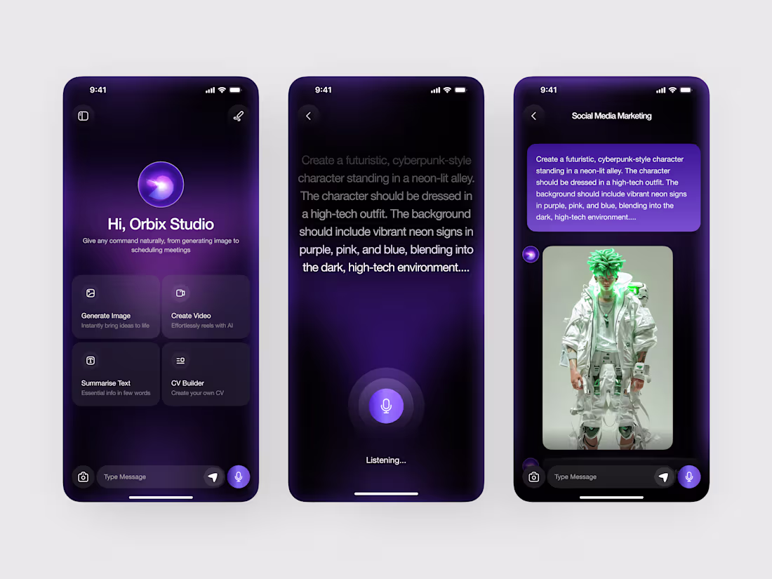
We designed this AI assistant mobile app in Figma to make complex tasks feel as simple as a conversation.
From generating images to summarizing text and creating content, everything is accessible through a clean, voice-first interface.
The concept:
An AI platform that blends multiple tools into one seamless experience. The home screen introduces quick actions like image generation, video creation, and CV building, while the voice interaction screen keeps the focus on natural input. The chat view then transforms prompts into real outputs — like AI-generated visuals with a clear, structured layout.
We focused on creating a futuristic yet minimal interface using soft purple gradients, glowing elements, and spacious layouts to guide attention without overwhelming the user.
Curious what you think about this direction. 👀
UI/UX Design
Figma
AI App
Mobile Design
SaaS
0
264
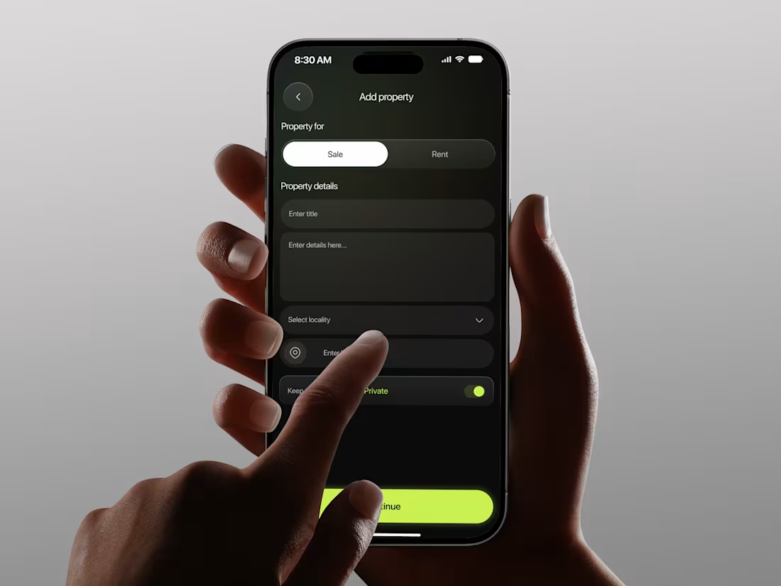
A clean and structured property listing experience designed for a real estate mobile app. This concept helps users easily add and publish property details, making the listing process simple, guided, and efficient.
The flow includes property type selection, detailed input fields, feature customization, and a clear success confirmation screen that builds confidence after submission. Built with a dark interface, neon green highlights, and organized form layouts, the design feels modern, intuitive, and easy to use.
Perfect for real estate platforms, property management apps, rental services, and proptech startups looking to simplify the property listing experience for users.
0
281
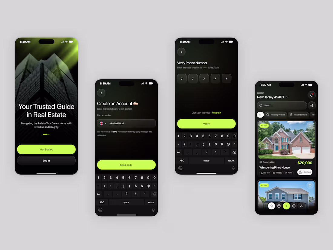
A clean and immersive onboarding experience designed for a real estate mobile app. This concept helps users quickly create an account, verify their phone number, and start exploring properties with ease.
The flow includes simple account setup, OTP verification, and a visually structured property browsing experience that creates a smooth first impression. Built with a dark interface, neon green accents, and clear layouts, the design feels modern, focused, and easy to navigate.
Perfect for real estate platforms, property listing apps, rental services, and proptech startups looking to create a seamless and user-friendly experience.
0
268
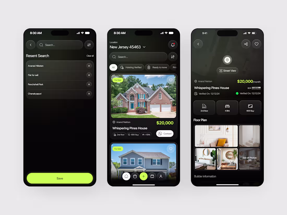
A modern real estate mobile app concept designed to make property search, discovery, and viewing feel effortless. This interface helps users explore homes, filter listings, save searches, and view detailed property information in a smooth and intuitive flow.
The design includes a clean search experience, listing cards with key property details, and an immersive property details screen with floor plans and interior previews. Built with a dark theme, elegant gradients, and clear visual hierarchy, the experience feels premium and easy to navigate.
Perfect for property listing platforms, rental marketplaces, real estate startups, and home discovery apps looking to create a seamless mobile experience.
0
264
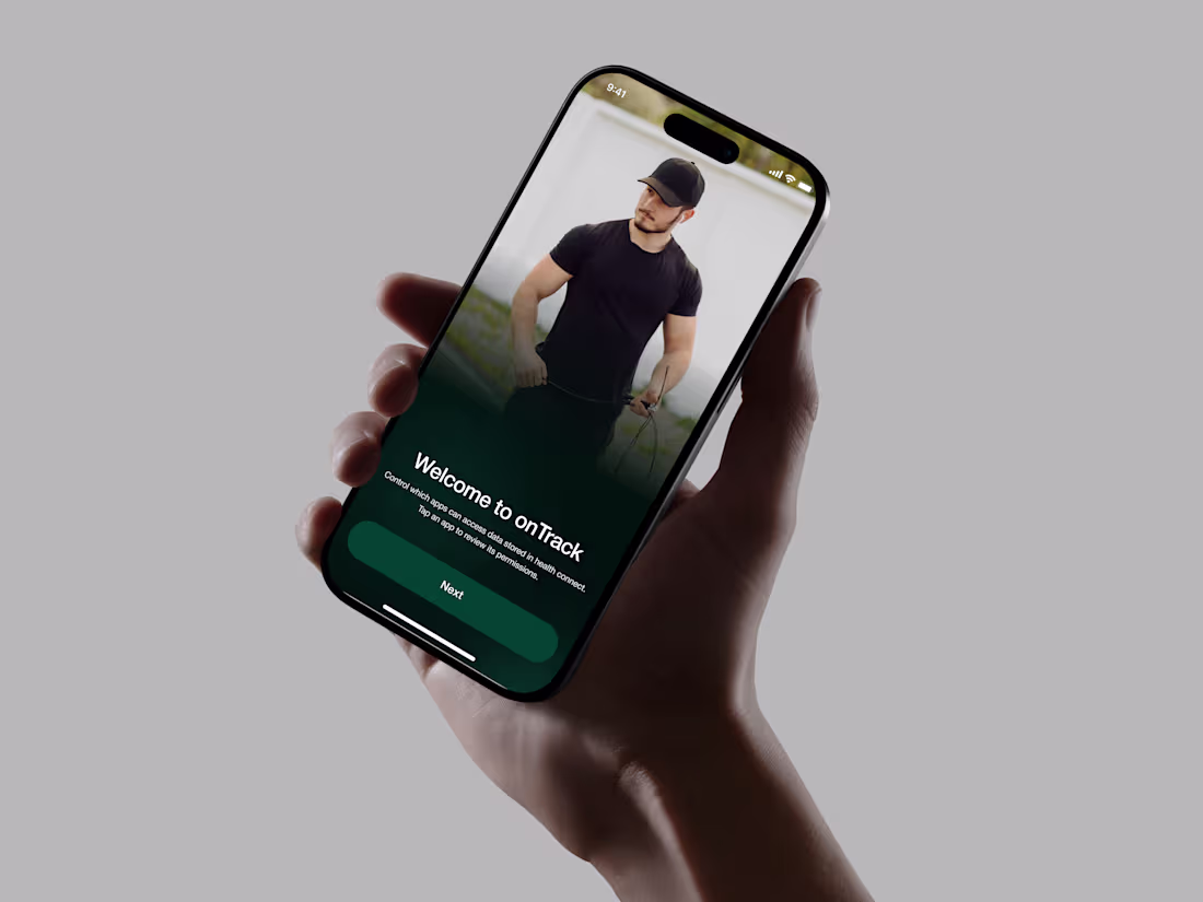
A clean and immersive onboarding experience designed for a fitness and wellness mobile app. This concept helps users set up their profile, choose fitness goals, and start a more personalized health journey with ease.
The flow includes simple bio setup, goal selection, and a strong welcome screen that creates an engaging first impression. Built with a dark green interface, smooth gradients, and clear form layouts, the design feels modern, focused, and easy to navigate.
Perfect for fitness apps, wellness platforms, personal coaching products, and health tracking startups looking to create a smooth first-time user experience.
0
268
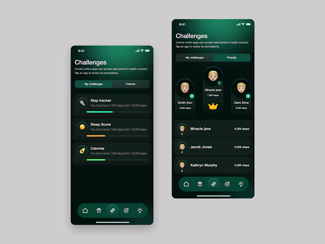
A sleek and engaging mobile app design built for fitness challenges, health tracking, and social motivation. This concept helps users stay active by monitoring daily steps, sleep score, and calorie progress in one clean interface.
The challenge leaderboard adds a fun competitive layer, making it easy to compare progress with friends and stay motivated. Designed with a dark green visual style, smooth card layouts, and clear data hierarchy to create a modern wellness experience.
Perfect for health apps, activity trackers, challenge-based products, and social fitness platforms looking for a simple and motivating user experience.
Tools: Figma
0
269
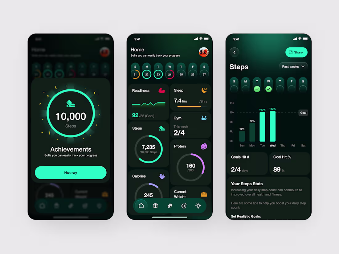
The interface focuses on clarity and momentum. Key metrics like steps, readiness, and activity progress are highlighted through intuitive visuals such as circular trackers and simplified graphs allowing users to quickly scan their performance at a glance. The goal was to reduce cognitive load while still delivering meaningful, actionable data.
We emphasized a strong visual hierarchy and consistent spacing system to ensure smooth navigation across screens. Subtle interactions and feedback moments, like achievement states and progress updates, are designed to keep users engaged and motivated throughout their journey.
Rather than adding complexity, this design strips things back to what truly matters, helping users build better habits through a clean, focused, and user-friendly interface.
Created by Orbix Studio (https://www.orbix.studio/). Now available for new UI/UX projects.
UX Design, UI Design, Product Design, Mobile App Design, Fitness Tracker, Health App, Dashboard UI, Dark Theme UI
0
302
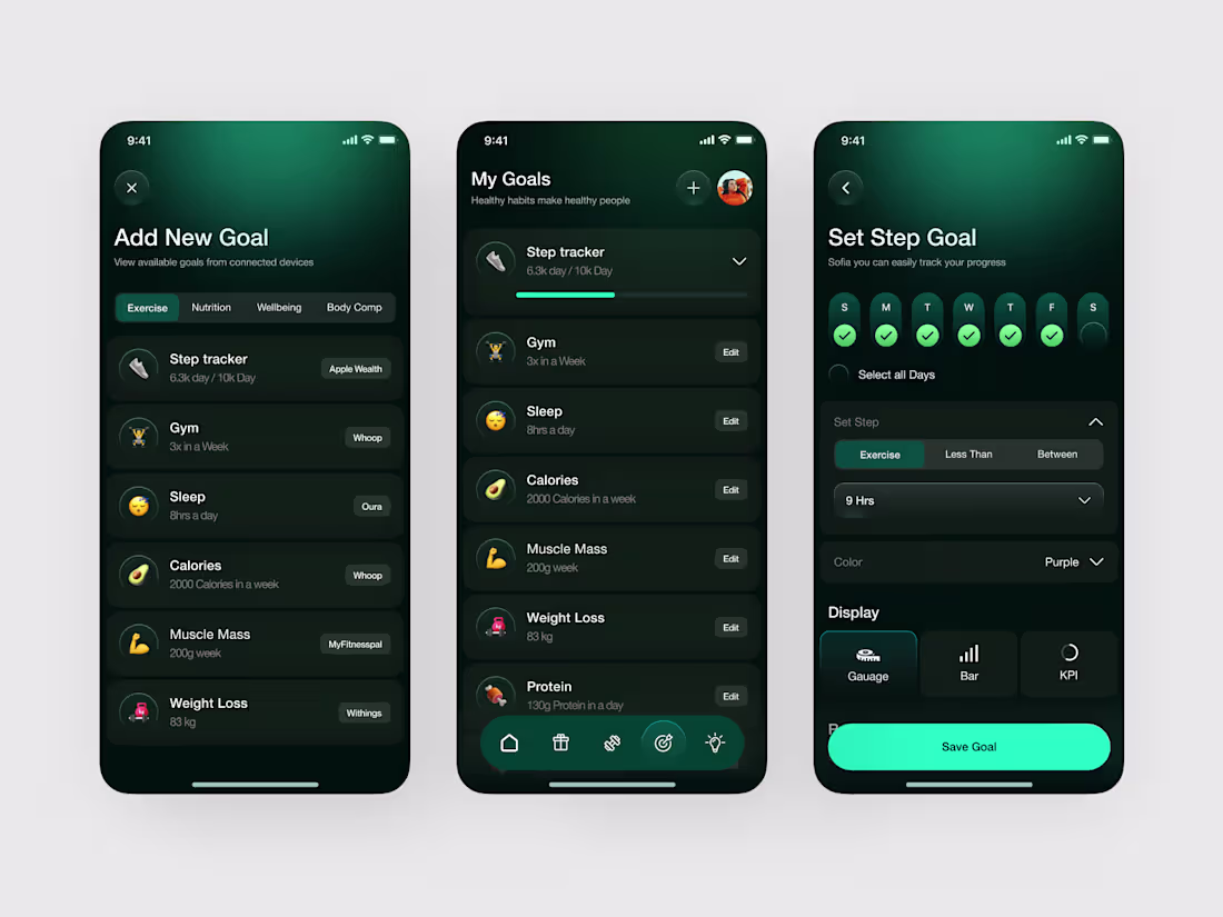
At Orbix Studio, we designed this Fitness Goal Tracker app to make healthy habits easier to build and maintain.
From step tracking and sleep goals to nutrition and wellness, every screen was created to help users set goals, monitor progress, and stay consistent — without feeling overwhelmed.
Our focus was simple:
Make health data easier to understand, faster to access, and more motivating to use.
Instead of clutter, we focused on:
• Clear goal setup and tracking flows
• Simple progress visuals (gauges, bars, KPI cards)
• Seamless device sync experience
• Clean dark UI for better focus and usability
This project reflects how we approach product design:
purposeful interfaces, intuitive systems, and experiences built around user habits.
Created by Orbix Studio. (http://www.orbix.studio)
Now available for new UI/UX projects.
UX Design, UI Design, Product Design, Mobile App Design, Health App Design
0
285

We brought this fashion brand identity to life with a focus on quiet confidence and lasting impression.
From a simple concept to a tag that feels like part of the garment itself, not an afterthought, but an extension of the brand's whole personality.
The concept:
A fashion identity that speaks before the product is even touched. Evolur needed a tag that carried weight through a single flowing logotype, generous negative space, and the kind of typography that doesn't need decoration to demand attention.
We moved away from busy, graphic-heavy hang tags and built something that feels refined, intentional, and completely still. The dusty blue fabric backdrop wasn't chosen by accident; it lets the ivory tag breathe and the navy wordmark land with full force.
The seal stamp, the tagline "The Art of Becoming," and the continuous curve beneath the logotype all quietly reinforce one : elegance that endures.
Really proud of how restraint became the loudest design decision here. 🤍
Curious what you think about the typography direction. 👀
Brand Identity | Fashion Branding | Logo Design | Packaging Design | Tag Design
0
316
We brought this fully functional finance dashboard to life with a focus on clarity and control.
From a complex list of requirements to a seamless user flow that makes managing money feel effortless.
The concept:
A fintech app that puts the user back in the driver's seat. It features real-time "Money Movement" tracking, instant virtual card issuance for subscriptions, and a visual hierarchy that turns data into insights.
We wanted to move away from the clutter of traditional banking apps and build something that actually feels good to use.
Really proud of how the deep blue palette and clean typography create a sense of trust and calm.
Curious what you think about the UI direction. 👀
UX Design | Fintech | Dashboard UI
1
405
Mindful Wellness & Healthcare Website Design
A modern wellness website designed to feel as calming as the services it offers. This project focuses on simplifying user journeys while creating a peaceful, trust-driven experience.
Most wellness platforms feel cluttered and overwhelming, making it hard for users to navigate or connect.
A clean, structured interface with clear paths to explore services, find specialists, and book sessions effortlessly.
𝗛𝗶𝗴𝗵𝗹𝗶𝗴𝗵𝘁𝘀:
• Calm, minimal UI
• Clear content hierarchy
• Smooth booking flow
• Soft colors and spacious layout
0
306
Sociafy – Social Media Growth Website Design
Sociafy is a modern website designed for people who manage and grow social media accounts. Instead of overwhelming users with complex analytics, the experience focuses on clarity, storytelling, and ease of navigation.
The website presents key insights - like audience behavior, content performance, and best posting times - in a visually engaging and easy-to-understand way. Every section is crafted to guide users smoothly, helping them explore features, understand value, and take action without friction.
With a clean layout, balanced typography, and thoughtful use of color, the design ensures information feels light and approachable rather than technical or confusing.
𝗖𝗵𝗮𝗹𝗹𝗲𝗻𝗴𝗲
• The main challenge was transforming complex social media data into a website experience that feels simple, engaging, and informative.
• Avoid making the interface feel like a heavy analytics tool.
• Present insights in a way that’s instantly understandable.
• Maintain visual clarity while showcasing multiple features.
• Create a design that feels modern and easy on the eyes for long browsing.
𝗢𝘂𝘁𝗰𝗼𝗺𝗲
A visually appealing and user-friendly website that communicates value effortlessly.
- Clean, structured layout that improves readability and flow
- Dark-themed aesthetic with vibrant accents to highlight key sections
- Clear content hierarchy guiding users through features and benefits
- Interactive and engaging sections that make exploration enjoyable
- A final experience that turns complex data into a simple, compelling story
0
292
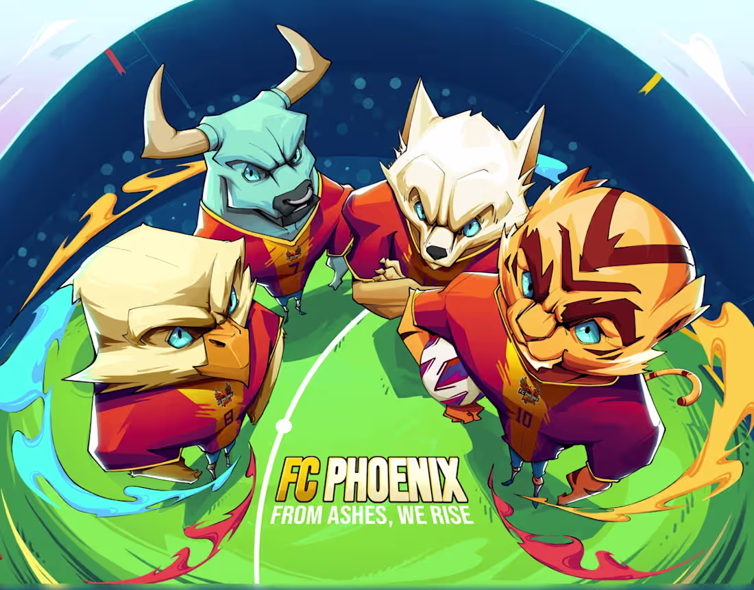
Champions of the Flames
0
8
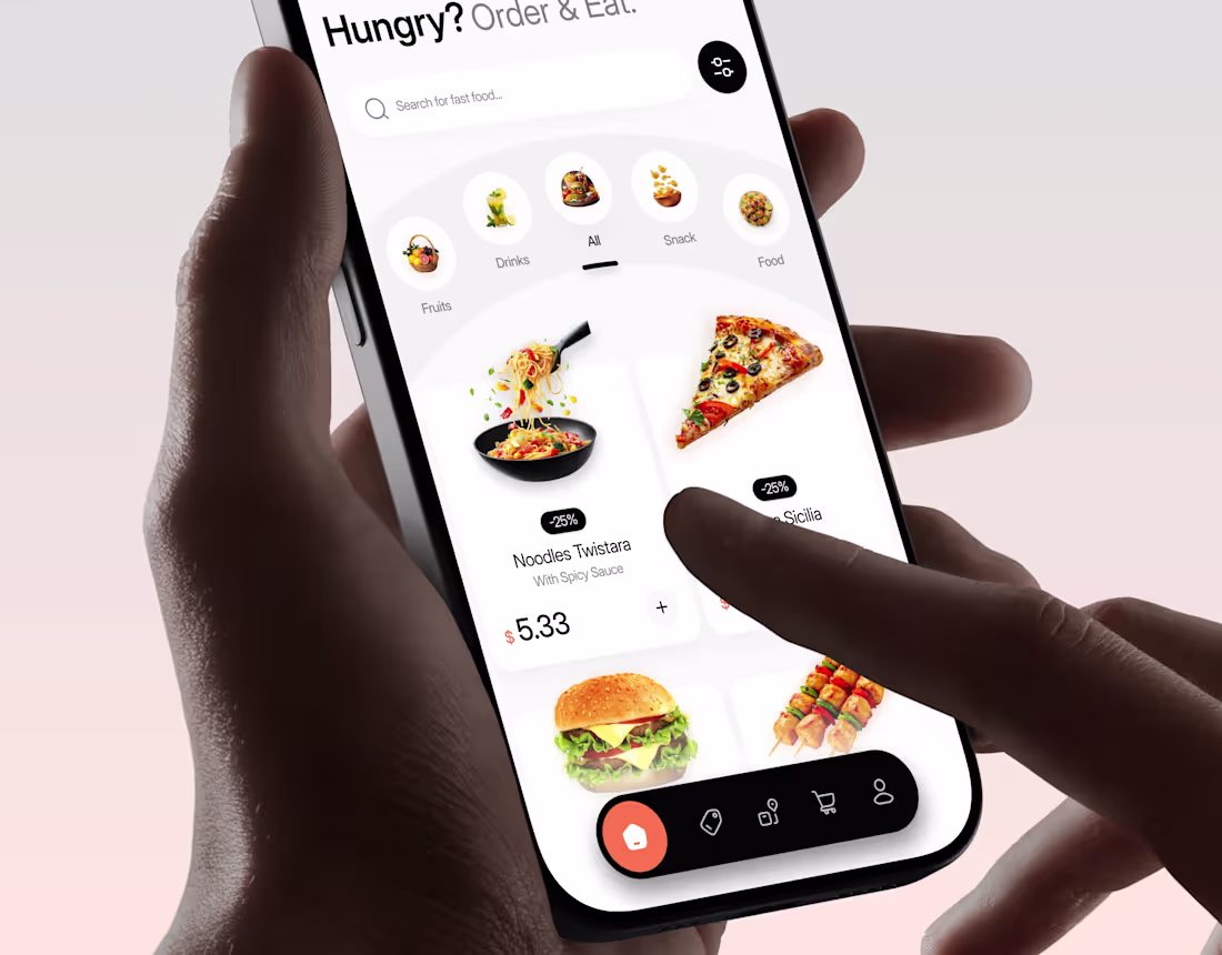
Gourmeat Food APP UI UX | Mobile App | Orbix Studio
0
9
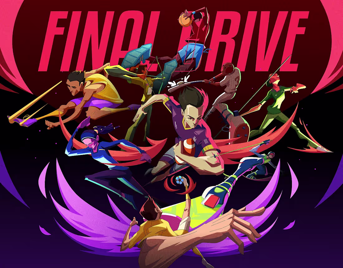
Final Drive | Sportsman Illustration Design
0
2

Defenders of the Galaxy | Orbix Studio | Illustration
1
1
Futuristic Habitat Scene| Illustration | Orbix Studio
0
4
Wellnest Healthcare UI UX | Mobile App | Orbix Studio
0
10

Relax Tour Painting Art | Orbix Studio | Illustration
0
2
Ronin Neon | Cyberpunk | Orbix Studio | Illustration
1
4
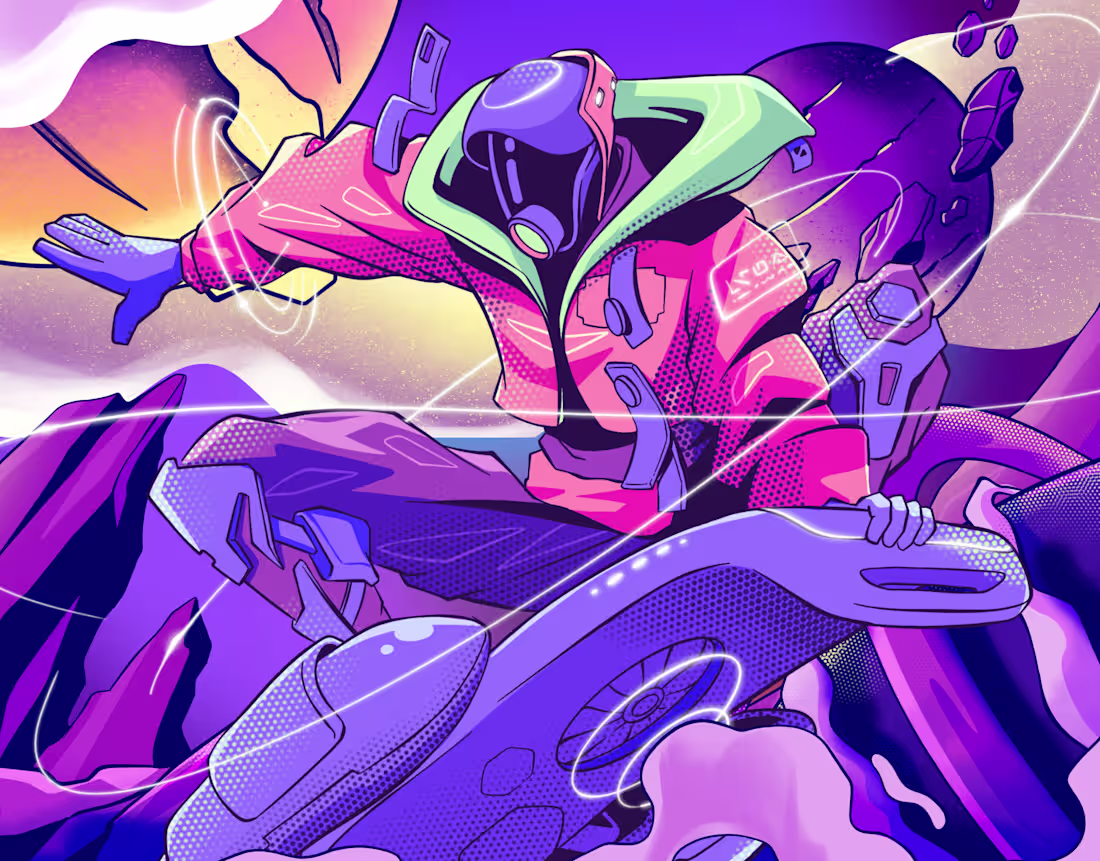
Defenders of the Galaxy 2 | Illustration Art
1
4
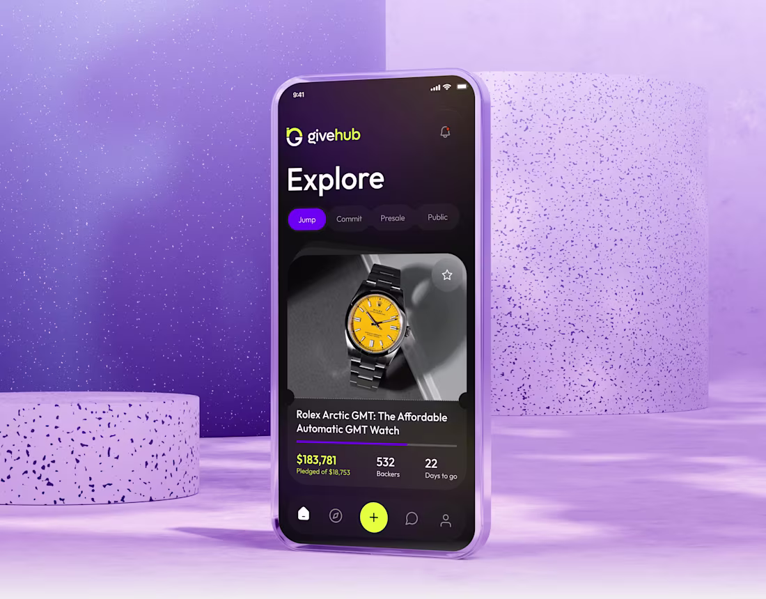
GiveHub - Mobile App Design | Orbix Studio
0
4
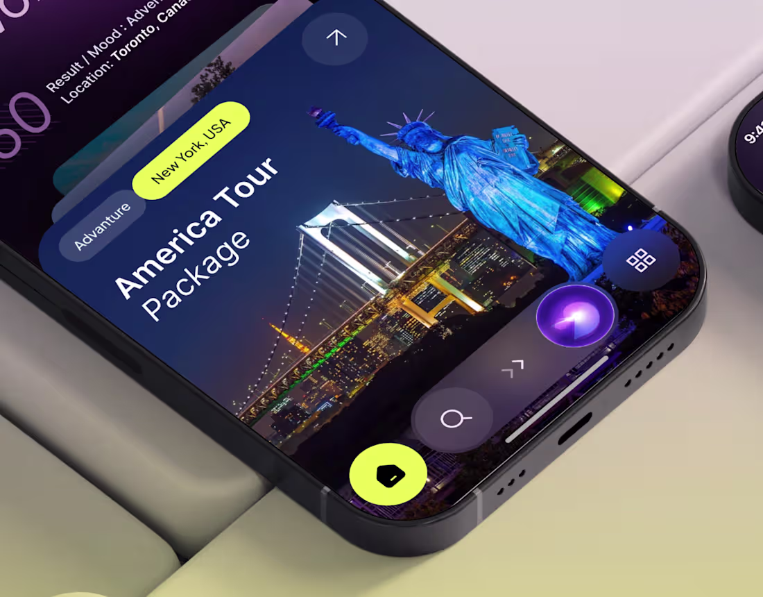
AI Travel - Booking App Design | Orbix Studio
0
6
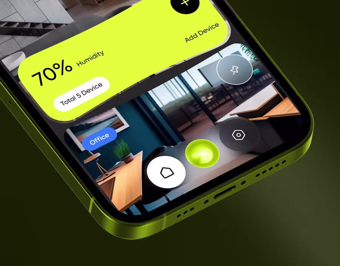
Gen.ho | Smart Home | UI UX | Mobile App | Orbix Studio
0
7
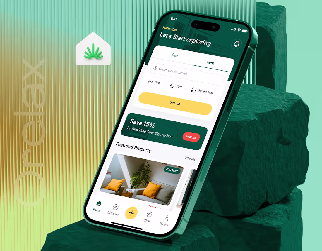
Orelax UI UX | Mobile App | Orbix Studio
0
4
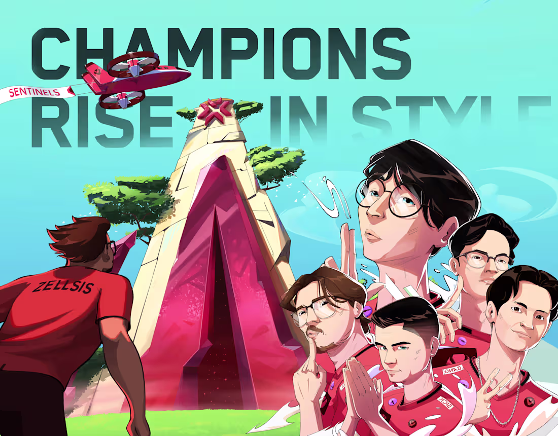
Valorant ChampionsCup | Orbix Studio | Illustration
0
7
Aladdin & Genie | Orbix Studio | Illustration
2
4
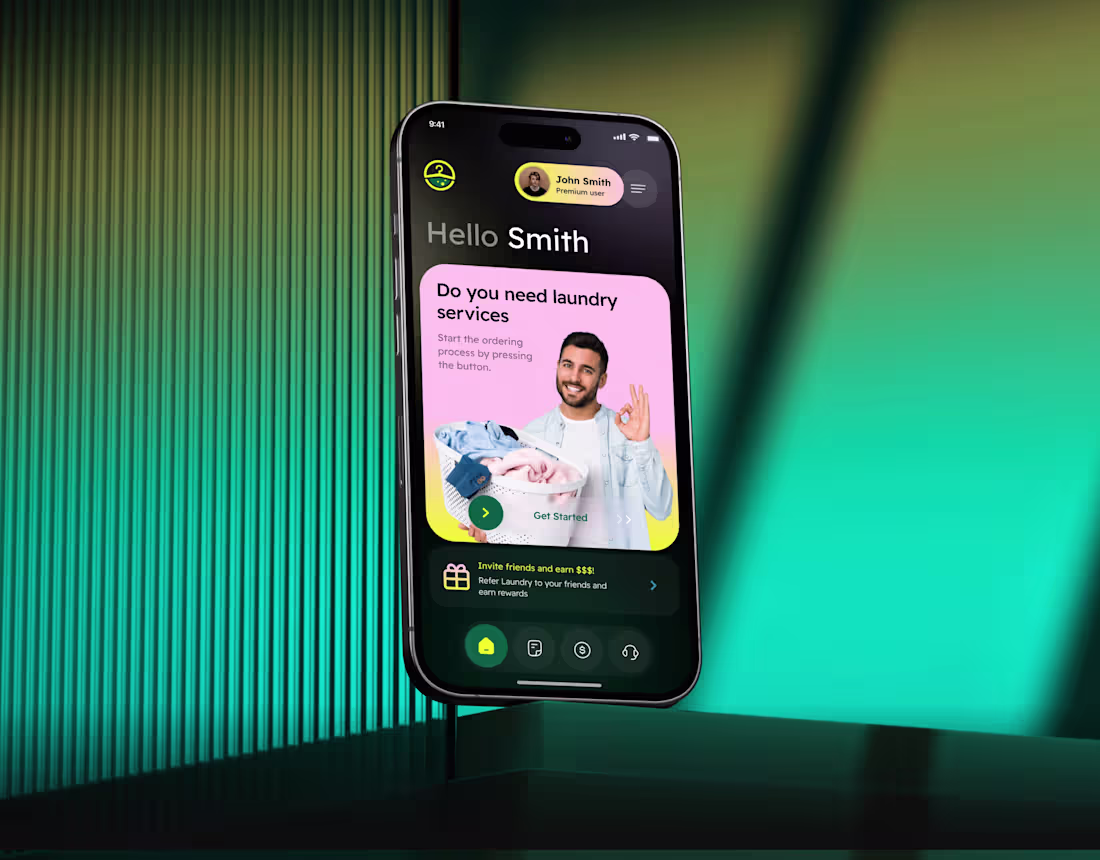
Swiftwash Laundry UI UX | Mobile App | Orbix Studio
0
4
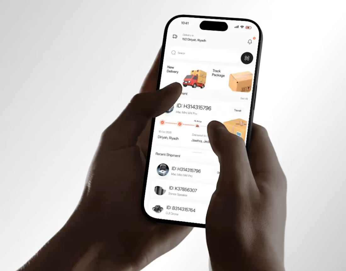
Couriq Delivery UI UX | Mobile App | Orbix Studio
0
5
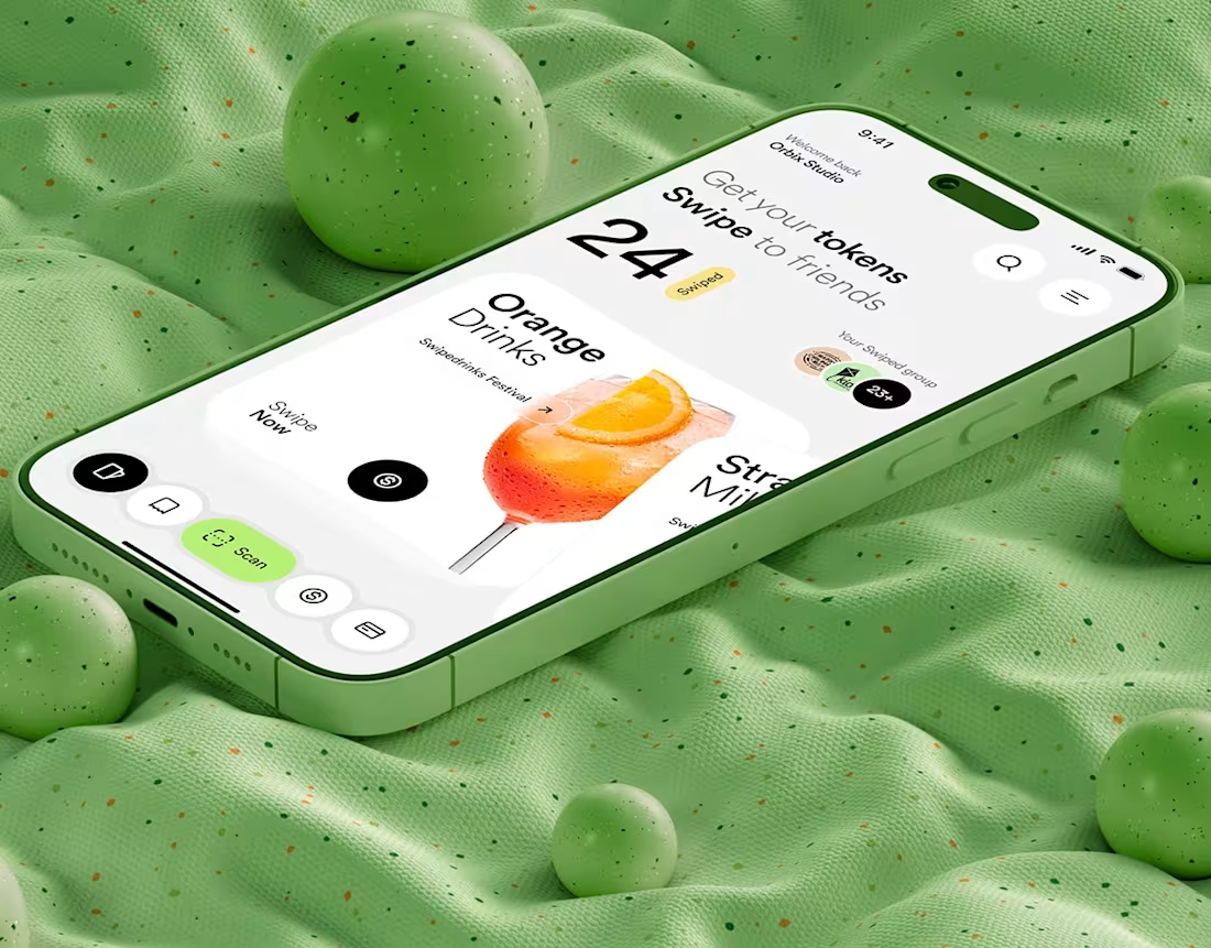
Swipe Drinks | Mobile App
1
6