max
Orbix Studio
UX-led product design & dev agency for b2b saas and AI
- $10k+
- Earned
- 107
- Followers

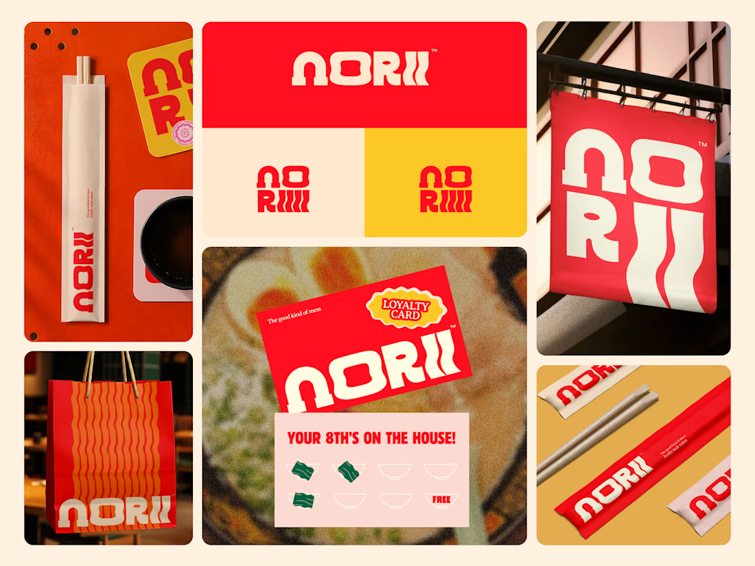
Some food brands play it safe. Norii was designed to do the opposite.
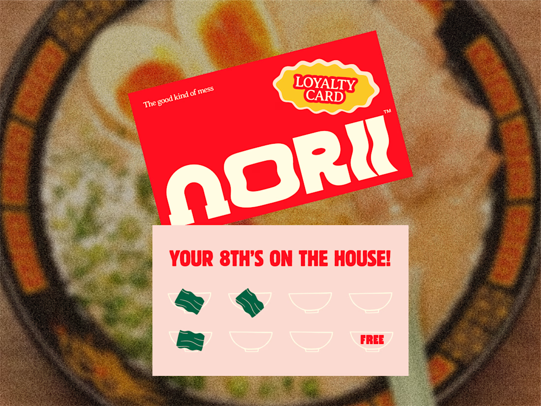
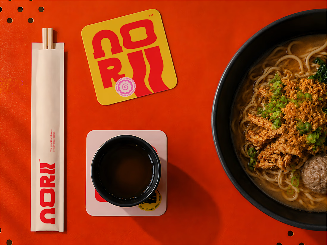
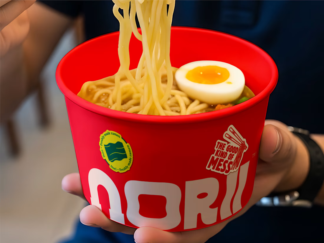
Bold red, warm yellow, a wavy wordmark that moves like noodles in a bowl, and a brand voice confident enough to put "the good kind of mess" on a loyalty card. Every touchpoint chopstick sleeves, takeaway bags,...

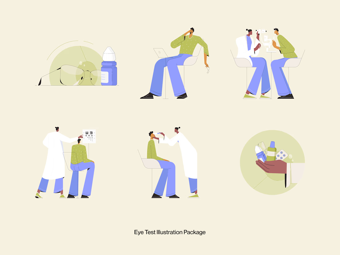
Good medical illustration doesn't dramatize. It clarifies.
This Eye Test Illustration Package was built for healthcare platforms, optometry clinics, and health tech products that need warm, approachable visuals to communicate clinical moments without making them feel cold or...

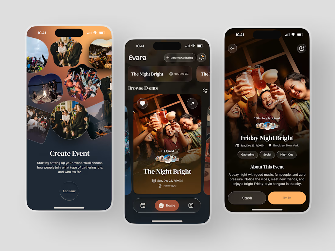
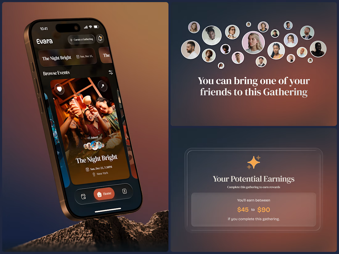
Most event apps help you find something to do. Evara was designed to help you find somewhere to belong.
The brief was a social gathering platform built around intention - not just events, but curated experiences where the host chooses who joins, what kind of gathering it is, and...
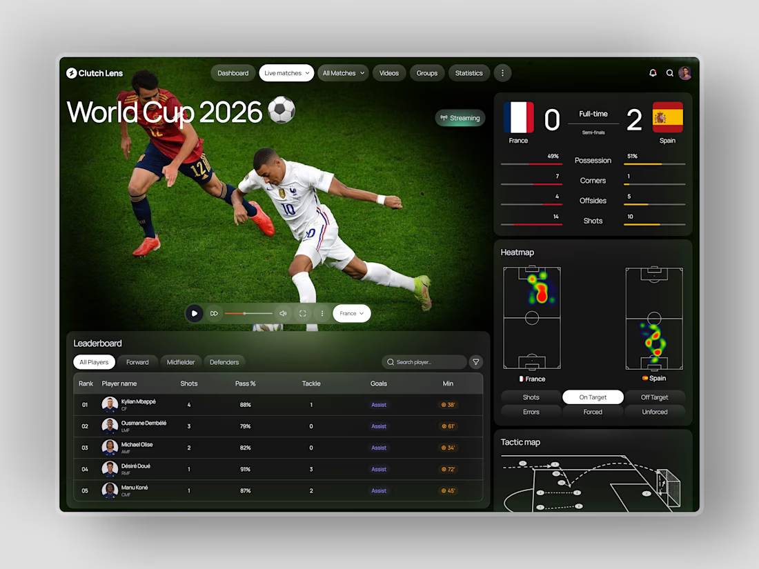
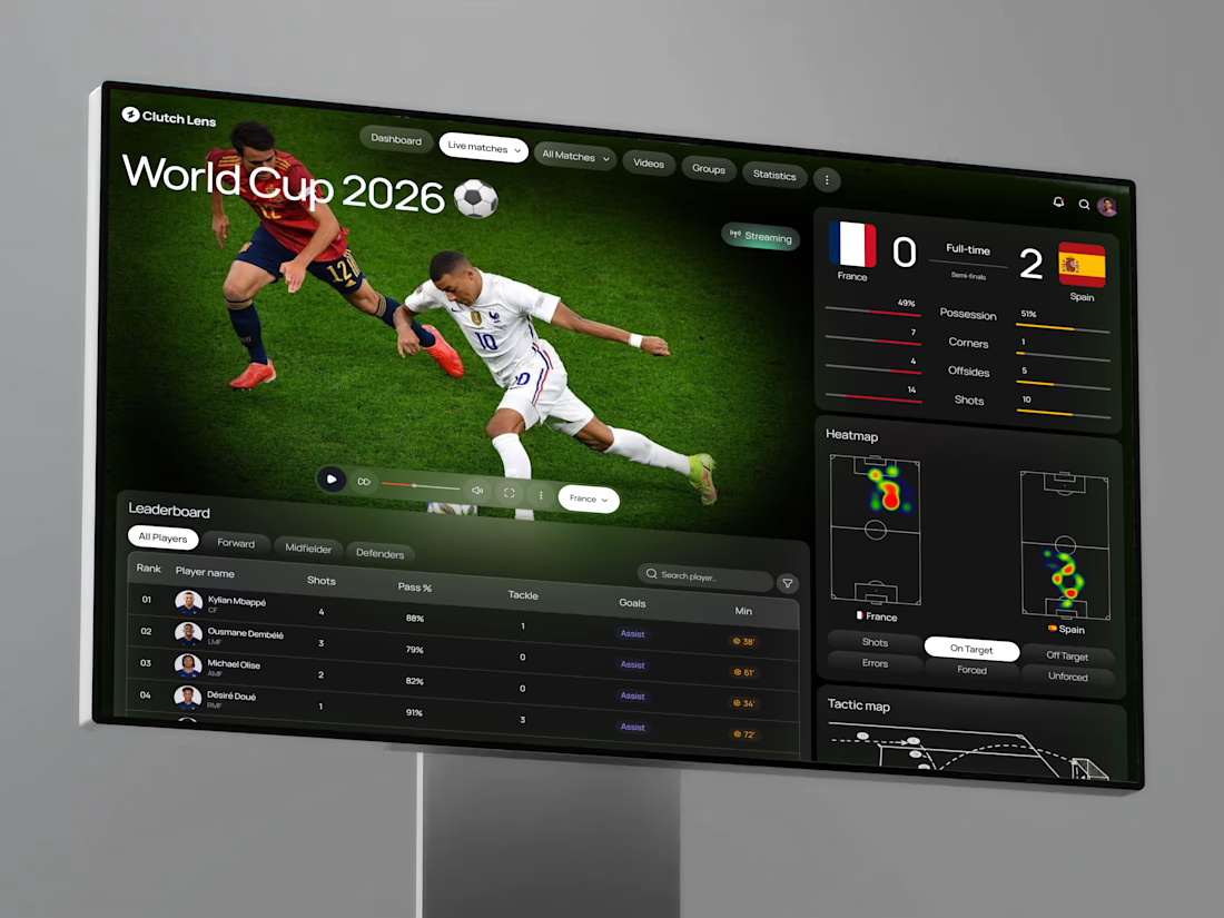
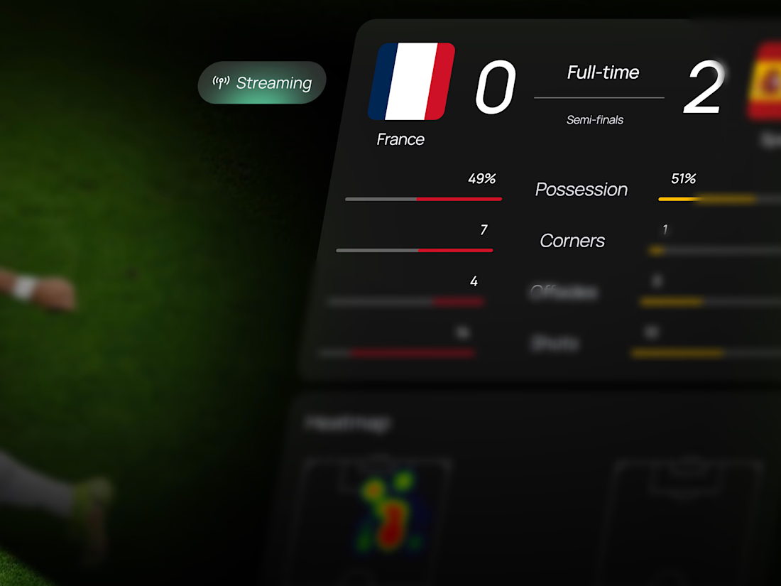
Live football data has always existed. A dashboard that makes it feel this immediate hasn't.
Clutch Lens brings the entire match into one screen: live streaming, real-time scoreboard, possession and shot stats, dual team heatmaps, player leaderboard, and a tactic map that shows...
The best brand touchpoints are the ones people don't want to throw away.
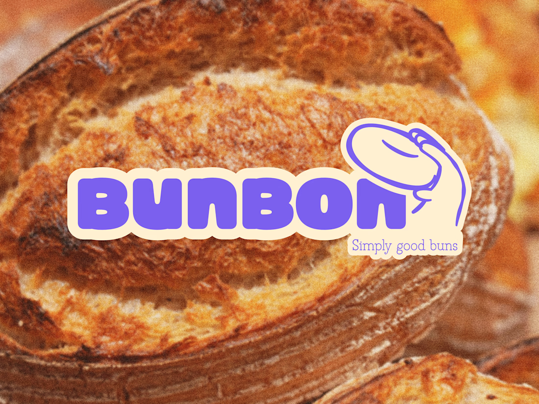
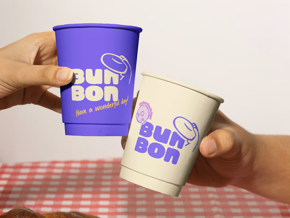
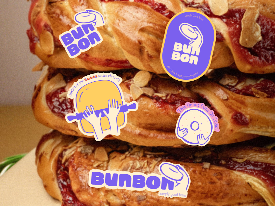
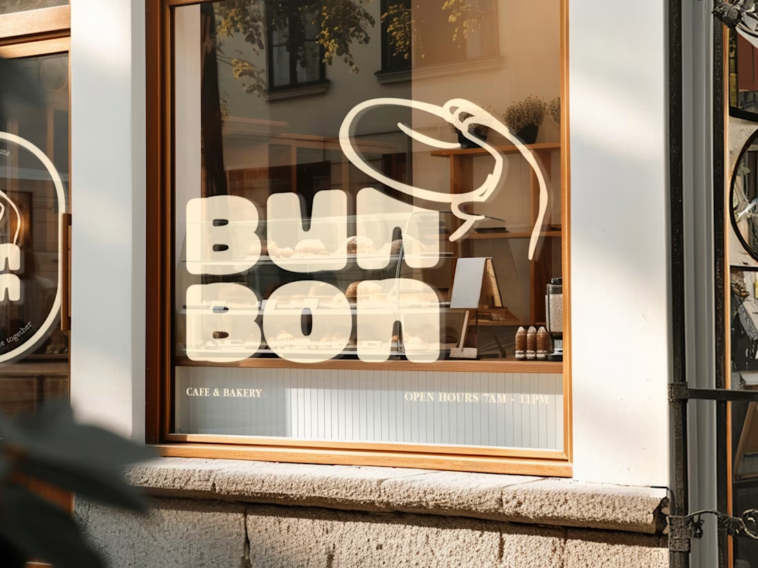
Bun Bon is a bakery and café brand built around warmth, playfulness, and the kind of identity that makes a paper cup feel like a keepsake. Bold purple, soft cream, a bouncy donut character mark, and a...