
Mouzam Khan
Brand Identity, Website & Marketing Designer


Adforce Website Design Case Study
Building a High-Converting Digital Presence for a Software & Marketing Agency
Overview
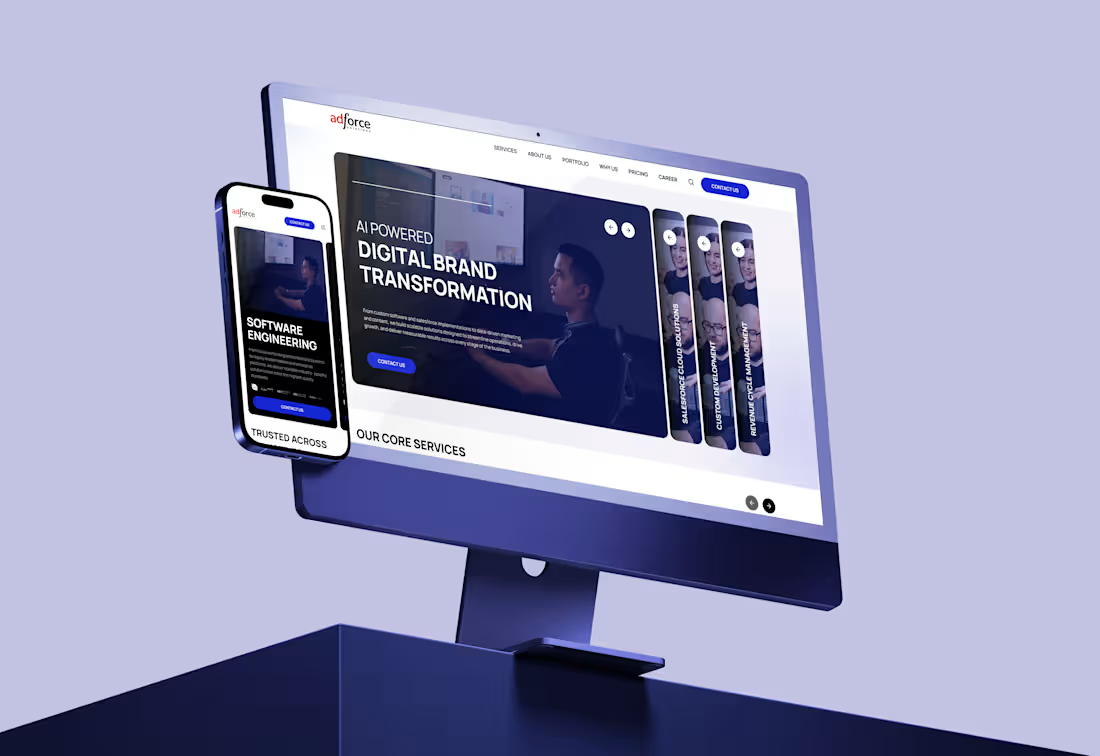
Adforce is a software house and marketing agency offering digital solutions across web development, branding, and performance marketing. The objective was to design a website that communicates credibility, showcases expertise, and drives qualified leads.
Problem
The existing presence lacked:
Clear value proposition
Structured service hierarchy
Strong visual identity
Conversion-focused user journey
Visitors could not quickly understand what Adforce offers or why they should trust them.
Approach
The redesign focused on strategic clarity and modern UX principles:
Positioning First: Defined a strong headline with a clear promise and niche focus
Service Architecture: Organized services into structured categories for easy navigation
Visual System: Designed a clean, modern interface with bold typography and consistent branding
Conversion Flow: Integrated clear CTAs, lead forms, and trust signals across the journey
Case Studies Section: Highlighted past work to build authority and proof
Design Highlights
Minimal yet impactful hero section with clear messaging
Modular sections for scalability
Strong use of whitespace for readability
Mobile-first responsive design
Fast-loading, performance-optimized layout
Results (Expected Impact)
Improved user understanding within first 5 seconds
Higher engagement and lower bounce rate
Increased lead generation through structured funnels
Stronger brand perception and trust
Conclusion
The Adforce website was transformed into a strategic sales asset rather than just a digital brochure. The focus on clarity, hierarchy, and conversion ensures that visitors are guided smoothly from awareness to action.
0
129
Overview
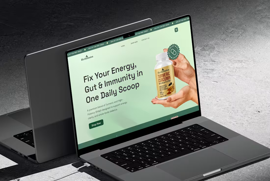
Redesigned the Herbal Nutrition website from a basic product catalog into a conversion-focused experience that clearly communicates value and drives user action.
Problem
The original site lacked:
Clear value proposition
Structured user journey
Strong trust signals
Conversion-focused product pages
Users could browse, but not confidently purchase.
Approach
Shifted messaging from products to health outcomes
Built a clear homepage funnel (problem → solution → CTA)
Simplified navigation into problem-based categories
Redesigned product pages with benefits, proof, and FAQs
Added trust elements and lead capture (quiz + email)
Result
The new structure improves clarity, builds trust, and guides users toward action, turning the website into a scalable sales system rather than just a storefront.
0
159
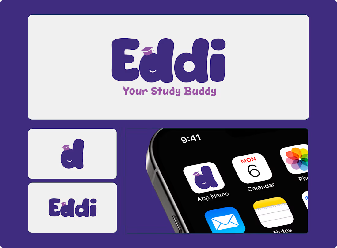
Eddi - Your Study Buddy | AI Tutor Guide for your Kids
0
9
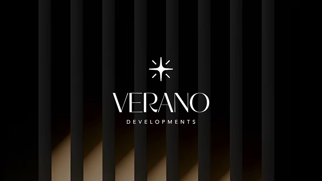
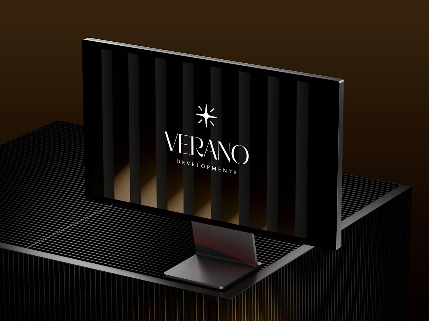
Verano Developments
Brand Identity & Visual System for a Boutique Luxury Real Estate Developer
Overview
Verano Developments is a new real estate developer entering Dubai’s competitive property market, launching its first residential project in Jumeirah Village Circle (JVC).
The objective was to create a premium, design-led brand identity that appeals to both investors and end-users seeking refined living experiences.
The Challenge
Dubai’s real estate market is saturated with developers positioning themselves as “luxury.”
The key challenge was:
How to differentiate Verano without relying on overused luxury clichés
How to establish credibility as a new entrant
How to communicate design sophistication with clarity and restraint
The Approach
The brand was built around the idea of quiet luxury and architectural precision.
Instead of loud visuals or decorative elements, the focus was on:
Strong typographic presence
Minimal and controlled visual language
A balance between emotional appeal and investment credibility
This ensured the brand speaks to both aspirational buyers and rational investors.
Brand Strategy
Positioning
A boutique developer crafting design-led residences for individuals who value quality, space, and timeless aesthetics.
Target Audience
Investors seeking long-term value
Design-aware professionals and expats in Dubai
Buyers who prefer understated sophistication over flashy luxury
Brand Personality
Refined
Architectural
Sophisticated
Warm
Intentional
Visual Identity
Logo Design
The identity is built around a refined wordmark, removing unnecessary symbols to reflect confidence and clarity.
The typography-led approach ensures the brand feels:
Premium
Timeless
Architecturally grounded
Typography
Primary: Minerva Modern (Serif)
Used to convey elegance and editorial luxury
Secondary: Avenir (Sans-serif)
Used for clarity, readability, and modern balance
This pairing creates a system where emotion meets function.
Color Palette
A soft, neutral palette inspired by architecture and natural materials:
Sand Beige
Warm White
Charcoal
Muted Gold (accent)
The palette avoids typical black-and-gold clichés, instead expressing modern luxury through restraint.
Imagery & Visual Language
The visual direction focuses on:
Natural light
Clean architectural forms
Material textures (stone, wood, glass)
Minimal human presence
This reinforces a sense of space, calm, and considered living.
Tone of Voice
The brand communicates with quiet confidence.
Instead of exaggerated claims, the messaging is:
Calm
Measured
Descriptive
Intentional
Example:
“Designed for those who value space, light, and quiet sophistication.”
Applications
To demonstrate real-world usability, the identity was applied across:
Social media creatives
Stationery (business cards, letterheads)
Outdoor branding concepts
Each application maintains consistency through spacing, typography, and tone.
Outcome
The final identity positions Verano Developments as a credible and differentiated player within Dubai’s upscale real estate market.
By focusing on clarity, structure, and restraint, the brand stands apart from typical luxury competitors and aligns with a more design-conscious audience.
Reflection
This project demonstrates my approach to branding:
not just creating visuals, but building systems that communicate value, trust, and positioning.
Let’s Work Together
If you’re building a brand that needs clarity, structure, and a strong visual presence, feel free to reach out.
🔗 Portfolio: https://Mouzambranding.framer.ai
(https://Mouzambranding.framer.ai)🔗 Case Studies: https://Mouzam.framer.wiki
0
193