
Cipher UI
UI/UX designer specialising in motion and interaction.
Ready for work
Cipher is ready for their next project!

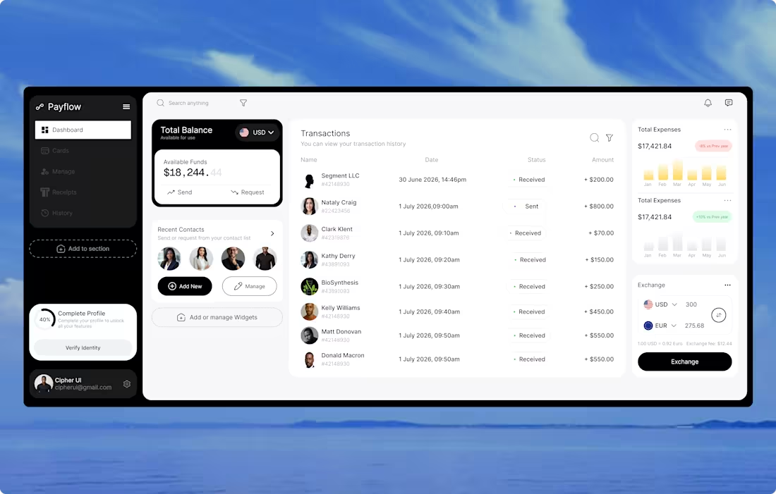
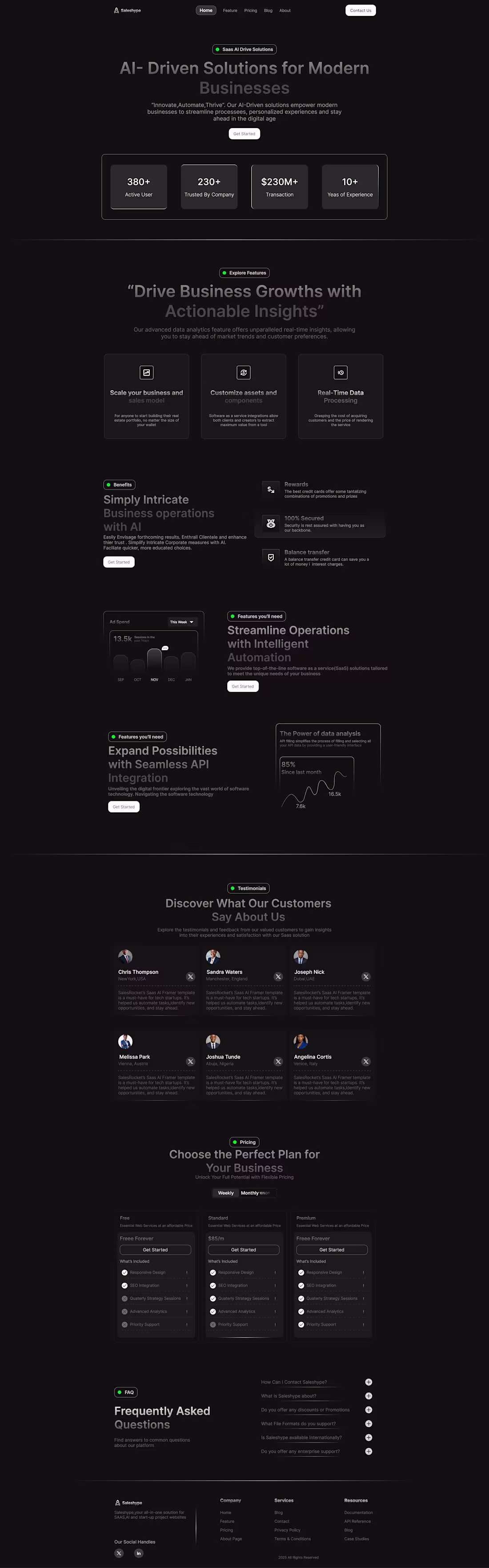
🚀 Fintech Dashboard Concept
Been challenging myself to design more complete product experiences instead of isolated UI screens, and this dashboard is one of those projects.
My focus while designing this:
• Clear visual hierarchy
• Clean typography
• Reusable UI components
• Better spacing and consistency
• Modern fintech aesthetic
• Dashboard UX that feels intuitive
Every new project teaches me something different, and this one helped me pay more attention to the small details that make a design feel polished.
I'd love to hear your thoughts—what's your favorite section of the dashboard?
#UIUX #DashboardDesign #Fintech #Figma #ProductDesign #Design
2
2
46
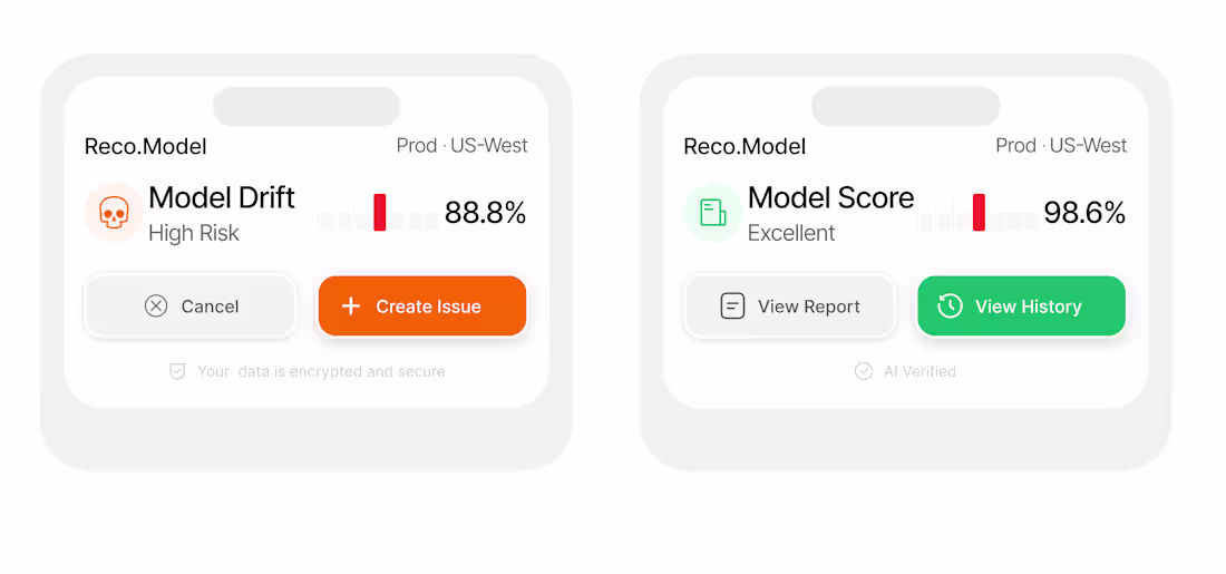
A small design study that turned into a creative exercise.
The widget on the left is a replication of a concept I discovered on Dribbble. My goal was to understand the designer's approach to spacing, typography, hierarchy, and component structure.
After recreating it, I designed the widget on the right from scratch using the same design language while introducing my own:
Different use case
New iconography
Updated color palette
New CTAs
Fresh content and interactions
This approach has been helping me move from simply recreating designs to building original interfaces with confidence.
Feedback is always appreciated!
#UIUX #Figma #DashboardDesign #ProductDesign #DesignStudy #WebDesign
0
33
Just finished animating a UI concept in Jitter.
My goal was to move beyond static screens and explore how motion can improve the overall user experience.
Focused on:
✨ Smooth transitions
✨ Micro-interactions
✨ Visual hierarchy
✨ User engagement
✨ Interface polish
The more I work with motion, the more I realize that great products aren't only designed—they're choreographed.
Feedback is always appreciated.
#MotionDesign #Jitter #UIUX #ProductDesign #Figma #UIDesign
0
36
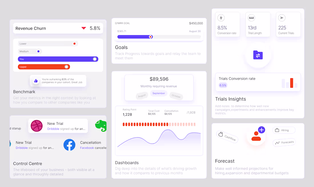
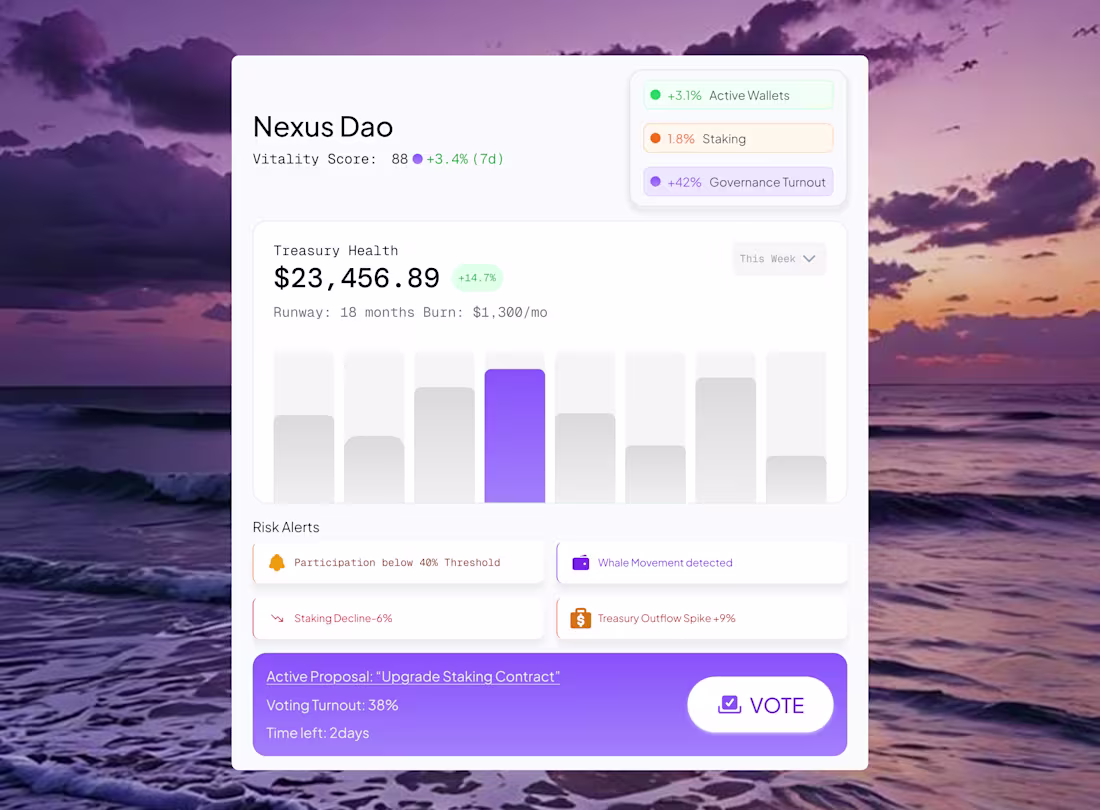
Designed this bento-style analytics dashboard section as an exploration of information hierarchy and modular UI design.
The goal was to organize large amounts of data into smaller, focused cards that are easy to scan while keeping the overall layout visually balanced.
Highlights:
✨ Bento card system
✨ Analytics-focused UI
✨ Clean visual hierarchy
✨ Lightweight data visualizations
✨ Modern SaaS aesthetic
One thing I've learned from designing bento layouts is that spacing and card relationships are just as important as the content itself.
Feedback is always appreciated.
#UIUX #DashboardDesign #BentoDesign #SaaSDesign #Figma #ProductDesign
0
42
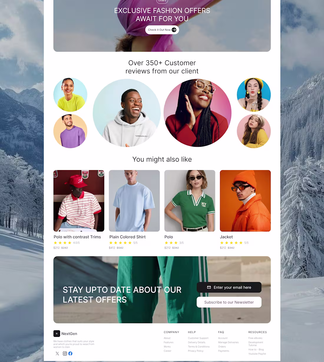
Recently replicated a fashion e-commerce landing page from Dribbble as a design exercise.
The goal wasn't just to copy the visuals but to understand the thinking behind the layout, spacing, product presentation, and overall user experience.
Every replication teaches something new, and this one helped me pay closer attention to structure and detail.
Feedback is always welcome.
2
79
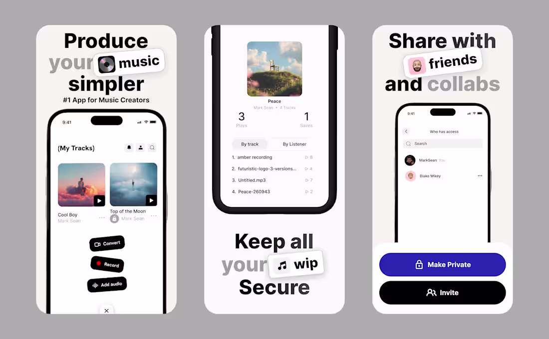
Designed a music creator app concept inspired by some amazing work I discovered on Dribbble.
I enjoy taking inspiration from great designs and using them as a foundation to practice, experiment, and develop my own design voice.
Feedback is always appreciated.
#UIUX #Figma #MobileDesign #ProductDesign #MusicApp
2
6
128
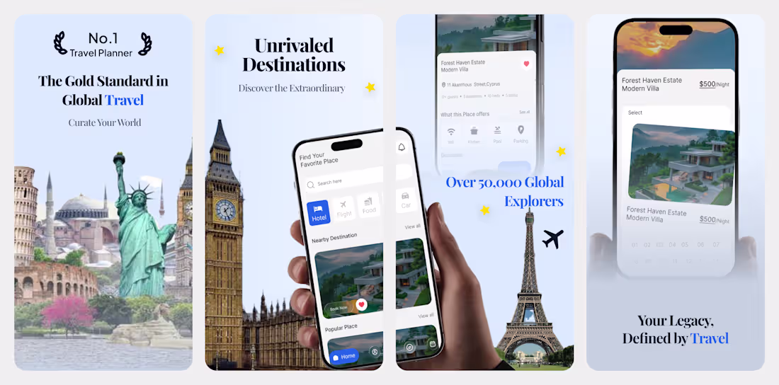
Designed a luxury travel app concept that blends editorial aesthetics with modern mobile UX.
The goal was to make trip planning feel exclusive and inspiring while keeping the booking flow intuitive.
Highlights:
✦ Luxury-focused visual direction
✦ Destination-driven storytelling
✦ Clean card layouts
✦ Premium typography system
✦ Mobile-first experience
I'm especially happy with how the travel landmarks and destination visuals help create a sense of exploration.
Which screen stands out most to you?
1
4
105
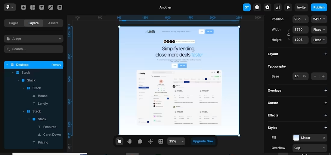
Designed this mortgage platform hero section from scratch in Figma and then recreated it in Framer.
After seeing both versions side by side, I prefer the Framer version. The responsiveness, spacing, and overall presentation feel much closer to a real product experience.
Still polishing the details, but I'm happy with the direction so far.
#Framer #Figma #UIDesign #LandingPageDesign #WebDesign
2
2
88
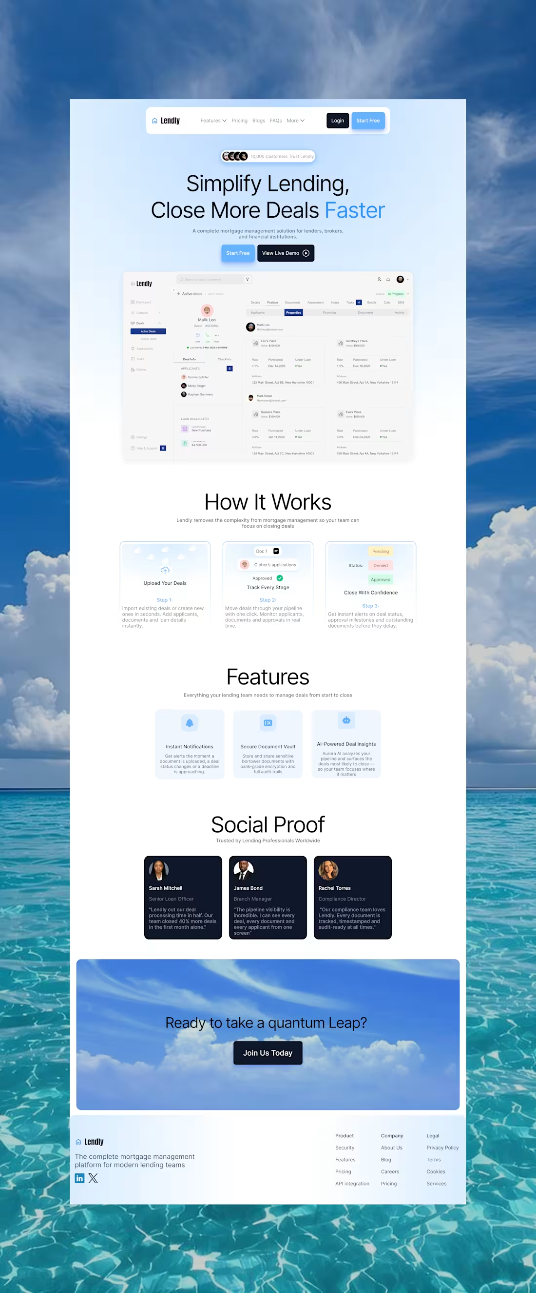
Finished designing a complete landing page concept for a mortgage management platform called Lendly.
The goal was to create a clean and trustworthy experience that communicates:
• What the product does
• How it works
• Key platform benefits
• Customer trust signals
• Clear conversion paths
Tools:
• Figma
Current focus:
Improving my bento design skills. While I'm happy with the overall layout and visual consistency, I believe the feature section could benefit from more dynamic bento-style compositions and stronger content hierarchy.
Always learning, always iterating.
Feedback is welcome.
#ProductDesign #Figma #SaaS #Fintech #WebDesign
1
58
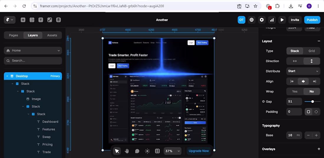
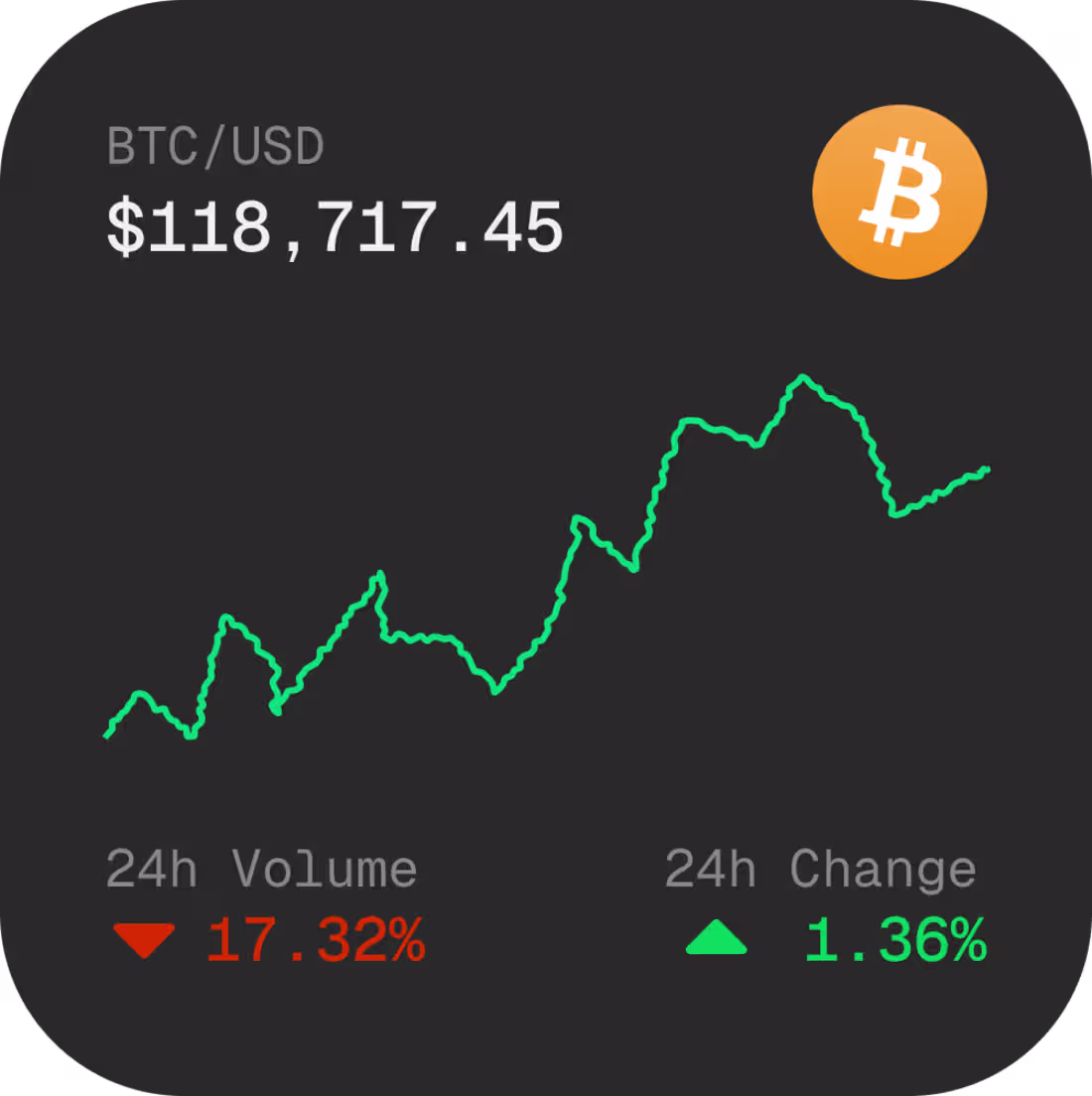
Just finished designing this crypto dashboard hero section in Framer ✨
The goal was to create a sleek Web3 landing page with a premium trading-terminal vibe using glowing lighting, dark UI layers, and a clean dashboard composition.
1
99
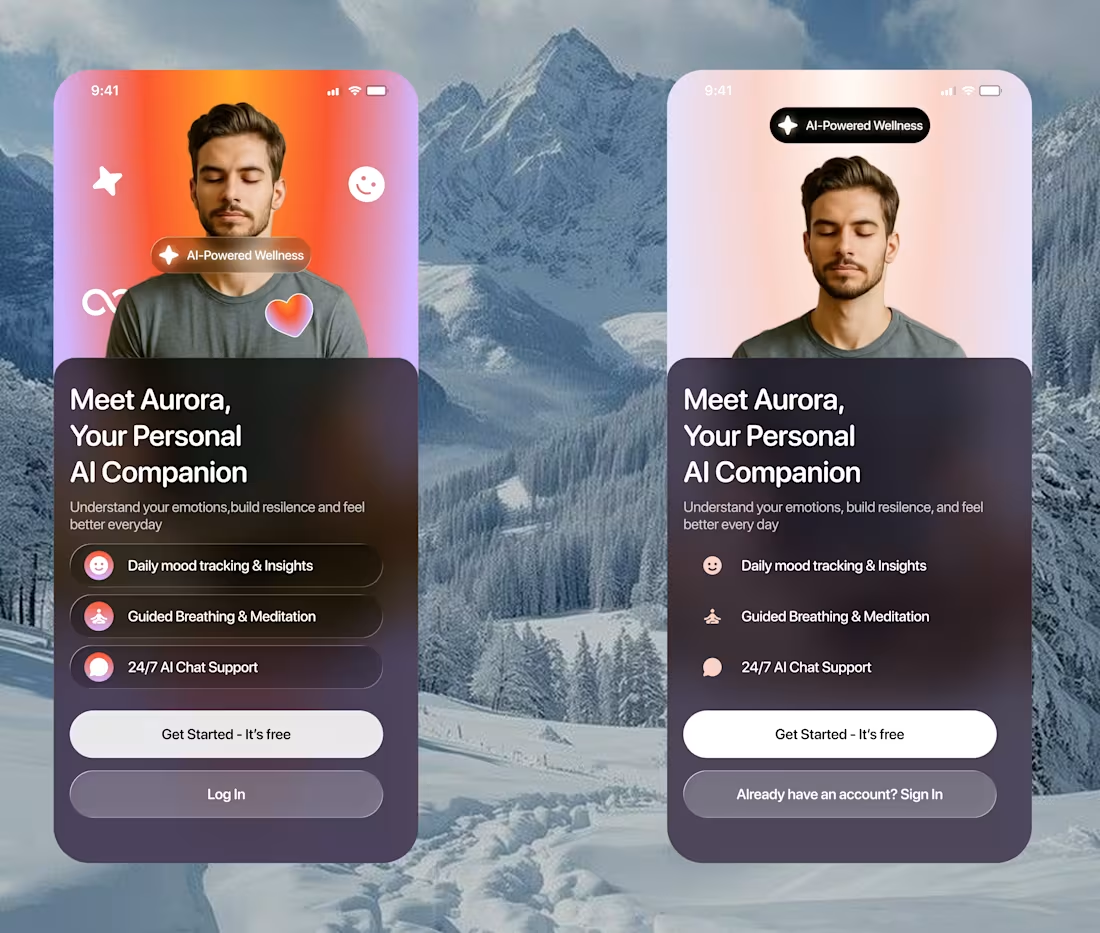
Exploring onboarding concepts for an AI-powered wellness app ✨
I wanted to test two different visual directions:
— expressive gradients & floating elements
— clean minimal layouts with softer balance
Still polishing the experience, but the next step is designing 2 more onboarding screens and animating the entire flow for a smoother product feel
Which direction feels stronger to you — Left or Right?
#UIUX #MobileAppDesign #ProductDesign #FigmaDesigner #InteractionDesign
3
81
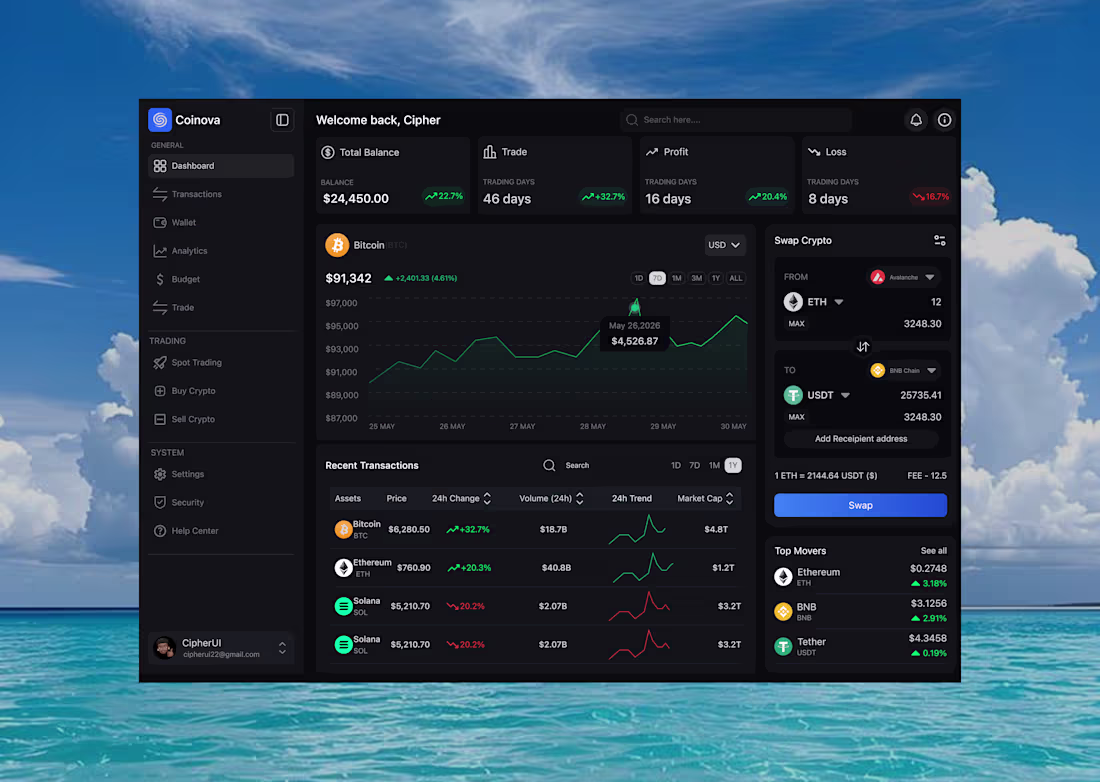
Designed and animated this crypto trading dashboard today.
Designed in Figma and animated in Jitter with a focus on:
• Clean trading experience
• Premium dark UI
• Smooth motion interactions
• Clear data hierarchy
Trying to push that modern Web3 dashboard feel further with every project ⚡
Available for UI work.
1
4
119
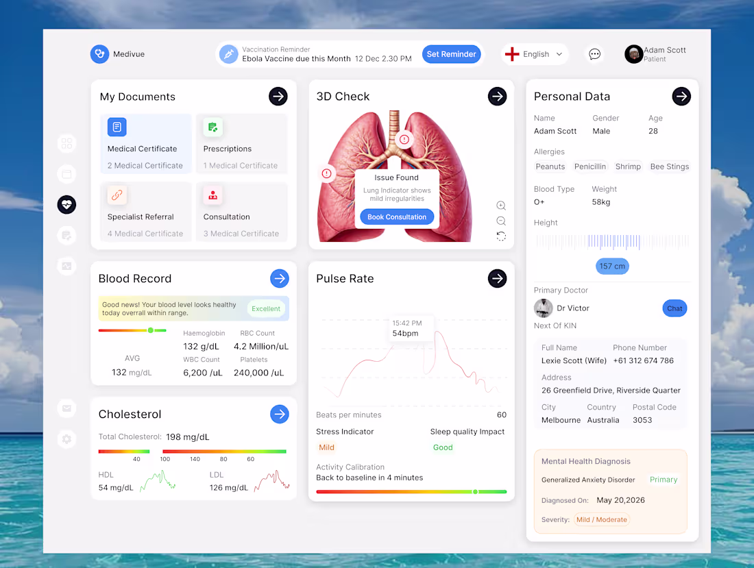
Designed a modern healthcare dashboard concept blending clean UI with real-time medical insights.
The goal was to make complex patient data feel:
• Easy to scan
• Visually organized
• Human-centered
• Futuristic without overwhelming users
Highlights:
3D medical visualization
Health monitoring widgets
Smart status indicators
Modern dashboard hierarchy
Minimal healthcare aesthetic
Available for healthcare, SaaS, and dashboard design projects.
1
1
103
Just wrapped up an interface animation in Jitter ⚡
The goal was simple:
make the design feel responsive, polished, and alive through motion.
I focused on:
• seamless transitions
• smooth micro-interactions
Motion creates emotion.
Available for UI design + animation projects.
#Jitter #MotionDesign #UIAnimation #ProductDesign #WebDesign
1
84
Just wrapped up a new UI animation concept in Jitter ✨
Designed in Figma.
Animated in Jitter.
Available for UI animation, landing pages, and Web3 product design projects.
1
3
95
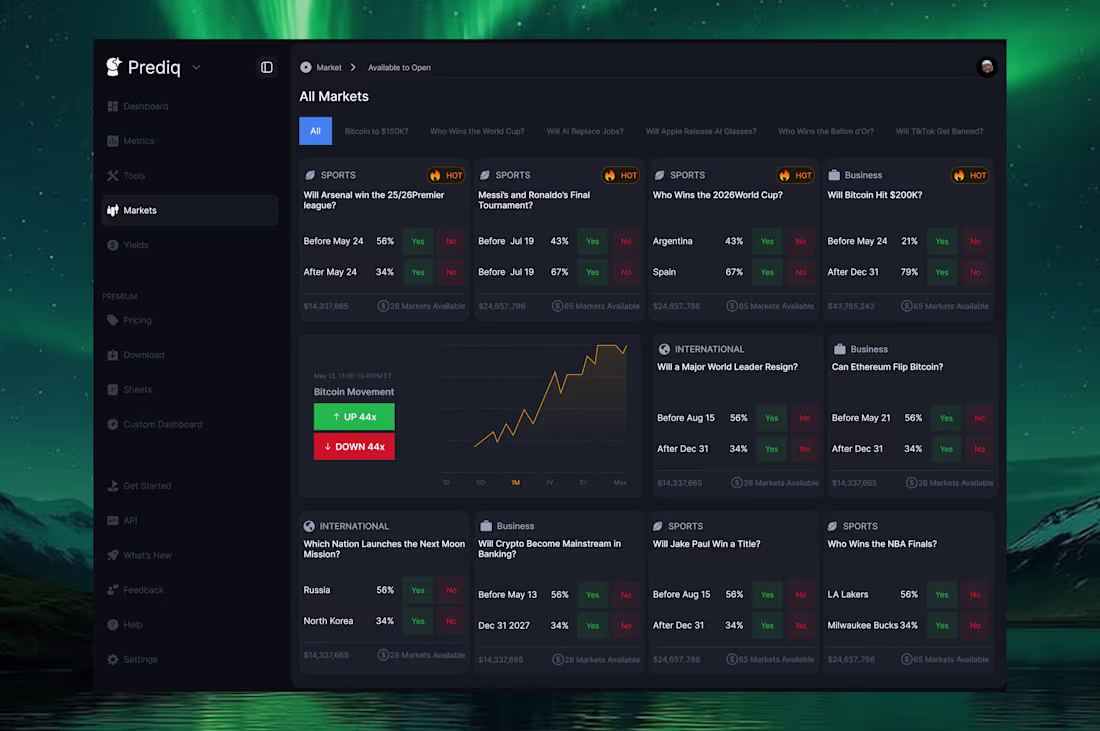
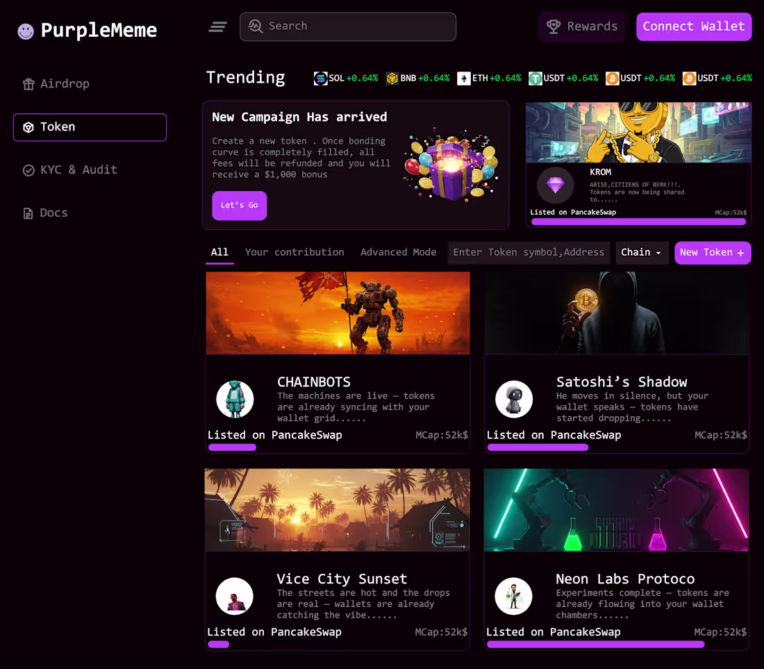
Just designed a prediction market dashboard concept for Prediq a platform inspired by the fast-paced world of forecasting, crypto, sports, and global events.
I focused heavily on:
dark Web3 aesthetics
card-based market layouts
prediction interactions
financial dashboard inspiration
visual hierarchy and spacing
One of my favorite parts is how the green aurora background contrasts with the dark UI to create a cinematic trading atmosphere.
Designed in Figma.
1
69
Recently designed and animated this UI concept using Figma + Jitter
The goal was to create a clean interface that doesn’t just look good statically, but also feels interactive and alive through motion.
Tools used:
• Figma for the UI design
• Jitter for the animation and transitions
Currently improving my workflow around motion, timing, and smoother interactions. More experiments coming soon 🚀
#Figma #Jitter #UIDesign #MotionDesign #WebDesign #Web3
2
2
93
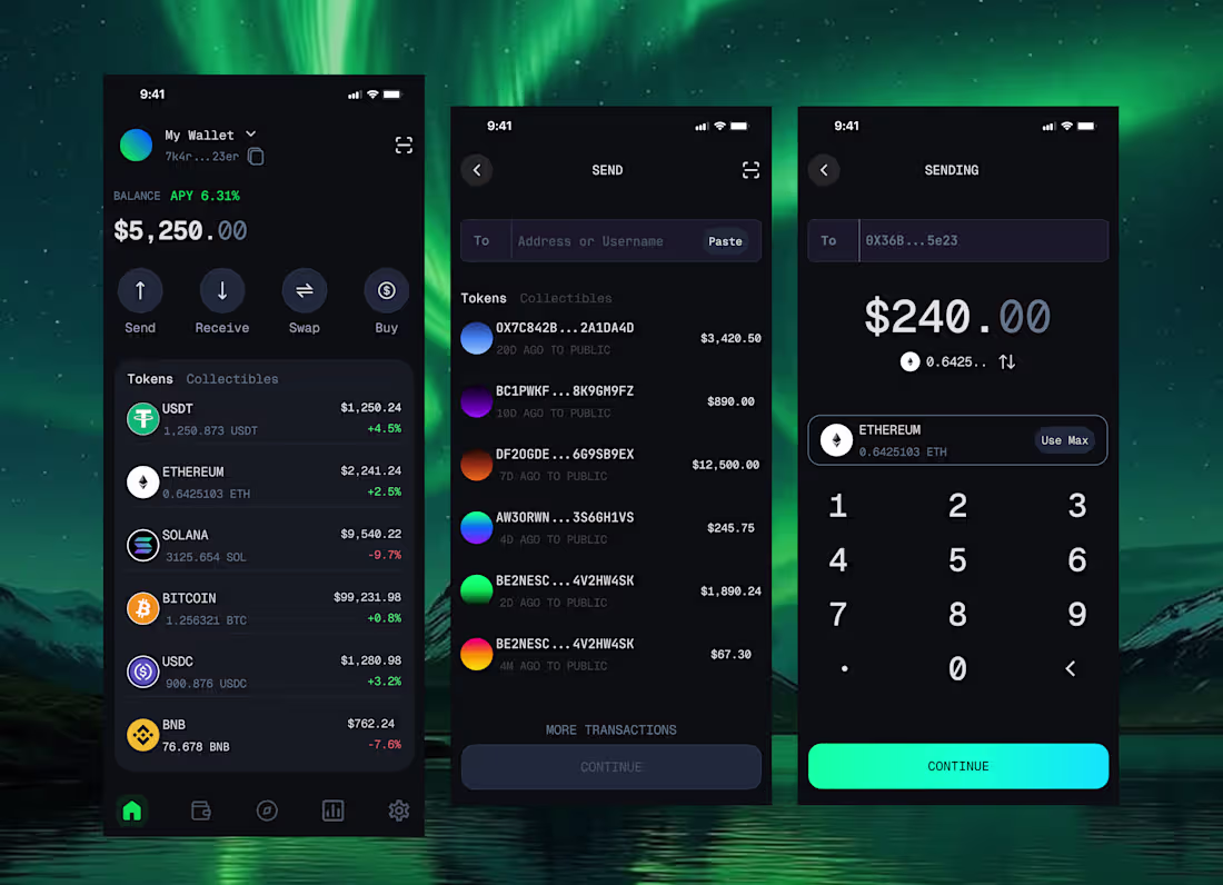
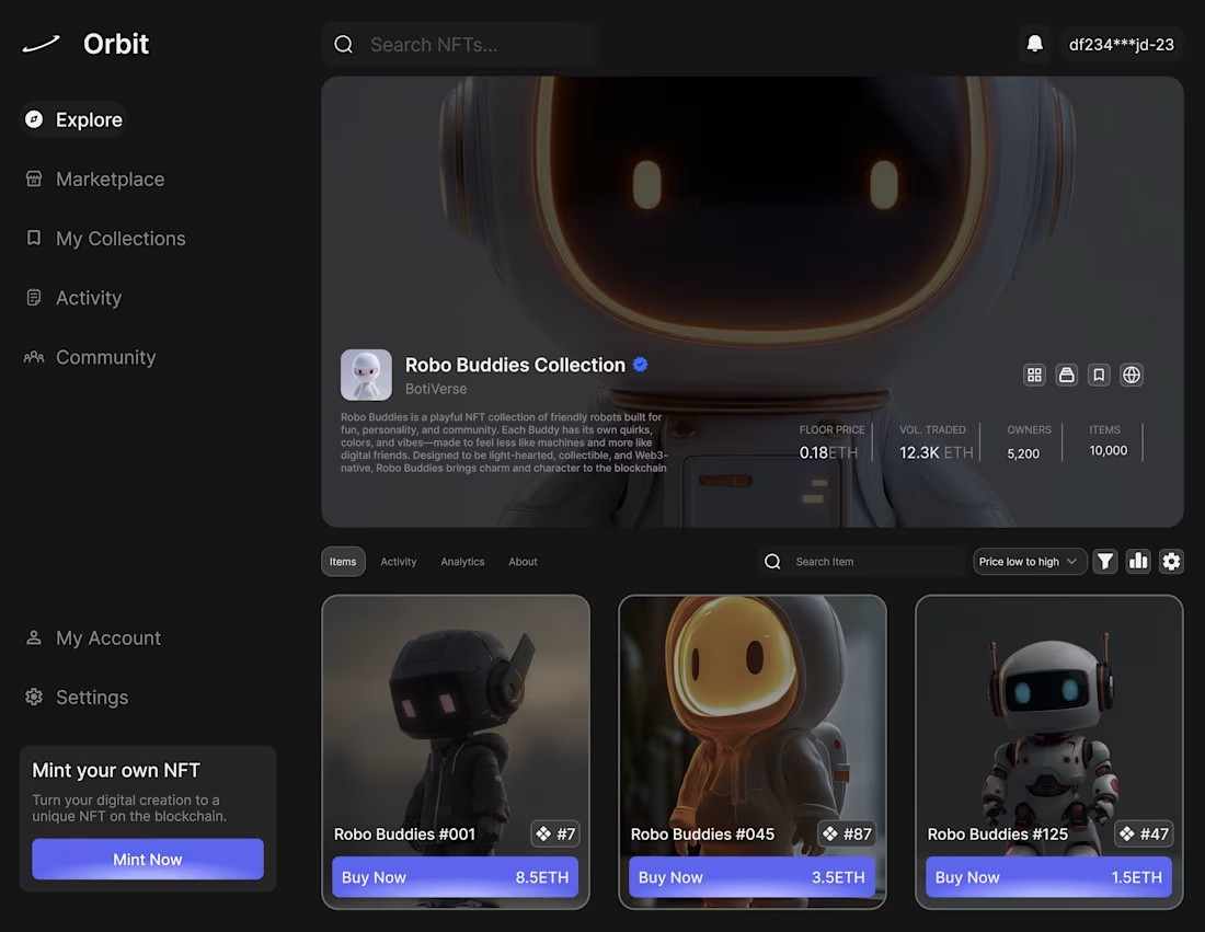
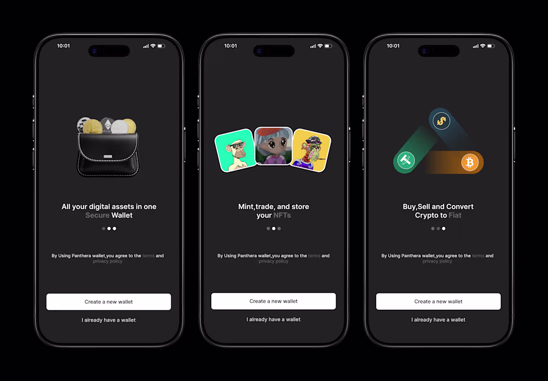
Just wrapped up this futuristic Web3 wallet mobile UI concept.
The goal was to create a wallet experience that feels premium, intuitive, and visually immersive without overwhelming the user.
Highlights:
• Clean portfolio overview
• Minimal send transaction flow
• Dark UI with neon aurora atmosphere
• Strong hierarchy and spacing
• Smooth fintech/Web3 inspired visuals
Designed entirely in Figma.
Always exploring ways to make Web3 products feel more polished and user-friendly.
Available for Web3, SaaS, and mobile UI projects.
1
2
88
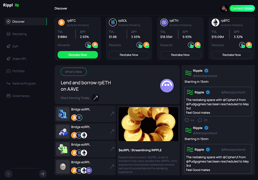
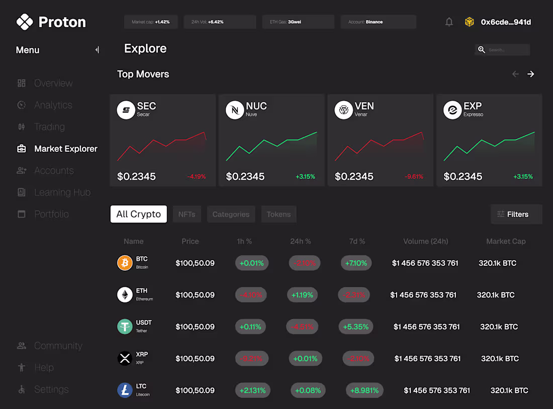
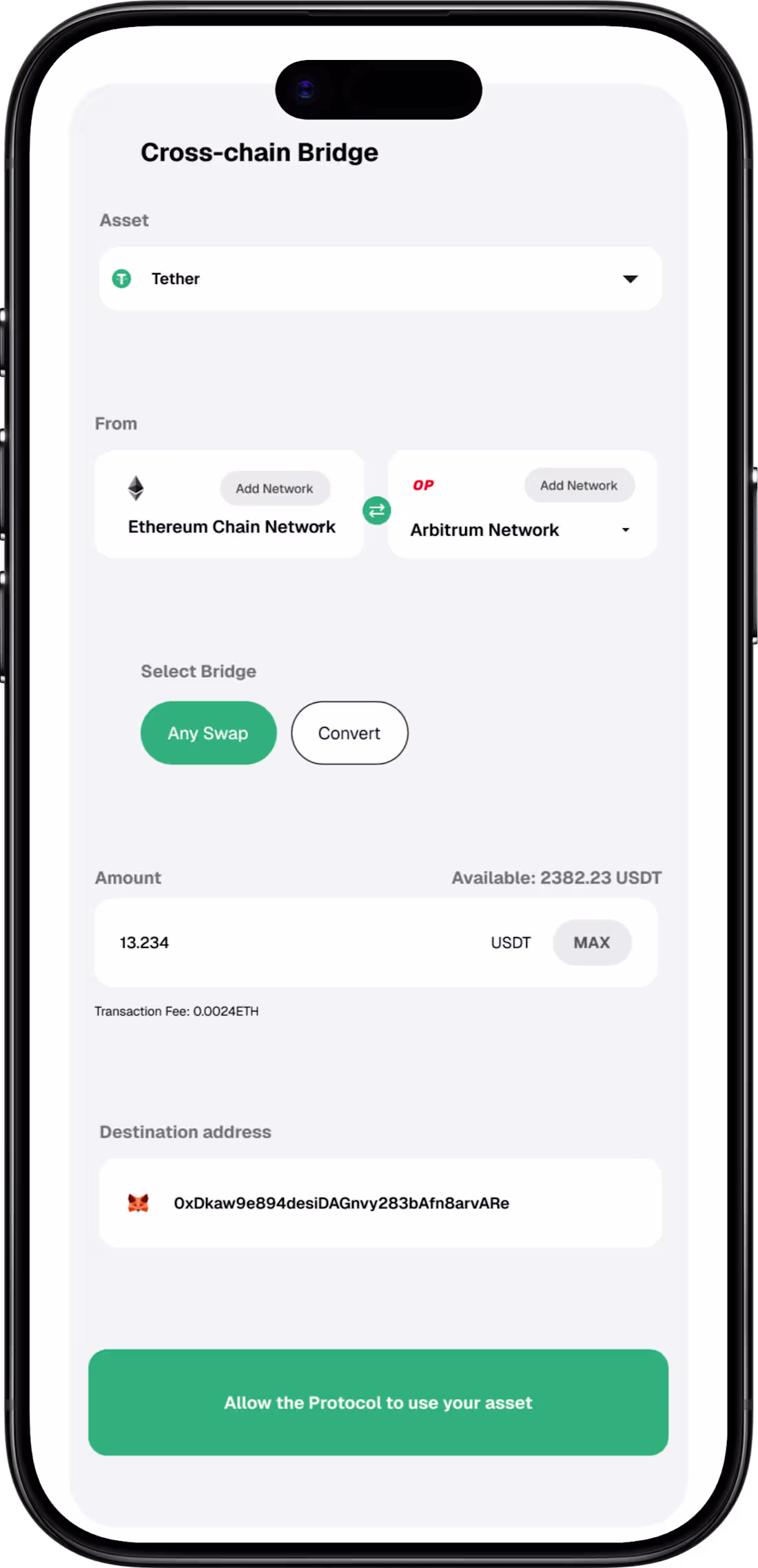
Rippl — Web3 Restaking Dashboard UI
A full dashboard concept for Rippl, a DeFi restaking protocol. Designed to handle high-density financial data while maintaining a clean, trustworthy aesthetic native to Web3 products.
What I designed:
— Protocol discovery cards with live TVL and APY data
— Three-panel layout: navigation, content, social feed
— What’s New banner with featured protocol spotlight
— Bridge and liquidity vault integration list
— Live social feed panel for community updates
— Dark UI system with consistent green brand accent
This project demonstrates my ability to handle complex data-dense interfaces common in DeFi and Web3 products.
Tool: Figma
Available for Web3, DeFi and crypto product design.
Let’s build something →
1
1
79
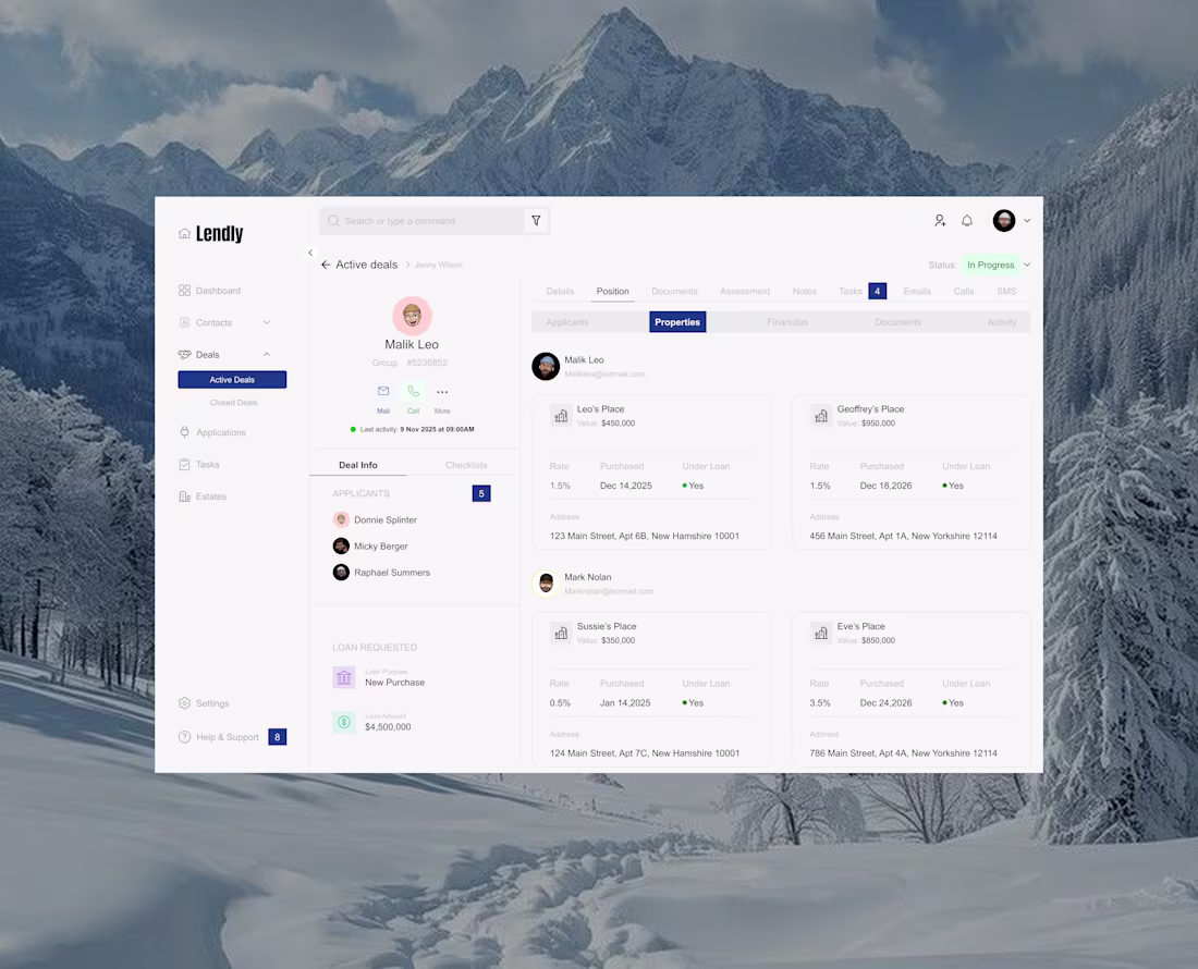
Designed a dashboard interface for managing active deals, focusing on clarity, organization, and usability.
The challenge was structuring multiple layers of information — user details, properties, loan data, and activities — without overwhelming the user.
I approached this by prioritizing strong visual hierarchy, clean spacing, and modular card layouts to make scanning and navigation effortless.
The result is a system that feels structured, intuitive, and easy to work with even when handling complex data.
Open to working on SaaS dashboards and product design projects.
1
83
Exploring motion in product design.
This animation focuses on clarity, smooth transitions, and subtle interactions that make the interface feel intuitive and engaging.
I’m currently refining how motion can improve user experience not just visually, but functionally.
If you’re building a product and want interactions that feel as good as they look, I’m open to collaborating.
1
95
Brought a UI design to life through motion, focusing on creating a smooth and intuitive user experience.
Instead of adding animation for aesthetics, the goal was to use motion to guide attention and improve flow — introducing elements in a clear, intentional sequence.
I explored timing, easing, and subtle transitions to ensure the animation enhances usability without overwhelming the interface.
Currently exploring more UI + motion design projects for SaaS and product experiences.
2
102
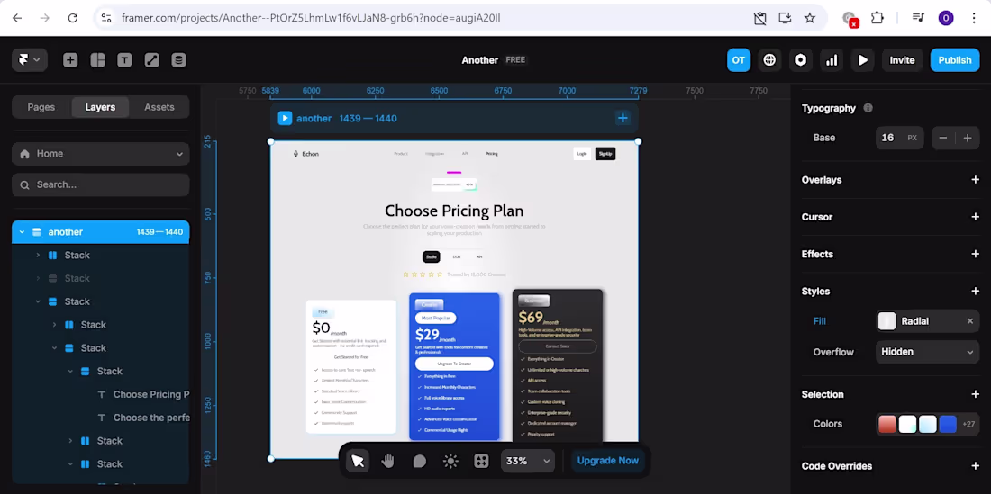
🚀 New Project Drop — SaaS Pricing Page Design + Framer Build
Designed and developed a full pricing page for Echon, a voice creation platform from Figma mockup to live Framer site.
What was delivered:
• 3-tier pricing layout (Free, Creator, Business)
• Fully responsive Framer build
• Conversion-focused design visual hierarchy, social proof, plan differentiation
• Clean light UI with premium dark card accent
• Annual/monthly toggle interaction
3
3
139
Exploring a new UI concept focused on clarity, motion, and user flow.
Good design isn’t just about visuals — it’s about how everything connects:
• Layout that guides attention
• Motion that communicates state
• Interactions that feel natural
Every screen should answer:
“What does the user do next?”
Still refining this direction, but pushing toward more intentional and experience-driven design.
2
122
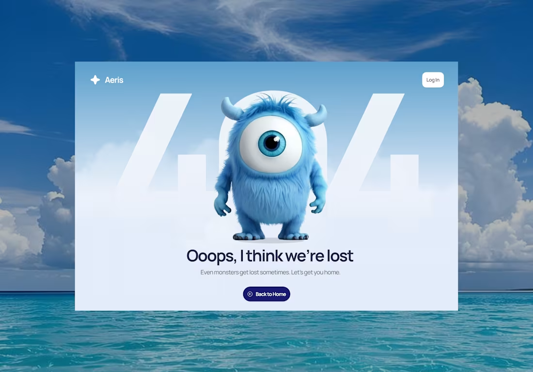
Designed and animated a 404 page that doesn’t feel like an error.
Most 404 experiences are overlooked — but they’re actually a key moment to build trust and personality.
This concept focuses on:
• Character-driven storytelling
• Soft, calming UI
• Clear navigation back to safety
• Subtle animation to keep users engaged
The goal: turn confusion into comfort.
If you’re building a product and want every state (even errors) to feel intentional — let’s work.
1
113
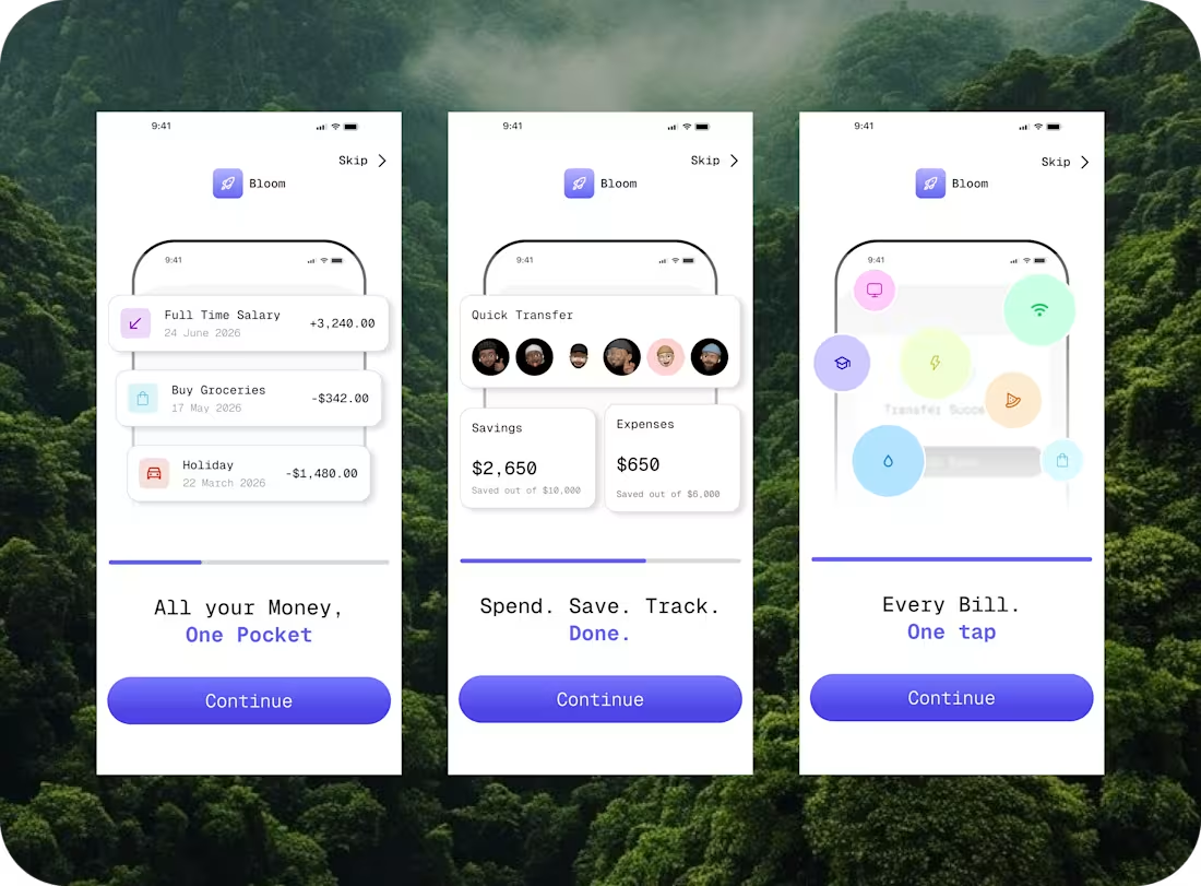
A personal favorite from last week.
Designed a smooth onboarding flow for a finance app — focused on clean UI, quick actions, and effortless navigation.
Simple. Functional. User-first.
If you need a designer who can turn complex ideas into clean, high-converting interfaces, let’s work.
3
3
149
Work in progress 🚧
Currently refining this animation—focusing on smoother motion, better easing, and stronger visual flow.
Great animation isn’t just movement, it’s how elements feel when they interact. That’s what I’m pushing here.
Would love to hear your thoughts.
1
125
Exploring UI motion that feels premium, not noisy.
This animation focuses on:
Controlled pacing
Subtle micro-interactions
Clean, modern transitions
Currently iterating on easing and timing to push it further.
If you’re building a product that needs polished UI animation that actually elevates UX, I’d love to collaborate
3
133
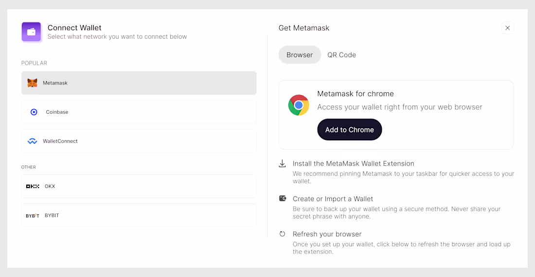
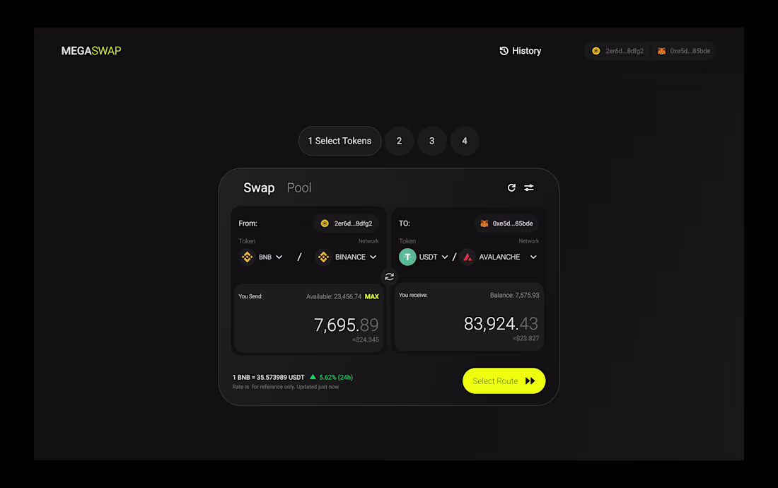
Web3 Wallet Connect UI 🚧
Work in progress — focusing on clean layout, clear hierarchy, and a smooth user experience.
Still refining the details to push it to a more polished, premium feel.
What’s one thing you would improve here?
Available for UI/UX & Web3 projects — let’s work.
3
142
UI Exploration 🚧
My favorite design for the previous week
What’s one thing you look for in a great design?
Available for UI/UX & Web3 projects — let’s work
3
139

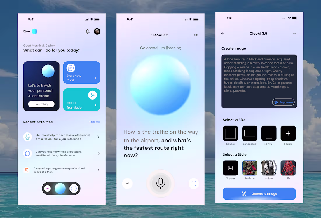
AI Assistant Mobile UI 🚀
Designed a clean and modern interface combining chat, voice interaction, and image generation into one seamless experience.
Focused on simplicity, usability, and a smooth visual flow across screens.
Which one do you prefer: 1, 2, or 3?
Available for UI/UX & Web3 projects — let’s work.
2
5
166
Work in progress 🚧
I’m currently designing a new interface and focusing on clarity, usability, and strong visual balance. Still refining the details, but the direction is shaping up well.
I believe great design comes from iteration — testing, adjusting, and improving until everything feels seamless.
What’s one detail you think most designers overlook?
Available for UI/UX & Web3 projects — if you need a designer, let’s work.
1
4
177

Just wrapped a clean UI design project recently 👨🏽💻
Focused on:
Clear visual hierarchy
Smooth user flow
Modern, conversion-driven layout
Design isn’t just about looks it’s about how users feel and act.
If your product isn’t converting or feels outdated, it might be time for a redesign.
I’m currently available for:
• Website UI/UX
• Web3 dashboards
• Landing pages
Got a project in mind? Let’s work 🤝
3
143
I previously worked on a dashboard design focused on turning complex data into a clean, intuitive interface.
The goal was simple:
Make information easy to scan, easy to understand, and easy to act on.
The design focused on:
• Clear layout structure
• Strong visual hierarchy
• Minimal but modern interface
• Data visualization that actually makes sense
A great dashboard should help users make decisions faster — not confuse them.
If you’re building a product that needs a clean, modern dashboard UI, I’d love to help bring it to life.
What type of dashboard are you currently building? 🚀
1
143
First post of the month 👋
This month, I’m focused on designing:
• Clean, conversion-driven landing pages
• Web3 dashboards
• SaaS interfaces with strong hierarchy
• Structured, scalable design systems
If your product feels messy, unclear, or not “premium” enough —
that’s usually a UI structure problem.
I help founders turn ideas into clean, modern, high-converting interfaces.
Building something right now?
Let’s work
1
143

Web3 founders —
If your landing page looks cool but doesn’t explain:
• How users earn
• How startups scale
• How funding works
• How community flows
You’re leaving clarity (and money) on the table.
I design structured Web3 interfaces that:
– Simplify complex ecosystems
– Make funding paths visual
– Turn roadmaps into user journeys
– Position your brand as premium
Building something in crypto, Web3, or blockchain?
Let’s make it look as serious as your vision.
Message me. 🚀
2
136
Random design reminder:
Good UI isn’t loud.
It doesn’t beg for attention.
It guides users quietly and confidently.
The best interfaces feel obvious — not overwhelming.
If you need clean, modern UI that makes your product easier to understand and easier to trust, I’m currently available for new projects
3
2
149
Animated a bento-style UI layout to bring structure and motion together.
Bento grids are powerful for modern landing pages and dashboards — but animation is what makes them feel alive. Micro-interactions, smooth transitions, and thoughtful timing turn static cards into engaging experiences.
If you’re building a product and want motion that enhances usability (not distracts from it), I’m currently open to new design projects.
Let’s collaborate
3
4
190
Great UI feels effortless.
When structure, spacing, and hierarchy are intentional, users move naturally through the experience. No confusion. No friction. Just clarity.
That’s the kind of design I focus on
Below is a card for a dashboard I am working on
ANTICIPATE
1
130
UI design works best when users don’t have to think.
Clear hierarchy, consistent spacing, and intentional flow turn complex products into simple experiences. That’s the standard I aim for in every interface I design
Which layout do you prefer?
2
3
138
Good design solves problems quietly.
A well-designed interface guides users without instructions. Visual hierarchy, spacing, and consistency work together to reduce friction and make actions feel natural.
UI isn’t about making things flashy it’s about making them usable
0
119
Design isn’t about adding more elements.
It’s about creating clarity.
Every section, spacing choice, and interaction on a landing page should guide users effortlessly. That’s the standard I design with
4
136
Crypto wallet UX isn’t just about visuals.
It’s about confidence.
Users need to understand balances, transactions, and actions at a glance. When the interface is clear, trust increases and mistakes reduce.
Good design makes wallets feel safe and usable — not intimidating
2
135
I’ve always loved dark mode — not just for the look, but for how it feels.
Done right, dark mode brings focus, reduces visual noise, and lets key elements stand out without shouting. It’s especially powerful for modern products and landing pages.
This landing page explores dark mode with clarity, contrast, and balance in mind.
If you’re building a product and want a dark-mode experience that feels intentional (not just inverted colors), I’m open to new design projectsI’ve always loved dark mode — not just for the look, but for how it fee
2
131

Motion isn’t just something you add at the end.
It’s part of the experience.
This Jitter animation was created to lead the eye, highlight key moments, and make the interface feel alive.
If your product needs motion that feels purposeful,
I’m currently open to new design projects
By the side is the full website i designed by the way
5
149
Good products don’t just work.
They feel easy.
When users understand what to do without thinking,
that’s good design doing its job.
I design websites and UI/UX for Web3 and tech projects,
focused on clarity, usability, and real results.
If you’re building something and need design that actually supports growth,
I’m open for new projects
2
134
Started putting more effort in learning Jitter and animated a section of a website I recently worked on...
Motion isn’t just decoration.
It’s communication.
This Jitter animation was designed to guide attention, explain ideas faster, and make the experience feel alive.
If you want your product or brand to connect better through motion and design, I’m currently open to new projects
1
6
157
Most people don’t leave a product because it’s bad.
They leave because they don’t understand how to use it.
That’s what good UI/UX really does.
It removes confusion, builds trust, and helps people stay.
If your interface feels difficult, your growth will feel the same.
I’m currently open for new design projects —
what part of your product’s experience needs the most improvement right now?
1
124
I’ve been a bit quiet lately — had some health stuff to take care of, but I’m back and fully active now.
If you’re building something and need a designer who focuses on clear UI/UX and real product results, I’m currently available for new projects.
Who’s looking to hire a designer right now
1
4
145

Most products don’t need more features.
They need better design.
If your users feel confused, they won’t stay.
If they feel comfortable, they convert.
I design UI/UX for Web3 and tech startups — landing pages, dashboards, and marketplaces.
If you’re building and want your product to actually work for your users,
let’s work
2
135
If users get confused, your product loses.
Good design doesn’t just look nice —
it makes your product easier to trust, easier to use, and easier to grow.
I design UI/UX for Web3 and tech startups, from landing pages to dashboards and marketplaces.
If you're building something and need design that actually moves the needle,
let’s work
2
2
156
First Post on the first day of the year 26😊
Most startups don’t have a marketing problem.
They have a design problem.If users don’t understand your product instantly,
they won’t trust it, use it, or pay for it.I design UI/UX and presentations that turn complex ideas into clear, convincing experiences especially for Web3 and tech startups.
If you’re building and want design that actually drives results,
let’s work.
Here's to more designs in this new year and happy new year
1
162
Your product doesn’t have a growth problem.
It has a clarity problem.
If users need instructions, the design failed.
If they hesitate, the experience failed.
If they leave, the system failed.
Good UI/UX removes questions before they’re asked.
I help teams turn confusing interfaces into simple, high-performing products.
If your website or app isn’t pulling its weight, I’m available for new projects and roles.
What part of your product do you think causes users the most confusion today?
#UIUX #WebDesign #ProductDesign #StartupDesign #UXDesign #SaaS #Web3Design
2
148
Another day to announce i am currently job hunting for design jobs
If users are confused, your product suffers.
If the journey isn’t clear, growth stalls.
Good design doesn’t just impress — it performs.
I’m open to new roles and projects.
If you’re hiring or know someone who is, send them my way.
What’s the biggest design mistake you see today?
#UIUX #WebDesign #ProductDesign #StartupDesign #UXDesign
2
149
Your website doesn’t need more features.
It needs fewer mistakes.
Most products don’t fail because of the idea.
They fail because the experience is confusing.
When users have to “figure it out,” they leave.
When the journey feels heavy, they bounce.
When the message isn’t clear, they don’t convert.
Good design removes friction.
Great design removes doubt.
If your website isn’t turning visitors into customers, your design is quietly working against you.
I help brands fix that.
What’s the one thing on your website you secretly know needs to change?
1
3
144

Most websites don’t need a redesign.
They need a reality check.
If your site looks “nice” but:
– users don’t know where to click
– your bounce rate is high
– conversions are low
– people keep asking the same questions
…then your design isn’t working.
Pretty colors don’t fix broken user journeys.
Animations don’t replace clarity.
Trendy layouts don’t save confusing products.
Good design makes decisions easy.
Bad design makes people leave.
I work with brands and startups to turn confusing websites into clear, high-converting experiences.
If your website isn’t pulling its weight, let’s fix that.
What’s one feature on your website that you think looks good but doesn’t actually help users?
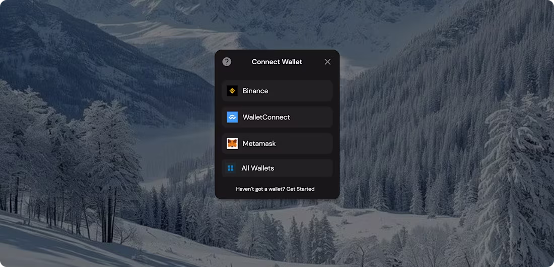
Below is a connect wallet feature I designed
#WebDesign #UIUX #StartupDesign #ProductDesign #SaaS #Web3Design #UXDesign #DigitalProduct
2
146
Can't hide it anymore.....a design job on contra before the year ends would help me alot😊 .....I deliver nice landing pages that leave clients hooked fr....need a designer I am open
2
181
Most products don’t need more features.
They need better UI.
DM me to fix yours
1
160
Most startups don’t have a traffic problem.
They have a clarity problem.
I help founders turn complex ideas into simple, high-converting UI.
Web3 • SaaS • Dashboards • Landing pages.
Got a project? My DMs are open
2
134
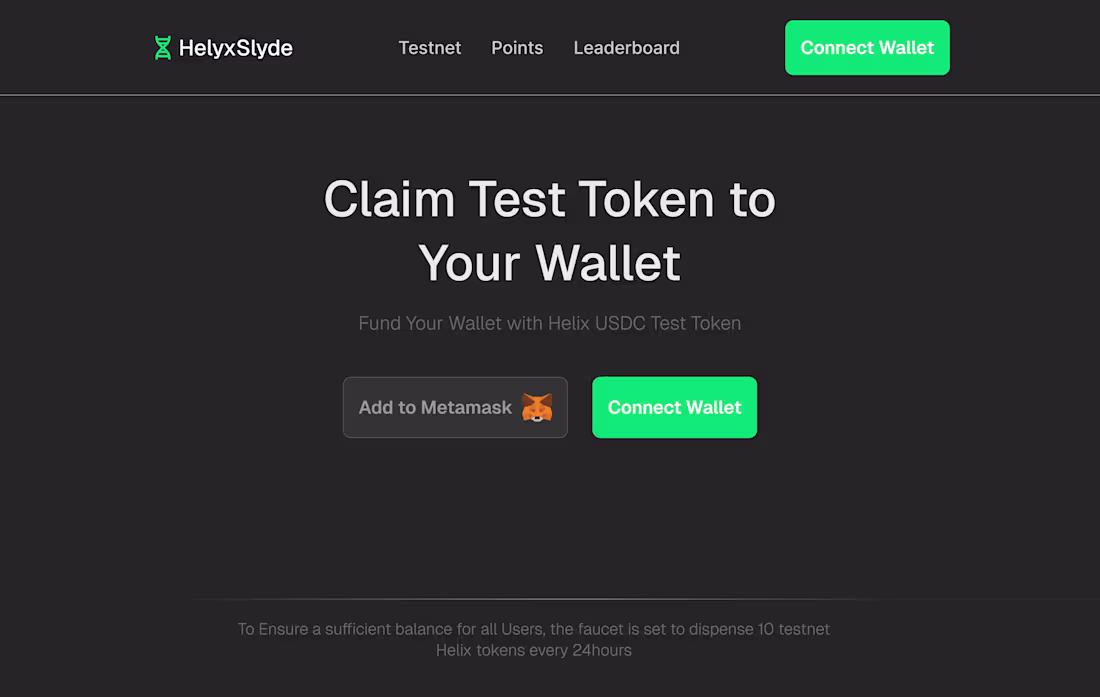
Most users don’t abandon Web3 because of the tech.
They leave because the first interaction feels confusing, cold, or risky.
This test token claim design explores how onboarding can feel simple, human, and confidence-building — even before a user connects a wallet.
If you’re building a wallet, protocol, or onboarding flow and want users to actually complete their first action, this is the level of UX I design.
Would you claim a test token through this flow — or what would you improve first? 👇
1
4
151
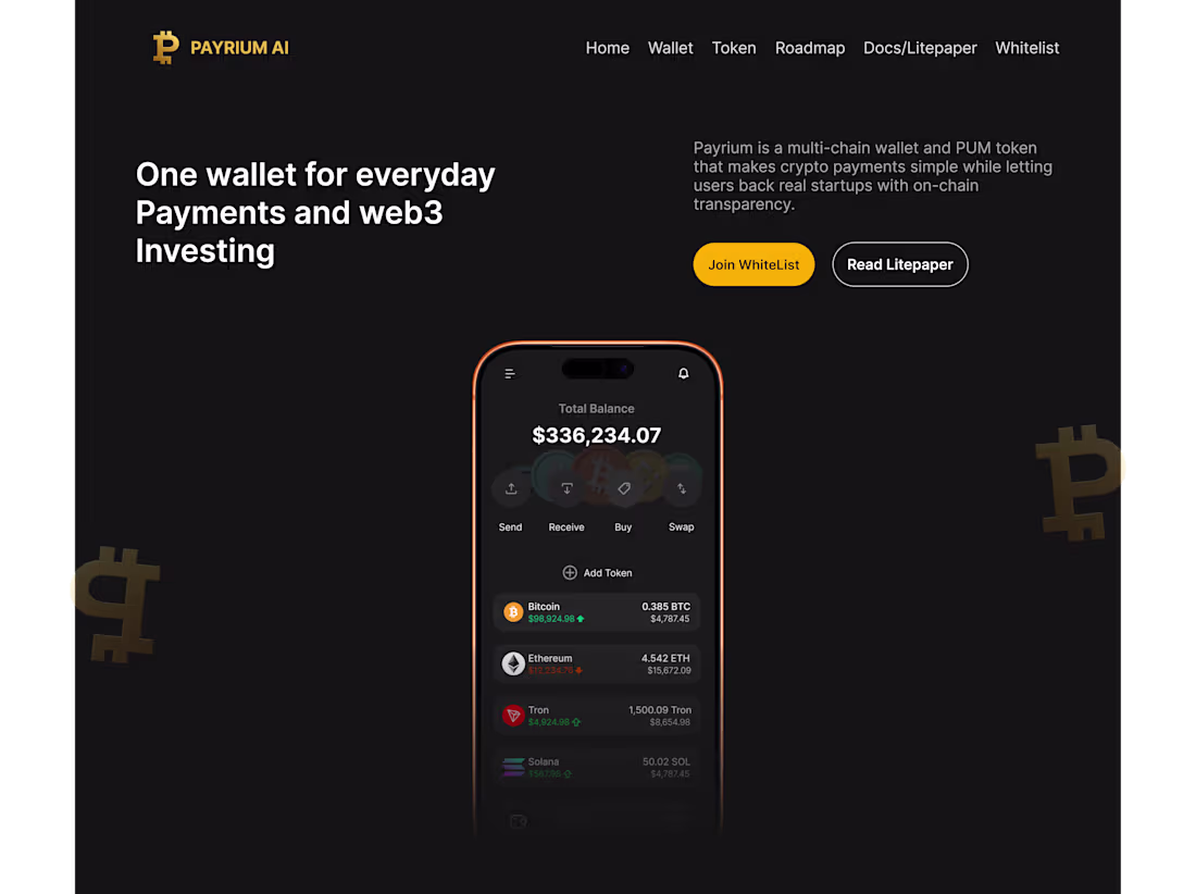
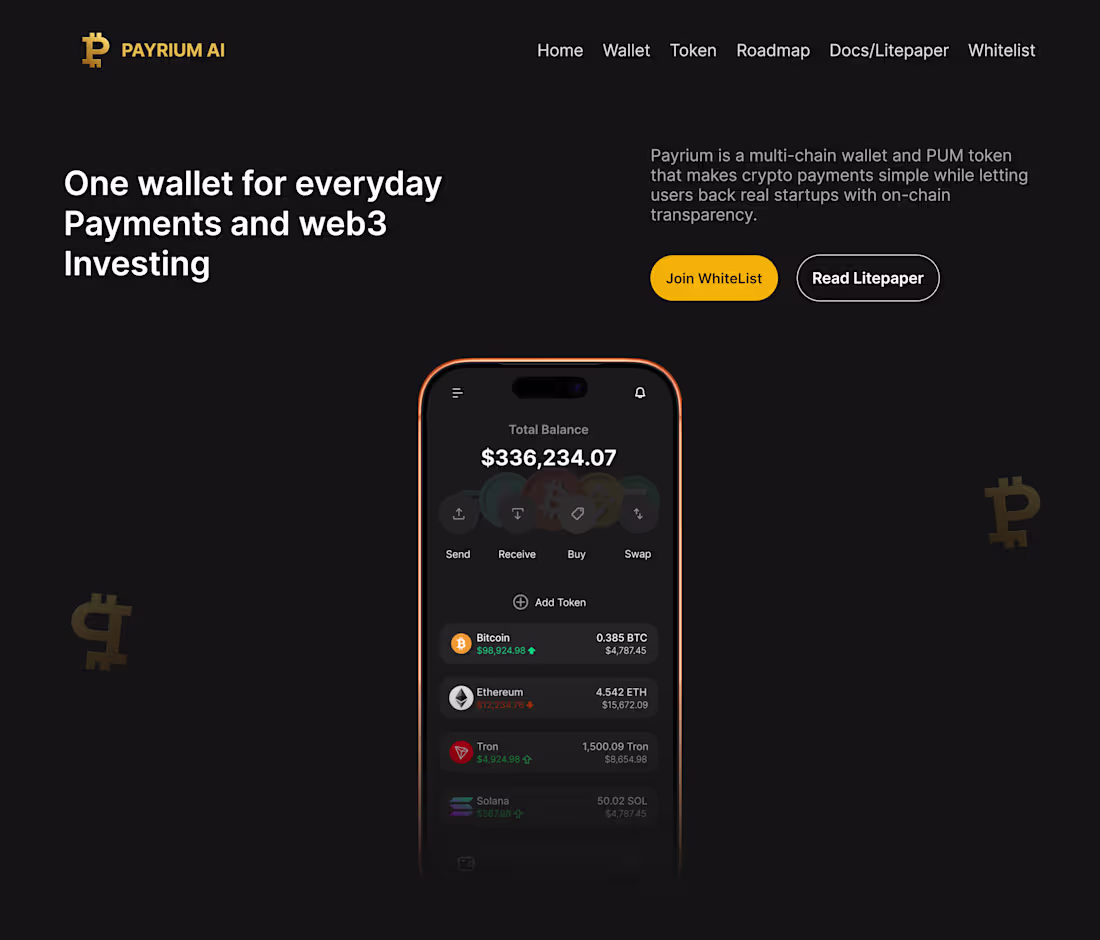
Designing for Web3 isn’t just about visuals — it’s about removing friction so users actually trust your product.
I just finished two hero section concepts for a multi-chain wallet, each built with a different onboarding flow, layout rhythm, and visual hierarchy in mind. Both push the same idea:
Make crypto usable for everyone.
If you're a startup looking to elevate your wallet UX or improve your first-impression visuals, this is exactly what I help you do.
Now I want your perspective —
Which version feels more intuitive to you: Design 1 or Design 2?
1
2
157
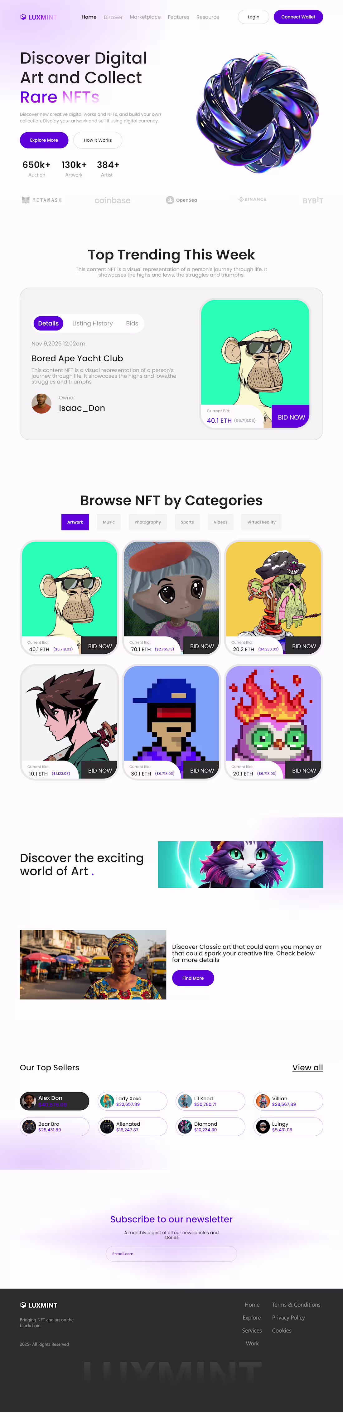
🚀 LuxMint NFT Marketplace — Landing Page UI/UX
I designed this landing page to solve one major problem I keep seeing in NFT marketplaces:
Too many platforms overwhelm users with clutter, poor hierarchy, and confusing navigation.
With LuxMint, I focused on:
A clean hero section that instantly explains the value
Clear CTAs (“Explore More” + “How It Works”)
A structured “Top Trending” area to highlight valuable NFTs
Organized categories that make browsing effortless
Visual storytelling sections to give the brand personality
A minimal, Web3-friendly look that feels premium and trustworthy
The goal?
Create a landing page where collectors understand the platform in seconds — not after digging around.
If you were building your own NFT platform, what’s the FIRST thing you’d want users to notice?
4
155

Still more explorations from some of my designs....need a designer for your project dm me today
1
3
162

First time on Contra today....and my first post on here....looking for a designer to design products that leave clients hooked on what you do send me a dm today
3
163