The network for creativity
Join 1.25M professional creatives like you
Connect with clients, get discovered, and run your business 100% commission-free
Creatives on Contra have earned over $150M and we are just getting started
Back to feedPost

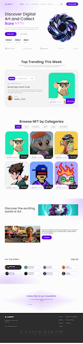
🚀 LuxMint NFT Marketplace — Landing Page UI/UX
I designed this landing page to solve one major problem I keep seeing in NFT marketplaces:
Too many platforms overwhelm users with clutter, poor hierarchy, and confusing navigation.
With LuxMint, I focused on:
A clean hero section that instantly explains the value
Clear CTAs (“Explore More” + “How It Works”)
A structured “Top Trending” area to highlight valuable NFTs
Organized categories that make browsing effortless
Visual storytelling sections to give the brand personality
A minimal, Web3-friendly look that feels premium and trustworthy
The goal?
Create a landing page where collectors understand the platform in seconds — not after digging around.
If you were building your own NFT platform, what’s the FIRST thing you’d want users to notice?

The network for creativity
Join 1.25M professional creatives like you
Connect with clients, get discovered, and run your business 100% commission-free
Creatives on Contra have earned over $150M and we are just getting started
Trending

Claude
Claude has entered the design space. How are you using it?

Contra University
Learn from expert creatives how to earn more using next-gen AI tools.
Brand Design
The best brand designers are on Contra. Scroll to see what's trending in brand design. What are you building?
creativeaiflow
Creative AI workflows are evolving. What tools do you use, and what are their strengths and weaknesses?
freelancerlife
Freelancer life is wins, pivots, and everything in between. What’s yours right now?


