Leticia Padilla's Work | ContraWork by Leticia Padilla
Leticia Padilla
pro

Leticia Padilla

Brand Identity Designer for Premium & Lifestyle Brands

    1x
    Hired
    5.00
    Rating
    27
    Followers
Cover image for Two cultures. One sweet spot.
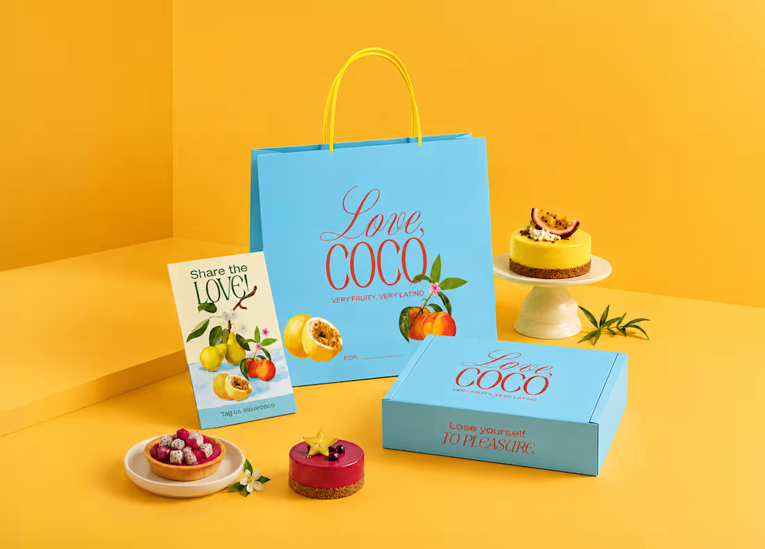
Two cultures. One sweet spot. Love, Coco brings Latin American desserts into the Canadian market with a fresh, modern twist. Built from scratch: identity, packaging, motion & more. Motion concept created with Google Flow’s latest update ⚡️ Full case study here: contra.com/p/mkk3o7OX-love-coco-dessert-brand-identity (https://contra.com/p/mkk3o7OX-love-coco-dessert-brand-identity)
1
3
100
Cover image for Where two worlds meet.   
1 Collaborator
Where two worlds meet.      A preview of the visual identity for Balance 51, specialty Peruvian coffee distributors based in Amsterdam. The visual direction explores the tension between Latin American warmth and Dutch minimalism, finding their point of convergence: clean structure with a bold presence. The logo is an exploratory geometric synthesis. On one hand, the symbol represent the anatomy of the coffee bean and the equilibrium of a scale. On the other, the logotype mirrors this same formal logic, where the visual play and custom cuts of the '51' inject character and rhythm into the composition. Explore the full case study: contra.com/p/XmXgo3Am-balance-51-specialty-coffee-brand-identity (https://contra.com/p/XmXgo3Am-balance-51-specialty-coffee-brand-identity)
1
1
5
152
Cover image for Balance 51 — Specialty Coffee Brand Identity
Balance 51 — Specialty Coffee Brand Identity
1
3
Cover image for Love, Coco — Dessert Brand Identity
Love, Coco — Dessert Brand Identity
2
4
Cover image for Beautiful Things Change Too...
In a
Beautiful Things Change Too... In a visual culture increasingly shaped by hyper-polished generative imagery, this project explores the opposite direction: imperfection as evidence of lived experience. The idea began with a speculative jewelry concept: a silver ring designed to evolve over time through oxidation, wear, environmental exposure, and human contact. Instead of preserving perfection, the object becomes more meaningful through visible transformation. As the concept evolved, the focus shifted away from the object itself and toward a broader idea: imagining a future form of luxury that feels more human, tactile, and lived-in rather than artificial or untouchable. That transition shaped both the concept and the visual language of the project. I intentionally moved away from clean digital aesthetics and explored Super 8-inspired textures, VHS-transferred imagery, low-resolution visuals, analog instability, light bloom, motion blur, and damaged film artifacts. These elements were not used simply for nostalgia, but to recreate the sensation of memory itself: fragmented, fleeting, imperfect and sensory. Rather than functioning as a traditional advertisement, the final piece was designed more like an atmospheric memory-film: something intimate, evocative, and visually unstable, as if rediscovered from another moment in time. PROCESS & EXECUTION: The project was developed entirely through Melius using an iterative node-based workflow, allowing continuous experimentation across prompts and agents, visual directions, and stylization branches. A large part of the process involved refining a unified visual language while exploring imperfect image behavior, analog textures, cinematic light bloom, and fragmented memory aesthetics. Moving visuals, editorial stills, and sound direction were developed together as part of the same atmosphere. Toward the end of the process, I also used the Mel agent to help refine stylistic details and generate the ethereal analog-inspired audio used in the final film. The final sequences prioritize atmosphere, rhythm, texture, and sensory continuity over traditional storytelling. FEEDBACK ON MELIUS: Melius made experimentation feel fluid and intuitive, especially while exploring multiple creative directions through iterative nodes and agents. The most valuable part of the process was being able to push AI away from perfect realism and instead use it as a tool for building atmosphere, texture, memory, and visual imperfection. In a future saturated with flawless imagery, perhaps imperfection becomes the most human form of realism. https://app.melius.com/projects/0f863324-6601-4505-8518-929ab8399691/canvas/61c97116-7ea3-4d2f-aaf1-754ac1520f1d
2
191
The synthesis of a craft. A preview of the visual identity for Tapidecor, a brand where furniture is created from scratch through artisanal manufacturing and signature upholstery. The development is based on a geometric synthesis representing the iconic profile of a chair. As the most essential form of a seat, this structure symbolizes the primary physical touchpoint between the user and the design, capturing the essence of the craft: the balance between structural firmness, functionality, and the comfort of the finish. The system features two variants: an integrated version where the naming is housed within the core of the symbol, and a pure logomark for high-impact applications (wood engraving, embroidery, or stamps), where the form maintains the brand identity on its own.
25
59
1.8K
A minimalist brand mark designed for a private stay in the Peruvian jungle. This symbol merges the concept of a key with architectural stairs, representing the access to a unique and remote experience. It bridges clean, modern lines with the natural beauty of a rainforest escape.
22
43
1.4K
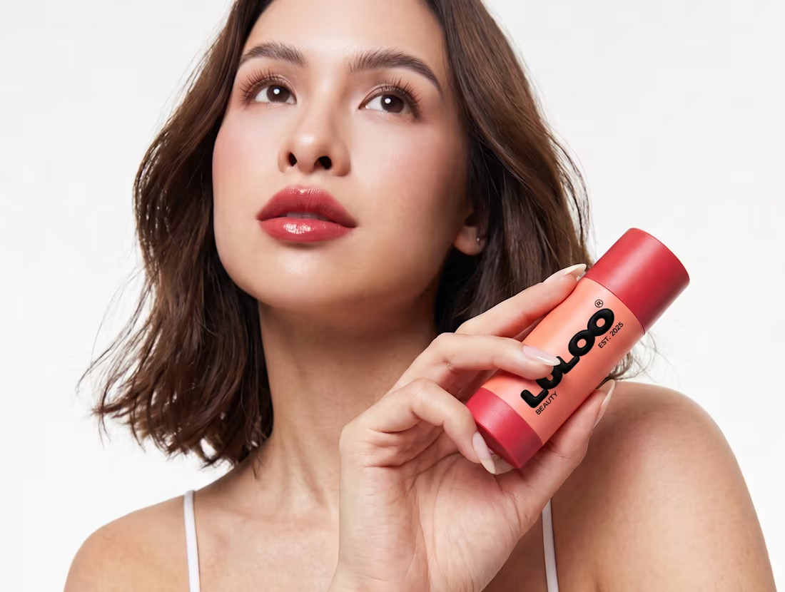
LULOO I 3D Packaging Animation A personal 3D motion study based on the branding project I co-developed at a design studio. This animation explores the physical essence of the packaging through dynamic lighting and dreamlike textures.
3
315
Cover image for Portfolio in Progress — 2026 Selection
Portfolio in Progress — 2026 Selection
2
14