LULOO — Beauty Brand Identity

Leticia Padilla


Beauty brand identity
LULOO - is a natural lip-to-cheek makeup brand.
Challenge
The natural beauty category often communicates through soft, minimalist aesthetics that emphasize purity and simplicity. While these visual conventions help build trust, they can feel predictable to younger audiences seeking brands with more personality and self-expression. LULOO wanted to move beyond the typical organic beauty aesthetic and create a brand that feels more expressive while still connecting with its audience and communicating trust.
Solution
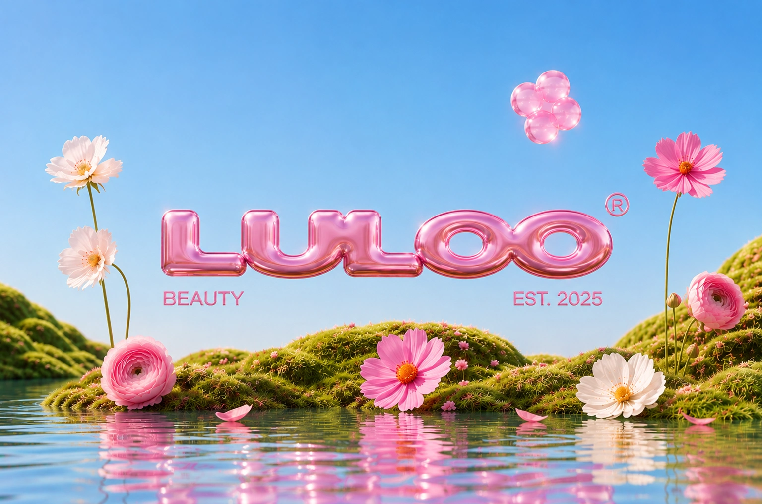
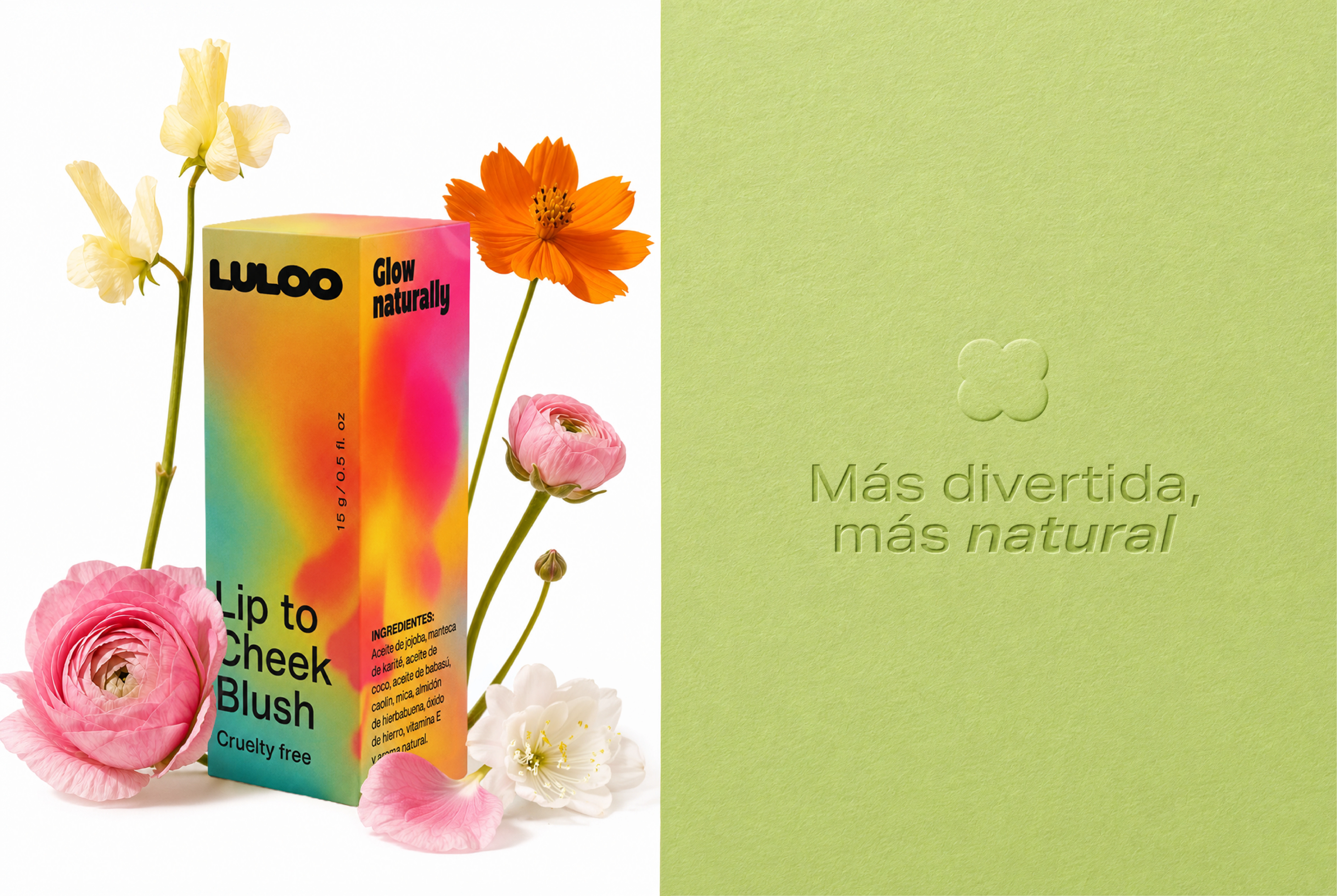
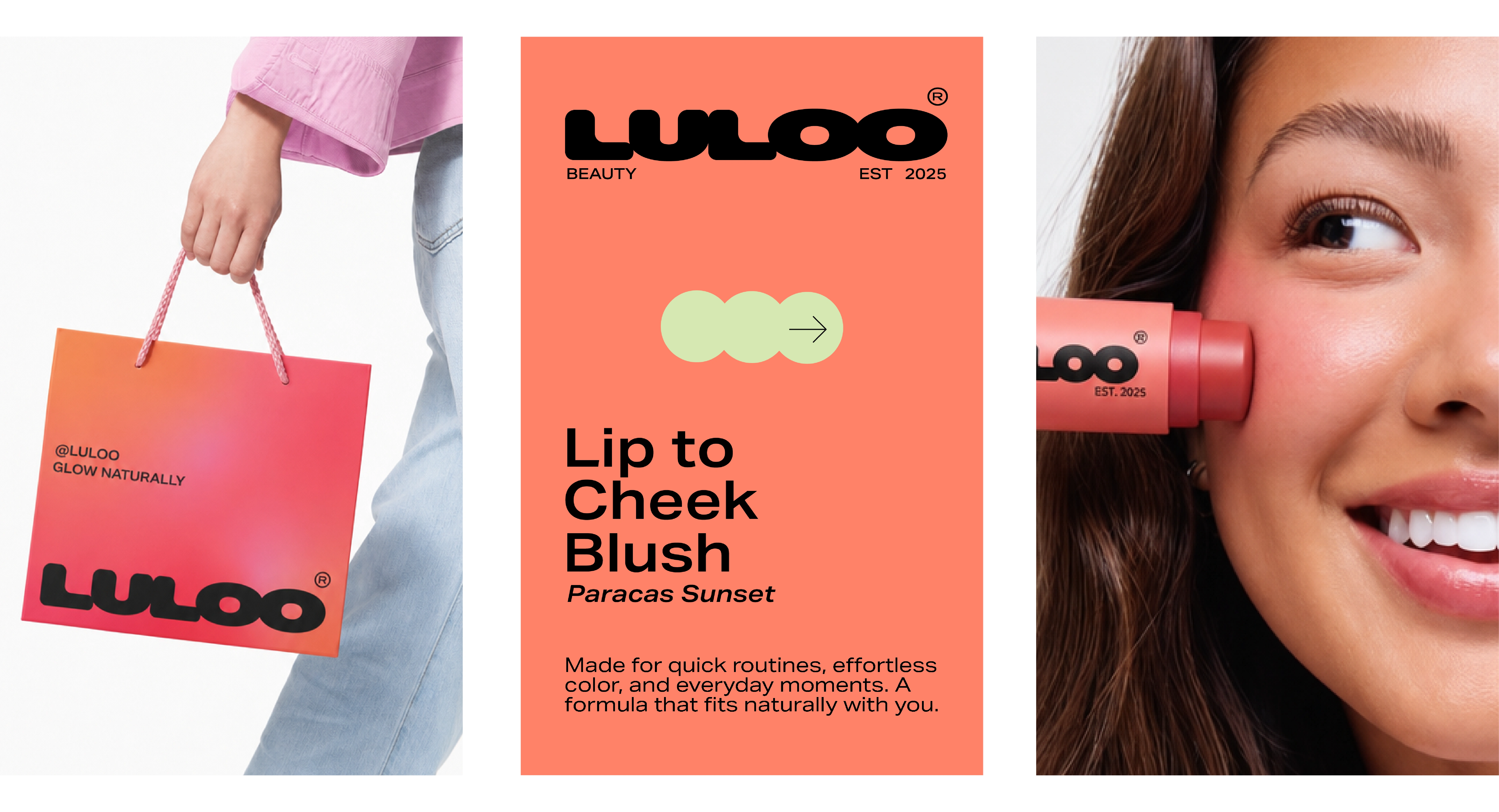
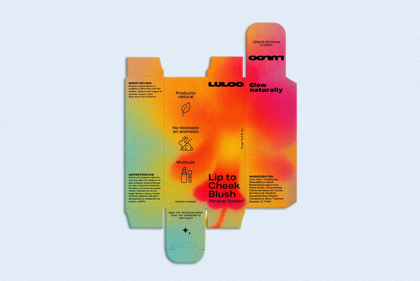
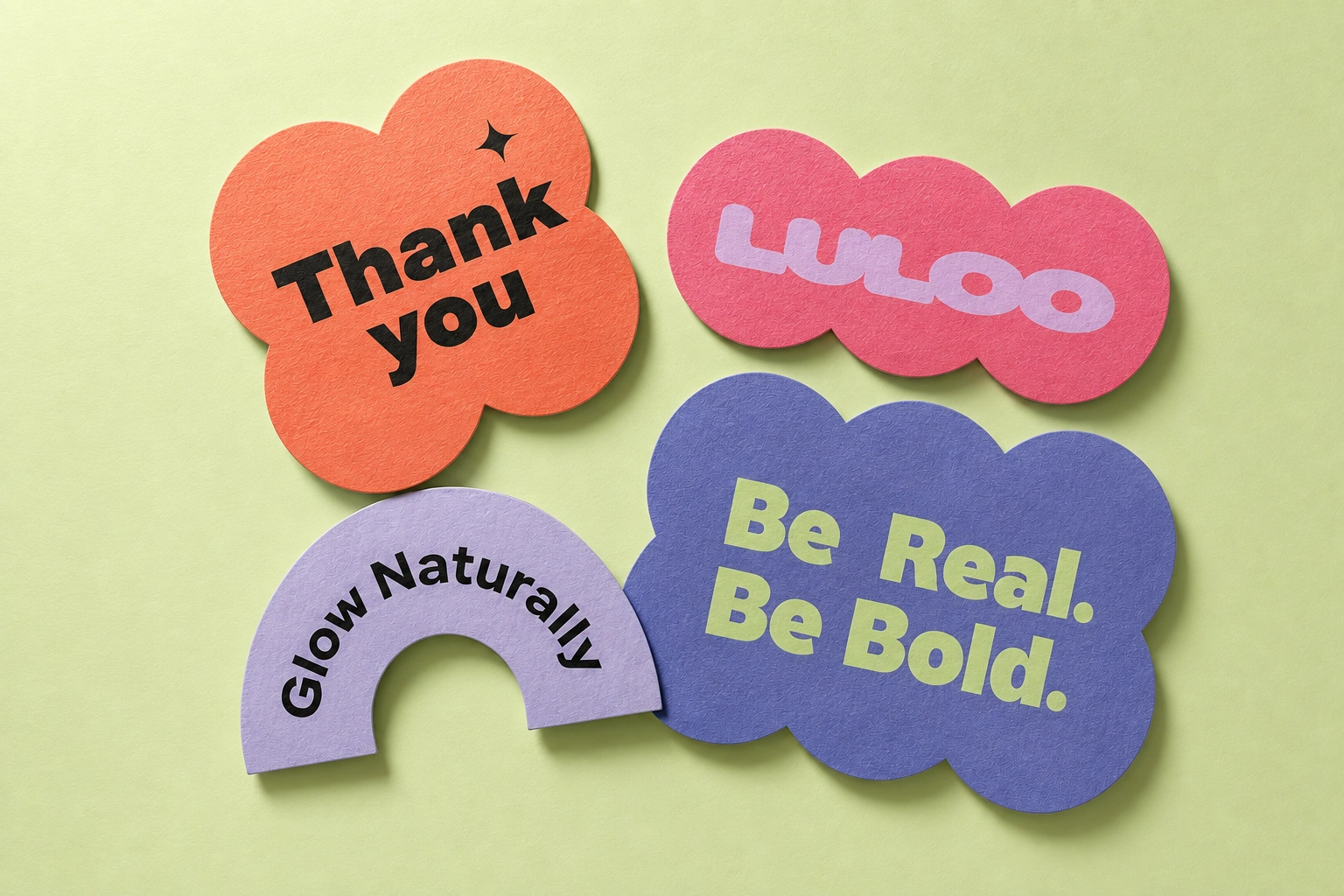
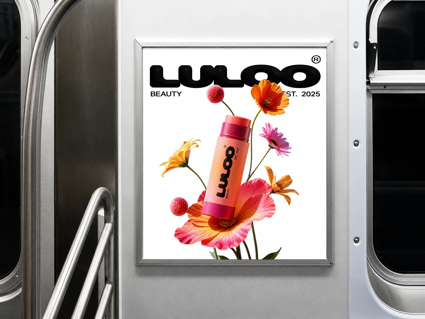
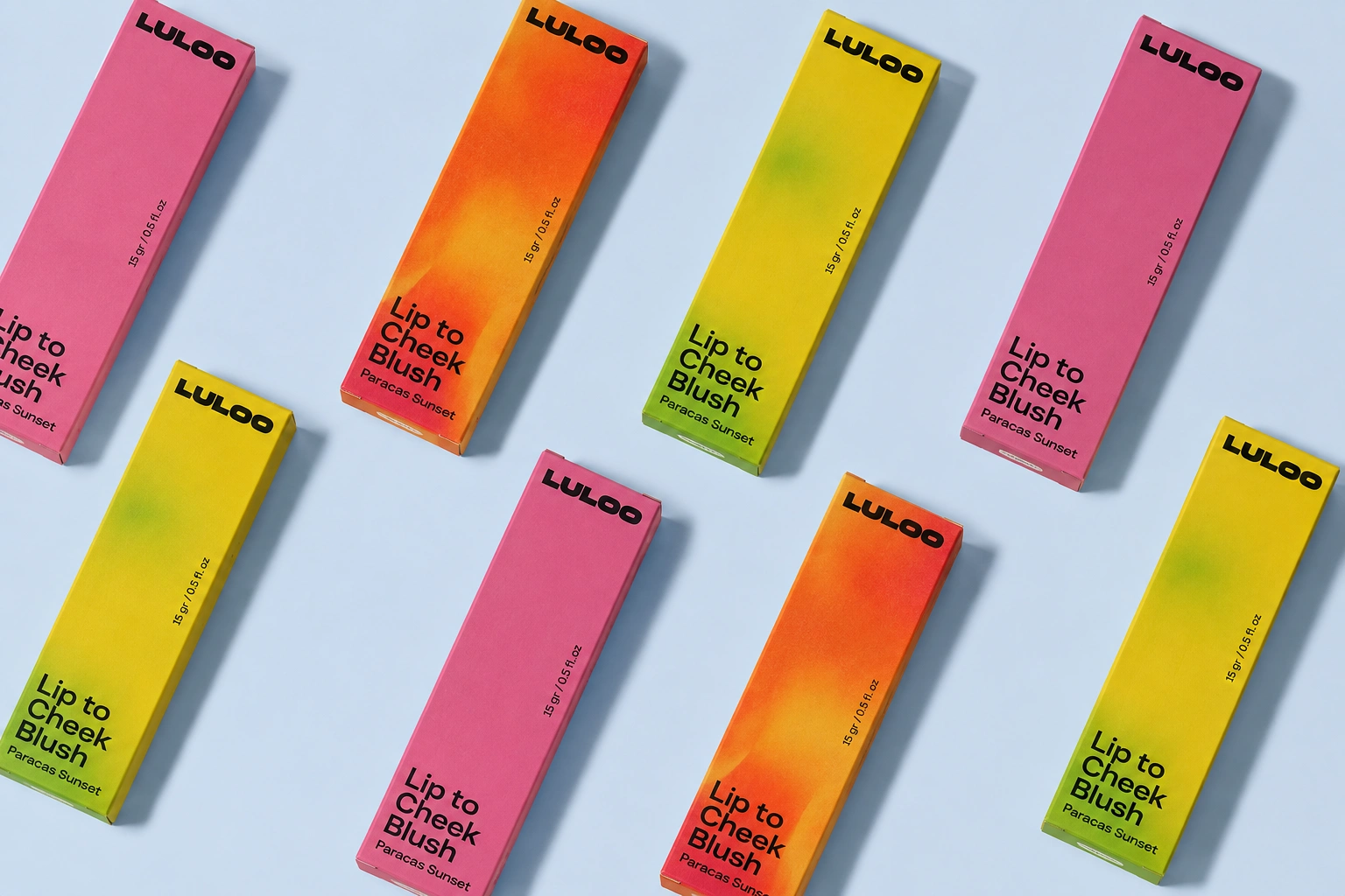
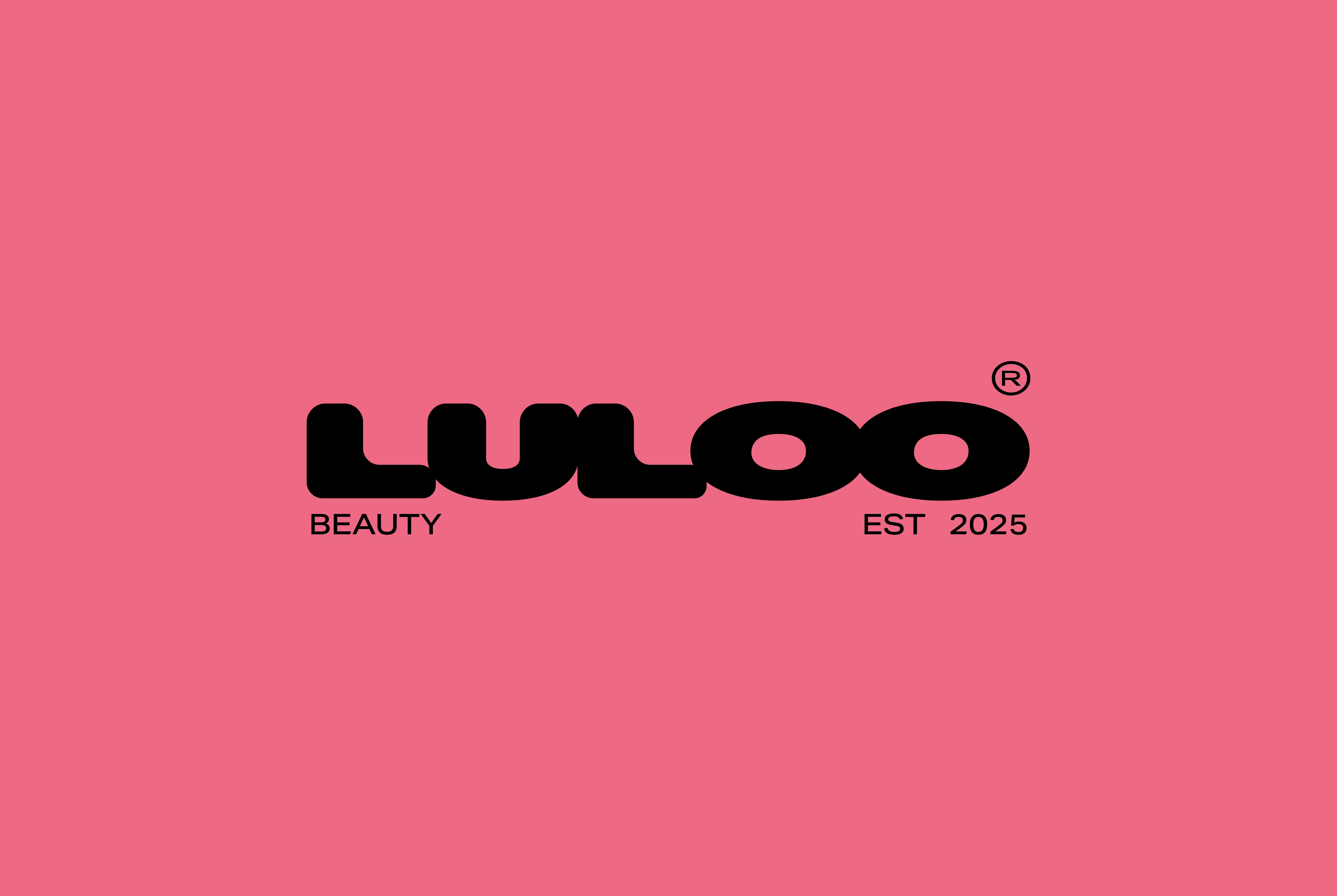
I created a flexible brand identity system that reinterprets the visual language of natural cosmetics rather than replacing it. Expressive typography, vibrant colors, dynamic compositions, and inflated floral graphics bring energy and personality while maintaining a clear, approachable, and trustworthy identity.
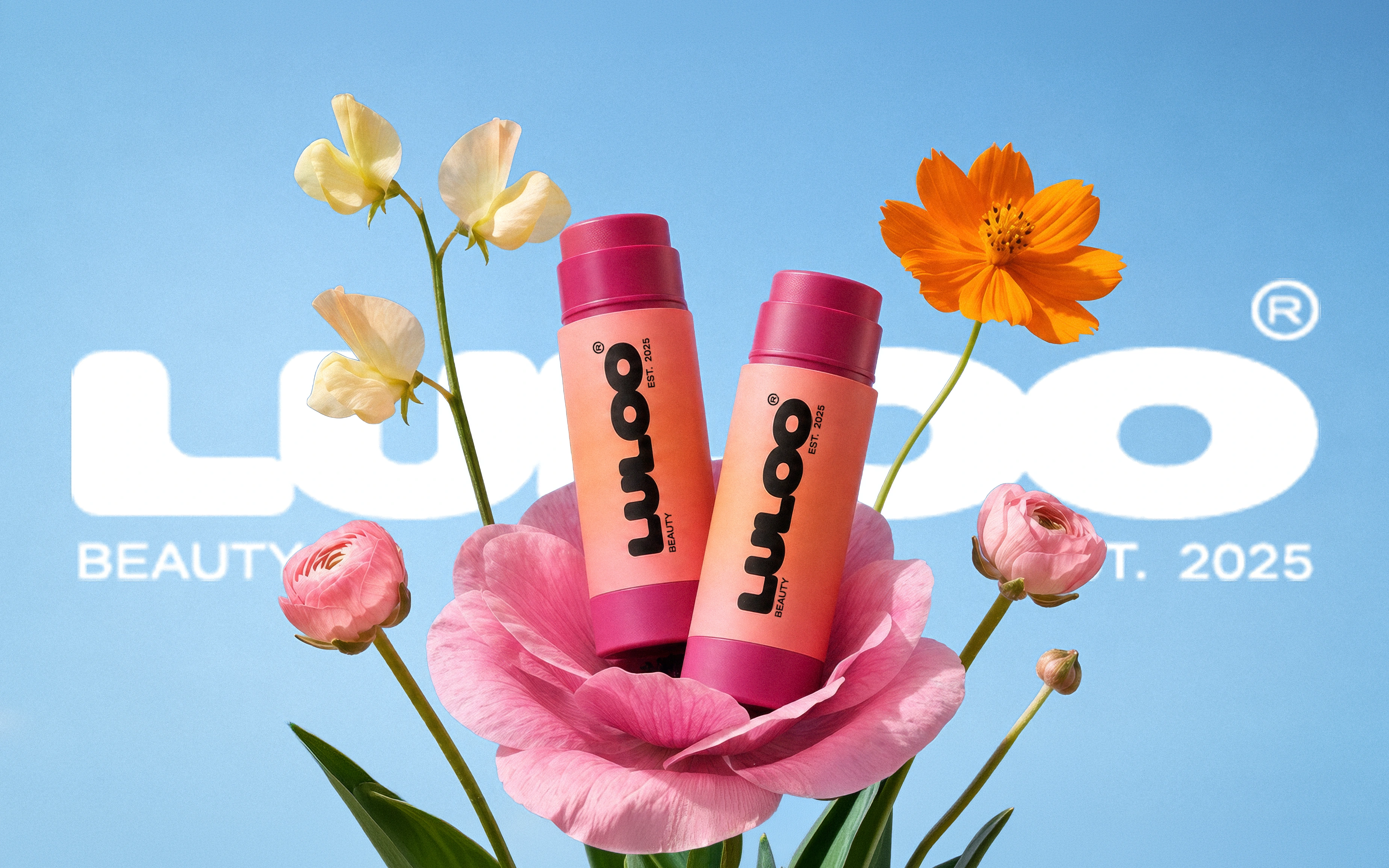
The visual system balances familiarity with expression. Bold typography conveys confidence, vibrant colors increase shelf impact, and inflated floral graphics reinterpret natural ingredients in a playful, contemporary way. Together, these elements create a memorable flexible identity.
Brand Values
Playful: Beauty should feel expressive and enjoyable.
Transparent: Honest ingredients, honest communication.
Approachable: Friendly, confident, and easy to connect with.
Trustworthy: Clear information without unnecessary complexity.
Result
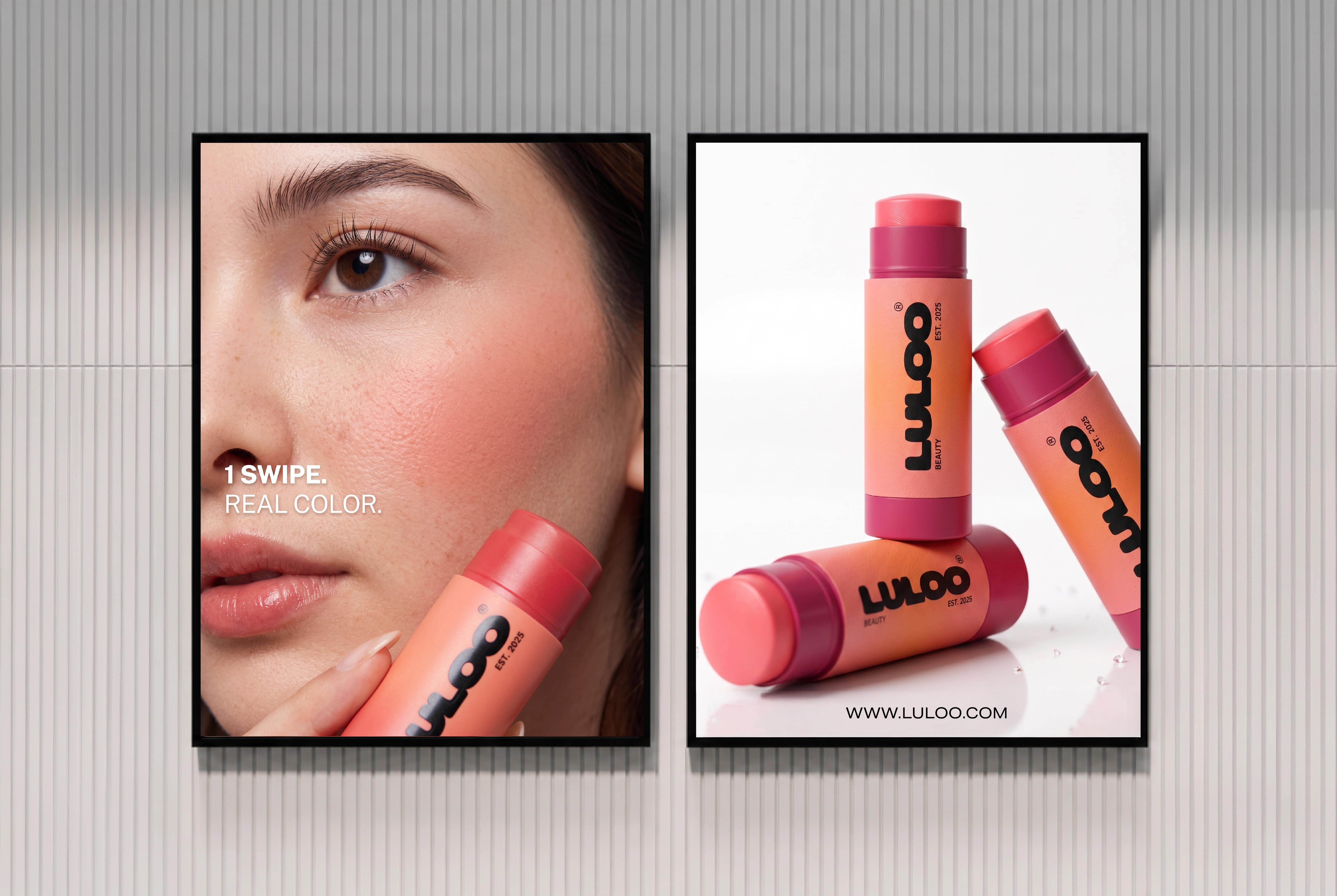
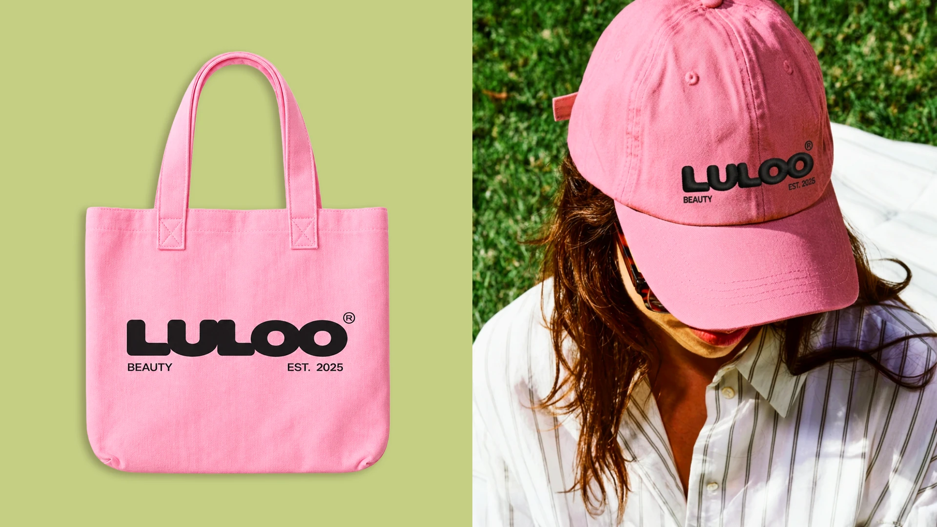
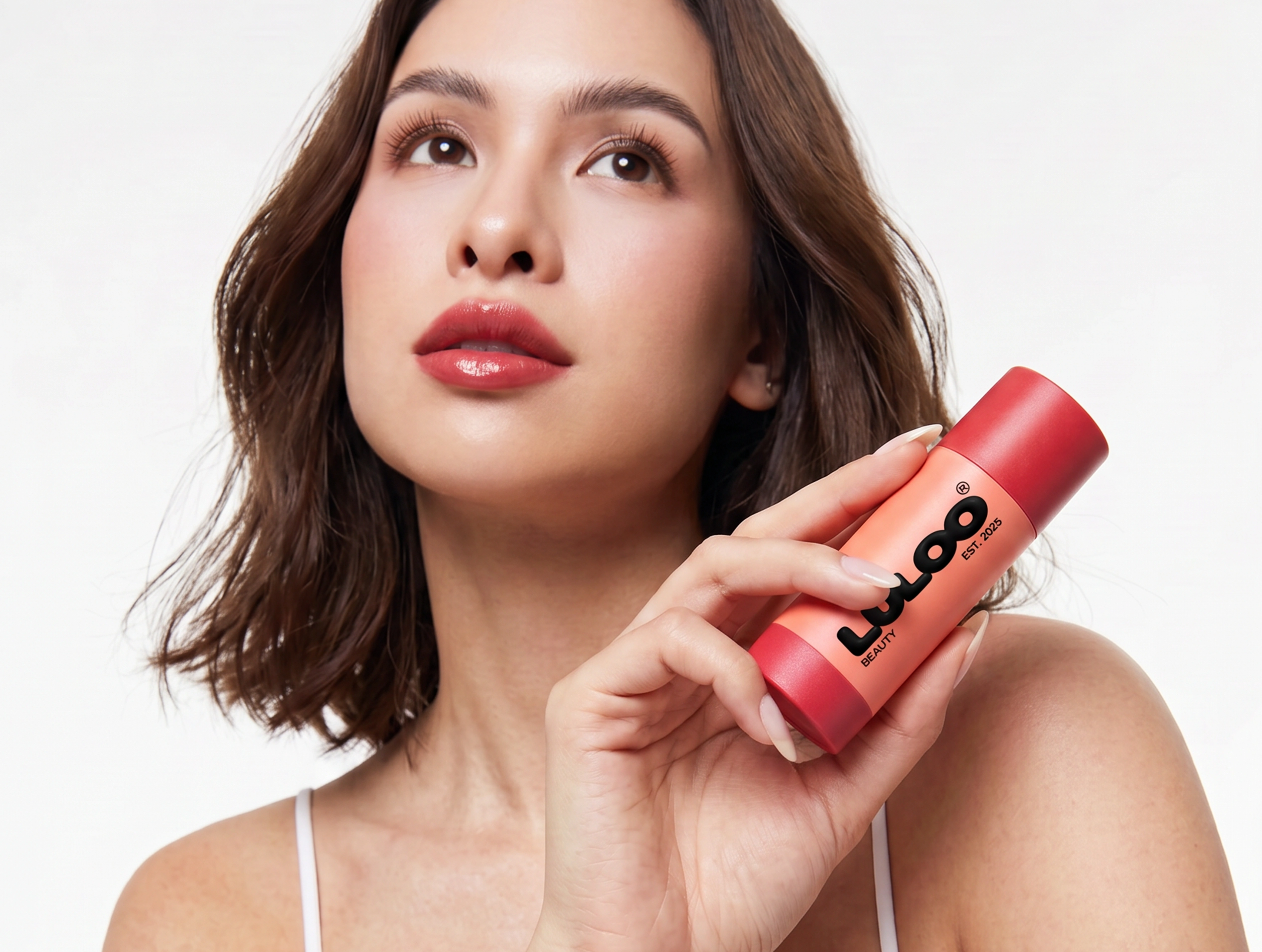
The final identity transforms a conventional natural beauty aesthetic into a more expressive and memorable brand experience. Built as a flexible visual system, it adapts seamlessly across packaging, retail, social media, and future product extensions while maintaining consistency at every touchpoint.
My Role
Brand Designer at Conjunto Studio
Like this project
Posted Aug 4, 2026
LULOO is a natural lip-to-cheek makeup brand balancing bold expression with clarity. I created a confident, contemporary visual identity as Brand Designer.