Runa Simi — Cinematic UI for a Tribeca-Winning Film

Leticia Padilla
1 collaborator


Winner of the Albert Maysles Award for Best New Documentary Director
Official Selection — Tribeca Festival 2025
Overview
Runa Simi is an award-winning Peruvian documentary directed by Augusto Zegarra. It follows Fernando Valencia, a Quechua voice actor and cultural activist from Cusco, as he embarks on an extraordinary mission: convincing The Walt Disney Company to authorize the first official Quechua dubbing of The Lion King.
What begins as one person's dream evolves into a story about cultural identity, language preservation, and the determination to ensure that one of the world's most iconic films can be experienced by future generations in the language of the Andes.
Premiering at Tribeca Festival 2025, the film received the Albert Maysles Award for Best New Documentary Director and has since been officially selected by more than 50 international film festivals, with screenings across 17 countries.
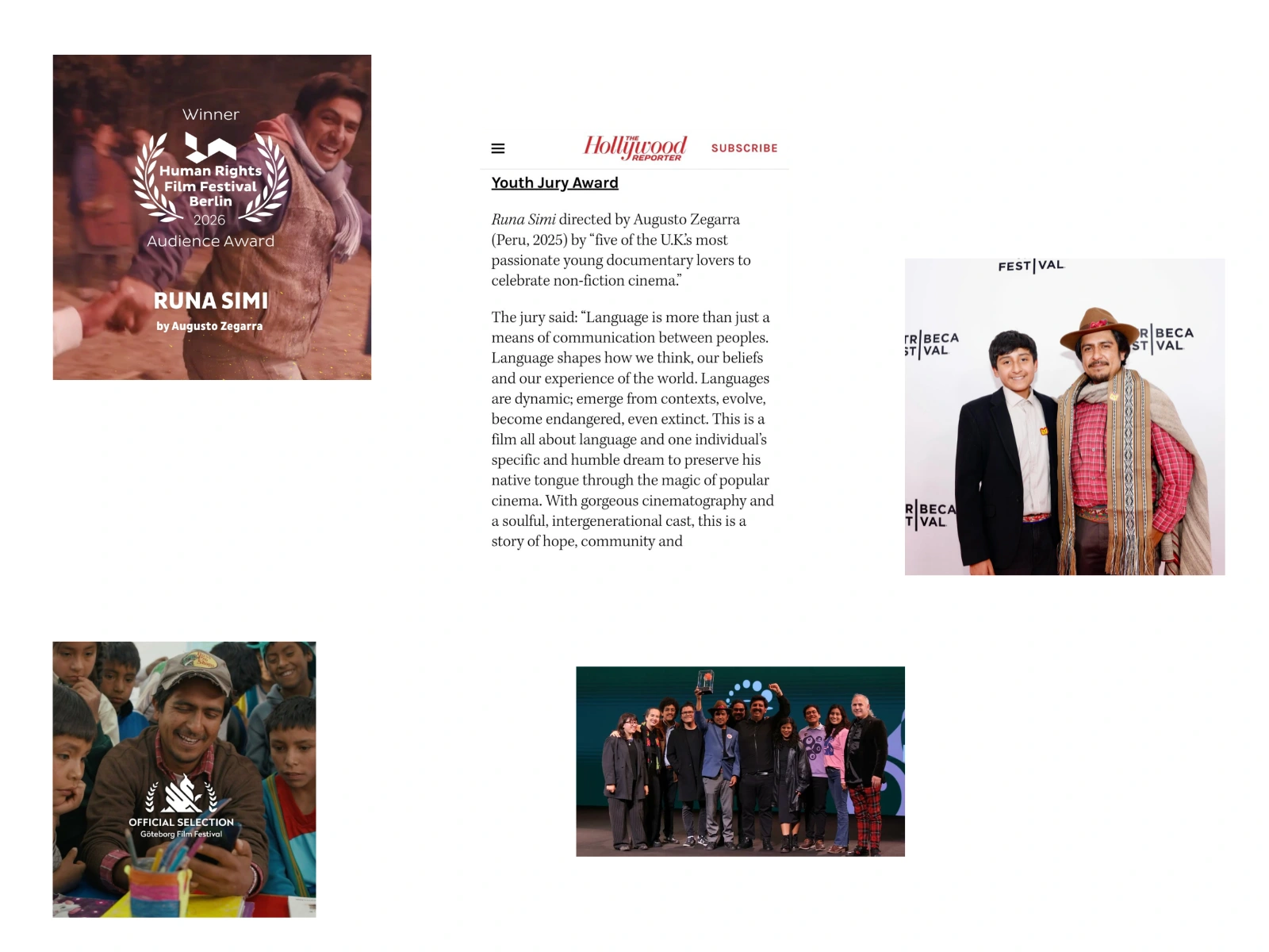
About Tribeca Festival
Founded by Robert De Niro, Jane Rosenthal and Craig Hatkoff in New York, Tribeca Festival is one of the world's leading film festivals, internationally recognized for discovering outstanding independent filmmakers and award-winning documentaries.
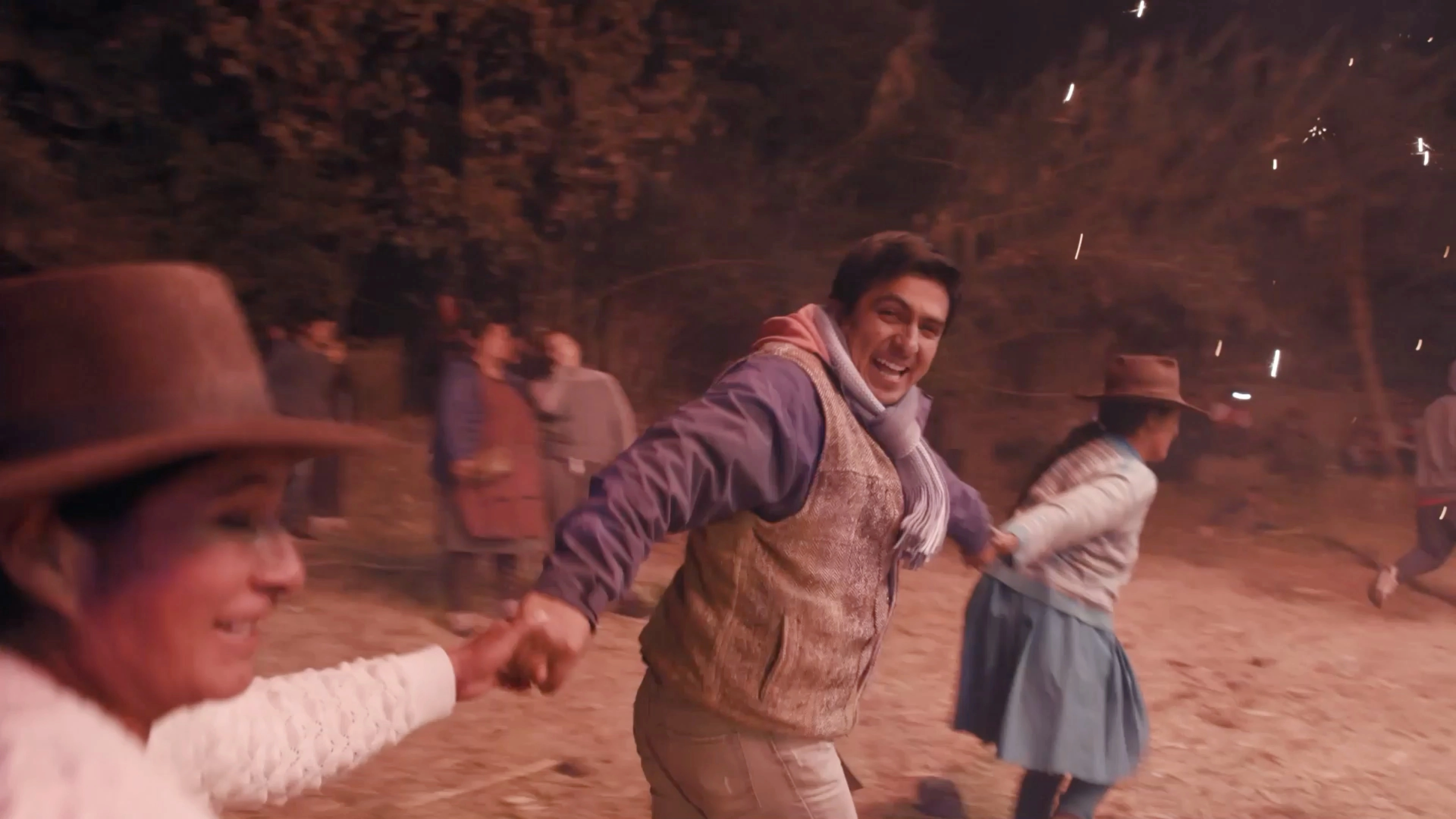
Documentary still
One Message Changed Everything
After every official request to Disney went unanswered, Fernando reached out directly to Rob Minkoff, co-director of The Lion King. That conversation became one of the documentary's defining moments.
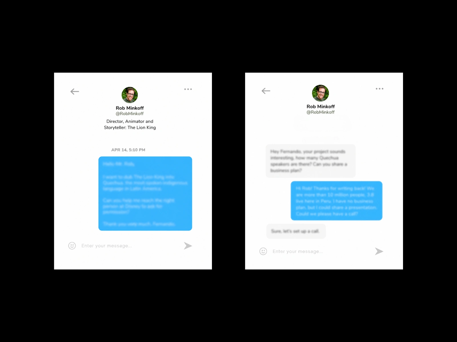
Original conversation screenshots used as reference. Content intentionally blurred while the documentary continues its international festival run.
My Contribution
As Additional Visual Assets Designer at Conjunto Studio, I was responsible for translating the documentary's real social media conversations into cinema-ready, fully editable production assets.
The original screenshots couldn't be used for the big screen. They lacked the resolution, scalability, and editorial flexibility that post-production required. My job was to rebuild every interface from scratch so it could be projected in theaters and individually animated during editing.
Scope:
16 Instagram conversation screenshots recreated (8 in English, 8 in Spanish)
4 Twitter/X posts recreated (2 in English, 2 in Spanish)
Each message bubble exported individually with its corresponding profile photo, giving the editing team full control over timing and animation
3 rounds of revisions with the director
Process:
I researched the actual typefaces used by Instagram and Twitter at the time, matched them as closely as possible, and rebuilt every UI element: message bubbles, timestamps, avatars, read receipts, spacing, and layout. The director also provided visual references to modernize certain elements, so the final assets weren't just replicas but refined versions designed to read clearly at cinema scale.
All files were delivered organized and production-ready in Figma, Illustrator, and Photoshop.
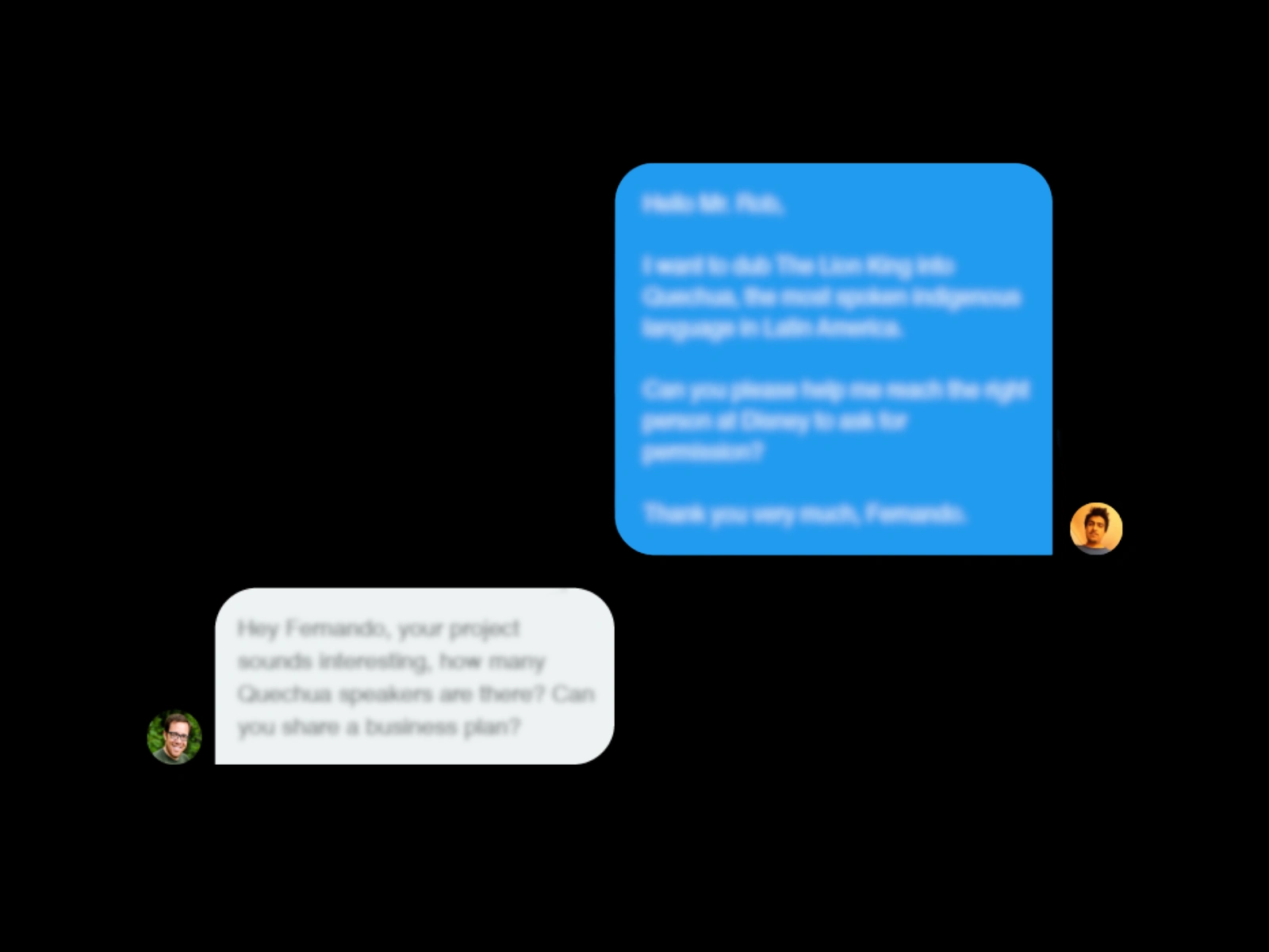
Selection of the reconstructed conversation interfaces used in the documentary. This is a small sample of a larger set of production assets, rebuilt from the original screenshots as fully editable, high-resolution files for post-production and large-format film projection.
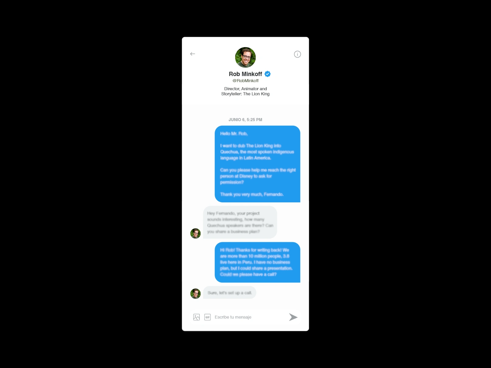
Each interface was delivered as separate editable UI components rather than flattened screenshots, giving the post-production team complete flexibility for animation, timing, and cinematic composition.
Poster Creative Process
Our team at Conjunto Studio worked directly with the director to develop the visual concept for the official poster. Through collaborative sessions, we explored ideas, references, and visual directions together.
Once the concept was defined, an external illustrator was brought in to execute the final artwork due to production timelines. The creative direction and final layout were handled by Conjunto Studio's lead.
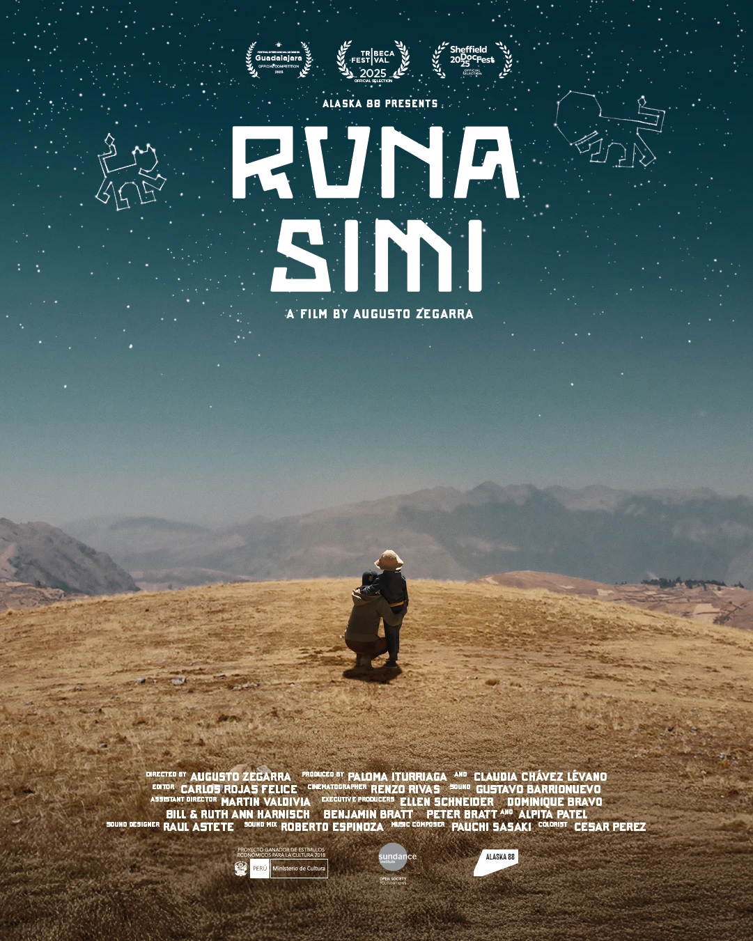
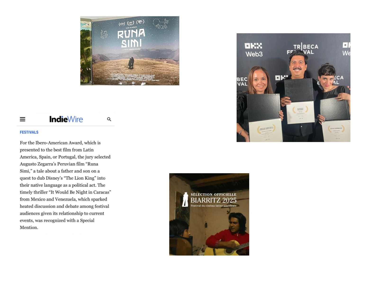
Runa Simi official poster
Credits
Project: Runa Simi (2025)
Film Director: Augusto Zegarra
Official Film Credit: Additional Art Assets (Conjunto Studio, Romanet Silva, Leticia Padilla)
My Contribution: Recreated 20 social media interfaces as fully editable, production-ready assets for film post-production and large-format projection.
Like this project
Posted Jun 28, 2026
Recreated cinematic UI and social media interfaces for the award-winning documentary Runa Simi, winner of the Albert Maysles Award at Tribeca Festival 2025.
Likes
2
Views
46
Clients
Conjunto Studio
Collaborators