El Postre Imposible — Broadcast TV Brand Identity
Leticia Padilla
The Context
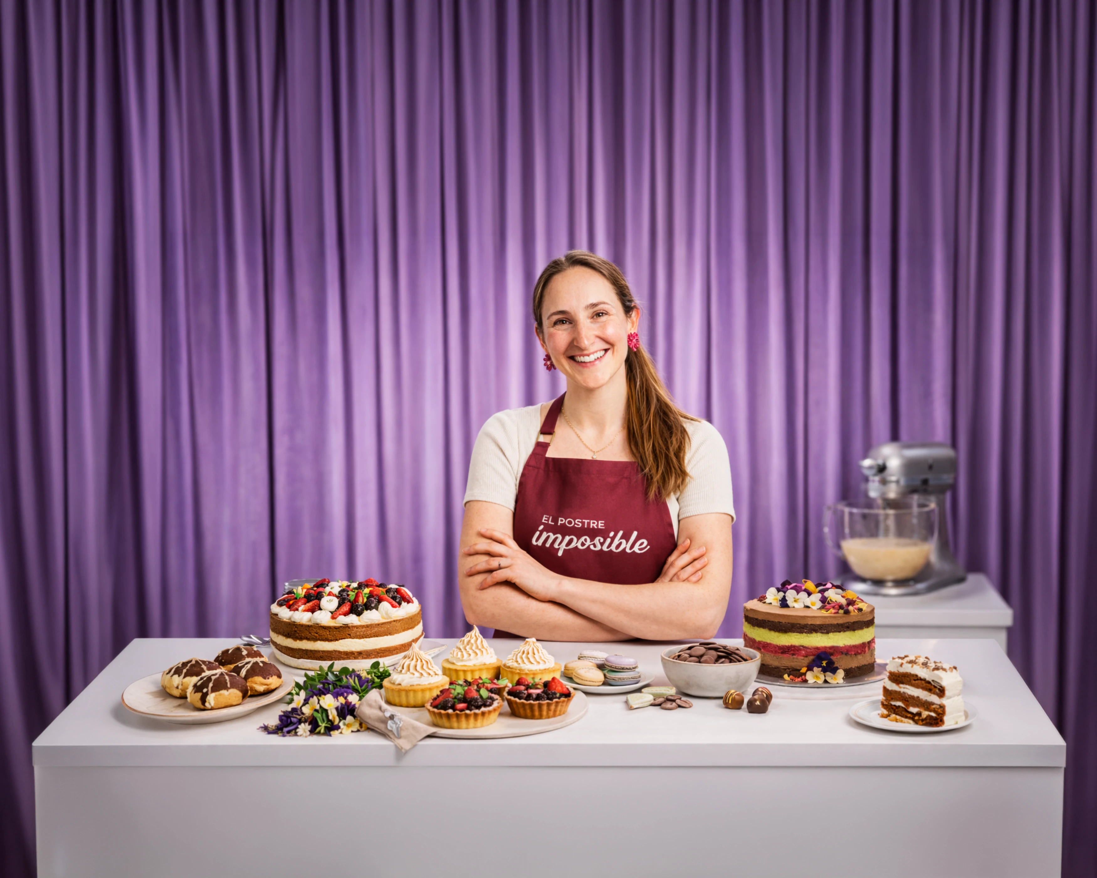
El Postre Imposible is a 24-minute broadcast television series that explores the gap between the flawless desserts people discover online and the reality of recreating them at home. Rather than celebrating perfection, the show embraces experimentation, mistakes, and the creative process behind every recipe.
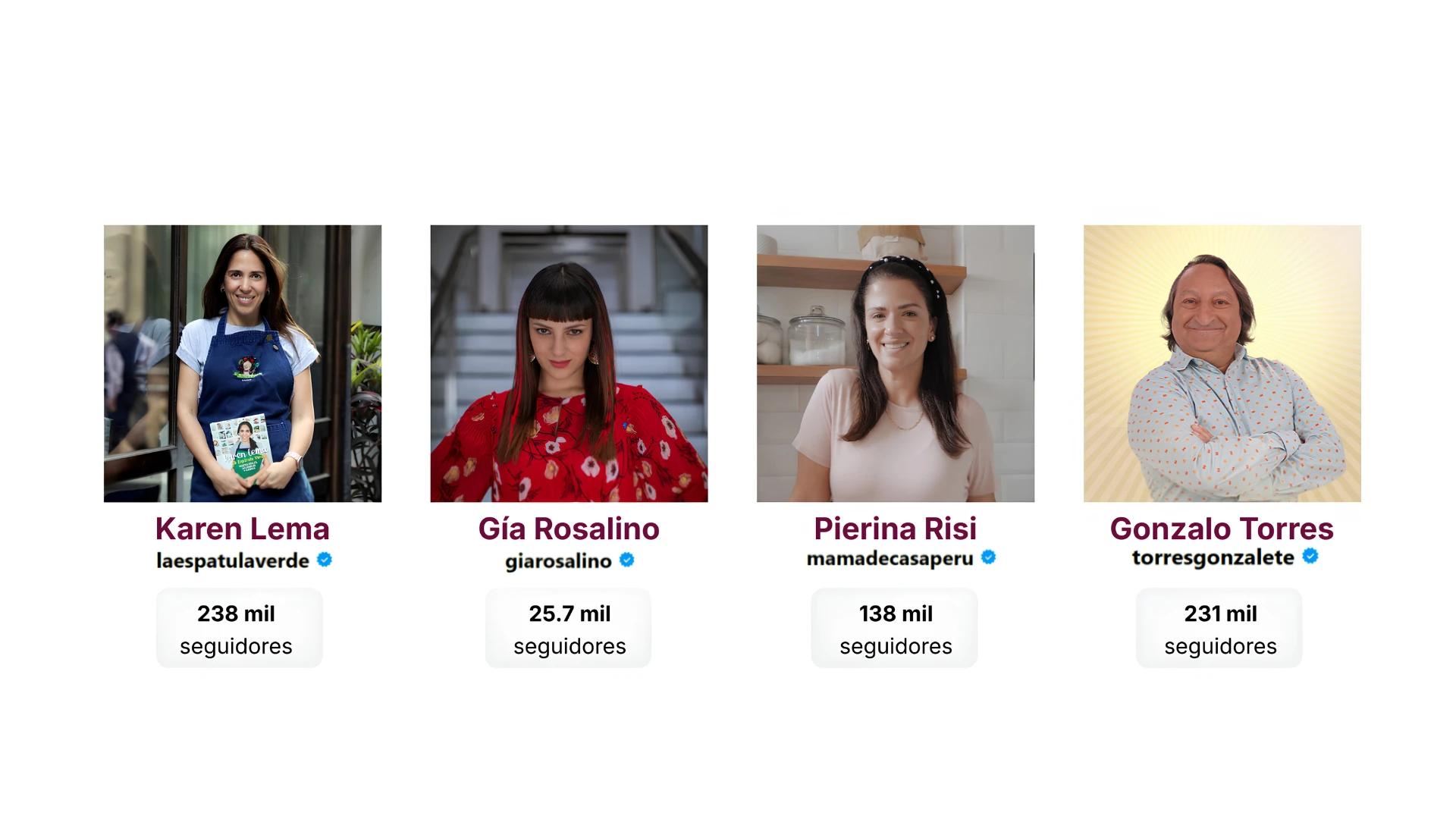
Hosted by Di Paola, a self-taught pastry enthusiast who trained in Piemonte, Italy, each episode reimagines two viral dessert recipes from social media alongside guest personalities from television and digital media. Featured guests include food creators Karen Lema and Gia Rosalino, content creator Pierina Risi, and Gonzalo Torres, one of Peru's most recognized television personalities and a lead actor in the iconic comedy series Pataclaun.
Bringing together established television personalities and digital creators, the guest lineup reinforced the show's central idea: connecting internet culture with traditional broadcast entertainment.
Brand Identity
The identity was developed around the central idea behind the show: bringing together two seemingly opposite worlds—the warmth of handcrafted baking and the contemporary visual language of social media. Rather than treating them as contrasting concepts, the system allows both to coexist within a single visual language.
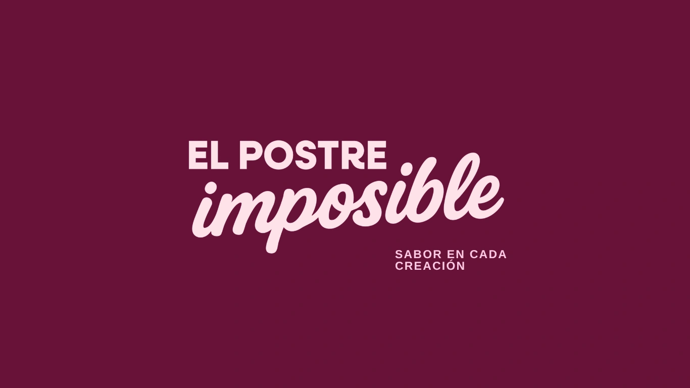
This idea begins with the logotype itself. A bold geometric sans serif introduces clarity and a contemporary digital character, while the handwritten script reflects the spontaneity, warmth, and imperfections of homemade baking. Together, both typographic voices create an identity that feels approachable, expressive, and instantly recognizable across every touchpoint.
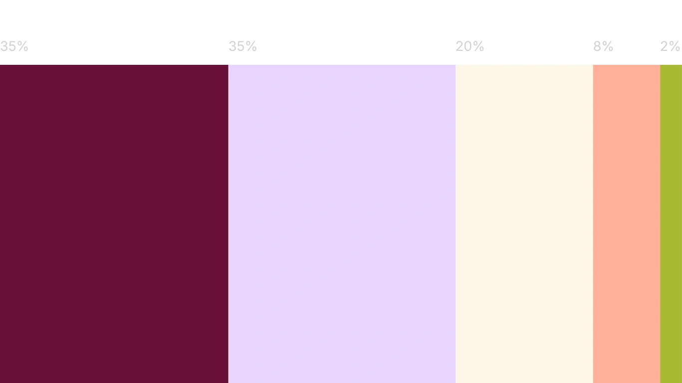
Color Palette
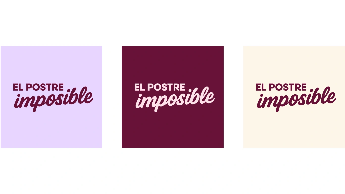
The palette reflects the meeting point between handcrafted baking and digital culture. Soft lavender introduces a contemporary character inspired by today's visual platforms, while deep burgundy grounds the identity with warmth and personality.
Muted salmon adds a human touch, warm beige softens the compositions, and vibrant green appears as a subtle accent inspired by fresh ingredients.
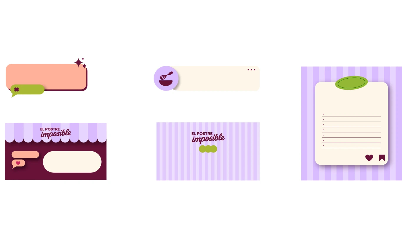
ON-AIR GRAPHICS
The broadcast graphics were conceived as a unified system rather than a collection of individual assets. Every component—from lower thirds and recipe cards to sponsor segments, ingredient lists, and end credits—shares the same visual principles, allowing the identity to remain recognizable while adapting naturally to the different moments of the show.
YouTube Thumbnails
Designed as an extension of the broadcast identity, the thumbnail system balances consistency with variation. A shared visual framework allows every episode to feel part of the same series while expressive headlines, photography, and graphic accents give each release its own distinct character.
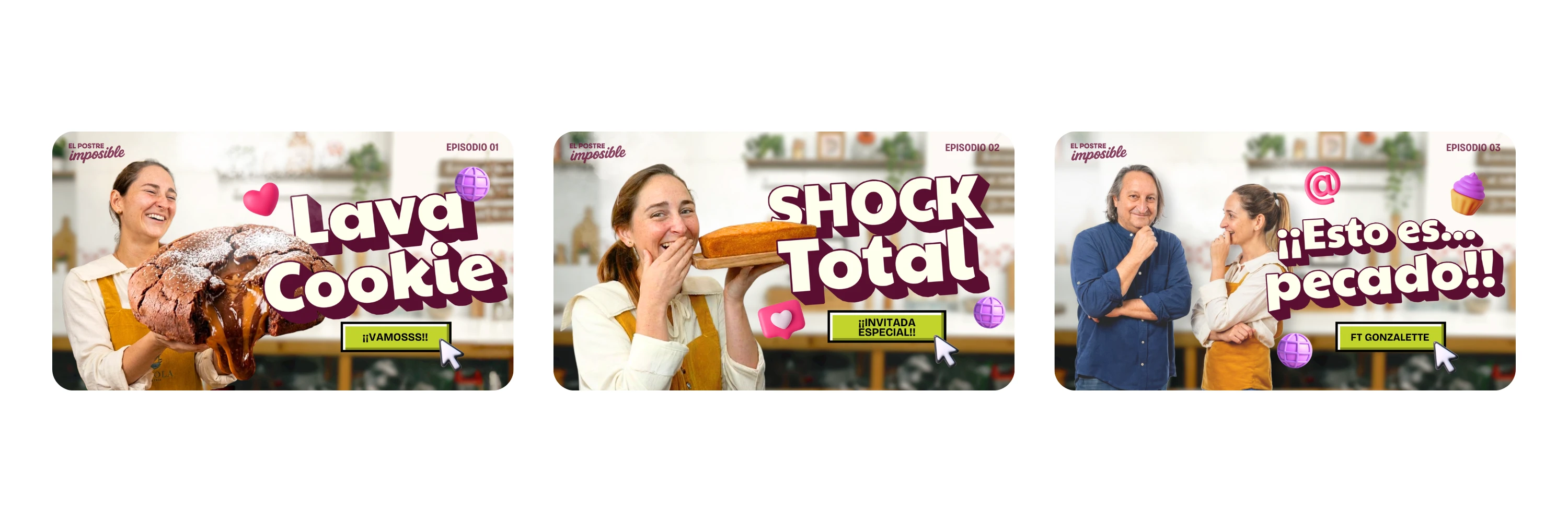
Applied across every episode, the system established a recognizable presence on YouTube from the show's first release.
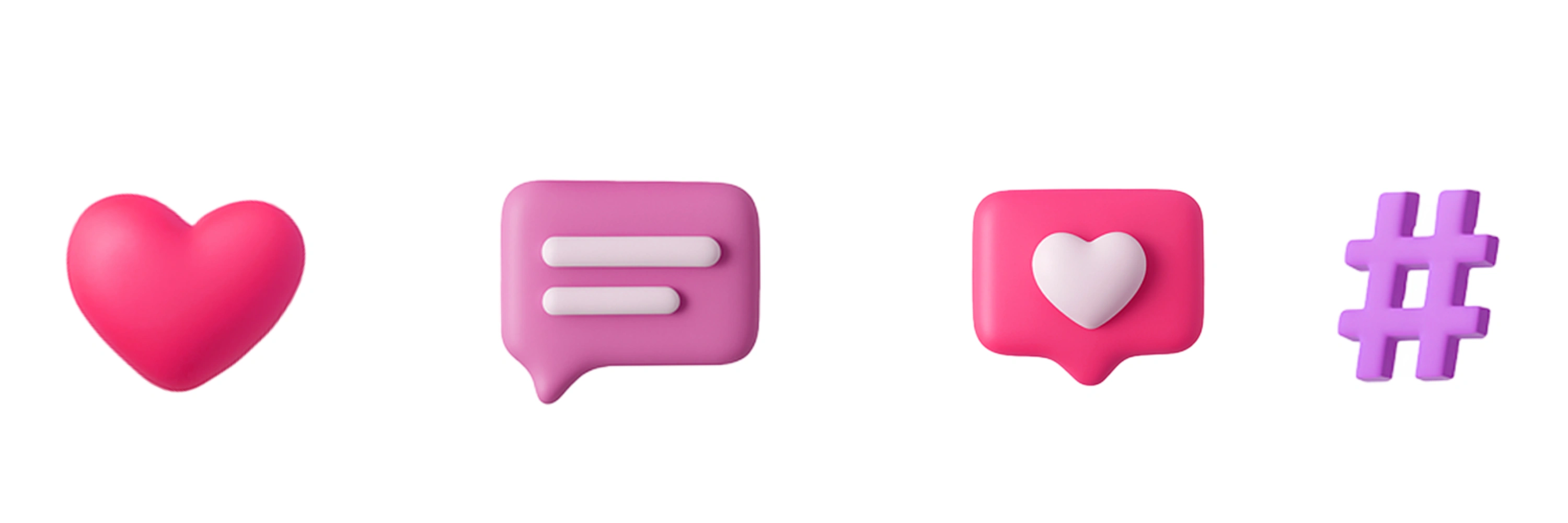
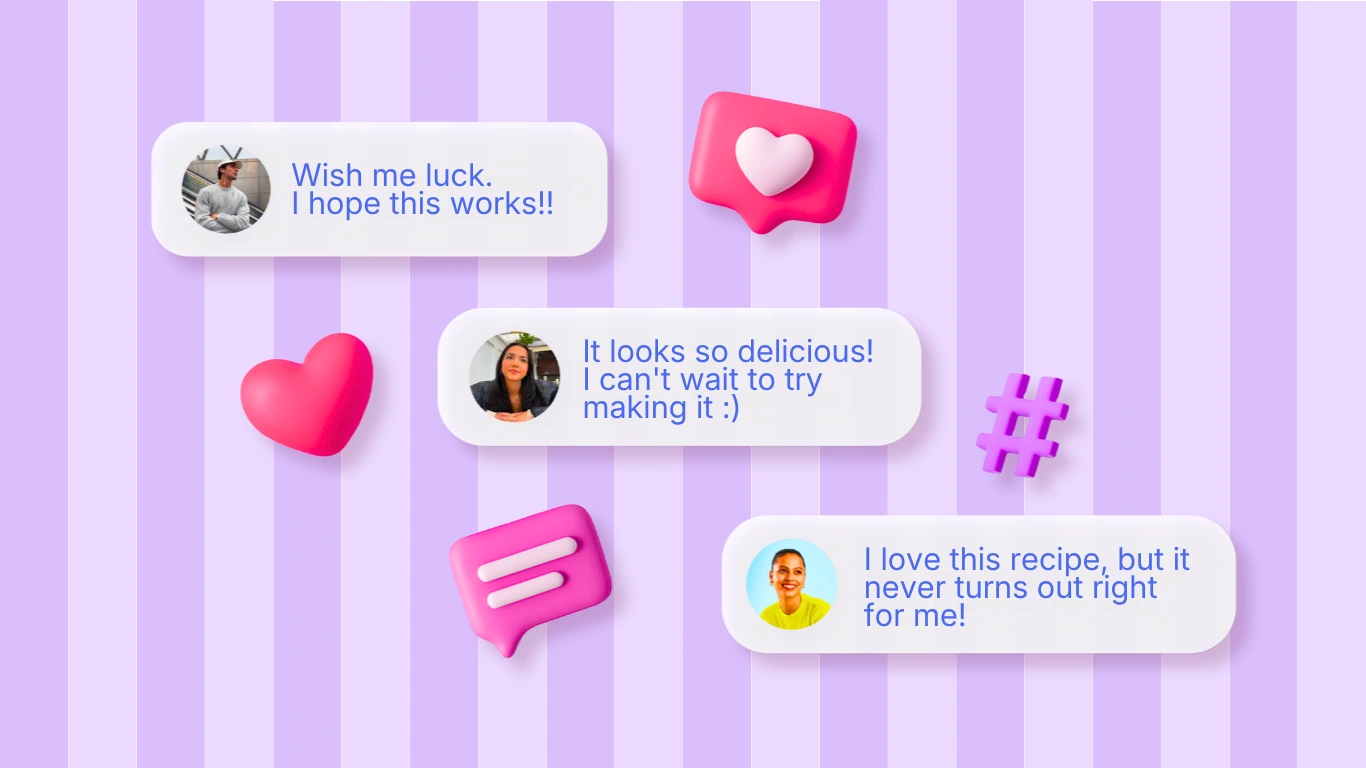
Social Media Launch
Beyond broadcast, the identity expanded into a social-first launch campaign designed to build anticipation ahead of the premiere. From announcement posts and countdowns to animated stories, every asset followed the same visual language, creating a consistent experience across television and digital platforms.
Selected animated stories created for the program's launch campaign
As part of the launch campaign, I explored an AI-assisted workflow to create seasonal social content inspired by internet culture. The concept began with a custom-generated still image, which I refined before transforming it into an animated promotional story. The result combined emerging creative tools with the program's established visual identity, creating content that felt native to social media while remaining unmistakably on brand.
AI-assisted concept development, from generated still image to animated social story.
AI-Assisted Character Animation
The visual identity expanded beyond static graphics through a series of AI-assisted promotional animations. Inspired by the handcrafted quality of needle felting, the characters were designed to echo the warmth and authenticity of homemade baking while introducing a playful, memorable way to announce upcoming guests.
Each piece began with custom-generated imagery, refined through art direction and post-production before being animated for social media. The result was a distinctive promotional series that extended the brand's personality beyond broadcast.
Selected promotional animation featuring the host and guest, created for the show's social media campaign.
My Role
I led the visual identity of the program from concept to launch, developing a cohesive system that extended across broadcast television, digital platforms, and commercial communications.
Scope
Brand Identity
Logo design
Color palette, typography, and brand guidelines
Art direction and visual language
Broadcast Graphics
Complete on-air graphics system
Mystery Box sponsor integration
Animation-ready assets for post-production
Digital
YouTube visual system and episode thumbnails
Social media launch campaign
AI-assisted promotional animations
Commercial & Sponsorship
Sponsor pitch deck
Marketing assets for branded integrations and launch communications
The Result
Premiering on Movistar Plus on December 12, 2025, Season 1 reached an estimated cumulative audience of 421K viewers across eight episodes.
The identity was successfully implemented across broadcast television, YouTube, social media, and sponsor communications, creating a consistent brand experience from launch through the first season.
Like this project
Posted Jun 29, 2026
Developed the complete visual identity for a nationally broadcast TV series, creating a cohesive system across television, digital, and sponsor communications.
Likes
1
Views
7
Timeline
Jul 14, 2025 - Nov 10, 2025
Clients
La Burra