Fimaki — Fintech Brand Identity System
Leticia Padilla
Humanizing financial technology
Financial services are often perceived as distant, overly technical and visually conservative. While these characteristics can communicate stability, they rarely create meaningful emotional connections with people.
As a new brand entering the financial sector, Fimaki sought to challenge that perception by presenting technology as something approachable, transparent and genuinely helpful. The identity needed to communicate confidence without appearing corporate, and innovation without becoming cold or impersonal.
The result had to work as a flexible brand system capable of supporting future growth across both digital and physical environments.
Brand Overview
Brand System
The visual system was developed to position Fimaki as a financial brand that feels approachable, modern and trustworthy without losing its technological character. Rather than following the rigid visual language commonly associated with the industry, the identity introduces a more dynamic and expressive design system that reflects agility, clarity and human connection.
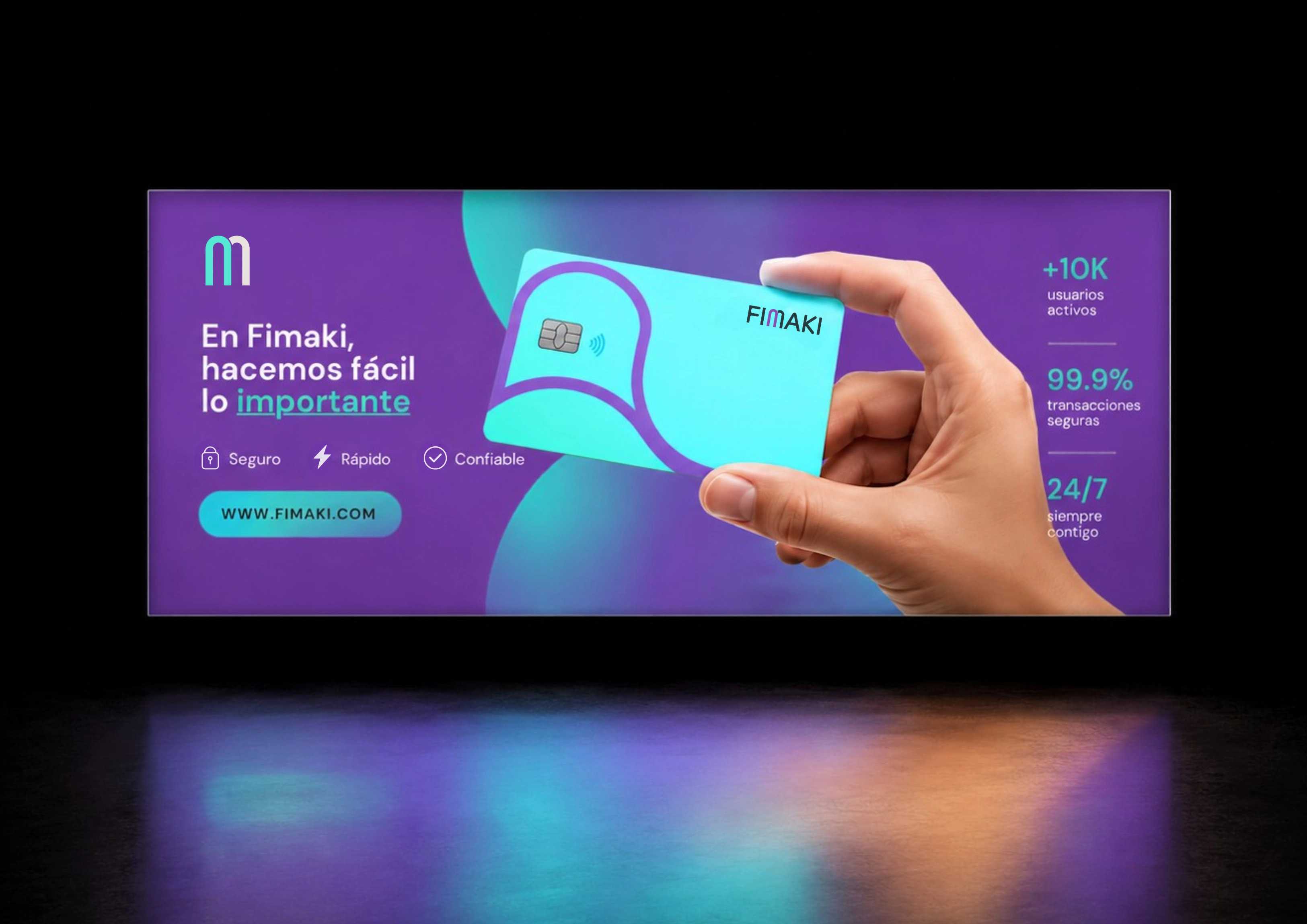
Built around simplified geometric forms, fluid compositions and a contemporary visual language, the system creates movement and rhythm while maintaining a professional and consistent presence across every touchpoint. Designed to scale seamlessly across digital and physical applications, the identity provides Fimaki with a flexible foundation capable of supporting the brand as it continues to grow.
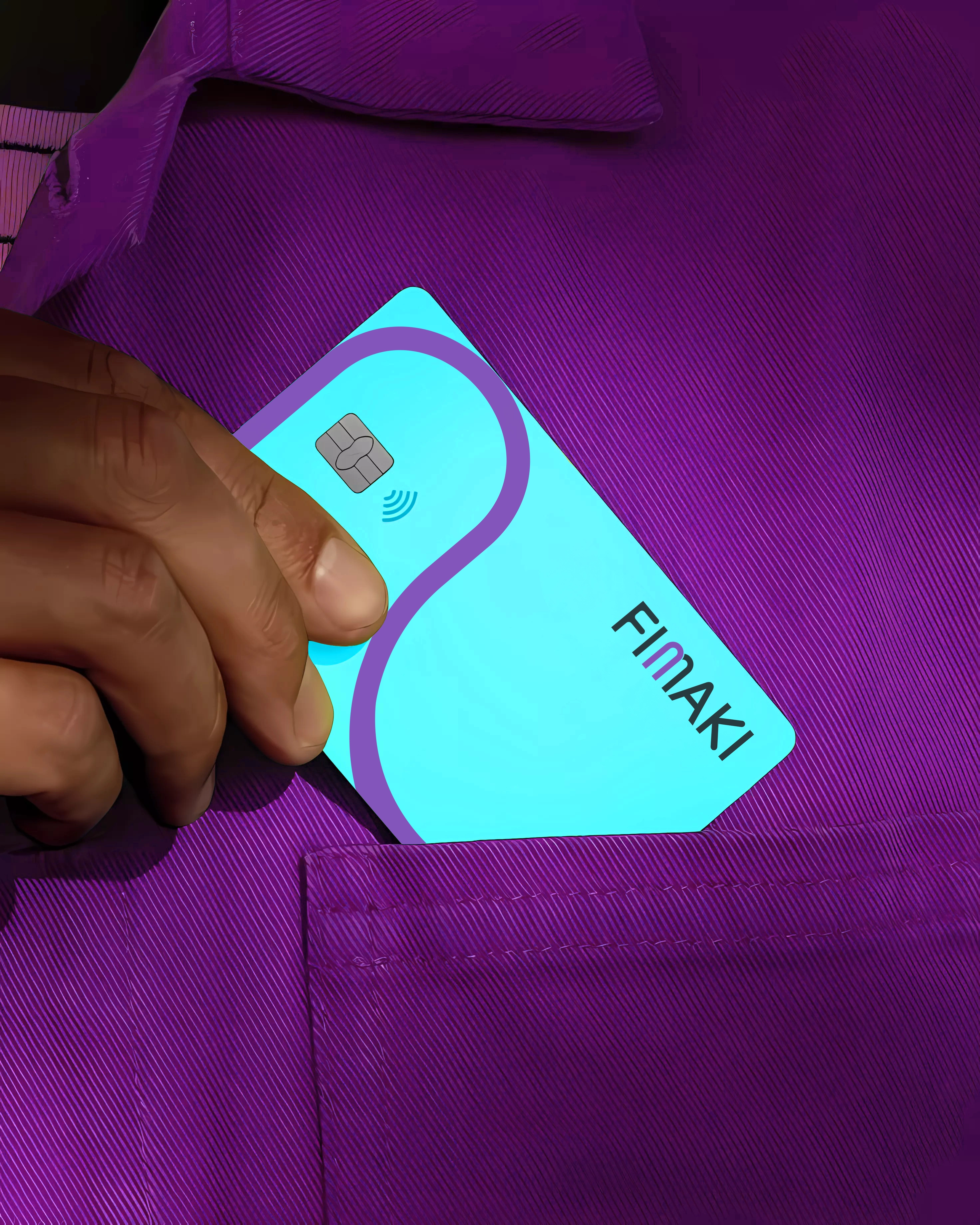
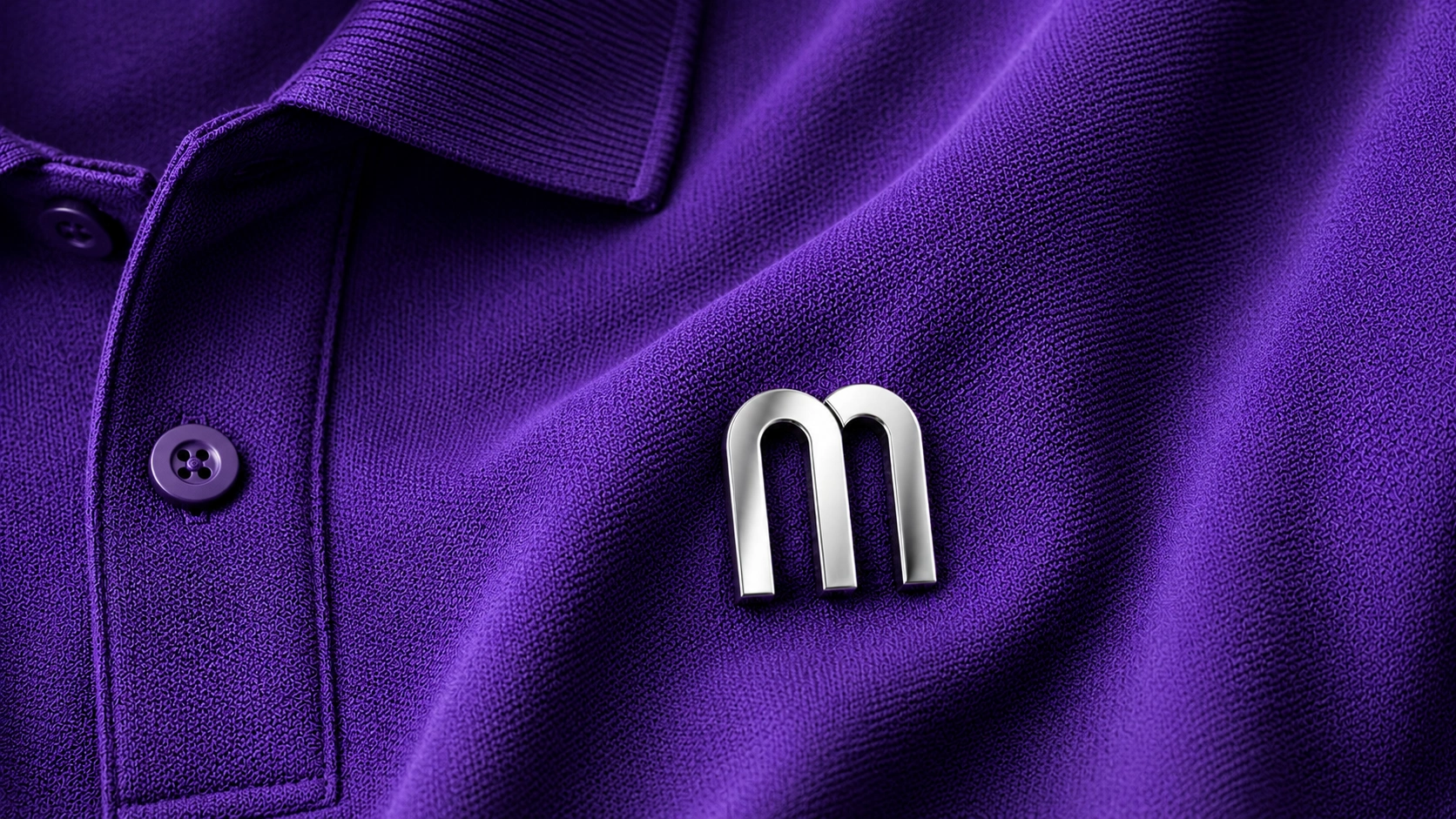
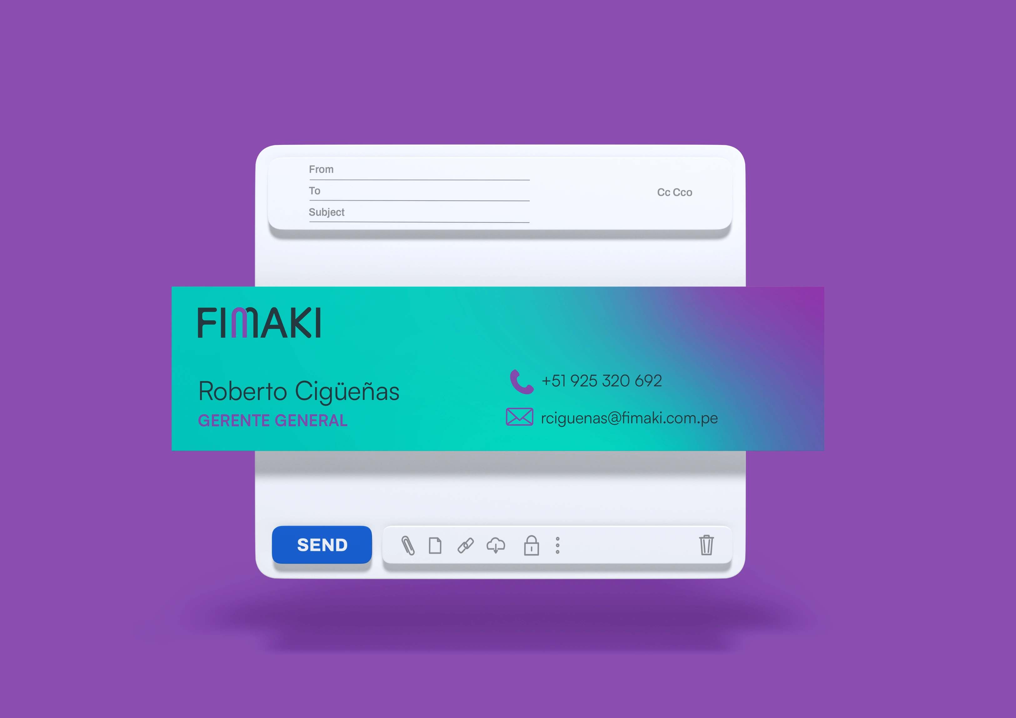
The identity extends across digital and physical touchpoints: stationery, business cards, email signatures, apparel, social media templates, marketing materials and brand guidelines. Every application follows the same visual principles, ensuring consistency as the brand scales.
System Details
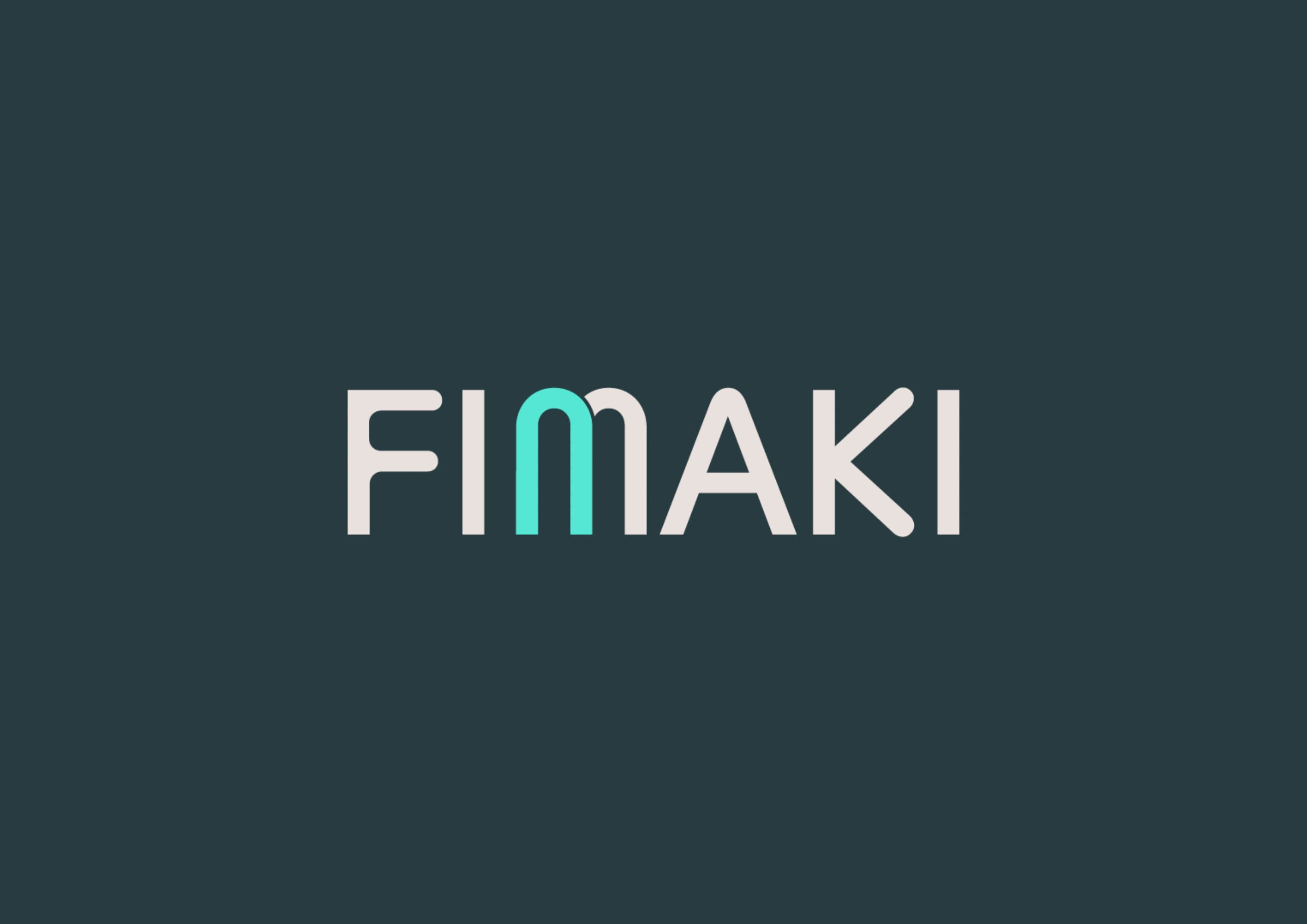
Logo
The primary identity is built around a clean and highly legible wordmark designed to remain distinctive across both digital and physical touchpoints. Its simplified construction ensures clarity at different sizes while providing a modern and recognizable presence.
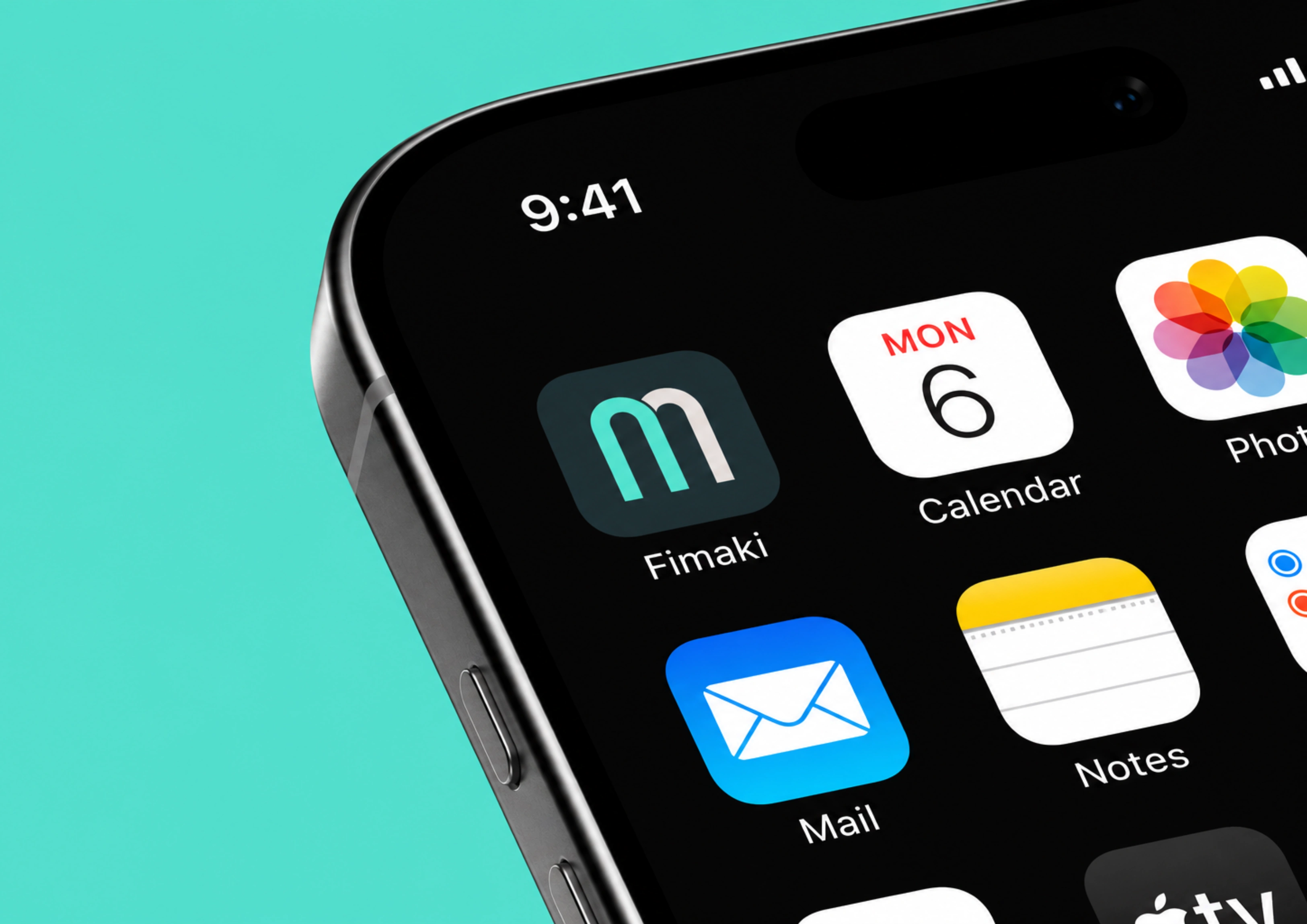
To complement the primary logo, a secondary monogram derived from the letter M was developed for compact applications where space is limited. Used across app icons, social media avatars and other small-scale touchpoints, it preserves brand recognition while maintaining consistency throughout the visual system.
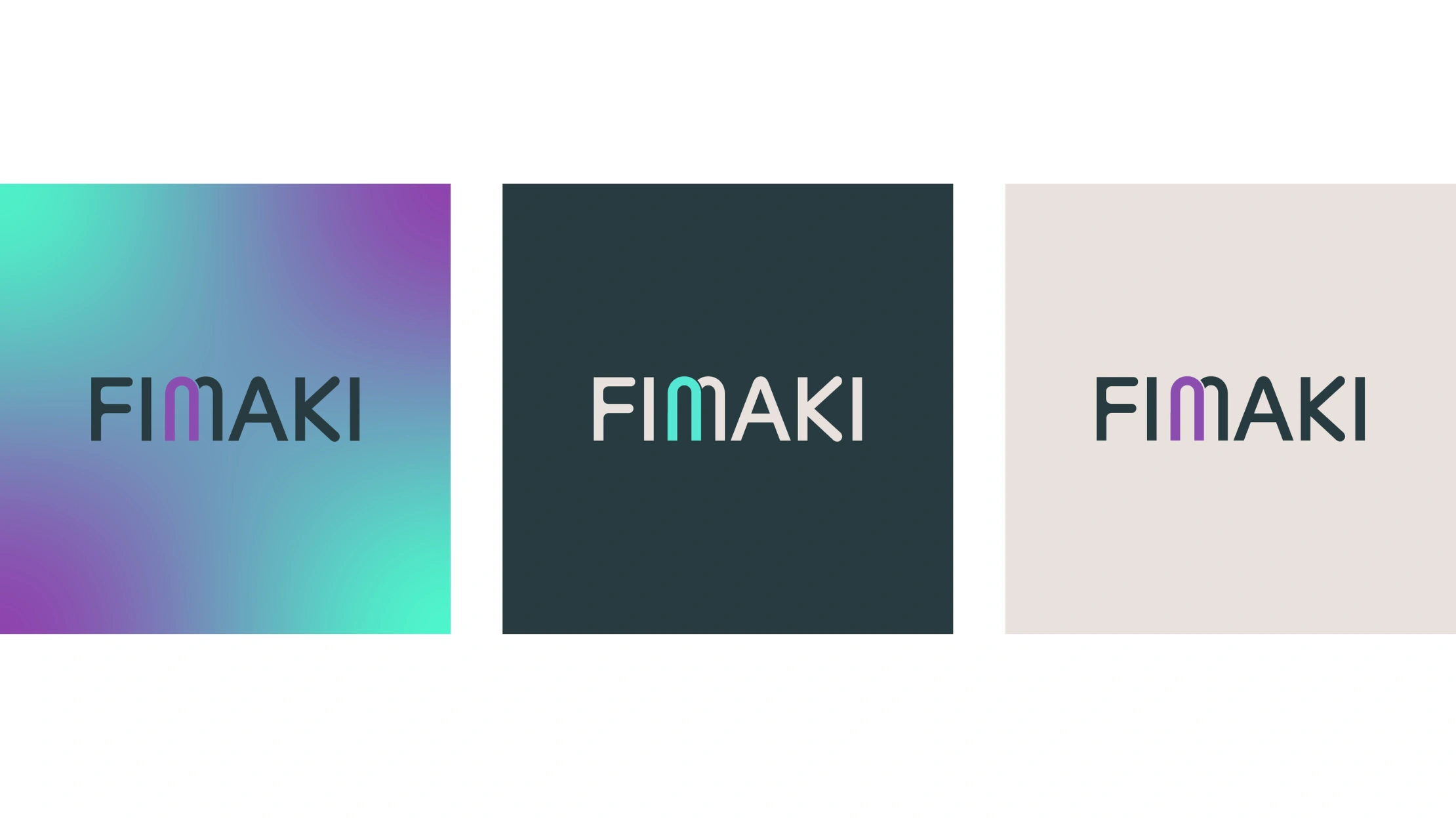
Color
The color palette was developed through a competitive landscape analysis, where corporate blue was found to dominate the financial sector. Rather than following this established visual convention, the identity adopts a more distinctive palette that still feels appropriate for financial services while creating stronger brand differentiation.
Turquoise introduces freshness and accessibility, purple reinforces innovation, while warm neutrals and deep blue provide the balance, stability and trust expected from a financial brand. Together, these colors create a visual language that feels contemporary and dynamic without compromising professionalism.

Social Media
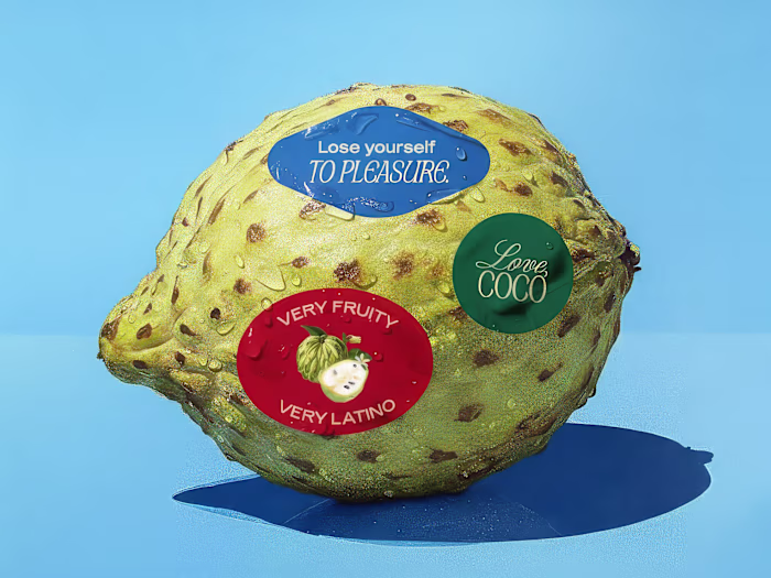
To strengthen the brand's digital presence, the social media system combines close-up photography, dynamic geometric compositions and vibrant gradients into a flexible content framework. The result is a modern and consistent visual language that reinforces recognition while allowing a wide variety of content to coexist within the same identity.
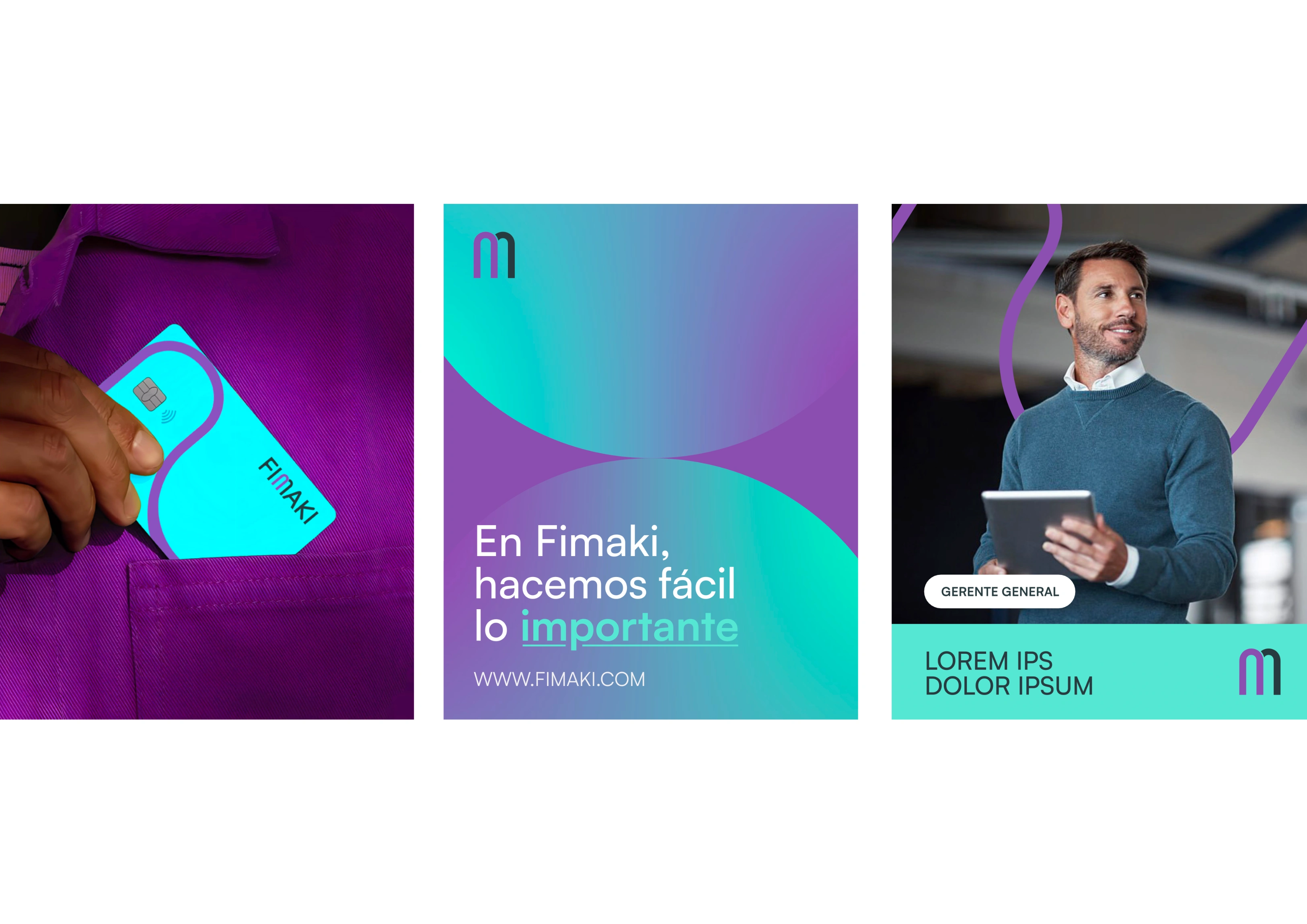
Selected examples from the complete social media system
Brand Applications
Secondary Mark
Applications
Scope
The final identity combines simplicity with flexibility through a scalable visual system:
Brand design
Custom wordmark
Secondary monogram
Color system
Typographic system
Modular layout system
Social media system
Brand applications
Brand guidelines
Landing page design
Credits
Developed in collaboration with Conjunto Studio.
Like this project
Posted Jun 29, 2026
Complete visual identity system for a fintech startup, designed for scalability across digital and print platforms.
Likes
1
Views
6
Timeline
May 25, 2025 - Jul 18, 2025
Clients
Fimaki