Brand identity and websites for tech & AI startups


Brand identity and websites for tech & AI startups




Strategic Website Partner for SaaS Startups & B2B Companies

Strategic Website Partner for SaaS Startups & B2B Companies


I’ve spent the last three months building this.
Deframer is finally here.
It started with the same conversation with clients: they wanted to leave Framer but felt stuck, since moving meant rebuilding their sites.
I felt it too. Pricing kept getting harder to justify, and the product experience felt worse.
Our template sales also took a hit after the marketplace and community changes.
Other template creators have been seeing their revenue dip too.
So I built Deframer.
Some exporters just package what the browser loads from your published URL.
Deframer writes a clean Next.js + TypeScript project, following Next.js best practices. Code you can read, maintain and run yourself.
It also optimizes for SEO, AEO and speed.
Paste your Framer URL, verify it’s yours, and convert. Your pages, components, layouts and motion come along.
Three months later, it’s ready for you to try.
https://deframer.co
(https://deframer.co)If you’ve been wanting to move off Framer, I’d love to hear how it works for you.
8
8
562




AI Automation & Business Systems Expert | Make.com, Zapier

AI Automation & Business Systems Expert | Make.com, Zapier





12 years Kajabi Expert + Partner
12 years Kajabi Expert + Partner


Shopify Partner, Framer, Media Buying, Web Dev. & Kajabi
- $1k+
- Earned
- 3x
- Hired
- 5.0
- Rating
- 49
- Followers
Shopify Partner, Framer, Media Buying, Web Dev. & Kajabi



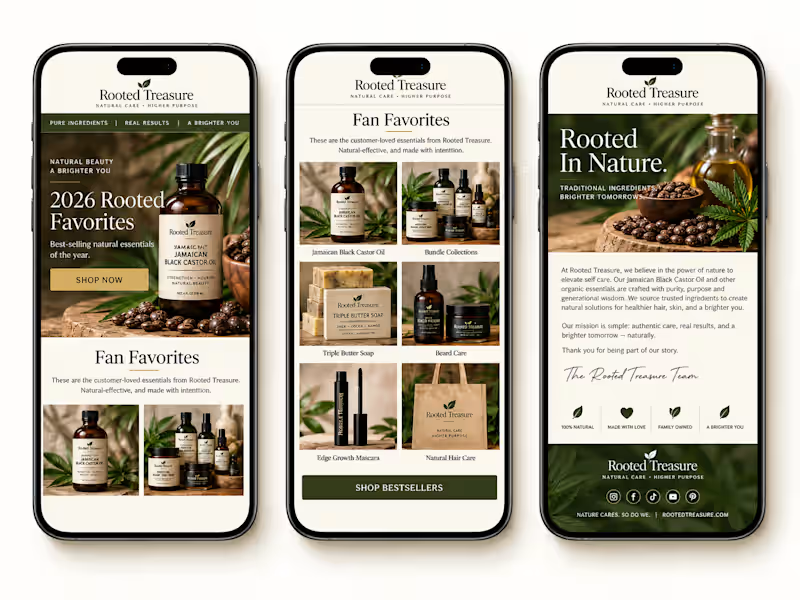
Klaviyo Email Marketing for Ecommerce Brands
- $•••••
- Earned
- 2x
- Hired
- 14
- Followers
Klaviyo Email Marketing for Ecommerce Brands


Would you like something like this for your supplement or fitness brand too?
A clean, high-converting promo design that instantly grabs attention, builds trust, and makes people want to try your products.
Feels like a premium fitness brand ad, but it’s designed strategically to help increase clicks, engagement, and sales.
I can create layouts like this with strong branding, product highlights, discount sections, and persuasive copy that actually connects with customers.
👉 Perfect for supplement brands, gym products, wellness stores, and fitness campaigns.
👉 Helps your products look more professional and trustworthy online.
👉 Makes your brand stand out instead of looking like every other generic fitness page.
👉 And definitely gives customers a stronger reason to stop scrolling and buy.
1
296

Title High-Converting Beauty Email Design for E-commerce Brand (Éclaté)
The Challenge The client needed an email design that looked premium and trustworthy while clearly communicating multiple offers without overwhelming users. The design also had to perform seamlessly on mobile devices, where most users interact with email campaigns.
The existing design lacked structure, had weak call-to-action visibility, and did not effectively guide users toward making a purchase.
The Strategy Rather than focusing only on aesthetics, the approach was centered on performance and usability:
Establish a strong visual hierarchy to guide users from headline to offer to call-to-action
Design for conversion by placing buttons where users naturally engage
Use a mobile-first layout to ensure optimal experience across devices
Present products in a clean and organized way to reduce clutter and increase appeal
Add-to-Cart Section A strategic upsell section was included to increase average order value. Suggested products are paired with pricing and clear call-to-action buttons.
Trust Elements Trust-building components such as clean beauty icons, free shipping, and return guarantees were included to reinforce credibility and reduce purchase hesitation.
Why This Works This design is built for performance, not just appearance. It aligns with user behavior by supporting fast scanning and decision-making. Call-to-action buttons are highly visible and strategically placed throughout the layout.
The modular structure allows the design to be reused and adapted for different campaigns, while the overall layout reflects real buyer psychology.
Expected Results
Improved click-through rate (CTR)
Increased product engagement
Better mobile user experience
Higher conversion rates from email traffic
Tools Used Figma (UI/UX Design)
1
299

Digital Marketing & Development Specialist