PostWealth: Brand Identity for Exited Founders
Portfolio project

Verified paid workView completed work
After the sale, a founder can wake up with time, money, and a question nobody around them is paid to answer. The portfolio can be optimized. The calendar is suddenly empty. PostWealth exists for that moment: a practice and podcast for people who have left a company, and now have to build a life on their own terms.
The public site at postwealth.com puts the job plainly. The work is about purpose, energy, and the problems that show up once money is no longer the hard part. We were hired to give that work a brand identity, something strong enough to carry serious ideas and still feel human.
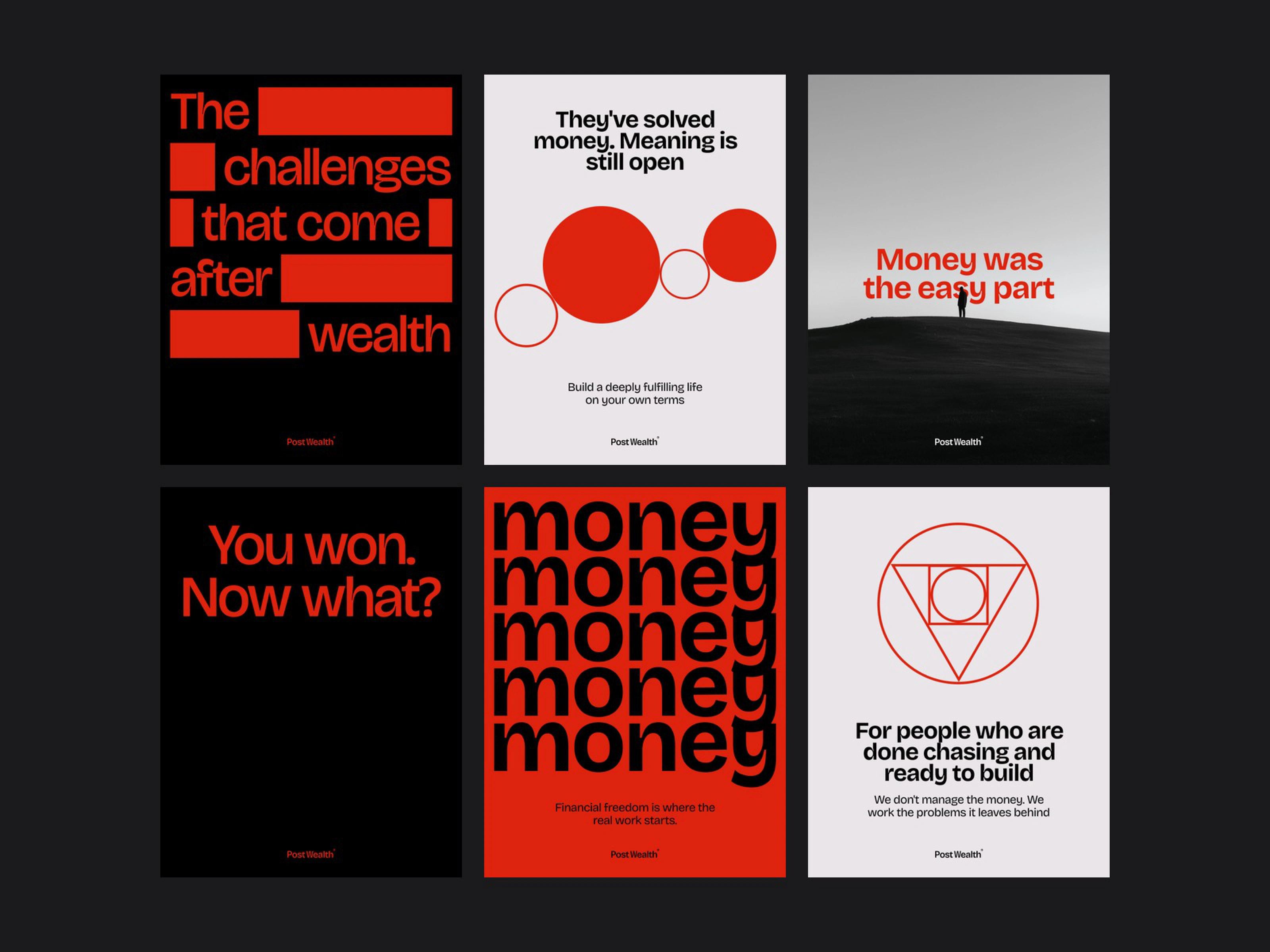
Poster explorations
The first pass, then a clearer system
The first direction had courage and a clear red. It also leaned too hard. Large fields of red and black, tight compositions, and the wordmark type used everywhere started to feel cold, almost like a poster for a cultural magazine. The styling was competing with the content. We kept the red, and we changed what surrounds it. Each part of the system got a clearer role.
Character in the name
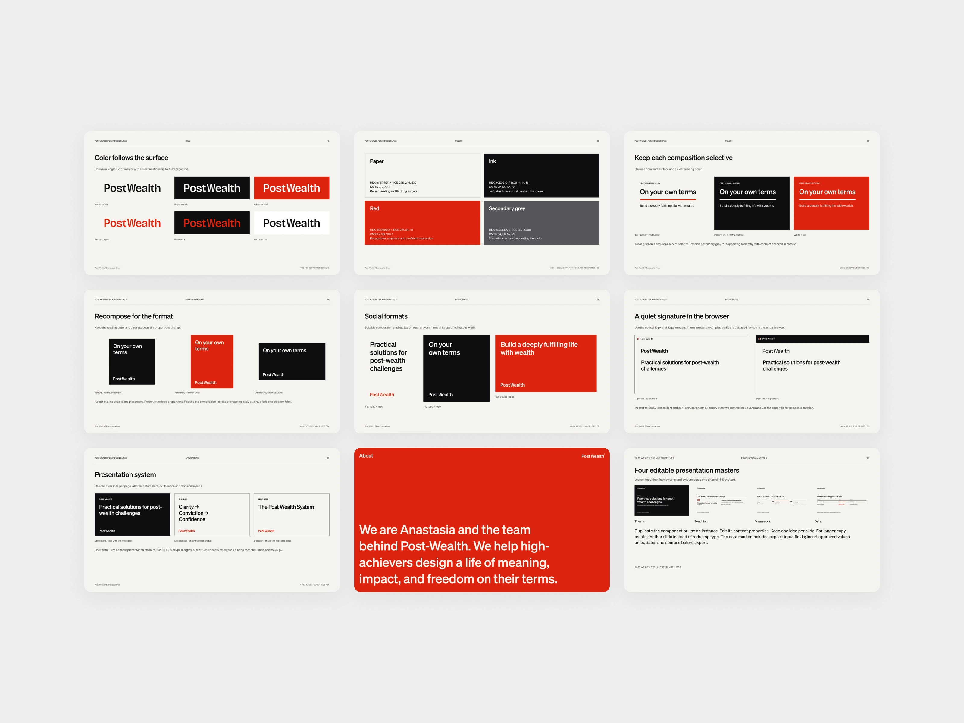
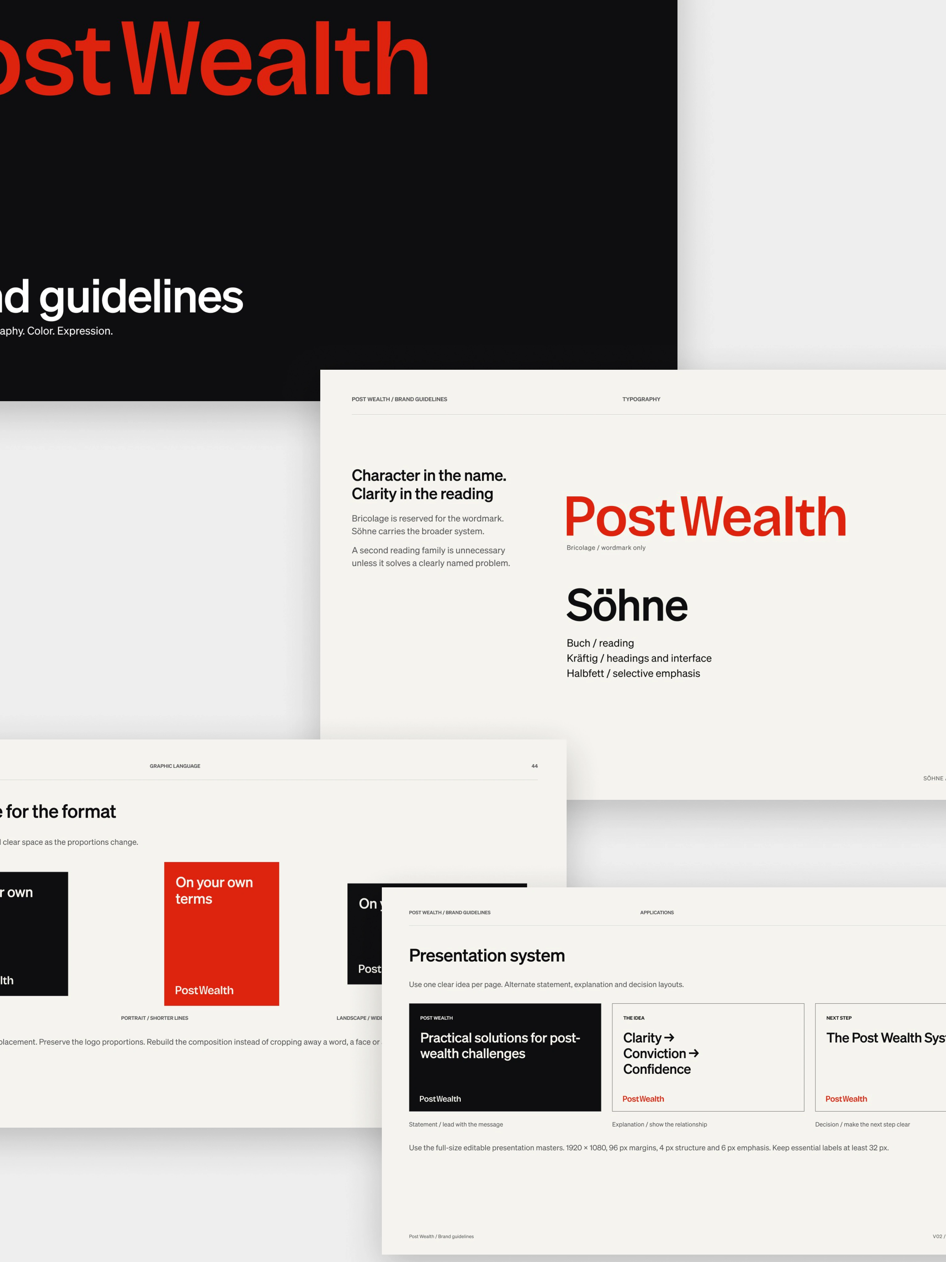
One wordmark, written PostWealth, with no hyphen. Bricolage is reserved for that mark, and the gap between the t and the W is optically tightened. That is where the character lives. Söhne carries everything else: reading, headings, and emphasis. In the guidelines we put it this way: character in the name, clarity in the reading.
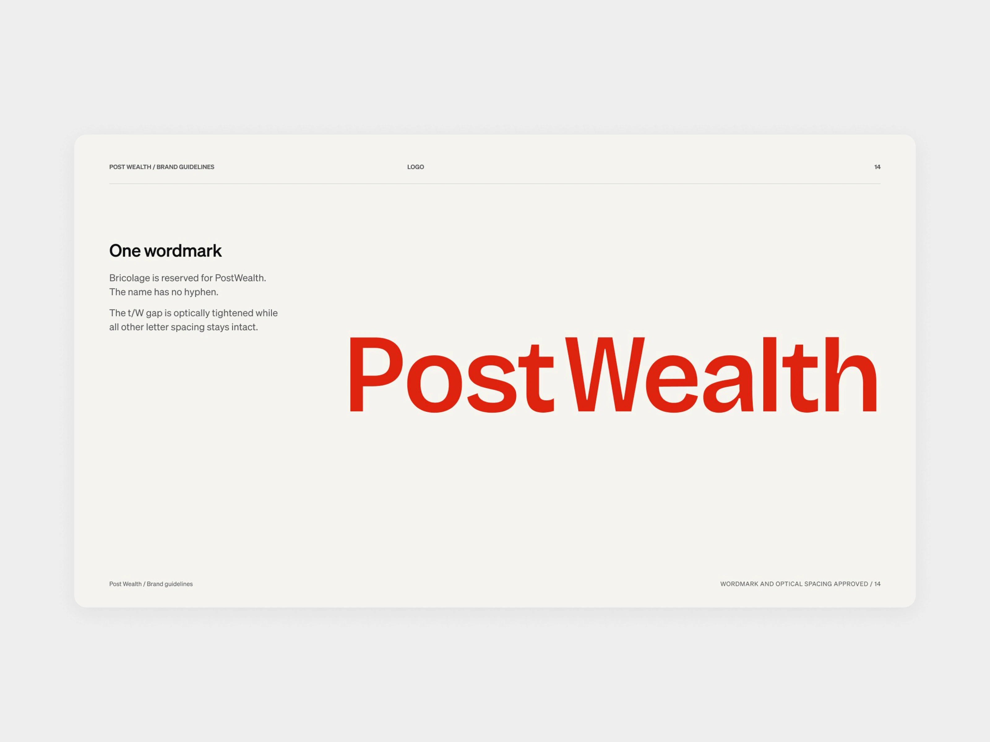
Primary wordmark
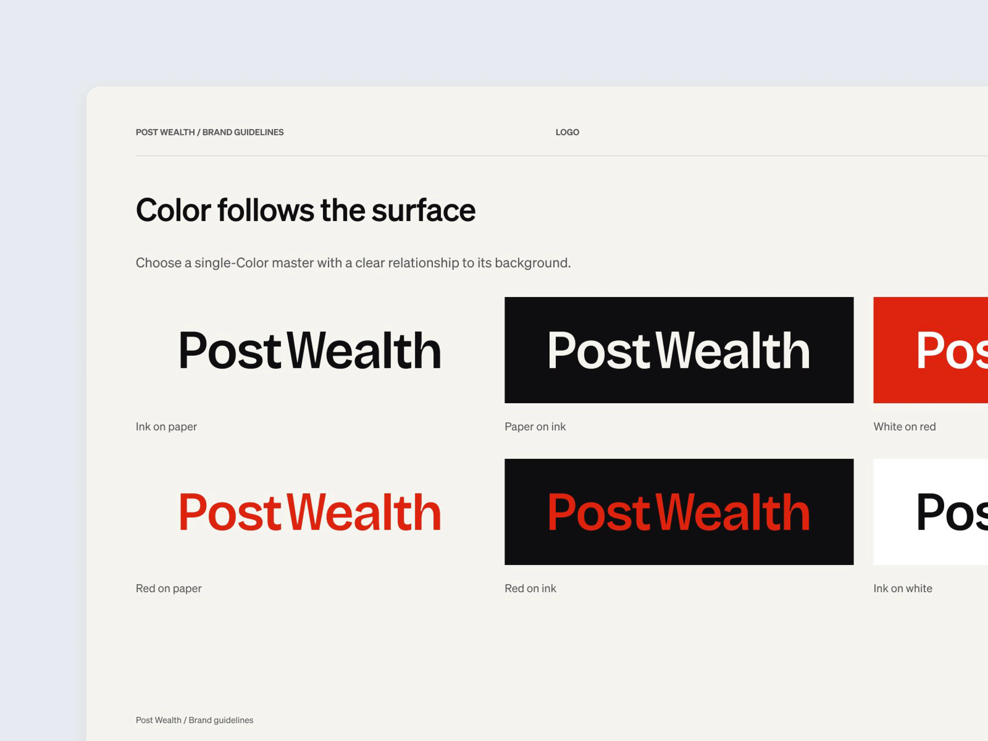
Logo color versions
Paper, ink, and red
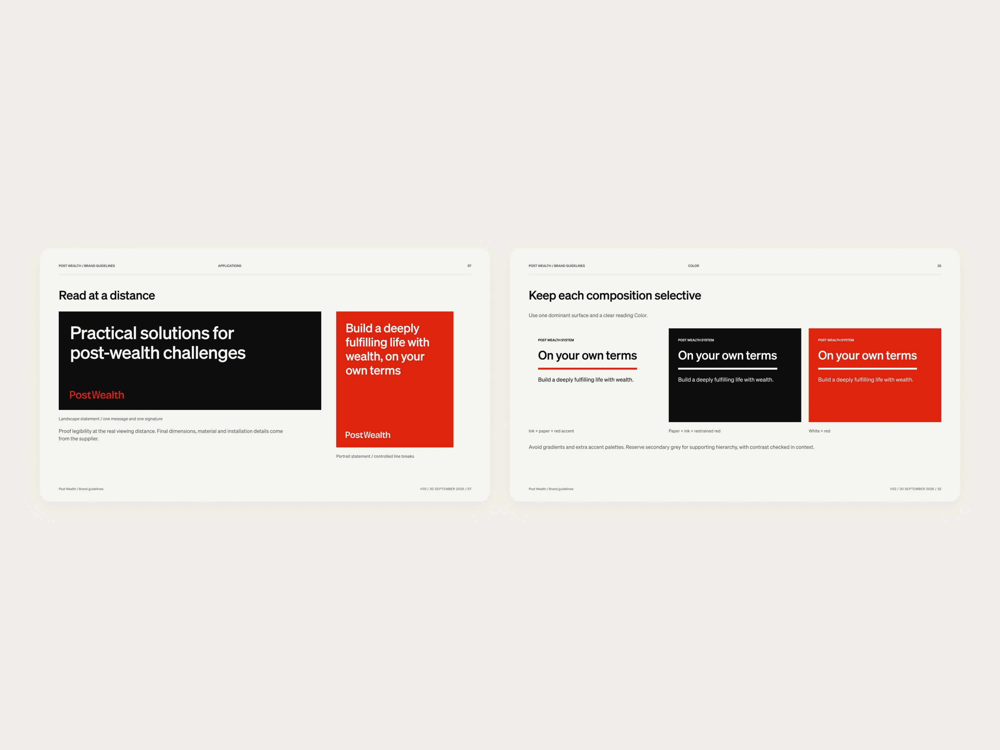
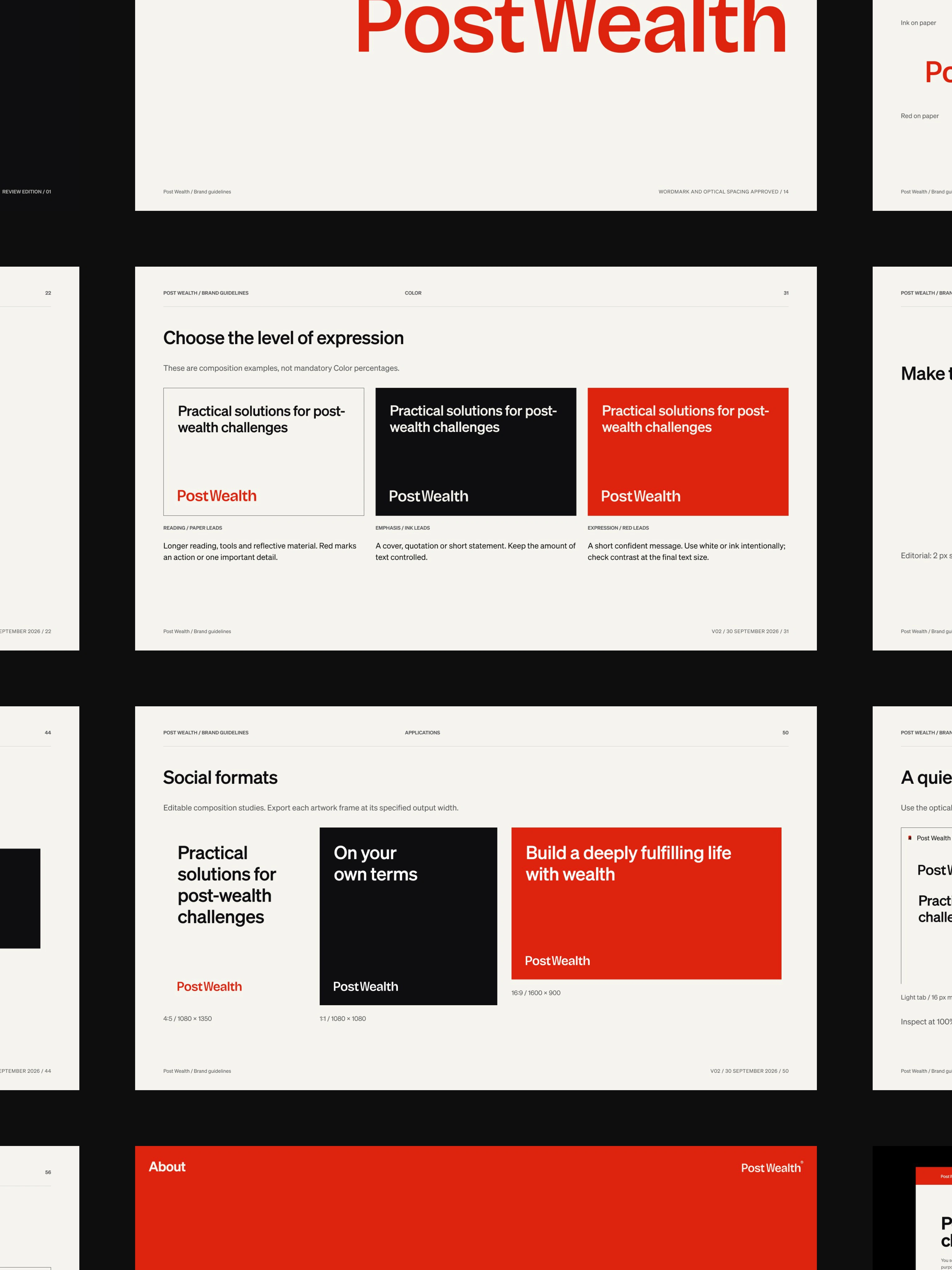
Color follows the surface. Warm off-white, the paper, is the place for thinking and long reading. Near-black, the ink, gives the system its structure, and can take over a whole page when the message earns that intensity. Red is energy and recognition: a line, a mark, or a full field when the job is a short, confident statement. We stayed with paper, ink, and red. Gold, navy, and the usual signals of money were left out, because this audience already has money, and the work is about what comes after it.
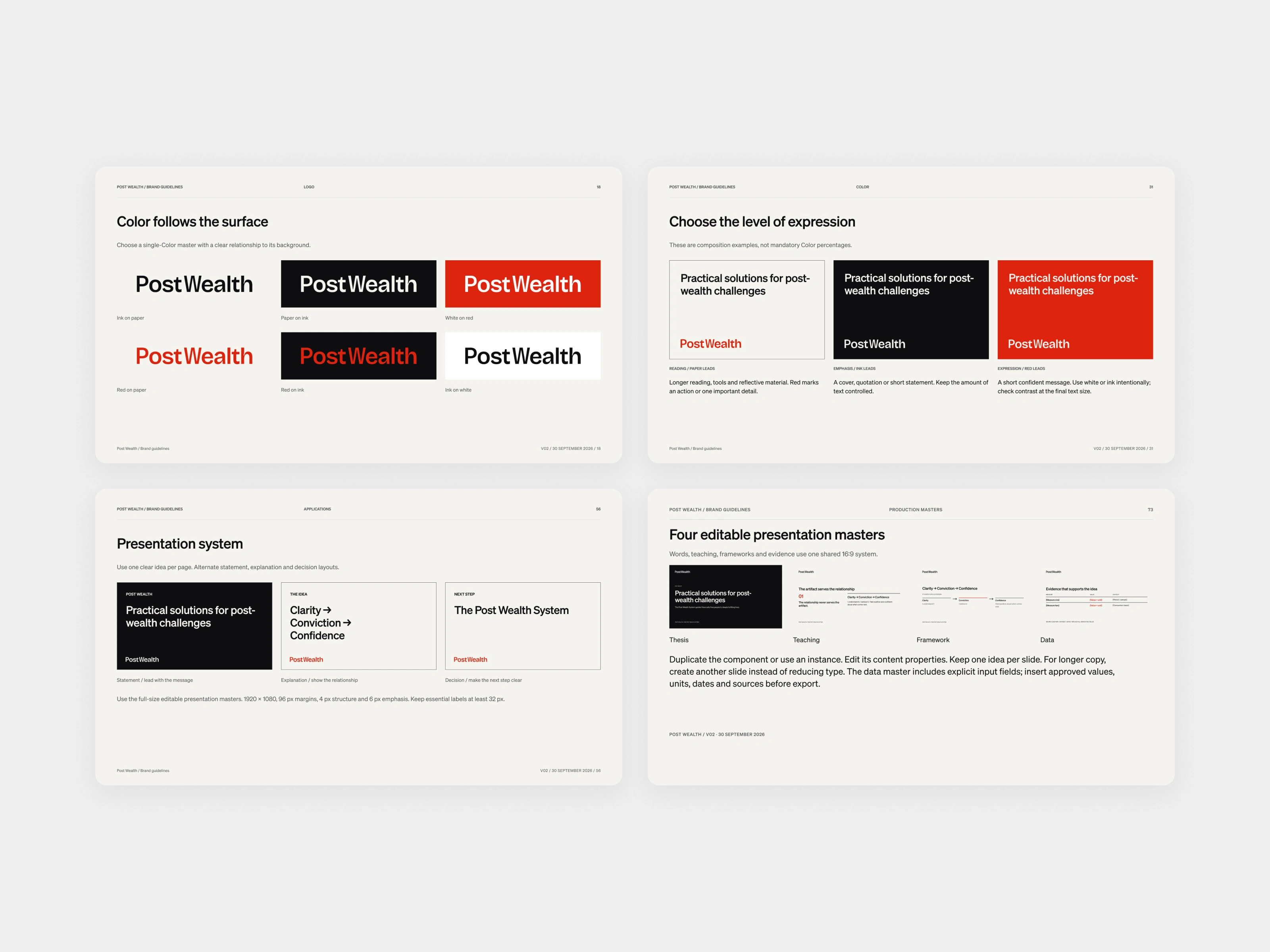
Color, presentation system, and masters
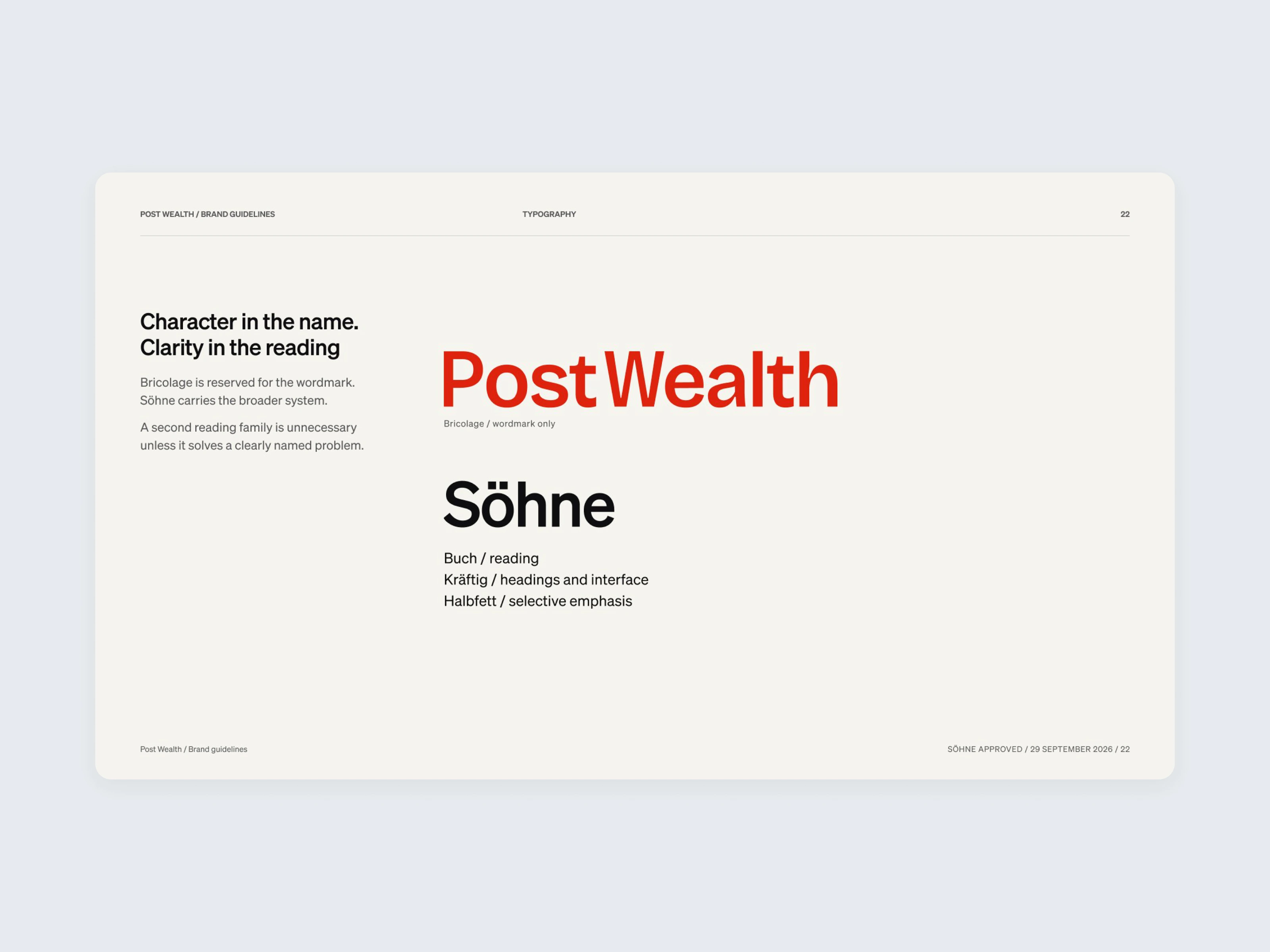
Typeface overview
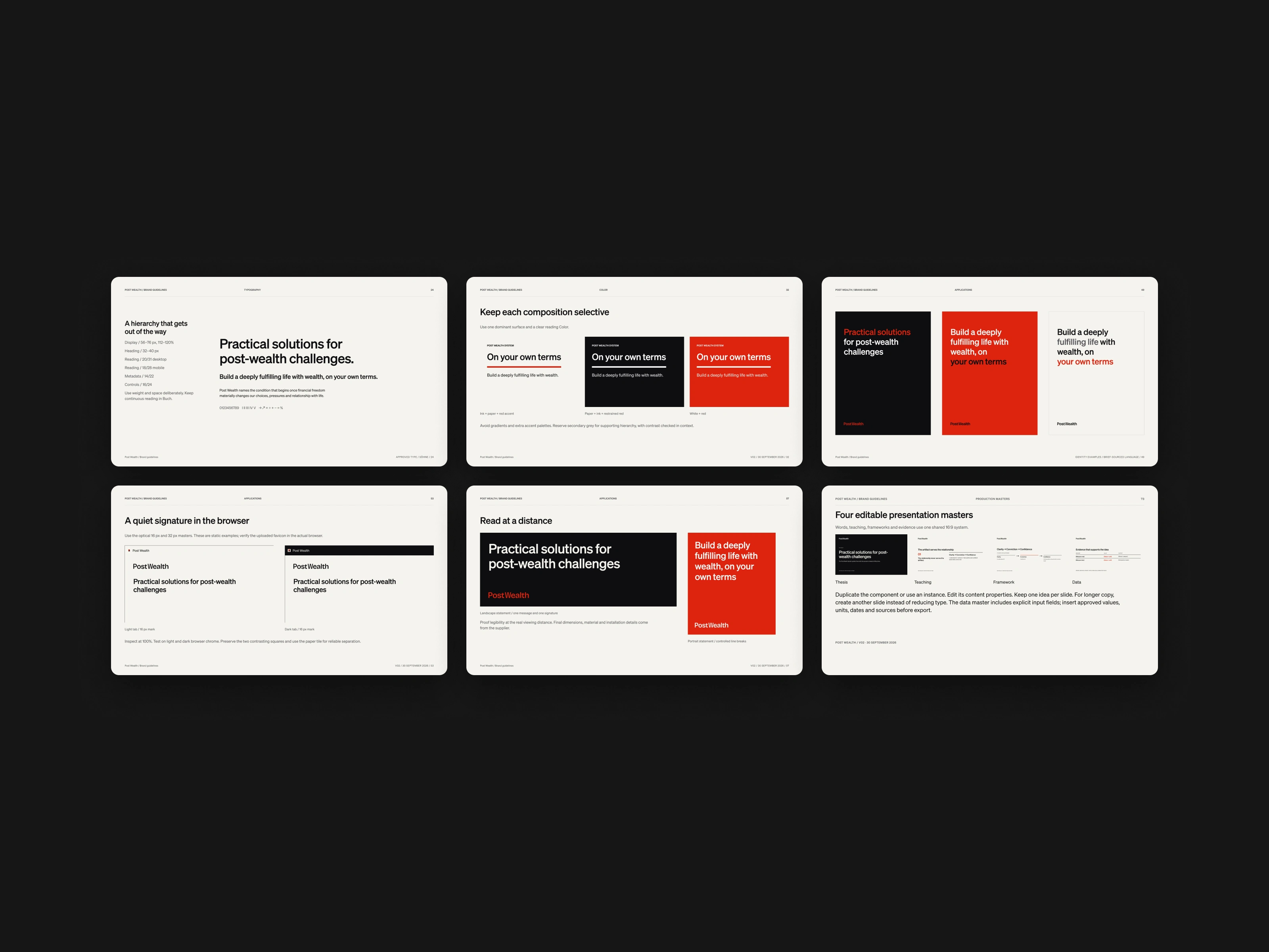
Type, color, and identity in use
A voice the brand can stand behind
The voice had to be just as direct. In a set of poster explorations we wrote lines the brand can actually stand behind: "Money was the easy part." "You won. Now what?" "They've solved money. Meaning is still open." "Financial freedom is where the real work starts." And a supporting line that states the job: "We don't manage the money. We work the problems it leaves behind."
A presentation system of four editable masters keeps one idea on each page. Diagrams use the same grammar at a scale that holds up on a wide slide. Social templates, document covers, and a compact paradox mark (red and black forms that each contain a little of the other) take the identity into the formats a team will publish.
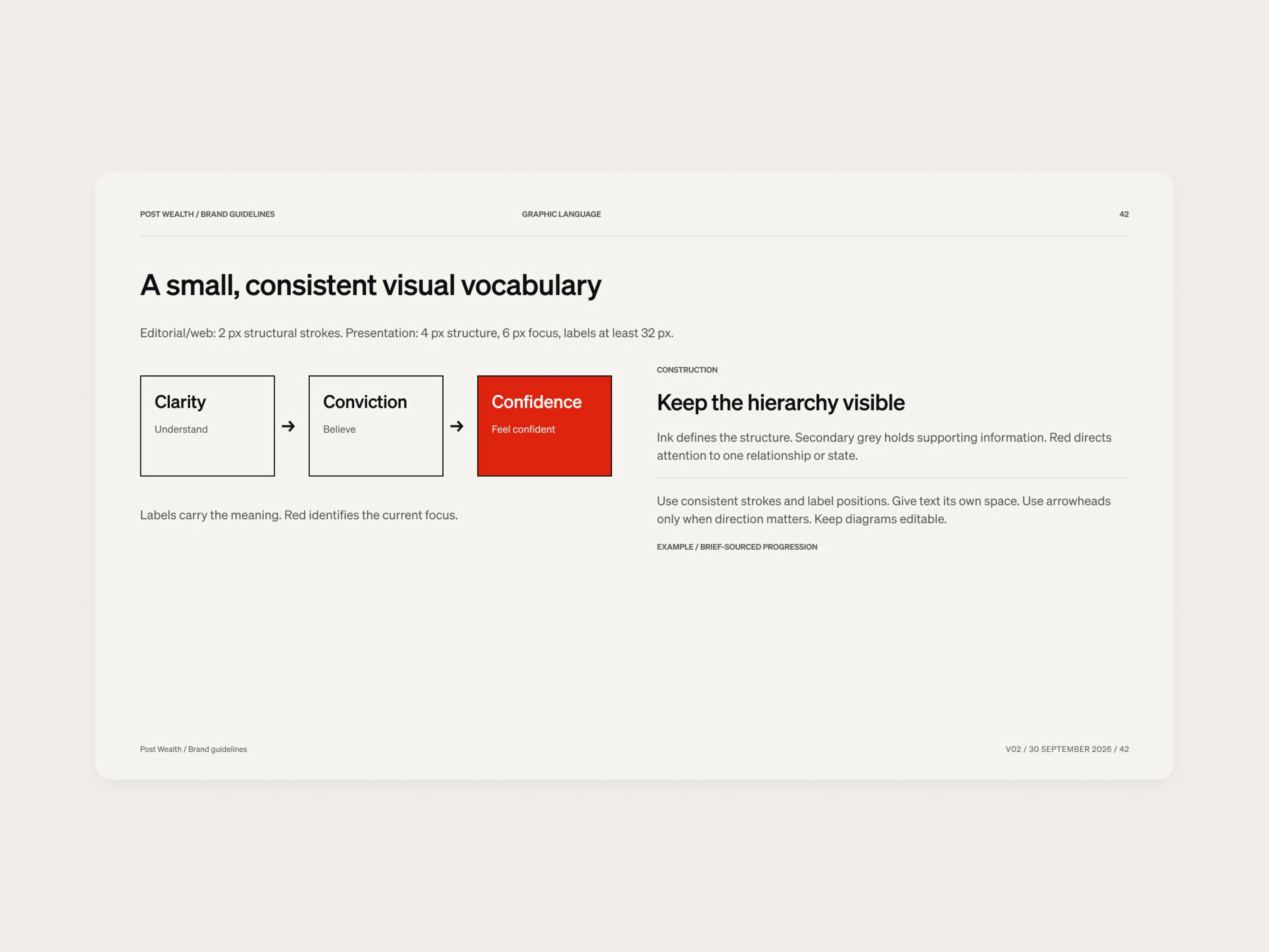
Diagram construction
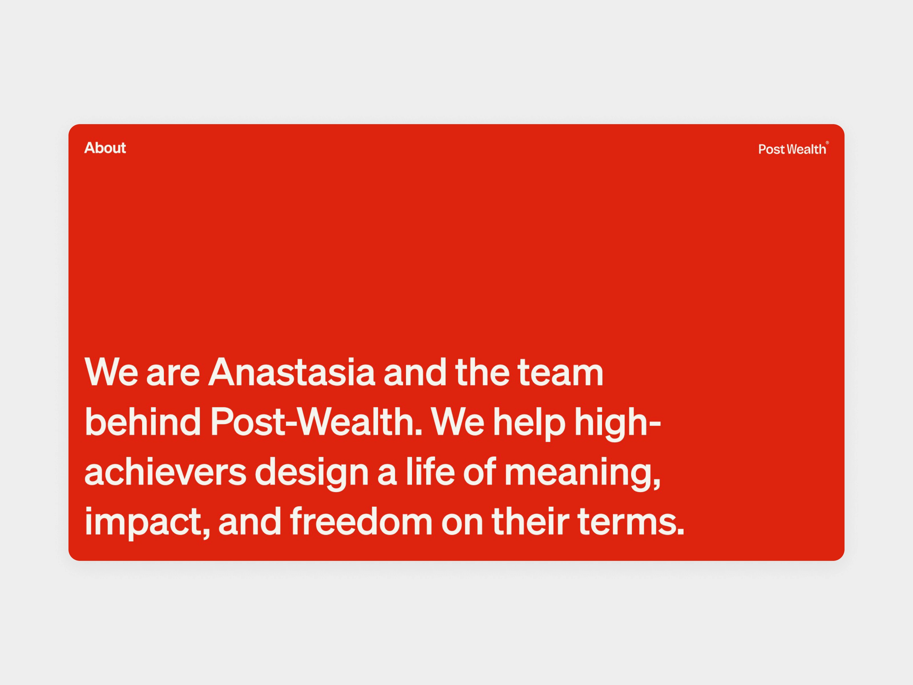
About application
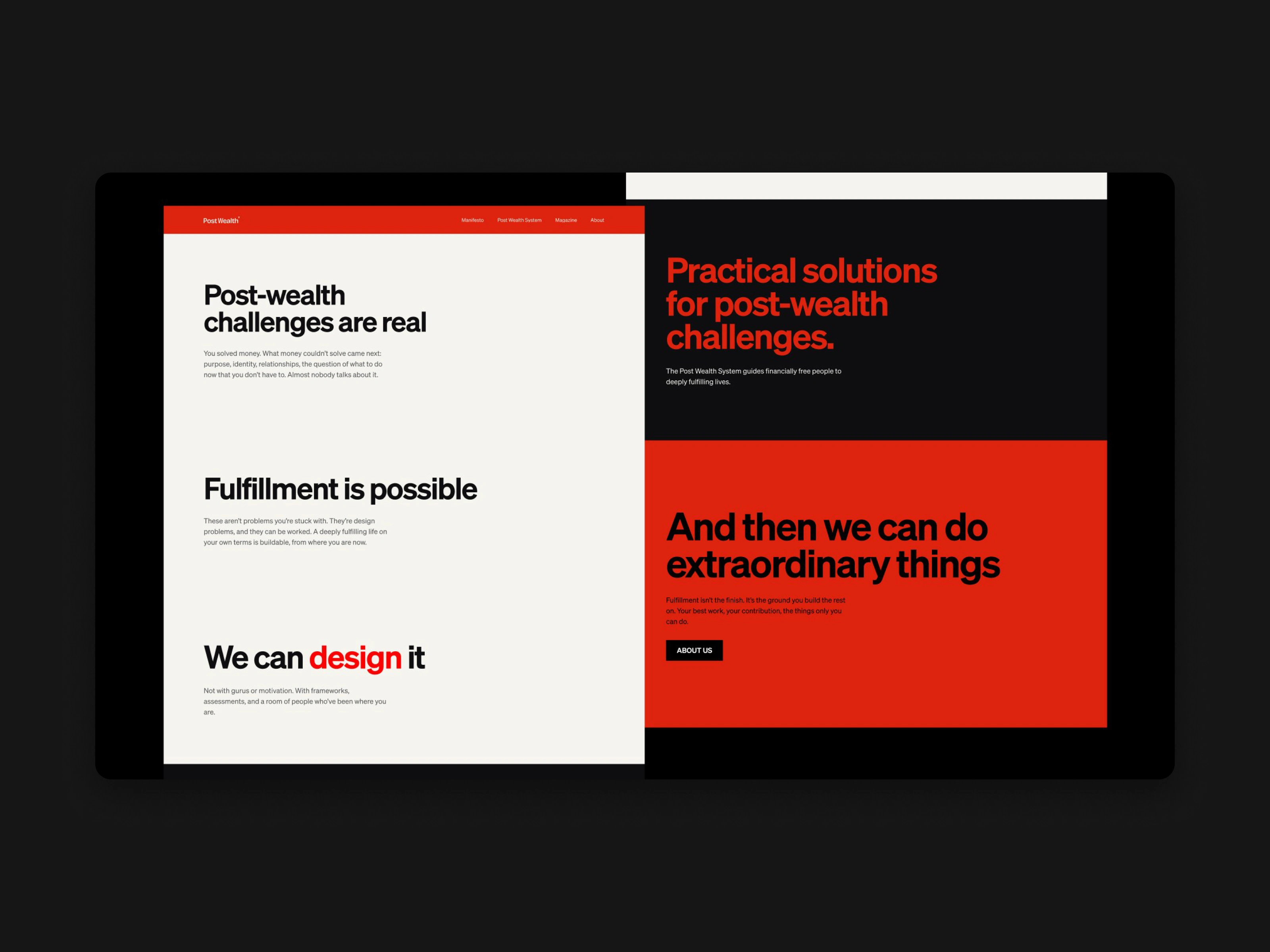
Manifesto application
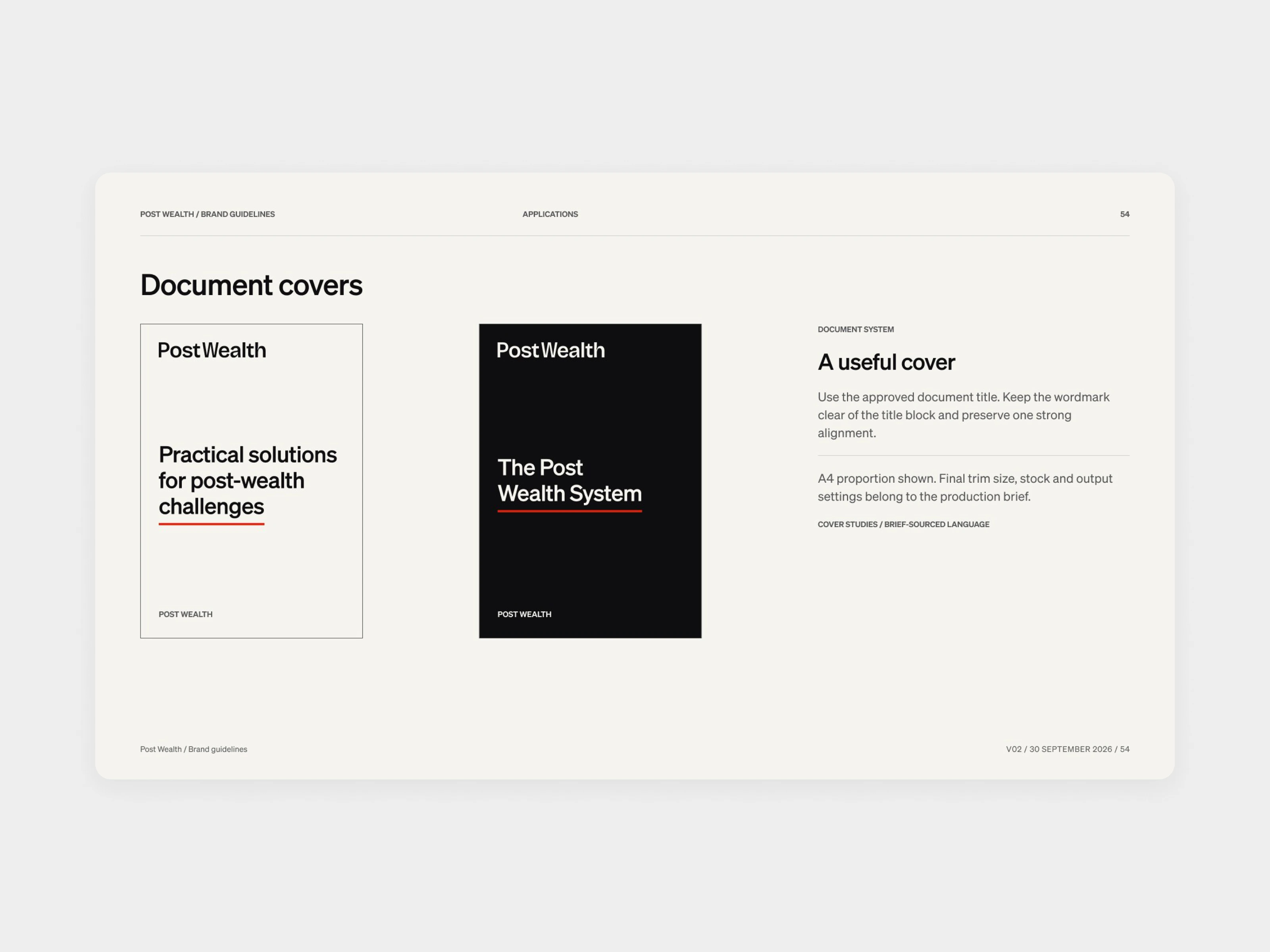
Document covers
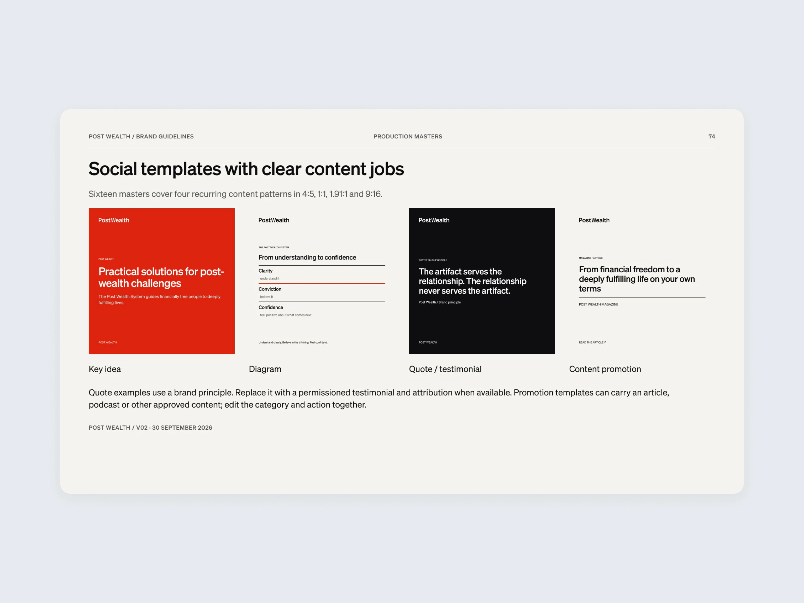
Social templates
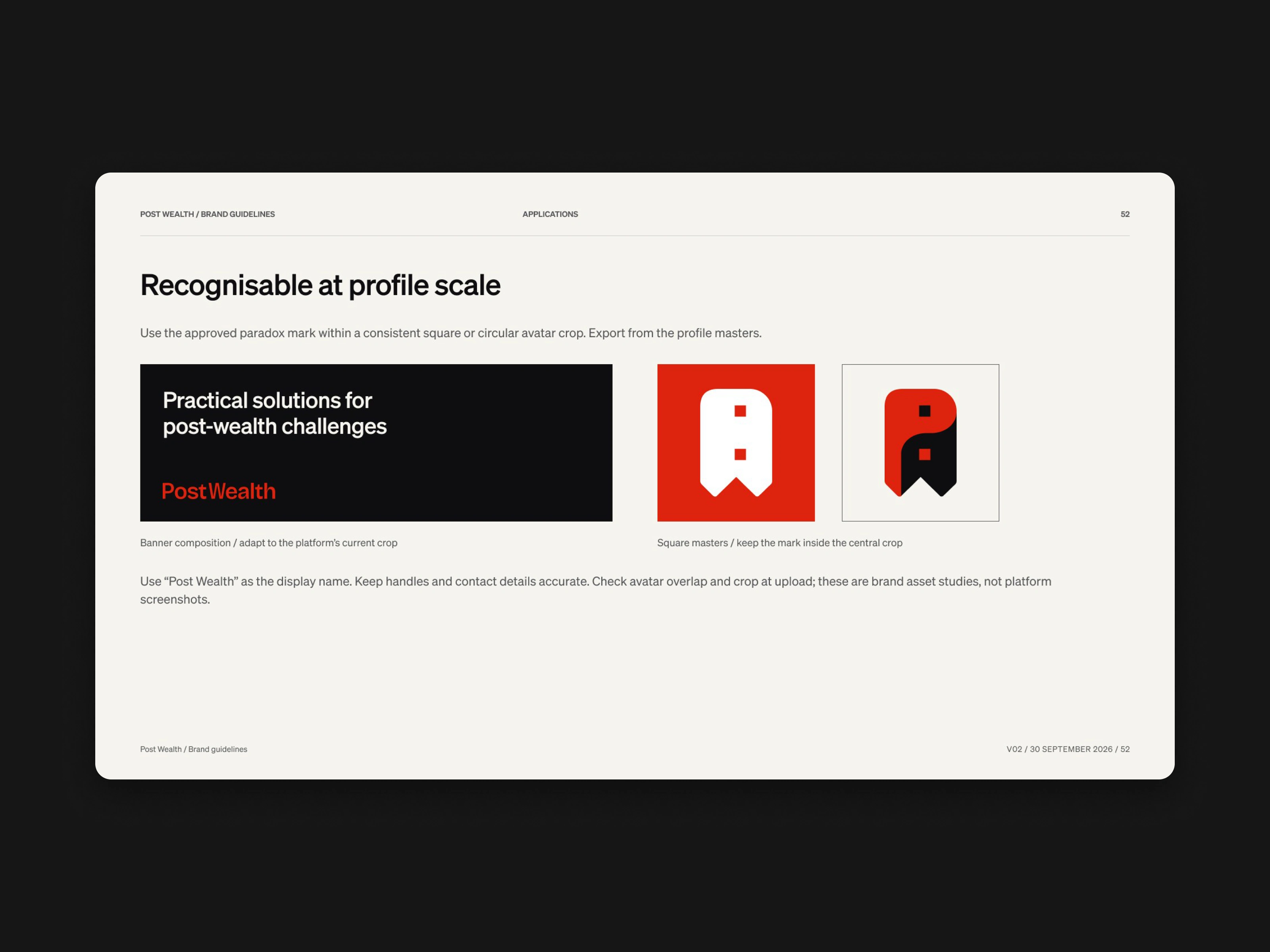
Profile identities
Environmental applications and color combinations
Contact sheet
What we handed over
We delivered the brand guidelines, the presentation masters, and the identity applied across social and print, with source files in the main Figma file and a Drive backup at close. The work ran from July to October 2026, and we handed it over on 1 October.
Guidelines collage
Guidelines wall
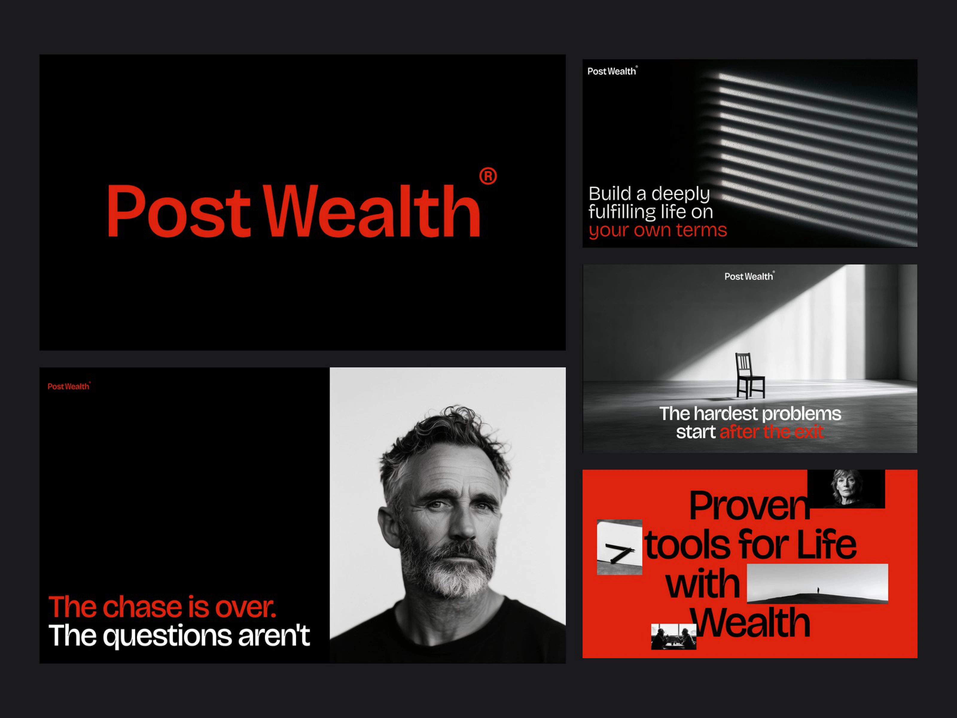
Social explorations
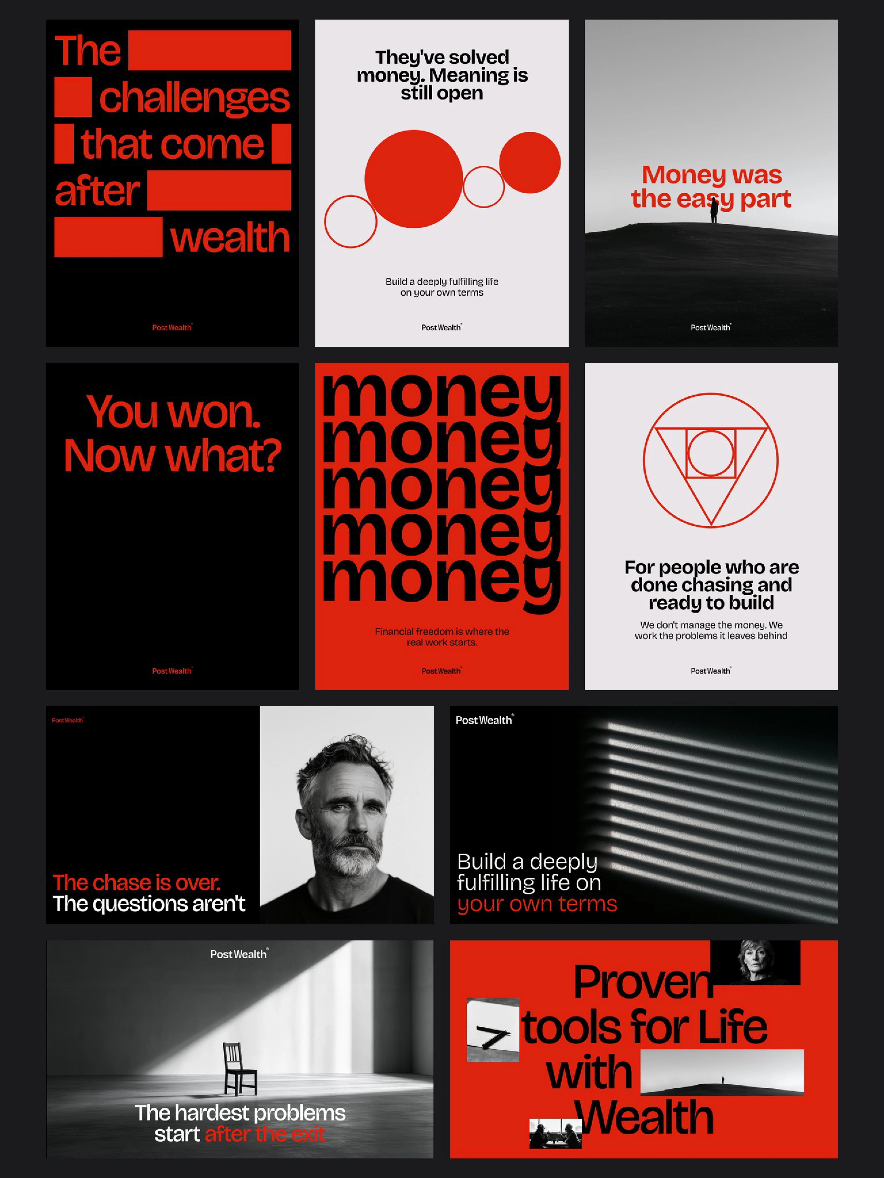
Poster and social compilation
This is the way we like to work at BrightStudios. Get the problem in focus, lock the few decisions that matter, and leave the client with a system they can use without us in the room. We have done that for 100+ career clients. If you have a brand that has to carry serious thinking, we would like to hear from you.
0 likes · 0 views · Nov 12, 2026
After the exit, money is no longer the hard part. We built the PostWealth identity: wordmark, color, typography, guidelines, and the templates a team can actually use.
