Arteway: brand identity and website for an online art school
Approve request to show earnings
View

Daniel G Bright
Verified


Arteway is an online art school where every course is filmed in a working artist's studio. Students learn from contemporary painters at their own pace, with lifetime access to each course and a private student community.
We designed the brand identity and the website, then built the site in Webflow on Arteway's real content: 15 courses, nine artists, the Journal and the Summit page.
The challenge
01. Many artists, one school. Each artist brings their own subjects, palette and way of working. The brand needed to hold all of them without becoming nine different looks.
02. A library that keeps growing. New courses, artists, mini courses and Journal pieces arrive all the time, and a small team publishes them.
03. A first Summit. Arteway was preparing its first Summit, a free online event coming in 2027, and it needed a home inside the same site.
The idea
We let the paintings carry the colour. The brand sets a calm base of warm neutrals and near black, and every course and artist brings its own colour, sampled from their work. The guidelines make it a rule: any accent colour has to come from an artist's painting.
That one decision did most of the work. It kept the school consistent and gave every artist a look that is actually theirs.
The mark
The identity pairs an AW monogram with a spaced ARTEWAY wordmark. The monogram is built to hold artwork. Filled with a painting, the letterform takes on that artist's colour, and the same move carries across posters, social and outdoor.
Both are set up in primary, secondary and tertiary colourways, with a set of lockups.
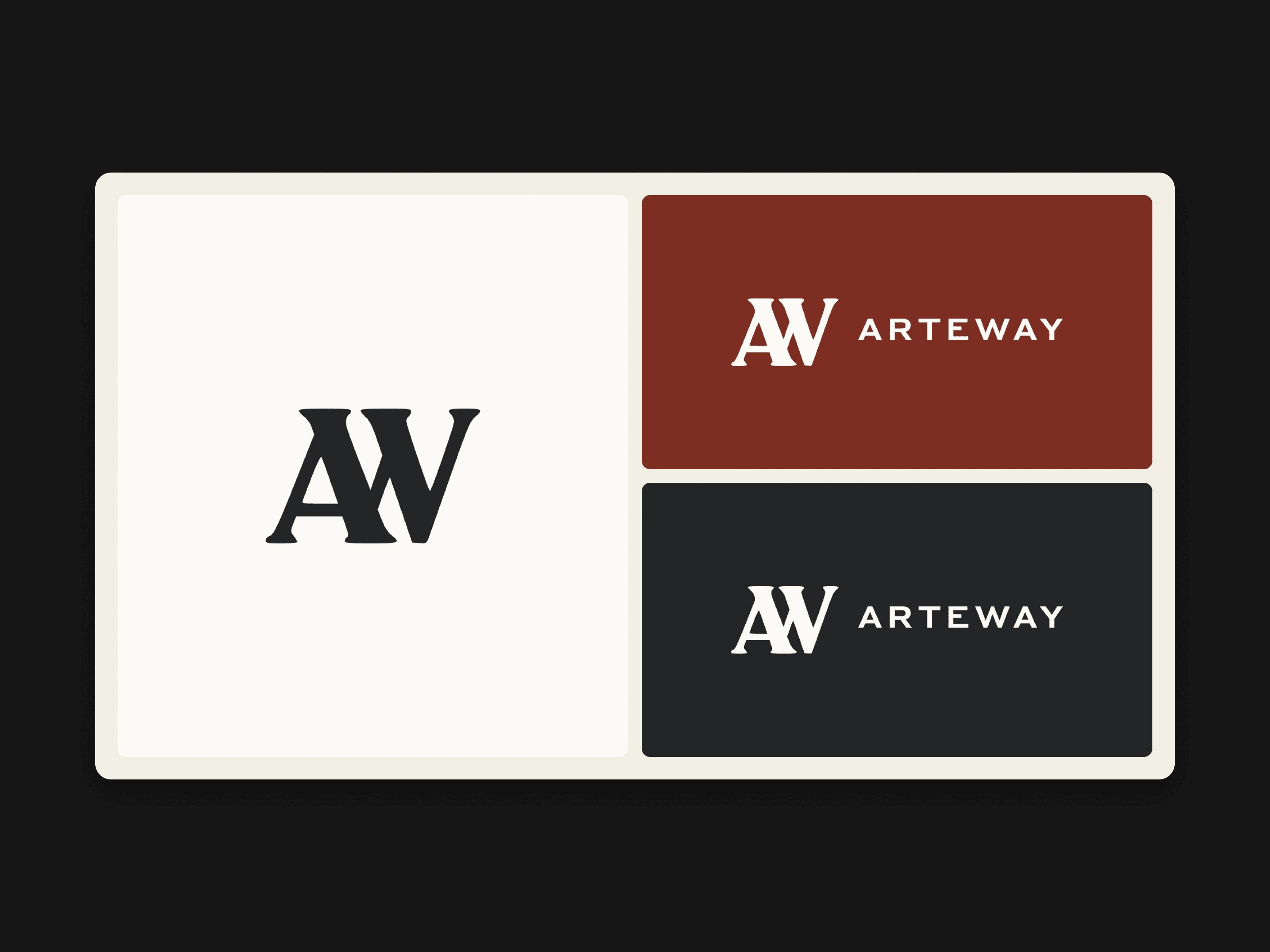
Arteway AW monogram and wordmark lockups
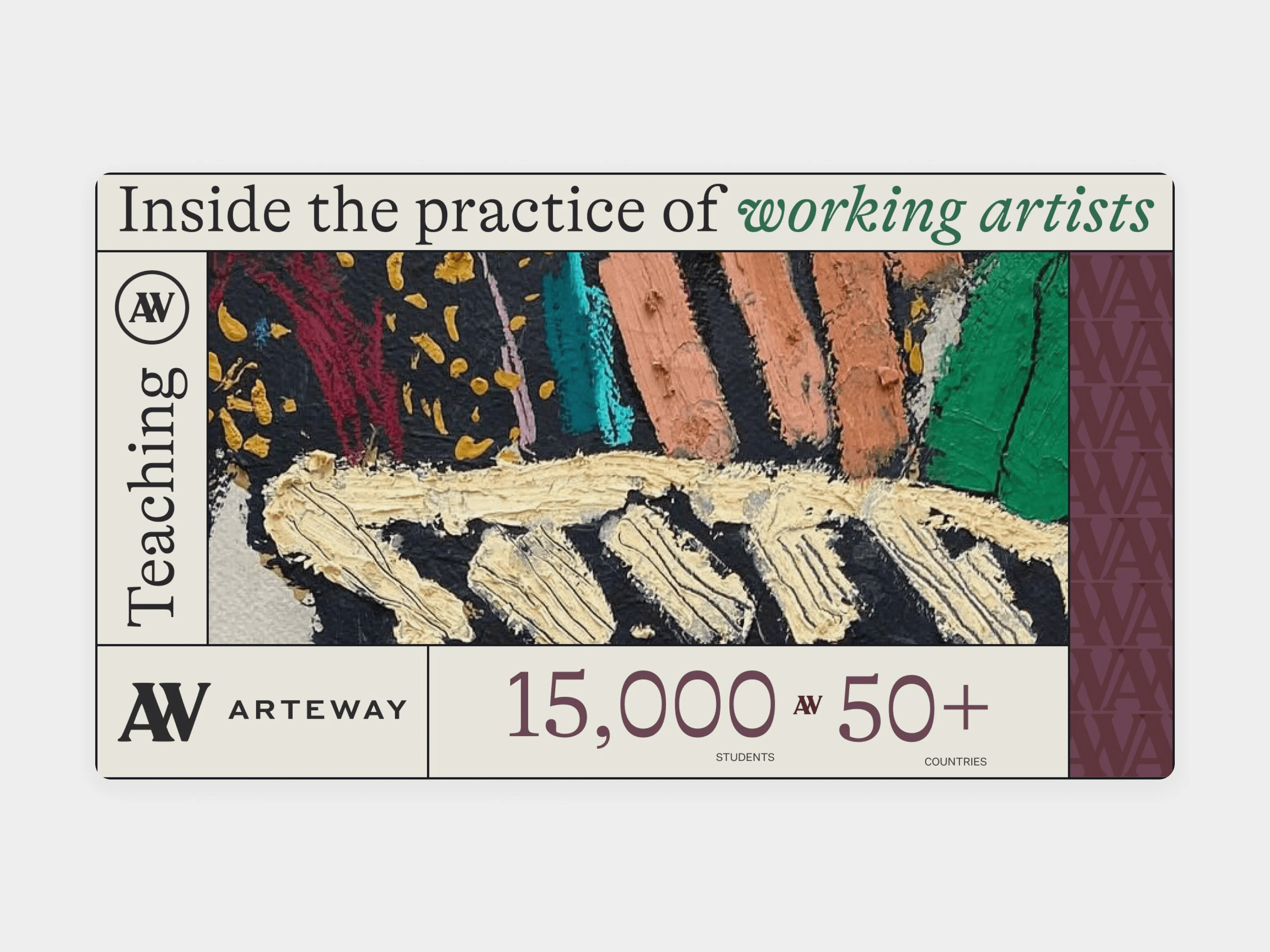
Arteway brand on a course poster
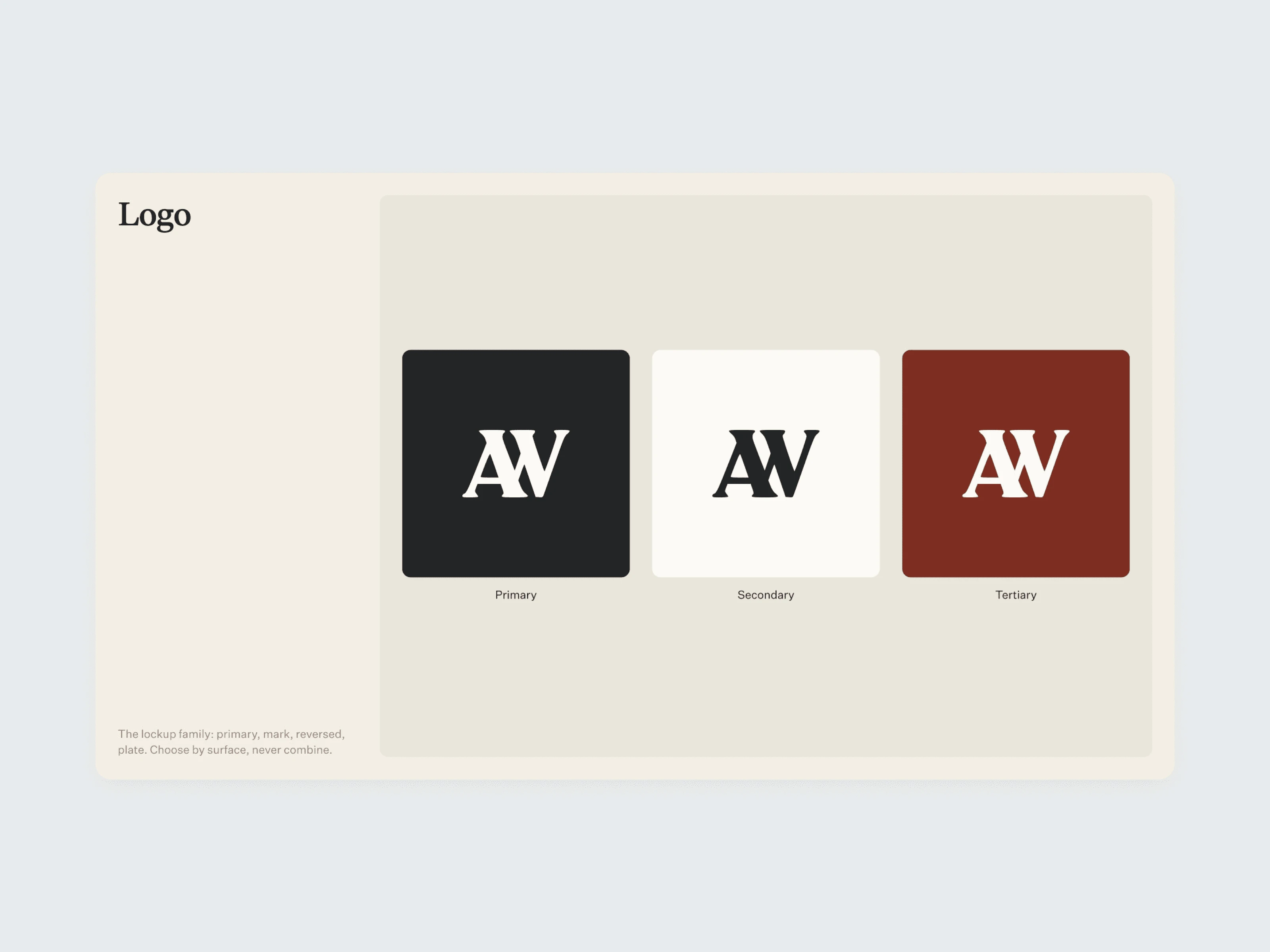
Arteway logo in three colourways
Colour
The secondary palette is Plaster, Celadon, Powder, Parchment, Lilac Ash and Burnt Sienna. These are the surfaces: soft enough to sit behind a painting without competing with it.
The accents come from the work. On the site this became the sample palette, four colours taken from each artist's painting.
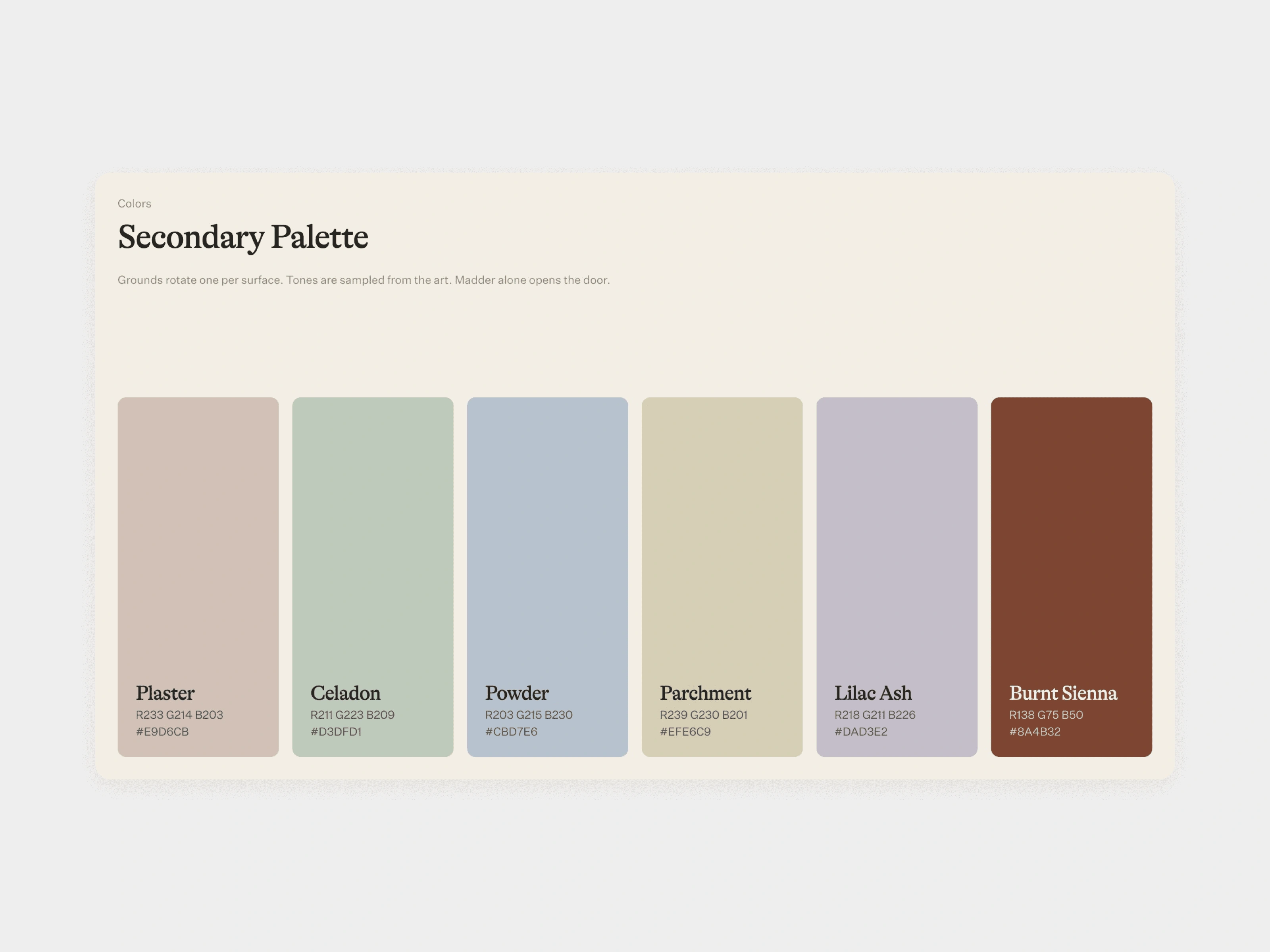
Arteway secondary palette
Typography
GT Alpina is the primary typeface, with Untitled Sans alongside it. We set one hierarchy that runs from display titles down to captions, across the brand materials and the site. The licensed fonts went to Arteway with the brand assets.
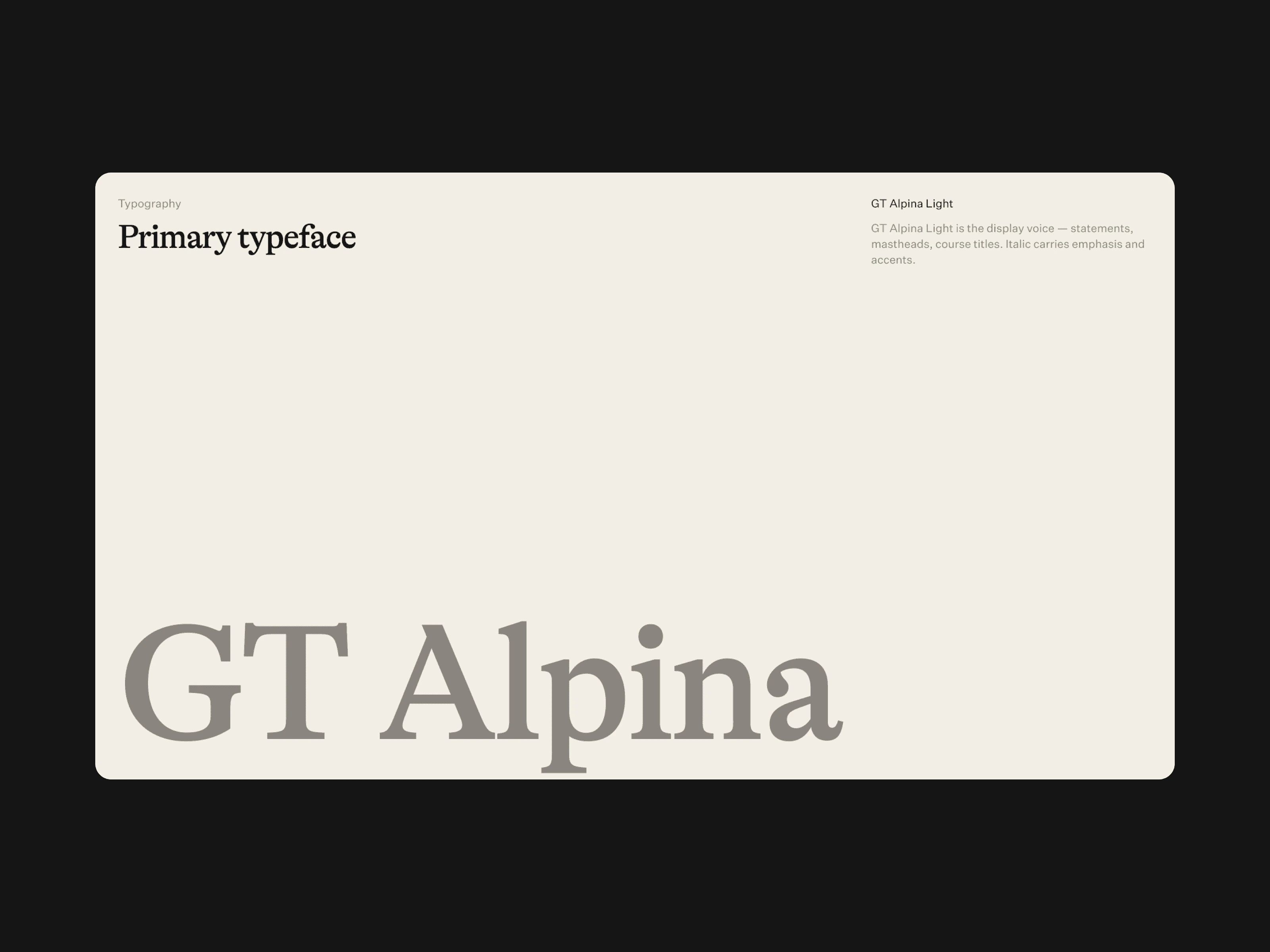
GT Alpina, the Arteway primary typeface
Art direction
The brand line is "Inside the practice of working artists", and the art direction follows it: the artist at work, the studio and the paintings come first. We carried it through business cards, social profiles, posters and outdoor, with the AW letterform filled with paintings.
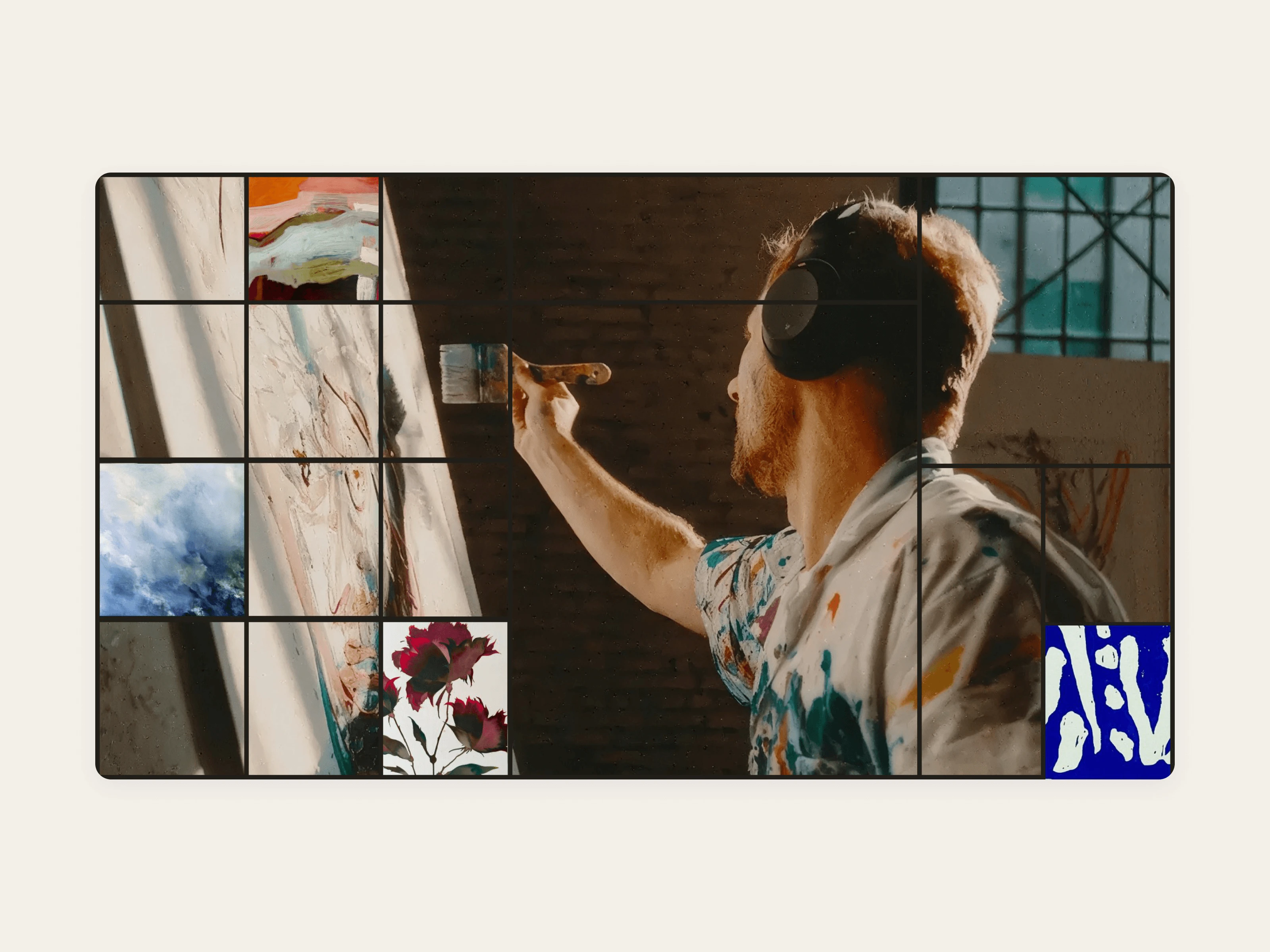
Arteway brand frame built around a painter at work
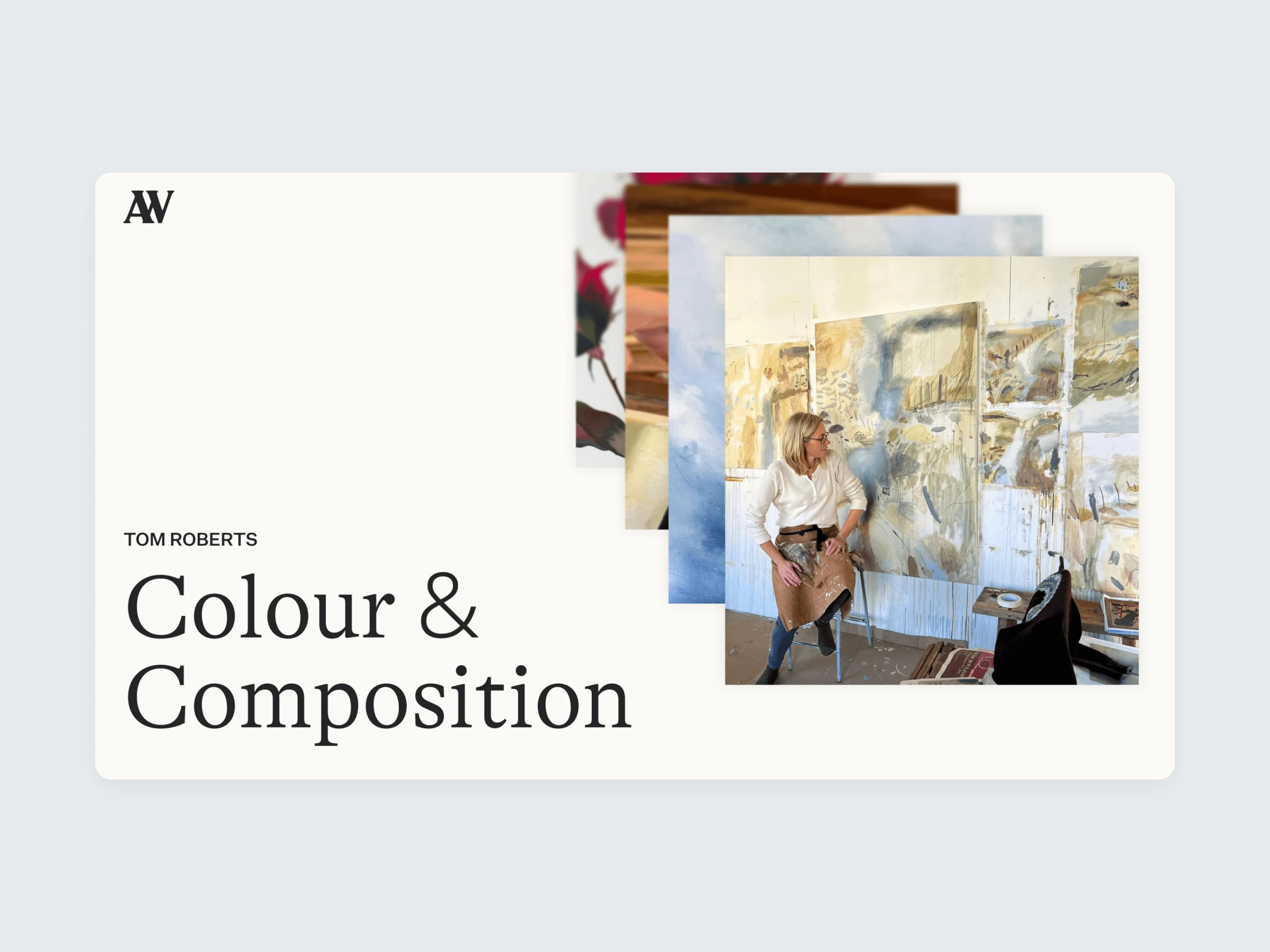
Colour and Composition course artwork
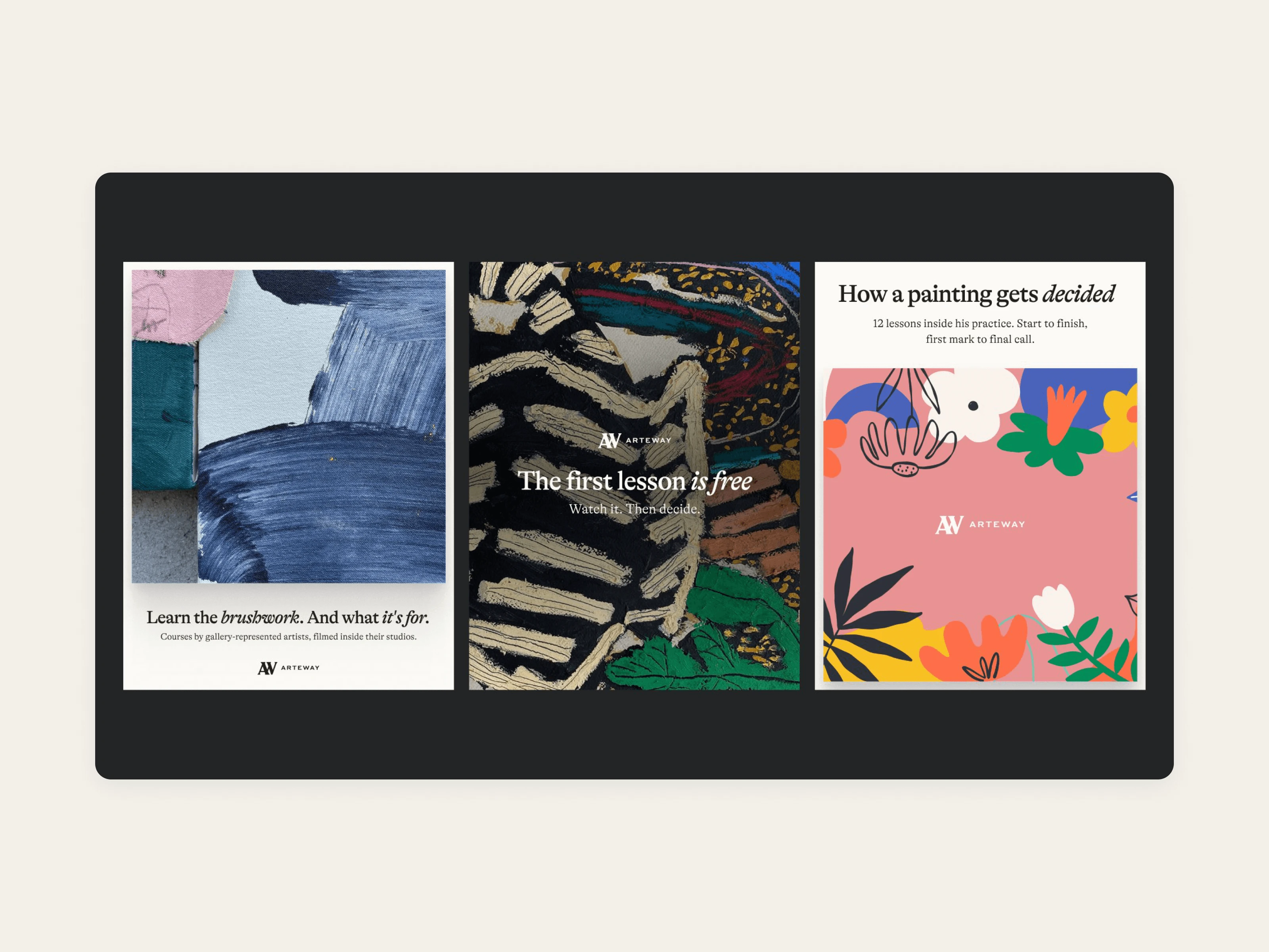
Arteway course posters in the dark theme
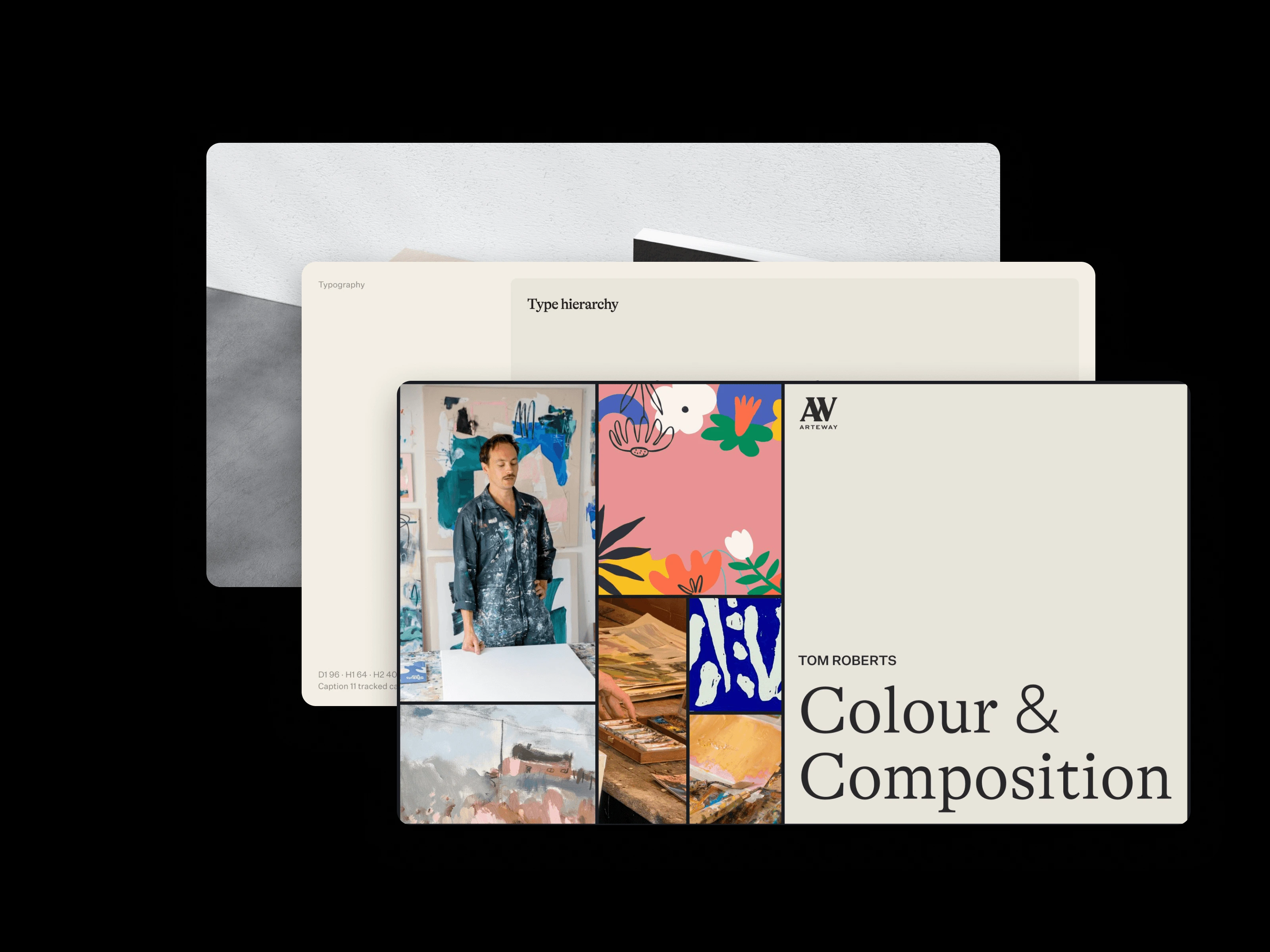
Arteway course artwork stacked in the dark theme
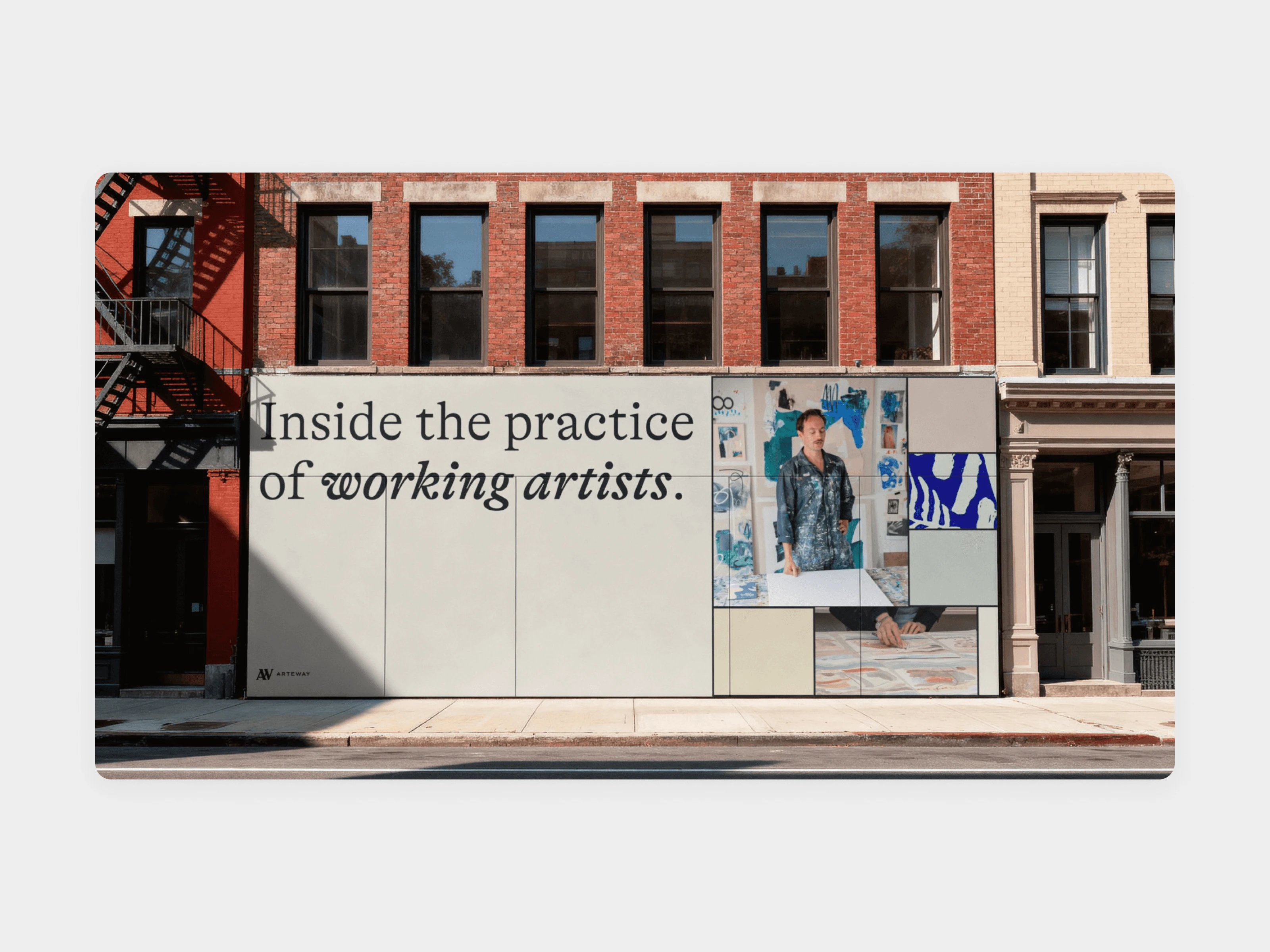
Arteway building mural
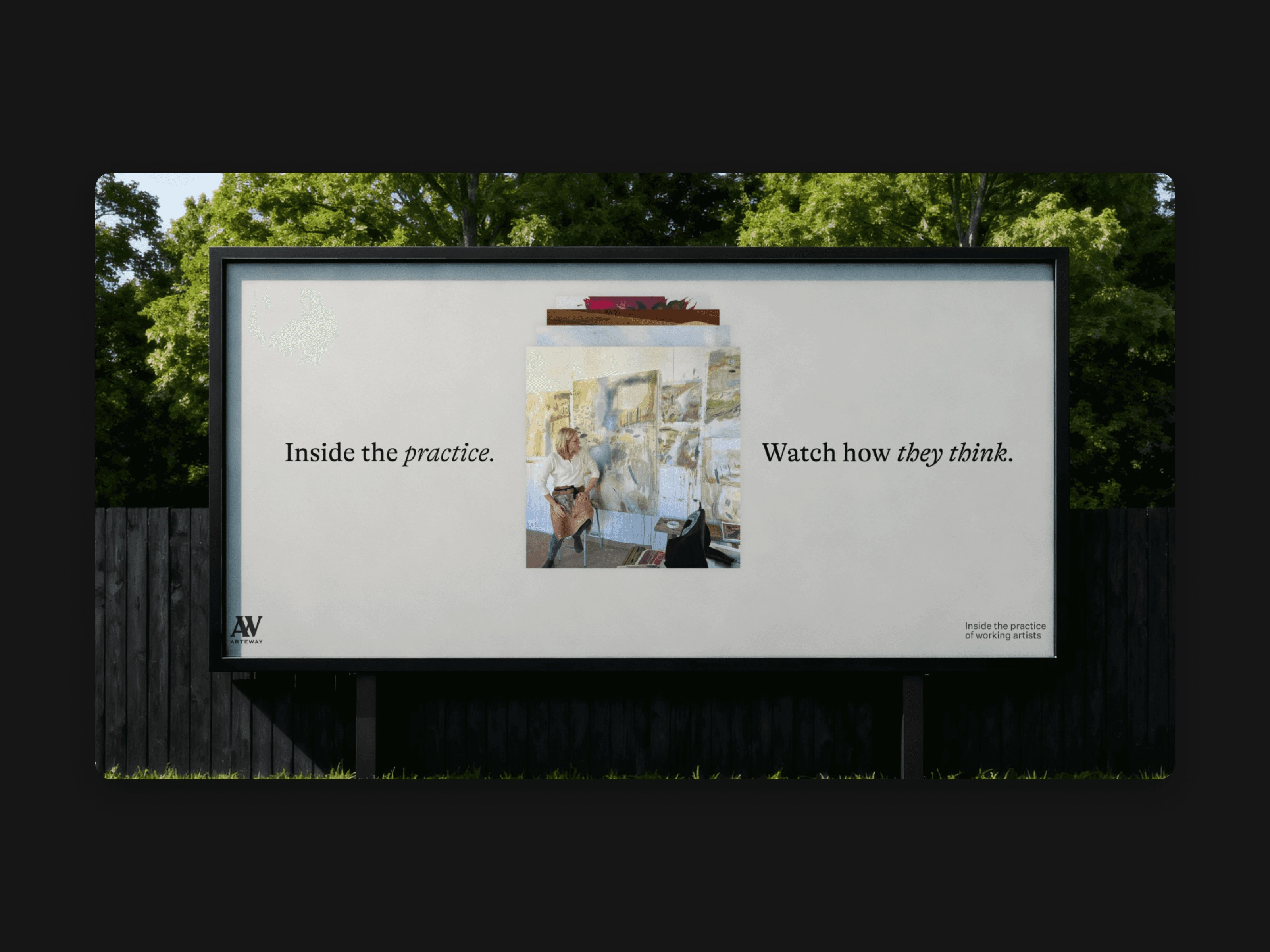
Arteway outdoor billboard
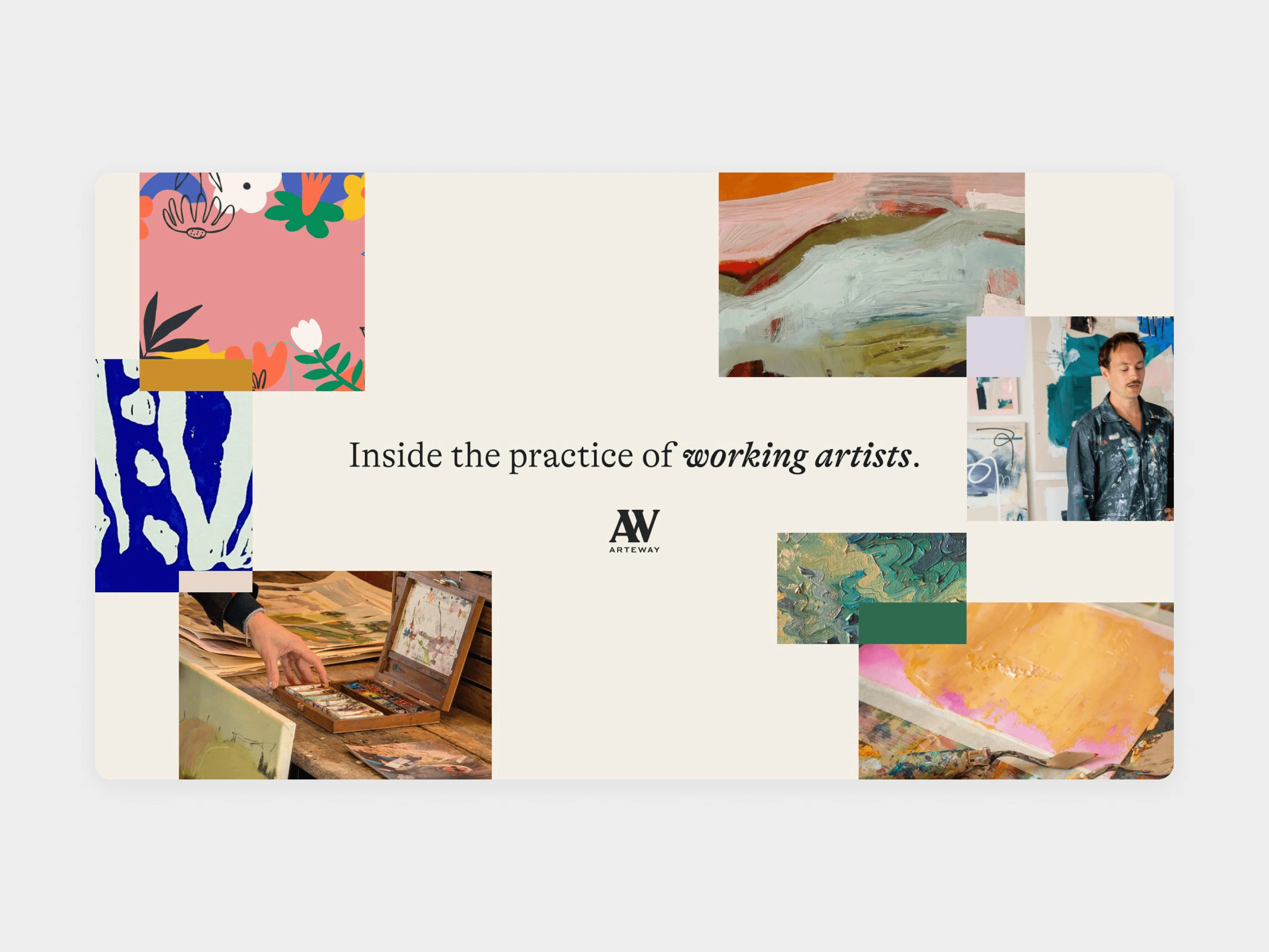
Arteway brand collage spread
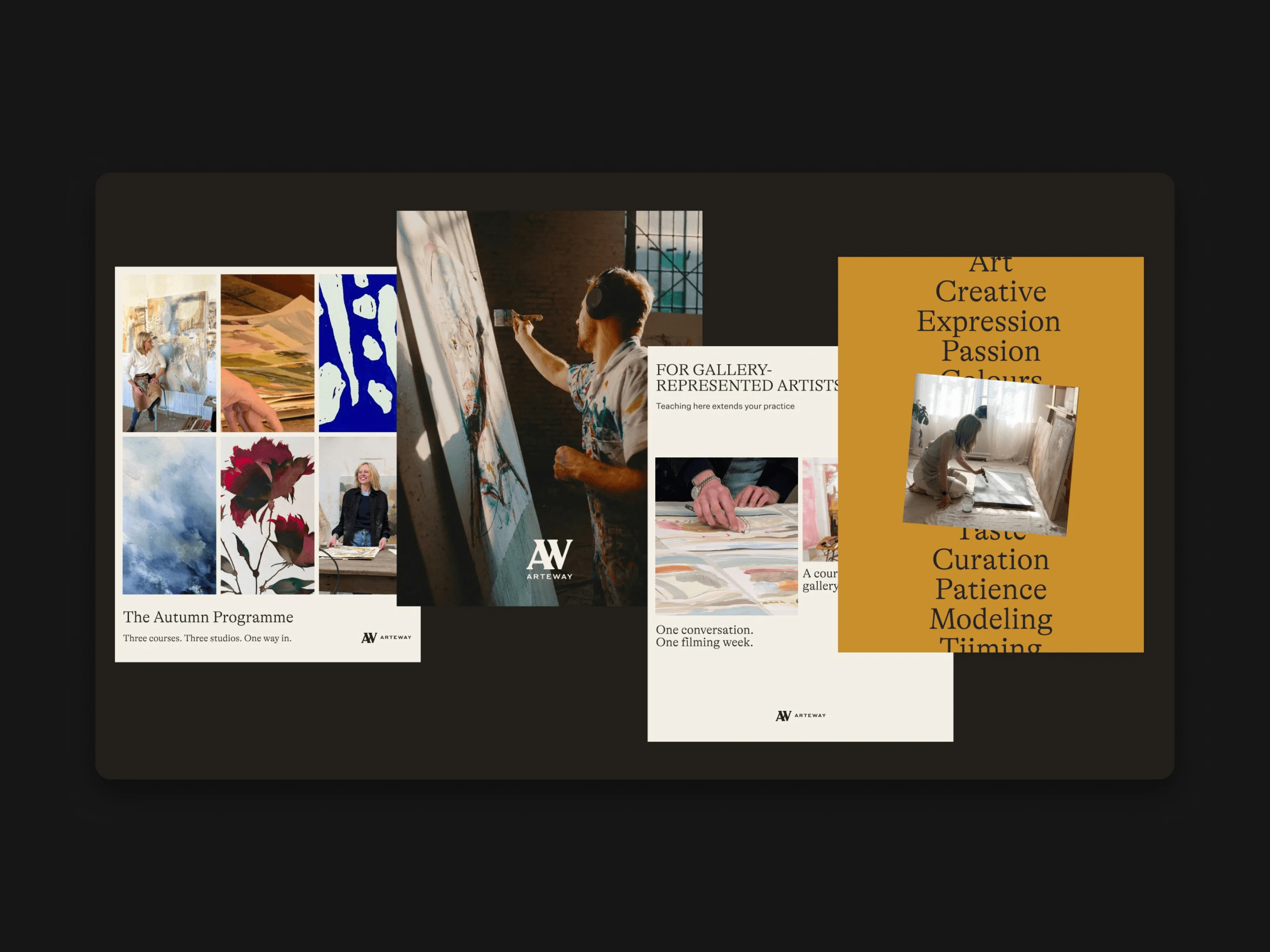
Arteway brand collage in the dark theme
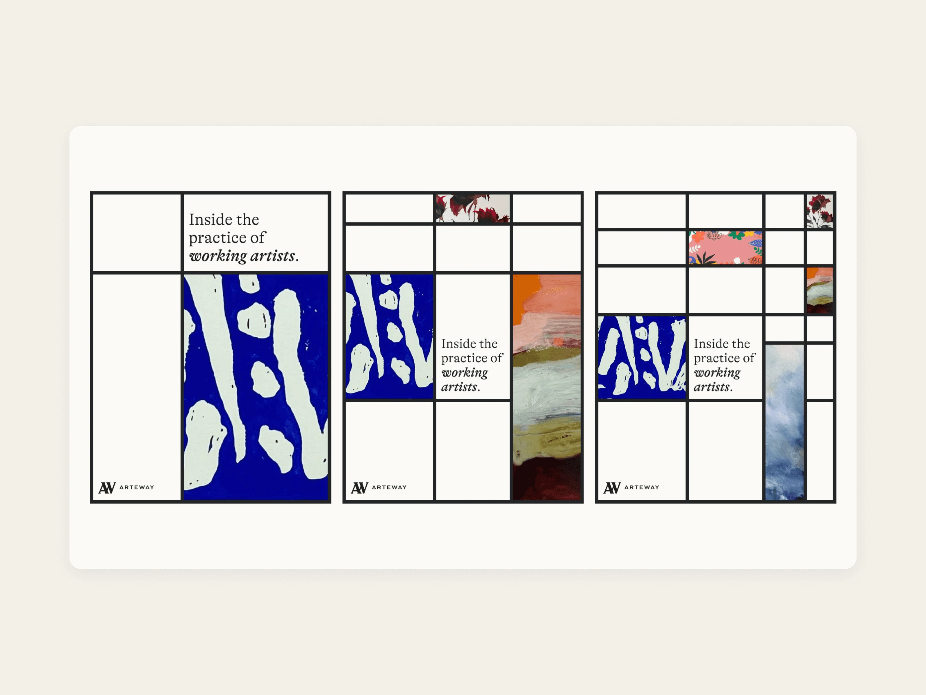
Arteway poster grid with the AW letterform
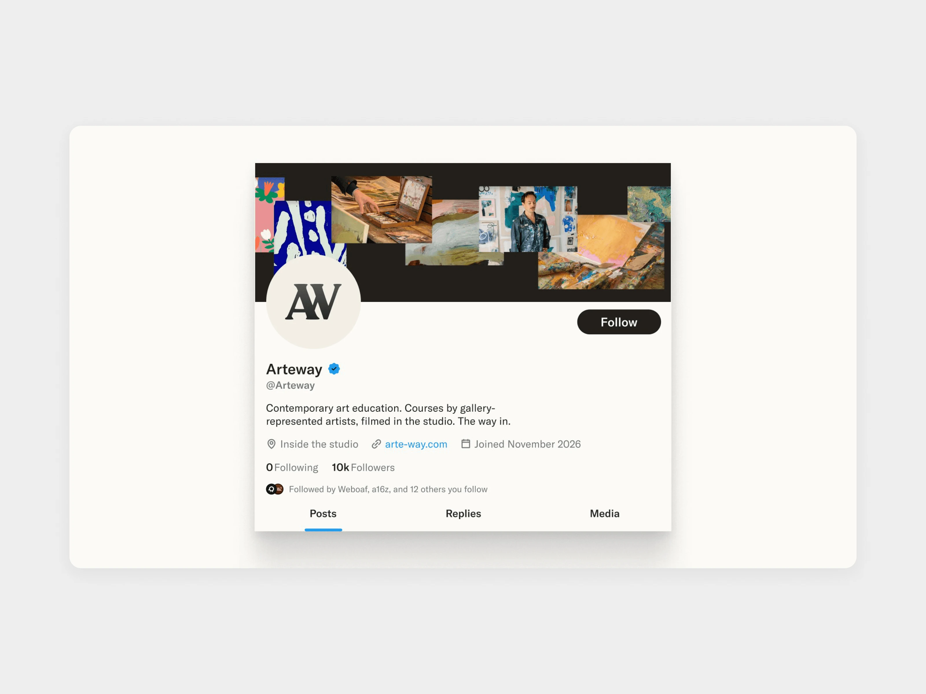
Arteway social profile
The website
We designed 23 screens, 11 for desktop and 12 for mobile: Home, Courses, course pages, The Artists, artist profiles, the Journal, the Summit, About, FAQ and Contact.
The site line is "Contemporary art education. The way in." On Home, About and the Summit page a doorway image, "Step inside", widens to full width as you scroll. On Home the artist quote band changes colour with each artist, and the Inside the Studio films play on the page: tap an artist and the film swaps, with a link to their course.
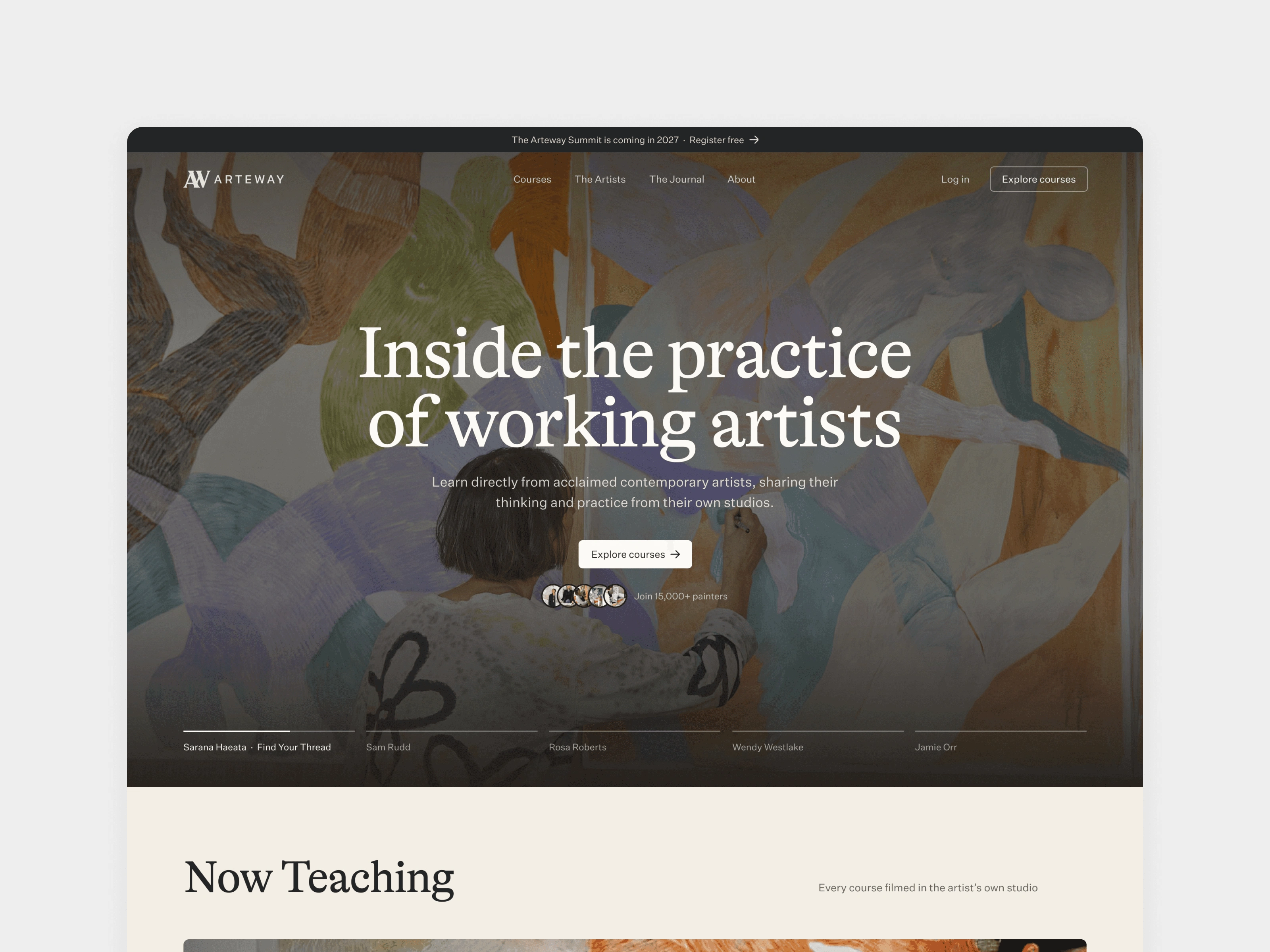
Arteway home page hero
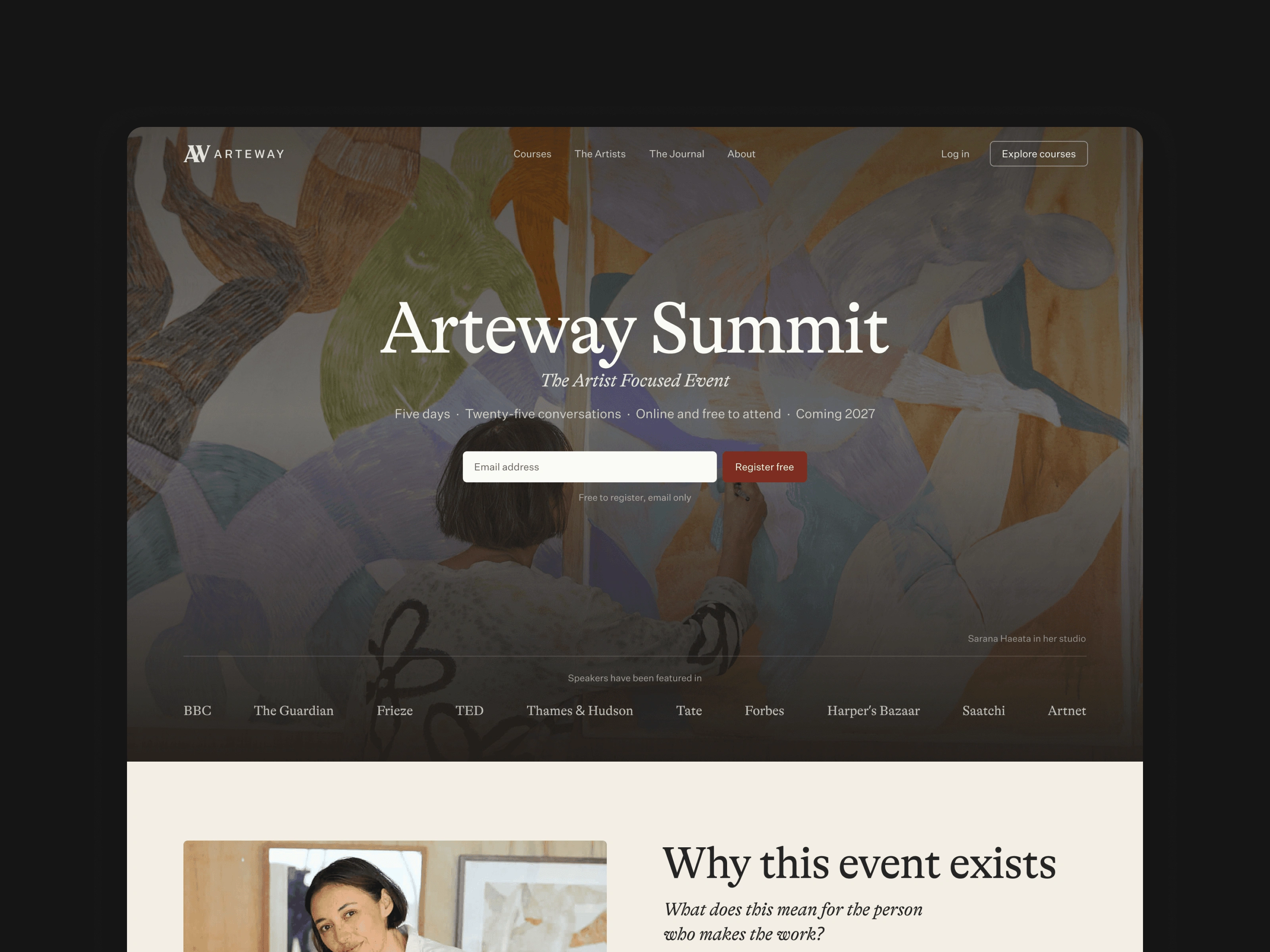
Arteway Summit page in the dark theme
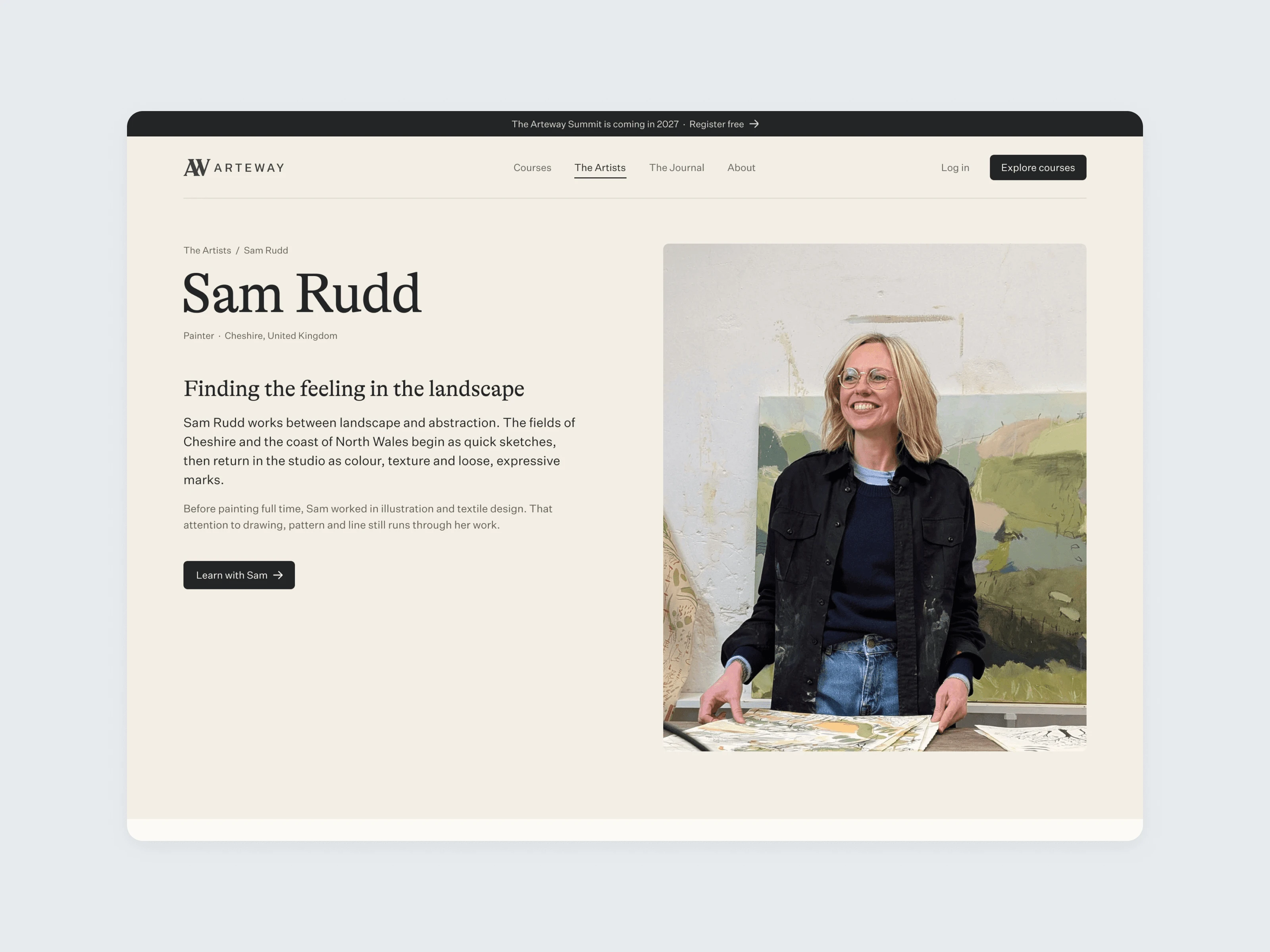
Arteway artist profile page
Course pages
Each course page lays out the modules, then shows a row of the artist's paintings before you meet them. On an art course the work is the proof. A sticky bar follows you down the page with the price, the artist's palette and a start button.
The sample palette is one CMS field per artist, drawn by the site's custom code on course cards, artist cards and the enrol bar. A new course gets its colours as soon as its palette is set.
Sections come in a light and a dark treatment. We chose the one that suits each section and kept it consistent, so pages hold their rhythm as content changes. FAQ and Contact stay quiet on purpose, so Home, About and the course pages keep their weight.
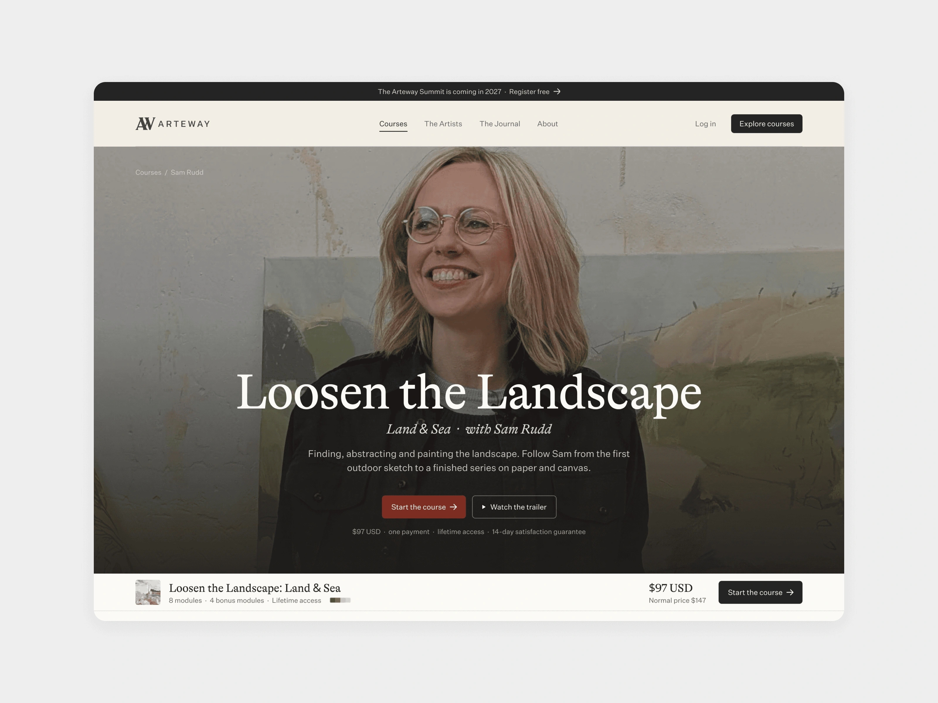
Arteway course page hero
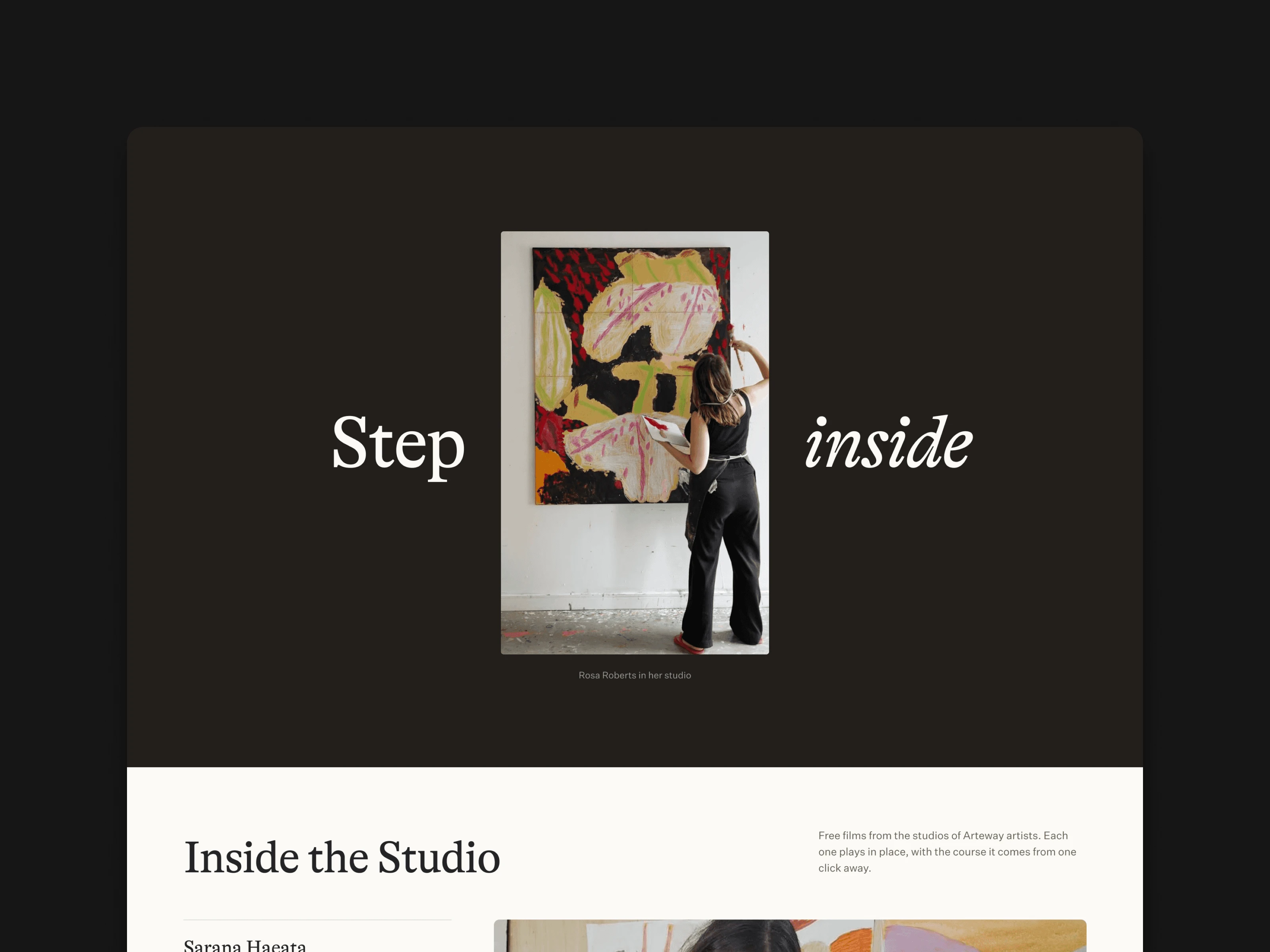
Step inside section in the dark theme
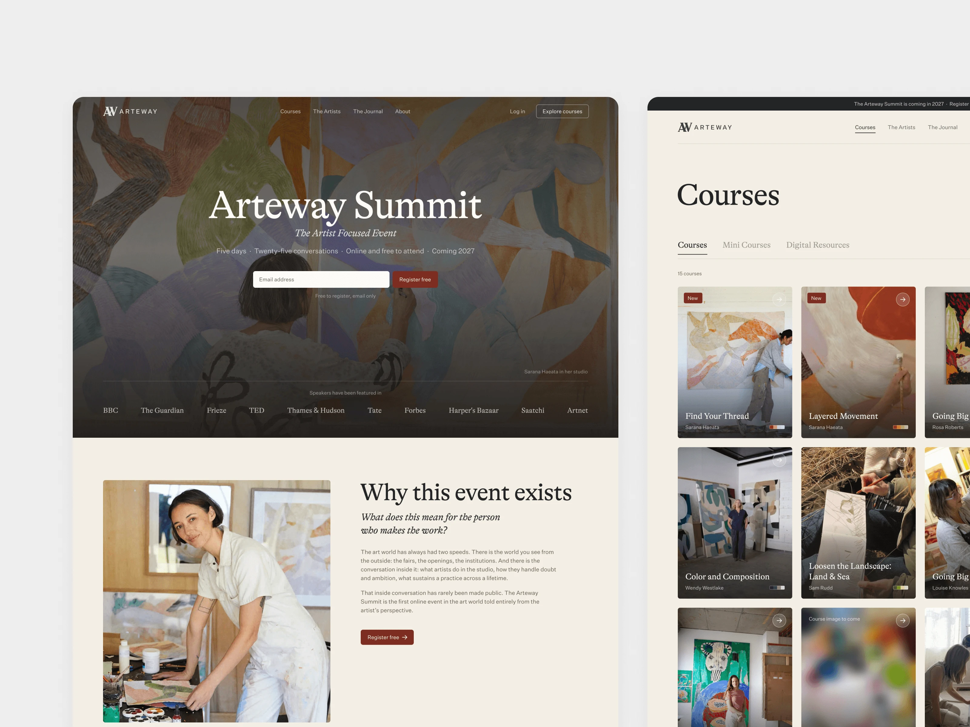
Arteway Summit and Courses pages
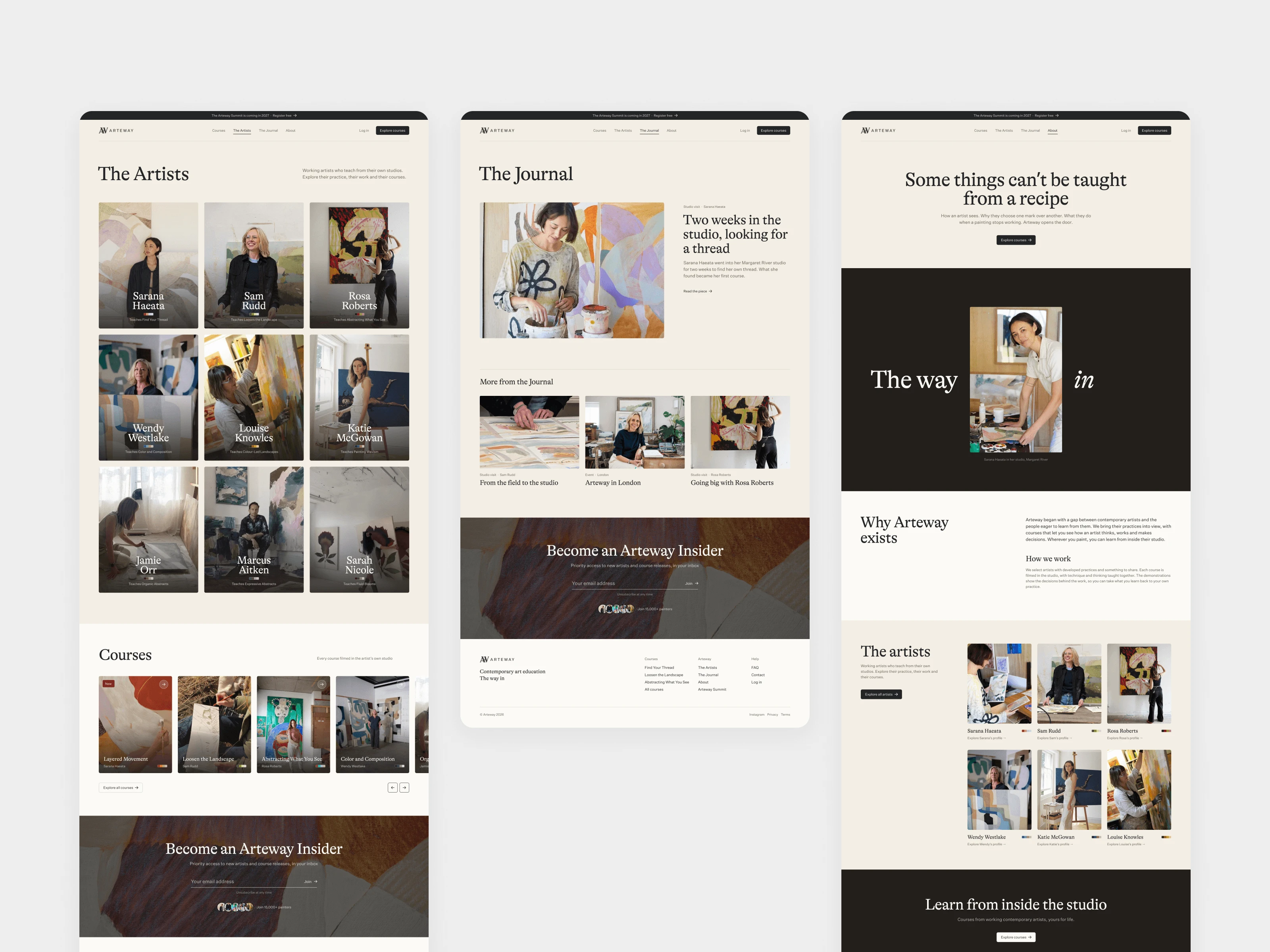
Arteway Artists, Journal and course pages
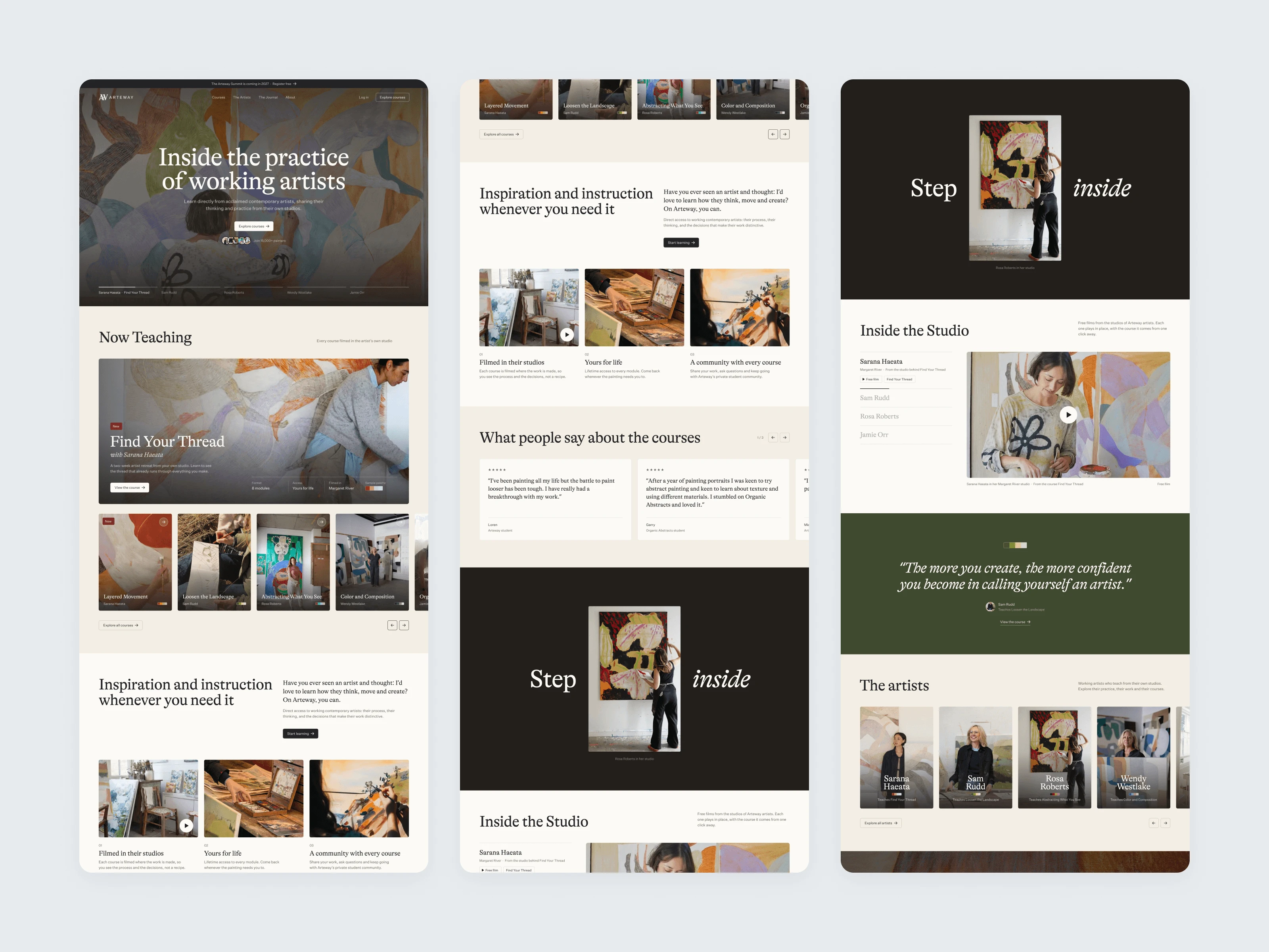
Arteway home page full scroll
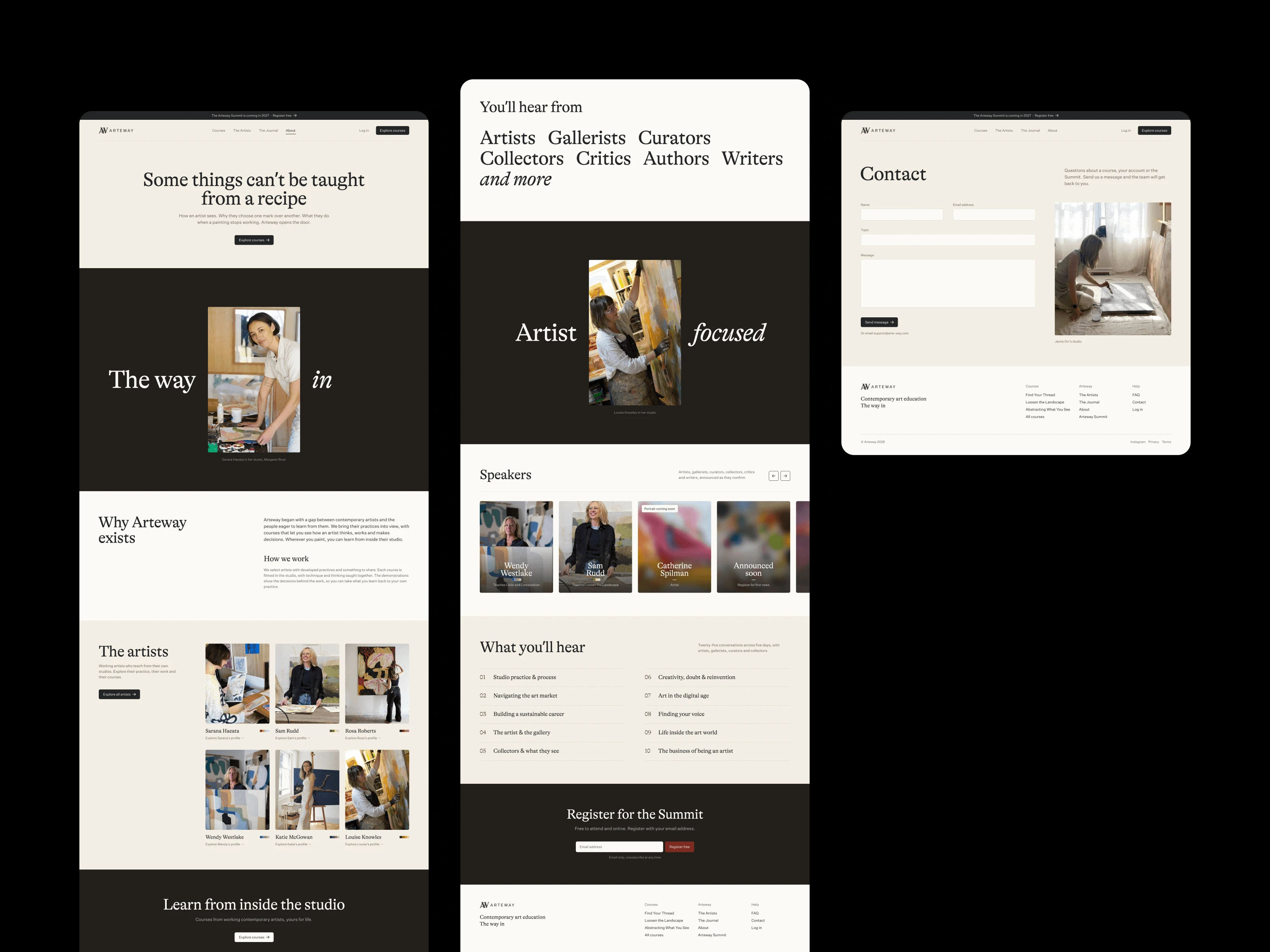
Arteway inner pages in the dark theme
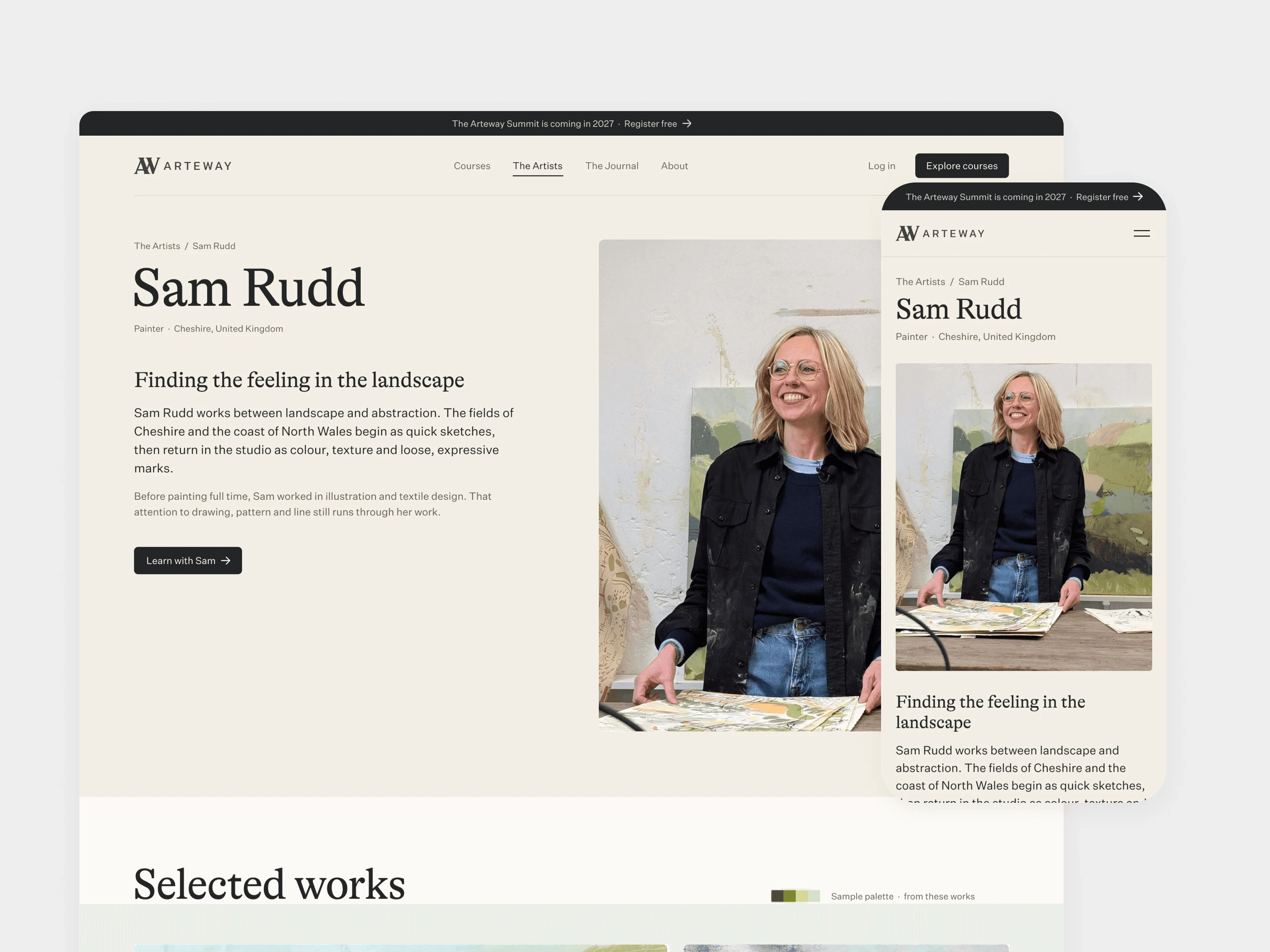
Arteway artist profile on desktop and mobile
Mobile
Mobile was designed at 390 wide with its own layout and the same page order as desktop. The hero rotates through the artists on its own, Home shows the top eight courses in a grid, and course and Summit speaker grids run in two columns. The menu goes full screen, sliders swipe, and the doorway image stays still on mobile and for anyone with reduced motion turned on.
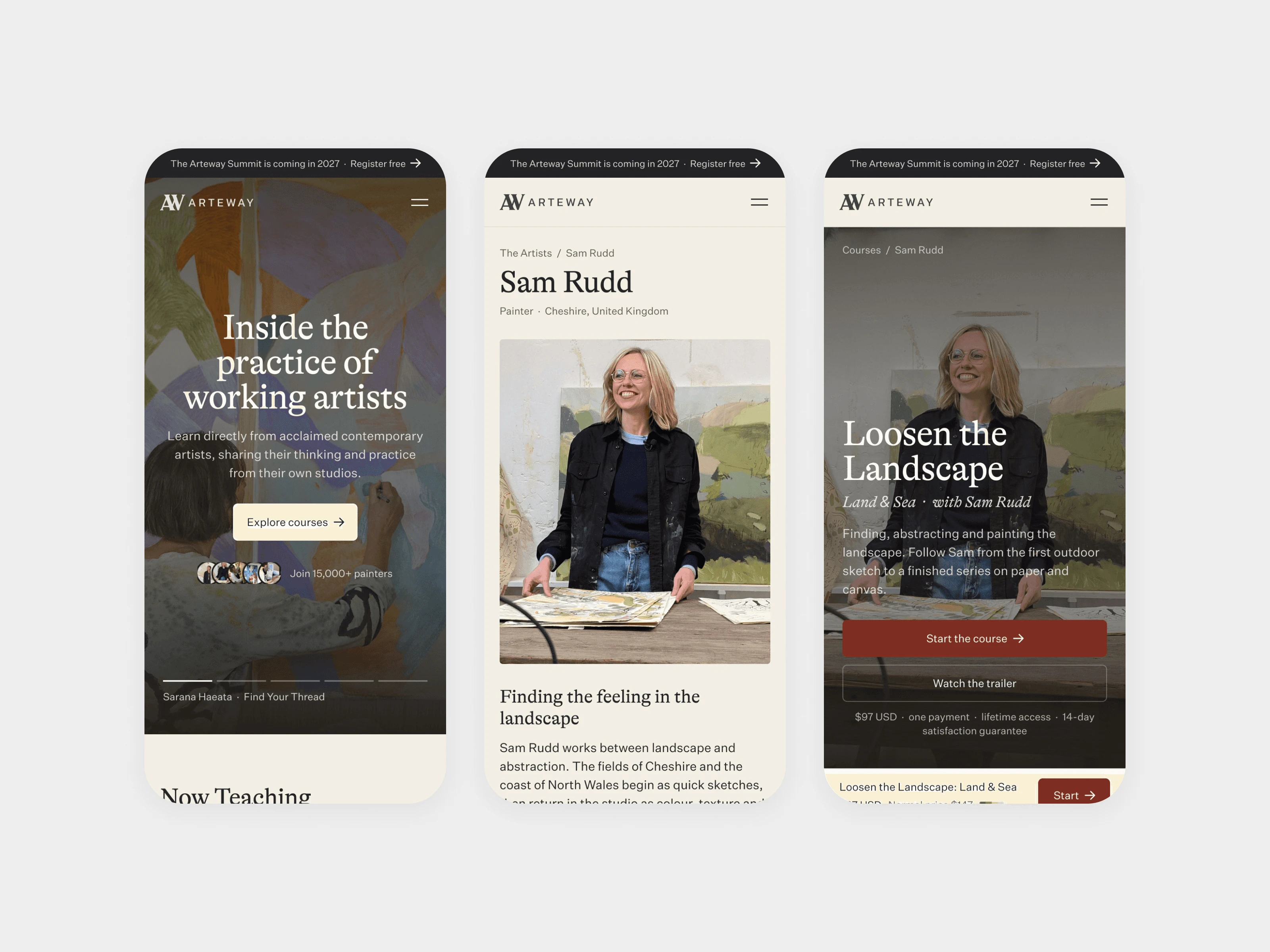
Arteway mobile home, artist and course screens
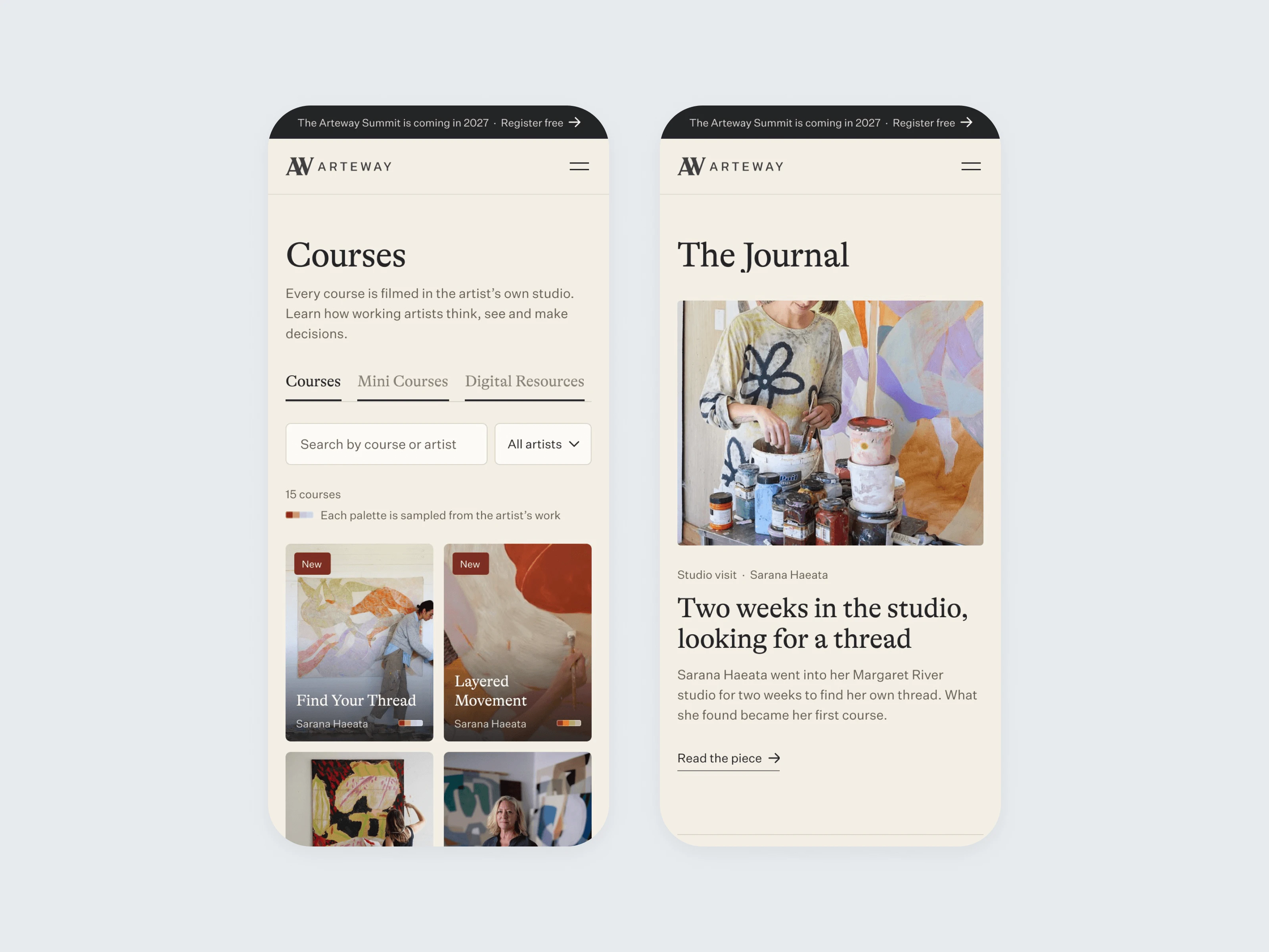
Arteway mobile Courses and Journal screens
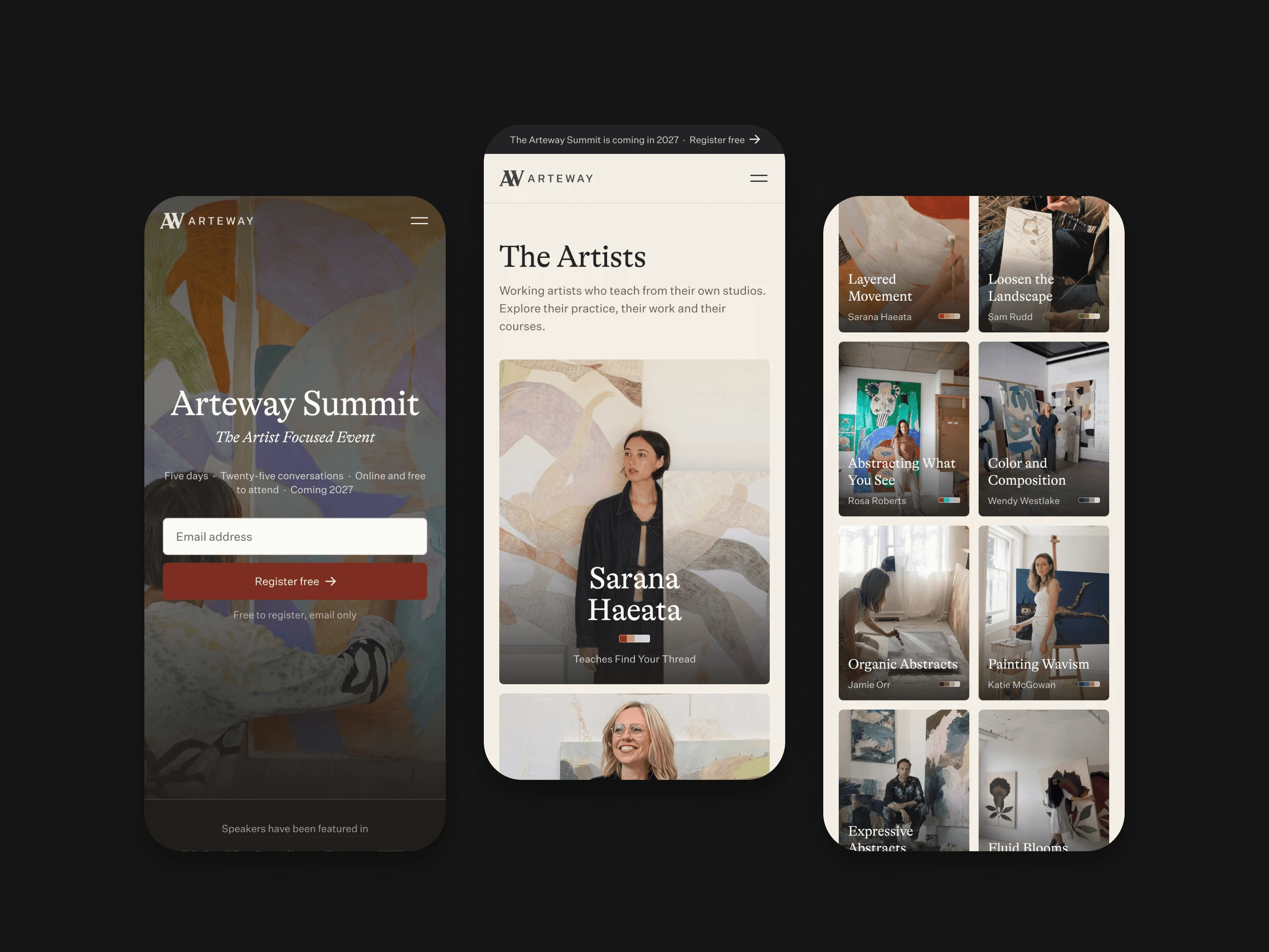
Arteway mobile screens in the dark theme
Built in Webflow
We built the site in Webflow on real content rather than placeholders: all 15 courses, the nine artists, the Journal and the Summit, then 11 mini courses and the Find Your Art Style Guide under their own tabs on the Courses page.
Things the team touches often are fields, not layouts. The Now Teaching card in the menu updates itself from the newest course. A studio film goes live by pasting a Vimeo or YouTube link into the artist's item. Both Summit forms submit to one Summit form, the newsletter sign-up keeps the same form and field names as the old site, and Google Tag Manager, the Meta pixel and Google Analytics were carried over so tracking would not drop. We also moved the existing Journal pieces across and added a minimal Community page.
Handover
At the end of October 2026 we transferred the site into Arteway's own Webflow workspace, ready for launch on their domain. The team also has the full brand assets: logos, colour values in HEX, RGB and CMYK, the typography and licensed fonts, graphic elements, the brand guidelines, and the social and icon files.
Like this project
What the client had to say
Daniel went deep on who Arteway is and why we exist before designing anything. The result is a brand and website that feel editorial, warm and easy to use. A thoughtful designer and a great partner. Highly recommend!


Martin Gorrie, Arteway
Nov 4, 2026, Client
Posted Nov 4, 2026
Arteway teaches painting through courses filmed in working artists' studios. We designed the brand identity and the website.
Likes
0
Views
0
Timeline
Jul 6, 2026 - Nov 4, 2026
Clients
Arteway