Built with Framer
EditMaster — Turning a Complex Course Offer Into More Sales

Mehdi Hassan
Verified
1 collaborator


Turning a Large Course Offer Into One Clear Sales Journey
EditMaster is a comprehensive training program for freelance video editors.
The offer combines technical editing education with the business systems required to build a sustainable freelance career—including client acquisition, pricing, project delivery, workflows, community support, and long-term growth.
The program contained substantial value, but that created an important conversion challenge: the website needed to communicate everything included without making the offer feel complicated or overwhelming.
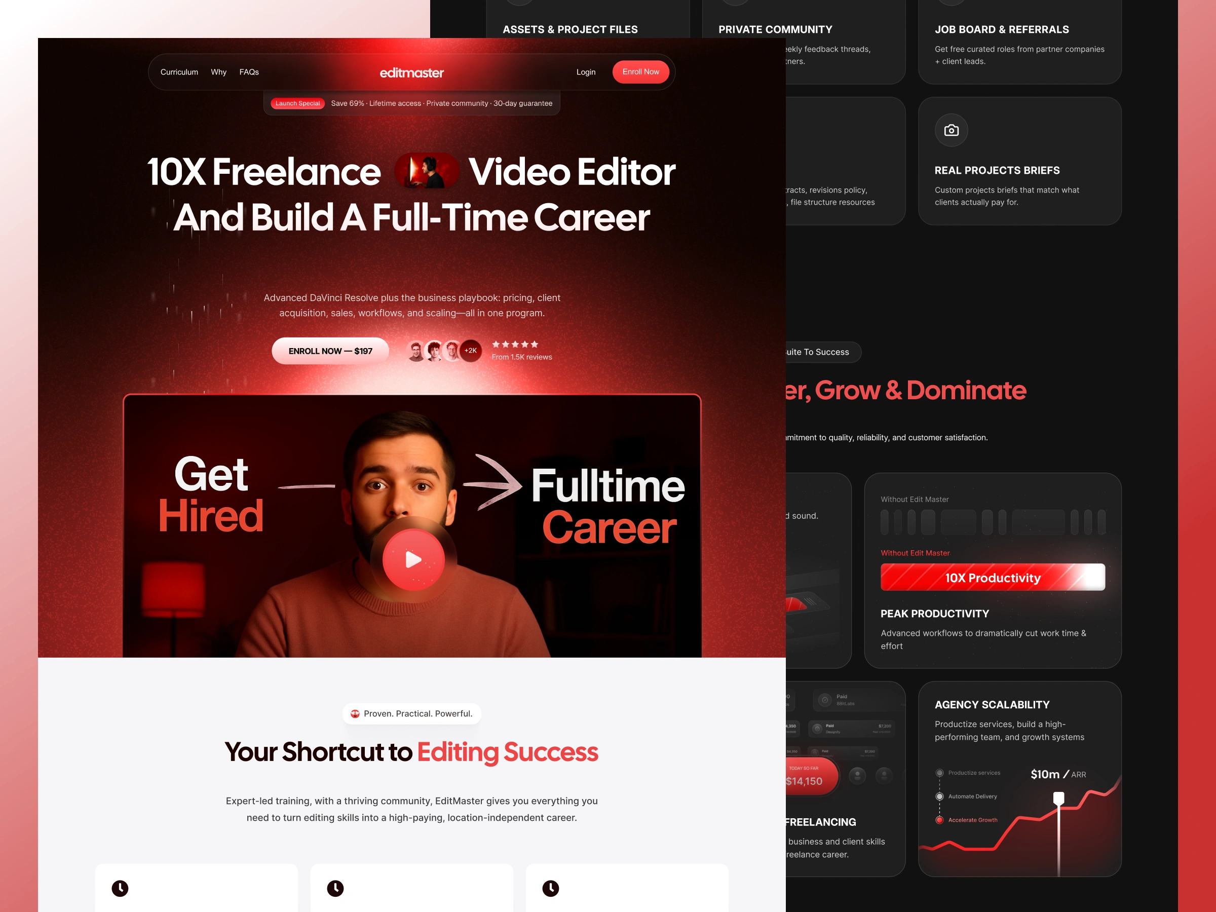
I redesigned and developed the long-form sales experience around a clearer journey—from understanding the transformation to exploring the roadmap, evaluating the program, building trust, and enrolling.
The Challenge
EditMaster was not selling one simple course.
The complete offer included:
Advanced editing education
A structured 30/60/90-day roadmap
Project files and creative assets
A private editor community
Job opportunities and referrals
Outreach and client-closing scripts
Coaching and live support
Workflow and delivery resources
Templates, presets, and frameworks
Guest training from industry professionals
The challenge was not a lack of content. It was organizing that content so visitors could understand its value without becoming lost in the details.
The redesigned page needed to answer the buyer’s most important questions:
Who is the program for?
What transformation does it promise?
What will students learn?
How does the roadmap work?
What resources are included?
Why is the offer credible?
How is it different from a typical editing course?
Is the value worth the investment?
What should the visitor do next?
A purely visual redesign would not have been enough. The page needed a stronger information hierarchy and a more deliberate sales journey.
about:blank
My Role
I led the project across conversion strategy, copywriting, UI/UX design, and responsive Framer development.
My responsibilities included:
Conversion-focused page structure
Information architecture
Offer and content hierarchy
UI/UX design
Visual direction
Long-form sales-page design
Responsive Framer development
Reusable section and component creation
Interaction and animation design
Mobile optimization
Quality assurance and final implementation
Selling the Transformation Before the Curriculum
One of the most important decisions was to lead with the outcome rather than immediately presenting the full curriculum.
A prospective student is not only buying editing lessons. They are buying the possibility of becoming more skilled, winning better clients, charging more confidently, and building a sustainable career around their work.
The opening experience was structured to communicate:
The primary career transformation
Who the program is designed for
The technical and business value combined in the offer
Immediate proof and credibility
A clear enrollment action
This made the page easier to understand before visitors encountered the more detailed course material.
Turning the Offer Into a Progressive Journey
The page was organized as one connected argument rather than a collection of unrelated course sections.
The journey moves visitors through:
The central promise
The professional and financial opportunity
The key benefits of the program
A 30/60/90-day path toward progress
The complete curriculum and resource system
Community, support, and client-acquisition resources
The larger bonus and value stack
Proof and credibility
Pricing and enrollment
Frequently asked questions and objection handling
Each section prepares the visitor for the next decision.
Instead of asking people to evaluate the entire program immediately, the page gradually builds understanding, confidence, and perceived value.
Making Progress Feel Achievable
Online education offers can feel abstract when they only describe hours of content or lists of lessons.
The 30/60/90-day roadmap helped turn the program into a visible progression.
The journey was divided into three stages:
Days 1–30: Build the foundation
Develop the core editing skills, create portfolio work, and prepare the initial outreach system.
Days 31–60: Acquire and deliver
Begin approaching clients, handling discovery conversations, closing initial projects, and improving delivery.
Days 61–90: Build retainers and scale
Raise rates, improve workflows, create repeatable systems, and move toward more predictable freelance income.
This structure helped visitors imagine themselves moving through the program rather than simply purchasing access to a library of content.
Translating Features Into Outcomes
The original offer included a large number of components.
Instead of treating them as one undifferentiated list, I grouped them around the outcomes students care about.
Master the craft
Technical training, project files, presets, templates, and practical assignments support stronger creative execution.
Win clients
Outreach scripts, proposal resources, sales frameworks, and project briefs make the business side of freelancing feel more actionable.
Deliver professionally
Contracts, revision policies, file structures, workflow systems, and delivery checklists help students operate more confidently.
Build a sustainable career
Community access, coaching, job opportunities, retainers, pricing systems, and scaling guidance connect the course with long-term professional growth.
This shifted the presentation from “here is everything included” to “here is how each part helps you reach the result.”
Increasing Perceived Value Without Creating Overload
EditMaster includes a substantial collection of training, resources, support, and bonuses.
The website needed to make that depth feel valuable rather than excessive.
I used a structured value-stack presentation in which each major part of the offer received:
A clear category
A focused benefit
Supporting details
A visual anchor
A stated role within the broader transformation
The curriculum, community, coaching, templates, scripts, and expert workshops were presented as connected parts of one system.
This helped visitors understand that they were not buying a single video course. They were joining a more complete education and career-development ecosystem.
Creating a Stronger Visual Hierarchy
Long-form sales pages can become difficult to scan when every section has the same visual weight.
I created a more controlled hierarchy through:
Large, outcome-focused headings
Shorter supporting explanations
Modular cards and structured content groups
Clear section transitions
Alternating visual density
Strong price and CTA emphasis
Consistent spacing and alignment
Repeated but purposeful enrollment actions
Distinctive roadmap and bonus presentations
The design gives important decisions more visual priority while allowing detailed information to remain available for visitors who need it.
The goal was not simply to make the page more attractive. It was to help visitors recognize what mattered at every stage of the journey.
Designing Repeated Calls to Action Without Creating Pressure
A long sales page should not require visitors to return to the top whenever they become ready to purchase.
I placed enrollment opportunities after the major decision-making moments:
The initial promise
The core benefits
The career roadmap
The curriculum and resources
The bonus stack
The pricing presentation
The frequently asked questions
Each call to action appears after the page has provided a new layer of value or answered an important concern.
This keeps the purchase path accessible without filling the page with disconnected or excessively aggressive buttons.
Reducing Purchase Friction
The bottom of the page needed to help visitors make a confident final decision.
The offer presentation brings together:
What is included
The total value
The current purchase price
Access terms
Community and support
Guarantee information
Frequently asked questions
A clear enrollment action
Rather than introducing new claims at the end, this part of the page summarizes the story visitors have already seen.
The result is a more focused transition from consideration to purchase.
Responsive Framer Development
I translated the redesign into a responsive Framer website with reusable sections and consistent behavior across screen sizes.
Particular attention was given to:
Keeping long-form content readable on mobile
Preserving heading hierarchy
Reorganizing multi-column curriculum sections
Stacking roadmap and bonus cards clearly
Maintaining appropriate CTA visibility
Optimizing spacing and content rhythm
Preserving image quality without hurting performance
Simplifying motion on smaller screens
Keeping pricing and enrollment information easy to understand
The mobile experience was treated as a separate conversion environment rather than a smaller copy of the desktop page.
The Result
The redesigned website gave EditMaster a clearer and more commercially effective way to present its complete program.
It transformed a large collection of lessons, resources, bonuses, support, and business systems into one structured enrollment journey.
The completed project delivered:
A clearer primary promise
Stronger offer hierarchy
A more understandable 30/60/90-day roadmap
Better organization of curriculum and bonuses
Improved perceived value
A more focused purchase journey
Responsive Framer implementation
A reusable system for future offer updates
Clearer enrollment opportunities throughout the page
After the redesigned website launched, the client reported a 10–15% increase in sales.
The result should be presented as client-reported unless access to the underlying sales and traffic analytics is available.
Like this project
What the client had to say
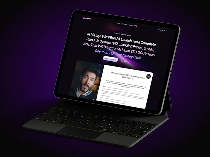
Working with Mehdi Hassan on the design of bridox.co has been an exceptional experience from start to finish. Mehdi combines strong technical expertise with a great eye for clean, modern design.


Nayeem Hussain, Bridox
Nov 15, 2025, Client
Posted Aug 10, 2026
Redesigned EditMaster’s long-form course funnel to improve clarity and trust; the client reported a 10–15% sales increase after launch.
Likes
10
Views
9
Timeline
Oct 24, 2025 - Nov 12, 2025
Clients
Bridox
Collaborators