Built with Framer
Lakehouse Partners — Turning Complex Data Into Clarity

Mehdi Hassan
Verified
1 collaborator


Overview
Lakehouse Partners helps organizations turn complex data, analytics, and AI initiatives into practical business value.
The company needed a website that could communicate a broad and technically sophisticated service offering without overwhelming business decision-makers.
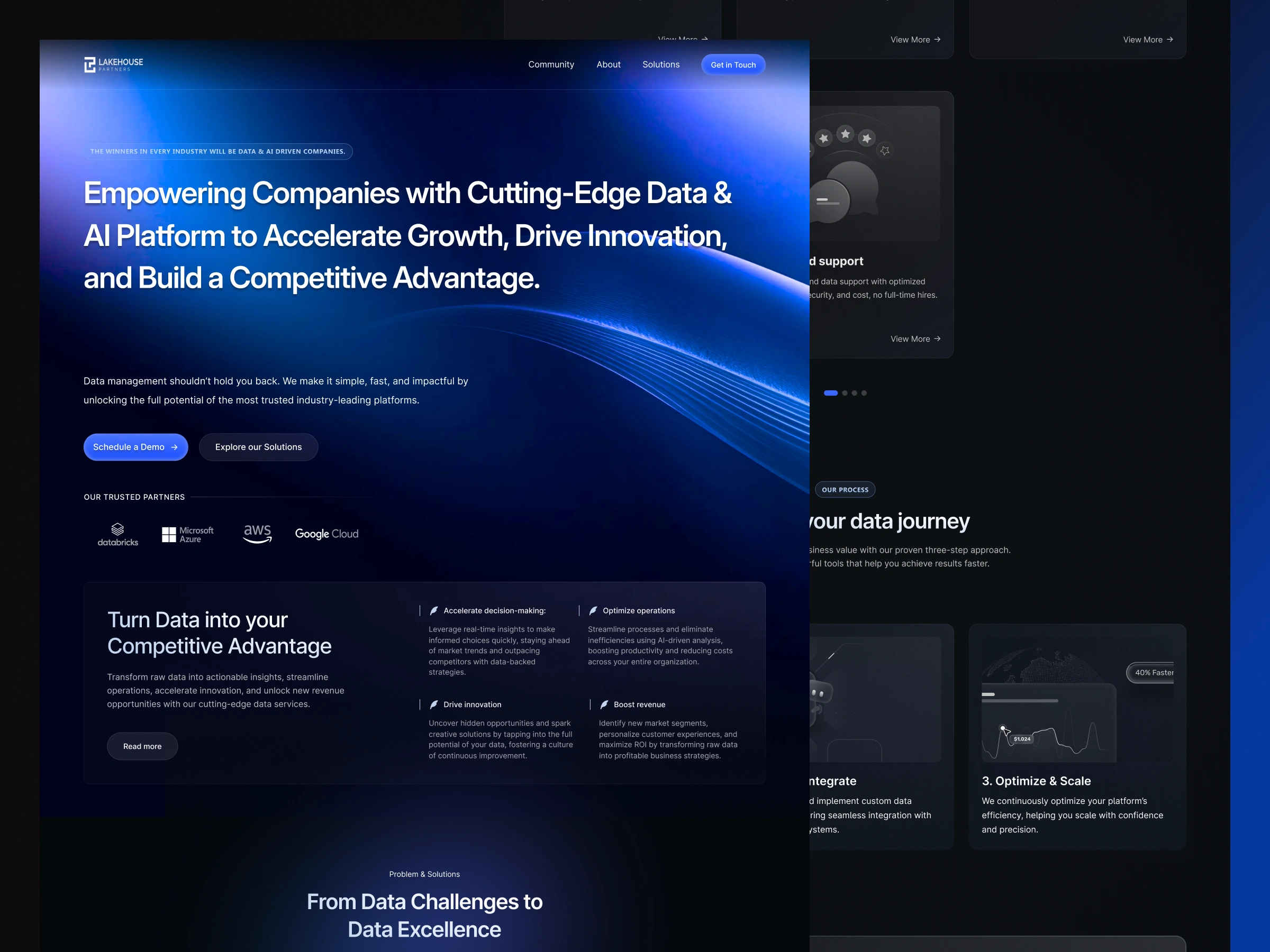
I designed and developed a connected multi-page experience that organized the company’s expertise into a clearer buyer journey across the homepage, methodology, services, commercial, and nonprofit pages.
The Challenge
Data and AI consulting services are difficult to explain clearly.
The subject matter is technical, the buying process involves several stakeholders, and different organizations enter the conversation with very different levels of data maturity.
The website needed to communicate expertise without relying on excessive technical language. It also had to help visitors understand:
• What Lakehouse Partners provides
• Where their organization currently stands
• How the engagement process works
• Which services match their needs
• How the value differs for commercial and nonprofit organizations
• What the next step should be
The challenge was not simply to fit more information onto the website. It was to give that information a clear hierarchy and turn it into a coherent decision-making journey.
My Role
I owned the website design and Framer development across the complete multi-page experience.
My responsibilities included:
• Website structure and page hierarchy
• Information architecture
• UI/UX design
• Visual direction
• Reusable section and component systems
• Responsive Framer development
• Interaction and motion design
• Cross-page consistency
• Quality assurance and final implementation
Structuring the Website Around Buyer Questions
Rather than presenting Lakehouse Partners as a long list of disconnected technical capabilities, I structured the website around the questions a prospective client would naturally ask.
The homepage established the broader value proposition and introduced the company’s expertise.
The methodology page explained how an engagement progresses, reducing uncertainty around what working with the company would involve.
The service page connected technical capabilities with business needs and outcomes.
Dedicated commercial and nonprofit pages then allowed the same core expertise to be presented through the priorities of two different audiences.
This created one connected website while still giving each audience a relevant path through the information.
Explaining the Methodology
For a consulting company, prospective clients are not only evaluating the final service. They are also evaluating how the company thinks, communicates, and delivers.
The methodology page was designed to make the process feel structured and manageable.
I used a clear vertical progression, grouped content, supporting explanations, and repeated visual patterns to guide visitors from the initial assessment through strategy, implementation, and long-term value.
This helped turn an abstract consulting process into something visitors could understand before starting a conversation.
Creating Audience-Specific Journeys
Commercial companies and nonprofit organizations may need similar technical foundations, but they evaluate value through different priorities.
The commercial page focused the experience around efficiency, growth, cost reduction, scalability, and competitive advantage.
The nonprofit page presented the same technical capability through organizational impact, responsible resource use, reporting, accessibility, and long-term sustainability.
Instead of duplicating the same generic service page, I created distinct journeys that allowed each audience to recognize its own challenges and priorities.
The Visual Direction
The visual system needed to feel technical, credible, and modern without becoming cold or overly corporate.
I developed a dark visual language built around deep blue surfaces, controlled gradients, luminous accents, structured cards, and clear typographic contrast.
The interface combines the precision expected from a Data & AI consultancy with enough visual energy to make a highly technical subject feel more approachable.
Motion and glow were used selectively to direct attention, reinforce hierarchy, and create depth—not as decoration that competes with the content.
Building a Connected Design System
The project included several substantial pages, so consistency and reusability were essential.
I created repeatable systems for:
• Navigation and page headers
• Hero sections
• Content and comparison cards
• Process and methodology blocks
• Service presentations
• Proof and credibility sections
• Calls to action
• Footers and supporting navigation
• Spacing, typography, color, and responsive behavior
This allowed every page to feel part of the same brand while still giving individual page types enough flexibility to communicate different content.
Framer Development
I developed the complete website in Framer, translating the visual system into reusable, responsive structures.
The build was organized to keep layouts, spacing, typography, components, and interactions consistent across the entire website.
Rather than treating each page as an isolated composition, I built a shared system that could support future services, audience pages, use cases, and content updates.
The final implementation preserved the depth and visual polish of the design while remaining structured and manageable as a working website.
The Result
The completed project turned a broad and technically complex consulting offer into a more coherent digital experience.
The final website delivered:
• A clear multi-page information architecture
• A stronger hierarchy for technical services
• Distinct journeys for commercial and nonprofit buyers
• A structured explanation of the company’s methodology
• A consistent visual system across five core pages
• A reusable and responsive Framer build
• A scalable foundation for future website content
The result was not simply a collection of redesigned pages. It was a connected website system that made Lakehouse Partners’ expertise easier to understand, explore, and act on.

Like this project
What the client had to say
Excellent work and experience working with Mehdi. His dedication to the project, attention to detail, great sense for design, and communication, made it an easy breeze working with him. Highly recommend and will continue working with him.

Ivan mana
Nov 18, 2025, Client
Posted Aug 9, 2026
Designed and built a multi-page website that turns complex Data & AI services into a clear, credible journey for commercial and nonprofit buyers.
Likes
10
Views
12
Timeline
Oct 7, 2025 - Nov 18, 2025
Clients
Lakehouse Partners
Collaborators