Shore Cafe Brand Identity Development
Mary Anne Josette
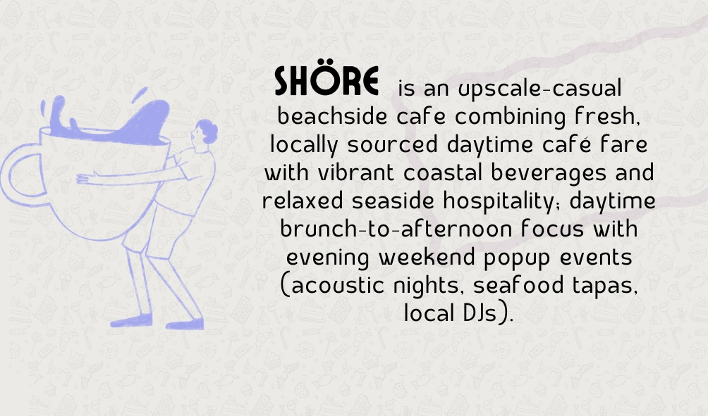
Shore Cafe
A full brand identity project for a beachside café concept — from logo exploration and visual language to window mockups and social-ready presentations. Shore was designed to feel like a place worth lingering in.
Brand Identity
Logo Design
Visual Strategy
Social Media Design
Mockup & Presentation
Copywriting
The Brief
Shore came in as a concept café — a place that lives at the intersection of a morning coffee, a lazy afternoon, and a glass of wine at sunset. The brief asked for a brand that could hold all three moods without losing its thread. It needed to feel local and welcoming, but polished enough to attract the kind of customer who notices design.
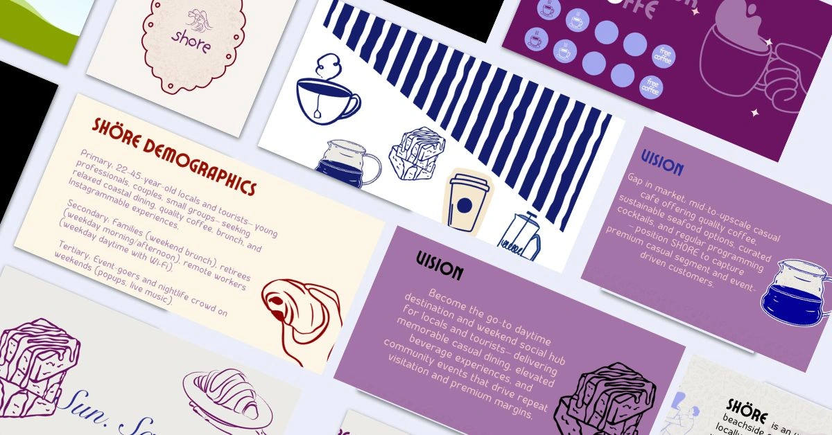
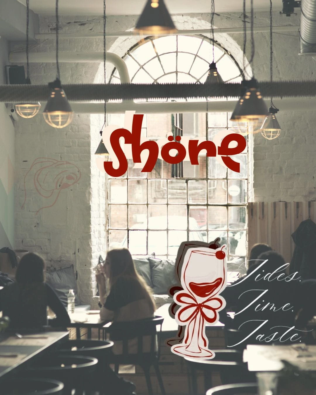
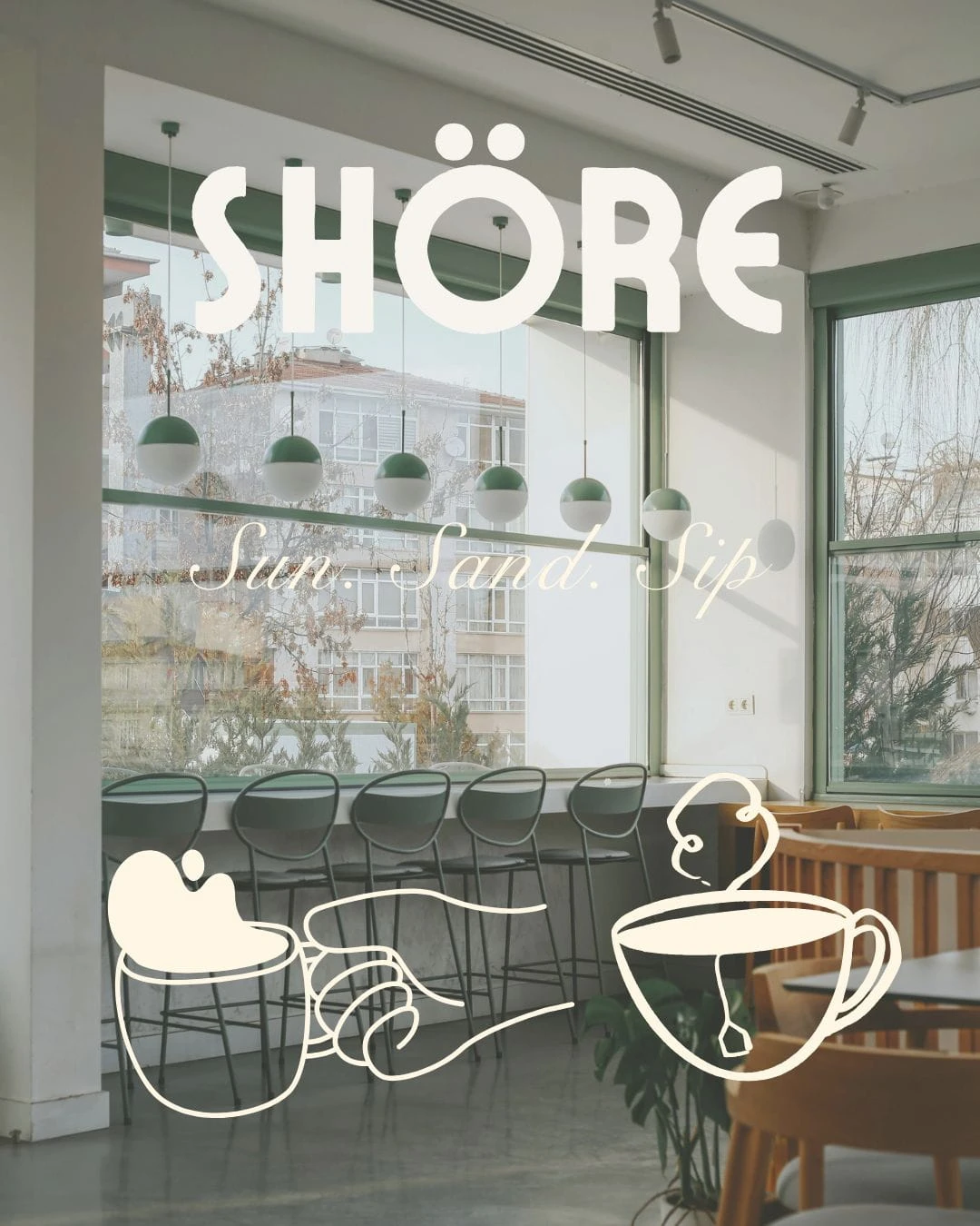
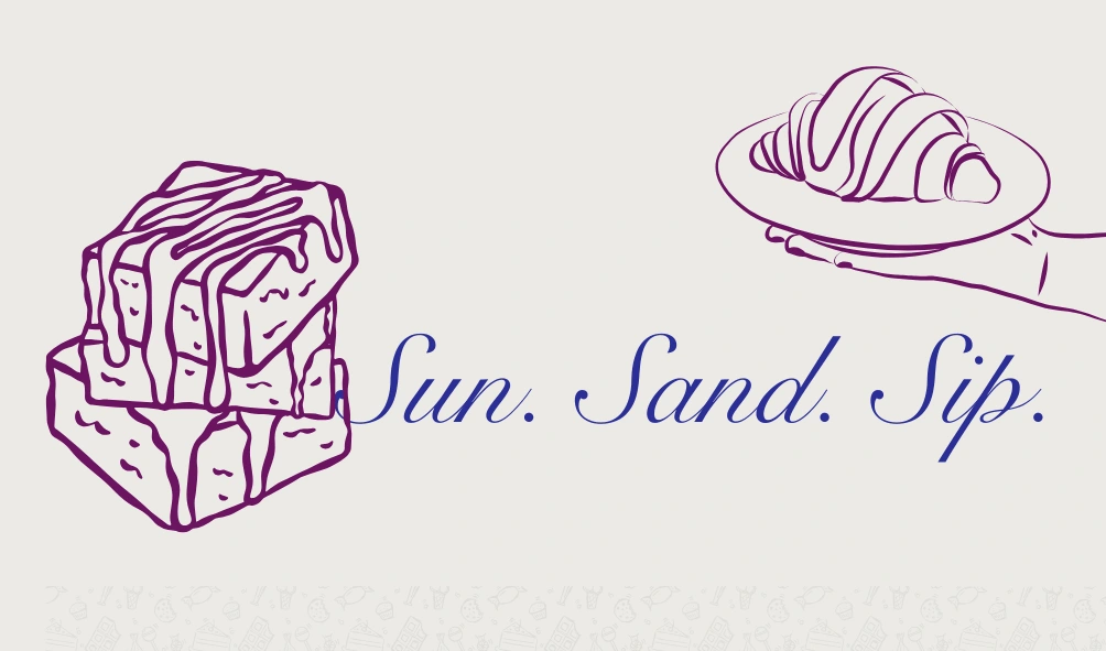
The taglines said it clearly: Sun. Sand. Sip. — and for the evening offering — Tides. Time. Taste. Two distinct personalities sharing one name.
What Was Made
Logo System | Colour & Tone | Illustration Style | Windows Mockup
Audience Strategy | Brand Deck
The Process
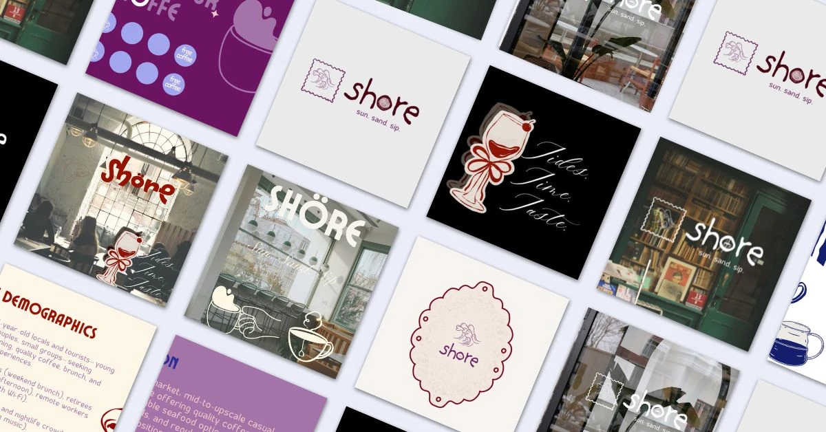
The work started with the stamp. There was something honest about it — a postmark is already about a place, a moment, a memory of somewhere you went. Putting a wave inside a stamp frame felt like the right anchor for a coastal café with a sense of permanence.
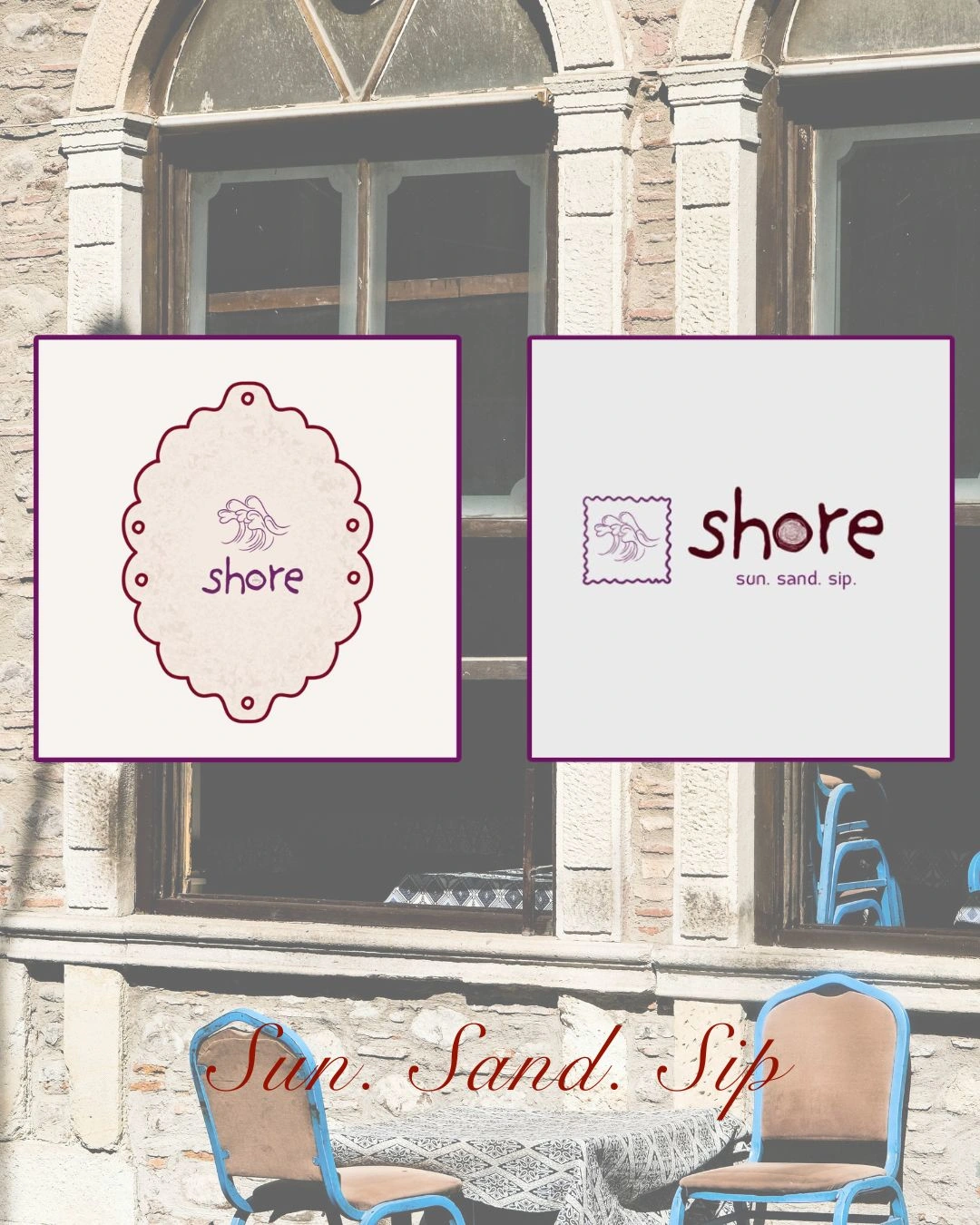
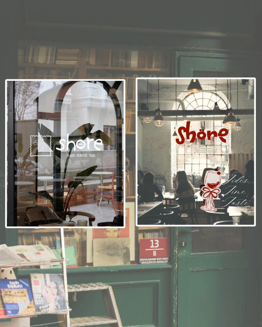
From there, the identity split into two directions. The daytime face was minimal — a clean lowercase wordmark, the stamp icon, white on glass. The kind of brand that looks good on a flat white cup or a frosted window at 8 am. The evening face went the other way: red, round, and handmade. The wineglass illustration with its little cherry hat was meant to feel like something a good bartender might doodle on a napkin.
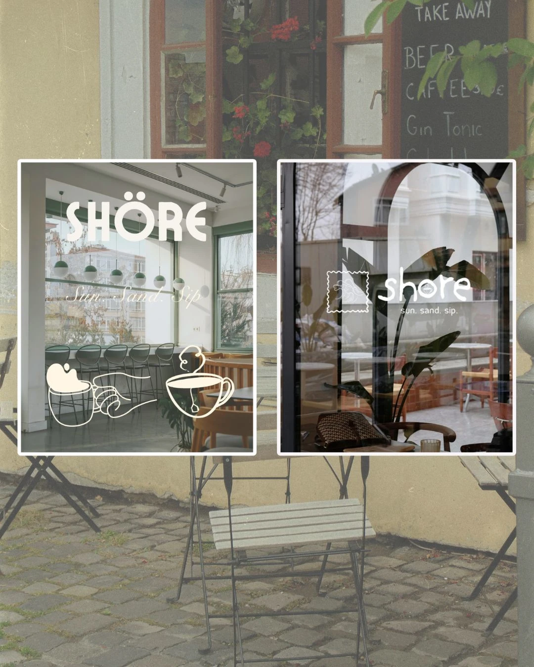
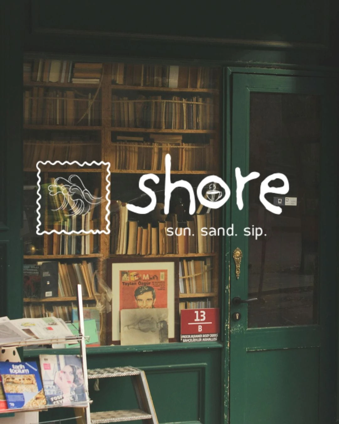
Window mockups were a key part of the process. Seeing a logo composited onto a real café storefront — light bouncing off glass, plants behind the sign, people inside — is where you learn whether the brand actually works. It forces honesty. Several directions that looked strong on a white slide fell away when placed in context.
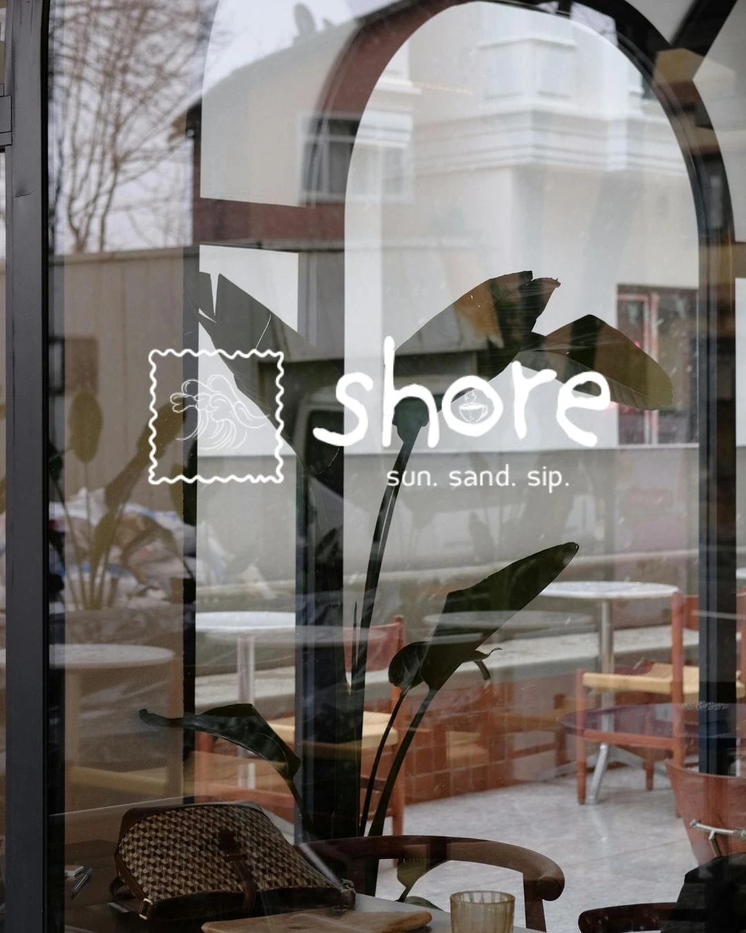
"The window mockups forced the real edit. Some logos that looked good on white didn't survive the glass."
The final presentation brought it all together: vision, demographics, visual system, and multiple identity routes. The client could see not just what the brand looked like, but why each choice had been made — and where the brand could go next.
A note on the work
Shore was the kind of project where the brief gives you just enough room to explore. The name itself — Shore — is doing a lot of work. It's a place, a feeling, a threshold between one thing and another. The best moments in the project were when the design started to feel like it understood that.
Like this project
Posted Jun 14, 2026
Developed comprehensive brand identity for Shore Cafe, capturing distinct day and night personalities.