Data Systems Design ProjectsData Systems Design Projects
Cover image for I specialize in transforming complex
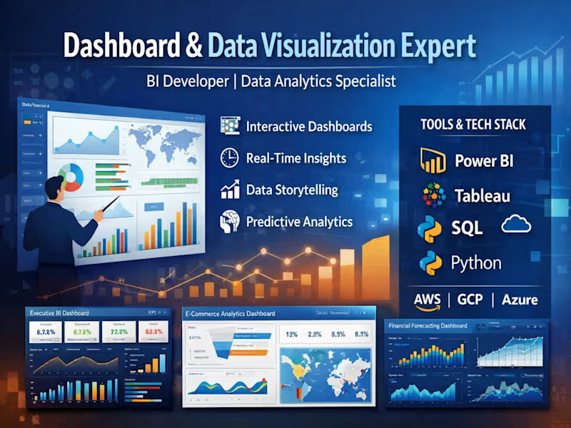
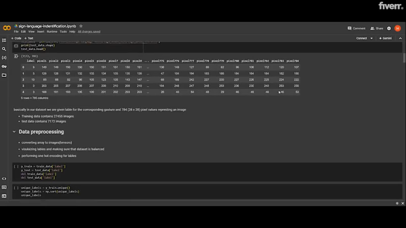
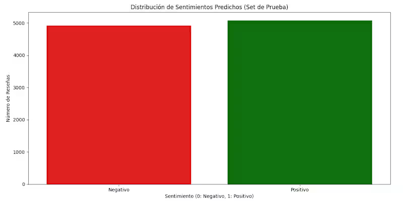
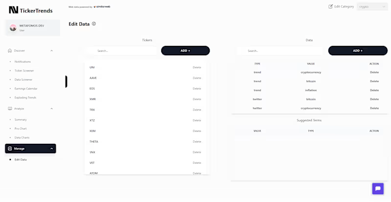
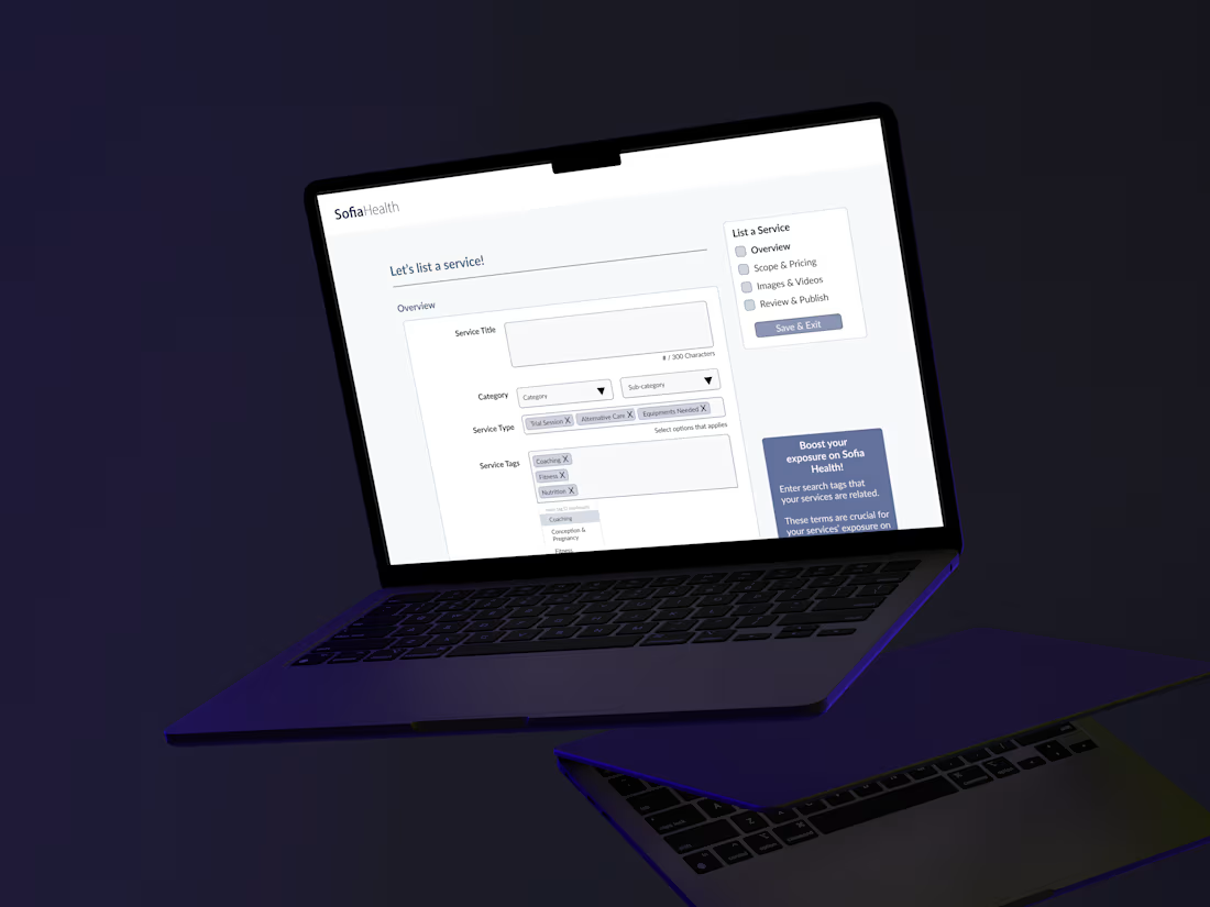
I specialize in transforming complex datasets into intuitive, visually compelling dashboards that drive strategic decision-making. With deep expertise in BI tools and data analytics, I design interactive, real-time reporting systems that help businesses uncover trends, monitor KPIs, and optimize performance. My approach combines data storytelling, clean UI/UX, and scalable architecture to deliver impactful insights. 🔹 My Project Portfolio: 📊 1. Executive Business Intelligence Dashboard Built a dynamic KPI dashboard for C-level executives Integrated multiple data sources (CRM, ERP, marketing platforms) Delivered real-time insights on revenue, growth, and performance Tools: Power BI, SQL, Azure 📈 2. E-commerce Analytics Dashboard Designed a dashboard tracking sales, customer behavior, and conversion rates Implemented cohort analysis and funnel visualization Improved marketing ROI tracking by 40% Tools: Tableau, Python, Google Analytics 📉 3. Financial Performance & Forecasting Dashboard Developed financial models and forecasting dashboards Visualized cash flow, P&L, and budget vs actuals Enabled data-driven financial planning Tools: Power BI, Excel, DAX 📍 4. Operations & Supply Chain Dashboard Created logistics tracking and inventory monitoring system Real-time alerts for stock levels and delays Reduced operational inefficiencies Tools: Looker Studio, BigQuery 📊 5. AI-Powered Analytics Dashboard Integrated machine learning predictions into dashboards Automated anomaly detection and trend analysis Delivered predictive insights for decision-making Tools: Python, TensorFlow, Streamlit
1
2
202
Cover image for Skip the License Fee: I
Skip the License Fee: I Built a Full Dashboard with Just JS Verve Pulse: Revenue & Funnel Intelligence Dashboard Most analysts stop at Power BI or Tableau. I wanted to go a layer deeper by building a fully custom dashboard in React to show what's possible when a BI tool's templates don't box you in. Off-the-shelf visualization tools are great, but they come with real limits: fixed chart types, licensing costs, and UX you can't fully control. With JavaScript, I designed and built Verve Pulse from a blank canvas. Total control over layout, interactivity, and how the story of the data actually reads to stakeholders, and deployed it for free on Vercel, with no licensing cost and no vendor lock-in. The dashboard unifies what's usually three separate reports - current performance, historical trend, and forecast as a single filterable view, with dedicated explorer views for 4 purchase funnels, 4 customer segments, and regional performance, plus a seasonality-adjusted forecast that shows its own assumptions instead of acting like a black box. What I did: Designed the full filter and data framework from a wireframe spec Built a seasonality-adjusted forecasting model (trend decomposition + monthly seasonal indexing) Designed and built the interactive dashboard end-to-end in React. Deployed it as a free, live, secure product on Vercel Why it matters: custom-coded dashboards trade a steeper learning curve for full design freedom, zero licensing cost, and infrastructure you fully control - a combination most Power BI/Tableau builds can't offer. Skills & tools: Data analysis & forecasting · Dashboard/product design · React & Recharts · Git/GitHub · Vercel deployment 🔗 Code: https://github.com/SrijaaBizAnalyst/Revenue-Analytics-Dashboard-for-Verve-Studio
1
28