Built with Jitter

Logo design and brand identity for Cobalt , a geometric mark built on the idea that raw data is noise until someone gives it structure.
Winner, Best Human by Design Moment — Envato Challenge.
Envato’s Challenge, themed “Human by Design,” asked creators to show where human judgment — not the AI tooling — made the work. I built Cobalt, a brand for an analytics platform: the concept “Metrics are blind. Architects see all.” carried through identity, tone, and a visual language built around moving from data noise to clarity (Origin → Synthesis → Expansion).
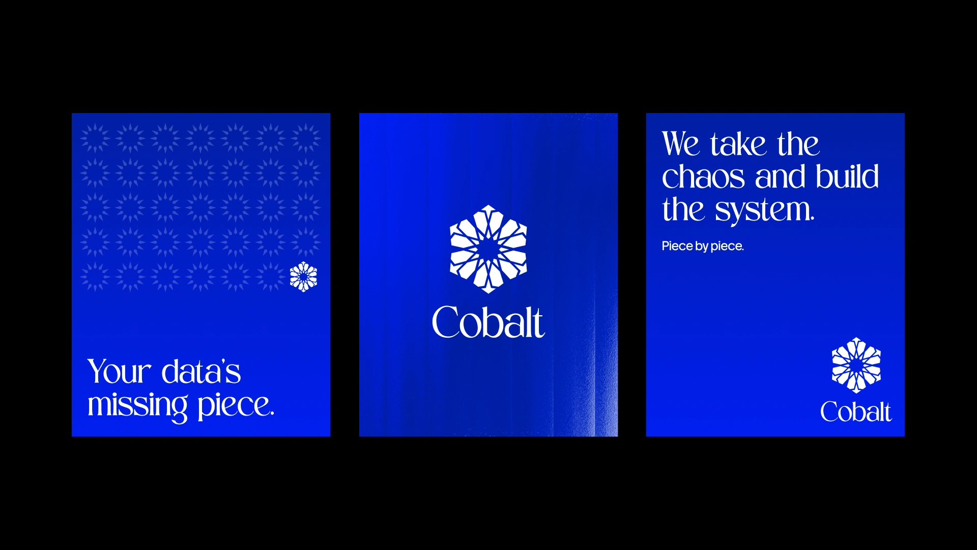
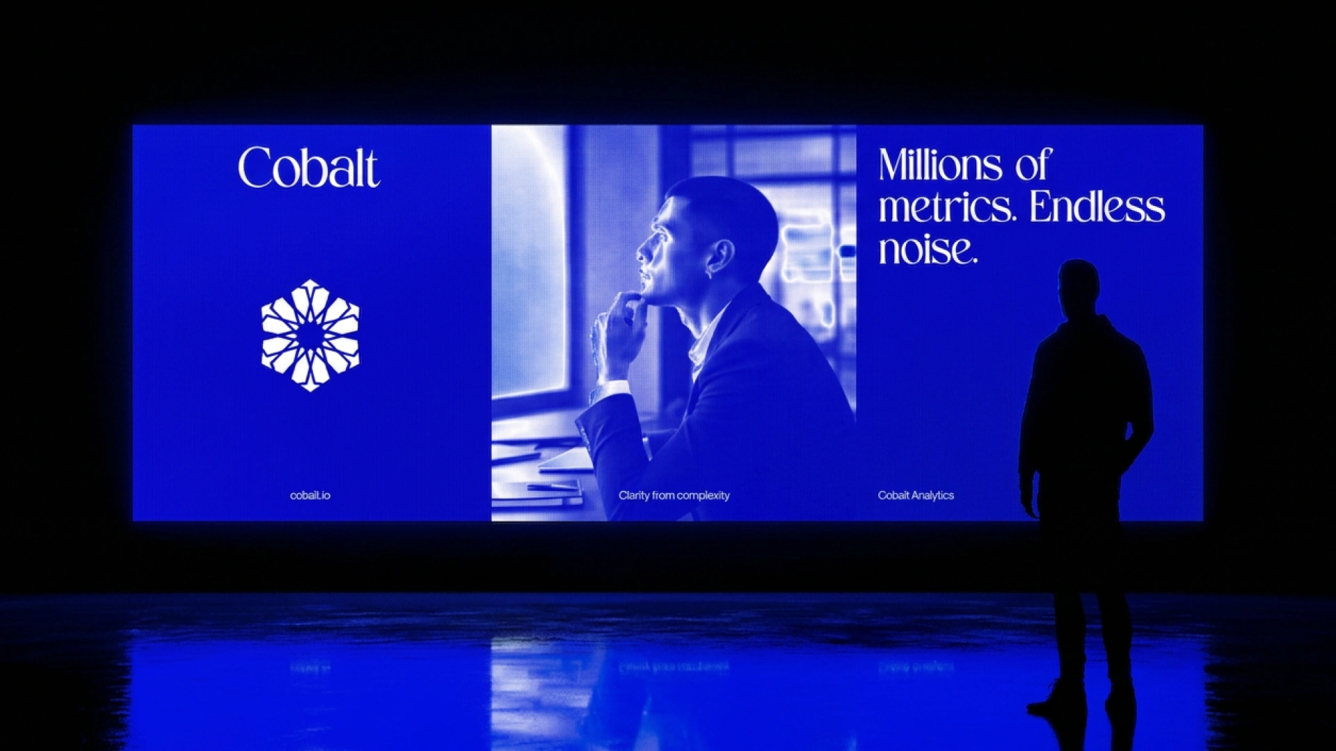
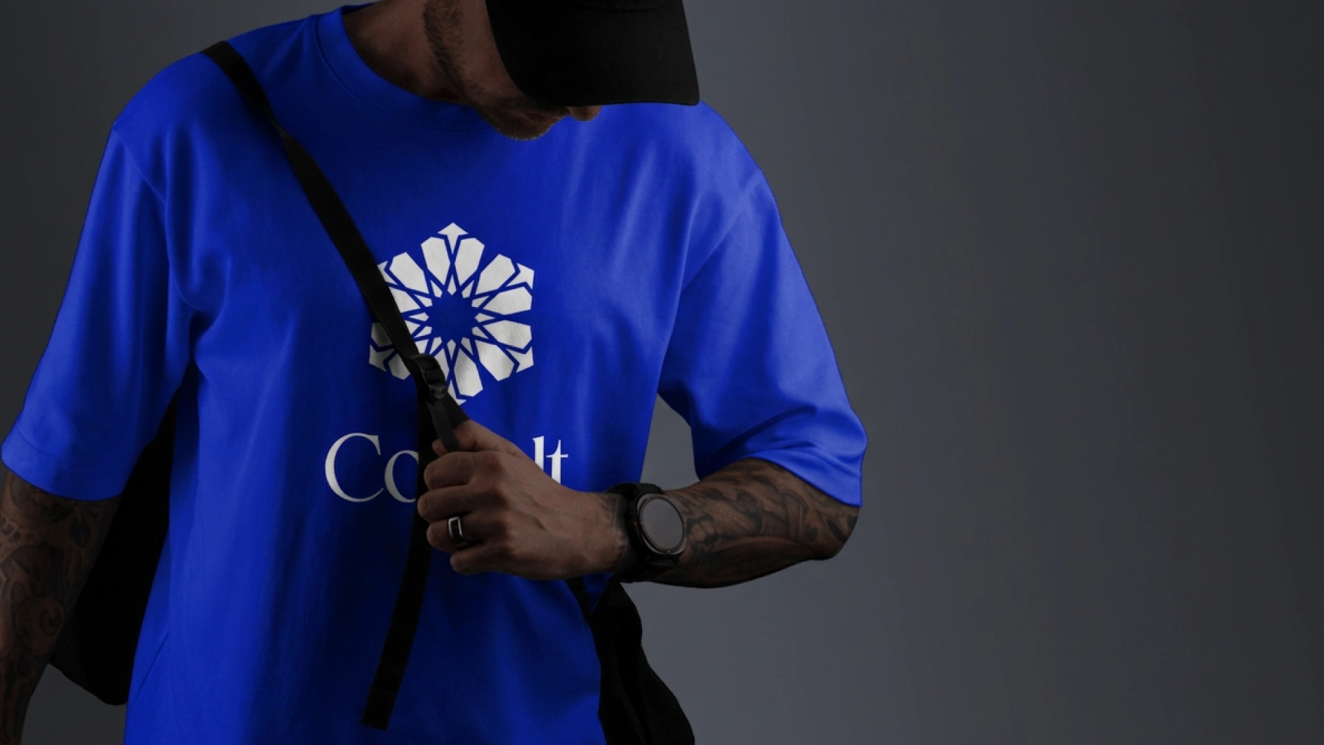
Cobalt turns scattered metrics into a readable architecture for enterprise teams. Analytics companies almost all land on the same visual language — a cold gradient, a geometric sans, an abstract swoosh — and the brief was to look engineered instead of generated, and to survive on a poster, a t-shirt and a pattern field without the mark falling apart.
The logo is a rosette drawn on a six-fold grid: twelve identical shards rotated around one centre, so the mark reads as many separate pieces resolving into a single form. That is the company's promise, drawn rather than written in a tagline. The shard is also the unit of everything else, which is why the identity has three construction states — Origin, Synthesis, Expansion — taking the mark from a sparse star to a closed rosette to a scattered field, and why one logo system carries the whole narrative instead of a single lockup. The wordmark is a high-contrast serif against that geometry: it gives a data brand authority and a little warmth, so the result does not read as cold infrastructure. Colour and texture do the rest — one cobalt blue, one vertical ripple, heavy grain, so every poster looks like a signal passing through interference. The mark then tiles into pattern fields at three densities, which makes the brand recognisable before the logo appears on the page.
5 likes · 92 views · Oct 21, 2026
Designed brand identity for Cobalt, an analytics platform, emphasizing clarity from data noise.


