Built with Jitter
Clark Baldwin Travel Website Redesign

Kris Anfalova
Verified


Clark Baldwin Travel is a bespoke luxury travel agency, planning trips through personal relationships with the world's top hotels — Rosewood, Aman, Waldorf Astoria, Belmond, and others. I designed the full website, positioning the agency as a trusted insider rather than a booking platform.
My role: UI/UX & Web Design
Scope: Full site — homepage, destinations, hotel partnerships, journey planning
The Problem
Luxury travel is an unusually crowded, unusually homogenous category online. Most agency sites lean on the same visual formula: dreamy resort photography, a search bar, a "book now" button — indistinguishable from an OTA. But Clark Baldwin's actual value isn't inventory, it's relationships and taste: the founder has personally stayed at the properties being recommended, and the hotels themselves know the agency by name.
The challenge was designing a site that communicates that personal, insider credibility — "the best hotels know us before you arrive" — in a category where everyone claims exclusivity but almost nothing proves it.

The Approach
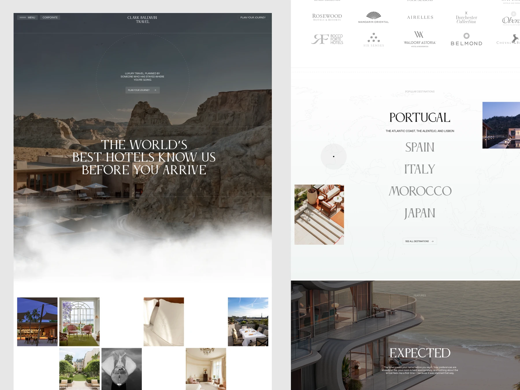
I leaned into restrained, editorial design rather than the maximalist luxury-travel visual clichés. Full-bleed cinematic photography (a cliffside pool disappearing into fog, an amphibious desert resort) opens the site, but the typography stays quiet — a classic serif, generous spacing, understated hierarchy — closer to a design magazine than a travel booking engine.
Rather than opening with a search bar, the homepage opens with a statement of trust, and the hotel partnership logos (Rosewood, Mandarin Oriental, Aman, Waldorf Astoria) are treated as social proof, not a footer afterthought — placed prominently, full-size, unapologetic.
Making "planned by an insider" tangible
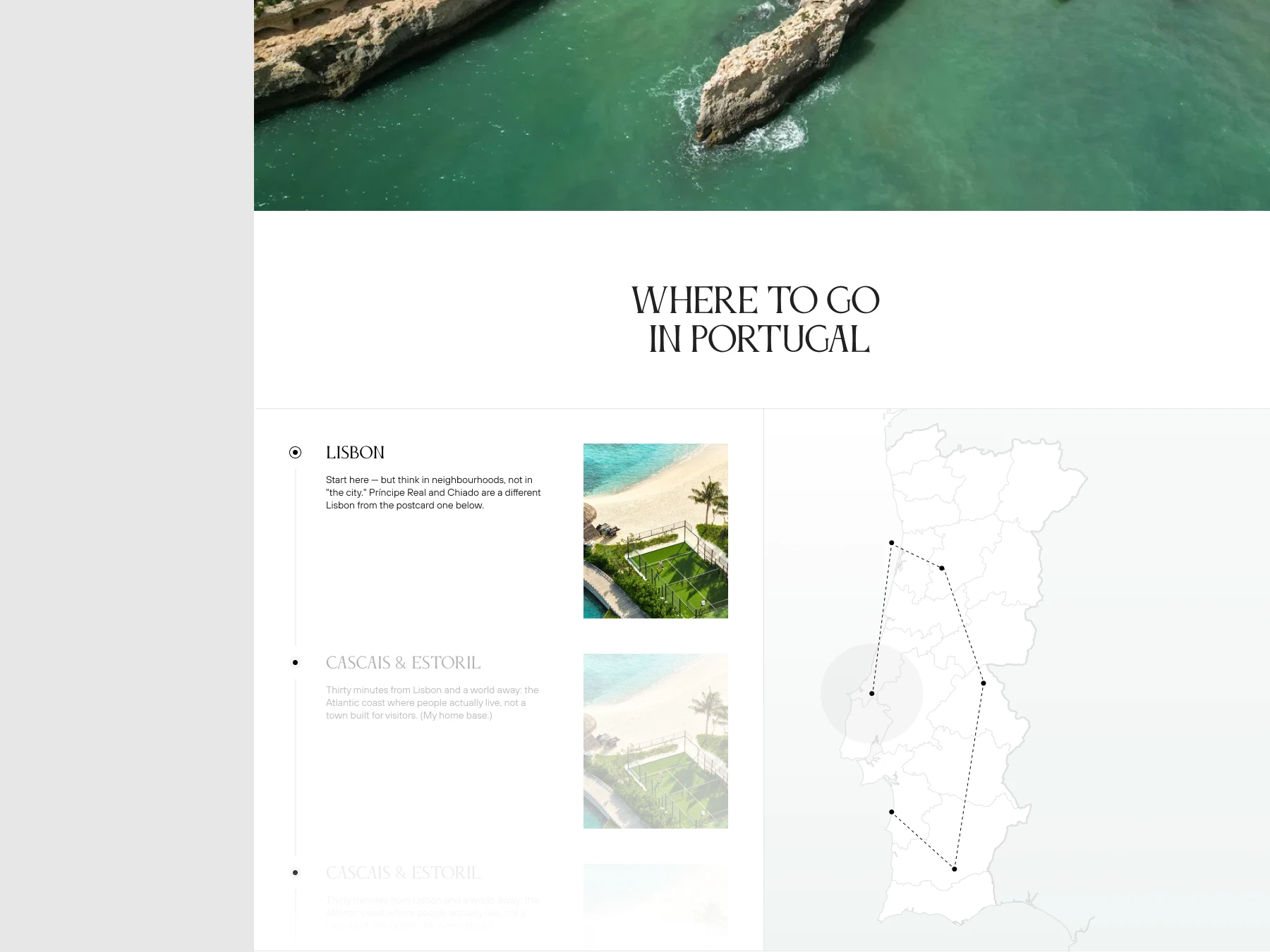
A dedicated founder section — Brian Baldwin, with his own photo and voice — grounds the entire brand in a real person rather than an anonymous concierge team. Destination browsing is handled through a minimal, typographic list (Portugal, Spain, Italy, Morocco, Japan) paired with a simple interactive map dot, rather than a cluttered filterable directory — reinforcing that this is curated, not exhaustive.
A three-part narrative — "Expected. Planned. Supported." — layered over full-bleed architectural photography, walks through what a Clark Baldwin trip actually feels like at each stage, turning an abstract promise of "white-glove service" into something specific and felt.
Outcome
A site that reads more like a personal referral than a booking platform — letting relationships, taste, and a real point of view carry the brand in a category where everyone else sounds the same.
Like this project
Posted Sep 18, 2026
UI/UX design a unique website for a luxury travel agency emphasizing personal and insider credentials.
Likes
2
Views
18
Timeline
Apr 9, 2026 - Jul 10, 2026
Clients
Clark Baldwin Travel