Packaging Design Projects in Western CapePackaging Design Projects in Western CapeTHE ONLY OIL
The only one you need: brand creation, packaging design and copywriting for a luxury South African skincare oil
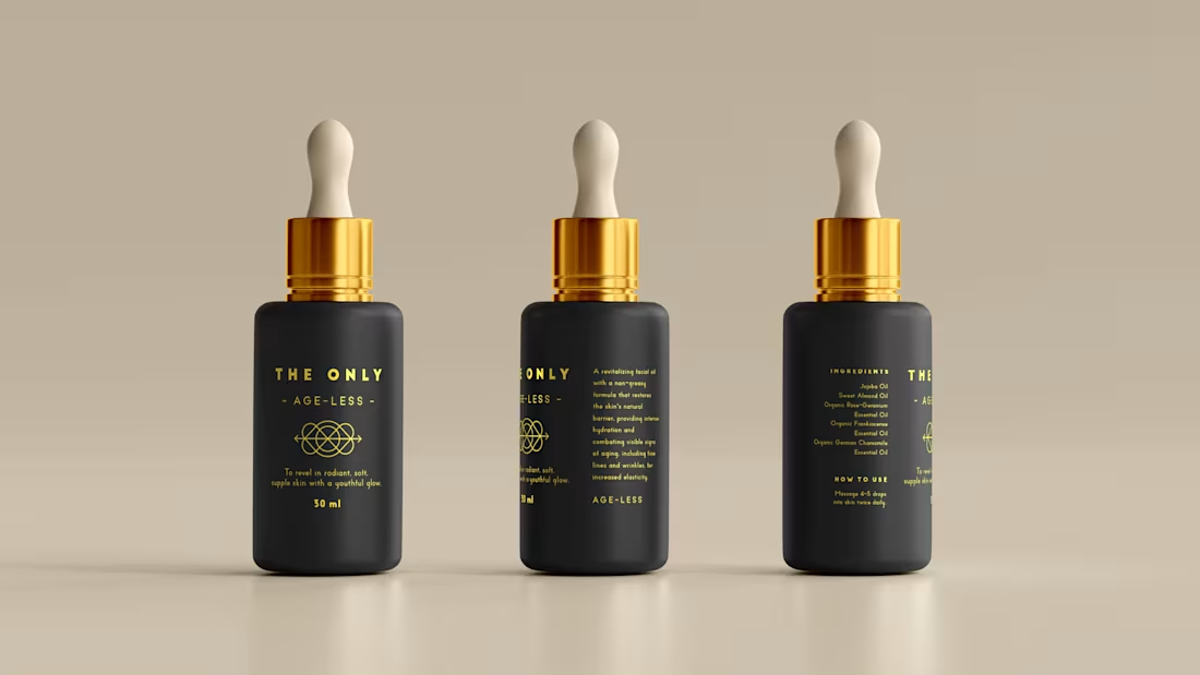
Brand creation, product naming, creative direction, packaging design and copywriting across a range of organic handcrafted facial oils.
THE STORY
Luxury skincare is one of the most crowded shelves in the world. Every brand promises transformation. Every brand reaches for the same words. Pure. Radiant. Restore. After a while it all blurs into the same thing.
The Only was built to cut through that quietly.
A South African skincare brand rooted in organic, handcrafted facial oils made from rare local ingredients. Clinically tested. Carefully formulated. The kind of product that doesn't need to shout because it already knows what it can do.
I created the brand from scratch, starting with the name. The Only. Two words that don't hedge, don't qualify, don't ask permission. Everything else followed from that conviction. The product names, Age-Less, Rooted, Ultimate, Calm, Nourish, Soothe, Revitalise, each share a feeling rather than a feature. The kind of names that make sense the moment you read them and stay with you.
The visual identity is deep matte black and gold. Minimal by design, because the product deserved space to breathe. The copy took the same approach: warm and purposeful, never overwrought. Skincare writing has a habit of tipping into the breathless. This couldn't afford to.
When the ingredients are this good and the formulation is this considered, the writing just needs to show up with the same integrity and get out of the way.
WHAT IT TAUGHT ME
That restraint is its own kind of confidence. The Only doesn't try to convince anyone. It simply presents itself and trusts that the right person will understand immediately. Learning to write like that, to say less and mean more, is a practice that never really ends. BRAND IDENTITY & LOGO DESIGN
The Problem
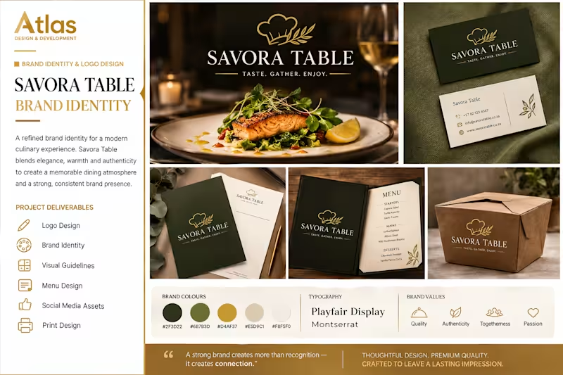
Savora Table needed a distinctive brand identity that would capture the warmth, quality, and refined experience of modern dining while creating a strong and memorable visual presence.
The Solution
I developed a complete visual identity featuring an elegant logo, refined typography, a sophisticated colour palette, and branded assets including stationery, menus, packaging, and social media visuals.
The Result
The final identity creates a premium and cohesive brand experience that feels warm, authentic, and memorable across both digital and physical touchpoints.