Freelance Brand Designers in Sheikhupura
Sign Up
Post a job
Sign Up
Log In
Filters
2
Projects
People
Umar Tanveer
pro
Lahore, Pakistan
Pitch Deck Designer | Packaging Design | Branding | Web
2x
Hired
5.0
Rating
193
Followers
expert
expert
+3
Follow
Message
Pitch Deck Designer | Packaging Design | Branding | Web
10
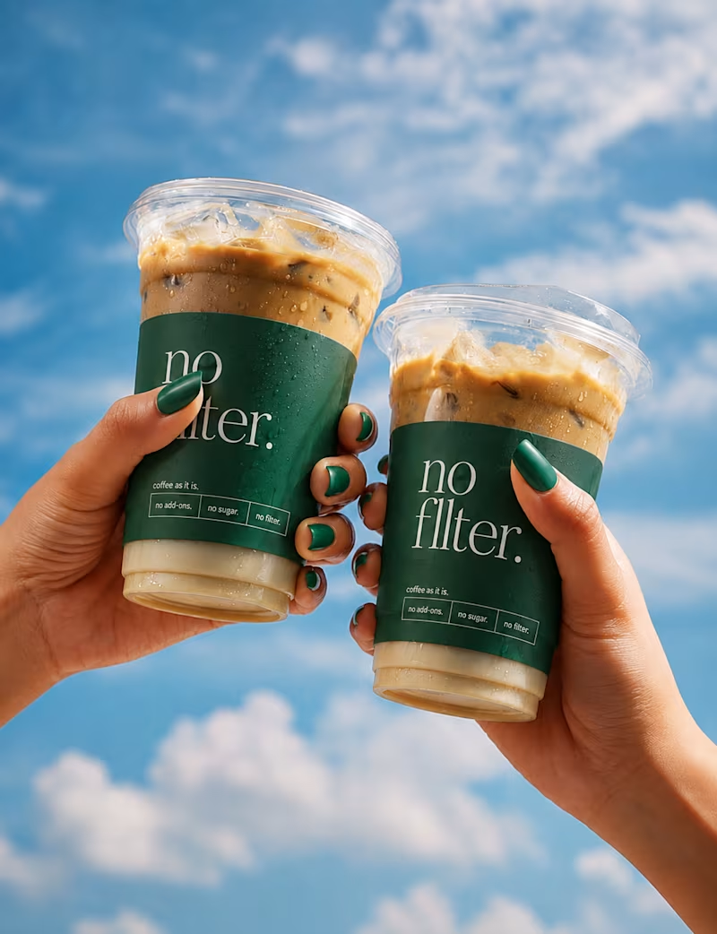
I’ve been wanting to create something that feels as unapologetic as a good cup of coffee — so, meet No Filter. ☕️ A coffee brand built around personality, simplicity, and doing things without unnecessary filters. From the visual identity to the cups, merchandise, and social visuals, I wanted every touchpoint to feel bold, recognizable, and a little bit unexpected. The goal was simple: create a brand that doesn’t just serve coffee, but has its own point of view. So here’s No Filter Coffee — a branding concept I had way too much fun bringing to life. 🌿🤎 No overthinking. No unnecessary extras. Just coffee, as it is. No Filter.
2
10
493
0
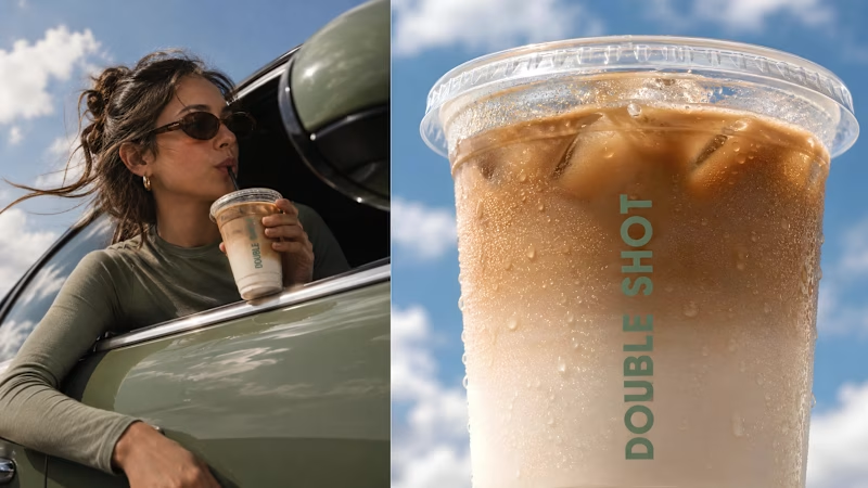
Premium Coffee Brand Identity Design | Double Shot
0
5
1
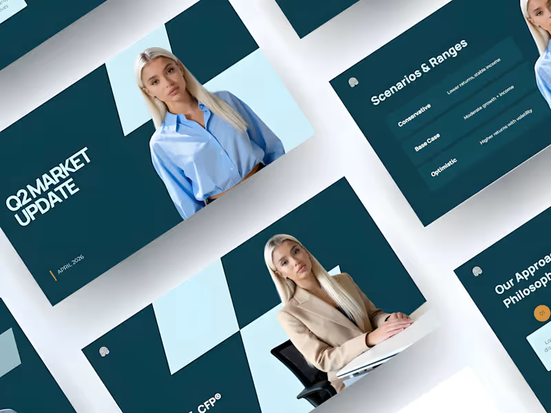
Financial Presentation Template Design
1
11
0
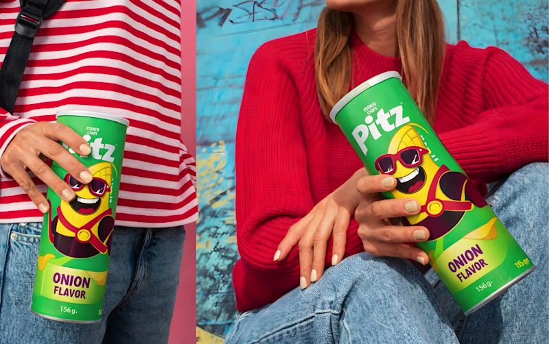
Pitz Chips Packaging Redesign
0
13
Brand Designer
(12)
Follow
Message
Abdul Rehman
pro
Lahore, Pakistan
Minimalist Brand Designer | Logo & Brand Identity.
5x
Hired
5.0
Rating
82
Followers
Follow
Message
Minimalist Brand Designer | Logo & Brand Identity.
6
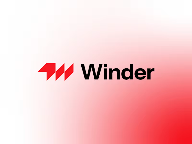
Winder Logo Design. A sharp, modern logo exploration for Winder. The logomark combines the letter W with forward-pointing arrows, creating a bold geometric symbol that represents movement, direction, and progress. The sharp angles give the mark a confident, energetic character while keeping it simple and highly recognizable. Clean, minimal, and built to move forward. → What do you see first: the W or the arrows?
6
6
204
3
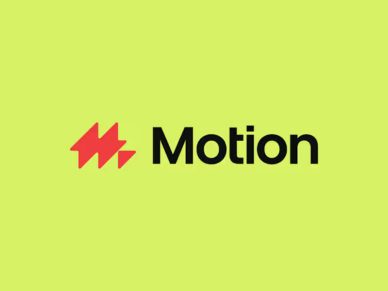
A bold letter M logomark fused with a lightning bolt to represent motion, speed, energy, and power.
3
121
9
Optix Logo Design!
11
9
638
1
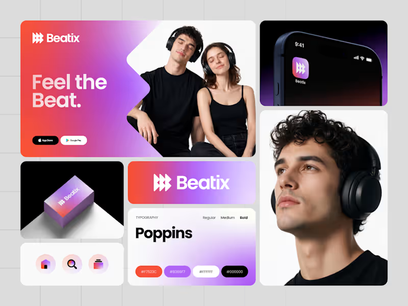
Music is all about emotion, rhythm, and movement. I wanted Beatix to capture that feeling in a simple, memorable identity. The logomark combines a stylized letter B with play buttons and forward arrows, creating a distinctive symbol that represents music, playback, discovery, and continuous movement. Paired with a vibrant gradient system, the identity feels energetic, modern, and built for a digital-first music streaming experience. From the app icon to the UI and brand applications, every element was designed to create a cohesive experience that users instantly recognize. Would you download an app with this identity? What's your favorite element? 🎧
1
244
Brand Designer
(35)
Follow
Message
SUBHAN DESIGNS • Identity & Packaging
pro
Lahore, Pakistan
Identity & Packaging Systems Beyond Category Conventions
$1k+
Earned
5.0
Rating
35
Followers
expert
Follow
Message
Identity & Packaging Systems Beyond Category Conventions
10
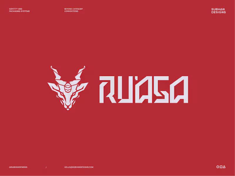
Sphynx or Markhor? Two very different logo directions, built for the same brand. One speaks to where the brand comes from. The other speaks to who the brand is for. Both had a reason to exist. Only one could define the identity effectively. Which one do you think the client chose? And if you’re curious about the thinking, debate and decisions that led to the final direction, I’ve broken down the full story in this post. (https://contra.com/community/MPQe3yrR-sometimes-the-first-idea-makes-perfect)
6
10
178
6
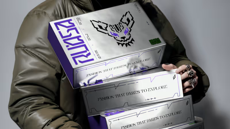
"We weren’t sure what our brand should look like. They gave us a clear path forward.” That’s how our client described their experience working with us on Ru’asā. They came to us with a clear ambition: build a premium fashion brand that goes beyond category conventions. Derived from the Arabic ra’is, meaning chief or leader, Ru’asā celebrates individuality and rebellion against conformity. We built the complete brand experience across Strategy, Creative Direction, Visual Identity, Packaging Experience and Collaterals. The full project is live. Take a look at how we brought the brand to life here (https://www.behance.net/gallery/241790871/Techno-Gothic-Branding-Packaging-for-Fashion-Brand) Building a brand that aims to set the standard rather than follow one? I’d love to hear from you
1
6
102
27
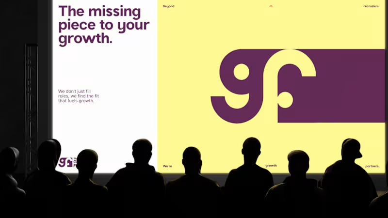
“We started with just a name and some vague ideas. They left us with a brand.” That’s how our client described their experience working with us on The Growth Fit. There was no existing identity to refine. Our job was to take an early-stage idea, understand what the brand needed to stand for, and turn it into a visual system with enough clarity and character to grow with the business. That meant exploring, challenging our own decisions, and going back to the drawing board when something wasn’t landing well. The result was a system built around one central idea: the right fit, carried consistently through the identity, motion and brand touchpoints. The complete project is live. If you’d like to see how the idea developed into the full identity system, you can explore the case study here: The Growth Fit (https://www.behance.net/gallery/254221567/TGF-Identity-Collaterals-Talent-Hiring-Global)
9
27
481
50
More visuals from the rejected brand direction I shared earlier. Really good to see this direction resonating with so many of you. It was one of our favourite explorations to build, from the narrative behind it to the visual world that brought it to life. Great work doesn’t always make the final cut, and sometimes the reason has little to do with the quality of the direction. Curious why this one was rejected? I’ve shared the story in the first comment✨
21
50
3.4K
Brand Designer
(9)
Follow
Message
Maryam Shakeel
pro
Lahore, Pakistan
Branding and Marketing Strategist
$1k+
Earned
3x
Hired
5.0
Rating
24
Followers
Follow
Message
Branding and Marketing Strategist
0
Brand Identity Development for DKT Pakistan Radiology Academy
0
4
0
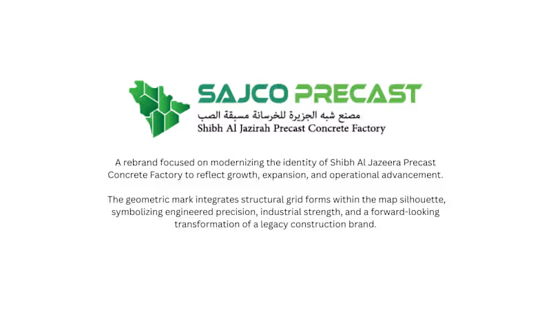
SAJCO Precast Logo Modernization
0
5
0
Brand Identity Design for Saaf Bazar
0
4
0
Designing The Boardroom Magazine Editorial
0
19
Brand Designer
(9)
Follow
Message
Zain Malik
pro
Lahore, Pakistan
Brands, Visual Identity & Digital Design
2x
Hired
5.0
Rating
26
Followers
Follow
Message
Brands, Visual Identity & Digital Design
0
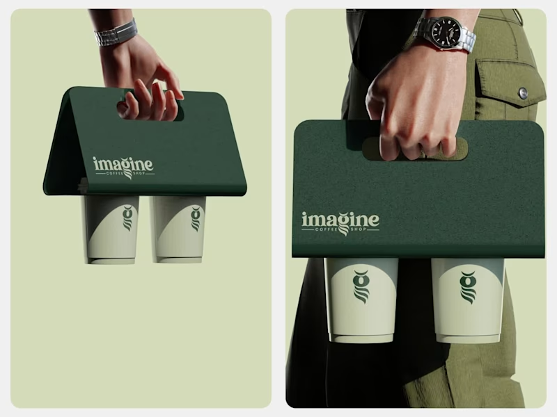
Imagine Coffee Brand Identity Design
0
20
2
KAIROS Luxury Brand Redesign
2
17
2
PRODIGI Studios Mobile App
1
2
29
5
VVIBE 360 Company Profile
5
44
Brand Designer
(7)
Follow
Message
Haider Irshad
Lahore, Pakistan
UX/UI | Framer Designer & Developer | SaaS, Startup Websites
5.0
Rating
55
Followers
expert
Follow
Message
UX/UI | Framer Designer & Developer | SaaS, Startup Websites
3
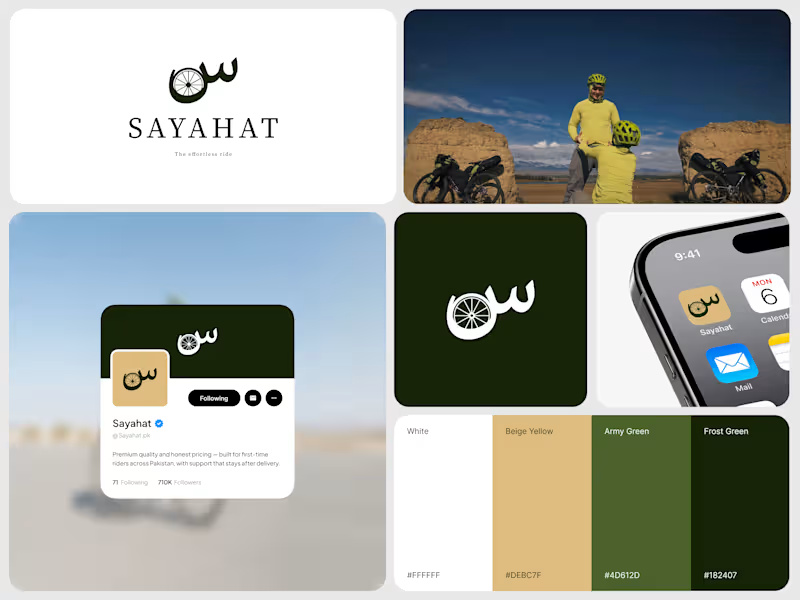
Sayahat Cycling Brand Identity Redesign
3
13
6
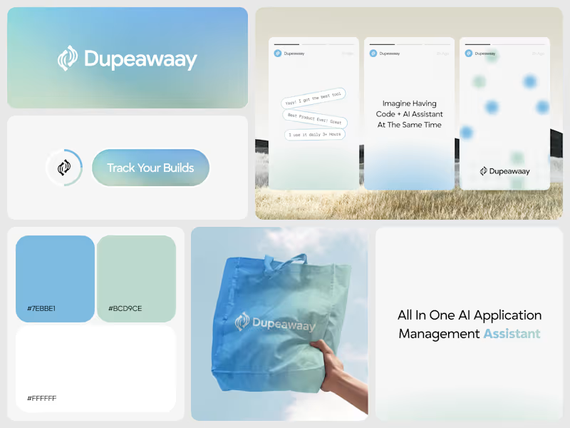
Dupeawaay — Logo Design (Case Study)
6
26
5
ZORYX — Brand Identity for Financial Innovation Platform
5
15
10
Just wrapped up this logo design for Dupeawaay. The goal was to create a clean, memorable identity that feels modern, trustworthy, and easy to recognize across digital platforms. I explored a simple geometric approach, focusing on balance, scalability, and a strong visual presence without overcomplicating the mark. Always enjoy the challenge of turning an idea into a logo that feels both distinctive and timeless. Would love to hear your thoughts 👇
8
10
755
Brand Designer
(4)
Follow
Message
Waleed B.
pro
Lahore, Pakistan
I Design What People Remember. Not Just Pretty.

1x
Hired
5.0
Rating
54
Followers
Follow
Message
I Design What People Remember. Not Just Pretty.
1
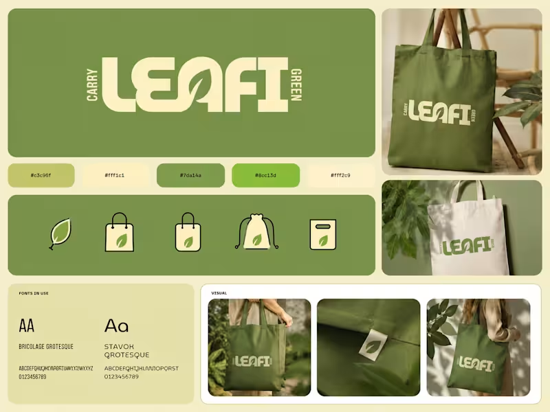
Behind the Design ✦ This concept started with one goal: make the packaging feel as good as the product itself. I wanted to move away from the usual bright-green matcha aesthetic, so I explored a mix of warm ivory, deep teal, and muted olive — giving it a more premium yet approachable feel. The bold typography adds personality, while the curved color blocks and ingredient photography give the packaging a distinctive shelf presence. Piece by piece, the colors, typography, imagery, and packaging style came together to create something that feels fresh, playful, premium, and memorable. Sometimes the final design looks simple — but there’s a lot of thought behind every detail. ✦
1
211
5
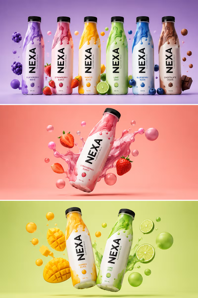
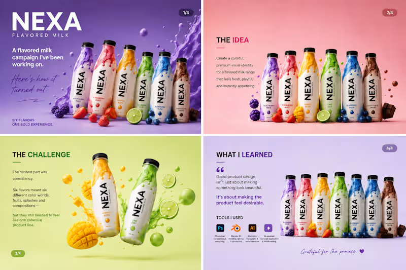
Been working on this one for a while, and I’m finally happy with how it turned out. 🥛✨ This was a fun product design project for a fictional flavored milk brand — NEXA. The goal was simple: make each flavor feel bold and delicious while keeping the entire range visually connected. The challenging part was getting the little things right — the liquid splashes, fruit placement, lighting, shadows, colors, and overall composition. It’s easy to add elements to a design. It’s much harder to make everything feel like it belongs together. One thing I took away from this project: good product visuals aren’t just about making something look good. They’re about making people want to reach for the product. I also experimented with a mix of 3D, Photoshop, Illustrator, and AI-assisted creative exploration to bring the concepts together. Pretty happy with where this landed. 👀 Which flavor would you pick? 🍓🥭🍋🫐🍫 #ProductDesign #PackagingDesign #3DDesign #GraphicDesign #CreativeProcess #BrandDesign #ProductVisualization #VisualDesign #AdobePhotoshop #Blender #DesignerLife
2
5
289
1
𝐁𝐄𝐇𝐈𝐍𝐃 𝐓𝐇𝐄 𝐃𝐄𝐒𝐈𝐆𝐍 𝑨 𝑵𝑬𝑾 𝑷𝑹𝑶𝑱𝑬𝑪𝑻. 𝑨 𝑵𝑬𝑾 𝑪𝑯𝑨𝑳𝑳𝑬𝑵𝑮𝑬. Every project teaches you something. This time, it was about creating a beverage brand that feels bold, playful, and unforgettable. The goal was simple: design a brand that stands out on the shelf and connects instantly with the right audience. 🎯 𝐌𝐘 𝐀𝐏𝐏𝐑𝐎𝐀𝐂𝐇 Bold Contrast – Each flavor has its own identity. Fluid Patterns – Inspired by energy and motion. 3D Visuals – To make the product look alive and irresistible. Storytelling Through Color – Every shade has a purpose and a mood. 💡𝐖𝐇𝐀𝐓 𝐈 𝐋𝐄𝐀𝐑𝐍𝐄𝐃 • Design is not just about looks, it’s about emotion. • The right colors and composition can make a product speak. • Patience, details, and iteration always pay off. 𝐀𝐍𝐎𝐓𝐇𝐄𝐑 𝐒𝐓𝐄𝐏 𝐅𝐎𝐑𝐖𝐀𝐑𝐃. 𝐀𝐍𝐎𝐓𝐇𝐄𝐑 𝐋𝐄𝐒𝐒𝐎𝐍 𝐋𝐄𝐀𝐑𝐍𝐄𝐃. 𝐎𝐧 𝐭𝐨 𝐭𝐡𝐞 𝐧𝐞𝐱𝐭. → TOOLS USED: Adobe Photoshop, Adobe Illustrator FOCUS • Brand Identity • Color Psychology • 3D Composition 𝐓𝐈𝐌𝐄 𝐒𝐏𝐄𝐍𝐓 Concept to Final – 2 Days Grateful for the process. Excited for what’s next. #graphicdesigner #brandidentity #branddesign #packgaing #barnding #designer
1
115
0
Brand Design | Brand Identity
0
49
Brand Designer
(6)
Follow
Message
Designer BhAI Studio
pro
Lahore, Pakistan
Brand Identity & Print Collateral for Hospitality and F&B
5.0
Rating
6
Followers
Follow
Message
Brand Identity & Print Collateral for Hospitality and F&B
0
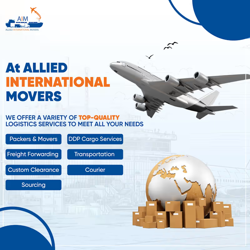
Integrated Logistics Campaign — Allied International Movers
0
22
0
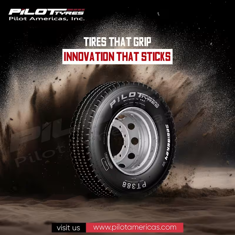
Overview Pilot Americas needed a series of social media advertisements that would make its tire products more engaging while maintaining a strong and recognizable brand presence. The goal was to move beyond conventional product advertising and develop visual concepts that connected tires with movement, reliability, adventure, and seasonal moments. The Challenge Tires are highly functional products, but conventional product photography can quickly become repetitive on social media. The challenge was to keep the tire clearly visible as the central product while giving every creative its own story, atmosphere, and reason to stop scrolling. The campaign also needed to remain consistent with Pilot Americas’ established red, black, and white visual identity. Creative Strategy I developed the campaign around one central idea: Make the tire the protagonist of every story. Instead of placing the product into generic automotive scenes, I used visual metaphors and imaginative compositions to connect it with open-road journeys, dependable performance, and seasonal celebrations. Bold typography, focused messaging, consistent logo placement, and repeated brand colors helped unify the different concepts as one recognizable campaign. Concept Development Your Journey, Our Tires The tire was transformed into a visual gateway opening onto an empty road. This connected the product directly with travel, freedom, and the journeys it helps make possible. Grip the Road, Own the Journey A glowing road wraps around the tire to create a dynamic representation of traction, control, and continuous movement. Christmas Snow Globe The tire becomes the central product inside a festive snow-globe environment, allowing the brand to participate in seasonal communication without losing product visibility. Love, Laughter, and Joy A playful snowman and winter landscape were combined with the tire to create a warmer, more approachable holiday advertisement while preserving the brand’s visual identity. Design Execution Each creative was developed through a combination of: Creative direction and concept development Social media advertising design Product-focused photo compositing Image manipulation and retouching Lighting and perspective matching Typography and message hierarchy Brand color implementation CTA and website integration Square and landscape format adaptation The tire remained the visual anchor throughout the campaign, while the supporting environments and messages changed according to each concept. Outcome The final campaign produced a flexible collection of evergreen and seasonal social media advertisements. Each creative communicates a different message, but the consistent product treatment, typography, color palette, logo placement, and CTA system keep the campaign connected to the Pilot Americas brand. The result is a more expressive and memorable approach to tire advertising—one that balances product visibility with visual storytelling.
0
28
1
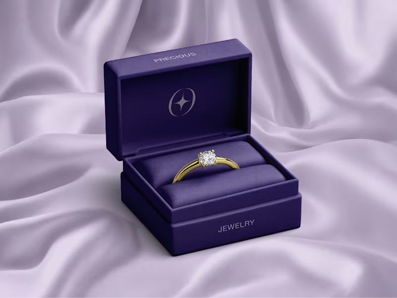
Diamond Direct: Building Trust in the Digital Luxury Market
1
13
2
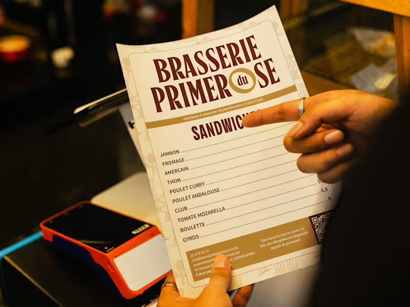
Brasserie du Primerose: Cross-Cultural Identity
2
10
Brand Designer
(8)
Follow
Message
Explore people