The network for creativity
Join 1.25M professional creatives like you
Connect with clients, get discovered, and run your business 100% commission-free
Creatives on Contra have earned over $150M and we are just getting started
Back to feedPost

Behind the Design ✦
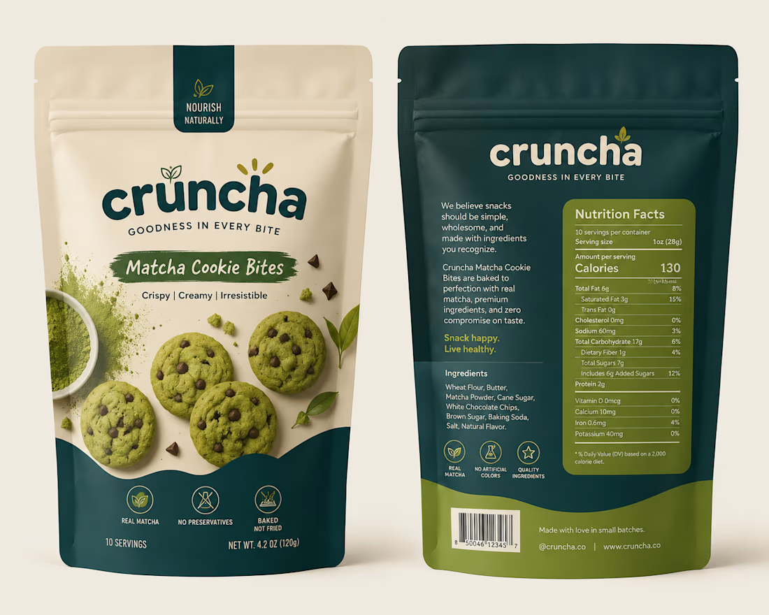
This concept started with one goal: make the packaging feel as good as the product itself.
I wanted to move away from the usual bright-green matcha aesthetic, so I explored a mix of warm ivory, deep teal, and muted olive — giving it a more premium yet approachable feel.
The bold typography adds personality, while the curved color blocks and ingredient photography give the packaging a distinctive shelf presence.
Piece by piece, the colors, typography, imagery, and packaging style came together to create something that feels fresh, playful, premium, and memorable.
Sometimes the final design looks simple — but there’s a lot of thought behind every detail. ✦
Brand DesignTypographyAdobe IllustratorAdobe PhotoshopCanvabranddesignbrandidentitypackgaingdesignPackaging Design


The network for creativity
Join 1.25M professional creatives like you
Connect with clients, get discovered, and run your business 100% commission-free
Creatives on Contra have earned over $150M and we are just getting started











Related posts




Aryna, that golden symbol pops so nicely against the plum background ✨

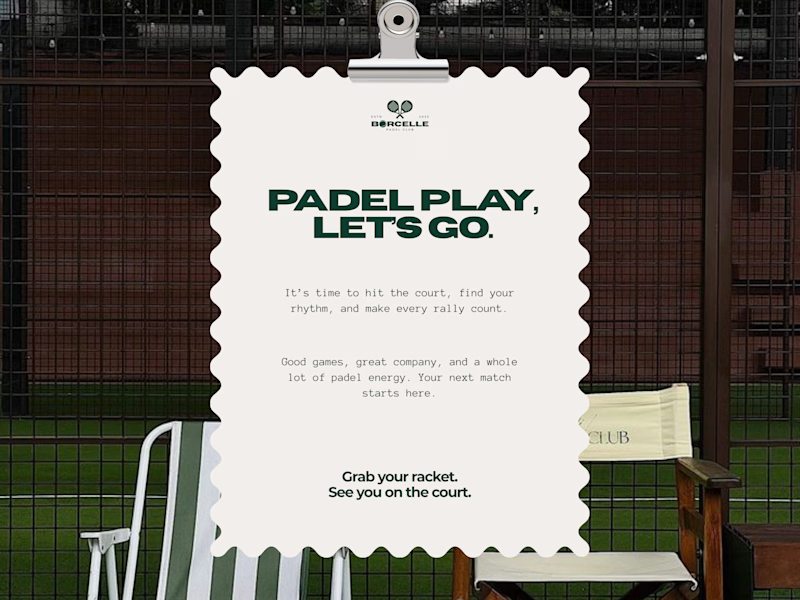
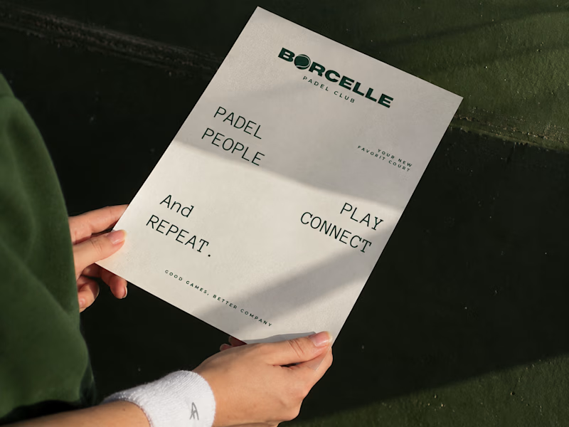
From the court to the little details, every touchpoint is an opportunity to bring the brand to life.
Good games, better company. 💚
What do you think of this direction?
11 voted
69%
5 voted
31%
16 votes
Closed

The green carries so nicely from the court to the small touchpoints. Feels sporty and friendly at the same time.


this is really nice 100%. nice job