pro
Waleed B.
I Design What People Remember. Not Just Pretty.
- 1x
- Hired
- 5.0
- Rating
- 71
- Followers


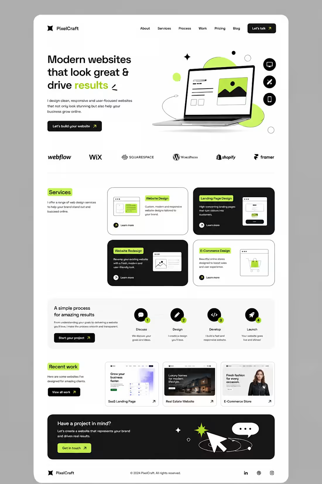
I didn’t want to build another website that simply “looked good.”
I wanted to build something that felt clear, modern, and actually guided people toward taking action.
So I started with a simple idea: less clutter, more clarity.
I built the layout around strong typography, clean spacing, bold contrast, and small lime-green accents to make important elements stand out.
Then came the details — service cards, responsive sections, portfolio previews, a simple process, and CTAs placed where they naturally make sense.
The goal was simple:
Make the website feel good to explore — and even better to use.
This is what I love about web design.
It’s not just about designing a pretty page.
It’s about turning an idea into an experience.
#Graphic Designer #Webdesigner #Website Designer
6
6
569
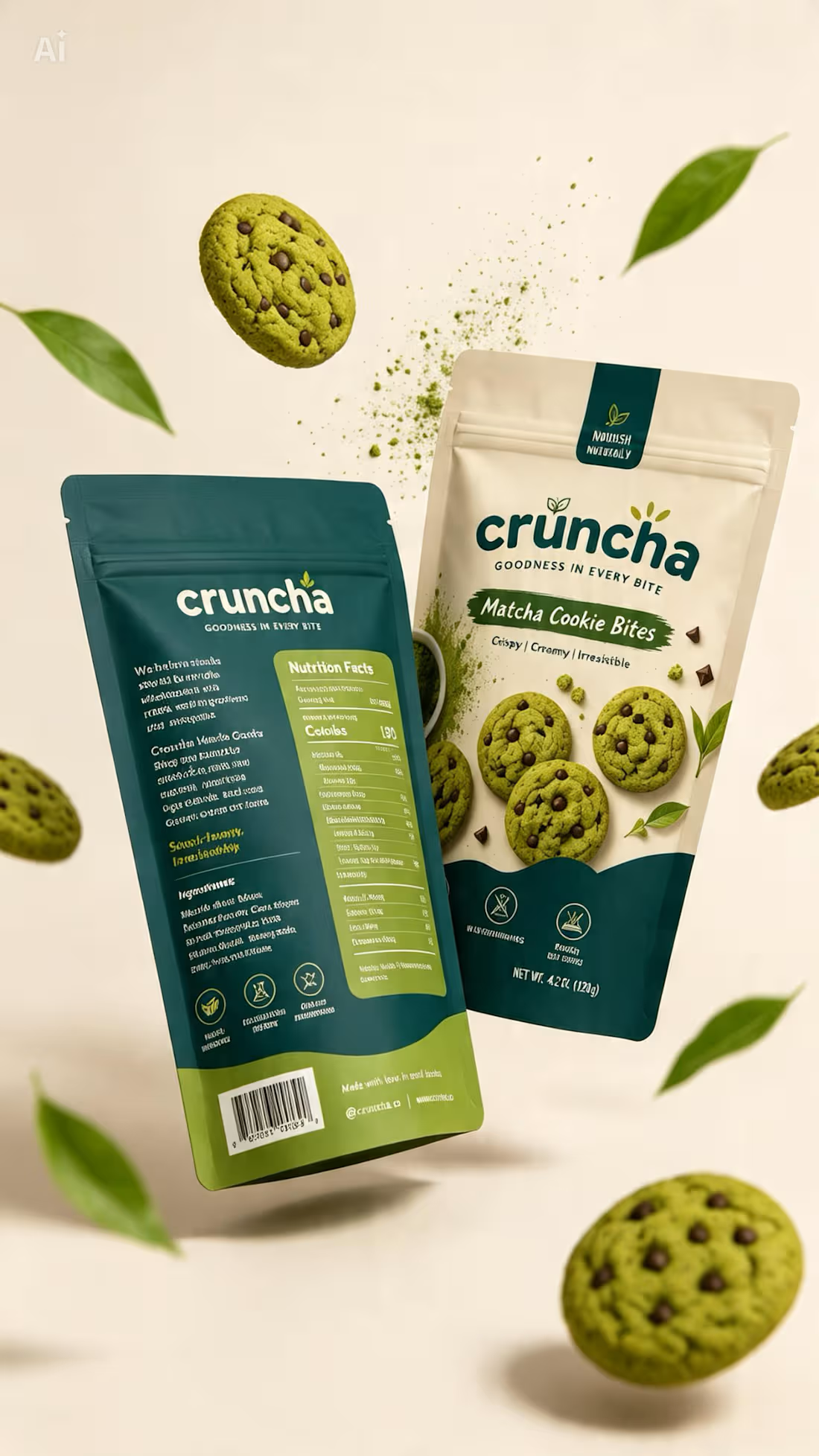
Cruncha was one of those projects I genuinely loved working on. ✦
From exploring the visual direction and color palette to shaping the packaging and bringing the whole concept together, every detail felt intentional.
It gave me the freedom to experiment, think beyond the obvious, and turn a simple idea into something that actually feels like a brand.
And honestly, the best part? I walked away from this project feeling like I’d actually earned something — not just completed another design.
0
188
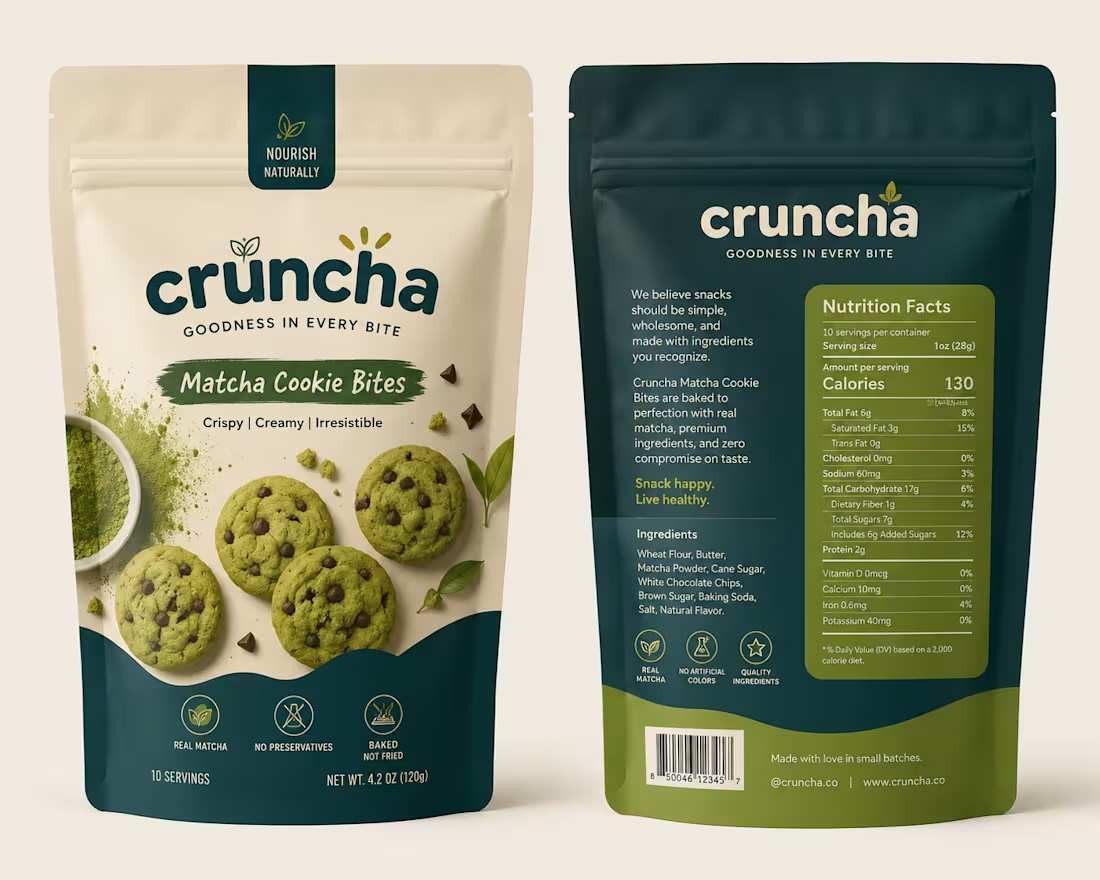
Behind the Design ✦
This concept started with one goal: make the packaging feel as good as the product itself.
I wanted to move away from the usual bright-green matcha aesthetic, so I explored a mix of warm ivory, deep teal, and muted olive — giving it a more premium yet approachable feel.
The bold typography adds personality, while the curved color blocks and ingredient photography give the packaging a distinctive shelf presence.
Piece by piece, the colors, typography, imagery, and packaging style came together to create something that feels fresh, playful, premium, and memorable.
Sometimes the final design looks simple — but there’s a lot of thought behind every detail. ✦
2
292
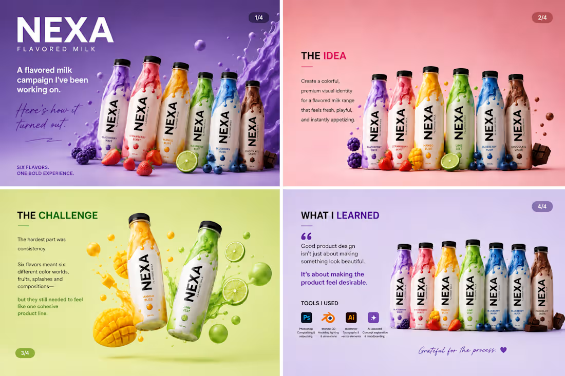
Been working on this one for a while, and I’m finally happy with how it turned out. 🥛✨
This was a fun product design project for a fictional flavored milk brand — NEXA.
The goal was simple: make each flavor feel bold and delicious while keeping the entire range visually connected.
The challenging part was getting the little things right — the liquid splashes, fruit placement, lighting, shadows, colors, and overall composition. It’s easy to add elements to a design. It’s much harder to make everything feel like it belongs together.
One thing I took away from this project: good product visuals aren’t just about making something look good. They’re about making people want to reach for the product.
I also experimented with a mix of 3D, Photoshop, Illustrator, and AI-assisted creative exploration to bring the concepts together.
Pretty happy with where this landed. 👀
Which flavor would you pick? 🍓🥭🍋🫐🍫
#ProductDesign #PackagingDesign #3DDesign #GraphicDesign #CreativeProcess #BrandDesign #ProductVisualization #VisualDesign #AdobePhotoshop #Blender #DesignerLife
2
6
369