
Behind the Design ✦
This concept started with one goal: make the packaging feel as good as the product itself.
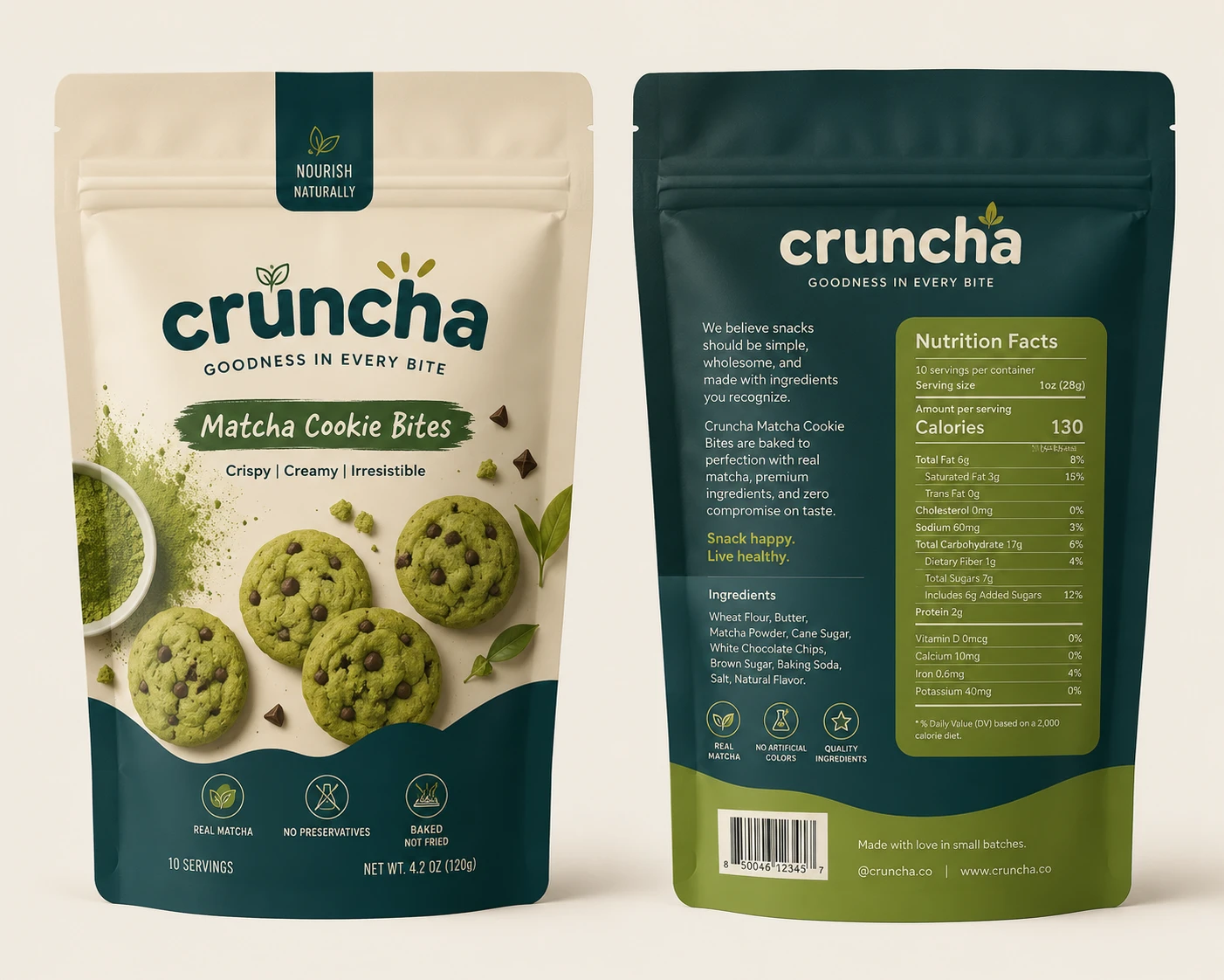
I wanted to move away from the usual bright-green matcha aesthetic, so I explored a mix of warm ivory, deep teal, and muted olive — giving it a more premium yet approachable feel.
The bold typography adds personality, while the curved color blocks and ingredient photography give the packaging a distinctive shelf presence.
Piece by piece, the colors, typography, imagery, and packaging style came together to create something that feels fresh, playful, premium, and memorable.
Sometimes the final design looks simple — but there’s a lot of thought behind every detail. ✦
0 likes · 0 views · Aug 8, 2026
Behind the Design ✦ This concept started with one goal: make the packaging feel as good as the product itself. I wanted to move away from the usual bright-gr...


