Sayahat Cycling Brand Identity Redesign

Haider Irshad


Overview
Sayahat is a premium cycling brand built for people who love adventure, freedom, and long-distance rides. The goal was to create a visual identity that feels modern, memorable, and deeply connected to cycling without relying on generic bicycle icons.
The challenge was to develop a logo that immediately communicates movement and exploration while remaining minimal enough to work across digital platforms, packaging, merchandise, and mobile applications.
The Challenge
The cycling industry is filled with logos that look almost identical—full bicycle silhouettes, mountain graphics, or aggressive sporty typography.
Sayahat needed a brand identity that could:
Stand out in a competitive market
Feel premium and trustworthy
Reflect exploration and effortless travel
Remain recognizable at small sizes
Work across digital and print applications
Design Approach
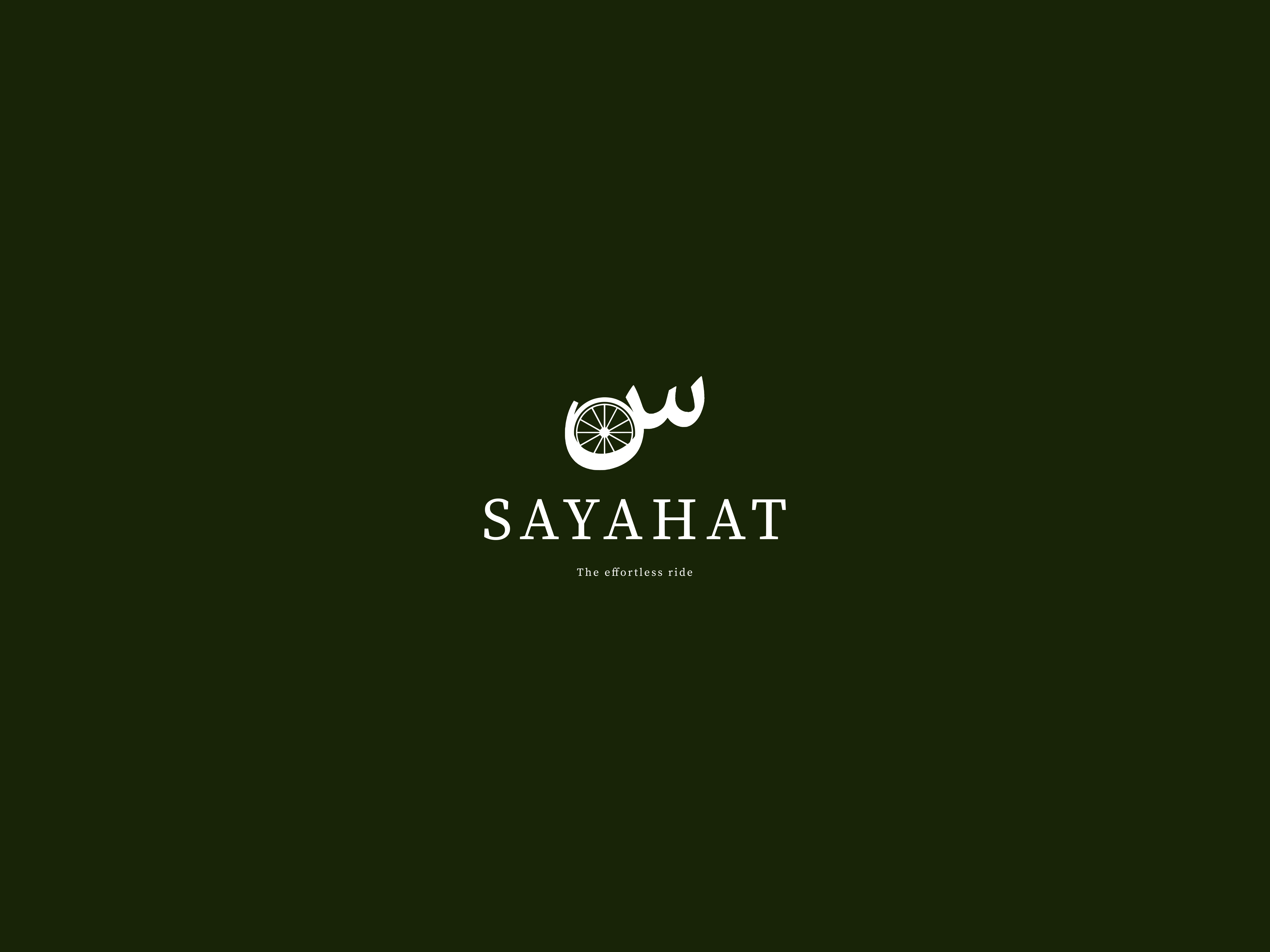
The concept combines Arabic-inspired typography with a bicycle wheel to create a distinctive brand mark.
Instead of illustrating an entire bicycle, the identity focuses on the wheel—the universal symbol of movement, journeys, and continuous progress.
The typography is kept elegant and minimal, allowing the custom symbol to become the hero of the brand.
Every curve was refined to create a balanced mark that feels both modern and timeless.
Logo Concept
The logo is built around three key ideas:
Freedom
The flowing custom lettering represents smooth movement and the feeling of an effortless ride.
Cycling
A detailed bicycle wheel is integrated directly into the mark, making the cycling connection immediate without overwhelming the design.
Simplicity
The minimal construction ensures the logo remains recognizable across every touchpoint—from mobile app icons to social media and product branding.
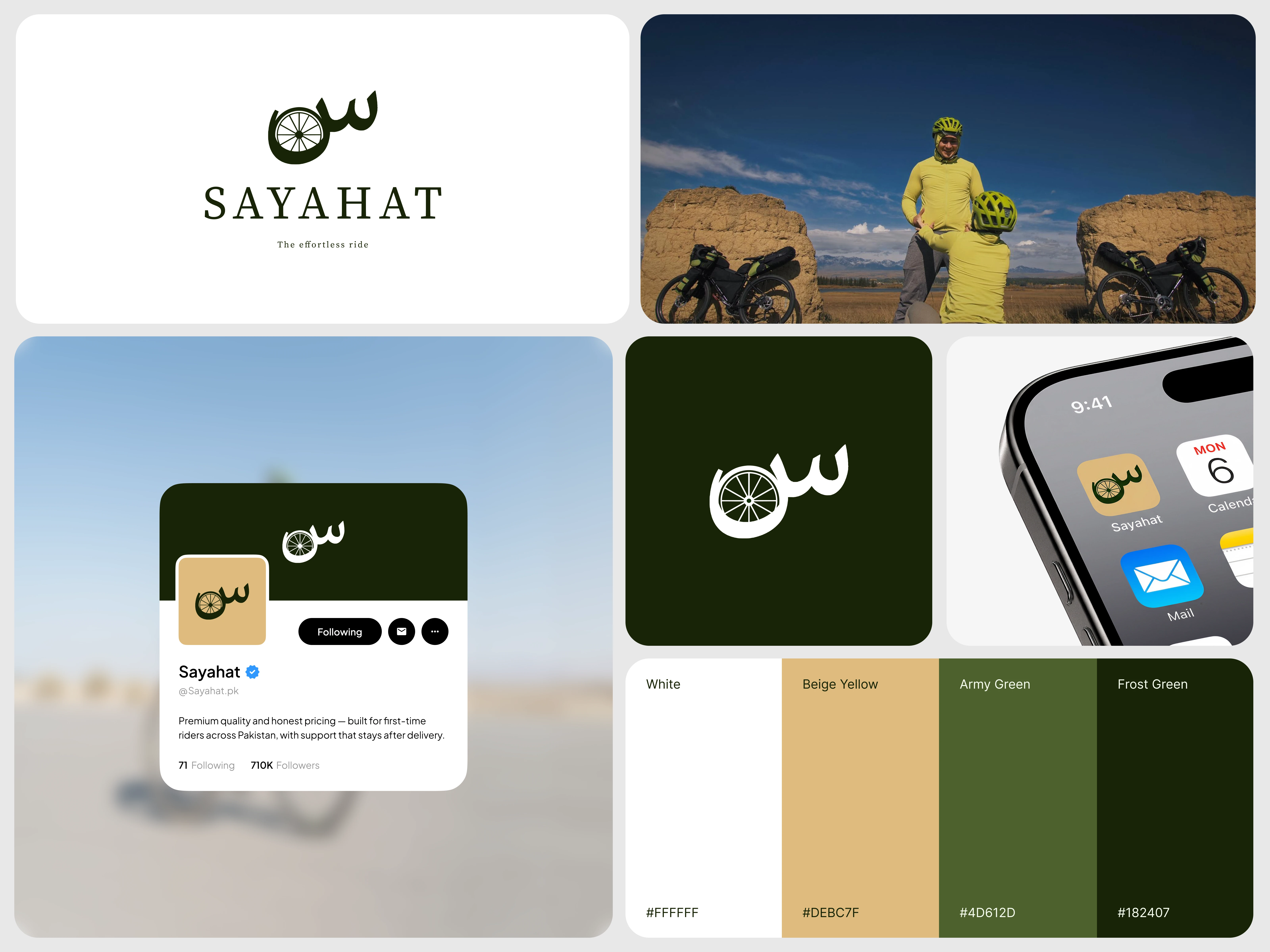
Color System
The visual identity uses an earthy palette inspired by nature and outdoor adventures.
Primary Colors
Frost Green (#182407) — Trust, stability, premium quality
Army Green (#4D612D) — Nature, adventure, endurance
Beige Yellow (#DEBC7F) — Warmth, comfort, optimism
White (#FFFFFF) — Simplicity and clarity
Together, these colors create a calm and sophisticated identity that reflects outdoor exploration rather than aggressive sports branding.
Typography
A refined serif typeface was selected for the wordmark to communicate:
Premium quality
Heritage
Reliability
Confidence
The generous spacing between letters improves readability while reinforcing the luxurious feel of the brand.
Applications
The identity was designed with scalability in mind and tested across multiple brand touchpoints, including:
Mobile App Icon
Social Media Profile
Brand Mark
Website
Digital Marketing
Packaging
Merchandise
Promotional Materials
The symbol maintains strong recognition even at very small sizes, making it ideal for modern digital products.
Design Outcome
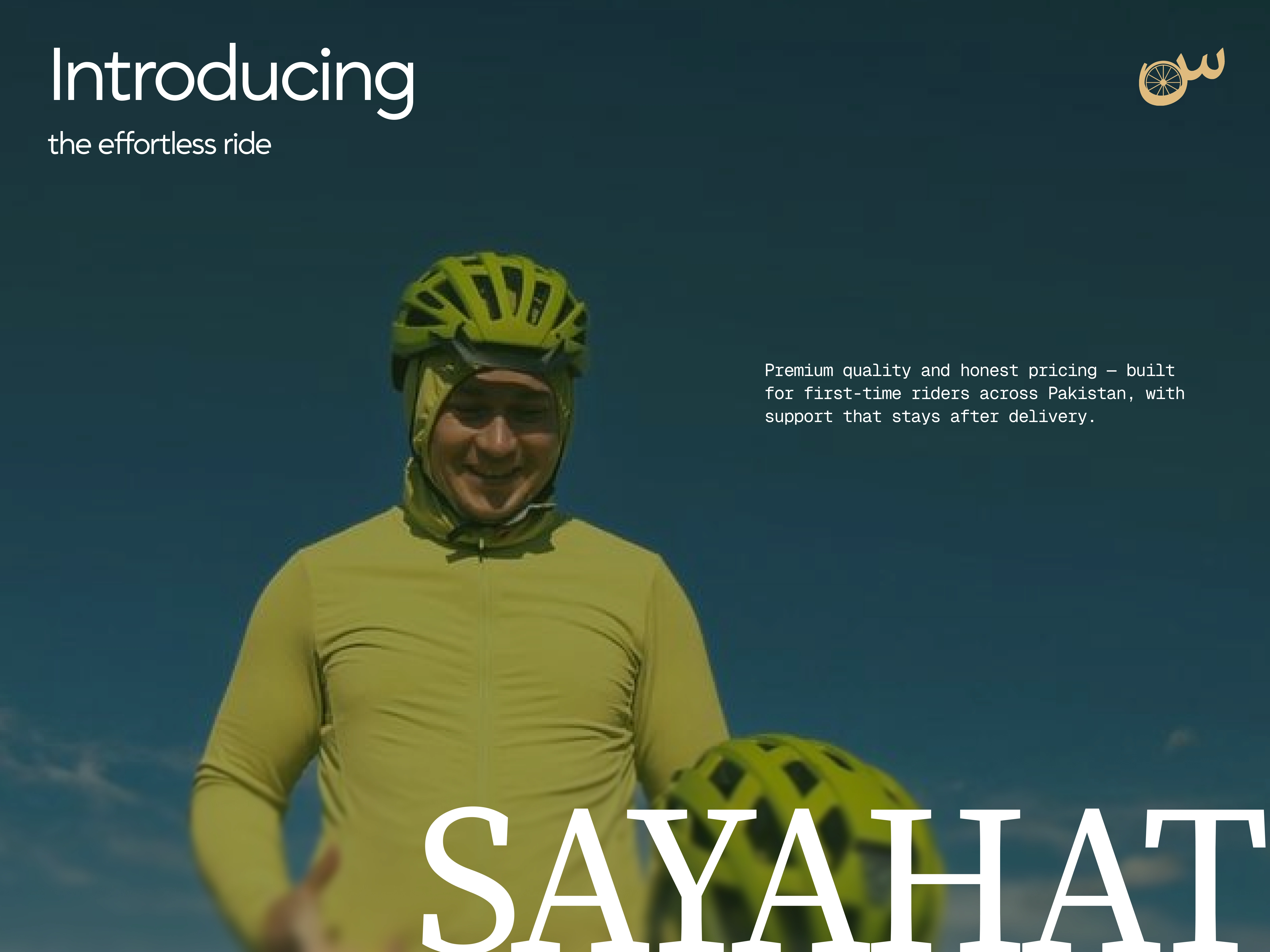
The final identity successfully captures the spirit of cycling through a clean, memorable visual language.
Instead of following common industry trends, Sayahat now owns a distinctive mark that represents movement, exploration, and premium craftsmanship while remaining highly versatile across both digital and physical experiences.
Like this project
Posted Jul 8, 2026
Brand identity redesign for a premium Pakistani cycling brand — combining Arabic-inspired typography with a bicycle wheel mark to stand apart from generic sports branding.
Likes
4
Views
19
Timeline
Jul 1, 2026 - Jul 8, 2026
Clients
Sayahat