Brand Identity Development for DKT Pakistan Radiology Academy

Maryam Shakeel



DKT Pakistan Radiology Academy — Brand Identity
Type: Brand identity & guidelines
Client: DKT Pakistan Radiology Academy, in partnership with DKT UK, the Radiology Society of Pakistan, and the Radiology Aid Foundation
Scope: Brand strategy, logo design, tone of voice, colour system, typography, and usage guidelines
Overview
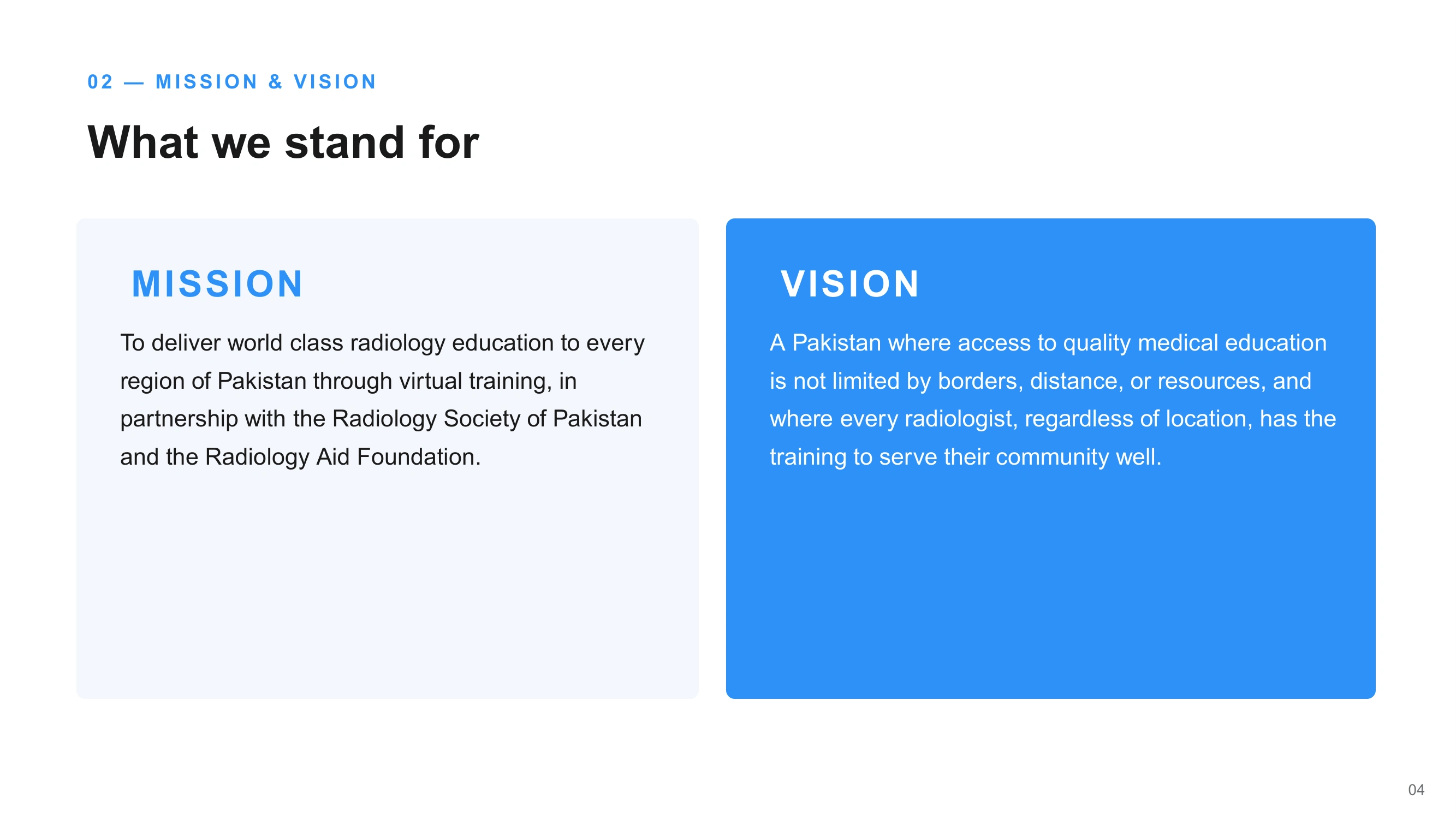
DKT Pakistan Radiology Academy delivers virtual radiology training across all seven zones of Pakistan, from Khyber Pakhtunkhwa and Balochistan to Kashmir and Islamabad. The academy exists to close a simple gap: geography should never decide the quality of a radiologist's training. I was asked to give that mission a visual identity substantial enough to sit alongside its clinical and institutional partners, while staying warm enough to read as a place people actually learn.
The challenge
A radiology training programme sits in an unusual space — it needs the credibility of a medical institution and the approachability of a teaching platform. The identity had to work across a wide range of applications, from formal partnership materials with the Radiology Society of Pakistan to day-to-day training content aimed directly at students, without tipping into either clinical coldness or informal inconsistency.
Approach
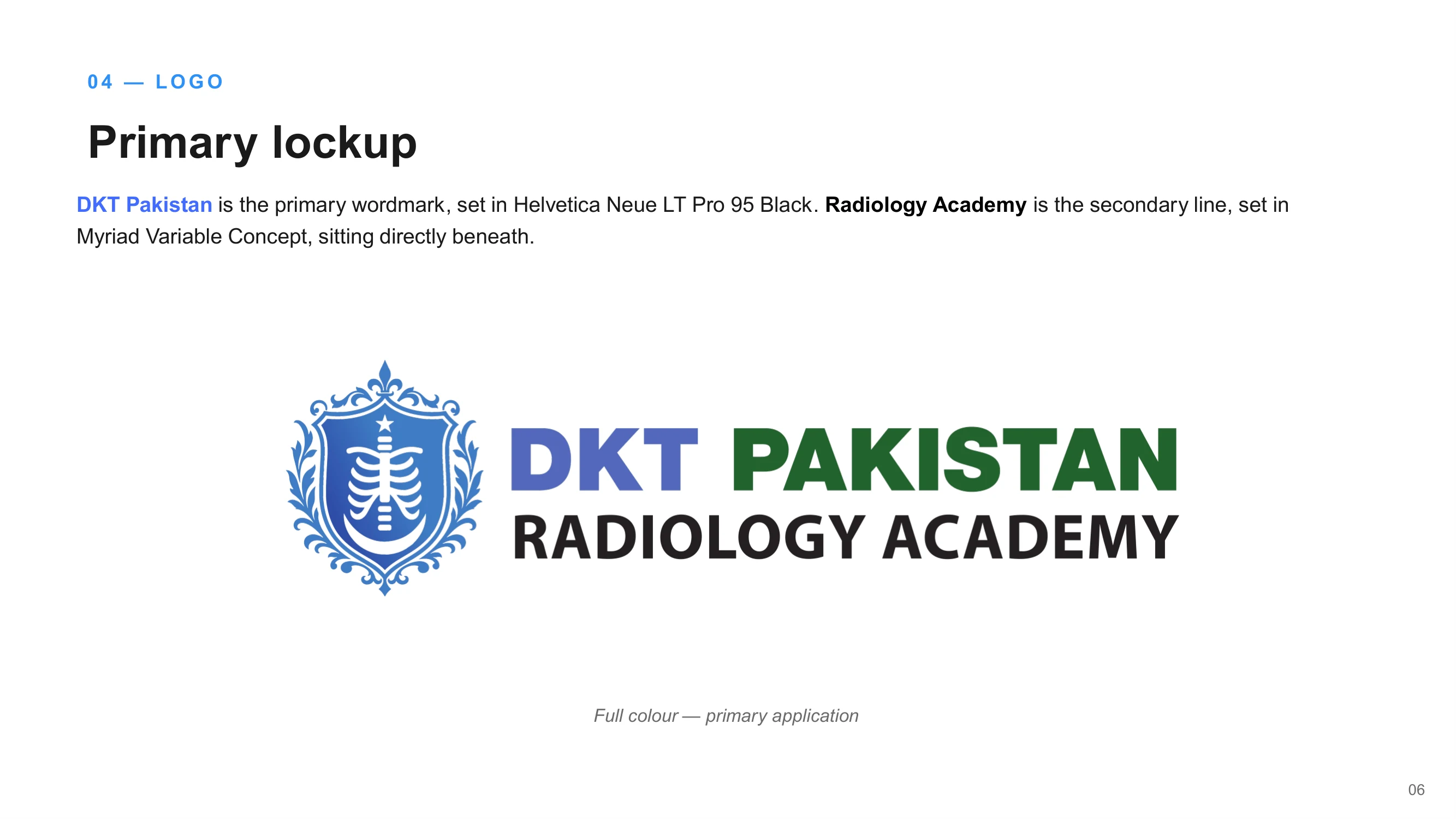
The identity is built around a crest: a stylised rib cage set inside an ornamental shield, referencing radiology's clinical subject matter through a classic, heraldic form rather than a literal medical icon. Paired with a bold wordmark, it gives the academy a mark that reads as established and trustworthy at a glance — closer to an institution's seal than a startup logo.
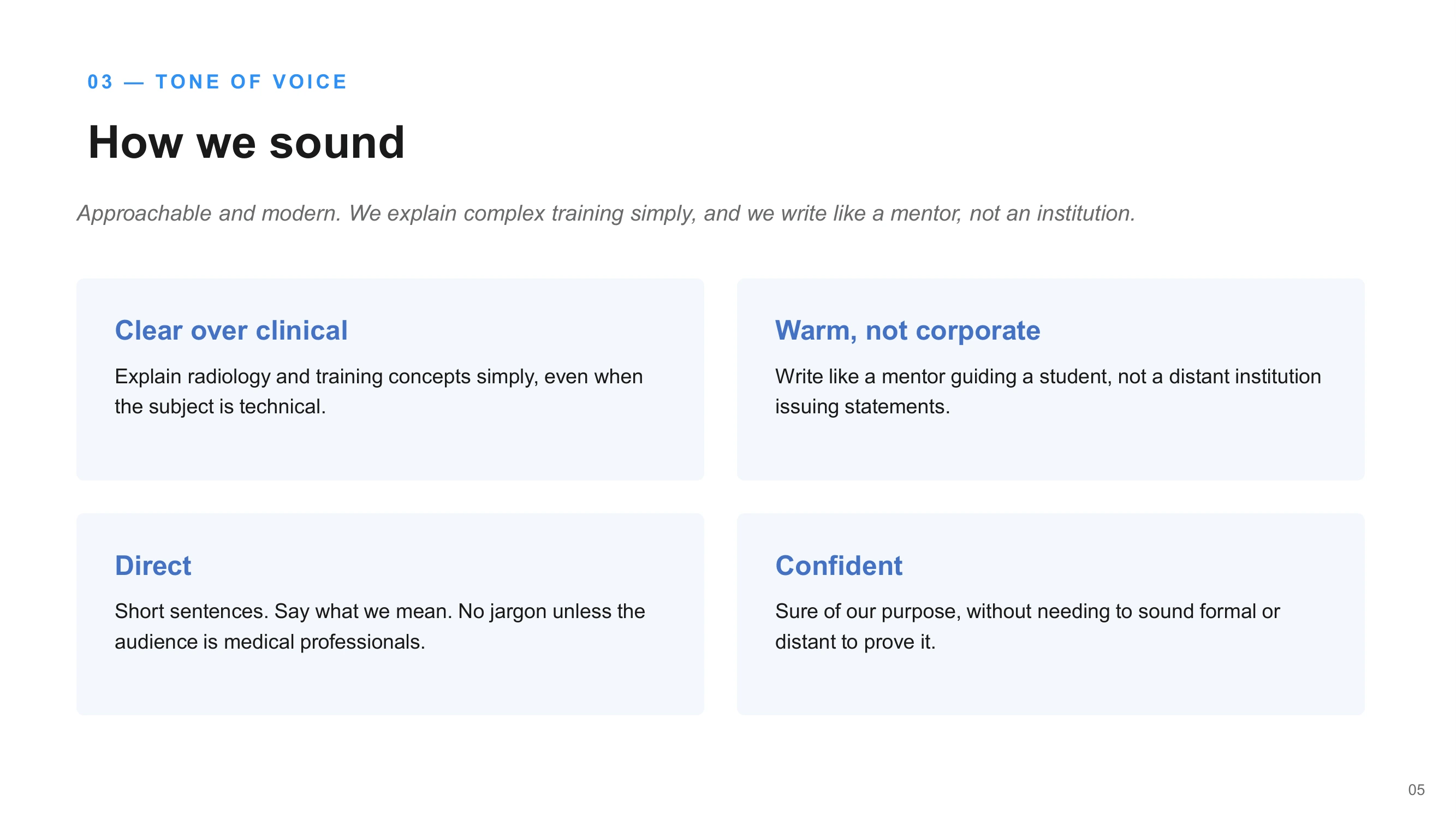
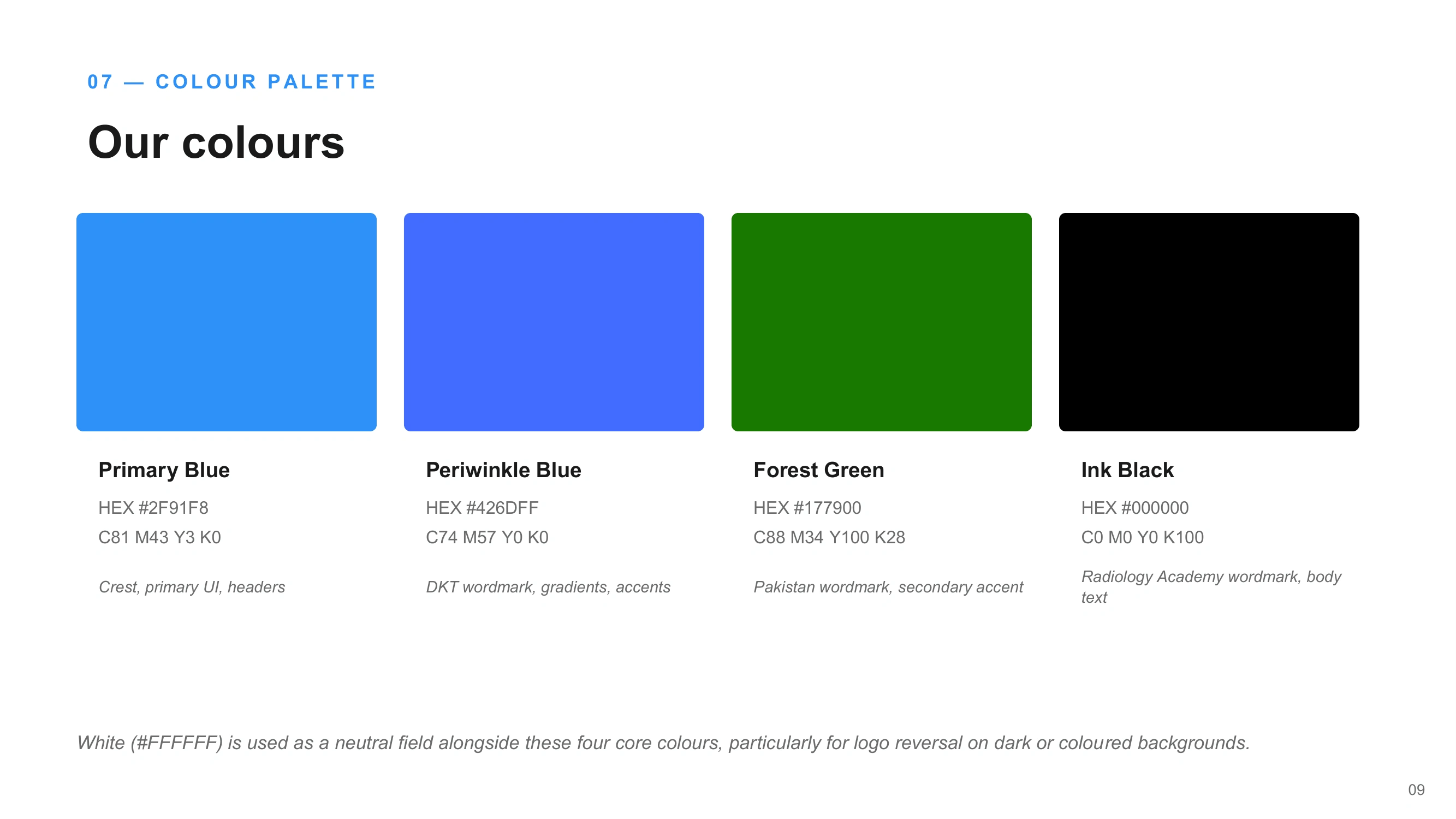
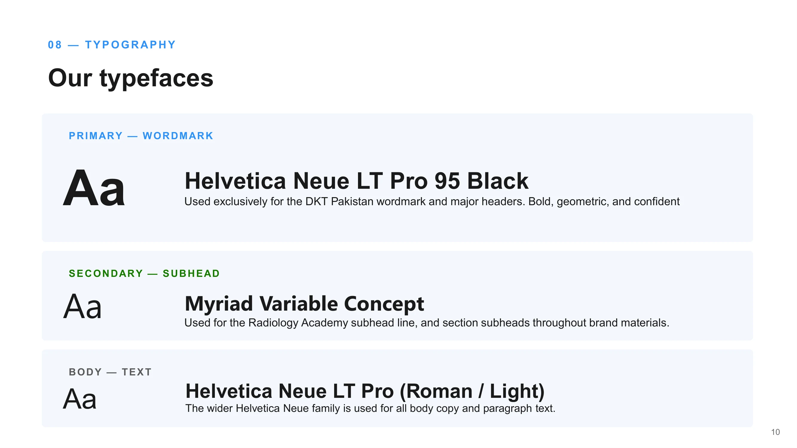
The tone of voice was defined around a single idea: write like a mentor, not an institution. Every guideline traces back to that — clear over clinical, direct over verbose, confident without needing to sound formal to prove it. The colour palette pairs a primary and periwinkle blue with a forest green and ink black, giving the brand enough range to differentiate the DKT and Pakistan wordmarks while keeping a consistent, medically credible core. Typography follows the same logic: Helvetica Neue LT Pro 95 Black for the primary wordmark and headers, Myriad Variable Concept for the Radiology Academy subhead, and the wider Helvetica Neue family for body copy.
Deliverables
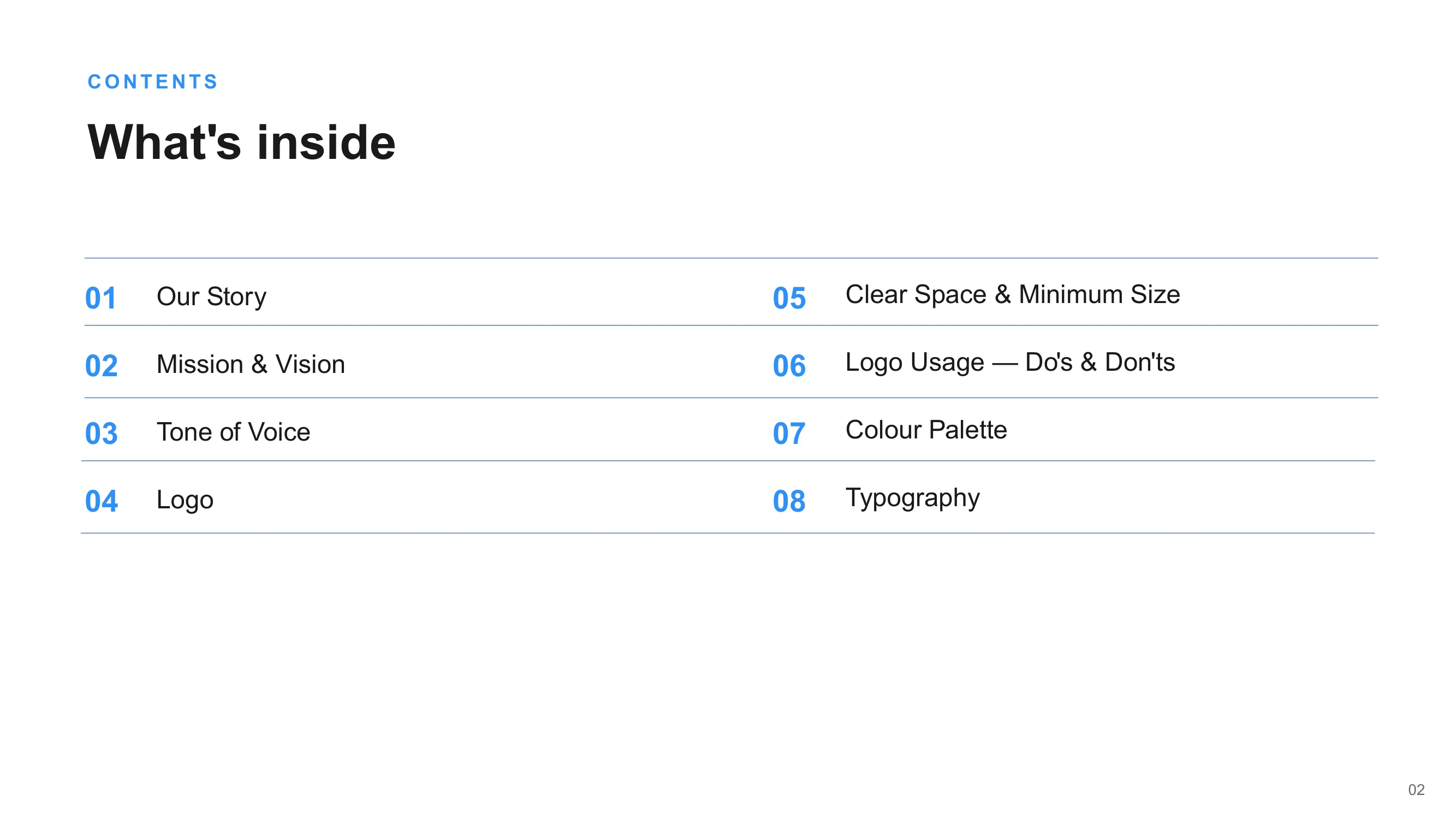
Primary logo lockup (crest + wordmark) and standalone logomark, in full colour and reversed-white versions
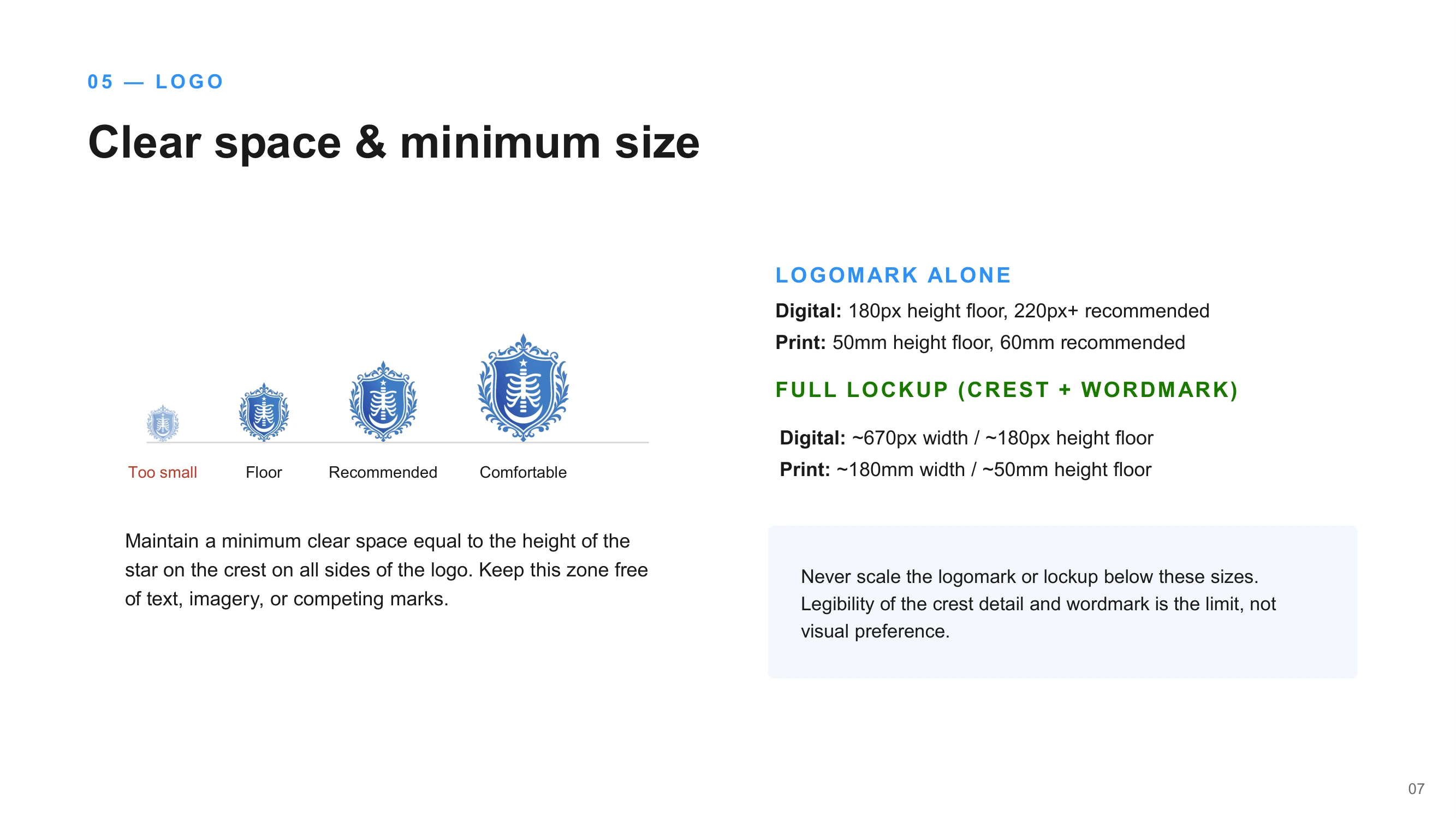
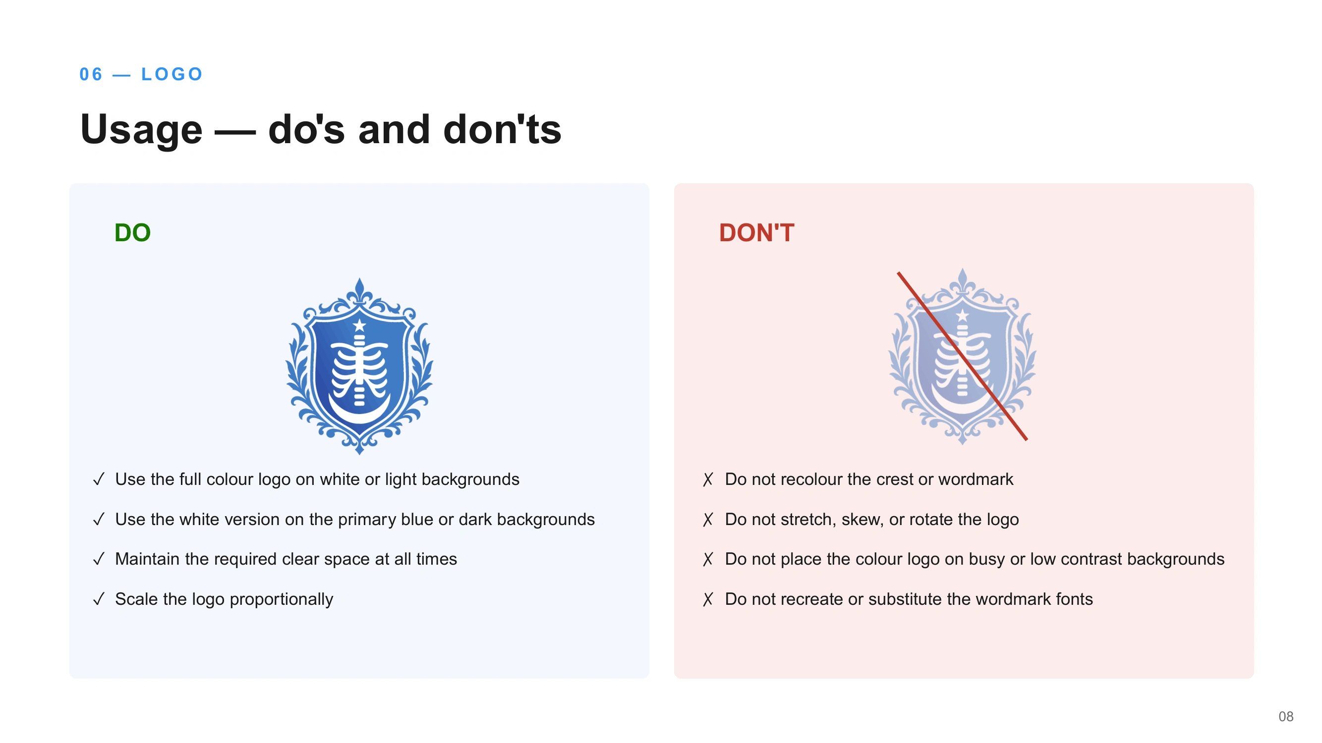
Clear space, minimum size, and usage rules (do's and don'ts) for digital and print applications
A four-colour brand palette with defined roles for each colour
A three-tier typography system (wordmark, subhead, body)
Tone of voice principles for training materials, partner communications, and digital content
A complete brand guidelines document for internal and partner use
Outcome
The result is a flexible identity system that can move between formal partnership contexts and everyday training materials without losing coherence — giving a young, mission-driven academy the visual credibility to stand next to the institutions it works alongside.

Like this project
Posted Aug 27, 2026
Developed a brand identity for DKT Pakistan Radiology Academy to enhance credibility.