The network for creativity
Join 1.25M professional creatives like you
Connect with clients, get discovered, and run your business 100% commission-free
Creatives on Contra have earned over $150M and we are just getting started
Back to feedPost

Winder Logo Design.
A sharp, modern logo exploration for Winder.
The logomark combines the letter W with forward-pointing arrows, creating a bold geometric symbol that represents movement, direction, and progress. The sharp angles give the mark a confident, energetic character while keeping it simple and highly recognizable.
Clean, minimal, and built to move forward. →
What do you see first: the W or the arrows?


Arrows first, then the W resolves about a second later — which is probably the order you want, since the movement idea is the message and the letter is the proof. Worth checking it in flat black though; the gradient is doing some of the work separating the three strokes right now.
Yes, Thank You


Great design!
Thank you


the red gradient looks great
Thank you
The network for creativity
Join 1.25M professional creatives like you
Connect with clients, get discovered, and run your business 100% commission-free
Creatives on Contra have earned over $150M and we are just getting started











Related posts

Brand Expressions -- Olivir




Thats so crazy!!!!!! Seeing this I feel we humans are still far better than AI

A little peek at the brand work we did for Elio Mortgage.
A warm, approachable identity full of warm vibrant colors paired with soft sun rising inspired gradients, inner glows and custom illustrations & more. Loved this direction!
Full case study coming soon, from process to final identity.
Plenty of logo explorations to share too!


That color palette takes the whole identity to a different level!! I loove it.

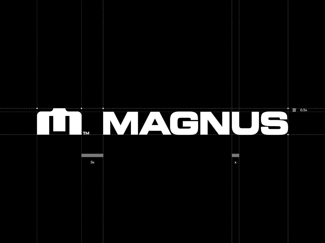
Every gap measured. A recent brandmark and logotype for Magnus, shown on the lockup construction grid. Precision and geometry are my thing :)

Great logo your work accuracy make unbelievable 🔥😎
Great job Pawel❤️