The network for creativity
Join 1.25M professional creatives like you
Connect with clients, get discovered, and run your business 100% commission-free
Creatives on Contra have earned over $150M and we are just getting started
Back to feedPost

A little peek at the brand work we did for Elio Mortgage.
A warm, approachable identity full of warm vibrant colors paired with soft sun rising inspired gradients, inner glows and custom illustrations & more. Loved this direction!
Full case study coming soon, from process to final identity.
Plenty of logo explorations to share too!


This is peak level premium branding!!
🙏🏼🙏🏼

Awesome, nice presentation 👍


That color palette takes the whole identity to a different level!! I loove it.
Thanks mate

stunning, i love that dark maroon paired with the unexpected light blue.

Sun-rise gradients and inner glows are a brave move in mortgage, a category that usually defaults to navy and rooftops. How are you planning to keep the glow readable once it shrinks down to a favicon or a printed letterhead?

The warm, sun-rising palette makes a mortgage brand feel approachable, which is rare in that space. Lovely work.

The warm gradient and sun rising concept fits perfectly for a mortgage brand, feels trustworthy yet modern. Would love to see the full case study!

nice one

That sun symbol pairs beautifully with the orange, Alex ☀️

Sunrise gradients with inner glows are a smart pick for a mortgage brand, since they feel warm before anyone reads a rate. The custom illustrations on top keep it from looking like every other lender.

amazing color palette!!

Nice

This warm direction fits mortgage so well Alex! Usually finance is cold blue, but the sunrise gradient makes it feel more human. Curious how the custom illustrations turned out?

Mortgage brands are usually so cold, so this warm sunrise feel is a breath of fresh air. Looking forward to the case study!

i can just feel the brand, nice work

nice work Alex
Thank you 😃

these designs are so calming @Alex Aperios
Thanks. yeah i wanted this company to feel more approachable.

The sunburst makes a mortgage brand feel friendly, which is hard to pull off. Did the sun idea come first?


Loved this! Looking forward to see case study🔥


Creating gradients with opposite colors is so bold and you did it sooooooo well!!!! love it!!

Love this dude!

This direction works really well for a mortgage brand. The sunrise gradients and inner glows make it feel warm and human, which is not easy in a category where trust usually means looking stiff and formal. I am curious which touchpoint was hardest to keep warm, the website or...

This is such a warm and approachable identity! The sunrise gradients and vibrant colors work so beautifully for a mortgage brand. It feels friendly, not corporate at all. Loved this direction!
The network for creativity
Join 1.25M professional creatives like you
Connect with clients, get discovered, and run your business 100% commission-free
Creatives on Contra have earned over $150M and we are just getting started


Related posts

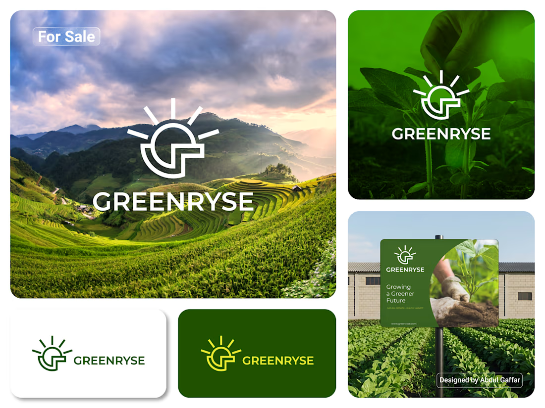
GREENRYSE – G Lettermark, Sun Logo Design, Sustainable Agriculture.
Introducing GREENRYSE, a modern logo concept inspired by nature, agriculture, and the power of growth. The symbol combines a geometric letter G with a rising sun, representing new beginnings, natural energy, and a brighter future for agriculture.
The presentation explores how the logo works across different backgrounds and applications, including agricultural landscapes, product imagery, and outdoor signage. Its clean geometric structure and fresh green color direction create a natural yet professional look.
Designed for agricultural companies, organic farming businesses, crop production, sustainable agriculture, and modern agritech ventures.


Stunning!

Hey Everyone! I've been a little quiet on here lately, but I'm finally back with lots of amazing branding and packaging design case studies which I was working behind the scenes.
Keep an eye out for lots of verified case studies coming your way. 👀
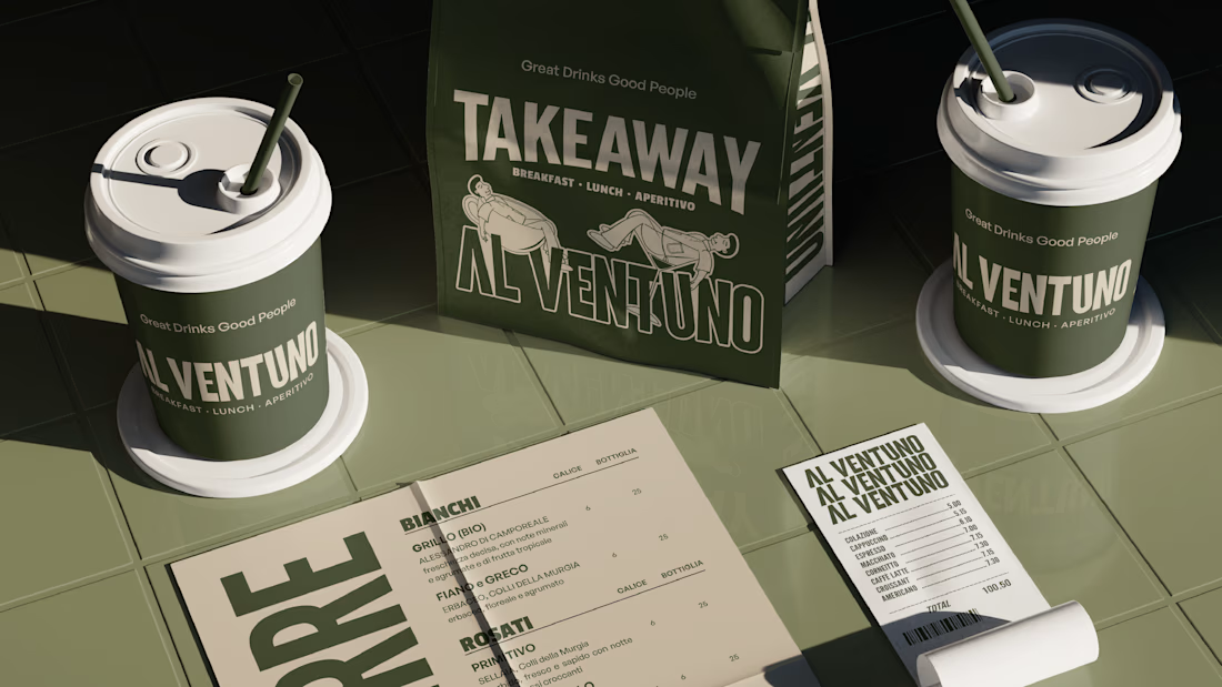
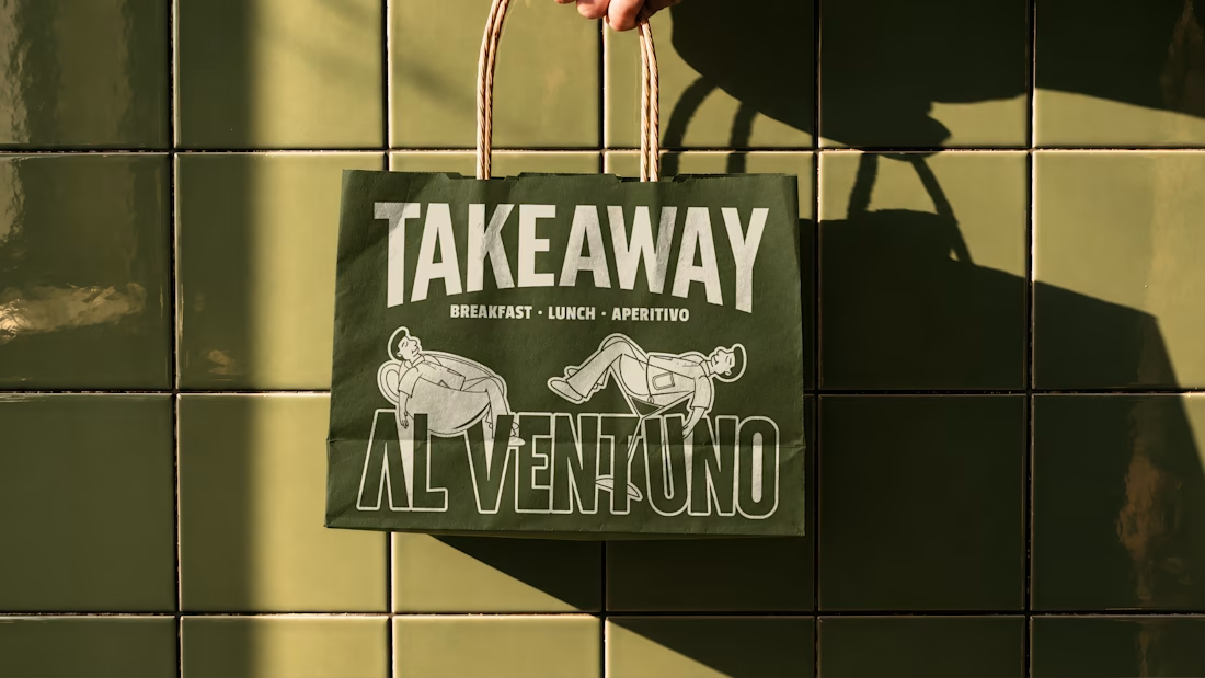
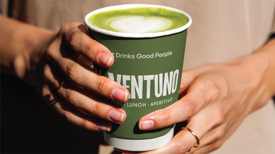
For now, here’s a little peek at some of the work I’ve created lately for a contemporary Italian cafe in Lecce.

Love it! Great work!

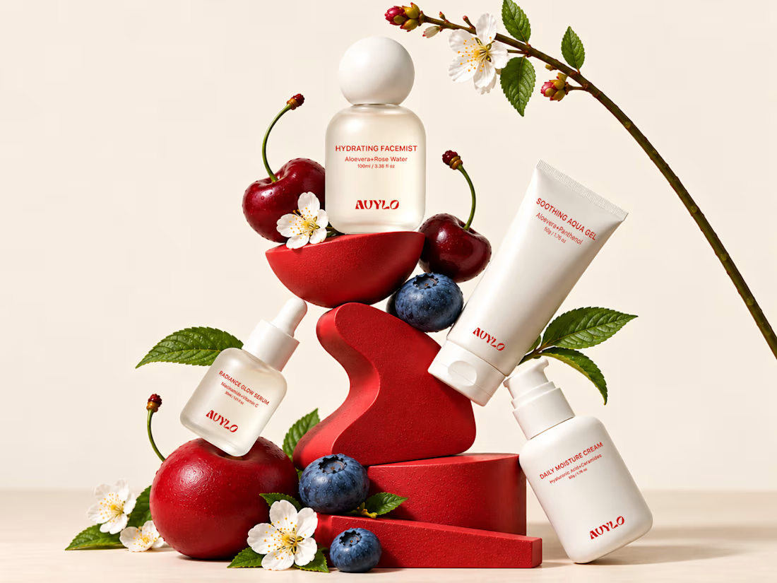
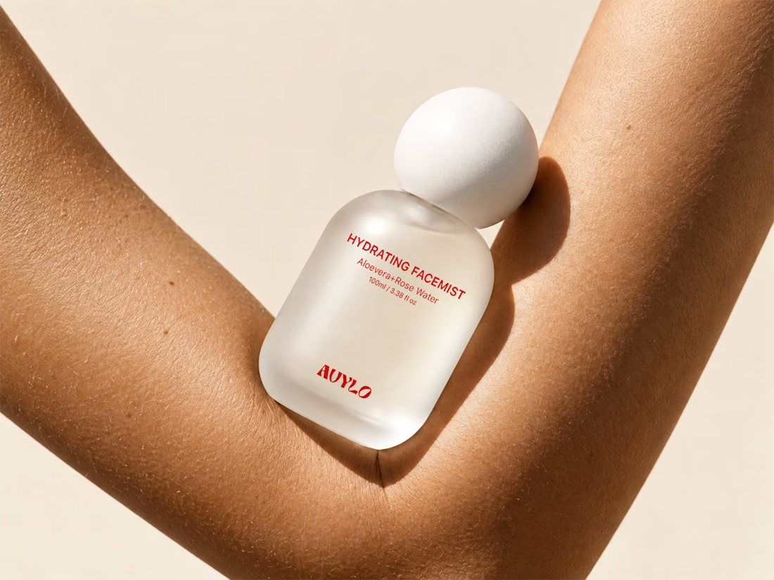
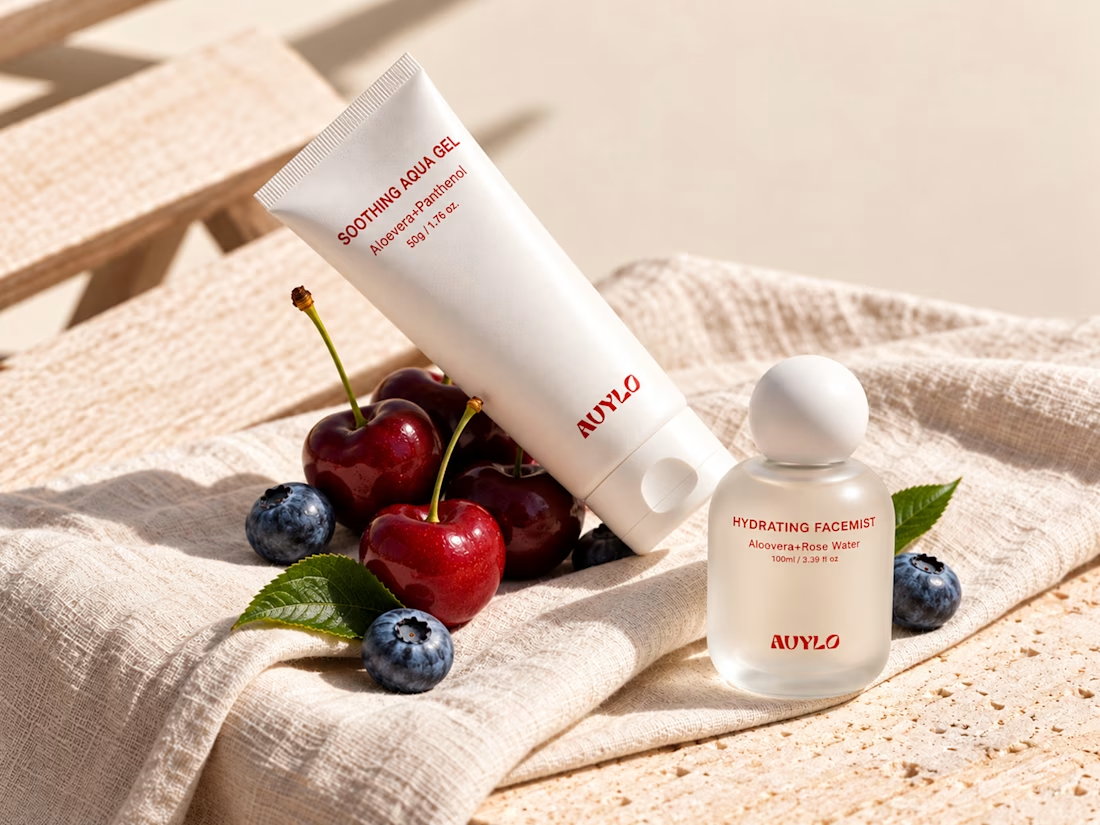
AVYLO Skin Care Packaging Design

Good job