The network for creativity
Join 1.25M professional creatives like you
Connect with clients, get discovered, and run your business 100% commission-free
Creatives on Contra have earned over $150M and we are just getting started
Back to feedPost
Taste Test
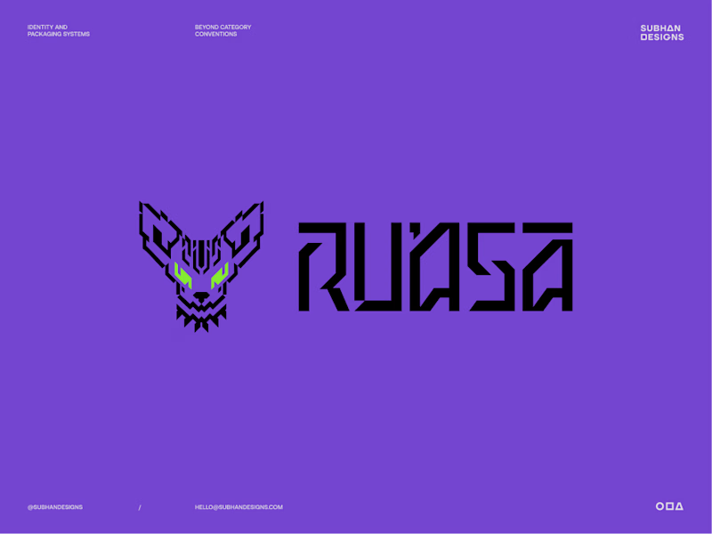
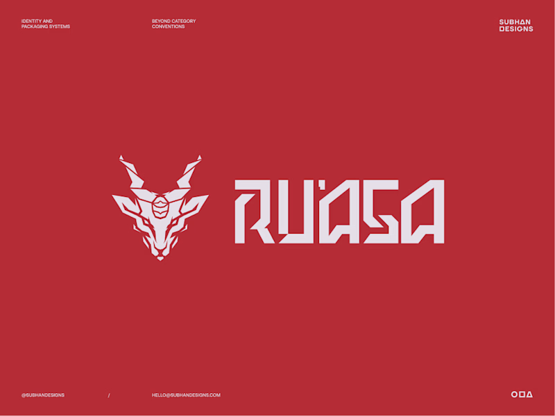
Sphynx or Markhor?
Two very different logo directions, built for the same brand.
One speaks to where the brand comes from.
The other speaks to who the brand is for.
Both had a reason to exist. Only one could define the identity effectively.
Which one do you think the client chose?
And if you’re curious about the thinking, debate and decisions that led to the final direction, I’ve broken down the full story in this post.


9 votes
Ends in 9h


The symbol feels more distinctive at a glance, and paired with that sharper wordmark it gives the identity a stronger sense of attitude and ownership.

The split between the Sphynx and Markhor directions is a great way to frame the brand decision—both feel intentional, but the audience lens makes the contrast especially clear.


the sphynx cat logo is cool. which one won?

Sphynx Cat Benjamin 😋

Markhor for me. The Sphynx is the cooler illustration, but the Markhor can carry a whole brand system without getting tired. One is a mascot, the other is an identity.
The network for creativity
Join 1.25M professional creatives like you
Connect with clients, get discovered, and run your business 100% commission-free
Creatives on Contra have earned over $150M and we are just getting started

Challenges
View all


Related posts


“Or similar” leaves a lot to the imagination.
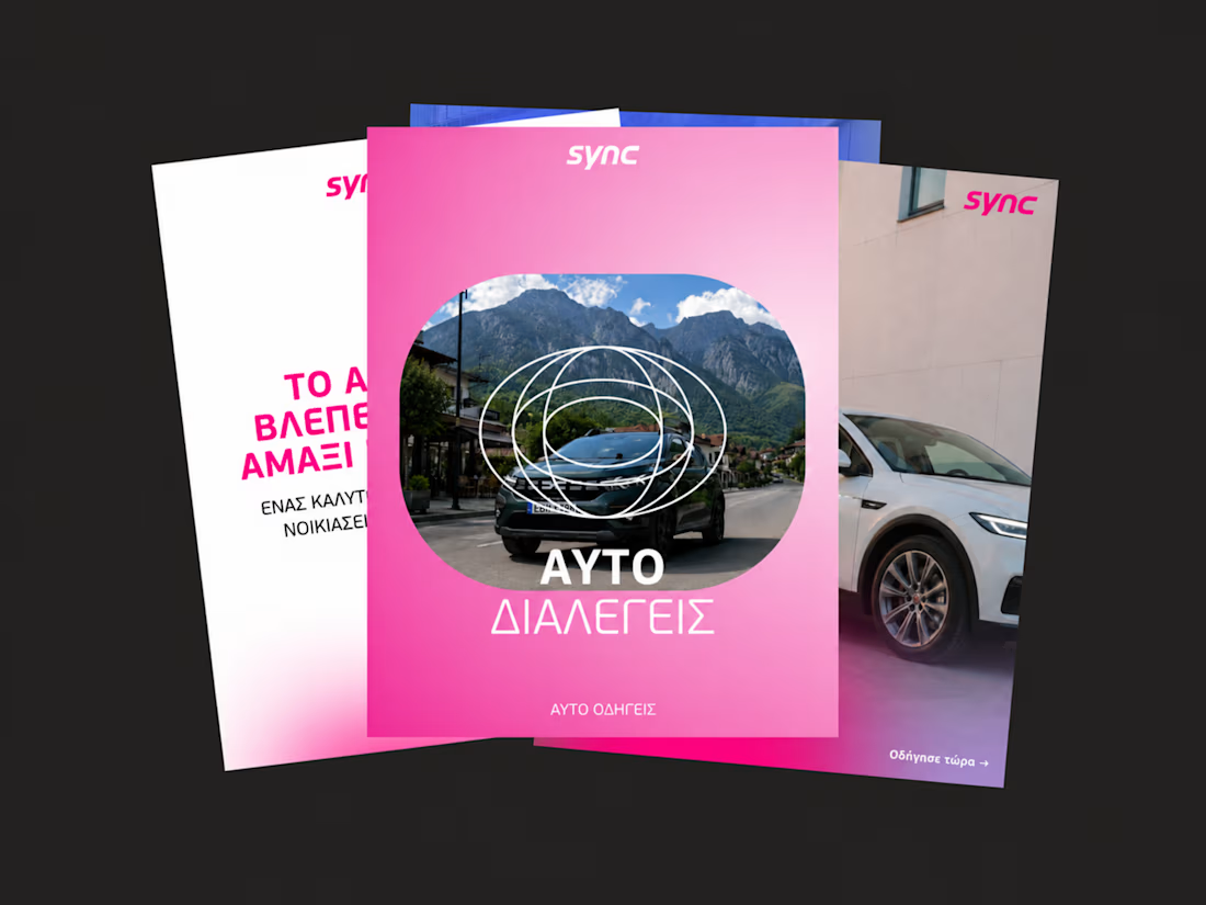
A few billboard designs I made for Sync as part of the rebrand. The campaign centres on a simple promise: the car you see is the car you drive.
I kept that message big and direct, with the cars up close and enough pink to make you look twice.
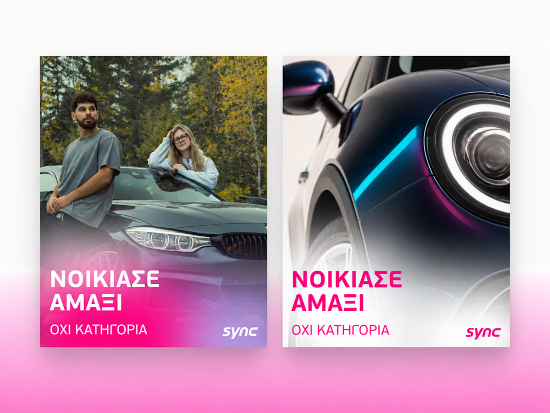
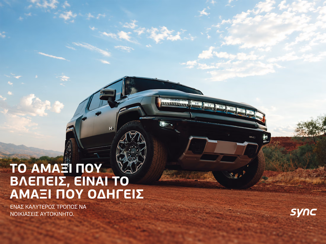
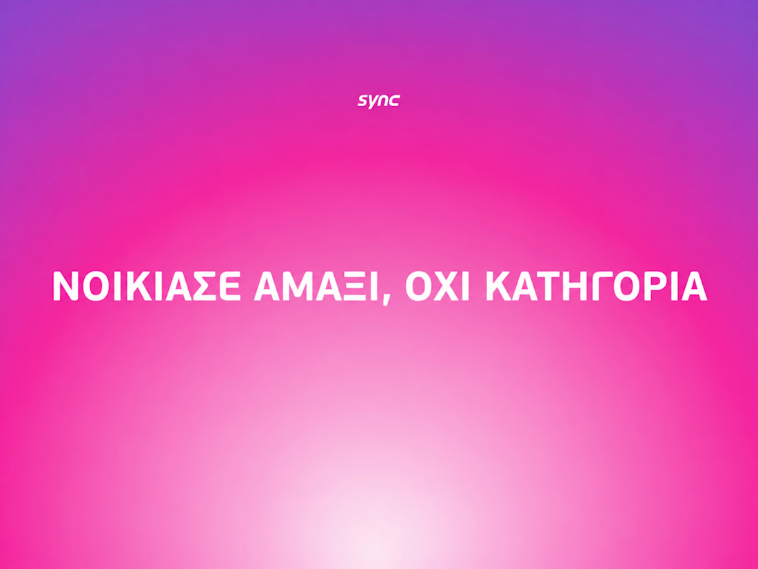
The way the oversized promise carries through the pink palette is really effective—the close-up crops make the car feel immediate without losing the campaign idea.

What if a space brand didn’t just look futuristic — but felt like it was already living in the future?
For XPACE, the goal was to build a visual identity that could turn the idea of space exploration into a complete and immersive brand experience.
The identity combines a bold typographic system, a high-contrast visual language, and electric blue accents against deep black to create a futuristic presence that feels precise, technological, and unmistakably XPACE.
But the identity didn’t stop at the logo.
The system was extended across digital interfaces, web design, favicon and UI icons, access cards, board passes, and branded applications — creating a consistent experience across every touchpoint.
Every detail was designed to make XPACE feel less like a brand inspired by the future, and more like a brand built for it.
XPACE — Visual Identity System.
Looking to build a visual identity that goes beyond a logo?
Let’s create something with a world of its own.

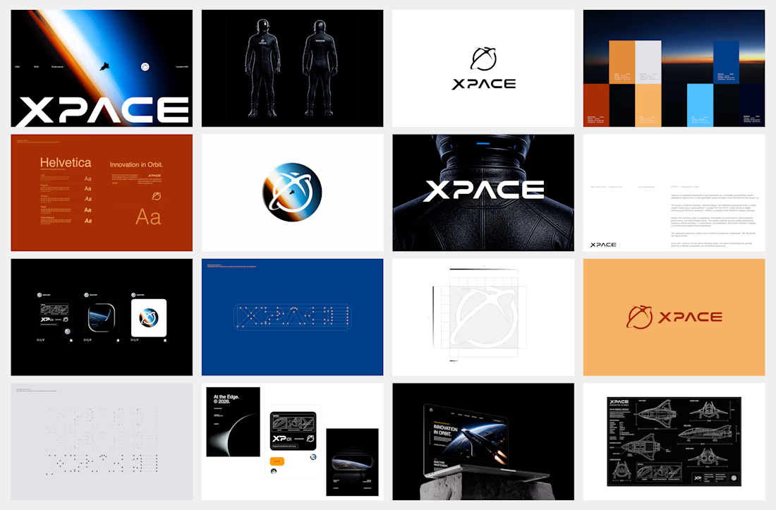
The identity system feels cohesive because the typography, electric blue accents, and image language all push in the same direction. Extending that logic into interfaces and packaging is what makes XPACE feel like a real world, not just a futuristic logo.

We're stuck 😅
Which one feels more premium and unique to you?
Comment 01 or 02 below your opinion will genuinely help us lock this in.
7 voted
33%
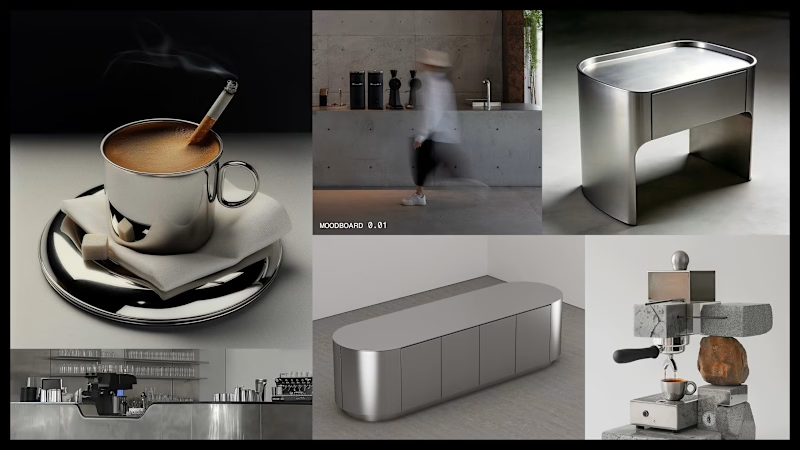
14 voted
67%
21 votes
Closed
