The network for creativity
Join 1.25M professional creatives like you
Connect with clients, get discovered, and run your business 100% commission-free
Creatives on Contra have earned over $150M and we are just getting started
Back to feedPost
Taste Test
We're stuck 😅
Which one feels more premium and unique to you?
Comment 01 or 02 below your opinion will genuinely help us lock this in.
7 voted
33%
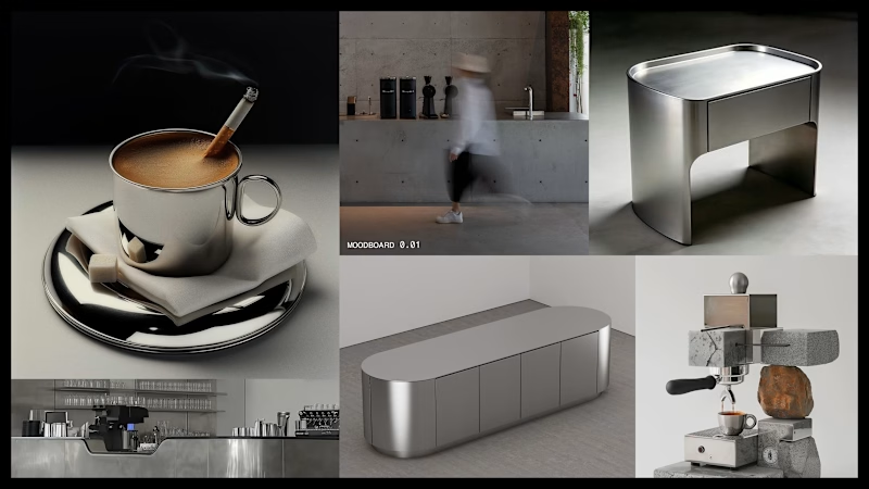
14 voted
67%
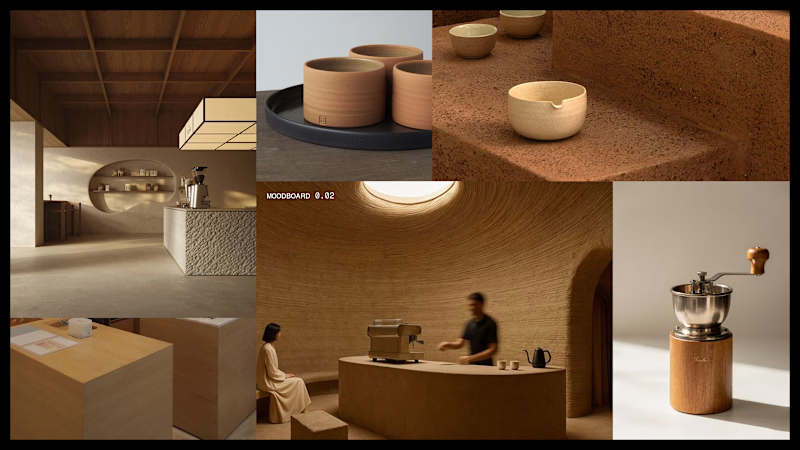
21 votes
Closed


Same here honestly! Let's see how others vote too before finalizing 😄

I’d go with 02 — Rammed Earth. The warmer material palette gives it more tactile depth, while the quieter composition keeps the brand feeling premium rather than over-designed.
Yoo, second vote again for Rammed Earth, wow! Definitely keeping this in mind, thank you for giving your feedback!

01, though for a slightly boring reason: the steel route survives reproduction. Rammed earth's whole appeal is texture, and texture is the first thing to die at small sizes, in one colour, or on cheap stock. If most of the touchpoints are physical and generously sized, that flips.
Damn, that's actually a really solid point, didn't think about how texture dies at small sizes or on cheap stock. Def something we need to test before locking touchpoints. Thanks for this, Artur...

Yeah the coffee-color tie in is exactly the vibe we were going for with 02! Glad that came through 🙌

That's another vote for 02! Thanks for weighing in, Sahil 🙏


the clay bowls look so warm. i vote 02
Haha yeah those clay bowls are doing a lot of work in that shot 😄 Thanks for the vote, appreciate it!

01 for me, the chrome cup with the steam is doing it. what's the brand, a cafe?
Glad 01 is landing for you! And yep, it's for a café project...

The second one!!

02 gets my vote. That warm, earthy palette feels more distinctive and premium to me.

02, rammed earth. The texture reads more premium than the steel version, which feels closer to a generic kitchen showroom.


02, the coffee color tie in works and gives the brand a distinct enough lane against the sea of black-and-white café identities out there.

Rammed Earth has such a warm and beautiful aesthetic!


This is awesome!
The network for creativity
Join 1.25M professional creatives like you
Connect with clients, get discovered, and run your business 100% commission-free
Creatives on Contra have earned over $150M and we are just getting started








Related posts


Finally landed on a version the client is happy with.
Which 'A' letter do you think fits better?
27 voted
52%
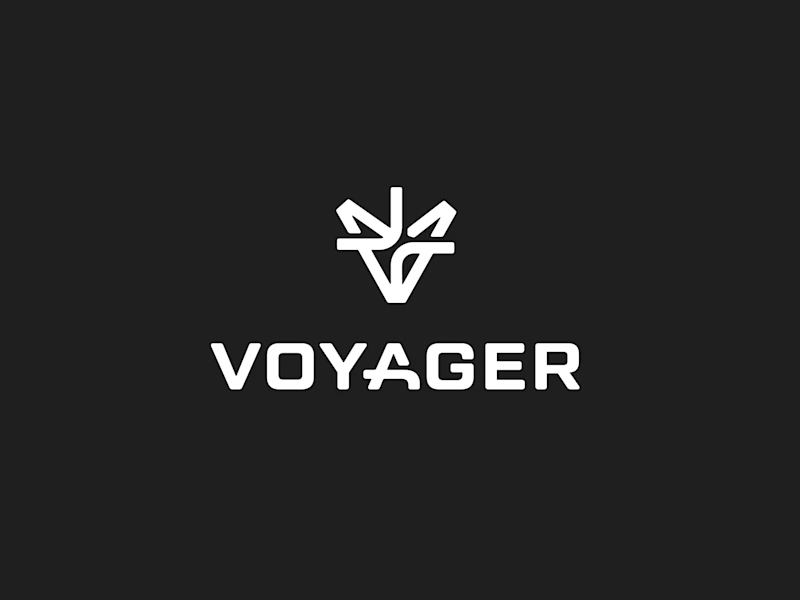
25 voted
48%
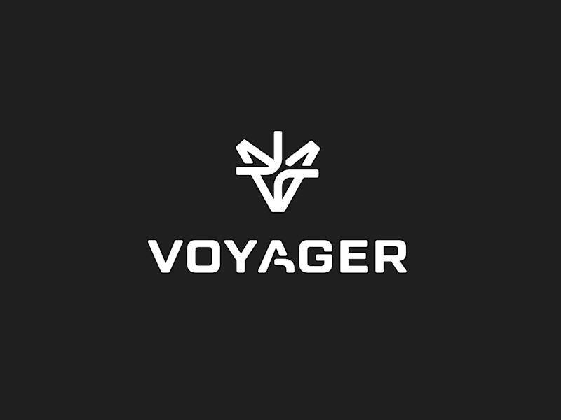
52 votes
Closed

I choose Short but I don't know the difference but the design is great congrats 🎉


Somewhere between a research lab and a film opening.
Two hero sections I developed in Webflow.
One fills the screen with lab footage. The other pairs a moving gallery with a wordmark that fades out of focus.
Same project, two very different moods. Which one does it for you?


38 voted
57%
29 voted
43%
67 votes
Closed

hard call, but i had to opt for gallery!

One of our older branding projects, but it still feels surprisingly fresh.
Cashbox started with a very simple idea: a box-shaped logo.
The identity went a little more out of the box.
Still a good example of how we like to work: keep the core idea simple, then push the visual system much further.


the design here is so immersive & innovative, love it.