The network for creativity
Join 1.25M professional creatives like you
Connect with clients, get discovered, and run your business 100% commission-free
Creatives on Contra have earned over $150M and we are just getting started
Back to feedPost
Taste Test


Finally landed on a version the client is happy with.
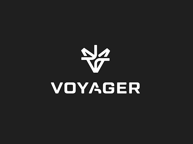
Which 'A' letter do you think fits better?
27 voted
52%
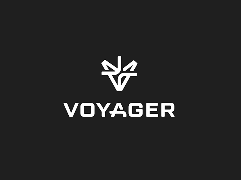
25 voted
48%
52 votes
Closed

I choose Short but I don't know the difference but the design is great congrats 🎉
Cheers!


Long. Like the way it goes into the negative space between the "Y" and "A" letters, giving it a better overall visual composition.


Typography is cool....and short "A" seems perfect!!

I don't much difference , but nice


I’d go with the long one

Short for me, it feels more balanced with the rest of the letters. Congrats on getting the client to a yes!

short compliments the mark, the longer kinda feels like its tryna compete

Long

I would go with short, since we already have same on the logo icon. it looks repetitive

I don't know any difference are there but logo was good.

I’d go with Short. It feels cleaner, more balanced, and more memorable. The compact letterform gives the Voyager logo a stronger visual identity and works better across app icons and smaller brand placements. 👏

short one is great because, in the long one my focus is on 'a' at first glance while in short version i am looking at the whole wordmark, and also the long one doesn't go well with the icon as both have too much going on, the message the simpler the better.

I go with the short concept

I'll go with long.
The network for creativity
Join 1.25M professional creatives like you
Connect with clients, get discovered, and run your business 100% commission-free
Creatives on Contra have earned over $150M and we are just getting started

Challenges
View all


Related posts

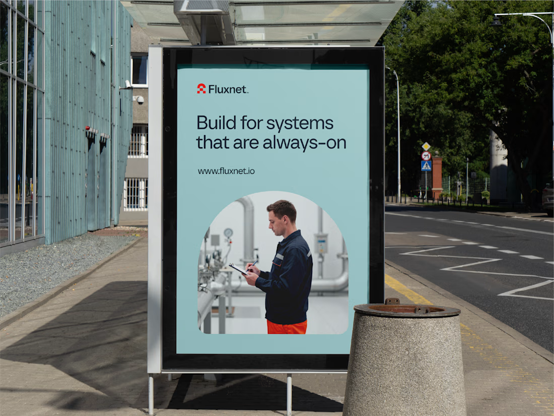
One of my favorite projects this year 👉 Fluxnet.
The challenge of this project was to create an identity for a company bringing AI into complex industrial environments, where trust and reliability matter just as much as innovation.
The direction was to balance these two worlds: a brand that feels grounded and dependable, but still looks ahead. The goal was to make complex technology feel clear and accessible without losing its technical edge.
Full project here
Curious to hear your thoughts. How do you approach branding in such a technical spaces?
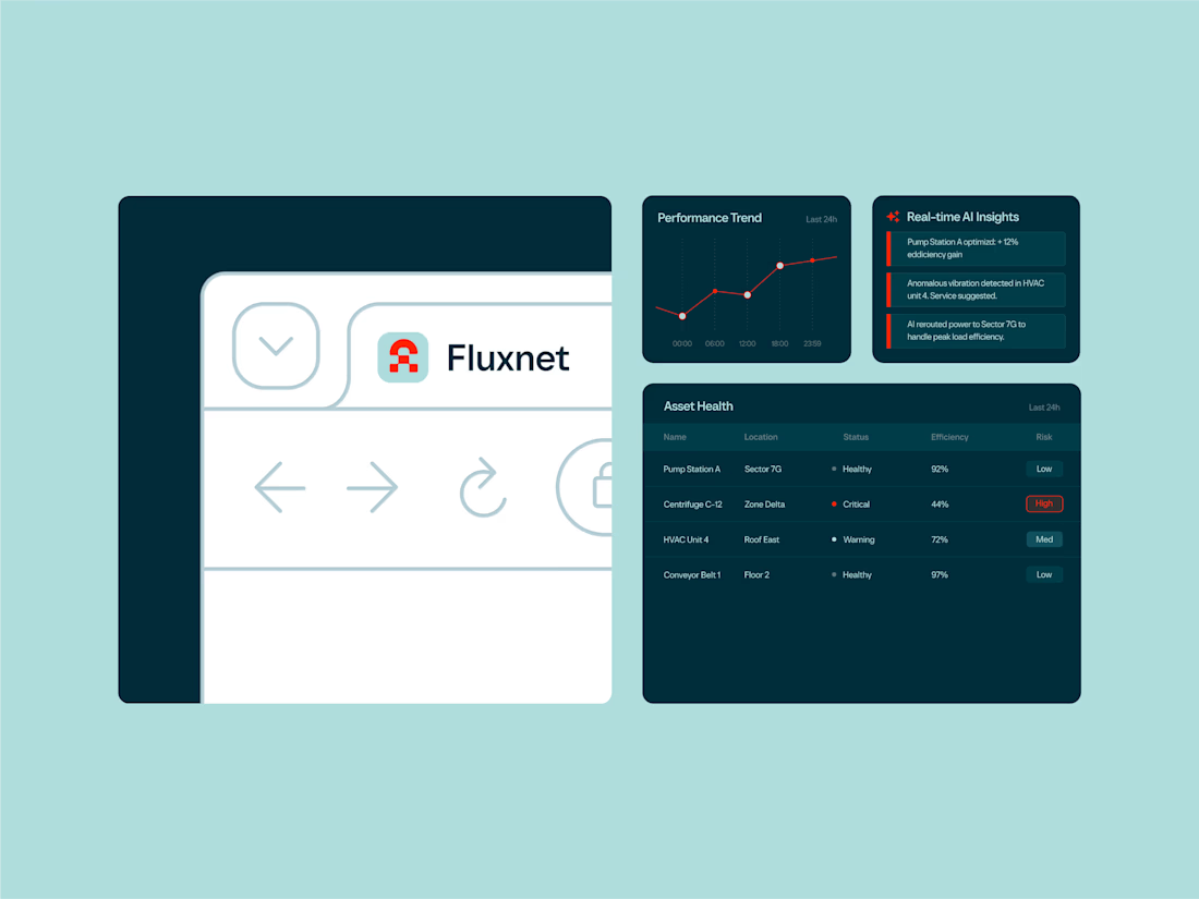
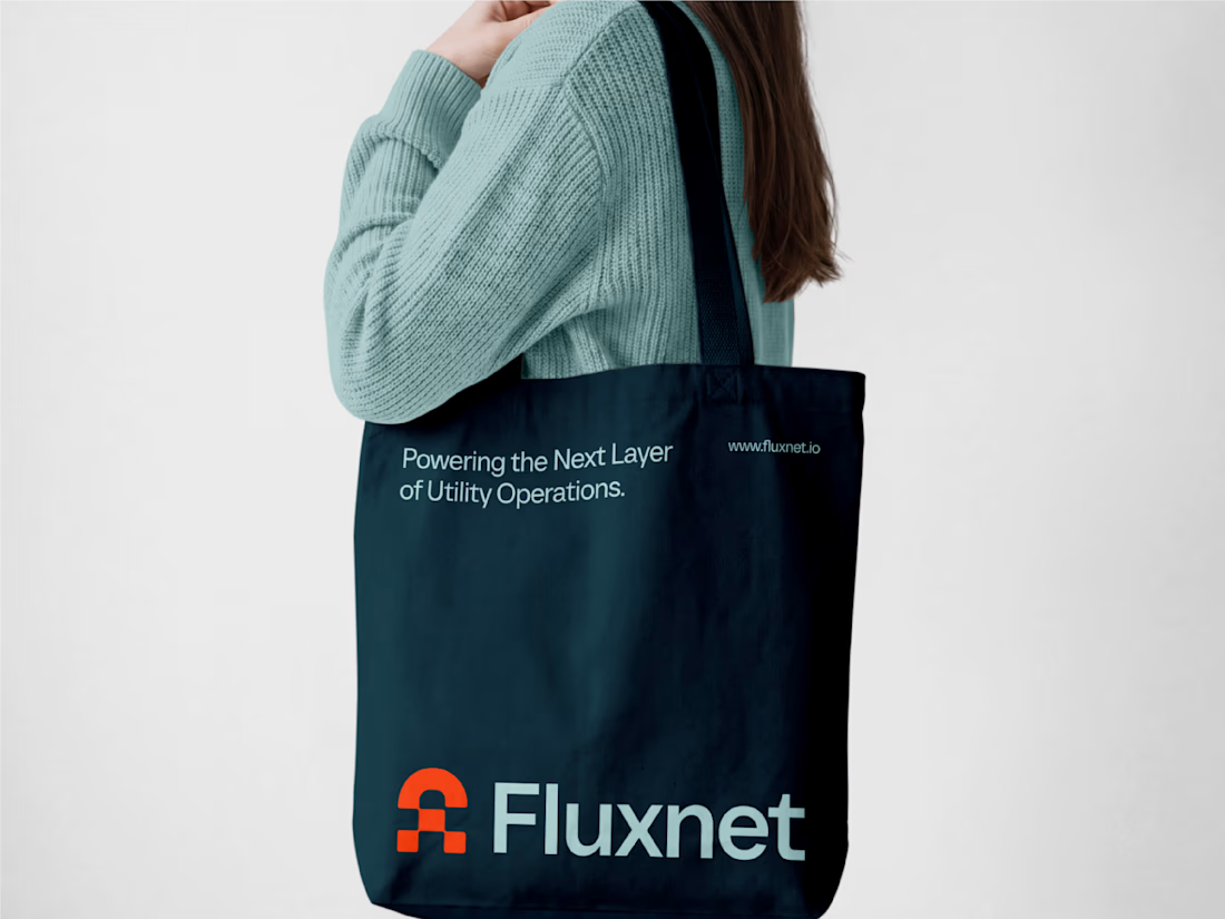


how did you land on the balance between industrial and innovative?

A founder ask me for a feedback on there product, so i started reviewing the healthcare app, and something felt off.
The website felt warm and welcoming. You could tell there were real people behind the brand.
But once you opened the app to sign up, that feeling was gone.
And honestly, for something as personal as healthcare, that matters. People need to feel comfortable before they trust you with their health.
So I worked on the onboarding screen to bring that feeling back.
Nothing complicated. I added a human touch through imagery and kept the screen simple, while making the app feel more connected to the website.
Sometimes, it's not about adding more to a screen. It's about making what's already there feel right.
Which would make you more comfortable signing up:
Before or After?

4 voted
14%
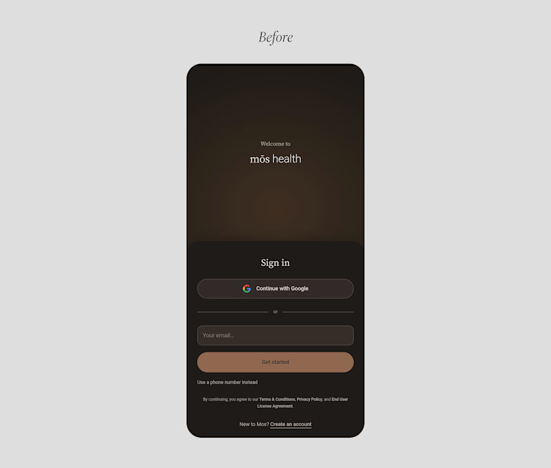
25 voted
86%
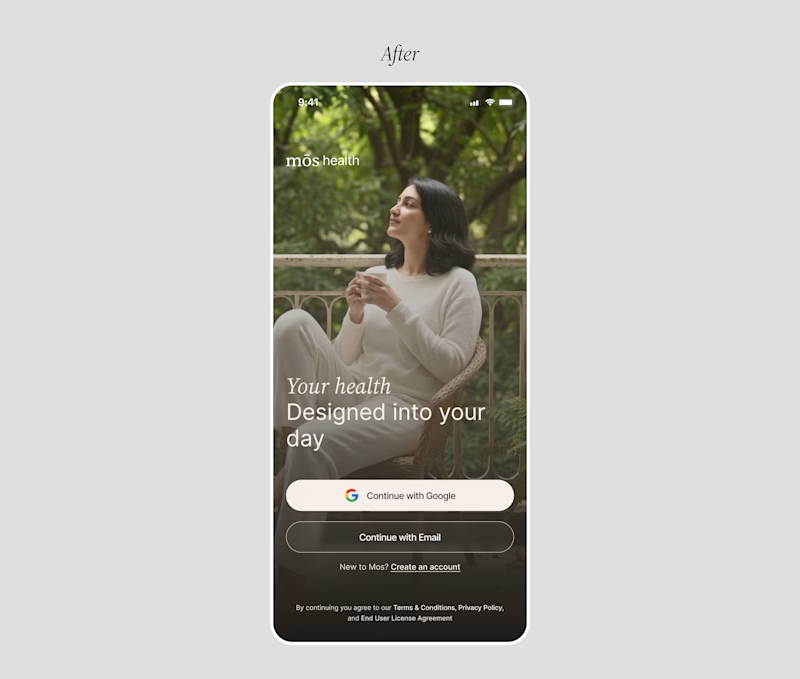
29 votes
Closed

Good catch on the disconnect between the website and signup flow. Carrying that human warmth into onboarding feels especially relevant for healthcare. Have you had a chance to test the redesign with new users?


Same animation, one detail changed.
Motion blur or clean.
Which one feels better? 👇
16 voted
53%
14 voted
47%
30 votes
Closed
Blure is more focused and better ❤️❤️