
Brand Copywriter & Creative Strategist


View more →

Quick Email Solutions for Small Biz & Startups 🚀
Quick Email Solutions for Small Biz & Startups 🚀


View more →

✍️ Substack Growth Expert + Creative Marketer

✍️ Substack Growth Expert + Creative Marketer

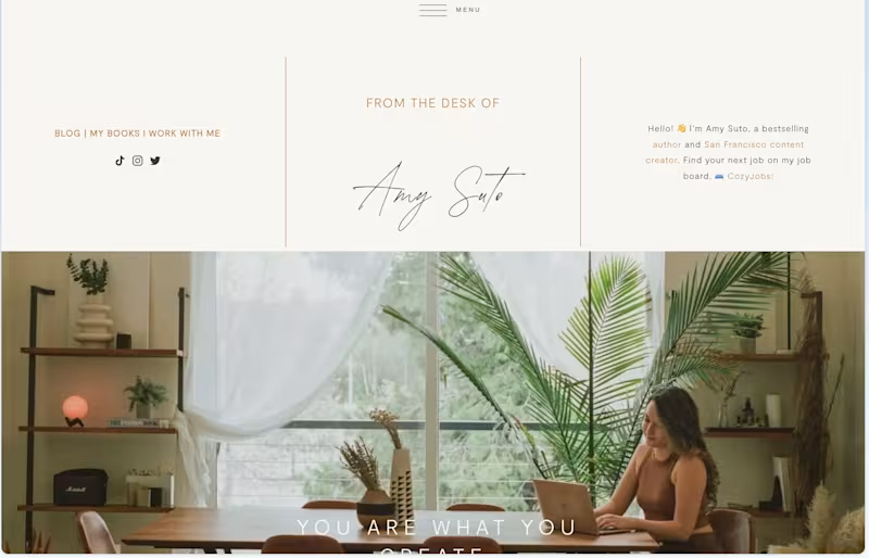
I coded my entire website, moving it off of Squarespace and rewriting every line of code while improving design elements and interactive pieces and boosting SEO using the Ahrefs MCP.
3
516


Product & Visual Designer · Brand Identity · UI/UX
- 2x
- Hired
- 5.0
- Rating
- 68
- Followers
Product & Visual Designer · Brand Identity · UI/UX
Project title
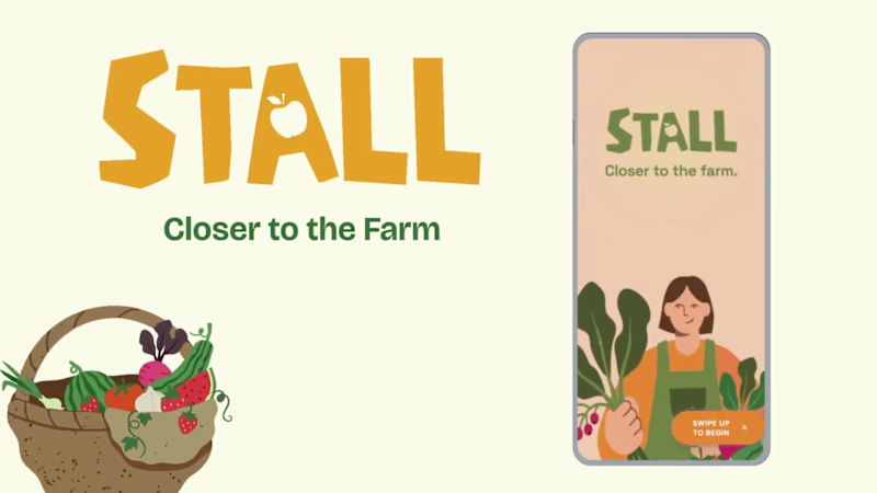
STALL — Your farmers market, alive.
A swipe-to-shop farmers market companion that connects local vendors with regulars before Saturday ever arrives.
The problem
Every Saturday, the same thing happens.
You show up to the farmers market at 10am. The ramp vendor you wanted is sold out by 9. You forgot cash. You walk past a honey stall three times because you can't remember if you already bought some. And that new mushroom farm you heard about? Gone before you spotted them.
On the vendor side, it's just as frustrating. Small farmers wake up at 4am, load the truck, drive an hour, and have no lightweight way to tell their regulars — the people who actually want what they grow — "I have asparagus this Saturday. Come find me."
STALL fixes both sides of that problem.
What STALL does
STALL is a two-sided farmers market app built around one weekly ritual: Saturday morning.
For shoppers:
Follow vendors at your local market
Swipe through a weekly produce deck — right to add to your list, left to skip — exactly like Bumble, but for ramps and sourdough
Get a Friday evening digest: what your vendors have this week, your auto-built shopping list, and where each stall is on the map
Pre-reserve high-demand seasonal items before you leave the house
Discover first-of-season arrivals with a "what's new this week" spotlight
For vendors:
Post a weekly inventory update in 3 taps — what you're bringing, quantities, price
Reach your regulars directly before market day
Manage pre-reservations without a complicated system
The app celebrates the seasonal nature of farmers markets — ramps in April, strawberries in June, squash in October. Every week feels like something worth showing up for.
How I built this with Google Stitch
STALL was designed and prototyped entirely using Google Stitch as the primary build tool, with Figma used only for initial wireframing.
The workflow:
Day 1 — Brand and wireframes
I started by defining the brand: the name, palette (Pumpkin Spice Forest — a warm amber, fern green, mauve, and cream system), and illustration direction. I wireframed the three core flows — swipe deck, Friday digest, and vendor post — before touching Stitch.
Day 2 — Into Stitch
I imported my Figma file directly into Stitch using the .fig import feature. From there I used streaming generation to build each screen live on the canvas — watching the splash screen, onboarding flow, and homepage assemble in real time was genuinely remarkable. The HTML-native canvas meant every animation I added — card tilt on swipe, drawer slide-up, bento tile stagger — rendered exactly as it would in production.
Key Stitch prompts used:
"Add a swipe gesture to the produce card stack — right swipe shows a green Added overlay with 5° card tilt, left swipe shows a mauve Skipped overlay with -5° tilt"
"Make the shopping list items stream in one by one with 120ms stagger on page load"
"Add a bottom drawer that slides up from the vendor card with spring easing — show the farm bio, full inventory list, and two action buttons"
"Build the Friday digest screen — vendor items animate in sequentially, the seasonal spotlight card pulses gently"
"Export web assets and deploy to Netlify"
In-place edits I used:
Swapped the swipe overlay color from red to mauve to match brand
Adjusted the bento grid gap from 8px to 6px after seeing it render on canvas
Changed the CTA button from outlined to filled after in-place visual comparison
Rewrote the seasonal spotlight copy directly on the canvas without regenerating
What Stitch made possible that nothing else could:
The swipe gesture interaction, the drawer spring animation, and the staggered list streaming — all three of these would have taken days to hand-code. In Stitch, they were prompt-driven and live on the canvas within minutes. The gap between "designed" and "interactive prototype" collapsed entirely.
Screens delivered
Splash screen — farmer illustration, full-bleed cream background
Onboarding screen 1 — market basket illustration, "Your market, every Saturday"
Onboarding screen 2 — swipe mechanic explainer with card UI
Onboarding screen 3 — Friday digest bento preview
Homepage — bento grid with market header, seasonal spotlight, list, map preview, swipe deck, streak tracker
Swipe deck — card front, vendor expand drawer, swipe right (added), swipe left (skipped)
Friday digest — streaming vendor list, seasonal spotlight, auto-built shopping list
Market day map — vendor stall grid, spot numbers, live confirmation states
Vendor post flow — 3-tap inventory update screen
Design decisions worth noting
The swipe mechanic — Borrowing the Bumble swipe pattern for produce discovery was the conceptual breakthrough. It transforms a passive browse into an active, satisfying decision. Every right swipe builds your list. Every left swipe still shows you where the vendor is on the market map — skipping is never permanent.
The Friday digest as the hero feature — Most apps make you come to them. The Friday evening push notification with a personalised market brief is the one moment where STALL comes to you. It changes Saturday morning from reactive to intentional.
Bento homepage — Instead of a scrolling feed, the homepage gives you everything at a glance: your market, your list, the seasonal moment, your vendors. Seven tiles, seven pieces of information, zero scrolling.
The color system — Pumpkin (#E8872A), Fern (#728040), Mauve (#B07090), Cream (#FDFAF6), and Moss (#4A5228). Every color has one job. Pumpkin is interactive. Fern is seasonal and confirmed. Mauve is reserved and streaks. Cream is every surface. Nothing competes.
What I learned
Stitch genuinely changes the prototyping workflow. The moment I stopped thinking of it as a design tool and started thinking of it as a build tool — one where the canvas is the product, not a picture of the product — everything accelerated. The in-place edit feature is the one I'll keep coming back to: being able to change a color, rewrite copy, or swap a component without regenerating the whole screen is the difference between iteration and rework.
STALL started as a hackathon idea. After building it in Stitch, it feels like something real.
Live Prototype: https://stitch.withgoogle.com/preview/8229547464152593644?node-id=e53124995cda49808685283be978dc8c
50
44
1K


Copywriter


Demand Gen & Performance Marketing Leader
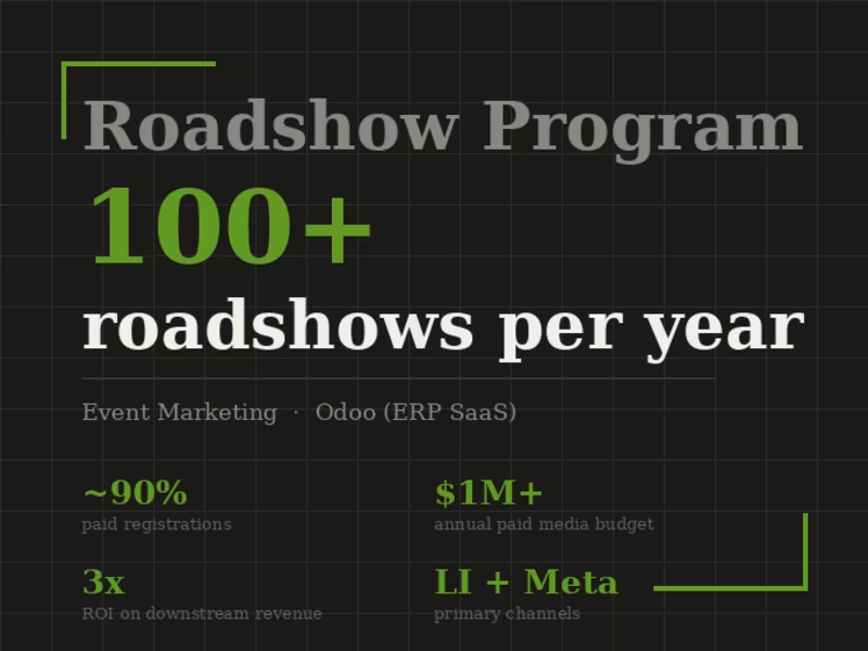
Odoo's go-to-market relied heavily on in-person events to drive regional pipeline and partner engagement. I built the paid acquisition engine behind a program that scaled to 100+ roadshows per year across the US and internationally.
LinkedIn and Meta were the primary acquisition channels. I used LinkedIn for persona-targeted outreach to decision-makers and IT buyers, and Meta for broader awareness and lookalike audiences built from past registrant lists. Roughly 90% of registrations came through paid, with organic and direct playing a minor supporting role.
The program reached $1M+ in annual paid media budget and delivered approximately 3x ROI tied to downstream revenue, making it one of the most consistent pipeline drivers in the business.
0
111
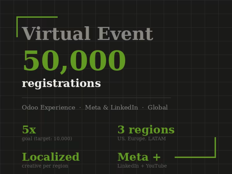
In 2020, COVID forced Odoo to cancel its annual in-person conference in Belgium, which typically drew 2,000 to 3,000 attendees. The CEO set a goal of 10,000 global registrations for a virtual replacement. I built and ran the paid acquisition strategy to get there.
The campaign led with teaser video content on Meta and LinkedIn, then retargeted 50% video viewers with registration-focused ads. Early in the campaign I spotted that LinkedIn CPLs in Latin America were running significantly higher than other regions. I split retargeting by geography and launched localized Spanish and French creative for LATAM and European audiences, which brought costs down and unlocked a new registration volume.
The event ended with 50,000 registrations — five times the original goal. It remains one of the clearest examples of what happens when you watch the data mid-flight and actually do something about it.
0
108
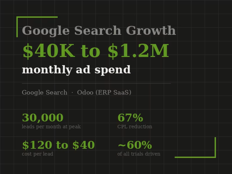
Odoo is an open-source ERP platform competing in one of the most crowded and expensive paid search categories. When I took ownership of the Google Search program, monthly spend was $40K and cost per lead was $120 — both signs of an account that hadn't been built for scale.
I restructured the account from the ground up: segmenting campaigns by use case rather than product, building out competitor and comparison query coverage, and implementing tighter bidding logic tied to trial-to-paid conversion rates rather than raw CPL. As confidence in the data grew, I scaled spend incrementally while protecting efficiency.
Over time, monthly spend reached $1.2M while CPL dropped from $120 to $40 — a 67% reduction. The program drove 30,000 leads per month at peak and accounted for approximately 60% of all free trial starts globally.
0
108
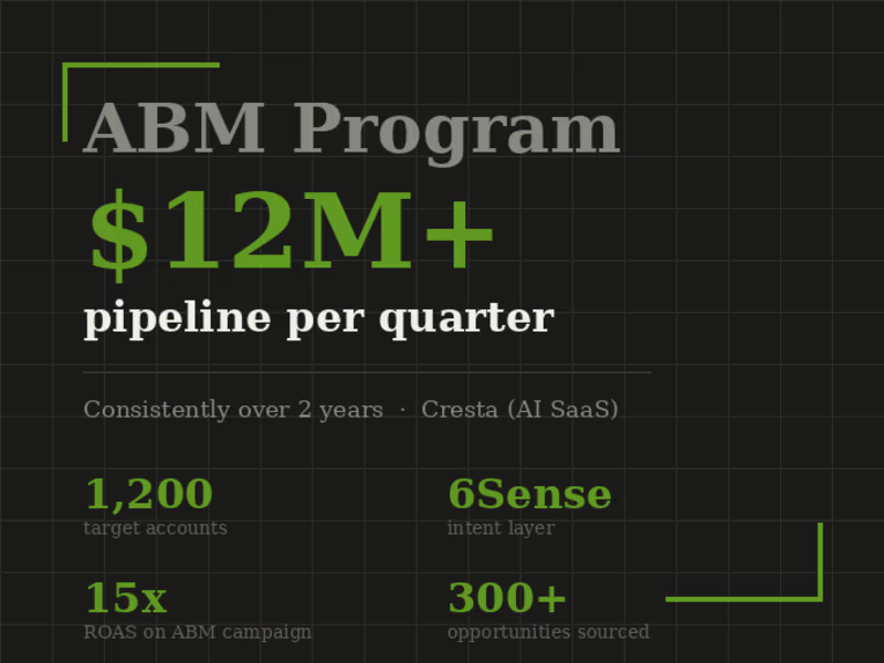
Cresta is an AI-powered contact center platform selling into enterprise accounts in highly competitive verticals including insurance, financial services, and retail. When I joined, demand generation was largely inbound and undifferentiated. I built a 1,200-account ABM motion from scratch, using 6Sense to layer intent signals on top of our ICP account list and prioritize outreach by buying stage.
The program ran across LinkedIn, programmatic display, direct mail, and executive-targeted content. I worked closely with SDRs to design follow-up sequences tied to specific intent signals rather than generic outreach cadences, which significantly improved SDR trust in marketing-sourced leads and conversion to pipeline.
Over two years, the program consistently delivered $12M+ in marketing-sourced pipeline per quarter and generated 300+ opportunities at 15x ROAS.
0
109

Visionary SEO Writer & Email Marketer Expert and Salesforce!
Visionary SEO Writer & Email Marketer Expert and Salesforce!



View more →

Freelance Writer & Copy Editor


