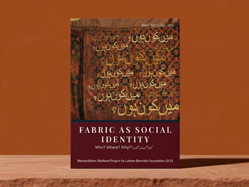
Typography Projects in PunjabTypography Projects in PunjabI didn’t want to build another website that simply “looked good.”
I wanted to build something that felt clear, modern, and actually guided people toward taking action.
So I started with a simple idea: less clutter, more clarity.
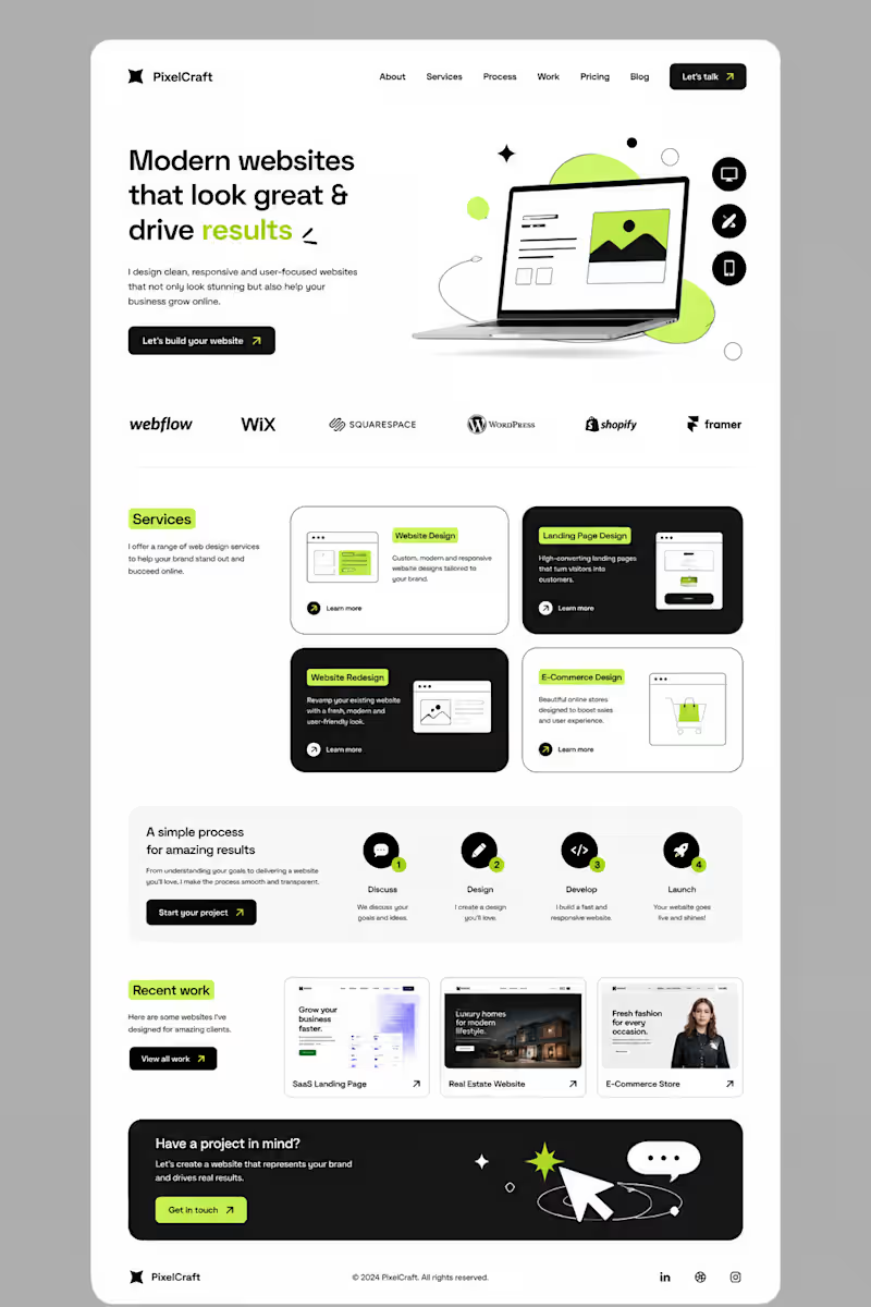
I built the layout around strong typography, clean spacing, bold contrast, and small lime-green accents to make important elements stand out.
Then came the details — service cards, responsive sections, portfolio previews, a simple process, and CTAs placed where they naturally make sense.
The goal was simple:
Make the website feel good to explore — and even better to use.
This is what I love about web design.
It’s not just about designing a pretty page.
It’s about turning an idea into an experience.
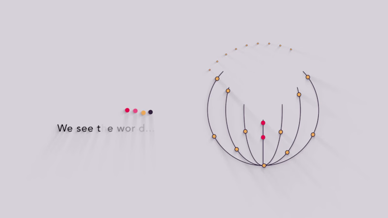
#Graphic Designer #Webdesigner #Website Designer I create clean, minimal motion graphics videos designed to communicate ideas with clarity, elegance, and simplicity. Instead of relying on complex characters or heavy visuals, my style focuses on smooth transitions, subtle animation, typography, and shapes that guide the viewer’s attention to the core message.
These videos are ideal for SaaS products, startups, corporate messaging, feature explainers, product launches, and brand storytelling where clarity and professionalism matter most.
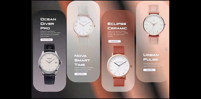
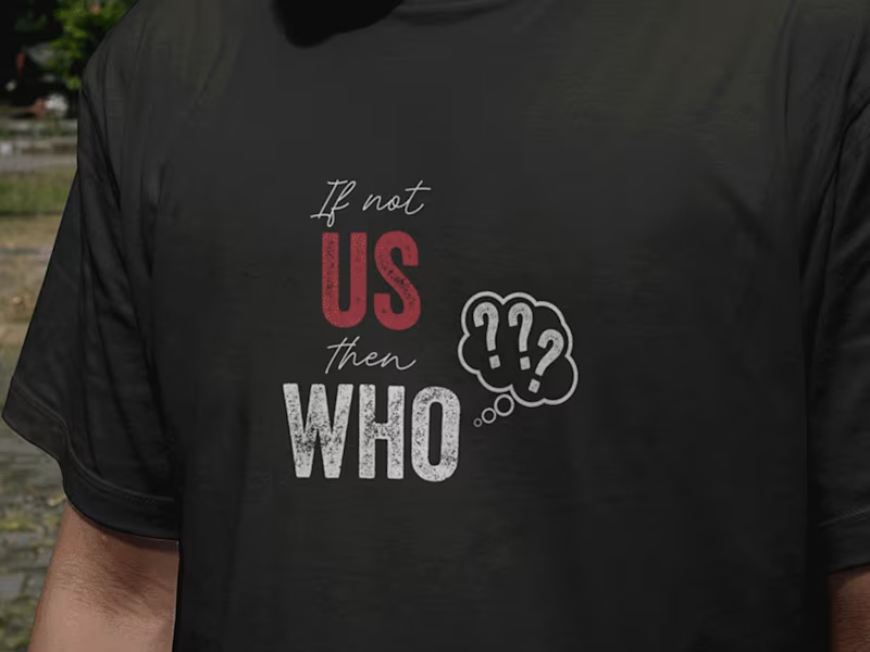
Every scene is structured with purpose — using icon-based visuals, symbolic animations, and modern layouts that keep the design minimal while still engaging and dynamic. Lately, I’ve been spending a lot more time thinking about typography not just as something you place on a design, but as something that shapes the entire visual language.
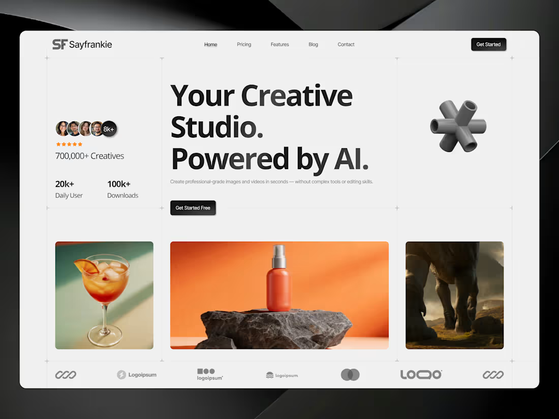
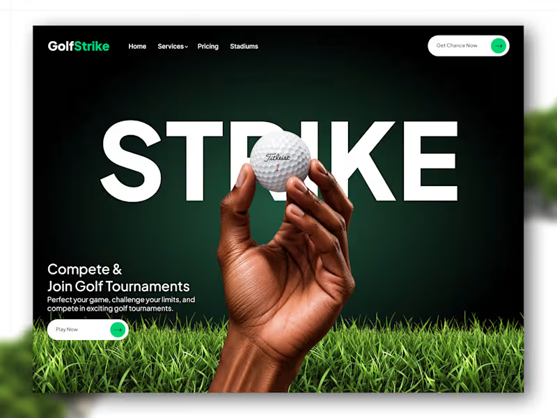
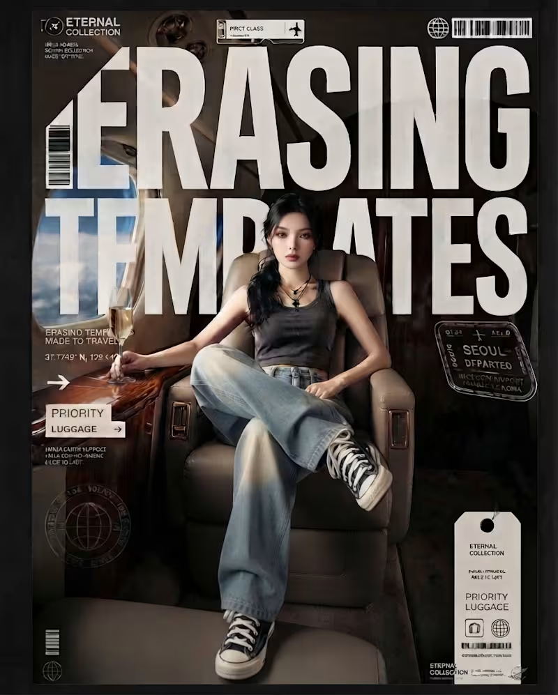
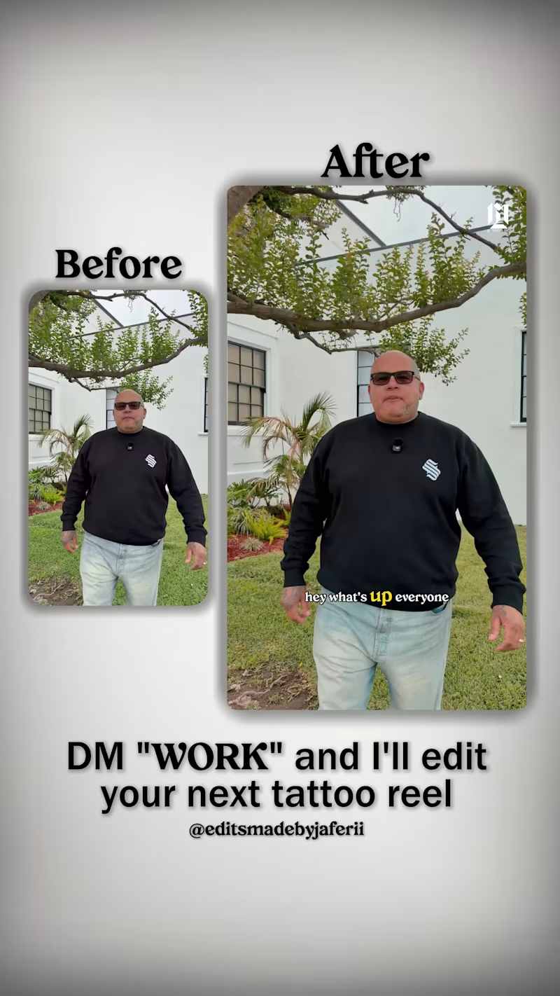
These pieces are all AI-generated, but the part I’ve been intentionally exploring is what happens after the image: how typography can interact with scale, perspective, composition, movement, and the subject itself.
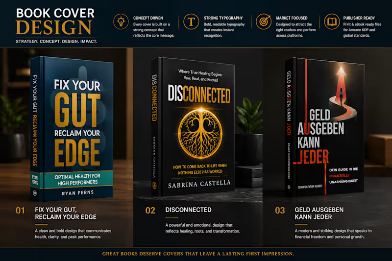
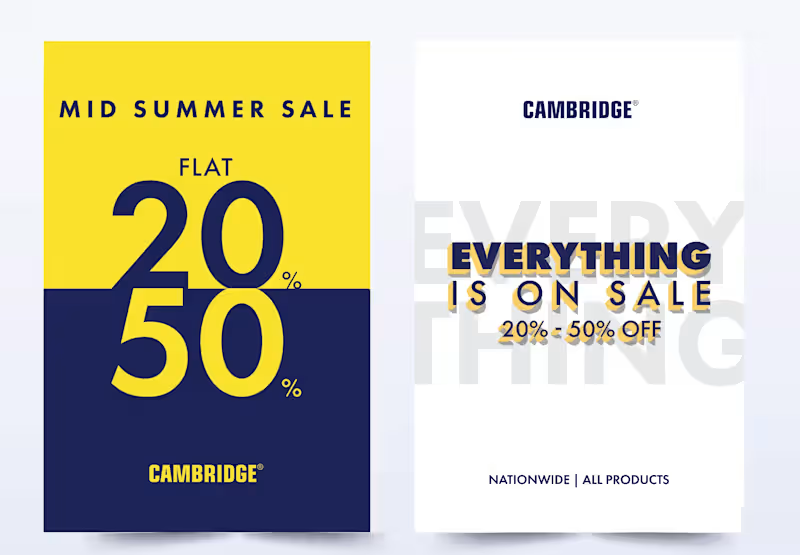
From oversized type becoming part of the image, to hand-drawn lettering carrying the energy of an illustration, to bold editorial type creating structure around a photograph. I’ve been experimenting with different ways for type and imagery to feel like one composition rather than two separate elements.
The goal isn’t simply to make AI images look good.
It’s to use AI as a visual tool while pushing the art direction, typography, hierarchy, and composition further.
Still experimenting. Still learning. And honestly, typography is becoming one of my favorite parts of the process.
Which of these approaches do you think works best, and is there one where the typography made you stop and look twice?