
Muhammad Dawood
Brand Identity Designer engineering custom vector asset kits
- 1
- Followers

Complete brand identity and promotional campaign designed for Licence to Learn DRIVING SCHOOL. The project aims to build a modern, trustworthy, and safety-orientated visual identity for new driver education.
Design & Video Execution:
Logo & Branding System: Crafted a dynamic vector logo incorporating a curved road motif, paired with bold typography to project guidance and safety. Included full horizontal, stacked, emblem, mono-colour, and colour palette variations.
AI Commercial Video Ad: Created a 12-second commercial promo showcasing the learning journey—from in-car instructor guidance to smooth road driving and earning a driver's licence.
Tools Used: Adobe Illustrator, Google Veo, CapCut
0
4
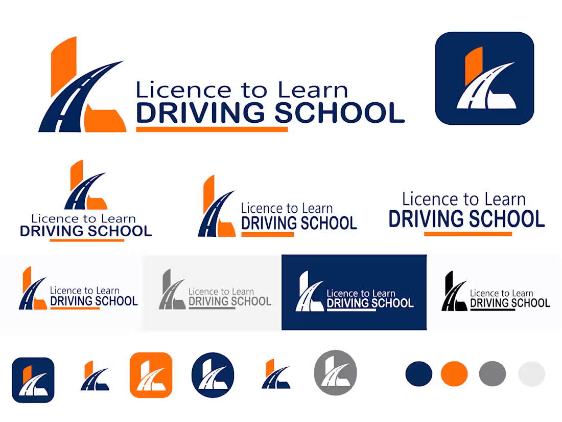
Complete brand identity and logo system designed for Licence to Learn DRIVING SCHOOL. The objective was to create a trustworthy, dynamic, and modern brand image that resonates with new drivers and learners.
Design Concept & Details:
Icon & Concept: Integrated a curved road/highway symbol within a sharp, modern geometric emblem to represent direction, movement, and safety.
Typography: Clean, highly legible sans-serif font pairing that balances "Licence to Learn" with a bold "DRIVING SCHOOL" emphasis.
Color Palette: Professional deep navy blue (representing trust and reliability) paired with vibrant orange (symbolizing energy and caution) and neutral metallic greys.
Brand Versatility: Designed full horizontal, stacked, app icon, mono-color, and responsive dark/light background variations suitable for vehicle graphics, signage, and digital platforms.
Tools Used: Adobe Illustrator
0
9
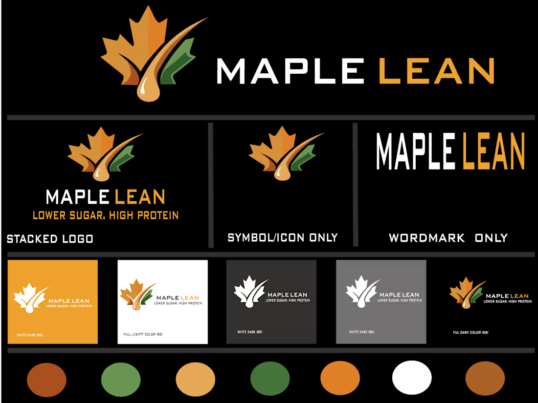
MAPLE LEAN is a health-focused brand specialising in low-sugar, high-protein products. The goal of this project was to craft a modern, clean, and dynamic visual identity that captures both natural quality and active lifestyle values.
Design Concept & Execution:
Iconography: Integrated a stylised maple leaf with a smooth syrup drop and leaf layer to symbolise purity, nutrition, and health.
Typography: Bold and modern sans-serif typography ("MAPLE LEAN") ensuring high legibility and strong brand presence.
Colour Palette: A natural, warm palette featuring tones of amber gold, leaf green, warm brown, and dark charcoal to emphasise health and energy.
Versatility: Designed full stacked, standalone icon, and wordmark variations to ensure seamless adaptability across dark and light backgrounds, packaging, and digital media.
Tools Used: Adobe Illustrator, Inkscape
0
12
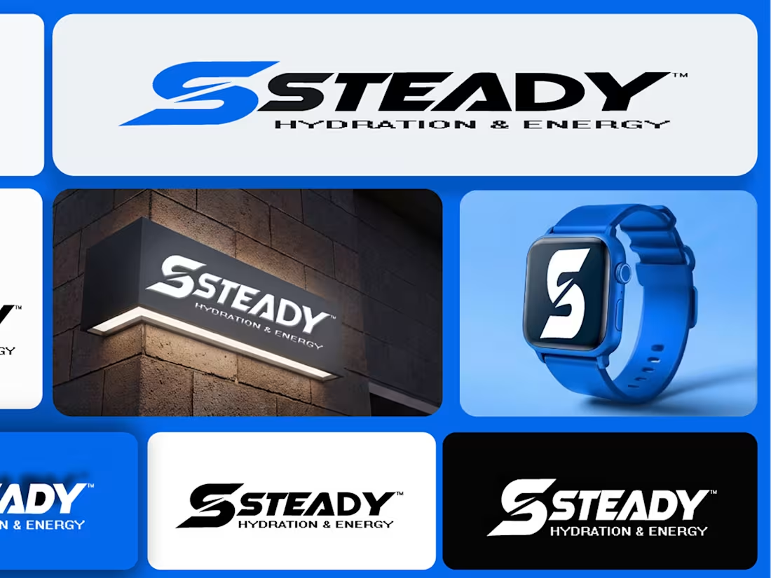
I designed a modern brand identity for STEADY, a hydration and energy drink brand. The goal was to build a bold, energetic, and memorable visual identity suited for active lifestyle products.
Key Elements:
Custom dynamic 'S' monogram representing motion and power.
High-contrast blue, black, and white colour palette.
Versatile design assets tailored for smartwatch apps, signage, and product packaging.
0
25