The network for creativity
Join 1.25M professional creatives like you
Connect with clients, get discovered, and run your business 100% commission-free
Creatives on Contra have earned over $150M and we are just getting started
Back to feedPost

If your energy drink needs to be picked up before the brand name becomes readable, the packaging hierarchy is already too weak.
That was the thinking behind MAXIUM.
The can had to work from a distance first.
Before ingredients.
Before claims.
Before flavor.
So the system was built around:
🔵 Electric blue for instant category presence
💗 Hot pink typography for contrast and recall
🔤 Vertical branding that stays visible across a full fridge display
⚡ Repeating graphic forms that reinforce energy without overcrowding the can
🥫 A system strong enough to look like one brand across an entire shelf
The goal was not to make one can look bold.
It was to make twelve cans look even stronger together.
That matters in energy drinks because customers rarely see your product alone.
They see it surrounded by competitors all fighting for the same second of attention.
MAXIUM was designed to win that second.
Here’s the real debate:
For a multi-flavor energy drink line, what matters more?
A. Strong brand recognition
Keep the blue + pink system locked across every flavor.
B. Faster flavor recognition
Give each flavor its own dominant color and accept a looser shelf system.
I’d protect the core identity and use flavor cues more selectively.
What would you prioritize?
If you are building an energy drink, sports beverage, soda, or performance brand and your can still disappears in a crowded fridge, send me a message.
I design packaging systems built to get noticed fast and stay recognizable at scale.
#PackagingDesign #EnergyDrinkBranding #BeverageBranding #CanDesign #CPGBranding #BrandIdentity #VisualIdentity #CreativeDirection


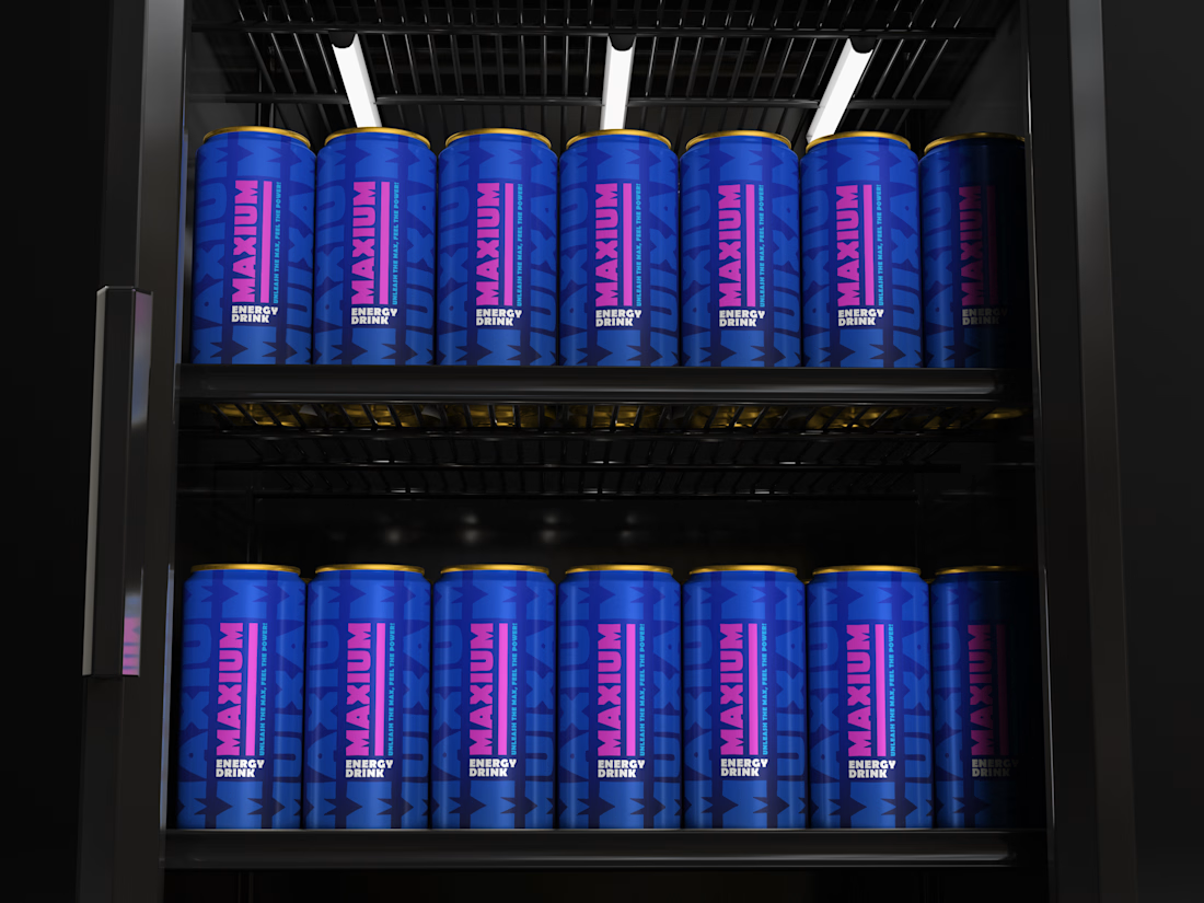

The bold hierarchy makes the flavor system readable from a distance.
The network for creativity
Join 1.25M professional creatives like you
Connect with clients, get discovered, and run your business 100% commission-free
Creatives on Contra have earned over $150M and we are just getting started
Related posts

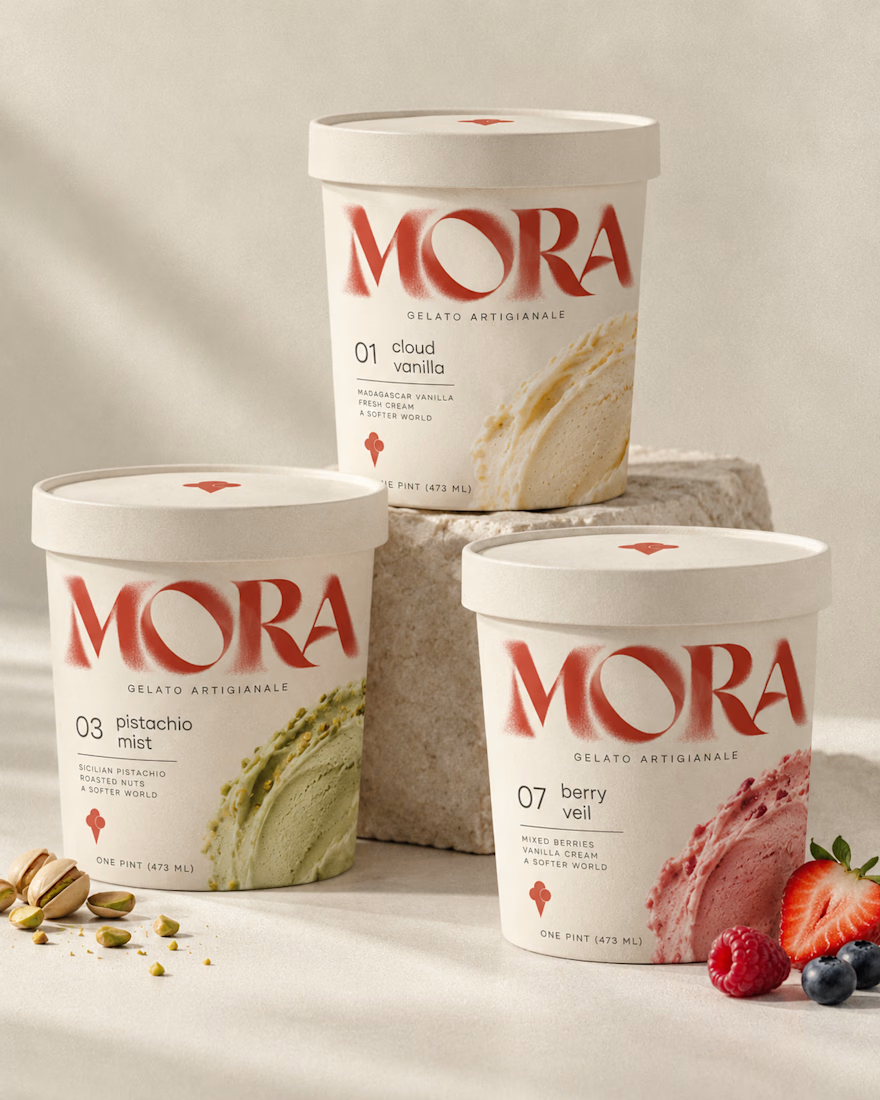
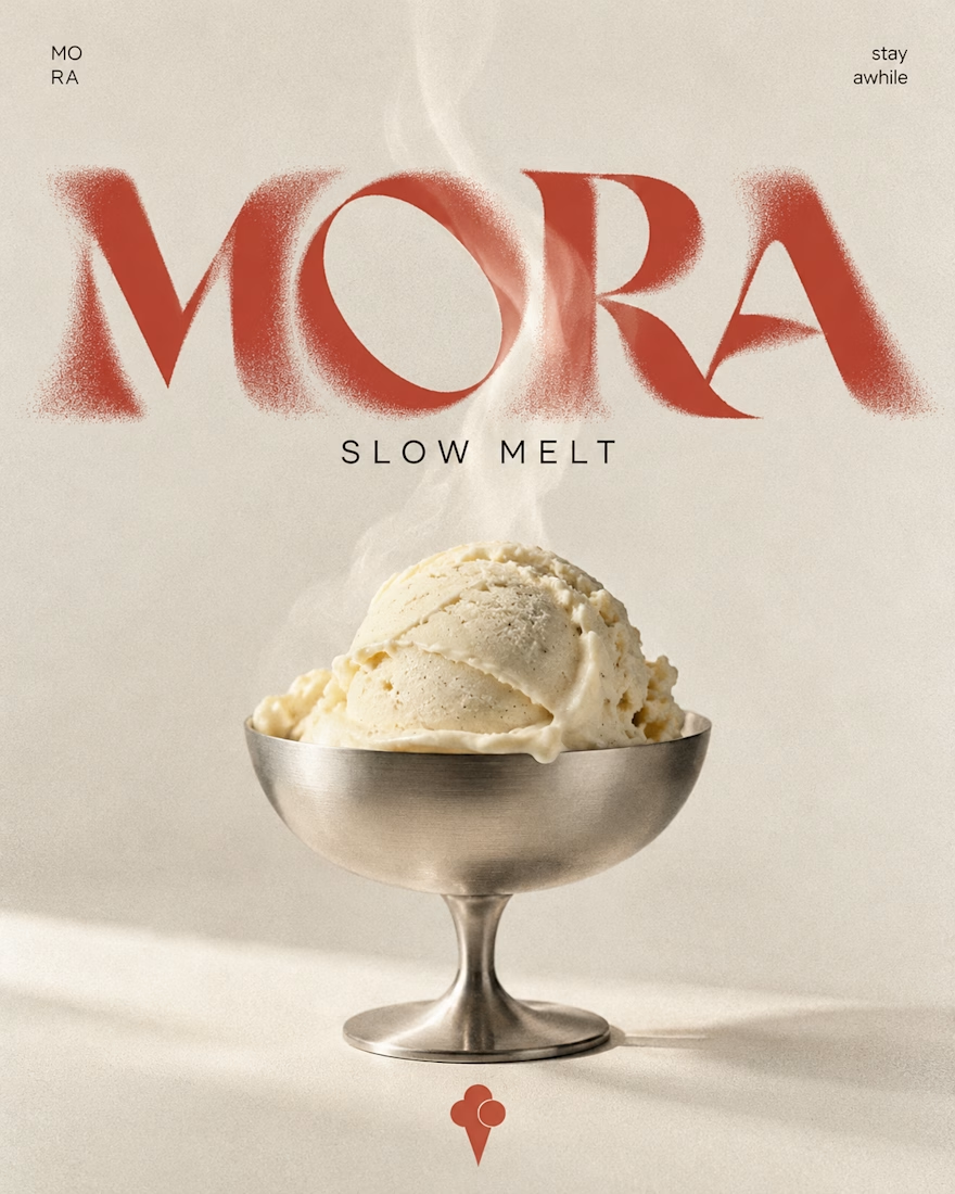
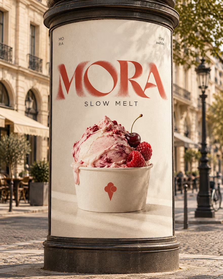
🍨 Meet MORA — artisanal gelato with a softer side.
Bold typography, creamy tones, and playful flavor-inspired packaging designed to make every scoop feel special.
Explore the full project on my Contra profile and let me know your thoughts!
#BrandIdentity #PackagingDesign #FoodBranding #GraphicDesign #BrandDesign


Flawless!

Nothing rots in salt.
So I put a skincare brand in a salt flat and let it crystallize. Name, mark, palette, campaign, packaging. One idea, zero moodboards.
HALITE. Case study live soon.
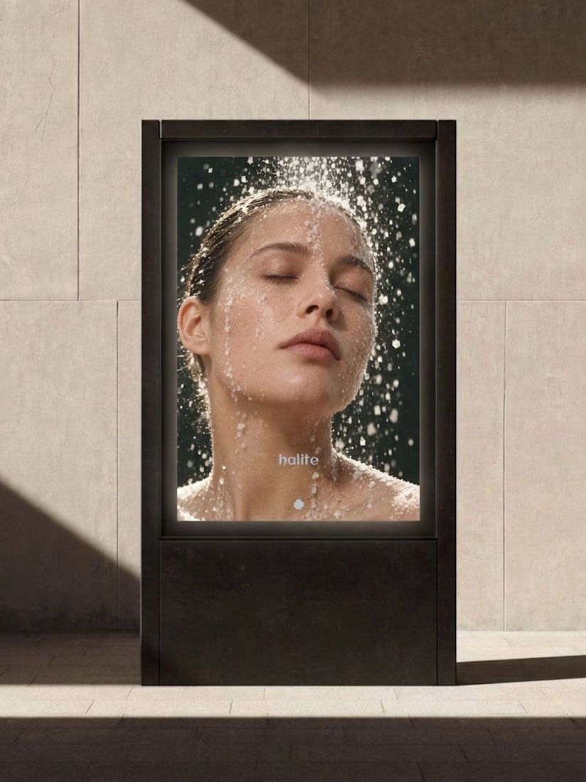
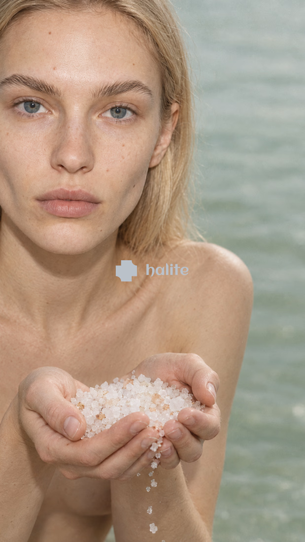
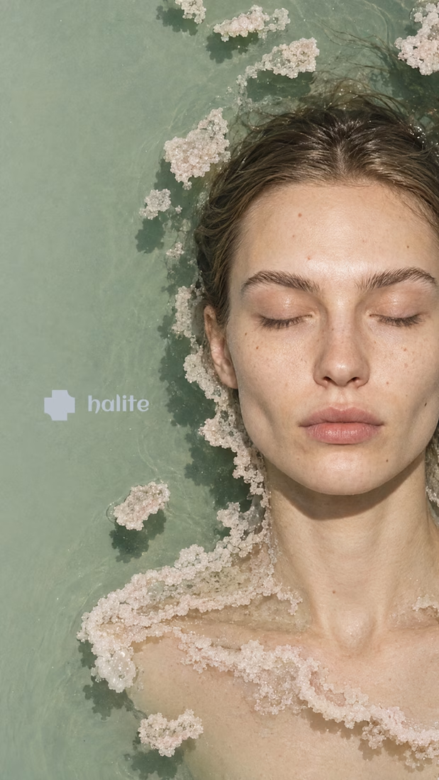
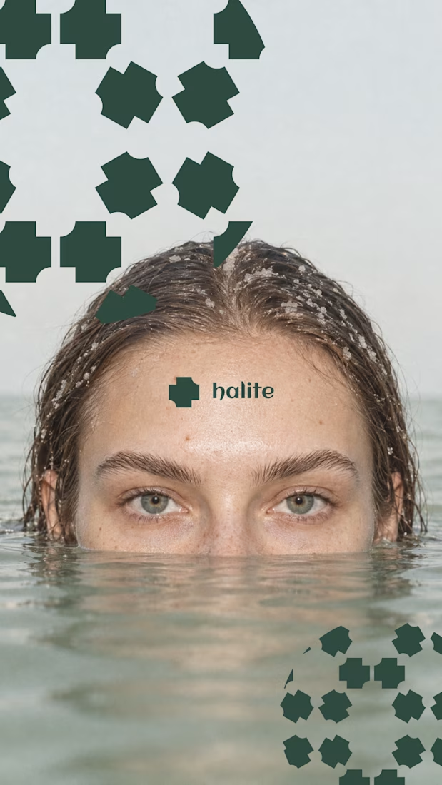

Salt as the core idea is clever. It says preservation, purity and texture in one move, which is exactly what skincare is trying to say. Curious how the crystal motif holds up at small sizes, like a cap or a sachet. Looking forward to the full case.
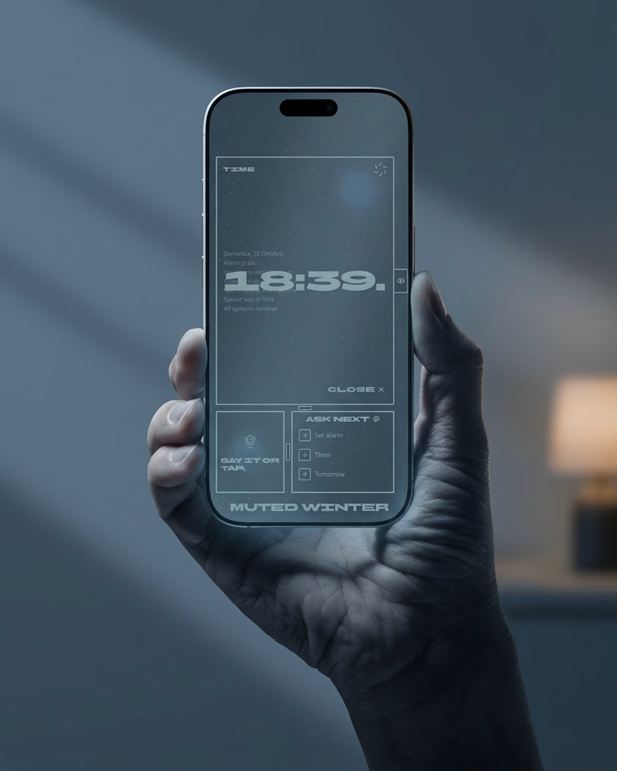
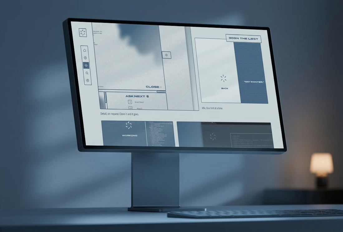
Most assistants talk. I wanted one that answers.
Muted Winter: a voice assistant that replies in three words, shows what it is doing with six petals, and dims itself after midnight.
Case study live

Three word replies is a smart constraint. The petals showing what it's doing is a nice touch.