MORA Gelato Brand Identity & Packaging Design

Jerin Nusrat


MORA — Artisanal Gelato Brand Identity & Packaging Design
A softer world, one scoop at a time. 🍨
Meet MORA, a contemporary artisanal gelato brand built around simple pleasures, beautiful flavors, and the joy of slowing down.
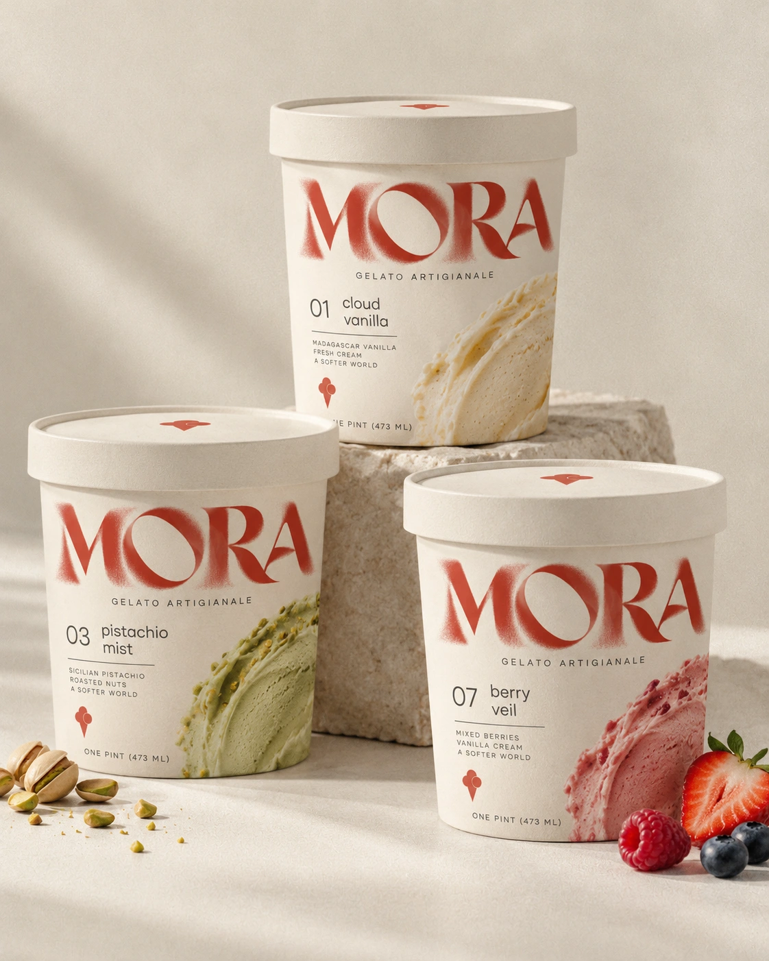
For this branding concept, I wanted to create something that feels both premium and playful. The expressive red typography brings personality and distinction, while warm cream tones, subtle textures, and soft flavor-inspired colors create a natural, inviting feel. Every detail works together to make the brand feel memorable without losing its simplicity.
What I Designed
Brand Identity: A distinctive wordmark and recognizable gelato-inspired symbol.
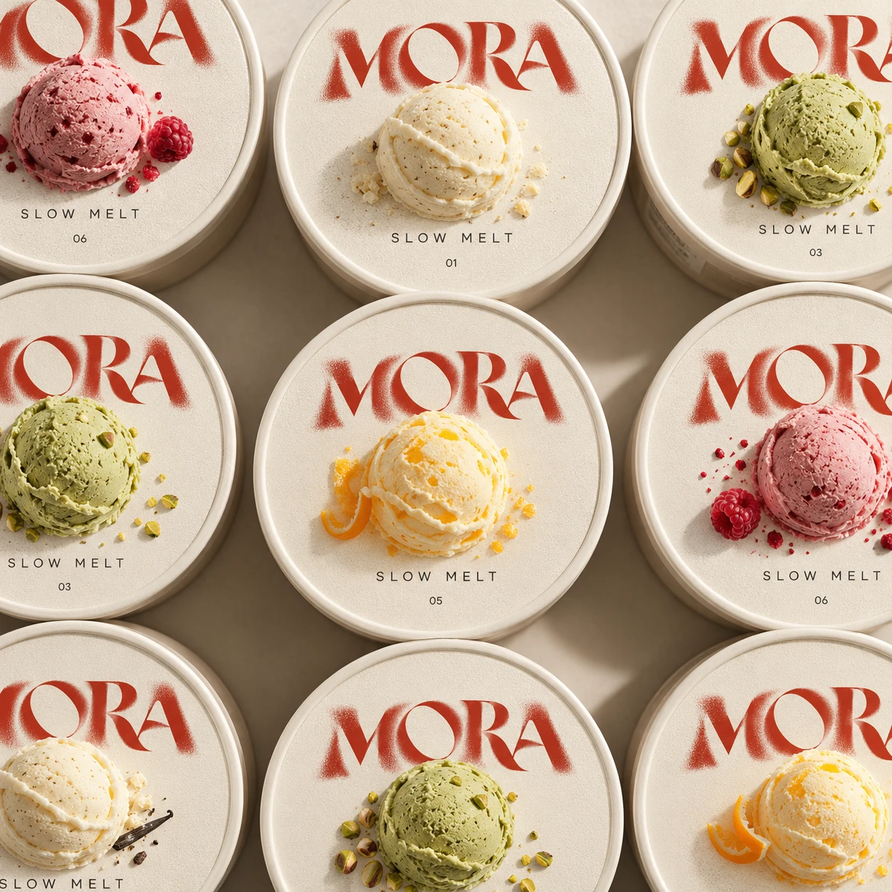
Packaging Design: Minimalist gelato tubs with clear flavor names, elegant typography, and appetizing product visuals.
Visual Direction: A warm, tactile aesthetic with soft lighting, natural textures, and refined product presentation.
Flavor System: A cohesive packaging approach that gives each flavor its own personality while keeping the entire collection visually consistent.
Brand Applications: Stickers, labels, flavor graphics, and supporting visual elements.
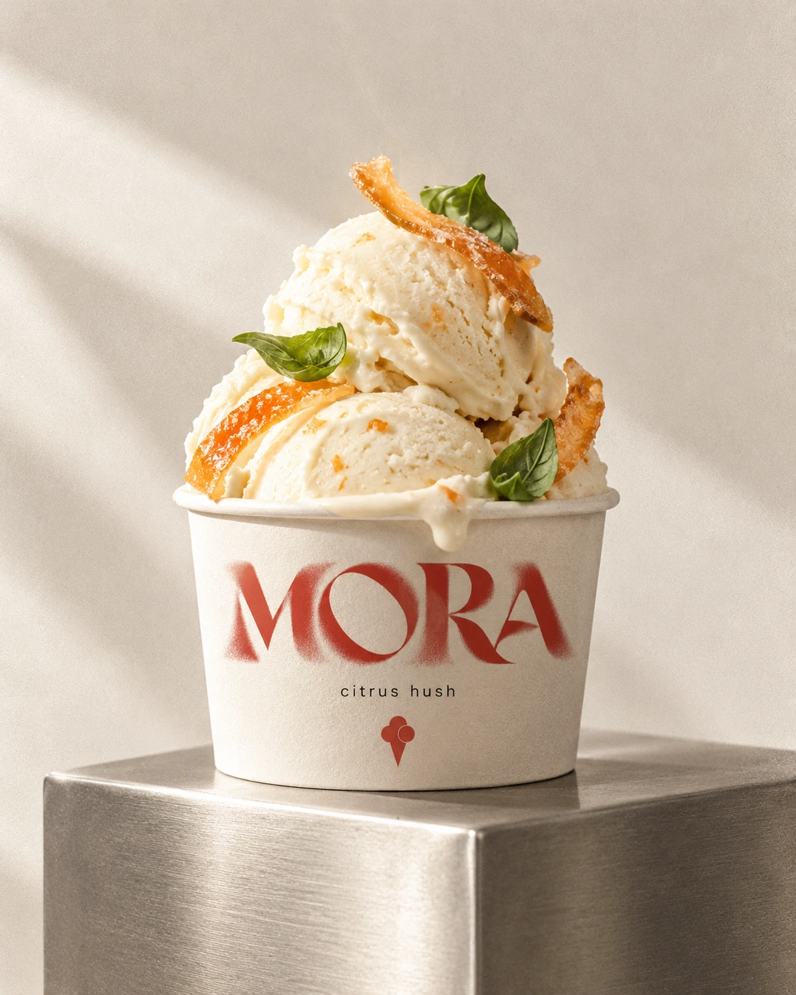
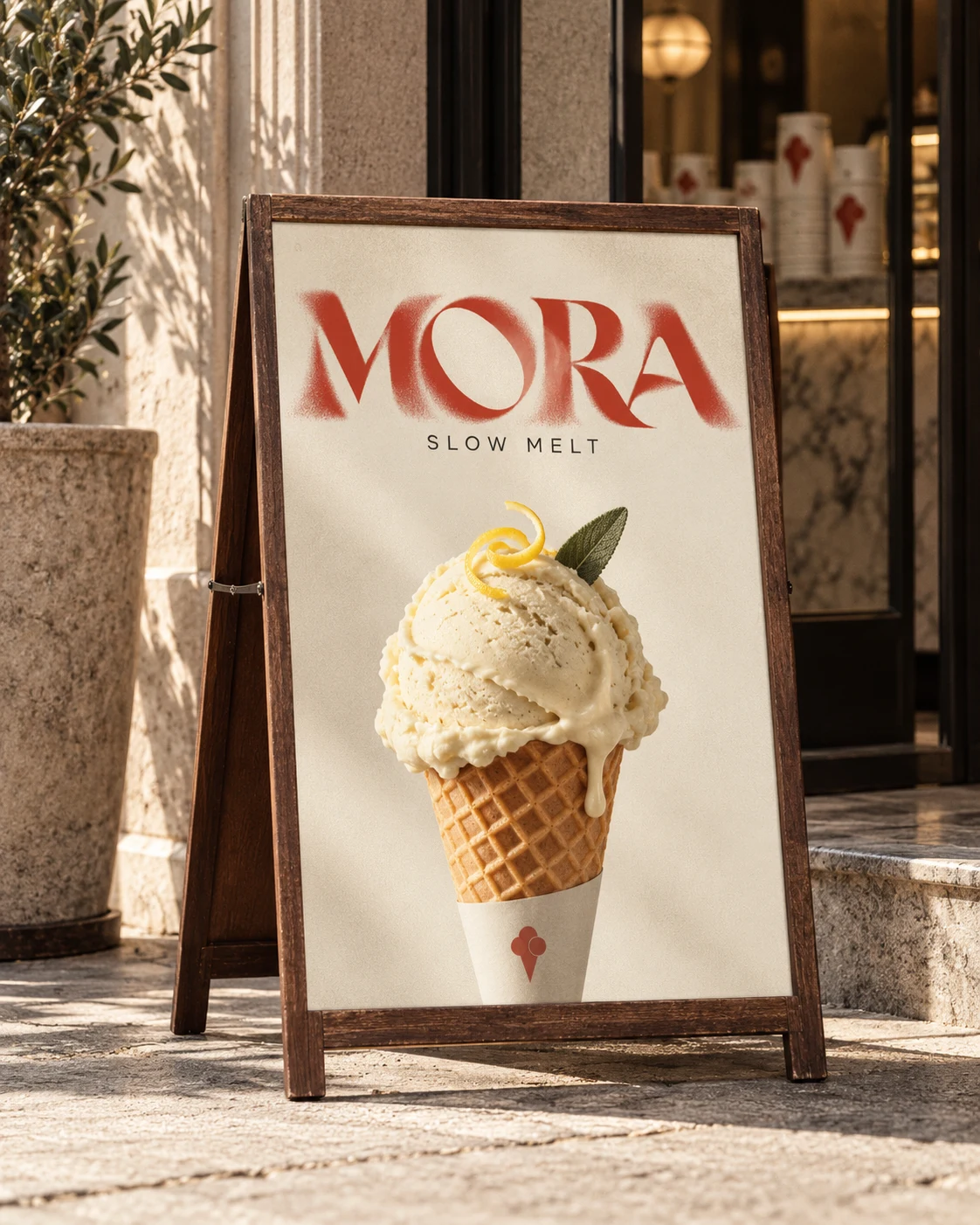
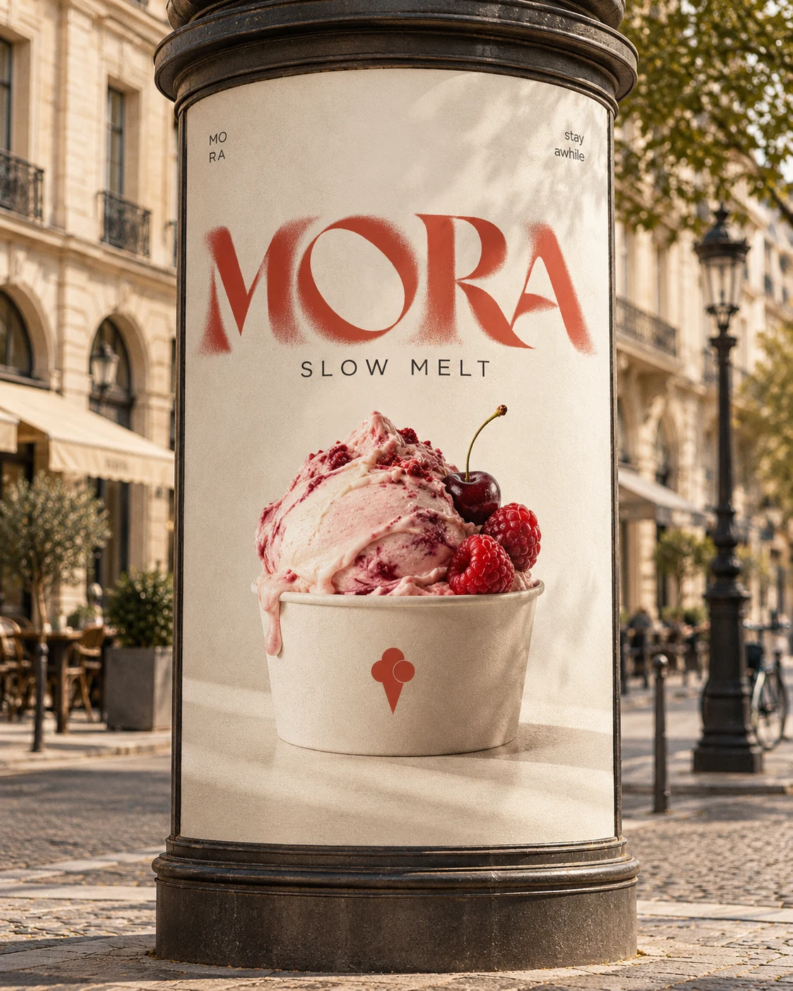
The goal was to balance modern sophistication with the warmth of handcrafted gelato. From the bold, expressive logo to the understated packaging, MORA is designed to stand out on the shelf while communicating quality, creativity, and indulgence.
The result is a visual identity that feels fresh, distinctive, and deliciously timeless.
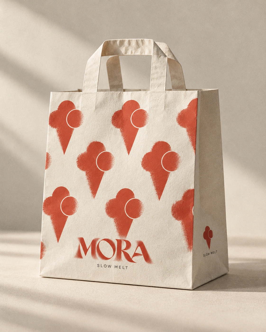
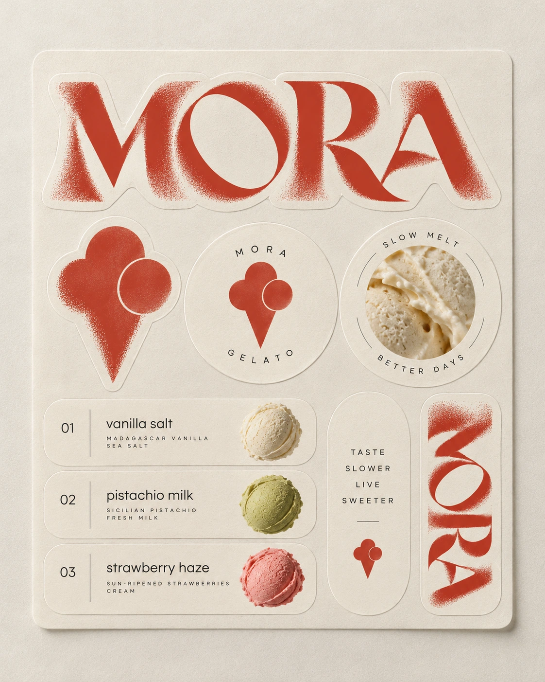
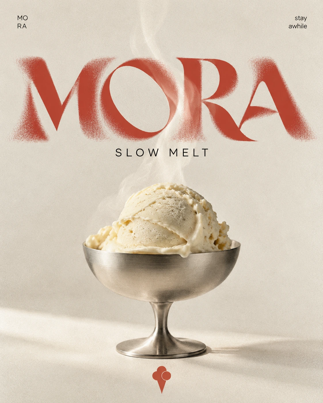
MORA — Slow melt. Better days.
Like this project
Posted Oct 23, 2026
Developed brand identity and packaging for MORA gelato. Every detail works together to make the brand feel memorable without losing its simplicity.
Likes
1
Views
0
Clients
MORA