Orivo Studio Website Design & Build

Jerin Nusrat


Orivo Studio: Website Design & Build in Framer
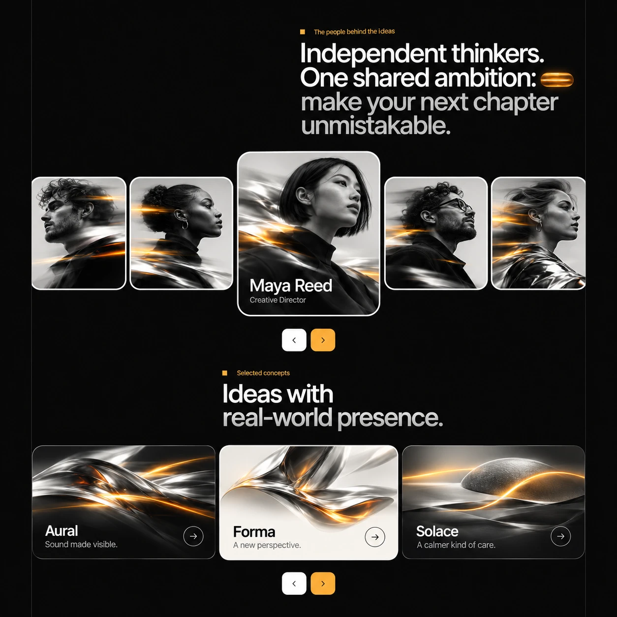
A bold, kinetic website for a creative studio, built on one line: ideas in motion.
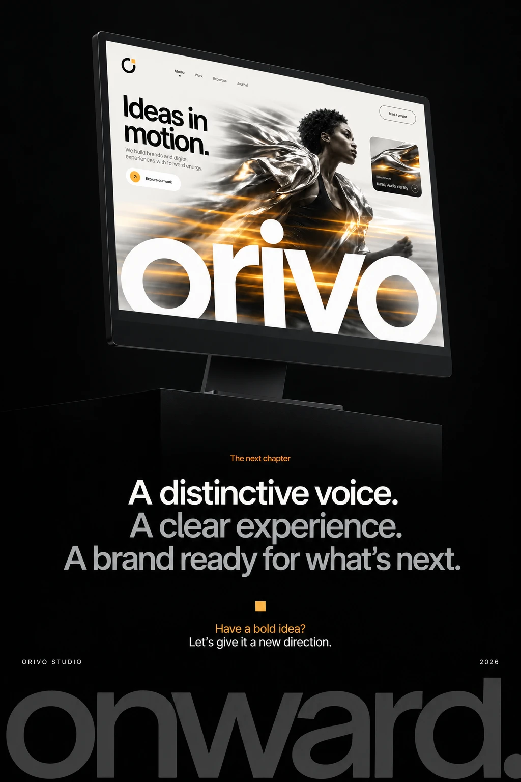
Orivo is a small creative studio that builds brand identities and digital experiences “with forward energy.” I designed and built its website in Framer to show that energy in the first second, with a site that moves, speaks clearly and works as well on a phone as on a big screen.
The Challenge
Studio websites often fall into two traps. They are either polished but forgettable, or experimental but confusing. Orivo needed a site that:
Makes a strong first impression and shows the studio’s taste immediately
Positions a small team as bigger-thinking and more ambitious than its size
Gives potential clients a clear path to Explore our work or Start a project
Keeps the same personality across desktop and mobile
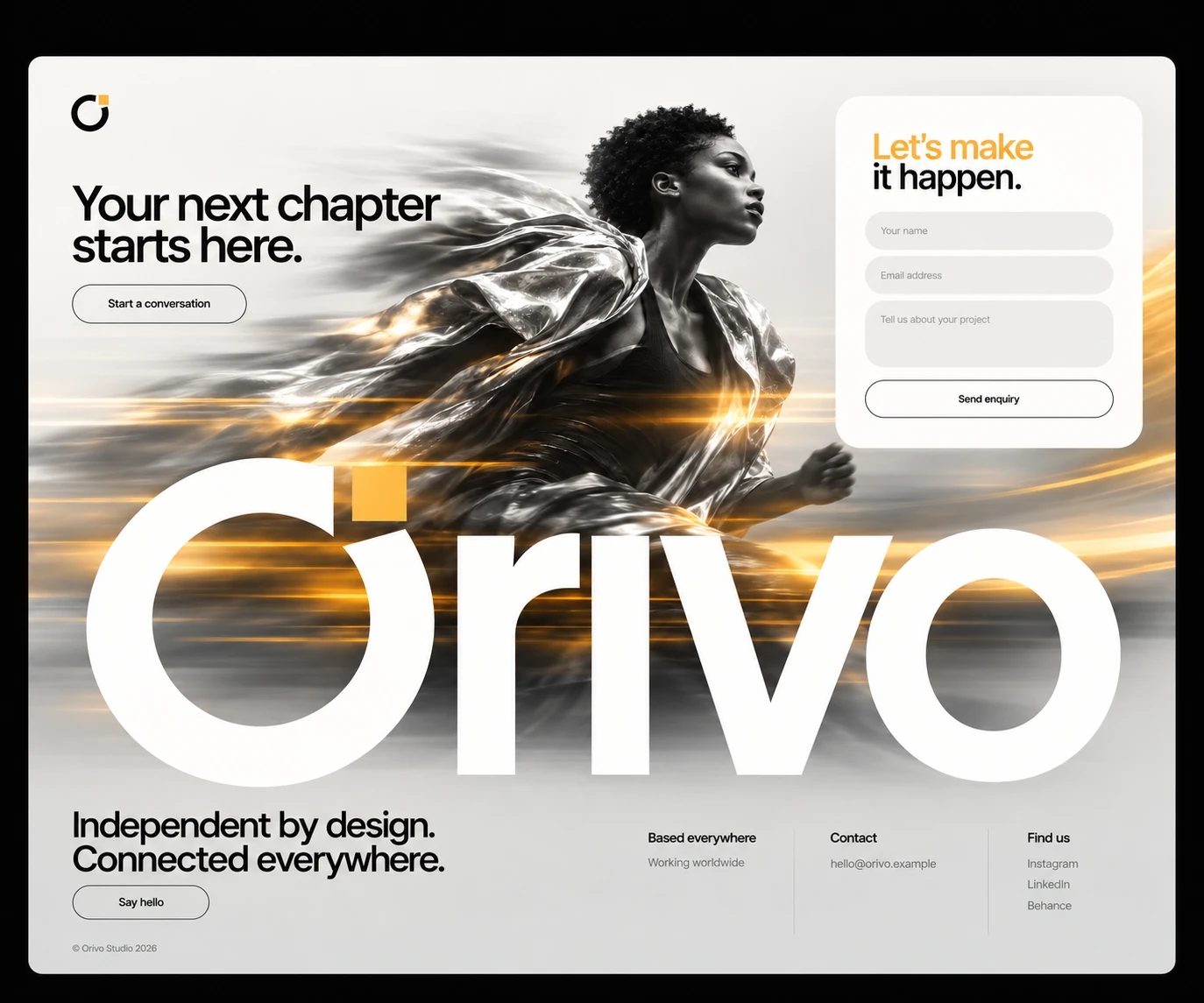
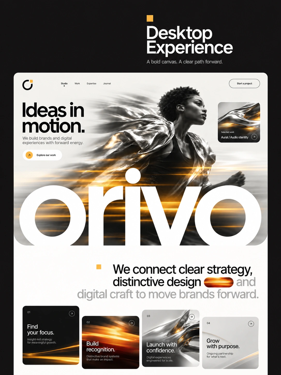
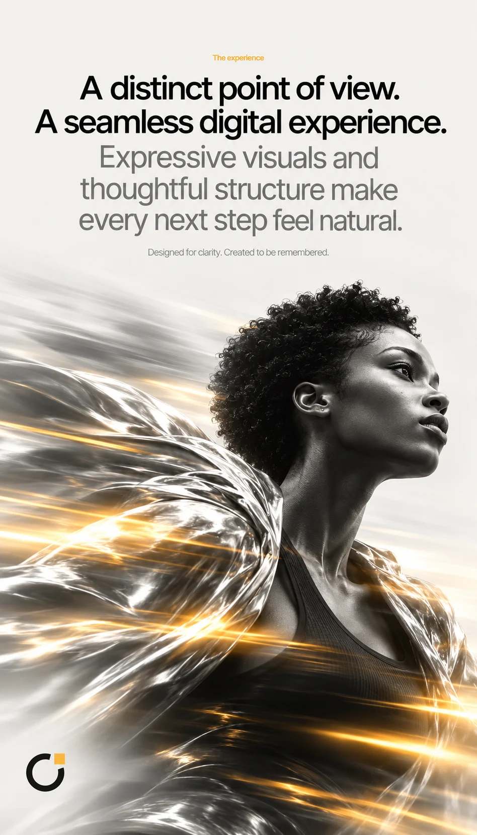
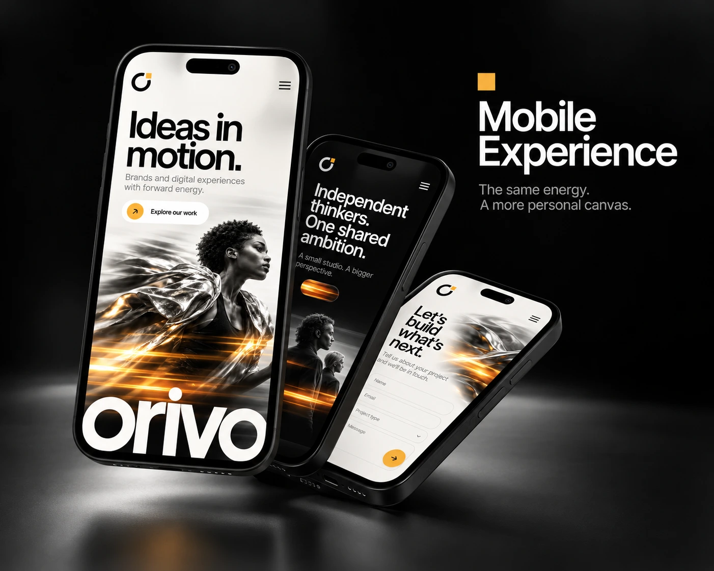
The headline sets the idea, and the design carries it out. A runner in a flowing metallic cape is caught mid-stride, with the fabric streaming back in motion blur. Streaks of amber light cut across the frame, and the oversized orivo wordmark anchors the bottom of the page. The page feels like it’s already moving before you scroll.
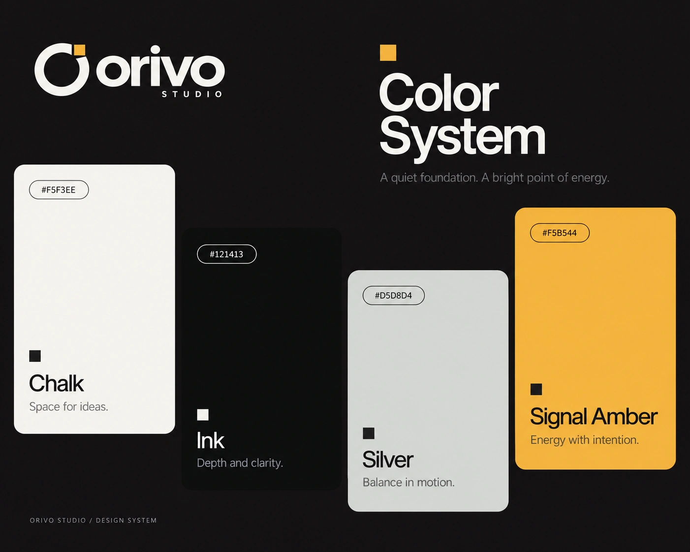
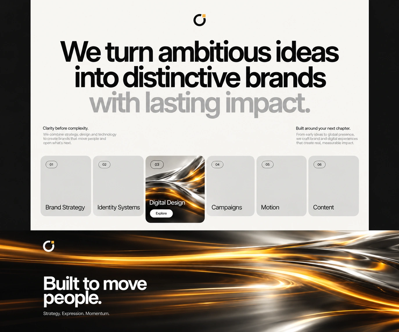
Monochrome with one spark. Black-and-white photography, soft greys and clean off-white backgrounds keep the page sophisticated. A single amber-gold accent appears in the logo mark, the light trails, the buttons and small highlights. Because it is used sparingly, it draws the eye exactly where it should go.
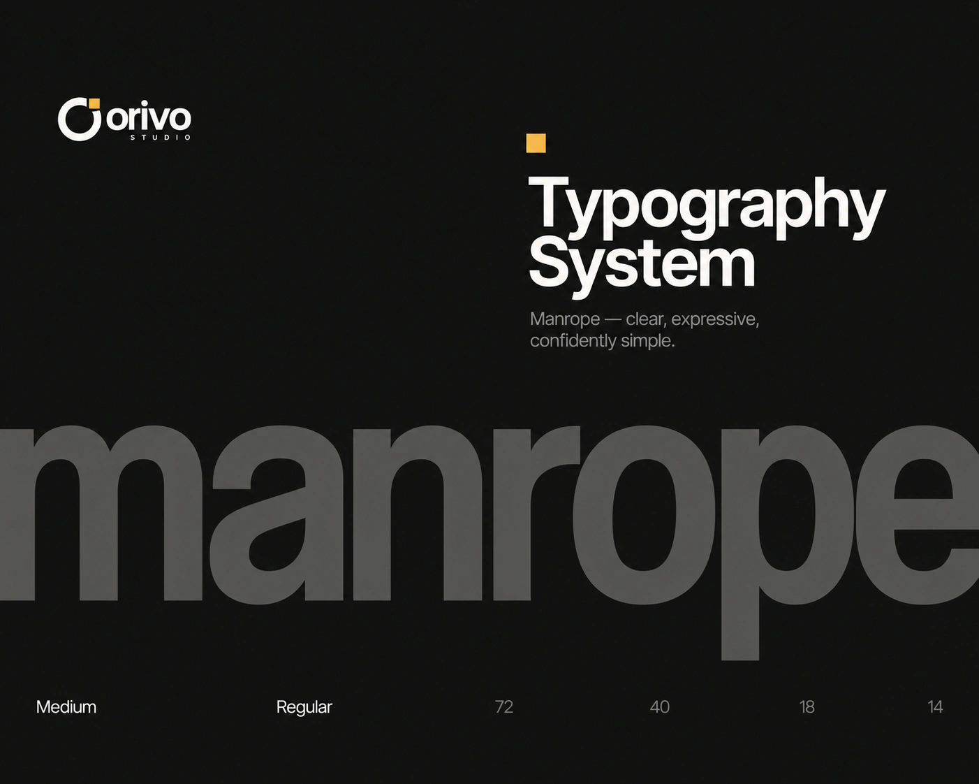
Giant type as a hero. The wordmark is scaled so large it crops off the edge of the page, which makes the brand feel confident and tangible. A heavy, tight grotesque sans-serif handles headlines, with light supporting copy for contrast.
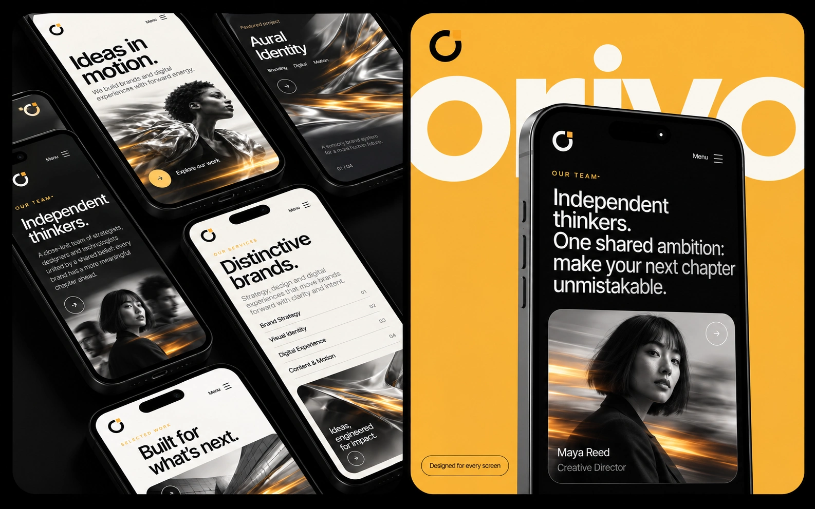
Mobile Experience: The Same Energy, A More Personal Canvas
I designed the mobile site as its own layout rather than a shrunk desktop page:
The headline, image and wordmark are re-stacked so the hero still lands in one screen
Buttons are thumb-friendly, with clear arrows and generous spacing
Dark and light sections alternate to keep the scroll lively
The contact form is simple and quick to fill in on a small screen
Built in Framer
Smooth scroll, reveal and hover animations that reinforce the “motion” idea
A reusable component system for buttons, cards, headers and forms
Responsive layouts for desktop and mobile
Fast-loading pages and a clean structure that makes updates easy
A working contact form so enquiries come straight to the studio
Outcome
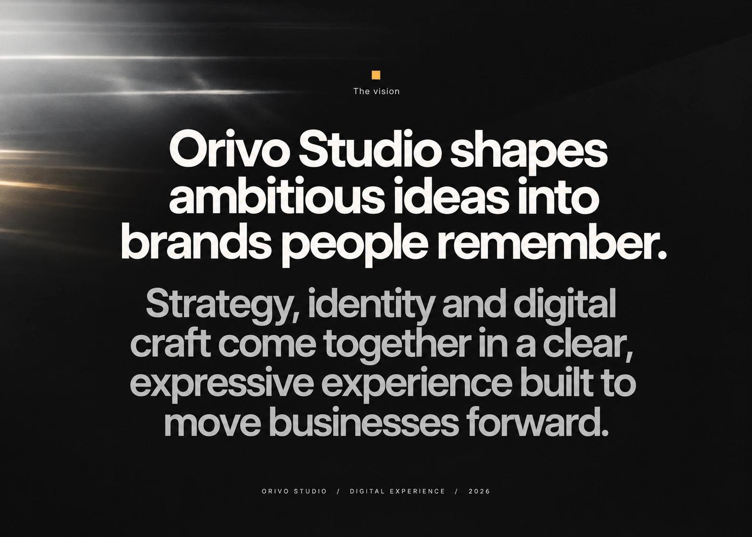
Orivo now has a website that feels as confident and forward-moving as the studio itself. It makes a memorable first impression, explains the studio’s attitude in a few lines and guides visitors to a clear next step.
Services: Website Design · UI/UX · Framer Development · Visual Direction · Brand Application · Responsive Design · Interaction Design
Like this project
Posted Oct 27, 2026
Designed a kinetic, responsive website for Orivo Studio using Framer. I designed and built the website in Framer to show that energy in the first second.
Likes
1
Views
0