Avenor Golf Club Website Design & Build

Jerin Nusrat


Avenor Golf Club: Website Design & Build in Framer
A calm, coastal website that makes a golf club feel less like a gate and more like an invitation.
Avenor Golf Club is a members’ club on a coastline. I designed and built its website in Framer around a single idea: the game is better in good company. The site has the polish people expect from a premium club, with the warmth of a place where you’d actually want to spend a Saturday.
The Challenge
Golf club websites tend to feel stiff and exclusive, with heavy crests, formal serif type and stock photos of empty fairways. Avenor wanted to appeal to a newer, broader audience while staying premium. The site needed to:
Sell the setting and the lifestyle, not only the course
Feel welcoming to first-time visitors and newcomers
Turn visits into membership enquiries and course bookings
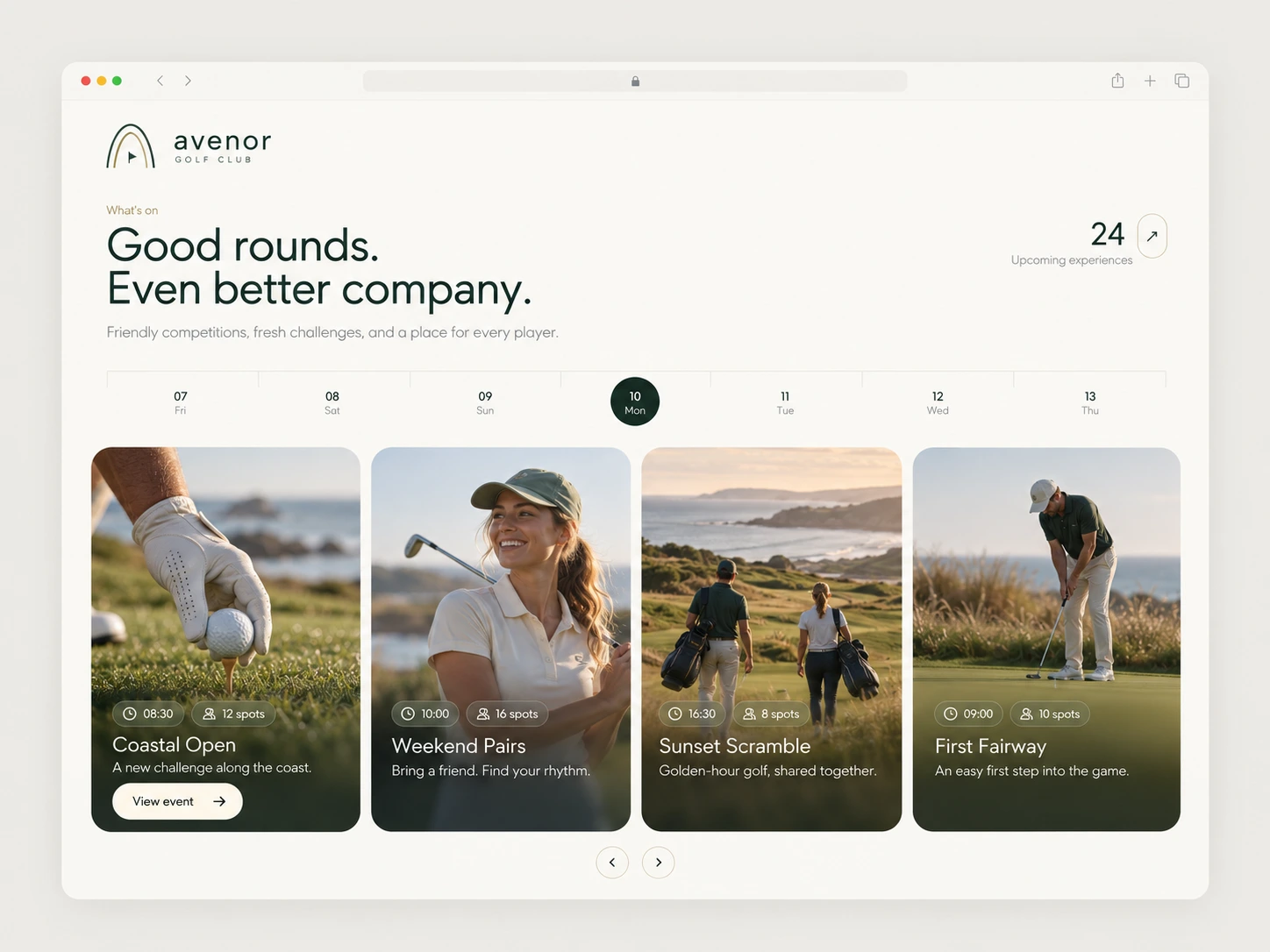
The Concept: A Little Closer to the Game
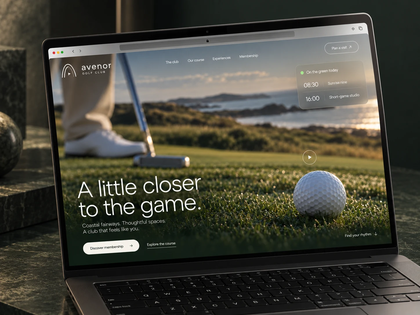
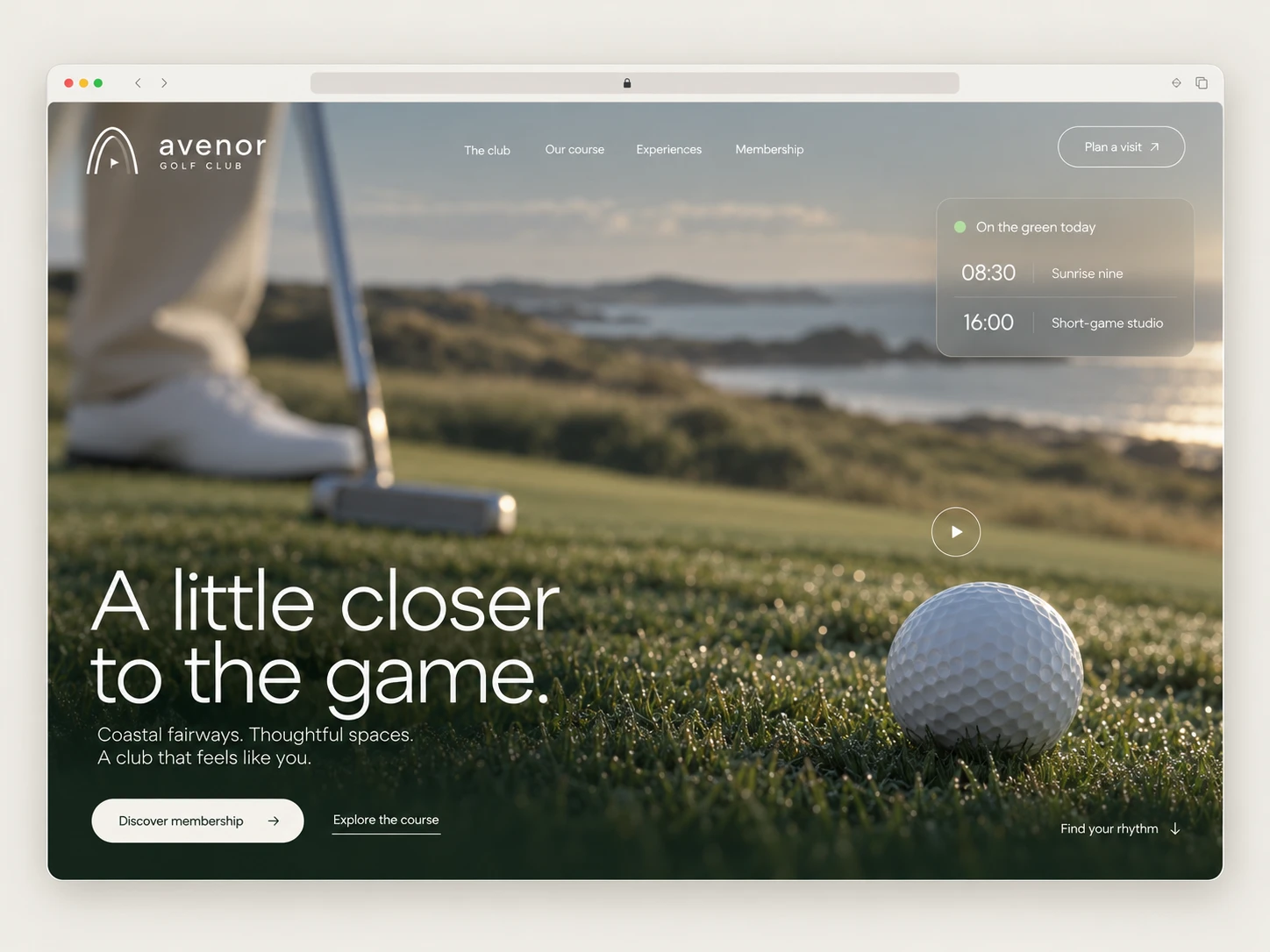
The hero line, “A little closer to the game.”, sets the tone. Instead of a wide, distant landscape, the first screen puts you at ground level, with dew on the grass, a putter in frame and a ball sitting in soft focus. It feels personal and immediate, like you’re already on the green.
Design Direction
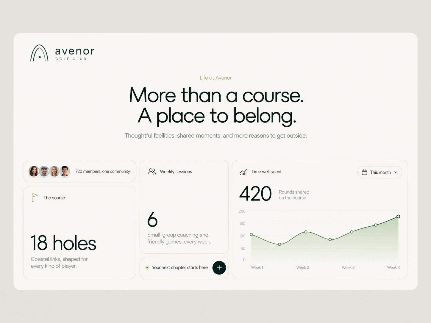
Calm, editorial luxury. The whole site uses generous white space, soft cream surfaces and deep forest green. Nothing is loud, so the photography and typography can carry the mood.
Typography. A light, modern geometric sans-serif handles the large headlines, such as “The game is better in good company.”, and tight, confident line spacing makes them feel editorial. Small, widely spaced caps support the logo and labels.
Cinematic hero
A full-bleed video-style hero with a clear headline, a short supporting line and two actions: a primary “Discover membership” button and a quieter “Explore the course” link. A play control hints at motion, and the “Find your rhythm” scroll cue invites you further down.
“On the green today” widget
Member stories section
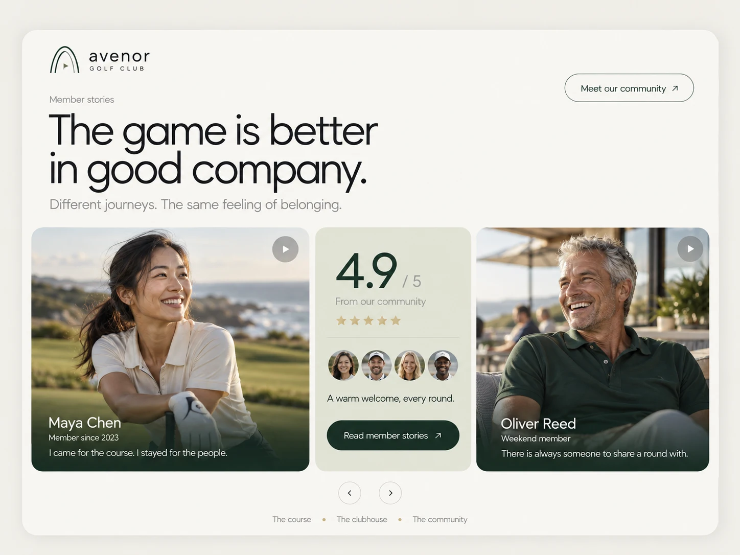
Trust is the main barrier to joining a club, so I built a dedicated social proof section. Large, portrait-led video cards feature real-feeling member voices (I came for the course. I stayed for the people.), with a central 4.9 / 5 rating card, member avatars and a “Read member stories” action. Arrows and section tabs (The course · The clubhouse · The community) let visitors browse in their own order.
Outcome
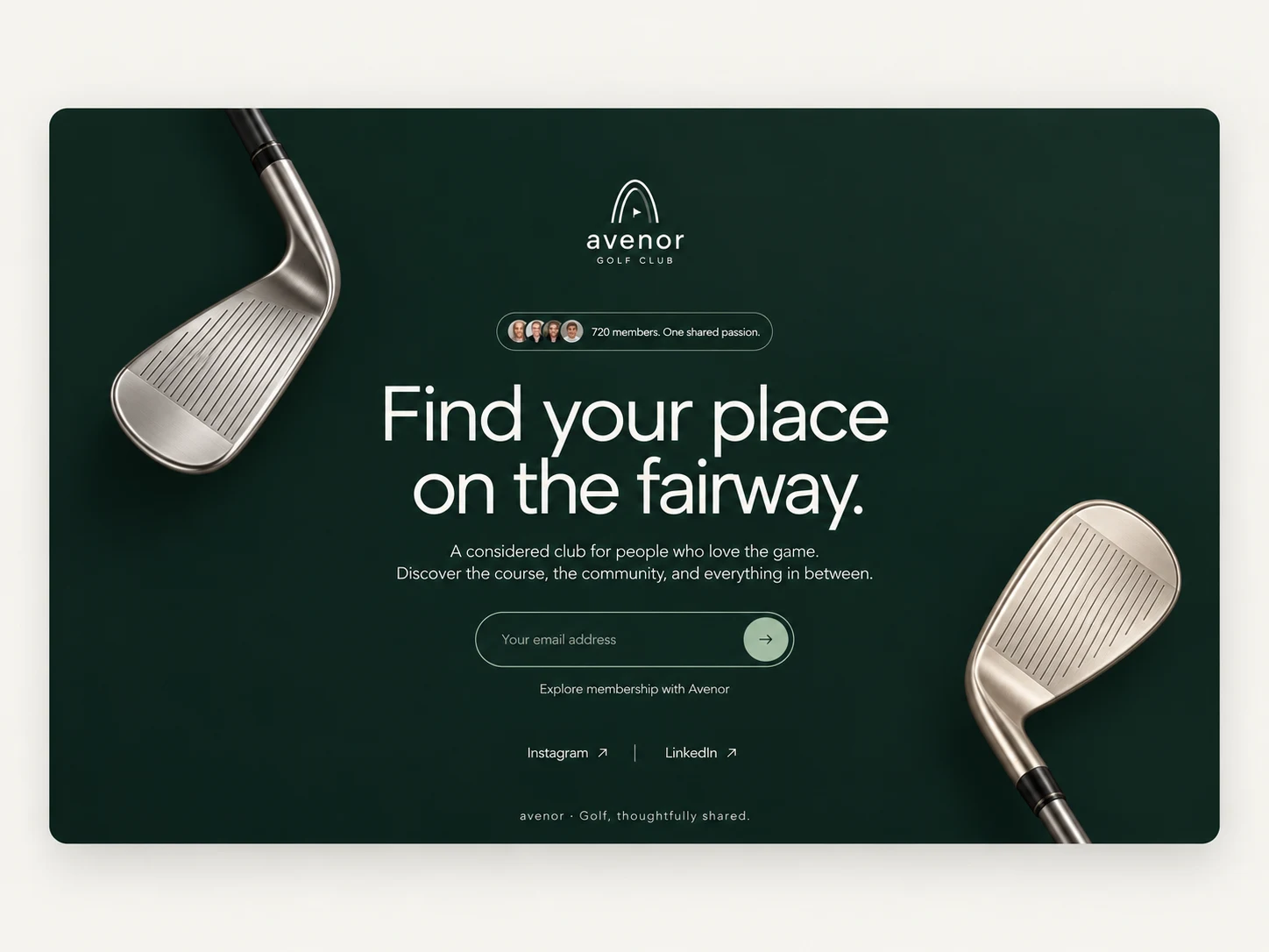
Avenor now has a website that feels premium without feeling distant. It guides visitors from the first emotional impression to trust-building stories to a clear membership action, and the club’s team can keep it fresh on their own.
Services: Website Design · UI/UX · Framer Development · Brand Application · Responsive Design · Interaction Design
Like this project
Posted Oct 26, 2026
Designed and built Avenor Golf Club's welcoming and premium website in Framer. The site has the polish people expect from a premium club, with a warm feel.