Design of Brand Identity and Packaging for DAYLO Café

Jerin Nusrat


Daylo: Cafe Brand & Packaging Design
Brand identity and packaging for a café that makes mornings feel unhurried.
DAYLO is a contemporary coffee branding concept inspired by slow mornings, thoughtful rituals, and the simple pleasure of a really good cup of coffee.
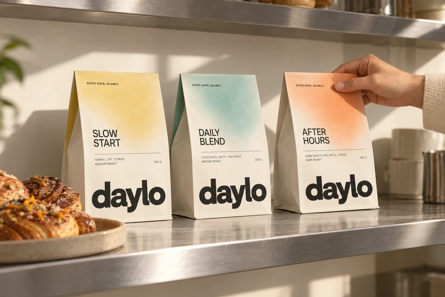
The creative direction combines minimalist packaging, bold typography, warm neutrals, and soft pastel accents to create a coffee brand that feels modern, approachable, and effortlessly distinctive.
Rather than relying on traditional coffee imagery or overly decorative packaging, DAYLO embraces simplicity. Every detail—from the oversized wordmark to the subtle color variations across the product range—is designed to communicate the brand's personality: relaxed, intentional, and made for everyday moments.
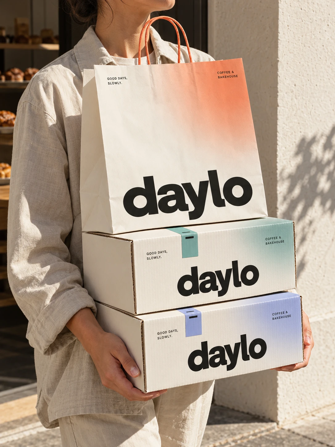
At the heart of DAYLO is one simple idea: good coffee doesn't need to be complicated.
The brand celebrates the quieter side of coffee culture—the first cup of the morning, a peaceful afternoon break, or the ritual of slowing down between busy moments.
The tagline, “Good days, slowly,” captures this philosophy and gives the brand a warm, memorable voice.
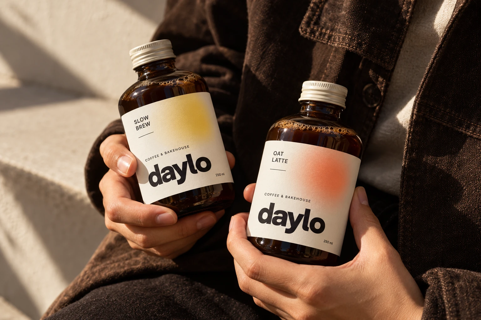
What I Designed
Complete Brand Identity & Visual Direction
Logo & Wordmark Design
Coffee Packaging Design
Retail Coffee Bag Design
Product Naming & Flavor Presentation
Typography System
Brand Color Palette
Product Collection Design
Packaging Layout & Information Hierarchy
Product Styling & Art Direction
Lifestyle Product Photography Direction
Brand Applications & Visual Storytelling
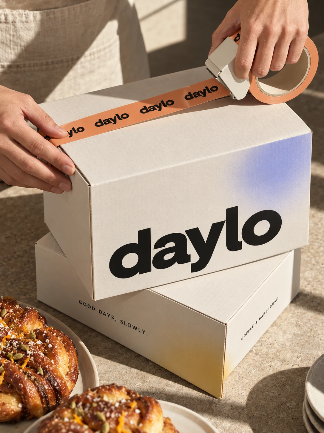
The DAYLO wordmark uses bold, rounded typography to create a confident and recognizable brand signature.
Its oversized placement anchors the packaging, making the brand instantly noticeable while keeping the overall design clean and uncluttered.
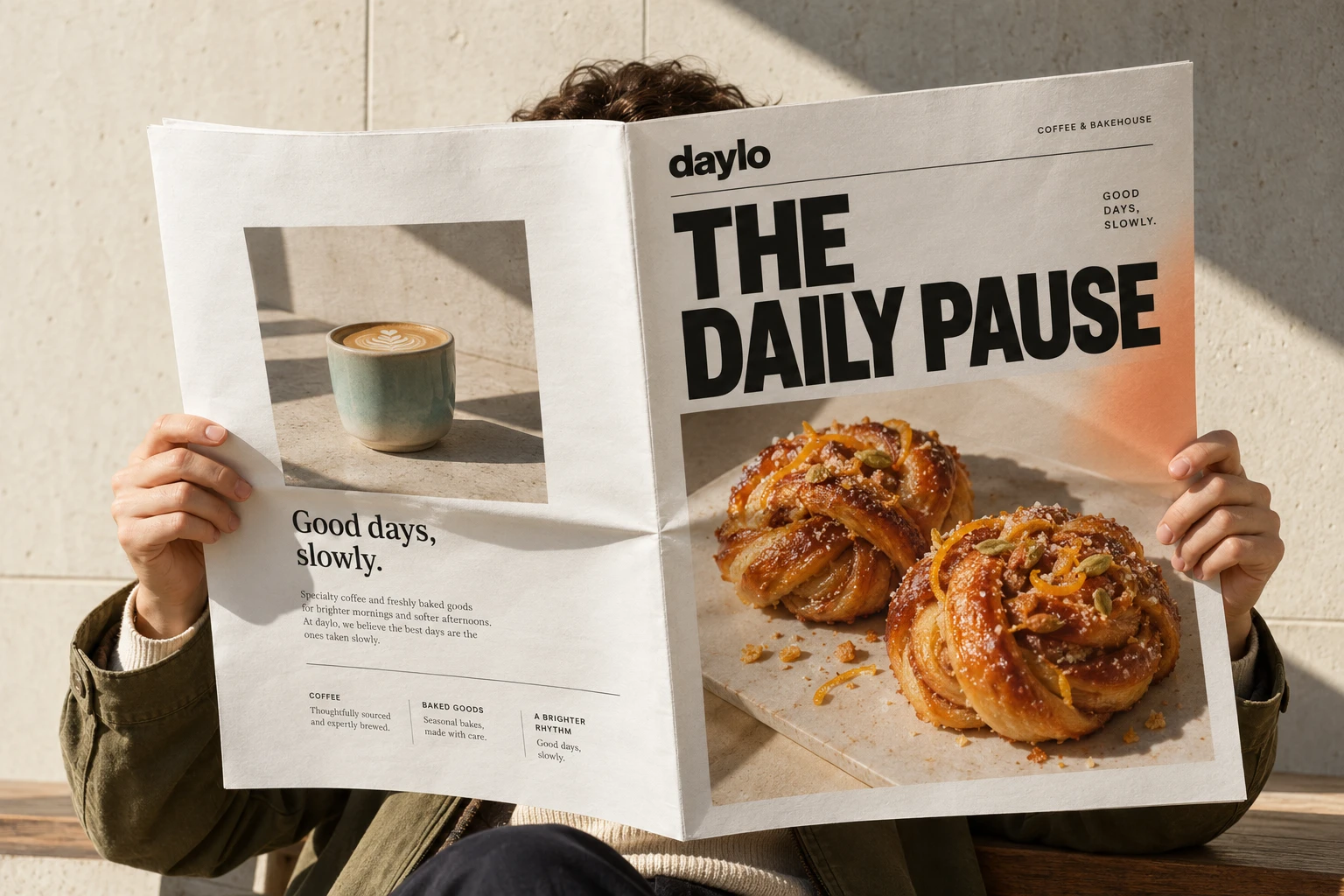
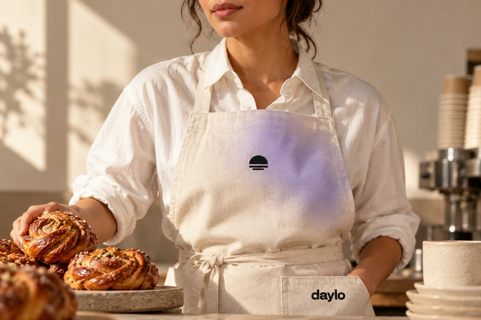
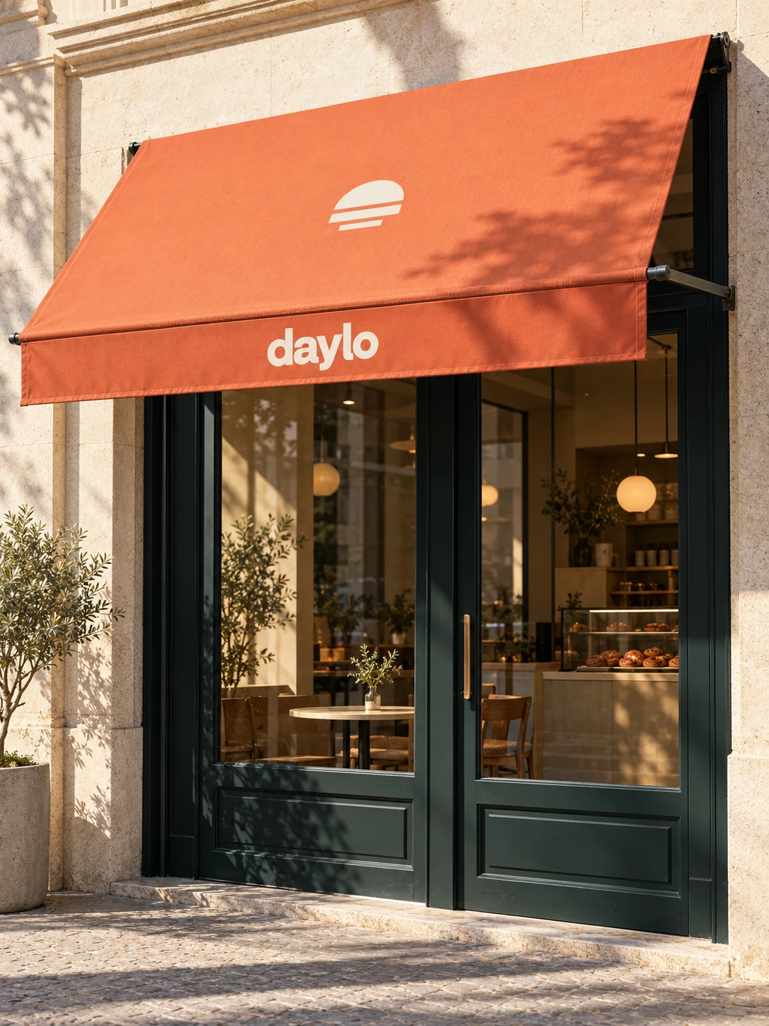
DAYLO sits at the intersection of modern specialty coffee branding, minimalist packaging, and contemporary lifestyle design.
I wanted the brand to feel:
Minimal, but not generic.
Bold, but not overwhelming.
Playful, but not childish.
Premium, but still approachable.
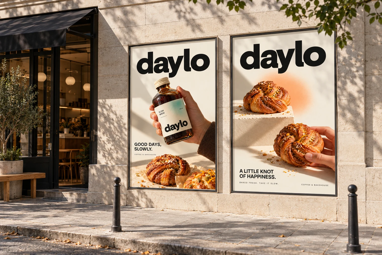
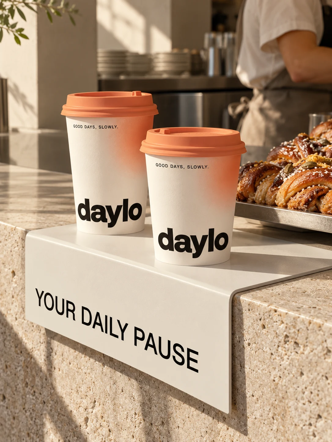
Packaging is the central focus of this project.
Each blend follows the same packaging structure, with variations in color and product information that make the collection easy to navigate.
The oversized DAYLO wordmark creates a strong visual anchor, while the carefully arranged product names, tasting notes, roast descriptions, and weight information keep the packaging functional and readable.
The result is a cohesive product family that feels unified without making every blend look identical.
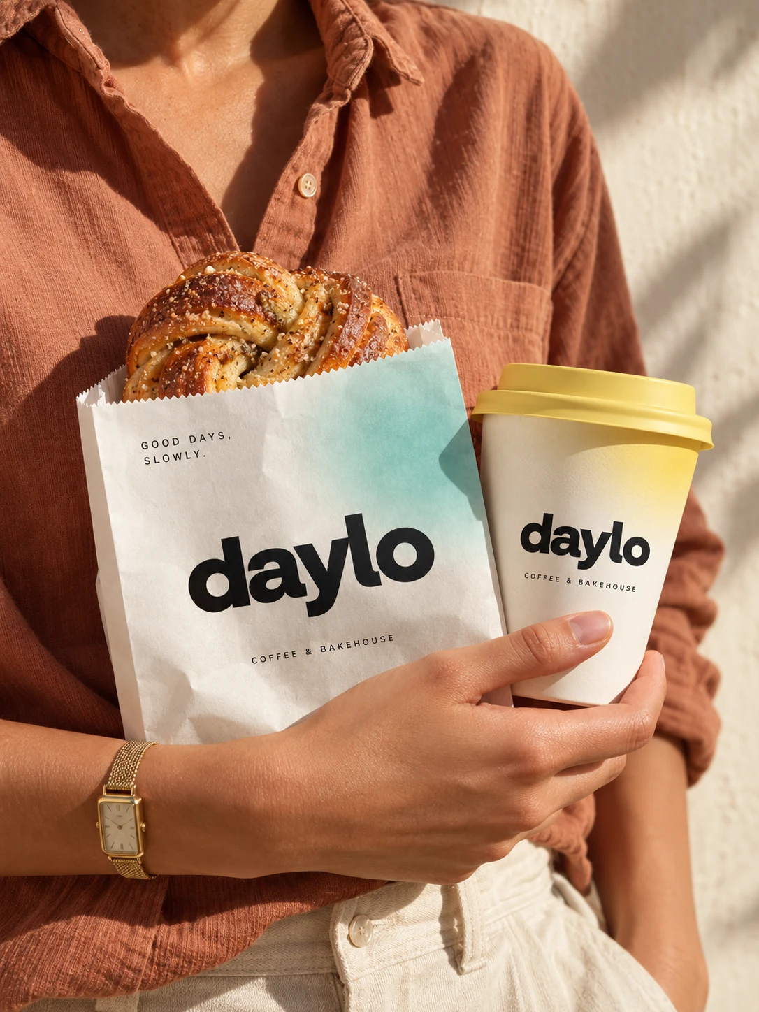
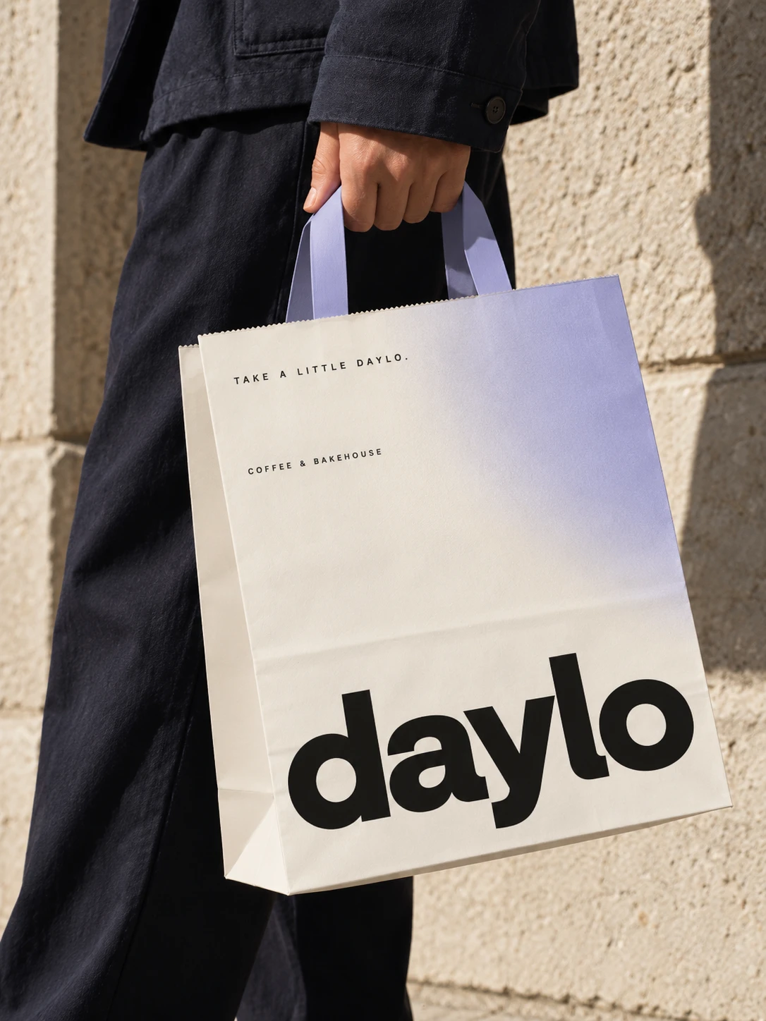
The goal was to create a distinctive coffee brand identity and packaging system that stands out on retail shelves while expressing a relaxed, modern coffee culture.
DAYLO is designed to make an everyday product feel like a small, meaningful ritual.
Less rush. Better coffee. Good days, slowly.
Like this project
Posted Oct 23, 2026
Created minimalist brand identity and packaging for DAYLO café. A contemporary coffee branding concept inspired by slow mornings and thoughtful rituals.