
Ismail khalid
Brand Identity Designer | Logos, Visual Systems & Packaging
- 14
- Followers


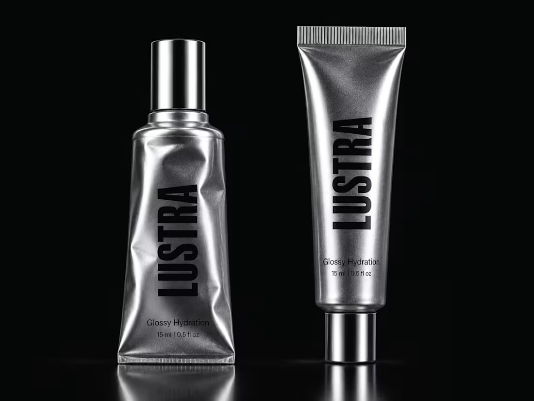
If your skincare formula is premium but the packaging still looks like everyone else, you are making the customer work too hard to see the difference.
That is the problem LUSTRA was designed to solve.
The goal was not to create another “clean beauty” pack.
It was to build something that could signal premium positioning, stronger shelf presence, and a more distinctive brand perception before the customer even reads the product details.
So the system was built around:
⚪ Metallic silver to create a sharper, more elevated presence
⚫ Black typography for confidence and contrast
🔤 Vertical branding for faster recognition
✨ Reflective materials that make the pack feel tactile and premium
🧴 A minimal hierarchy that keeps the product looking intentional, not empty
The result is a packaging direction that feels closer to fashion and product design than conventional skincare.
And that matters.
Because when customers are comparing five similar products, the brand that looks more considered often gets perceived as more valuable.
Packaging is not decoration.
It is part of the buying decision.
LUSTRA
Glossy Hydration.
What would make you notice this first on a shelf?
A. The metallic finish
B. The vertical wordmark
C. The black + silver contrast
D. The overall premium direction
Drop A, B, C or D below.
If you are building a skincare, beauty, cosmetic, or wellness brand with a strong product but weak visual positioning, send me a message.
I help product founders turn good formulas into brands that look ready to charge more, compete harder, and be remembered.
#PackagingDesign #SkincareBranding #BeautyBranding #CosmeticPackaging #BrandIdentity #LuxuryPackaging #VisualIdentity #CreativeDirection
4
1
23
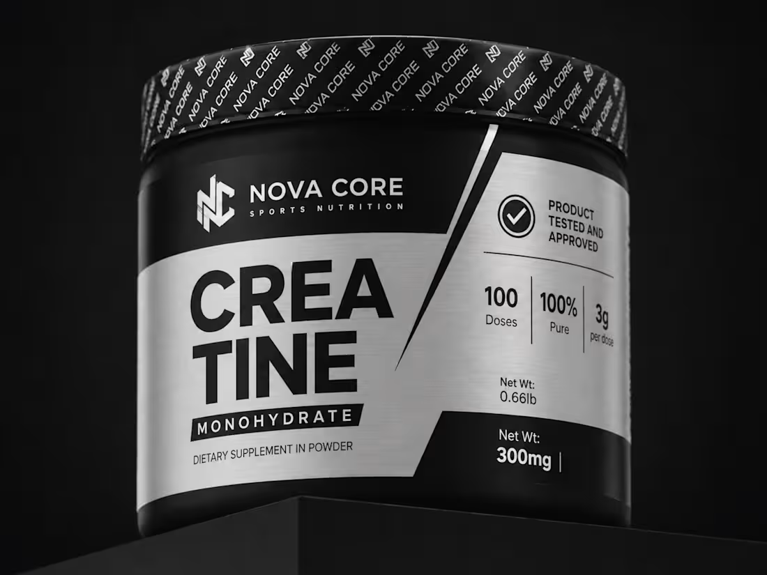
If your creatine packaging looks weak, nobody is going to assume the formula is strong.
That was the problem behind NOVA CORE.
This product did not need more decoration.
It needed more authority.
So the packaging was stripped back to what matters:
⚫ Black for strength
⚪ Brushed silver for precision
🔤 Heavy typography for instant recognition
📊 Clear dosage and purity information
🧪 A structured hierarchy that feels serious, technical, and performance-driven
No fake energy.
No oversized fruit graphics.
No “premium” effects added just to make the pack look expensive.
The goal was to make the product feel like it belongs in the hands of someone who actually trains.
Direct. Functional. Credible.
Because in sports nutrition, packaging is doing more than competing for attention.
It is answering a question before the customer even picks it up:
“Can I trust this?”
NOVA CORE was designed to make that answer feel obvious.
What gives this pack the strongest presence?
A. Black + silver
B. The typography
C. The technical information hierarchy
D. The overall performance feel
Drop A, B, C or D below.
If your supplement formula is strong but your packaging still looks like another generic tub on the shelf, send me a message.
I design packaging that helps performance products look credible before the customer ever reads the ingredients.
#PackagingDesign #SupplementBranding #SportsNutrition #Creatine #FitnessBranding #LabelDesign #BrandIdentity #CPGDesign
0
9
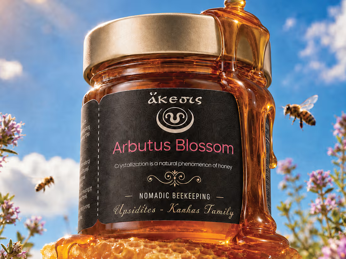
Premium honey can taste exceptional and still look forgettable on the shelf.
That was the problem this packaging needed to avoid.
For this Arbutus Blossom honey, the direction was built around one idea:
Make the product feel as rich and distinctive as the honey inside.
The visual system combines:
🍯 Deep amber tones that let the product itself do part of the branding
⚫ A dark label for contrast and premium shelf presence
🌸 Soft pink accents to connect back to the blossom source
✨ Ornamental detailing that adds heritage without making the design feel dated
🐝 Natural imagery that reinforces origin, craft, and authenticity
The goal was not to make the jar look “luxury” for the sake of it.
It was to make the product feel:
Natural
Crafted
Trustworthy
Gift-worthy
Easy to remember
Because with food packaging, the first purchase often happens before the first taste.
The label has to create enough trust and curiosity to get the product picked up.
That is the real job of the design.
What gives this packaging the strongest presence?
A. The dark label
B. The amber glass and honey color
C. The typography and ornamentation
D. The overall premium-natural feel
Drop A, B, C or D below.
If you are building a food, beverage, honey, wellness, or premium product brand and the product is stronger than the packaging looks, send me a message.
I help brands turn good products into packaging people notice, trust, and remember.
#PackagingDesign #FoodBranding #HoneyPackaging #BrandIdentity #LabelDesign #CPGBranding #VisualIdentity #CreativeDirection
0
18
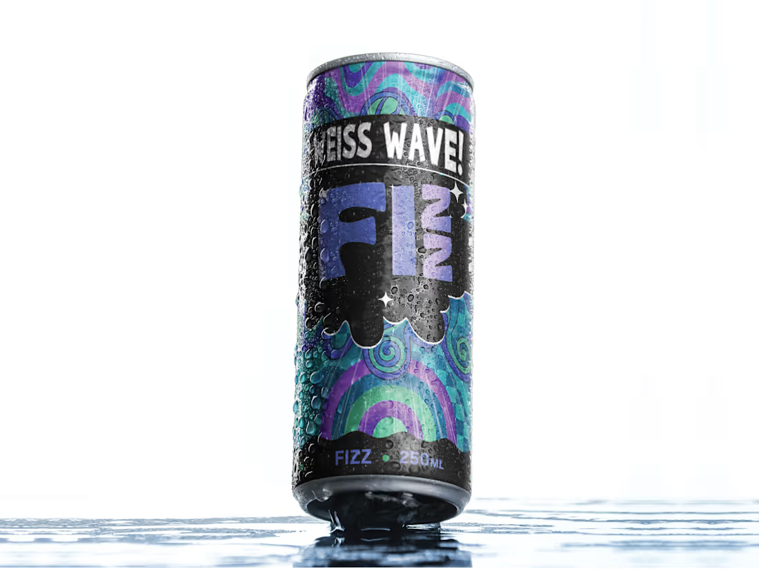
One thing I kept coming back to with this can: it had to look as energetic as the drink is supposed to feel.
This is FIZZ, a beverage packaging exploration built around a louder, more expressive shelf presence.
The direction combines psychedelic wave graphics, aqua and purple tones, heavy black contrast, and a playful type system to give the can a more youthful, slightly chaotic personality.
What I wanted to avoid was the usual “clean but forgettable” beverage look.
The can needed to feel:
Cold
Fizzy
Playful
A little weird
Easy to spot from a distance
The black band became important because it gives the artwork somewhere to breathe and keeps the whole thing from turning into visual noise.
Still deciding how far I would push the system across multiple flavours.
Curious what you’d do:
Keep this direction as-is, or simplify the graphics for stronger shelf readability?
Would love to hear how other designers would approach it.
And if you’re building a beverage or CPG brand and need the packaging to have more presence, feel free to reach out.
#PackagingDesign #BeverageBranding #BrandIdentity #CPGDesign
0
31