The network for creativity
Join 1.25M professional creatives like you
Connect with clients, get discovered, and run your business 100% commission-free
Creatives on Contra have earned over $150M and we are just getting started
Back to feedPost

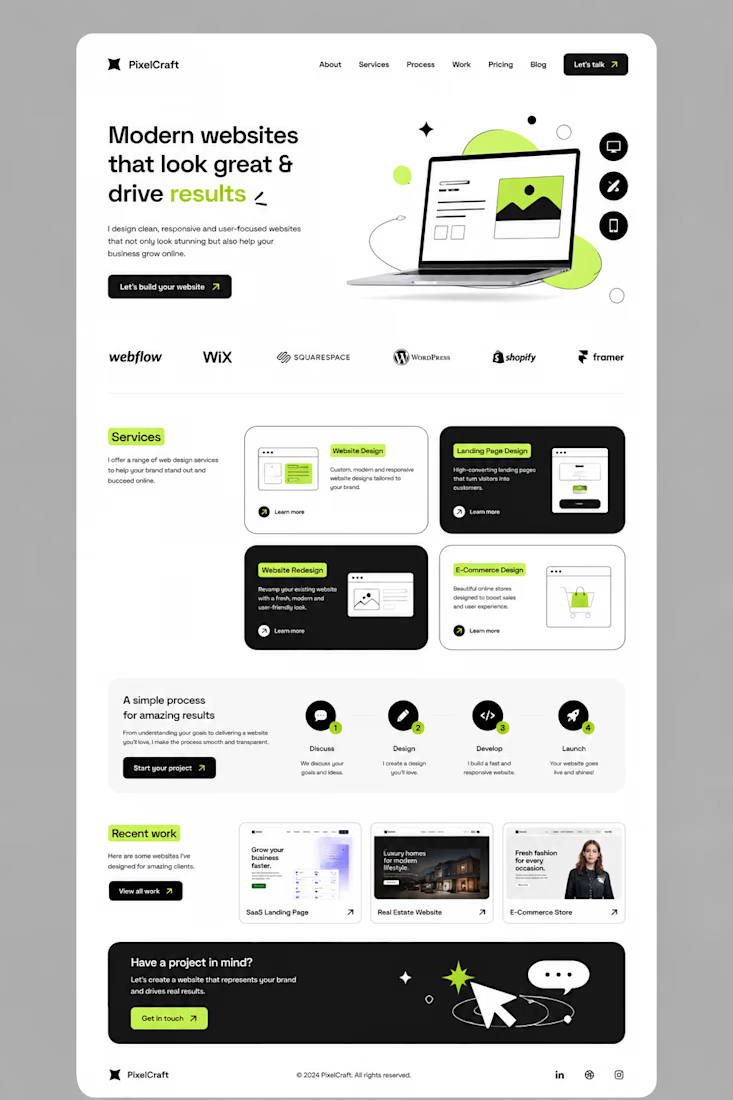
I didn’t want to build another website that simply “looked good.”
I wanted to build something that felt clear, modern, and actually guided people toward taking action.
So I started with a simple idea: less clutter, more clarity.
I built the layout around strong typography, clean spacing, bold contrast, and small lime-green accents to make important elements stand out.
Then came the details — service cards, responsive sections, portfolio previews, a simple process, and CTAs placed where they naturally make sense.
The goal was simple:
Make the website feel good to explore — and even better to use.
This is what I love about web design.
It’s not just about designing a pretty page.
It’s about turning an idea into an experience.
#Graphic Designer #Webdesigner #Website Designer



The awkward part of "less clutter" is that the first things to go are usually the proof — numbers, client names, the boring specifics — so a page can get calmer and less convincing at the same time. What did you keep even though it made a section heavier?

The network for creativity
Join 1.25M professional creatives like you
Connect with clients, get discovered, and run your business 100% commission-free
Creatives on Contra have earned over $150M and we are just getting started











Related posts

looking for a great designer

Behind the scenes of the Treal Studio brand film.
Built in one week, from creative direction to sound design.


Love the overall feel, looks amazing 👌🏼

It’s been a minute since my last post here on Contra.
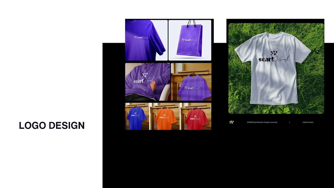
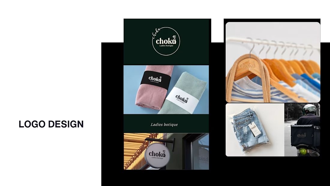
While my main focus usually lives in photo editing and digital design, I was digging through the archive recently and thought it’d be fun to share a couple of branding projects from the past:
Slide 1: Seart Visuals apparel & merchandise branding (1 year ago)
Slide 2: Choku Ladies Boutique identity and mockups (2 years ago)
Brand identity isn't my everyday lane, but tackling projects like these taught me a lot about visual consistency across different mediums. I’d love to hear your thoughts or see any feedback from fellow designers. Great to connect with the community again.



That's really great typography logo design❤️❤️

