
Umair Khan
Framer expert, product designer, motion in Rive and Jitter
Ready for work
Umair is ready for their next project!
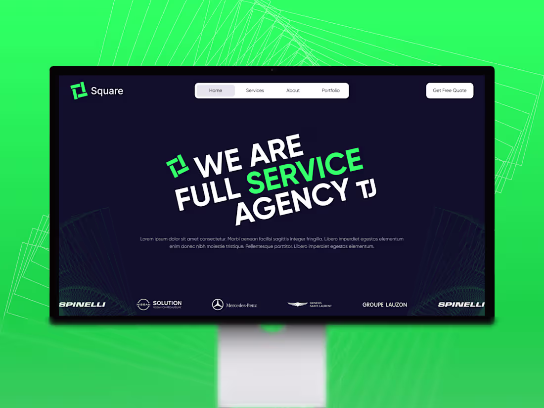
Square Agency Website Design
0
7
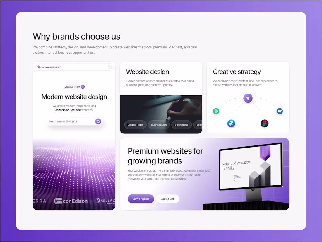
Bento design exploration for my own agency website.
I wanted to make the “Why choose us” section feel more visual, premium, and easy to scan.
Focused on clean cards, soft purple branding, and a modern layout that presents multiple ideas without feeling crowded.
1
165
Just finished this cross-border payments landing page in Framer
Went with a dark futuristic direction, bold typography, neon accents, and a premium visual feel to make the product feel modern, trusted, and high-converting.
Built to make fintech feel simple, fast, and bold.
0
220
Metrica — Finance SaaS Landing Page Design
Designed a clean, modern landing page concept for Metrica, a finance management platform built for businesses that want better control over cash flow, expenses, budgeting, and team collaboration.
The goal was to create a calm, trustworthy visual direction using soft mountain imagery, clean typography, and a premium dashboard preview that instantly communicates clarity, control, and confidence.
Design focus:
Modern SaaS layout, finance dashboard UI, strong hero section, soft visual storytelling, and conversion-focused CTAs.
Available for SaaS, fintech, AI, and startup website design projects.
2
1
295
Designed a clean hero section for founders in SaaS, Sports, and Tech.
The goal was simple: create a first impression that feels modern, premium, and clear without overloading the screen.
Strong typography, soft whitespace, bold orange highlights, and a sculptural visual element to give the layout more personality.
This direction is built to help founder-led brands look sharper, more credible, and more memorable from the first second.
If your website still looks “fine” but doesn’t feel like your company is growing, that’s usually the first thing to fix.
Looking for a website that actually reflects your product and positioning? Let’s connect.
2
1
277
I design Framer websites that do more than look futuristic — they solve real business problems.
Clear structure, strong visuals, smooth interactions, and purposeful UX that helps brands stand out and perform.
Framer designer. Strategic thinker. Problem solver.
11
15
611
Designed this hero section for a marketing agency that wants to feel strategic, modern, and high-end from the very first scroll.
The chess composition helps reinforce the idea of smart positioning and long-term brand movement, while the bold typography keeps the message direct and confident.
A strong hero section should not just look good. It should instantly communicate value, build authority, and push action.
Currently available for website design projects and landing pages.
3
4
269
Built a soft cinematic hero section concept for a personal brand / coaching website focused on growth, clarity, and emotional alignment.
The idea was to create something that feels calm, aspirational, and immersive from the first second. Instead of relying on a standard layout, I used a dreamlike cloud environment, a monumental arch, reflective water, and spacious typography to make the hero feel more like an experience than just a section.
What I focused on in this concept:
premium and calming visual direction
clear hierarchy and spacious composition
emotionally driven hero storytelling
soft conversion flow with balanced CTAs
modern layout designed to feel both elegant and intentional
This kind of direction works especially well for personal brands, coaches, wellness founders, and service businesses that want to feel elevated and trustworthy without looking overly corporate.
Would love to build more web experiences like this.
2
2
260
Built the hero section of my new Analytics SaaS template in Framer today.
Focused on keeping it minimal, structured, and product-led with a strong enterprise feel. The goal was to create a layout that feels modern, clear, and conversion-focused while still leaving room for strong dashboard visuals and sharp messaging.
Now the foundation is ready, and I’m moving into the next sections to shape the full template.
1
239
Designed this testimonial section to make client feedback feel as premium as the brand itself.
Instead of treating testimonials like filler, I wanted this section to instantly communicate trust, quality, and credibility through strong hierarchy, elegant spacing, and a refined dark visual system.
For service brands, agencies, and startups, sections like this can quietly do a lot of heavy lifting — they reduce hesitation, build confidence, and support conversions.
Looking to elevate your website with a more strategic, high-end feel? Let’s work.
1
238
Designed a clean landing page concept for a Peru travel experience brand focused on adventure, culture, and destination storytelling.
The goal was to keep the layout minimal and premium while making the visual hero do the heavy lifting. I used a spacious composition, bold typography, and an immersive floating-island illustration to create a strong first impression without overwhelming the user.
This kind of design works well for travel brands, tourism startups, and experience-based businesses that want to feel modern, trustworthy, and memorable.
Looking for a landing page that makes your brand feel premium and instantly clear? Let’s work together.
#WebDesign #LandingPageDesign #TravelWebsite #UIDesign #HeroSection #FigmaDesigner #WebsiteDesigner #TravelBrand #MinimalDesign #Contra
1
223
A strong hero section does more than look premium — it shapes how buyers see your brand in seconds.
For this BMW i8 concept, the focus was clear:
high-end positioning, instant impact, and a layout designed to hold attention.
Founders do not need “just a nice website.”
They need a first impression that builds trust and moves people to act.
Need a landing page that feels premium and drives results? Let’s talk.
1
237
Designed a luxury travel landing page concept for Dawn Risa — crafted to sell an experience, not just a flight.
The goal here was to create a hero section that instantly feels peaceful, premium, and unforgettable.
The oversized balloon visual, soft sunrise atmosphere, and minimal navigation were all used to make the experience feel aspirational from the very first second.
I focused on combining emotional storytelling with clear booking-oriented structure, so the design feels immersive while still guiding users toward action.
This is the kind of website direction that helps travel and hospitality brands feel more elevated, memorable, and worth booking.
Need a website that makes your brand feel premium at first glance? Let’s work.
1
225
Designed a luxury landing page concept for a private lakeside stay brand focused on calm, exclusivity, and premium living.
The goal was to create a first impression that feels cinematic, peaceful, and high-end — using atmospheric imagery, clean typography, soft contrast, and a spacious layout that lets the visuals do the heavy lifting.
This concept is built to attract modern hospitality, real estate, and premium lifestyle brands that want a website experience that feels elegant from the first scroll.
Available for luxury website design, landing pages, and high-converting web experiences.
1
237
Luxury Real Estate Hero Section for a Calm Living Experience
Designed this elegant hero section for Elara Hills, a luxury real estate concept focused on peace, nature, and elevated community living.
The goal was to create a first impression that feels calm, premium, and aspirational.
I used a cinematic lakeside visual, soft glassmorphism UI, spacious layout, and bold typography to communicate a lifestyle centered around privacy, open space, and modern luxury.
This concept is built to attract buyers who are not just looking for a home, but a slower, more intentional way of living.
What I focused on:
Premium first-screen experience
Clean navigation with luxury feel
Strong headline with emotional positioning
Nature-driven visual storytelling
Modern UI for high-end residential branding
#WebDesign #LandingPageDesign #LuxuryWebsite #RealEstateWebsite #UIUXDesign #HeroSection #ModernWebDesign #ContraDesign
1
248
Designed this hero section concept for an Amazon travel experience website.
The goal was to make the first screen feel immersive, calm, and instantly transportive while still keeping the layout clear and conversion-focused. I used strong typography, layered transparency, and a cinematic background to create a premium travel feel without overwhelming the content.
A hero section should do more than look good. It should set the tone, communicate the offer quickly, and make the next action feel natural.
5
6
428
Minecraft-inspired gaming hero section concept
Designed this hero section to capture the playful chaos and nostalgic energy of the Minecraft universe while keeping the layout bold, clear, and conversion-focused.
if you have any project and want me to help you DM me
3
5
324
Travel website concept for Peru — clean, modern, and experience-driven.
This landing page was designed to make the destination feel immersive from the very first screen.
The layout uses strong whitespace, a unique image composition, and minimal navigation to keep the focus on the travel experience.
Perfect direction for a travel brand, tour company, or destination-based booking platform that wants a premium digital presence.
I’m currently available for website design, landing pages, and Framer development.
#webdesign #travelwebsite #landingpage #uidesign #framerdesigner #figmadesign #contra
2
226
Designed this Bali travel hero section to feel immersive, luxurious, and experience-led.
I focused on:
bold typography that instantly grabs attention
cinematic destination imagery
a clean modern navigation with a soft glass effect
a layout that feels both editorial and conversion-friendly
This kind of hero section works especially well for travel brands, resorts, retreats, and premium destination campaigns.
Currently available for website design, landing pages, and high-converting hero sections.
1
3
257
Your website should make your business feel more valuable in seconds.
This concept was built around one core idea:
a strong first impression can change how people see your brand.
I help businesses create websites that feel modern, premium, and strategically designed — not just pretty screens, but experiences that support trust, clarity, and conversion.
If you need a landing page or full website that helps your brand stand out, I’m currently available for new projects.
Send me a message or book a call and let’s discuss your goals.
2
4
267
Designed a premium hero section with a dark minimal aesthetic, emotional visual storytelling, and a clean CTA structure.
The goal was simple: make the first screen feel elegant, modern, and instantly memorable.
2
4
299
Built a bold AI landing page concept designed to feel sharp, futuristic, and instantly credible.
The goal was to translate complex AI positioning into a cleaner visual story through strong contrast, minimal structure, and a dark interface accented with purple highlights to create a more premium, high-tech presence.
I design landing pages that help innovative products look more advanced, communicate faster, and leave a stronger first impression.
2
226
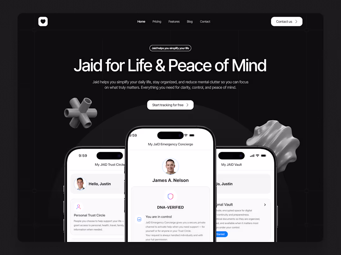
Built a premium landing page concept for a life-management app focused on clarity, trust, and peace of mind.
The design combines a dark, minimal visual system with strong typography, centered messaging, and product-focused mockups to make the experience feel both modern and reassuring from the first screen.
I design landing pages that help digital products feel more credible, more intentional, and easier to connect with.
2
219
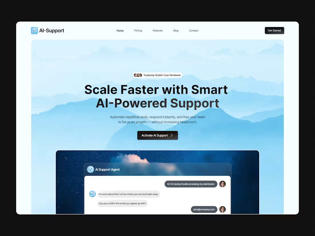
Built a modern AI support landing page focused on clarity, trust, and product storytelling.
The goal was to make the offer feel instantly valuable through strong typography, a calm visual system, and a clear hero section supported by an interface preview that shows the product in action.
I design landing pages that help SaaS products look sharper, explain faster, and convert better.
2
208
Built a clean SaaS landing page concept for an eCommerce growth platform focused on clarity, trust, and conversion.
The goal was to make the product feel simple and credible at first glance — using strong typography, minimal visuals, structured layout, and a dashboard preview that instantly shows value.
I design landing pages that don’t just look polished — they help products communicate faster and convert better.
2
199
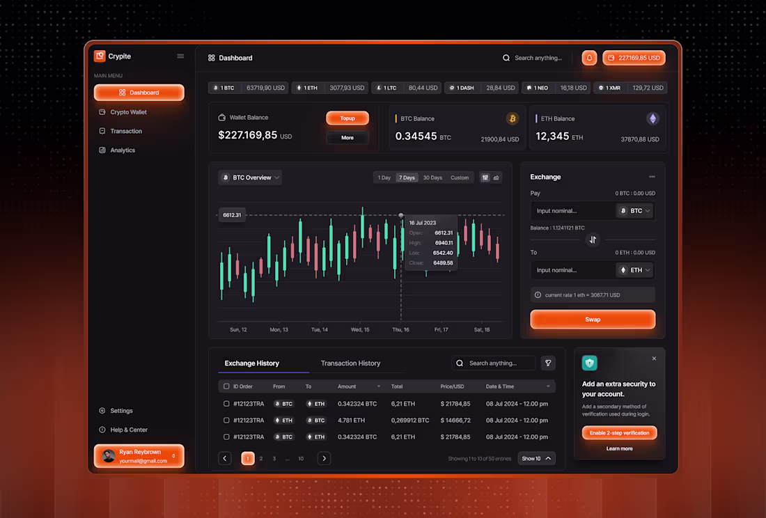
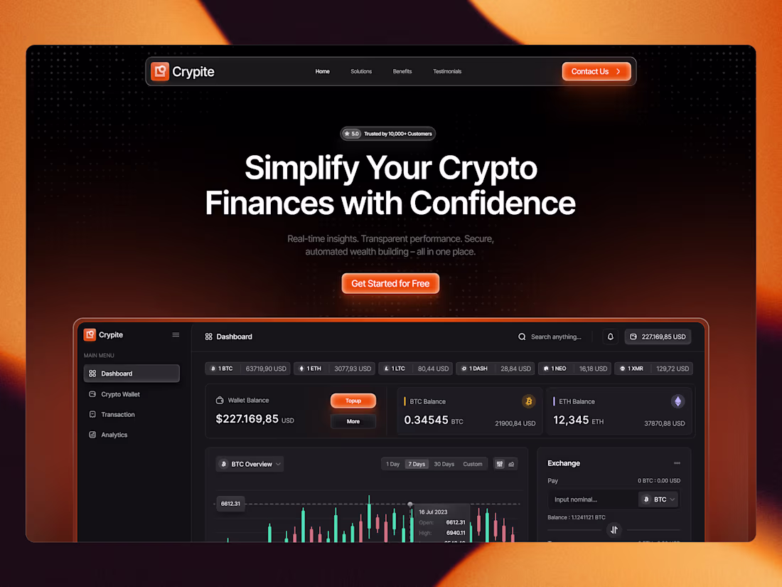
Designed a modern crypto dashboard focused on usability, clean hierarchy, and premium visual depth.
This concept combines wallet tracking, exchange actions, analytics, and transaction history in one clear interface — helping users process complex information faster.
I design interfaces that don’t just look good, but also improve how products feel and function.
1
190
I design in Framer with one goal: solve problems, not just make things look good.
Clean visuals, smart structure, smooth interactions, and conversion-focused thinking — built to help brands communicate clearly and perform better.
Framer expert. Website designer. Problem solver.
1
186
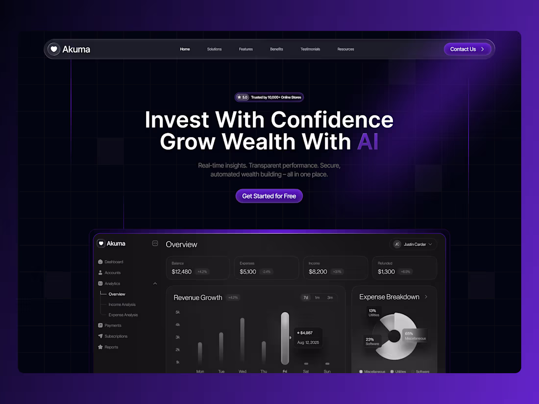
Designed a high-conversion FinTech landing experience focused on clarity, intelligence, and user control.
This concept shifts from traditional dashboards to an AI-powered financial interaction layer — helping users not just track money, but optimize decisions in real time.
If you're building in FinTech or SaaS and want a premium, conversion-focused experience — let’s connect.
1
181
Most websites try to show everything at once.
High-end websites do the opposite — they create a moment first.
This hero section is designed to:
• Capture attention instantly
• Build emotional connection
• Increase engagement before scroll
That’s how premium brands convert.
2
213
This is how you design a high-converting luxury real estate hero.
Instead of listing features, we:
→ Sell emotion (calm, silence, exclusivity)
→ Use immersive visuals to build desire
→ Keep CTAs minimal and intentional
→ Guide attention with strong hierarchy
Luxury users don’t scroll fast — they experience.
1
201
If your landing page doesn’t convert, it’s not a traffic problem — it’s a design problem.
This hero section was built to:
• Capture attention instantly
• Communicate value in seconds
• Guide users to action clearly
Simple. Strategic. Effective.
If you want your website to actually bring results, let’s talk.
2
213
Hero sections are the first impression of any website.
For this concept, the focus was creating an emotional connection within seconds.
Strategy:
• immersive hero imagery
• calm typography hierarchy
• clear primary CTA
• lifestyle-driven brand storytelling
Good design doesn't just look beautiful — it guides the user experience.
2
208
Hero section design for IsoCraft AI, a platform that allows users to generate beautiful isometric store designs using AI.
The design focuses on clarity, friendly visuals, and showcasing the AI-generated store environment as the centerpiece of the experience.
2
233
Modern fintech hero section designed for a credit card platform.
Focused on clean typography, premium card visuals, and a conversion-driven layout to create a strong first impression.
Need help with design Dm me😉
2
219
Rise with the Dragon
Dragon mythology meets modern web design.
Minimal, cinematic, and calm.
😊
2
229
Nexora a ai intelligence system
I designed this hero section for an AI platform focused on intelligent automation and modern digital tools. The goal was to create a visually immersive first impression while keeping the interface clean, structured, and easy to navigate.
🙌
2
233
Hero Exploration for Life on Mars
A modern interface exploration focused on simplicity, strong typography, and clear visual hierarchy. The goal was to create a clean and engaging layout while maintaining a smooth and intuitive user experience.
Every element was designed with balance, spacing, and usability in mind to deliver a polished digital experience.
Available for new projects
If you're looking for a modern website design for your startup or business, feel free to reach out.
📩 Let’s work together:🙌
1
218
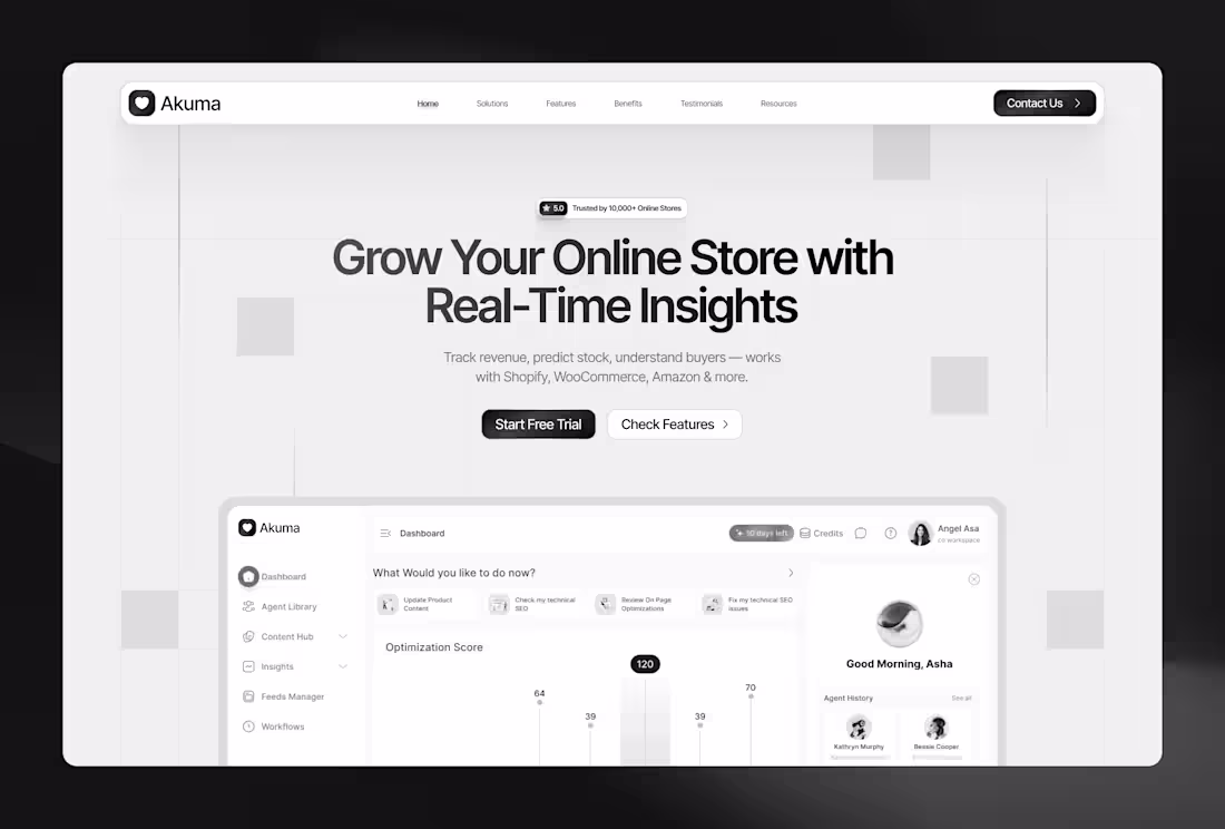
This project focuses on helping users feel more confident about tracking and growing their finances.
I used a clean dark interface with modern visuals to make the experience feel both premium and simple.
The Dashbaord was also designed by me
3
237
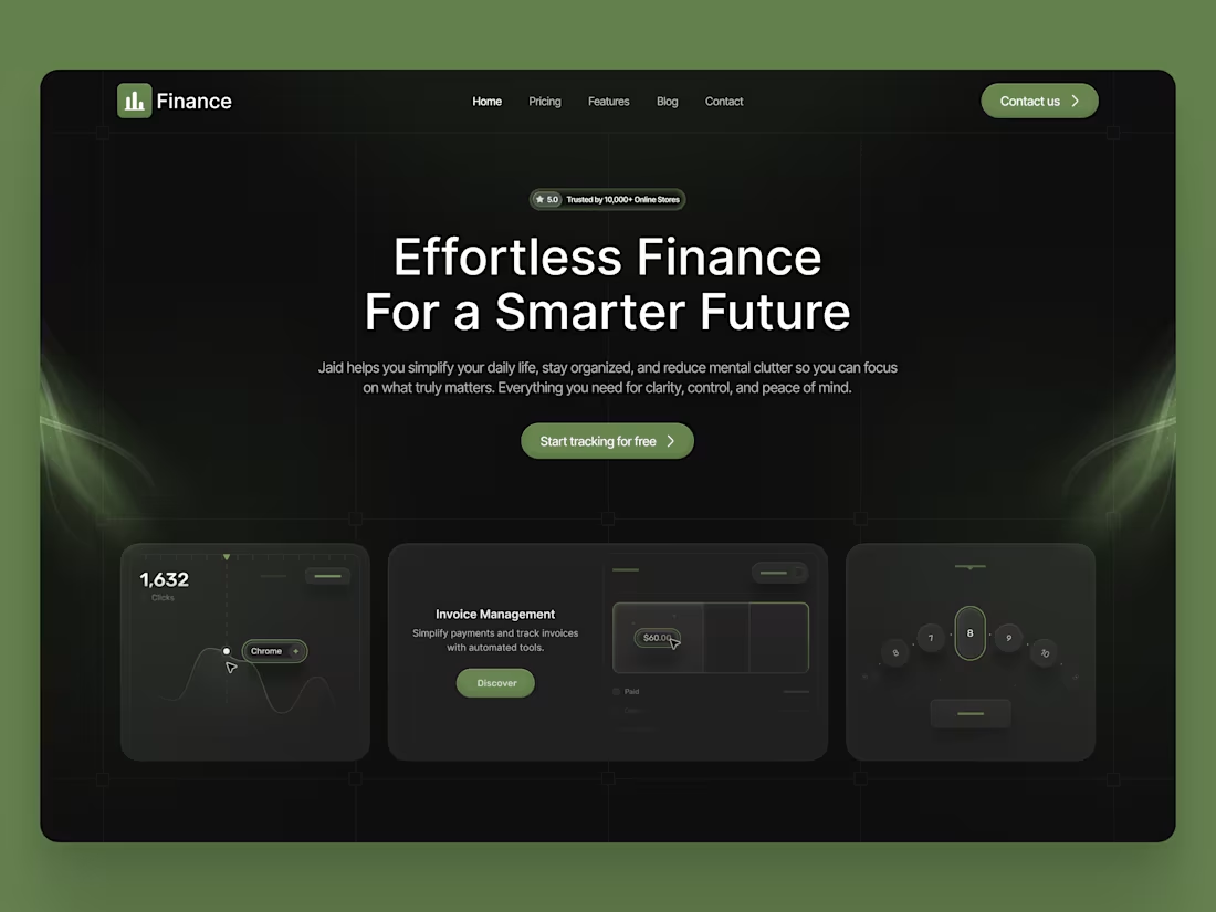
This website was designed for people who want to manage money in a simpler and more organized way.
I did custom bento card design for this project. From vector to final bento card.
I charge $500 for this landing page.
3
232
A crypto finance website designed for people who want to manage their money without feeling overwhelmed.
The goal was to make crypto feel clearer, safer, and easier to understand through a clean and modern interface.
I focused on creating a bold experience that builds trust while still feeling simple to use.
3
229
Hero section design for my upcoming agency website.
what you think ?
5
255