Web/Brand | Launch your project THIS MONTH, not this year ⚡️


Web/Brand | Launch your project THIS MONTH, not this year ⚡️





Make your brand standout


Make your brand standout





Product Design for Founders. From Zero to Launch.
- $10k+
- Earned
- 6x
- Hired
- 5.0
- Rating
- 837
- Followers
Product Design for Founders. From Zero to Launch.


Webflow Developer & Web Designer

Webflow Developer & Web Designer


Figma to Framer, Research to Revenue
Figma to Framer, Research to Revenue

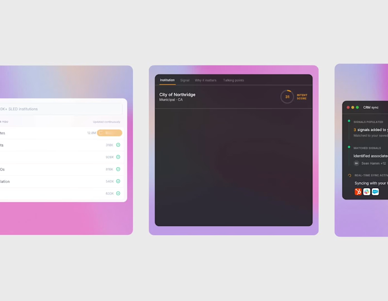
I recreated another video from Framer with Jitter.
Jitter feels faster and more product-focused.
But After Effects still gives deeper control.
Different tools. Different strengths.
Looking for your thoughts and feedback!
6
6
536

Decided to share a peek into my past design projects!
These frames are from the onboarding experience I designed for Taskpin, a Canadian SaaS-enabled marketplace.
Let me know what you think. Your feedback means a lot!
2
1
503

Hey guys,
Recently, I started a challenge to recreate some clips made with After Effects and other professional tools using Jitter. I’m looking for your feedback and opinions.
This clip is a copy of one from Framer. I really love their clips. I didn’t complete it because I want to know if it’s worth continuing this journey or if I should try a different direction.
My goal is to learn and create more samples for my portfolio.
2
18
633


Kajabi Expert | Growth Hacker | 10+ year experience

Kajabi Expert | Growth Hacker | 10+ year experience
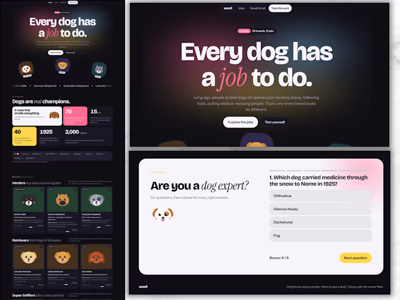
Dogs at Work: An Interactive Learning Page for Kids
Short description
A playful, modern learning page that teaches children about 25 dog breeds and the jobs they were bred for. It includes filters, a size line-up, favourites and a built-in quiz.
Overview
Dogs at Work is a self-initiated concept project. It explores how educational content can feel like a product people want to use, instead of a page they scroll past. The subject is simple and kid-friendly: why do dog breeds look so different? Each breed was shaped by the job it was bred for, from herding sheep to pulling sleds to rescuing people in the snow.
The challenge
Educational pages for kids often fall into one of two traps. Some are text-heavy and dull. Others are so busy that the learning gets lost. I wanted to prove that a learning page can be clean, modern and genuinely fun, while still teaching real facts in a clear structure.
My approach
I started with the content structure before the visuals. Instead of listing breeds alphabetically, I grouped them by job: herders, retrievers, super sniffers, guard dogs, sled dogs, diggers, rescuers, cuddlers and speedsters. That one decision turns a list of facts into a story kids can follow and remember.
For the design, I chose a modern, Framer-inspired look: bold oversized typography, bento-style blocks, a floating pill navigation and soft gradients. To keep it warm and child-friendly, I paired that clean system with illustrated dog faces, rounded cards and small moments of motion.
Key features
Filter by job: a segmented bar lets kids explore one type of work at a time.
Breed cards: each card shows where the breed comes from, what it does, a “Did you know?” fact and a shoulder-height ruler in centimetres.
Favourites: kids tap a heart to save the dogs they like most.
From small to tall: all 25 dogs side by side, sorted by height, from the Chihuahua to the Kangal.
By the numbers: a bento grid of memorable facts, such as the Greyhound’s top speed of almost 70 km/h.
Built-in quiz: six questions with instant feedback, a progress bar and a “bones” score that rewards every right answer.
Design decisions
Structure as learning: grouping by job gives every fact a reason to exist.
One bold moment per section: each section has a single focal point, so the page never feels cluttered.
Accessible by default: it is fully responsive from phone to desktop and supports light and dark mode. It is keyboard-friendly and respects reduced-motion settings.
Real units, real facts: heights and speeds use real measurements, so the page teaches, not just entertains.
What this project shows
This concept reflects how I approach course and learning experiences for my clients. The same principles apply to a course sales page, an interactive lead magnet or a lesson inside a course. Structure the content so it sticks, design it so people want to stay, and add small moments of interaction that make learning feel rewarding.
0
10

Chronic illness has already stolen enough of your life. It doesn’t need your social calendar too.
This is Plan-ISH, my submission for the @Base44 Challenge on @Contra. A FREE app for people with an invisible chronic illness who are sick of choosing between having a life and spending the next week recovering from it. I built it with Base44, step by step: design, planner, automations and voice.
I’m living this myself. I know what it’s like to want to do something completely normal, like a dinner, a wedding or Christmas, and first have to calculate whether my body can handle it. Sometimes you just stop making plans. Not because you don’t want to go, but because the aftermath feels like too much.
Sometimes I just want to go to a bloody dinner and have a good time. So I built Plan-ISH.
What it does:
➔ Plans the days before, the event itself and your recovery afterwards, around the energy you actually have
➔ Helps you ask for what you need, and writes the awkward message to the host
➔ Works with your voice, because some days typing is an Olympic sport
➔ Turns your symptoms into one clear page for your doctor
➔ Sends reminders and check-ins on its own
➔ Has a low-light mode for migraine days, and comebacks for every “but you don’t look sick”
Will it guarantee you won’t have a flare-up? Absolutely f*cking not. But it can help you prepare better, respect your limits and actually enjoy the things you love.
We deserve more than managing our illnesses. We deserve to live.
19
13
1K


Freelance digital designer and developer