Framer & Motion Designer | Bringing Ideas to life


Framer & Motion Designer | Bringing Ideas to life



AI Video Producer | Product Designer | UI & Branding


AI Video Producer | Product Designer | UI & Branding
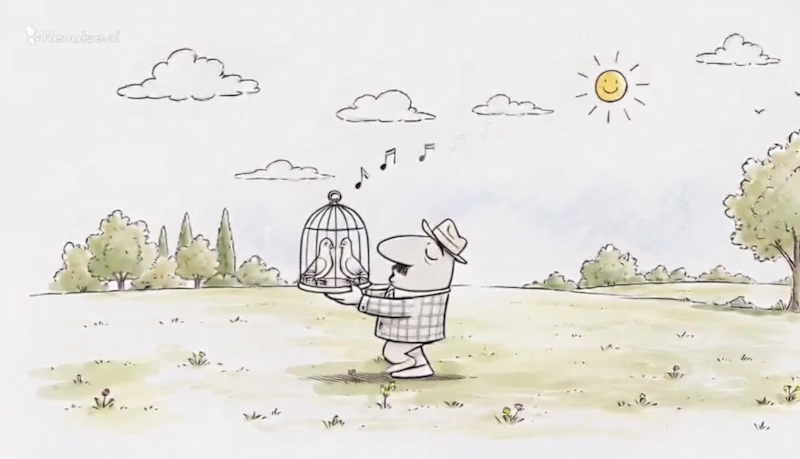
If there’s one thing I love about AI adverts and video production, it has to be experimentation.
I’ve been working on an advertisement for PickPeas, and this right here is the first draft.
There’s still a LOT I want to fix and enhance. The pacing, a few transitions, some character details, and a couple of visual moments can definitely be pushed further.
But honestly?
This already feels about 80% complete.
And that’s what I find so interesting about working with AI for video. You can start with a rough idea, experiment with different visual directions, test a sequence, break it, rebuild it, and suddenly you’re looking at something that actually feels like an advert.
The goal isn’t to get everything perfect in the first generation.
It’s to experiment enough to discover what works.
This is just Draft 01. 👀
I’ll share the final version once I’ve pushed it further.
What do you think of the direction so far?
2
5
980
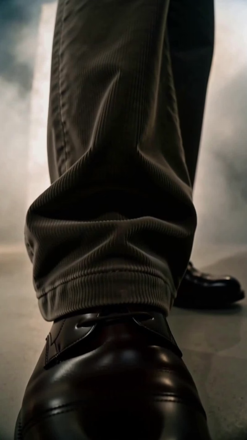
Fashion, but cool.
AI, but real.
Less artificial.
More attitude.
Creating visuals where AI doesn’t look like AI.
6
9
860
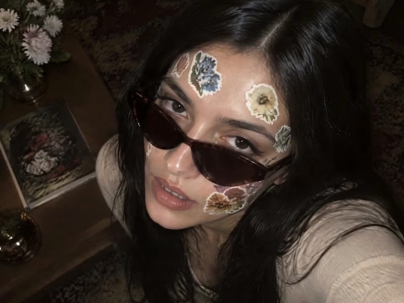
What if history wasn't just something you looked at, but something you could wear, stick and make your own?
Stickers. Yes, stickers. The coolest invention of modern creative history, at least in my books. If you've been following my creative journey throughout this challenge, you know I've pivoted twice before landing on this idea.
And suddenly, it clicked.
What better way to connect with history than to turn it into something you can actually carry with you?
Not just admire art. Not just study it. Reimagine it.
But here's where the creative challenge got interesting.
Could stickers be fashionable? Usable? And, most importantly, scalable?
Turns out, the answer is a big, rebellious YES.
Look what happens when historical art meets contemporary creative expression.
Art-inspired fashion that brings the past into the present. Face stickers that turn art into personal expression. Backgrounds and stationery that make history part of everyday life. Fashion editorial covers that give historical inspiration a whole new identity.
And the best part? Every visual starts with an actual artwork from the Cleveland Museum of Art.
Artwork 01
(https://www.clevelandart.org/art/1926.428)Artwork 02
(https://www.clevelandart.org/art/1919.1.1)Artwork 03
(https://www.clevelandart.org/art/1920.1976)Artwork 04
(https://www.clevelandart.org/art/1966.432)Artwork 05
(https://www.clevelandart.org/art/1953.155)Artwork 06
(https://www.clevelandart.org/art/1926.247)Artwork 07 (https://www.clevelandart.org/art/1962.23)
2
9
585
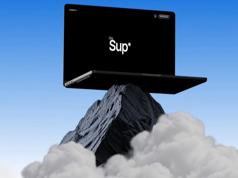
I bet you’ve NEVER seen button hover effects quite like these. And honestly, this time, I COOKED!
I went into this wanting to build a portfolio website. Somewhere along the way, it became so good that I’m genuinely considering making it my MAIN portfolio.
The scroll. The transitions. The interactions. But especially the button hover effects. Every little detail makes the experience feel alive, and I’ve probably spent more time hovering over these buttons than I’d like to admit.
But this wasn't just about making something that looks good. I wanted to build something that actually works for me.
THE BRANDING: I built the entire experience around my existing Sup* identity, keeping the personality intact while giving it a website that feels distinctly mine. From the visual language to the interactions, I wanted every part of the experience to feel intentional rather than like another template with a name slapped on it.
THE EXPERIENCE: As a designer, I obsess over the little things. The way an element responds when you hover over it. How scrolling feels. How one section transitions into the next. And how all of it comes together into an experience that feels cohesive.
The button interactions were easily one of my favourite parts to work on. But don't just take my word for it. Go try them yourself.
And yes, I designed a mobile-specific menu experience too. Please don't skip that part!
THE AUTOMATION: A portfolio shouldn't just display your work. It should help you get work.
One of my biggest goals was to turn this website into a funnel that brings potential clients directly to my Contra profile (https://contra.com/supreethere). I wanted to make it easier for people to discover my work, get in touch, and take the next step.
So, I built in form automation that delivers incoming submissions straight to my email and the website's admin side. No manually checking submissions across different places. The enquiries come to me, giving me a more direct way to keep track of potential opportunities.
It's a small but meaningful workflow that makes the website more than just a pretty front end.
THE STORY BEHIND THE BUILD - I've always wanted a portfolio website that properly showcases my work, personality, and approach to design. And once I found Contra, I realised I had the perfect opportunity to do more than just build a portfolio.
I could create a funnel that showcases my work and helps bring potential clients directly to my Contra profile.
When the @Base44 x @Contra HQ contest came along, it felt like the perfect excuse to bring that idea to life finally.
And the best part? This was my FIRST time trying @Base44. (Process video in the comments)
I've never had to type so little to get something this good. The recommendations were surprisingly on point, and instead of constantly fighting the tool to get what I had in mind, I could focus on what matters most to me: the experience, the details, and making the final product feel right.
As someone who genuinely enjoys pushing interfaces beyond the expected, that was a pretty exciting experience.
Because building something that looks good is one thing. Building something that looks good, feels good, works behind the scenes, and has an actual purpose? That's where the fun begins.
And Base44 made getting there ridiculously enjoyable.
This one's for the Base44 x Contra contest, and I might've accidentally built my new favourite portfolio in the process.
A couple of things I want you to try:
1. Hover over the buttons. Like Seriously.
2. Experience the mobile-specific menu.
3. Check out the custom favicon. Yes, that's me. 😉
Live website: https://supreet.base44.app/
Built around my Sup* identity. Designed to showcase my work. Automated to capture enquiries. Created to turn visitors into potential clients.
Now, please go hover over those buttons. You'll understand.
12
24
1.8K


Brand & Web Designer for Immersive Digital Experiences

Brand & Web Designer for Immersive Digital Experiences



AI Video Producer | Brand & Web Designer for Startups

AI Video Producer | Brand & Web Designer for Startups



Product design, Framer development, full-stack builds
Product design, Framer development, full-stack builds


Product & Web Designer for AI/Tech Startups
Product & Web Designer for AI/Tech Startups

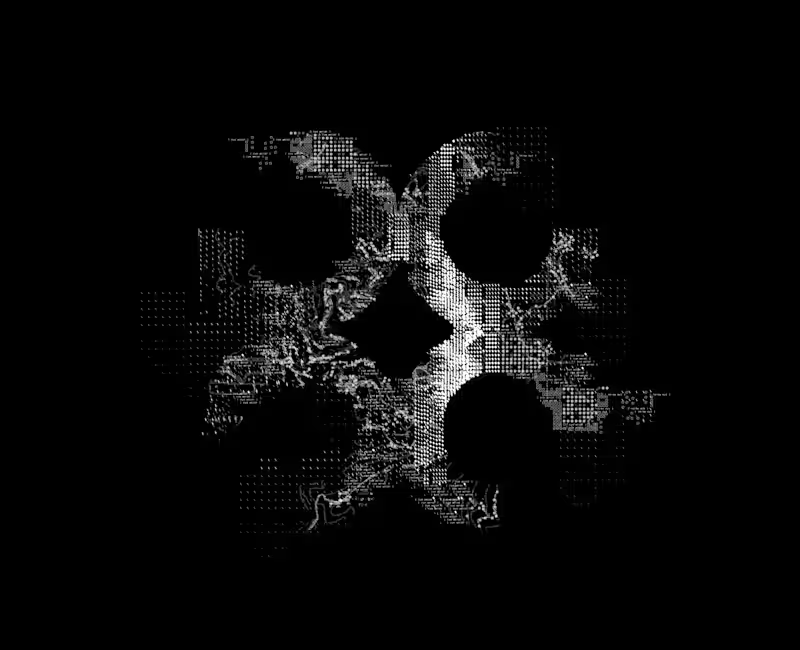
Building a brand pattern for a diagnostics AI company — this one’s a work in progress!
I’ve been experimenting with micro-details like symbols (slashes, squares, text fragments) and topographical map lines inspired by the brand’s origin location to bring depth and structure to the logomark.
Still refining the details over the next few days, but I think it has started to shape up really well!
4
668

Product Designer | Mobile apps, Web apps, Software

Product Designer | Mobile apps, Web apps, Software


The only person you need to strategize your marketing
- $•••••
- Earned
- 10x
- Hired
- 5.0
- Rating
- 55
- Followers
The only person you need to strategize your marketing