
01. Logo
Veyra
A global payments brand built for a more connected economy. One symbol, one wordmark, one idea: move money, move forward.
02. Construction and lockups
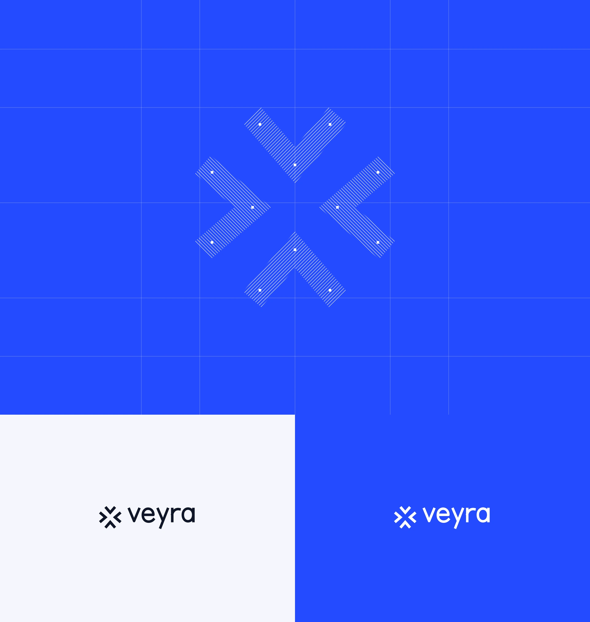
Junction
Four V forms. One shared centre. The symbol is built from a single chevron rotated in quarter turns on a strict grid, so it stays precise at every size. The lockup works in Ink on Soft White and in white on Cobalt.
03. Colour
Five colours, one leader
Cobalt
#254BFF signals momentum. Midnight #080D21 and Ink #101629 give it depth. Ice #B8D3FF and Soft White #F5F7FC give it room. High contrast everywhere, from a billboard to a balance screen.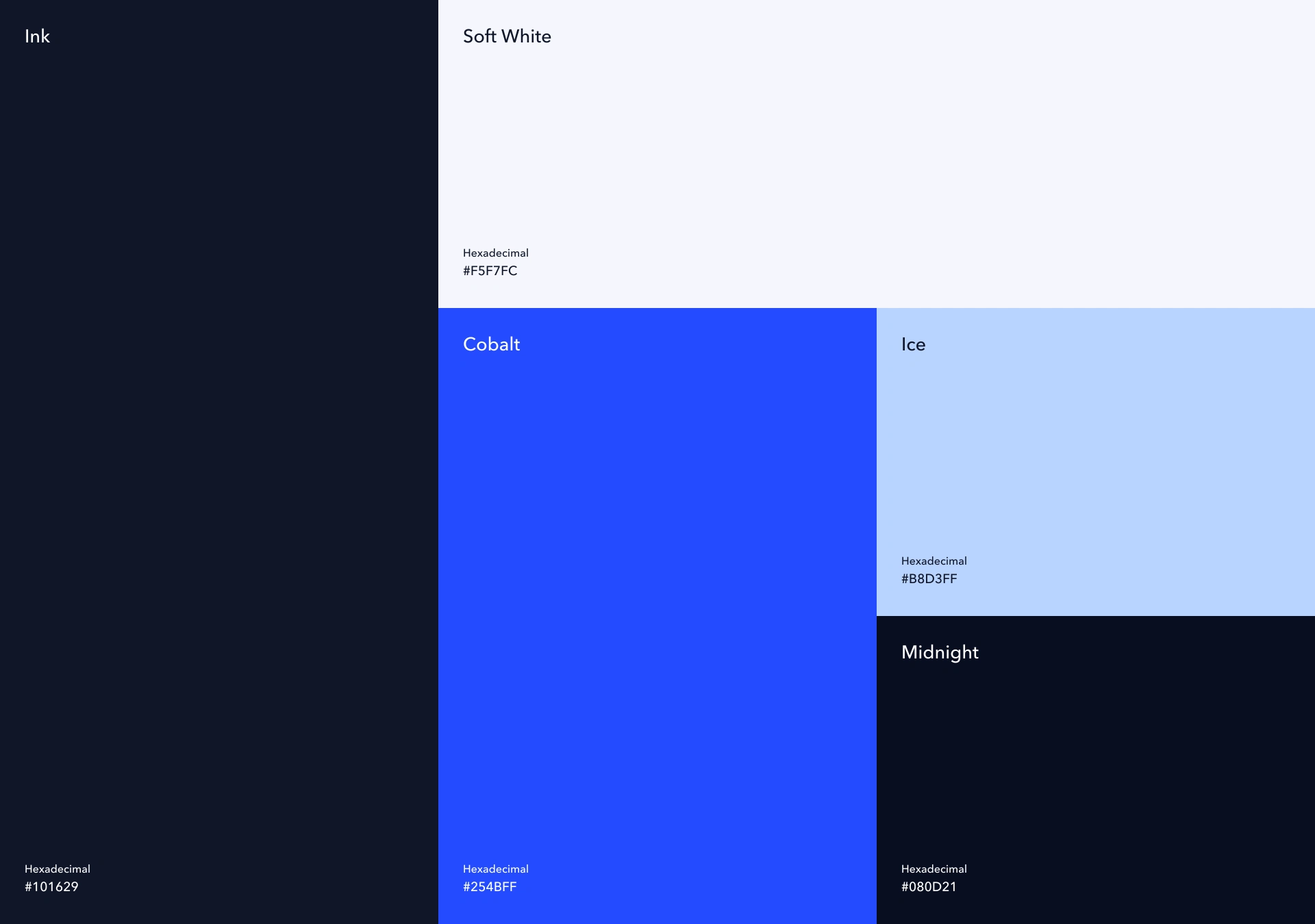
04. 3D symbol
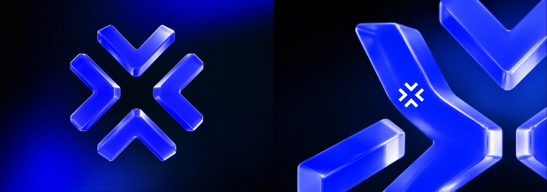
Junction in glass
For hero moments the symbol becomes an object: four blocks of cobalt glass, lit from within. The flat mark sits on top of it as the signature.
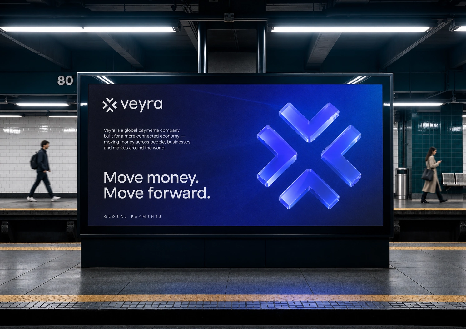
05. Station billboard
Move money. Move forward.
The launch line at full scale. The glass Junction carries the image and the tagline carries the message.
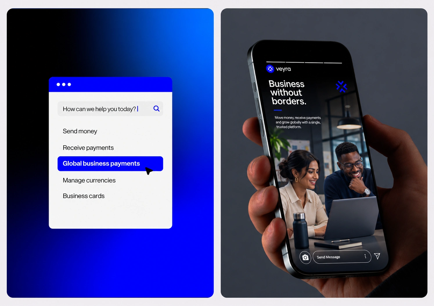
06. Product search and social story
Business without borders
In product, Cobalt marks the action: the selected item, the cursor, the next step. On social, the same blue and the same symbol frame real people at work.
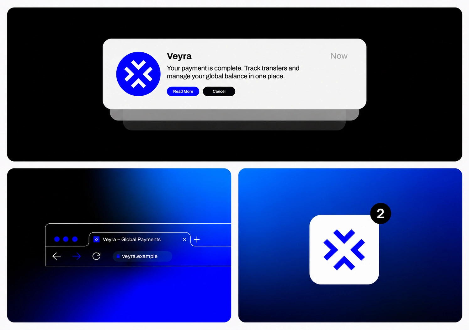
07. Notification, browser tab, app icon
Small sizes
The Junction is drawn to survive at 16 pixels. It holds its shape as a favicon, a notification badge and an app icon without a simplified version.
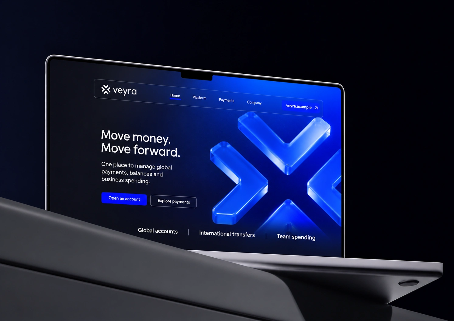
08. Website
One place for global payments
The homepage opens on the glass Junction and the brand line, then gets straight to the product: global accounts, international transfers, team spending.
09. Brand book
The guidelines
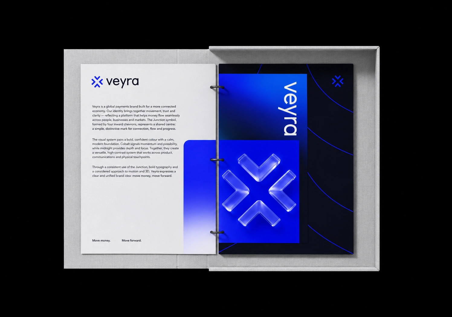
The identity is documented as a system: what the Junction means, how Cobalt and Midnight work together, and how motion and 3D extend the same idea.
10. Stationery and business cards
Print
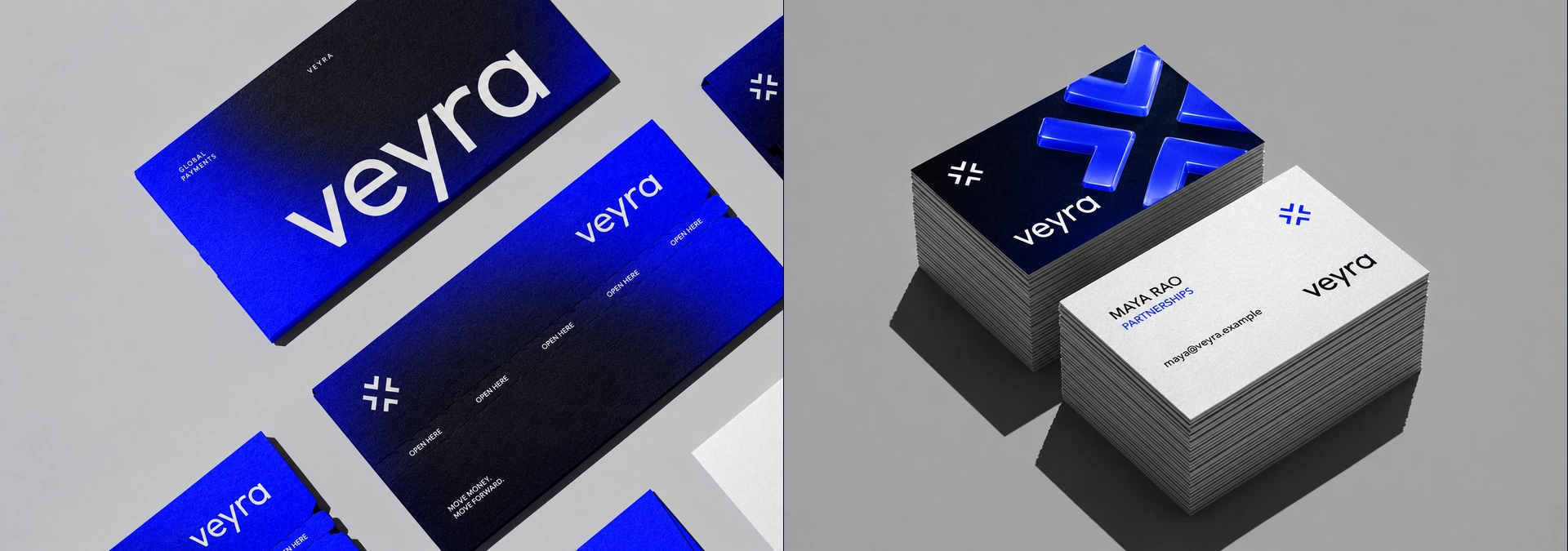
Envelopes fade from Cobalt into Midnight with the wordmark set large. Business cards pair a glass Junction on the front with a quiet white back.
11. Guidelines box set
Three volumes
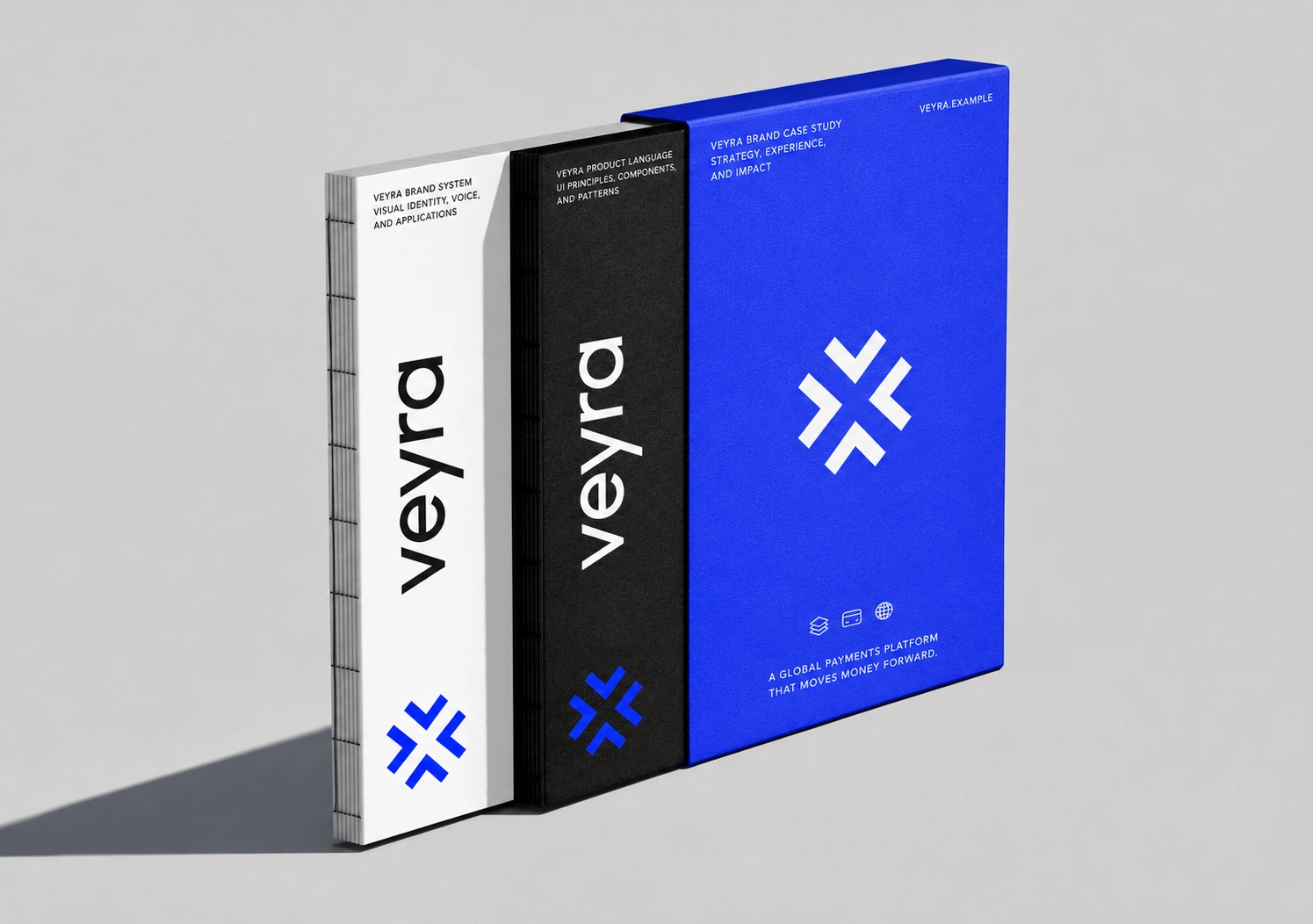
Brand System, Product Language and Brand Case Study, one each in Soft White, Ink and Cobalt. The palette doubles as the filing system.
12. Badge, cap, jacket
Team
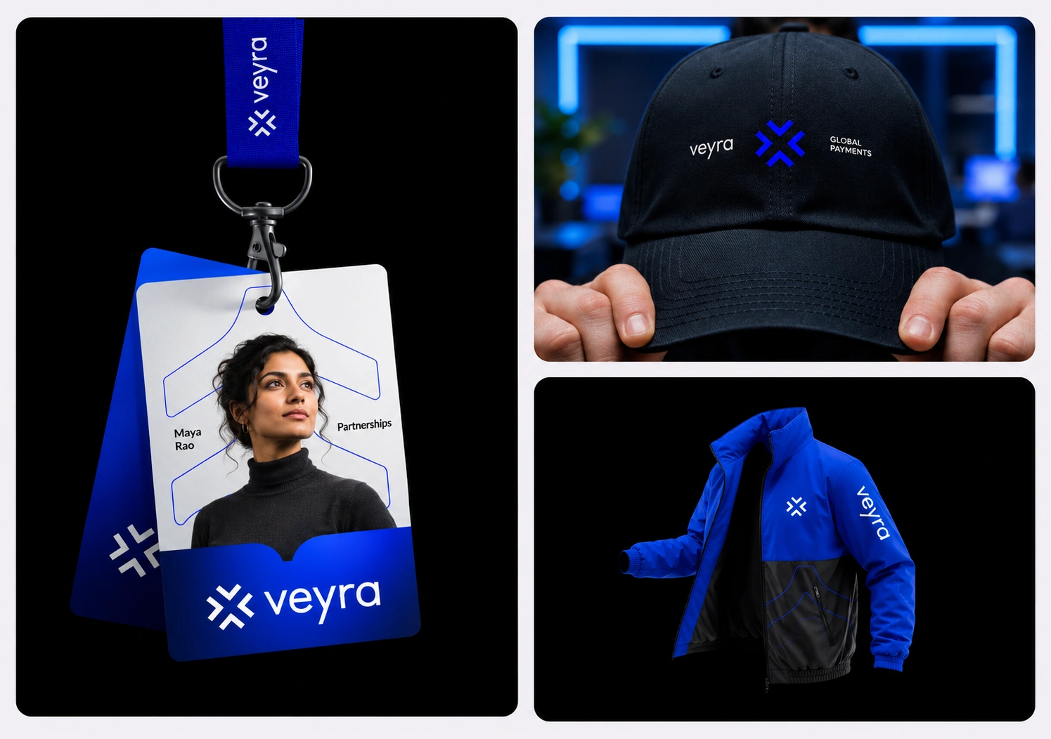
The chevron becomes a pattern: outlined behind the portrait on the badge, stitched as a line across the jacket. The cap carries the full lockup in three parts.
13. T-shirts and knitwear
Apparel
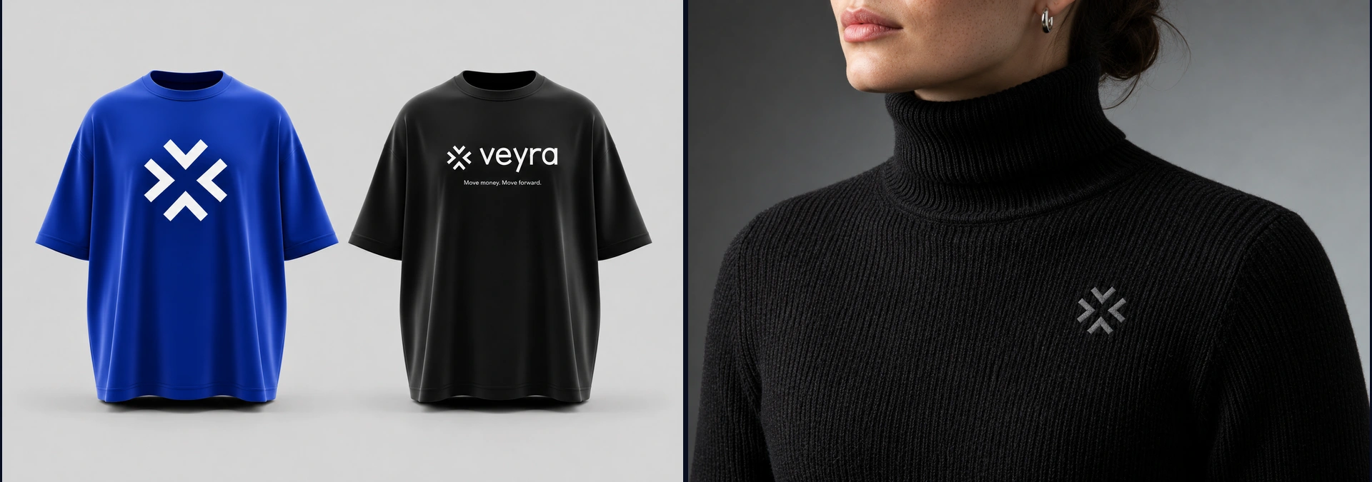
Loud or quiet, it’s the same mark. Full-chest Junction on Cobalt, lockup and tagline on black, and a tonal embroidered symbol on knitwear.
14. Tote
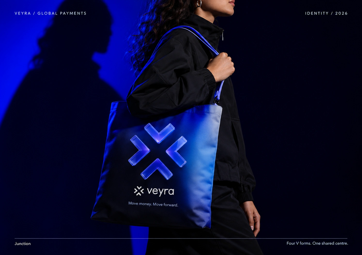
Junction
Four V forms. One shared centre. The glass symbol on a gradient tote, with the lockup and “Move money. Move forward.” beneath.
15. Event screen, watch, share card
Every screen
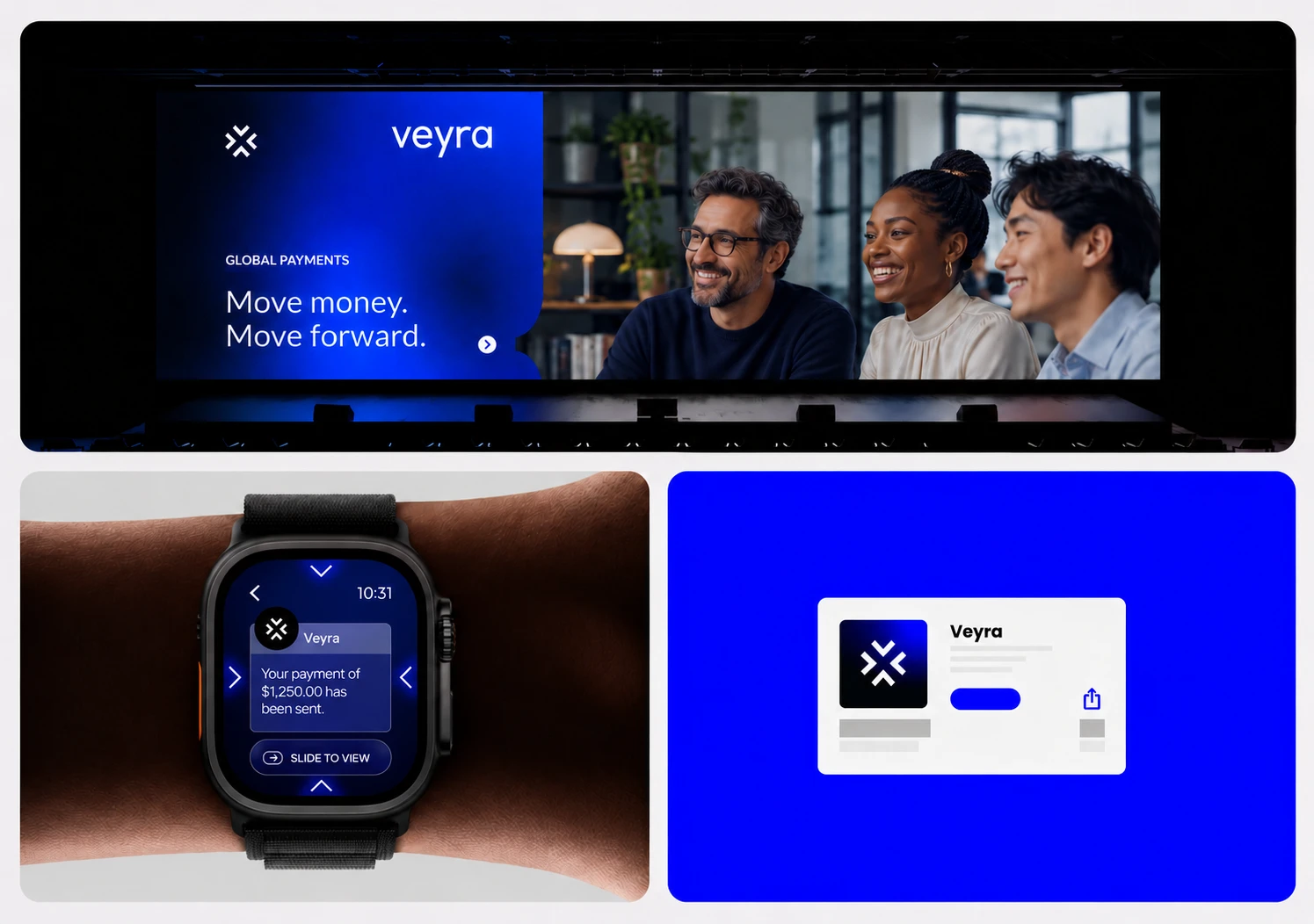
From a keynote stage to a wrist. The watch notification uses the four chevrons as its navigation, so the symbol is the interface.
16. Poster series
Three posters, one system
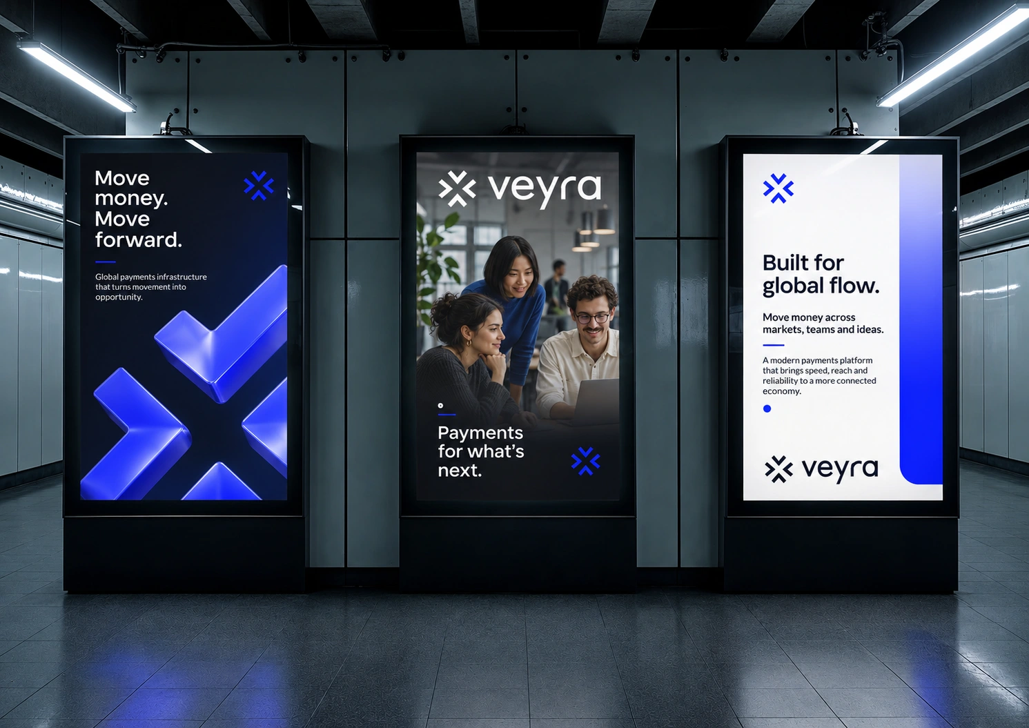
Symbol-led, people-led and type-led. “Move money. Move forward.” “Payments for what’s next.” “Built for global flow.”
17. Digital screen
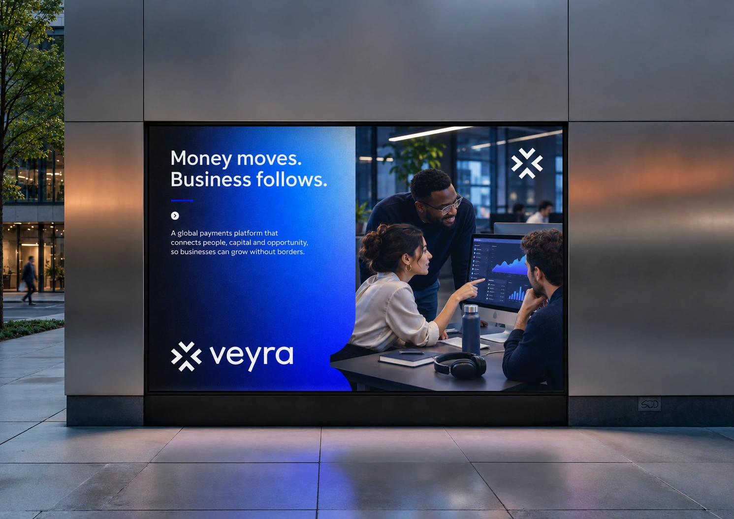
Money moves. Business follows.
A split layout: brand gradient and message on one side, people and product on the other, joined by a curved edge taken from the chevron.
18. Street posters
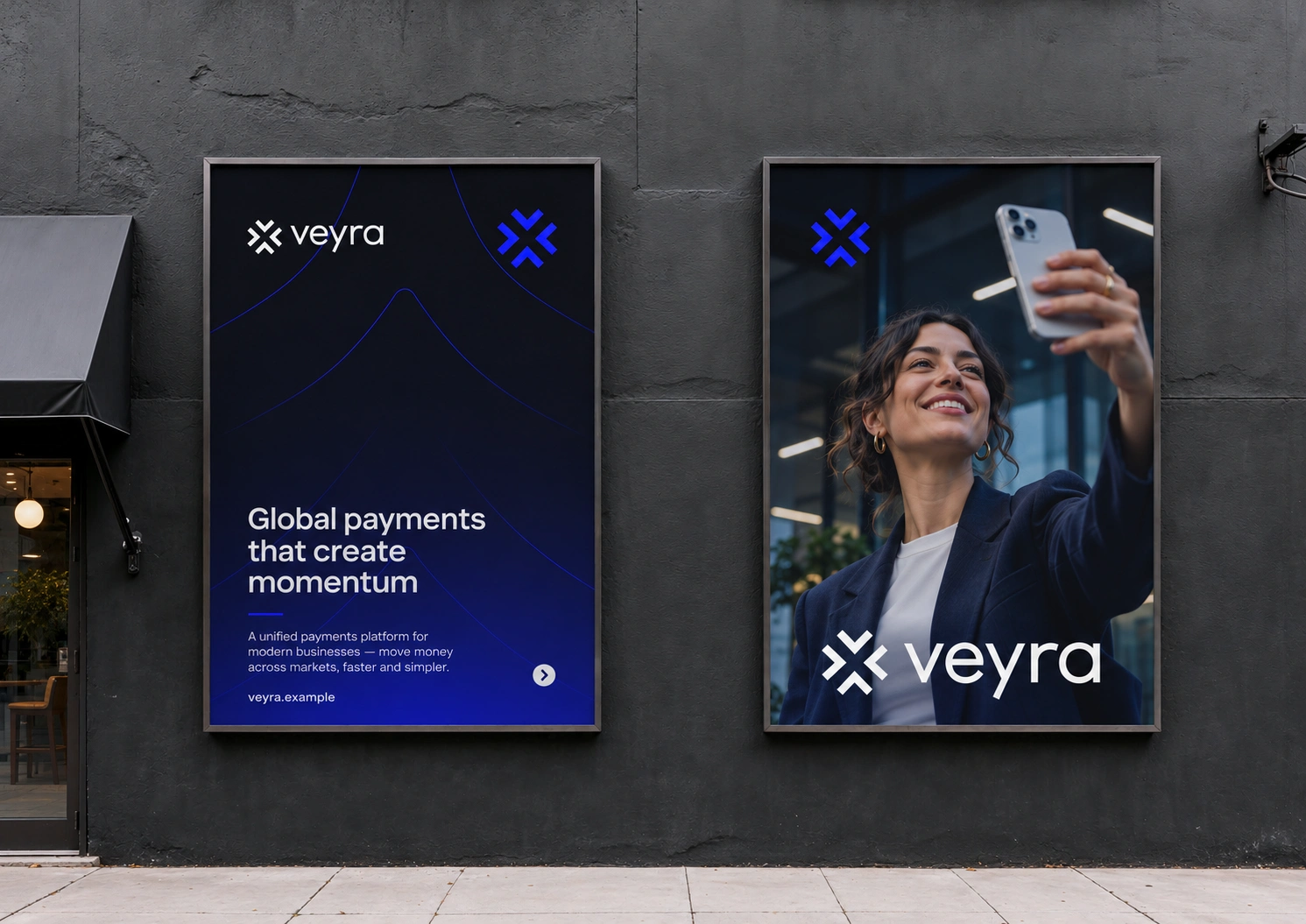
Global payments that create momentum
The chevron opens into fine line work on the type poster and steps back to a corner mark on the photo poster. The lockup closes both.
0 likes · 0 views · Nov 11, 2026
A brand identity for global payments company Veyra, built on the Junction: four V forms, one shared centre.


