Tithe - iOS App Design

Disha Shah
Verified

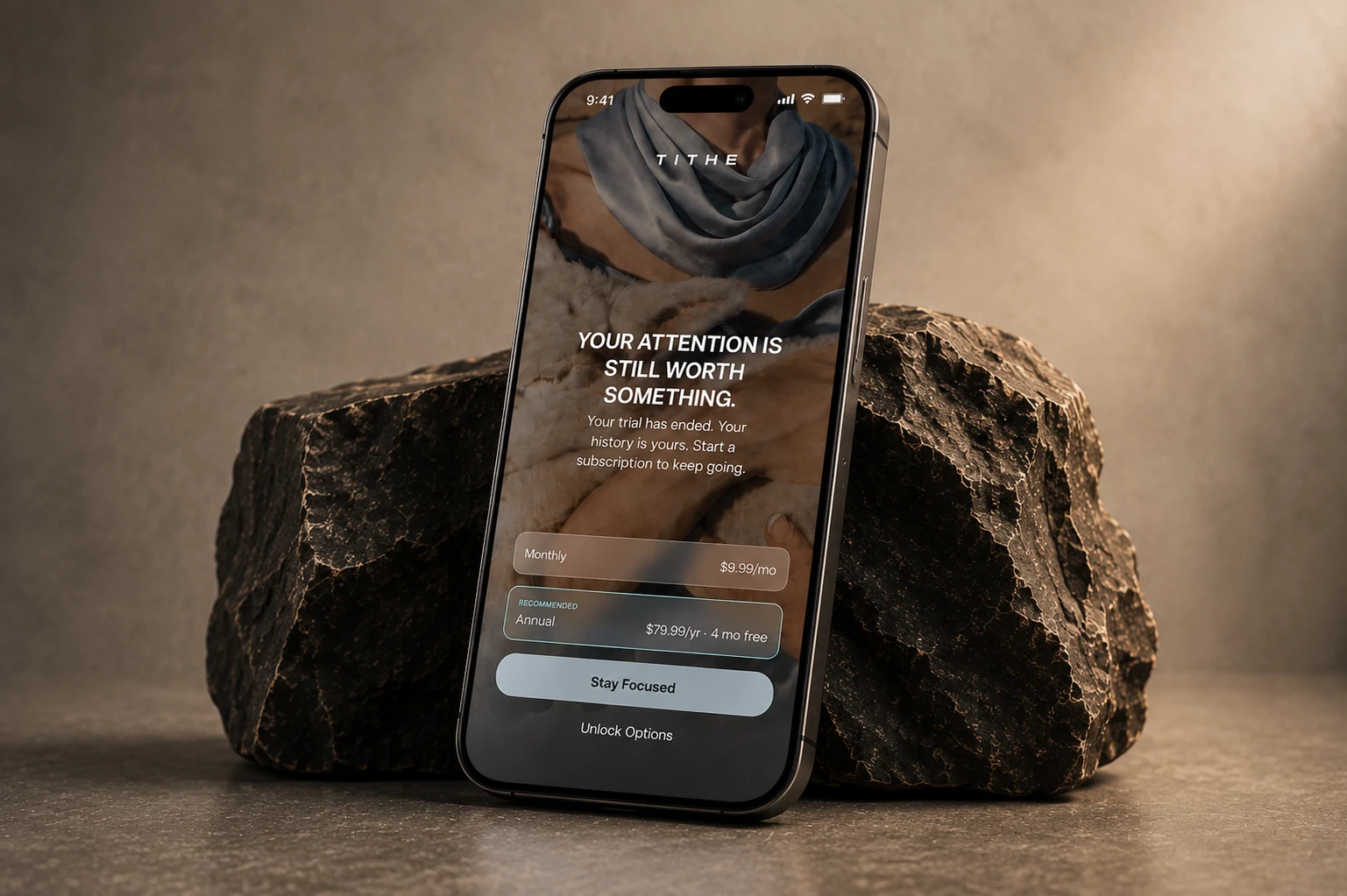
Tithe
Tithe is an iOS app built around a simple idea: if your attention has a value, what happens when you put something behind it?
I worked on the product and visual design for the iOS app, keeping the experience intentionally lean, simple, and easy to move through. The UX is very targeted — there’s no unnecessary coaching, productivity language, or noise. You set your focus, choose what happens if you break it, and get on with your time.
A different kind of focus app
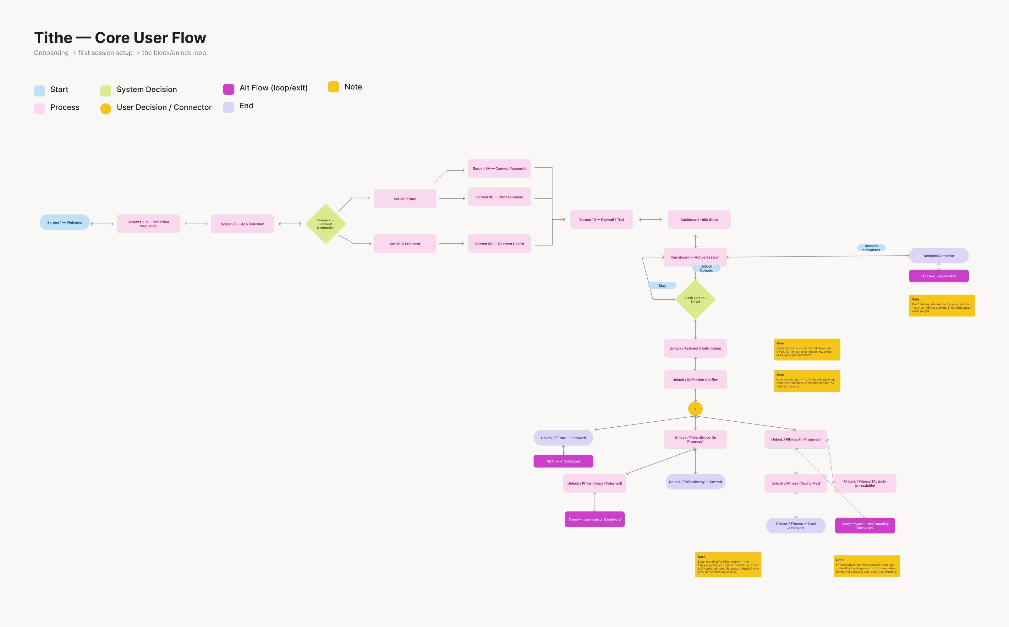
When a focus session is active, selected apps are blocked using Apple’s native Screen Time experience. If you try to open one, you get a moment to decide whether you really want to break the session.
If you do, your attention is redirected in one of three ways:
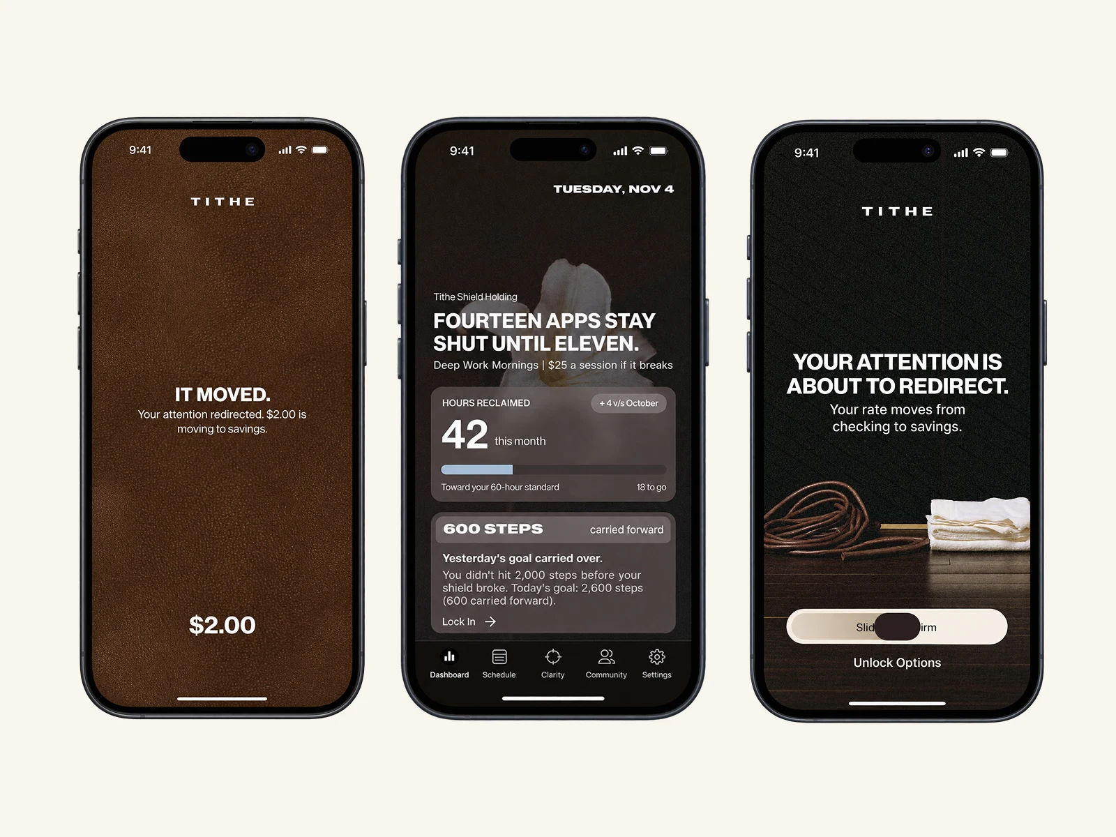
Future — a set amount moves from checking into savings.
Philanthropy — the amount goes towards a cause you care about.
Fitness — you earn your access back by reaching a movement threshold through Apple Health.
I liked that the mechanic makes the decision feel tangible without making a big deal out of it. You either stay focused, or you consciously choose otherwise.
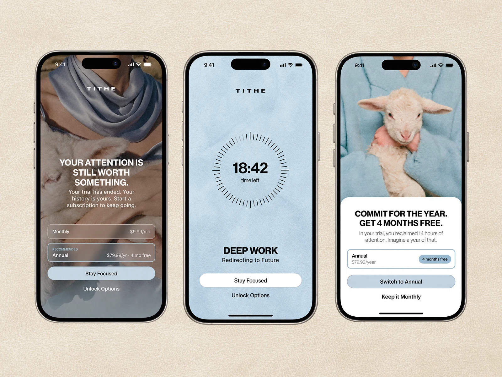
Making a utility feel like a lifestyle brand
A big part of the work was making Tithe not feel like a productivity app.
The visual direction takes cues from brands and spaces like Soho House, Open, and Pillow Talk — more editorial, personal, and lifestyle-led. Photography does a lot of the work, supported by typography, tactile textures, and a powder blue and espresso palette.
The textures were especially important. Burl wood, suede, cashmere and other material references helped give the interface a little more warmth and personality without making it feel busy.
Even the lamb has a small role in the identity, referencing the idea of a tithe as an offering.
Designing for less
The rest of the product follows the same idea.
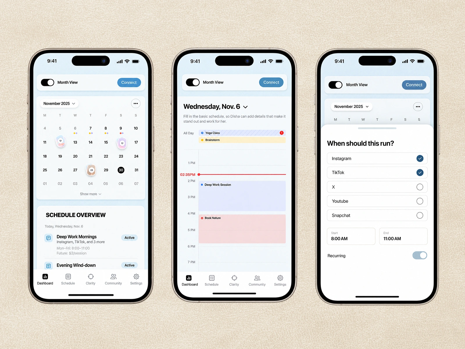
Dashboard — centred around the one number that matters: hours reclaimed, rather than a wall of productivity metrics.
Quick Focus + Scheduling — simple ways to protect time without over-configuring it.
Clarity — gradually surfaces patterns in how you use your attention, without telling you what to do.
Block + Unlock — designed around a small moment of friction, so breaking focus feels intentional rather than automatic. The overall goal was pretty simple: make the product quiet, but not boring; considered, but not complicated.
Something that helps you focus without constantly reminding you that you're using a focus app.
Like this project
Posted Aug 12, 2026
Tithe — an iOS app that turns phone-checking into a conscious choice. I designed UX + visual system, simplifying focus flows with a distinct lifestyle identity.
Likes
0
Views
14
Timeline
Jul 1, 2026 - Aug 10, 2026
Clients
BrightStudios®