A path-first website for newcomers entering Canada’s job market.

Disha Shah
Verified


About
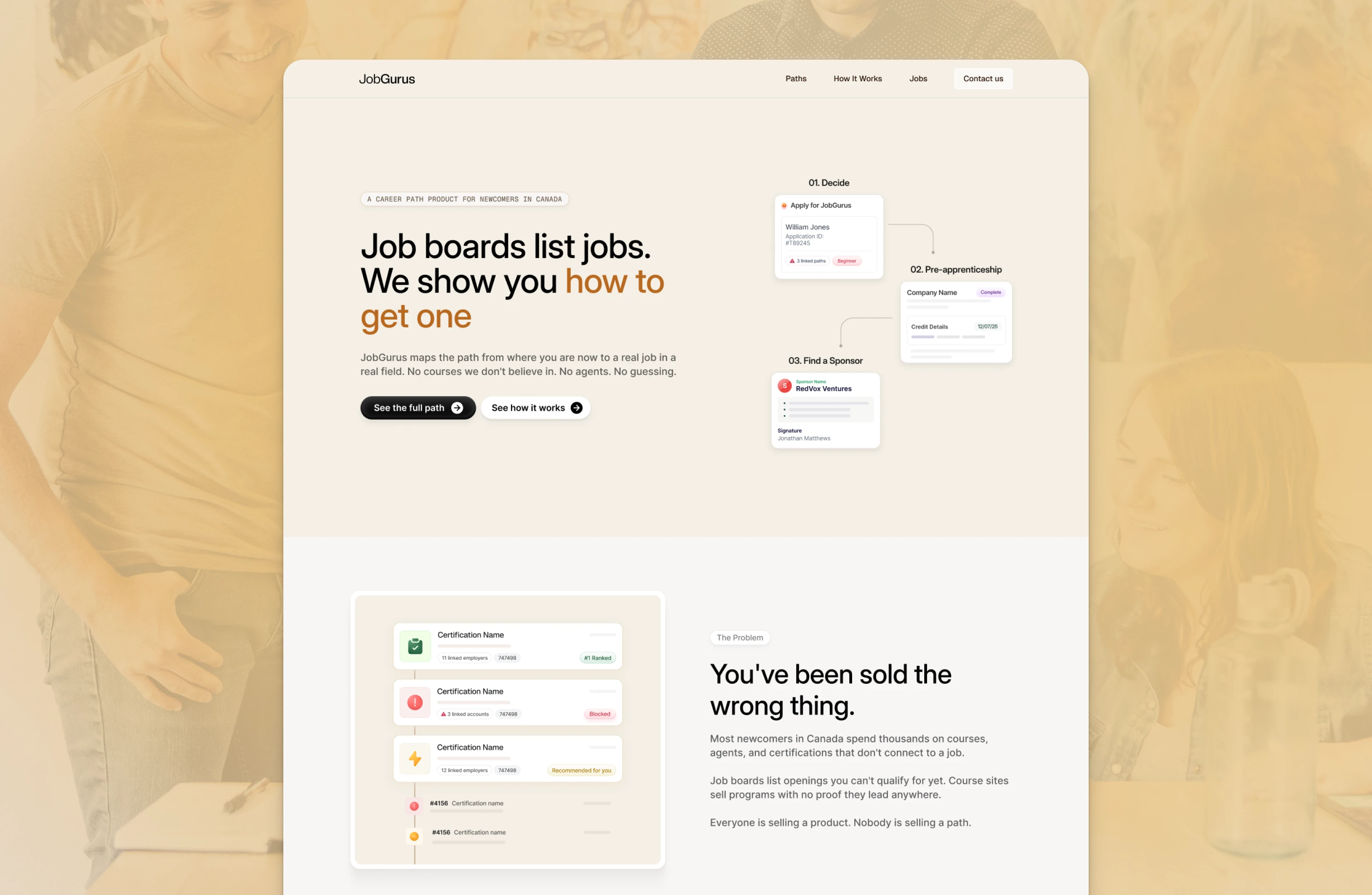
JobGurus helps newcomers navigate the Canadian job market through career pathways. The project covered five website pages, designed with Bright Studios, using the route to becoming an electrician in Ontario as the launch showcase.
Challenge
A job listing shows the requirements. A course offers a qualification. Newcomers still have to figure out how these connect to their own situation. The website needed to make that path visible, including the difficult parts and what to do next.
Outcome
The career path became the central experience of the website. Six steps lay out the route, each explaining what it involves, what’s hard about it, and what action to take.
That gives JobGurus a concrete way to demonstrate its value. Visitors can explore the guidance itself, with the obstacles given as much attention as the milestones. The product’s approach is visible in the page — connecting career information to a sequence someone can follow.
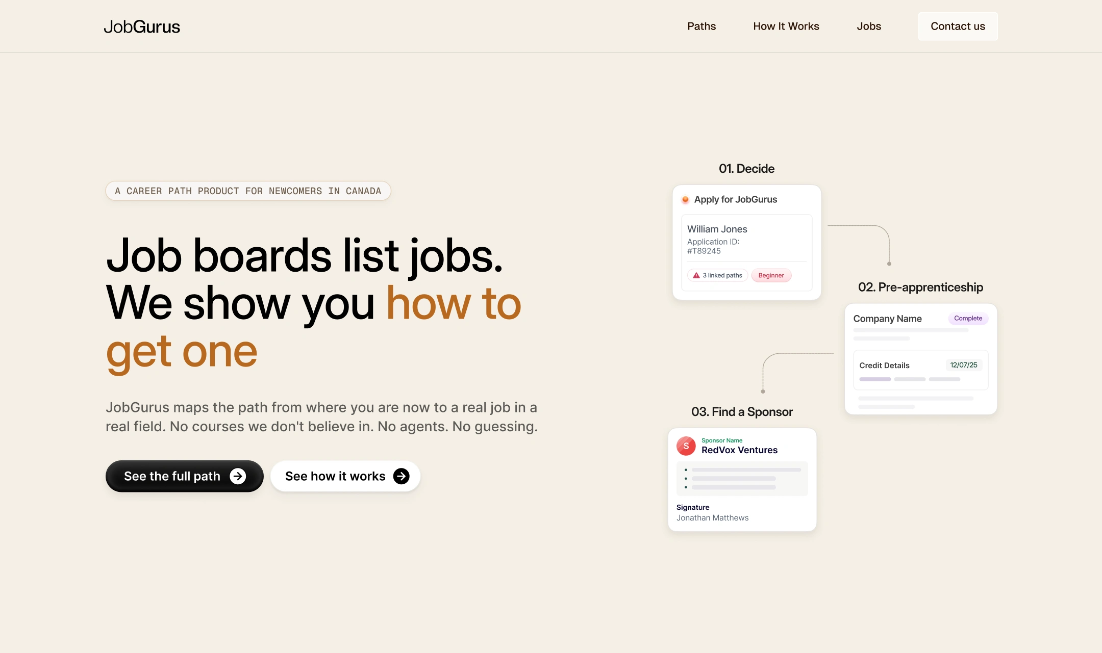
JobGurus is built on a simple observation: the career tools people rely on — job boards, course sites, consultants — all stop short of showing the actual path. You get a list of openings you can't qualify for yet, or a course with no evidence that it connects to a role. Nobody maps the distance between where you are now and where you need to be.
The founder wanted a website that does exactly that. Starting with one trade, one province, one path laid out end to end. The scope was five pages — Home, Career Path, Jobs, Job Detail, How It Works — with Electrician in Ontario as the launch showcase. I designed this site as part of Bright Studios.
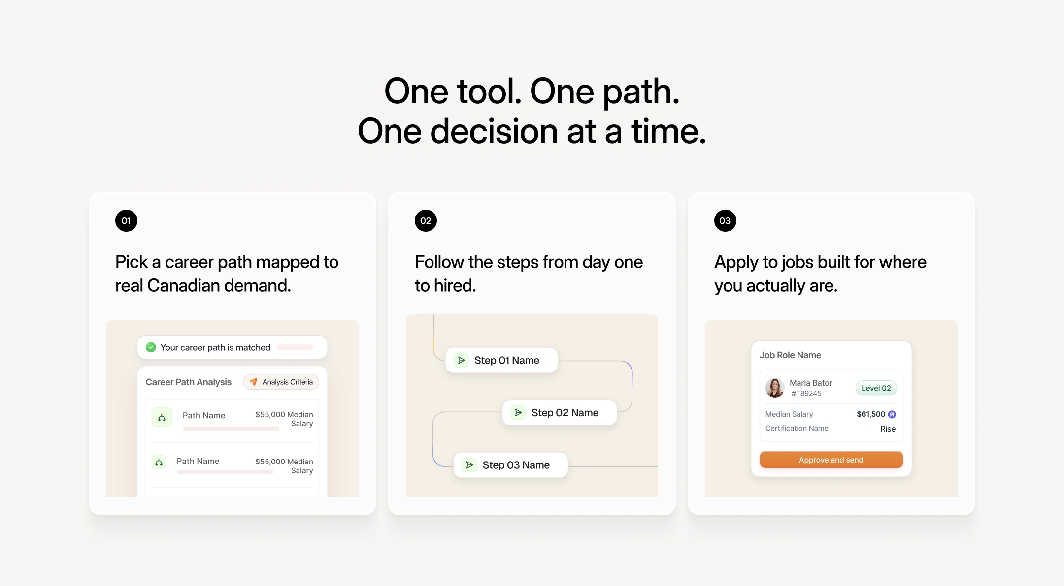
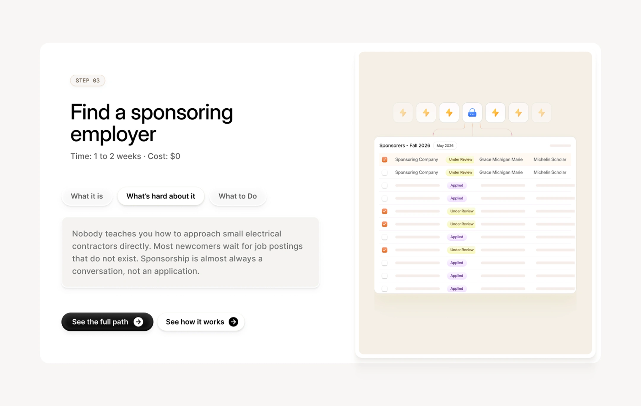
The website design, hence, had to function like a tool, not a content or marketing page. The primary surface — the Career Path page — is where a first-generation professional or newcomer on a work permit should be able to land and immediately understand what step they're on, what comes next, and what's actually hard about it. Not a clean overview. A usable map.
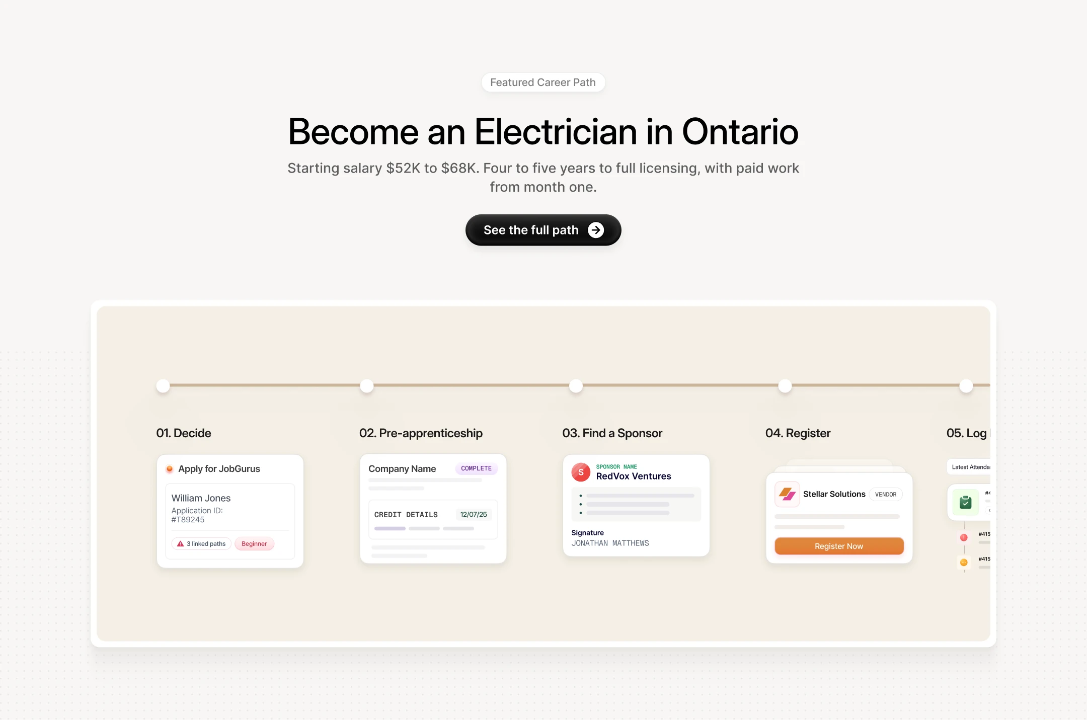
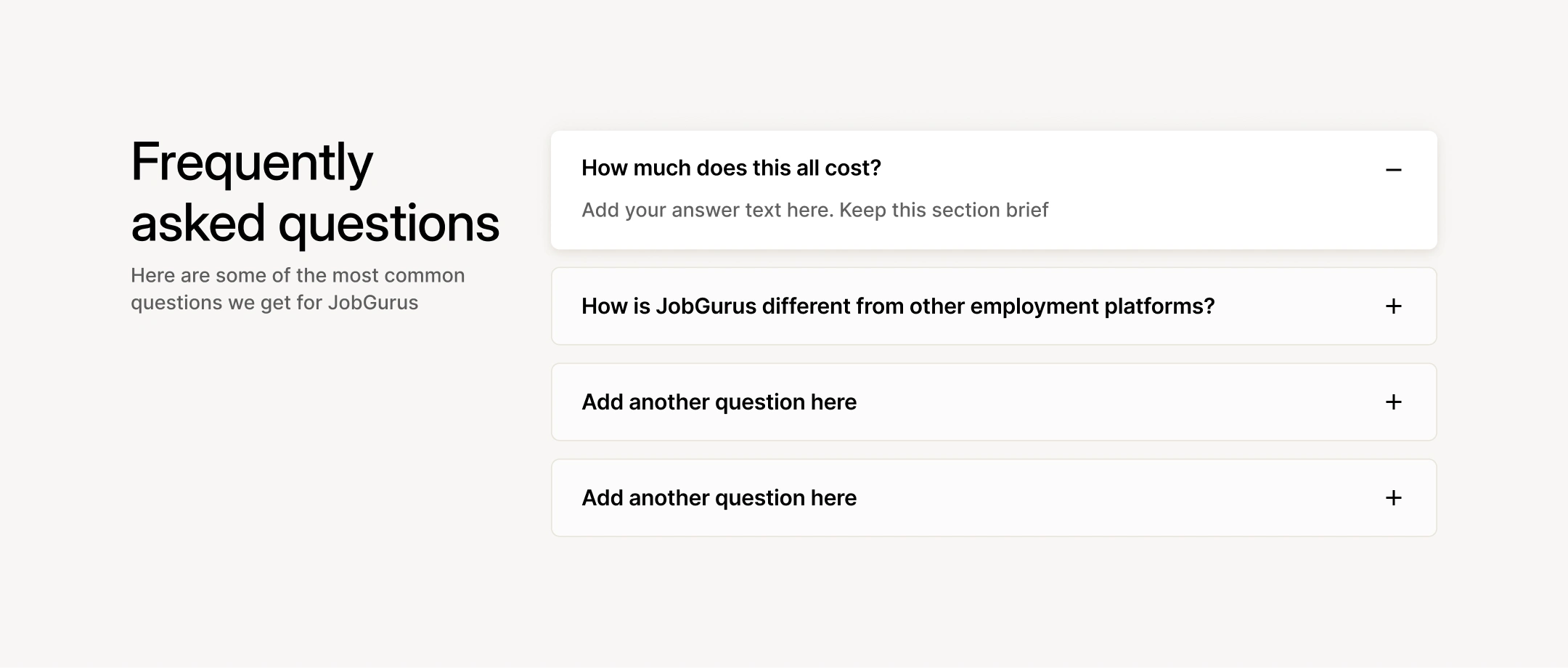
The Career Path page is where the product either earns belief or loses it. A newcomer who's already paid for the wrong thing once lands here and needs to know immediately: this is different, this is for me, this is what I do next. If that doesn't land in the first minute, nothing else matters.
The six-step path component became the central design object — because the path itself is the product differentiator. Job boards can't show you this. Course sites don't know your step. The component makes the methodology visible, and that's what builds trust faster than any copy on the page.
Each step is structured around three tabs — what it is, what's hard about it, what to do — because the friction is the point. Most platforms sanitise the process. This one names it.
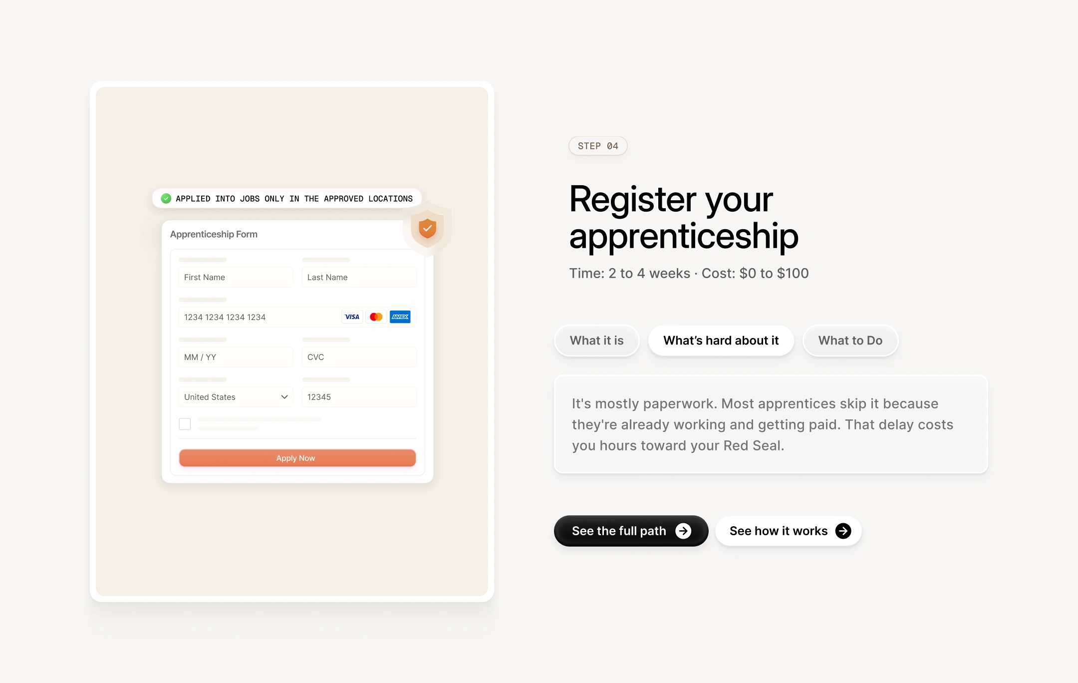
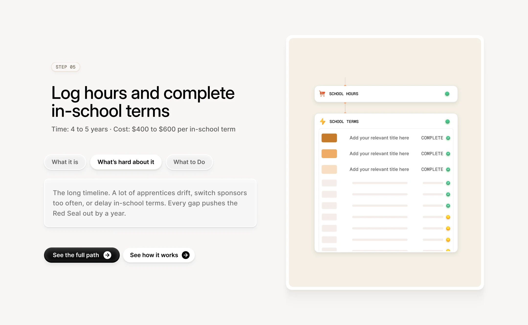
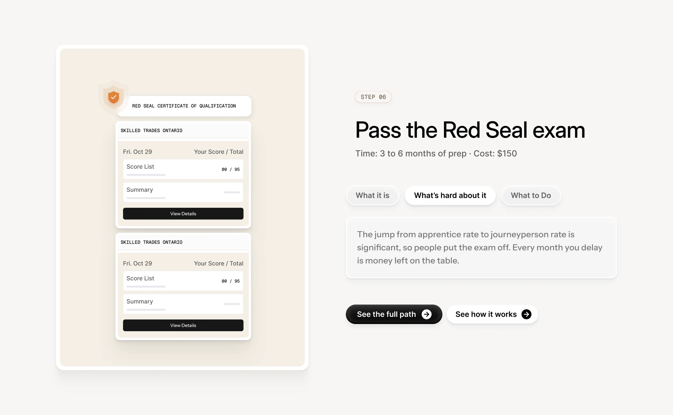
The visual direction keeps that same honesty: type-led, restrained, a single warm accent. The people using this product have been oversold before — by agents, by course sites, by job boards that list roles they can't qualify for yet. The design doesn't try to compensate for that with polish. It earns trust the same way the product does: by being direct about what's in front of you.
Like this project
What the client had to say
Working with Disha is always fantastic. She's super reliable, and it's always a pleasure to meet with her. I really have no more to say about her, since I've been saying that for so long. Honestly, 10 out of 10 experience every time.


Daniel G Bright, BrightStudios®
May 11, 2026, Client
Posted Sep 10, 2026
Website design for a tool that shows newcomers in Canada not just what jobs exist — but how to actually get one.
Likes
1
Views
14
Timeline
Apr 22, 2026 - May 11, 2026
Clients
BrightStudios®