LC/NC tool for Salesforce Backend Developers

Disha Shah


Context
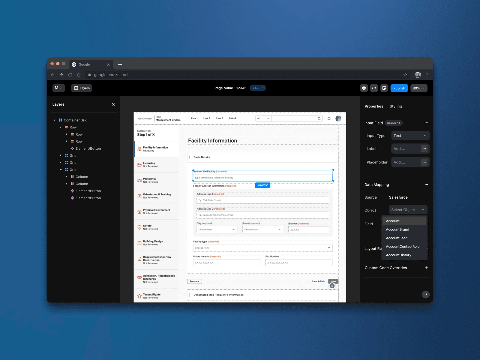
Mirage is a low-code, no-code page builder built for Salesforce backend developers. It lets them import Figma screens, map fields directly to Salesforce data objects, and deploy production-ready Lightning experiences — without touching the frontend or depending on a separate design-dev cycle. The goal: 90%+ of design pulled from Figma, backend 100% managed in Kreator and Salesforce, with ±10% frontend adjustable via code overrides.
The first use case was RFP prototyping — where speed and fidelity both matter and there's no time for full design-dev cycles. The longer-term play is using Mirage as the primary delivery tool for actual client projects.
Research & discovery
Extensive — and deliberately structured
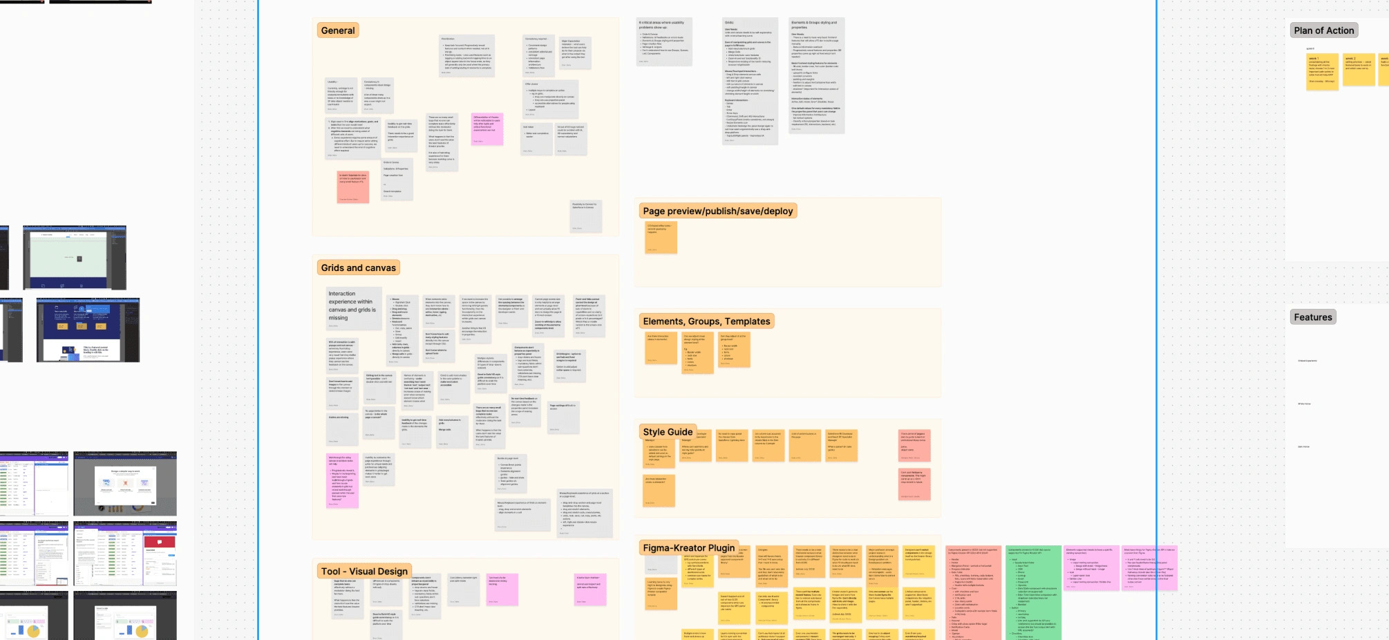
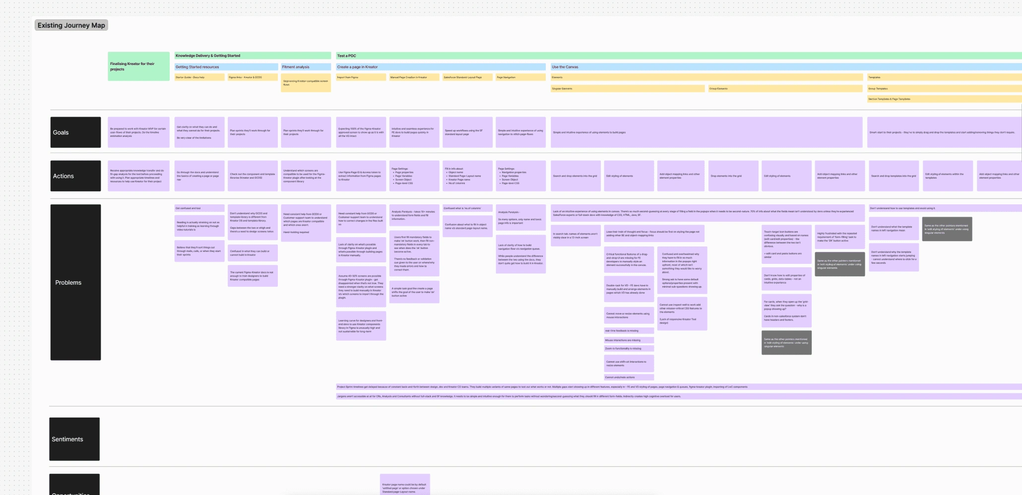
The research process covered heuristic evaluation, competitor mapping, and a usability study across 10 participants — a deliberate mix of Kreator-team and non-Kreator-team members, ranging from FE and BE developers to master specialists, DC Salesforce consultants, and a full-stack manager. We ran semi-structured interviews alongside closed tasks. Two user groups shaped everything: generalists (early-level to senior managers trained across multiple platforms) and specialists (senior consultants with deep SF expertise but limited frontend fluency).
The research also surfaced a longer-term ambition — the tool needed to be legible enough for PMs, business leads, and marketing teams, not just developers. Comparative analysis was done at a high level. What was deliberately deferred: user flow analysis, full IA analysis, complete journey mapping, and ideation. The heuristic evaluation focused on where visual design and element grouping created confusion; usability sessions confirmed where the canvas broke down hardest.
Brief constraint: no functional changes to the platform itself. The design question was — how do you improvise the user experience within what exists, and make the canvas feel genuinely usable without rewriting the backend?
What made this hard
The canvas was the core problem
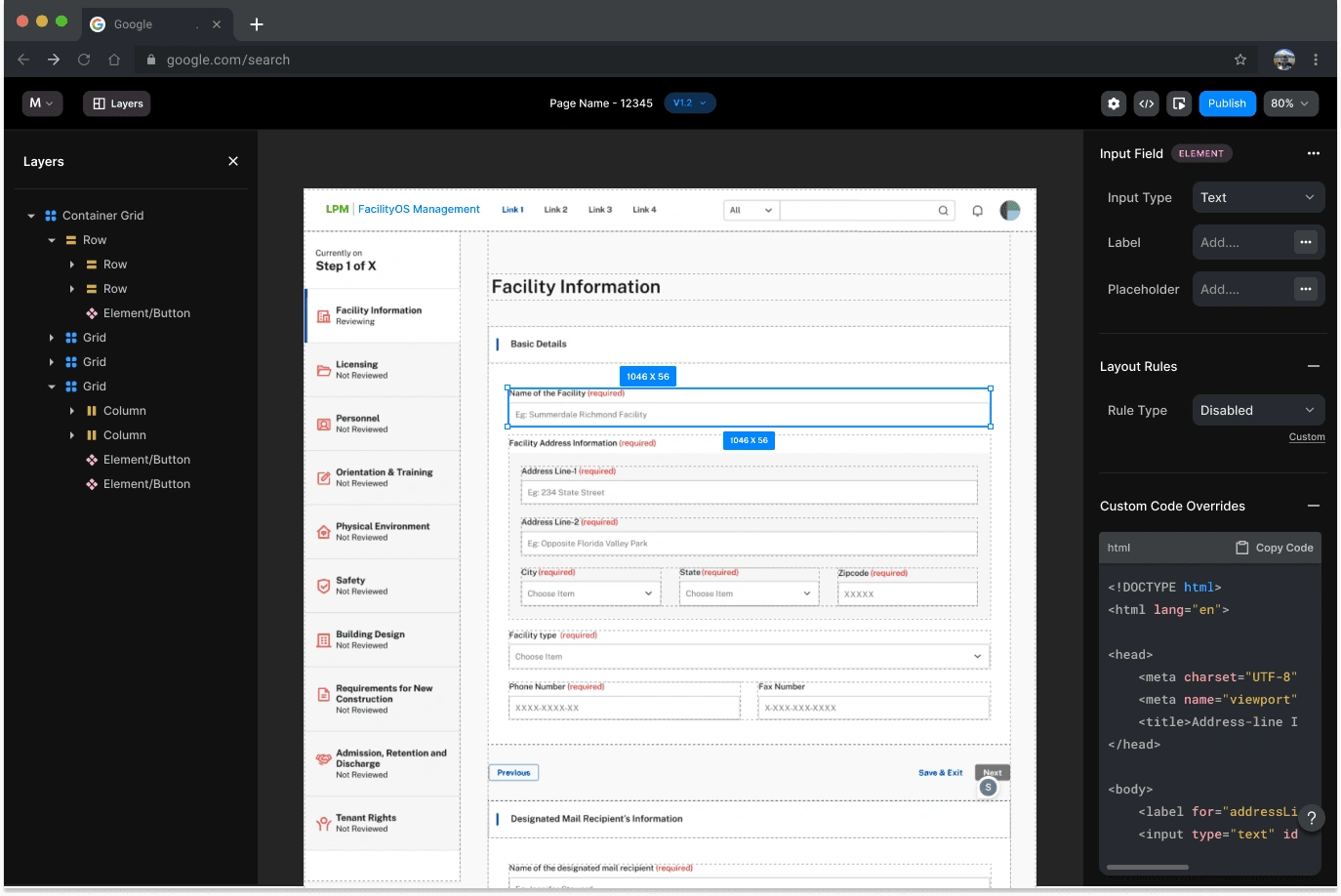
The existing canvas had no visible structure. Users couldn't see gutter widths. They couldn't tell whether they were selecting a container grid or part of one. Column resizing didn't exist. The grid anatomy — margins, gutters, columns, rows, modules — was present in the underlying system but completely invisible in the interface. Nearly every test participant misunderstood it.
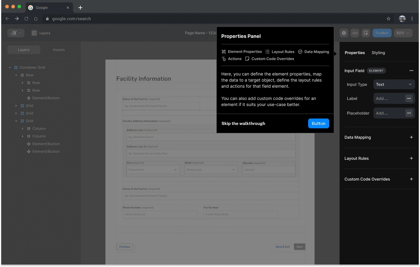
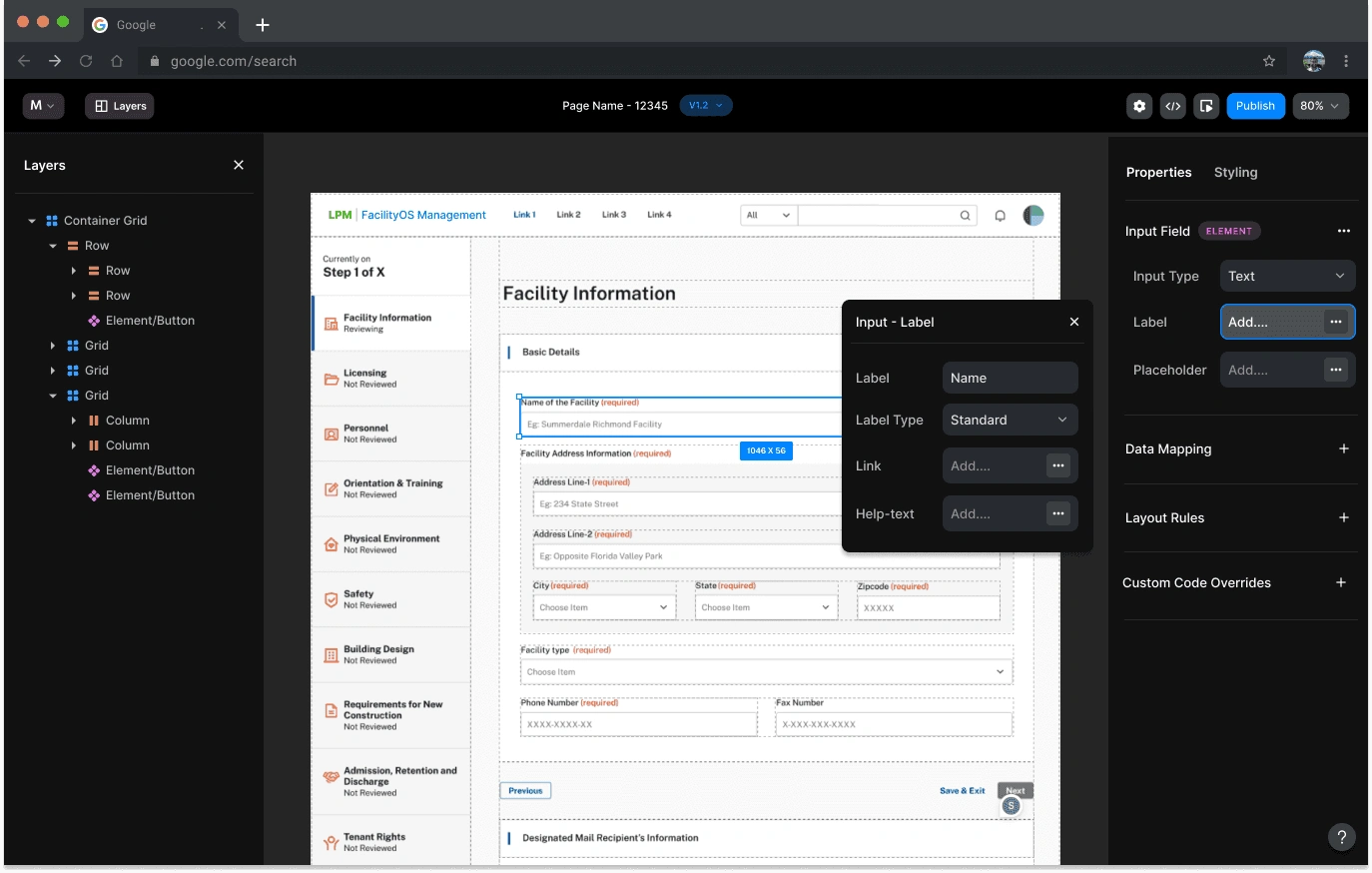
The properties panel also needed to surface element properties, Salesforce data mapping, layout rules, and custom code overrides — without overwhelming users who weren't Salesforce-native. And the IA and terminology throughout the tool was written for SF specialists, which was a blocker for broader adoption
Design decisions
What we built and why
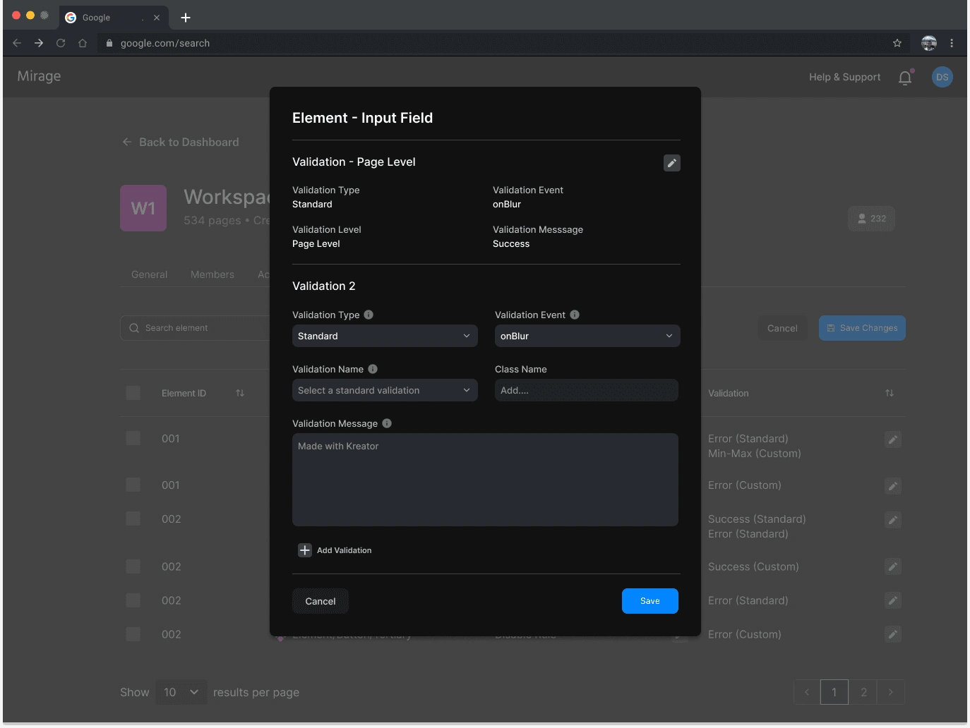
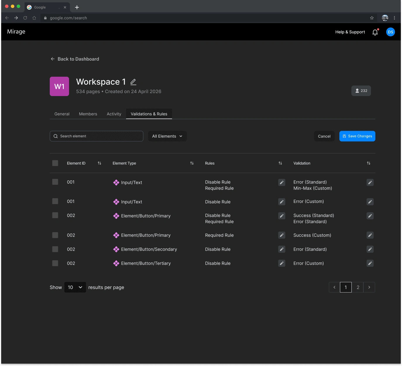
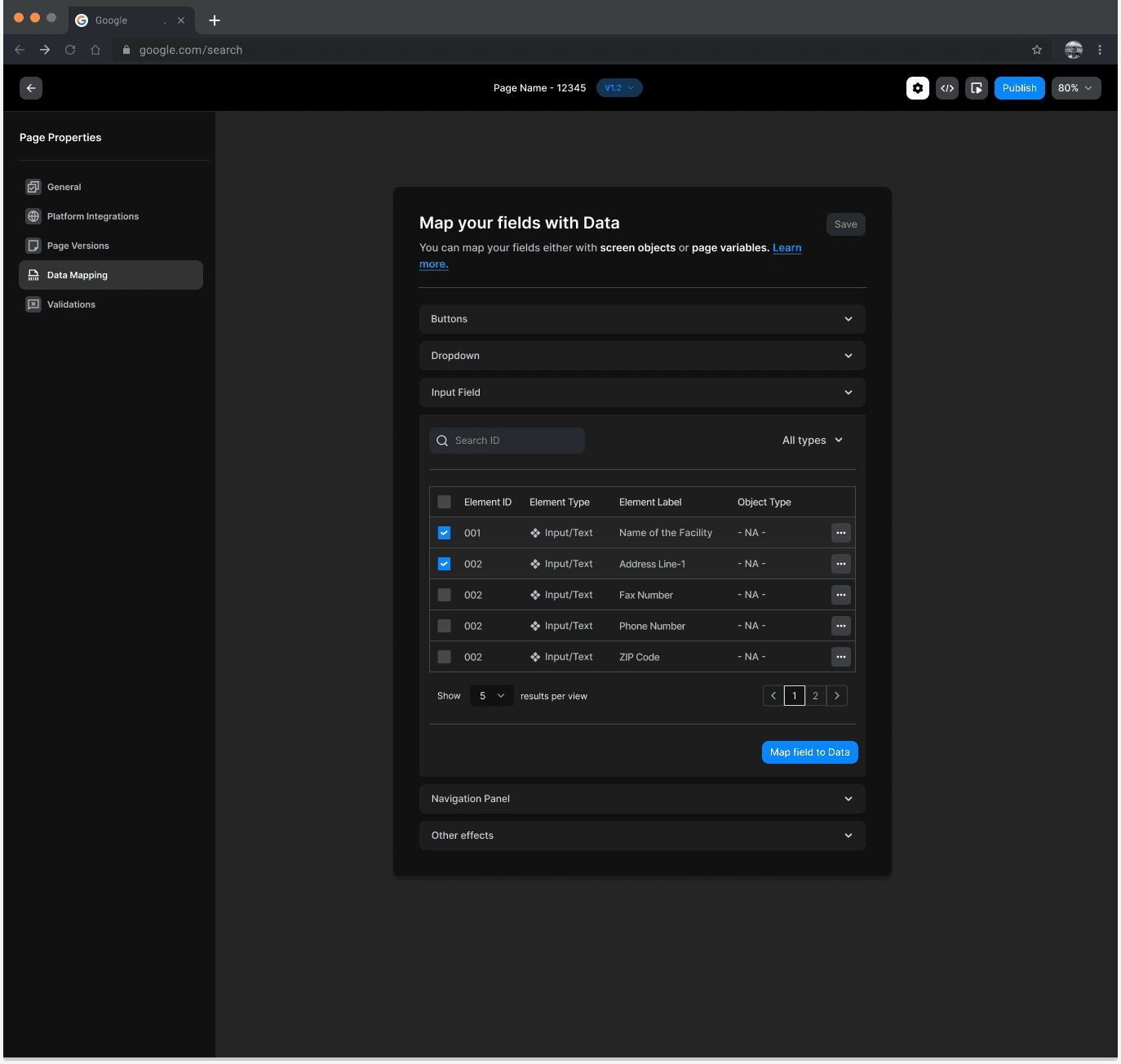
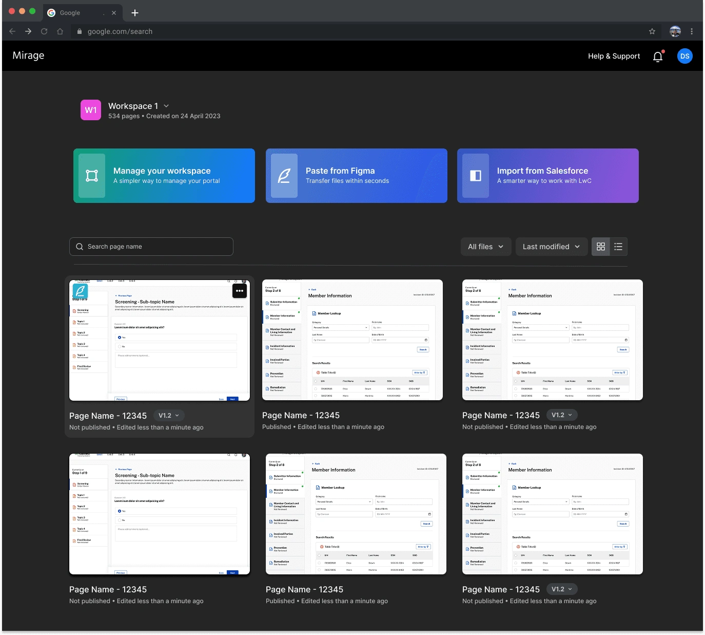
01Grid anatomy made visible. Hover states on grid boundaries, drag handles, gutter width previews on hover. An extension symbol lets users click and drag to resize columns with real-time canvas feedback. None of this existed before.02Container vs. partial selection states. Distinct visual feedback depending on whether the full container grid is selected or parts of independent grids. The single most-cited confusion in usability testing — resolved through clear selection state differentiation and boundary highlighting.03Properties panel: everything in one place. Input type, label, placeholder, Salesforce object and field mapping, layout rules, validation (standard and custom), and a Custom Code Overrides escape hatch for the ~10% of UI that can't be handled visually. No context-switching to another tool.04Normalized IA and terminology. Salesforce-specific jargon audited and rewritten throughout. The goal was legibility for backend devs who aren't Salesforce experts — and eventually for BAs and marketing teams. A deliberate audience-expansion decision, not just a copy fix.05Onboarding that doesn't block power users. A tooltip walkthrough covering the Properties Panel, Layout Rules, Data Mapping, Actions, and Custom Code Overrides — fully skippable. Useful for the first session, invisible after that.06Versioning and workspace management. Multiple root versions per page, status tracking, team assignment, list and grid views. MVP1 supports single-page export — folder-grouped projects are on the longer-term roadmap.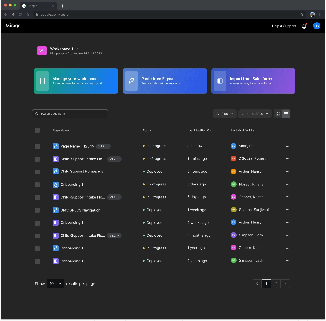
What's unique
Both sides of the gap, not just one
Most tools solve for one side — either a page builder disconnected from Figma, or a plugin that generates code but doesn't handle data. Mirage does both: a custom Figma-Mirage API handles design import at high fidelity, and the canvas handles the data side — field-level Salesforce object mapping, layout rules, validation, and deployment — all in one workflow.
The other distinction was audience design. This wasn't built for frontend developers. It was built for backend and full-stack devs — and deliberately structured so non-SF audiences could use it without an onboarding program. That required both IA work and a full terminology audit, not just UI decisions.
Like this project
Posted Aug 14, 2026
I helped shape the research, UX, and visual design of a low-code builder taking Salesforce developers from Figma to production-ready LWC—without frontend code.