
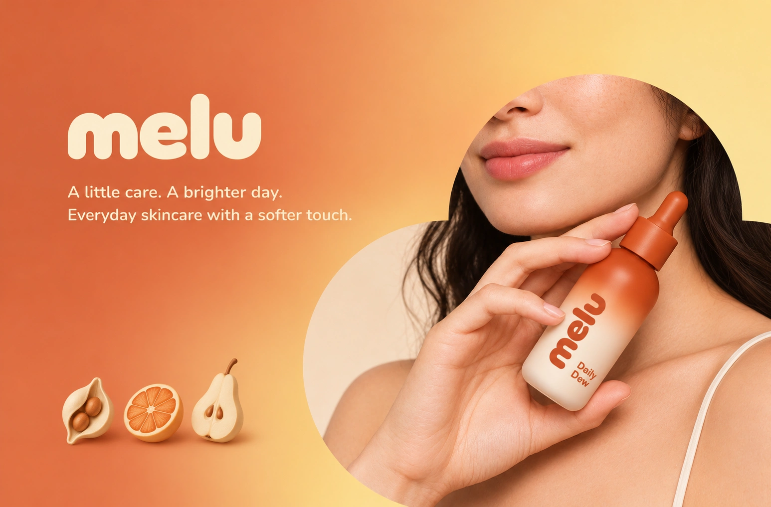
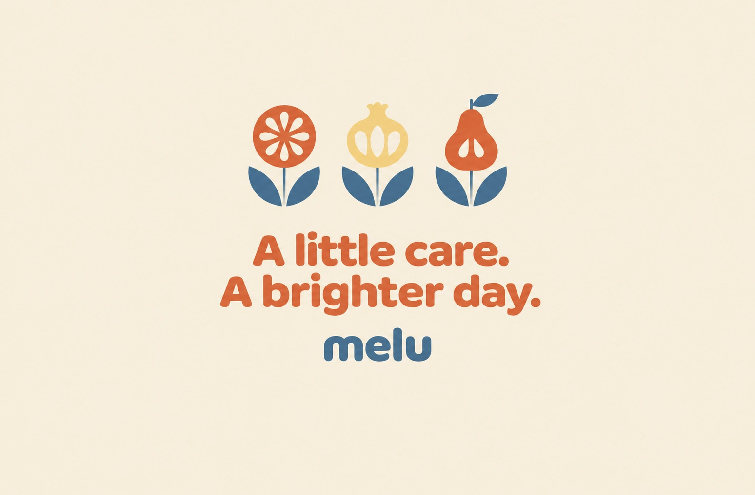
A little care. A brighter day.
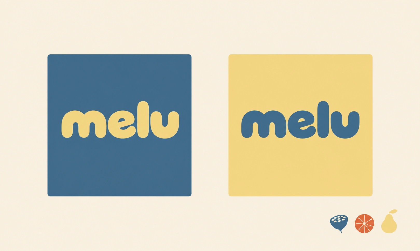
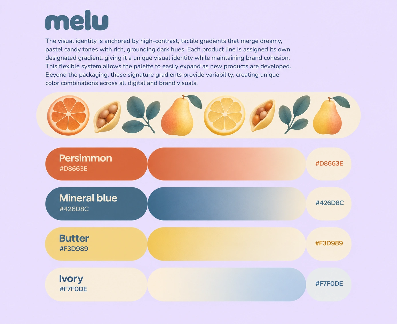
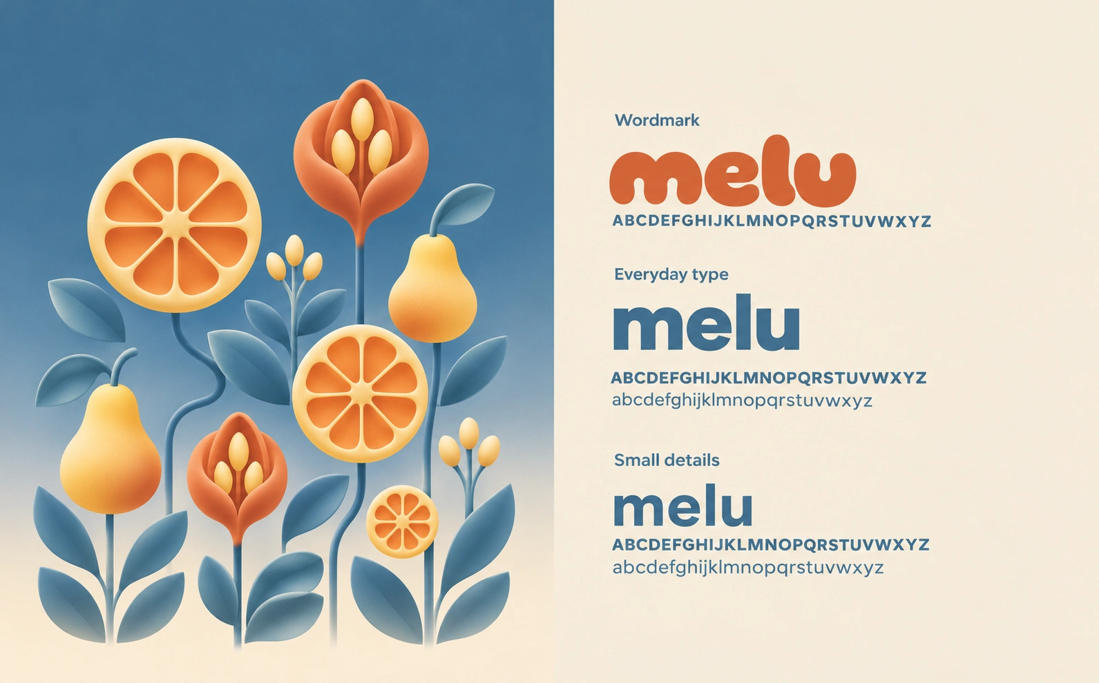
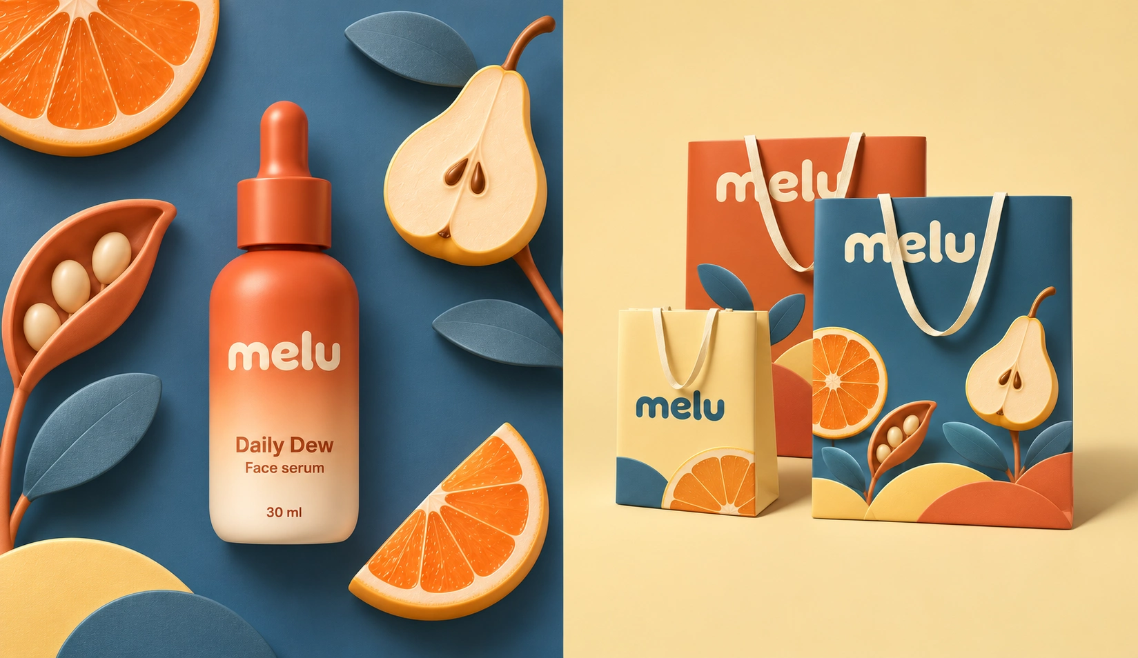
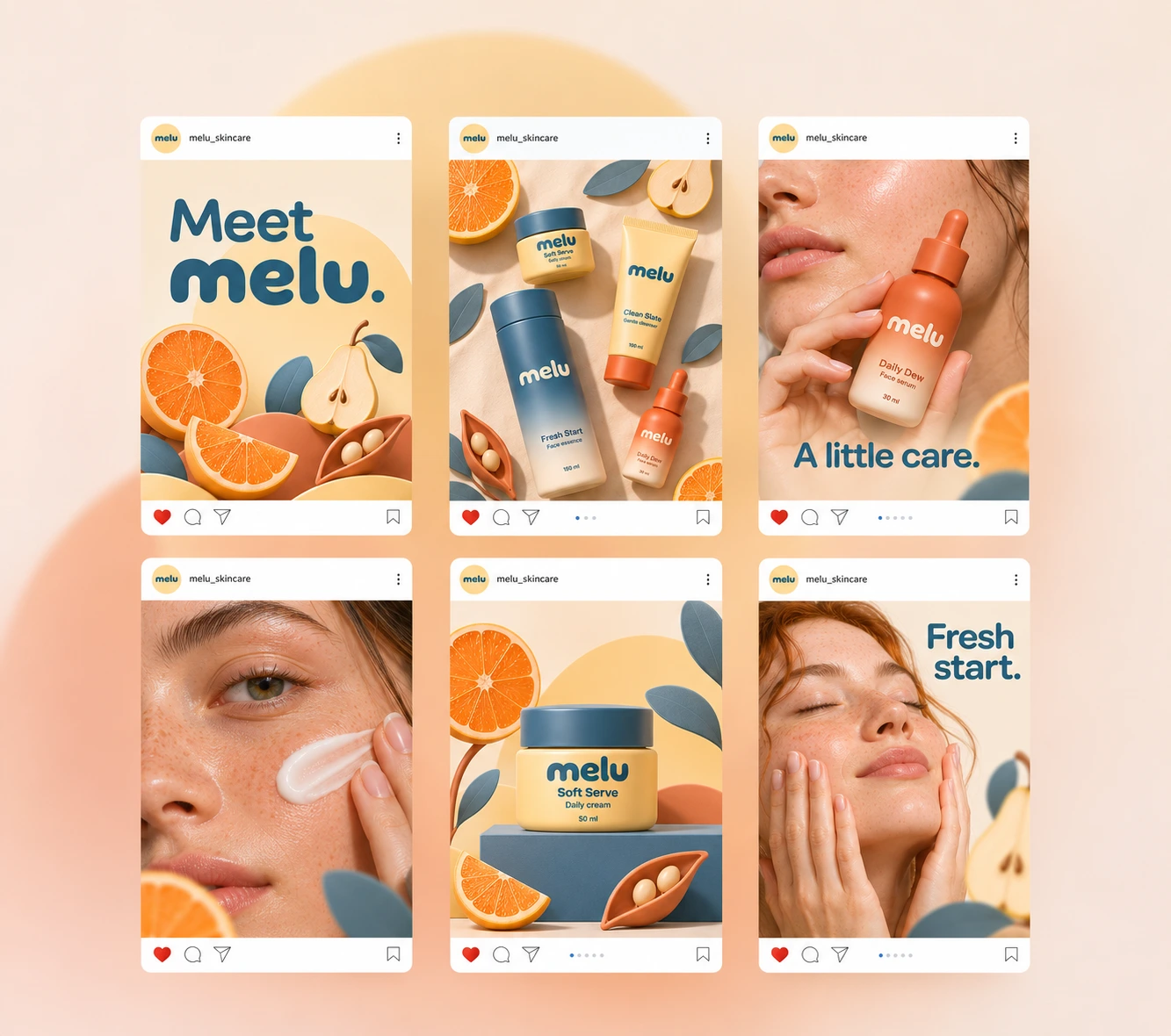
MELU is a skincare brand that brings a playful touch to everyday routines. The identity combines soft, rounded lettering with sculptural fruit imagery and a palette of mineral blue, persimmon, butter yellow, and warm ivory.
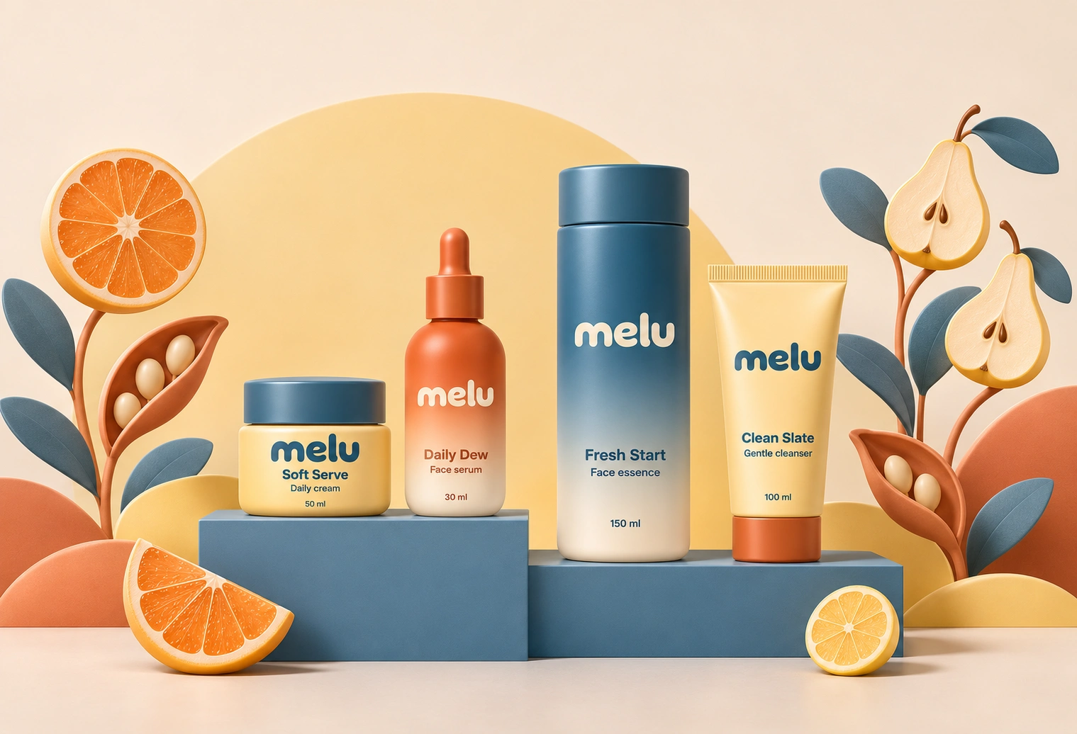
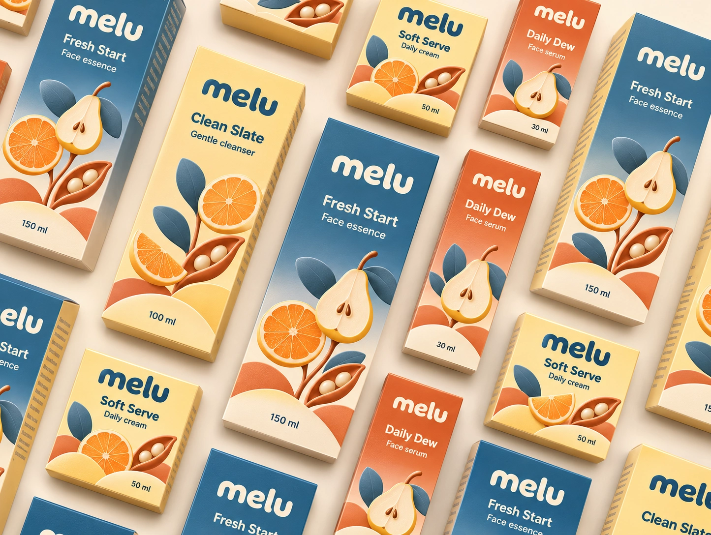
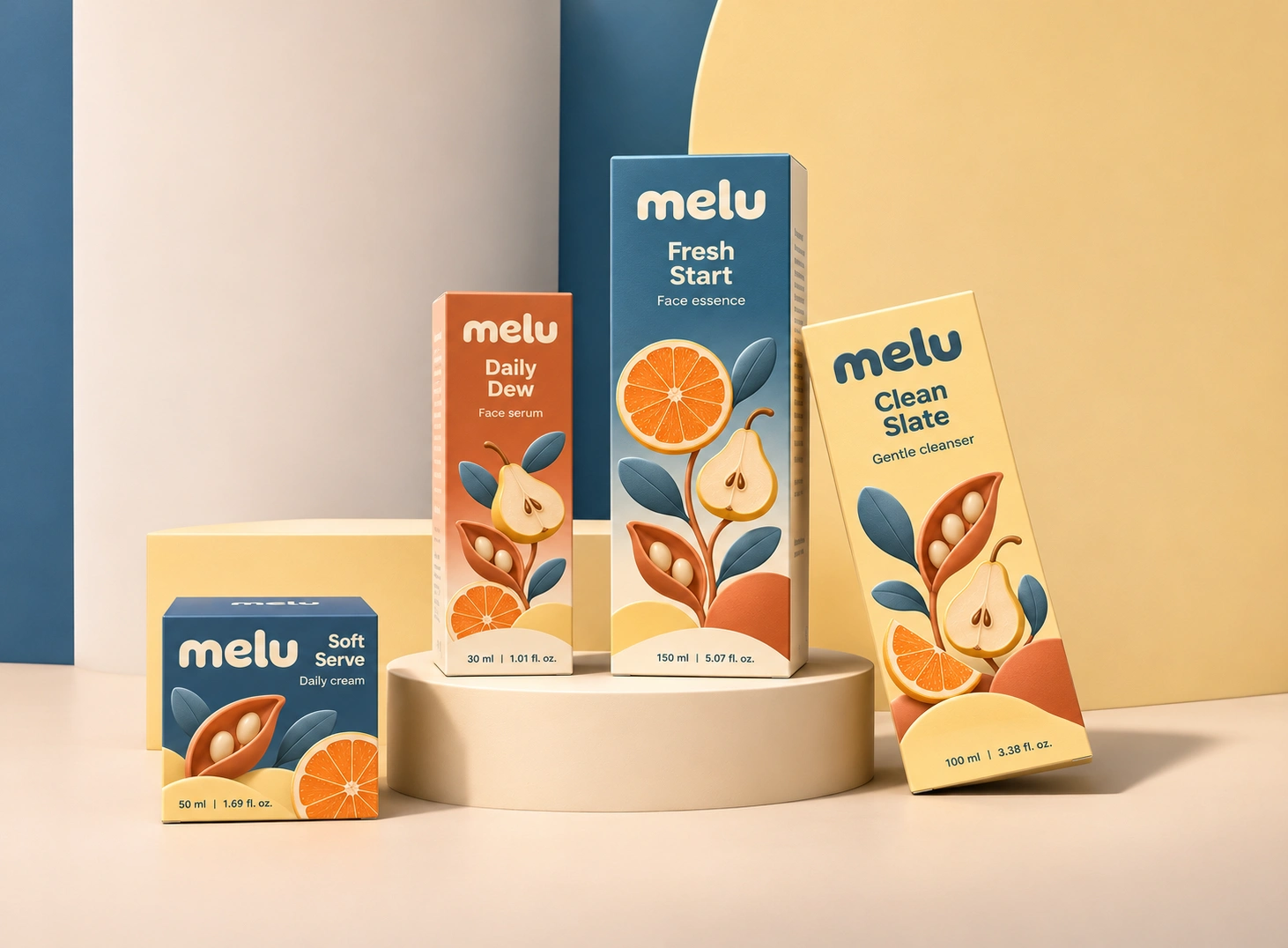
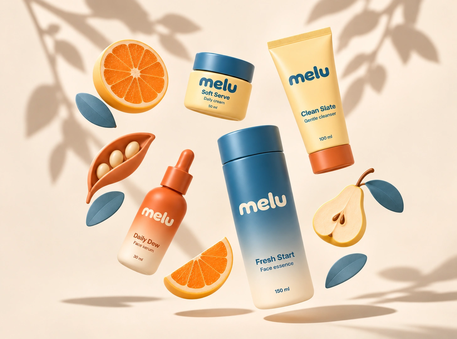
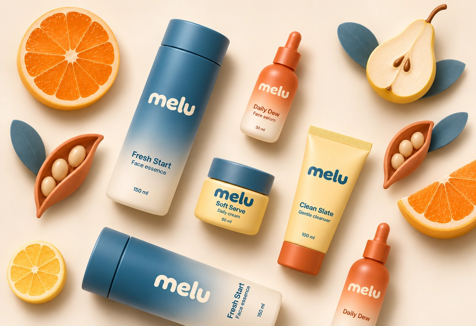
The packaging system spans four products: Daily Dew face serum, Soft Serve daily cream, Fresh Start face essence, and Clean Slate gentle cleanser. Colour helps distinguish each product, while consistent typography and gentle gradients connect the range.
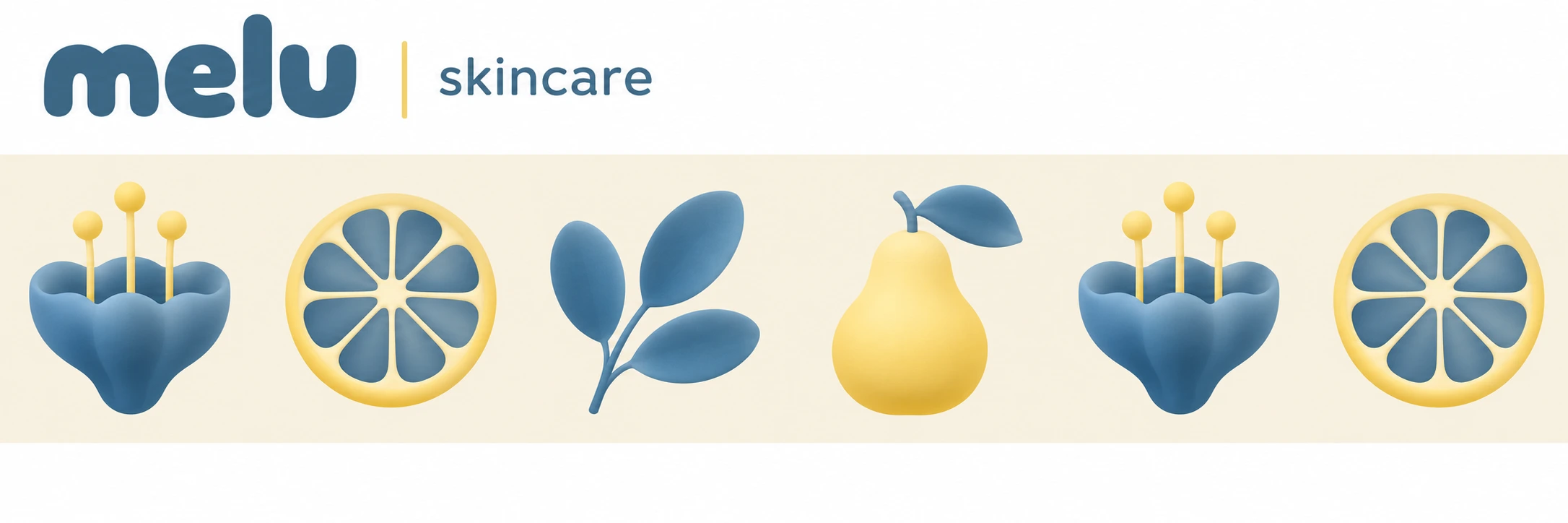
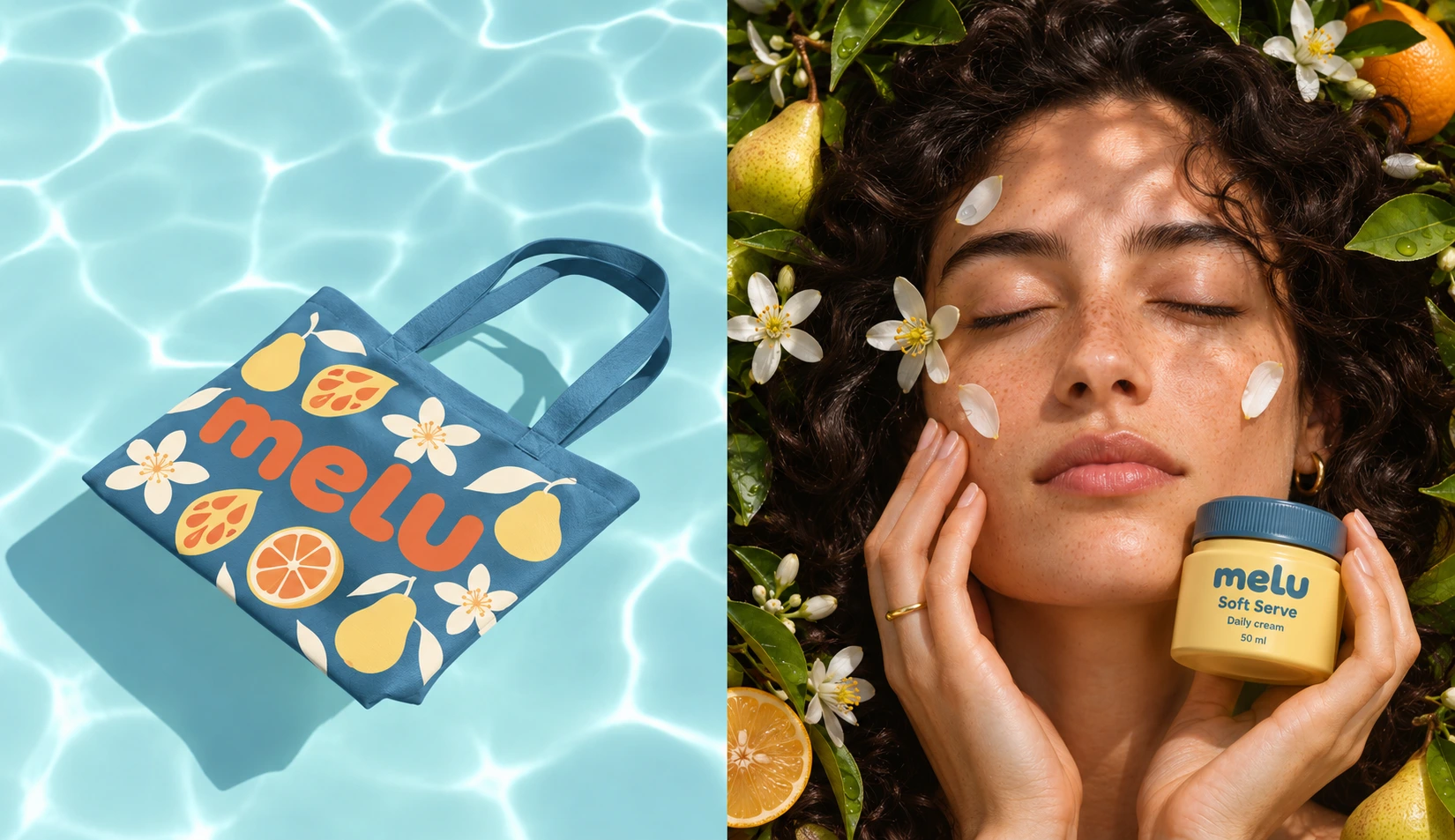
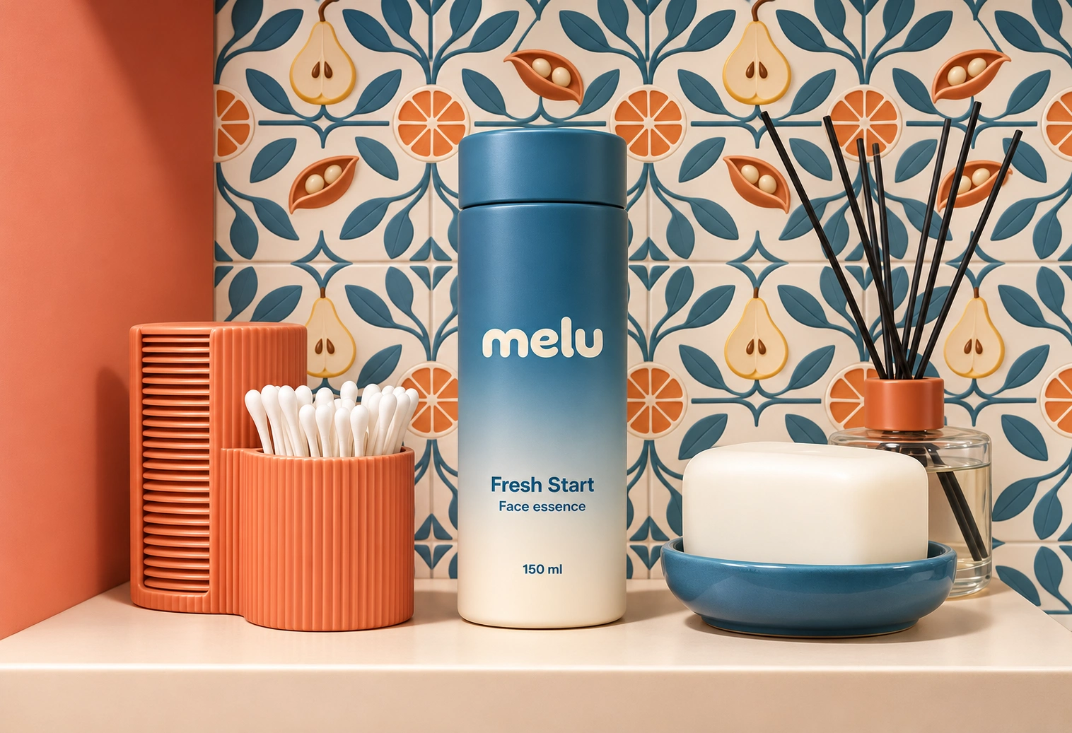
Citrus slices, pears, leaves, and seed pods form a flexible visual language across cartons, shopping bags, and campaign imagery. Their curved shapes echo the wordmark and give the brand a recognisable presence beyond the packaging.
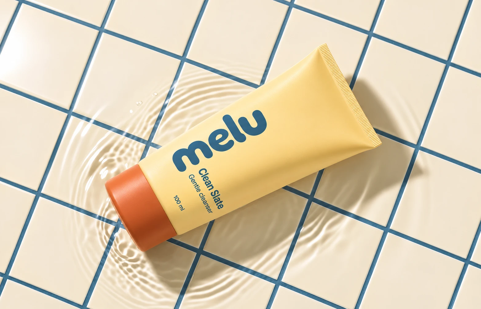
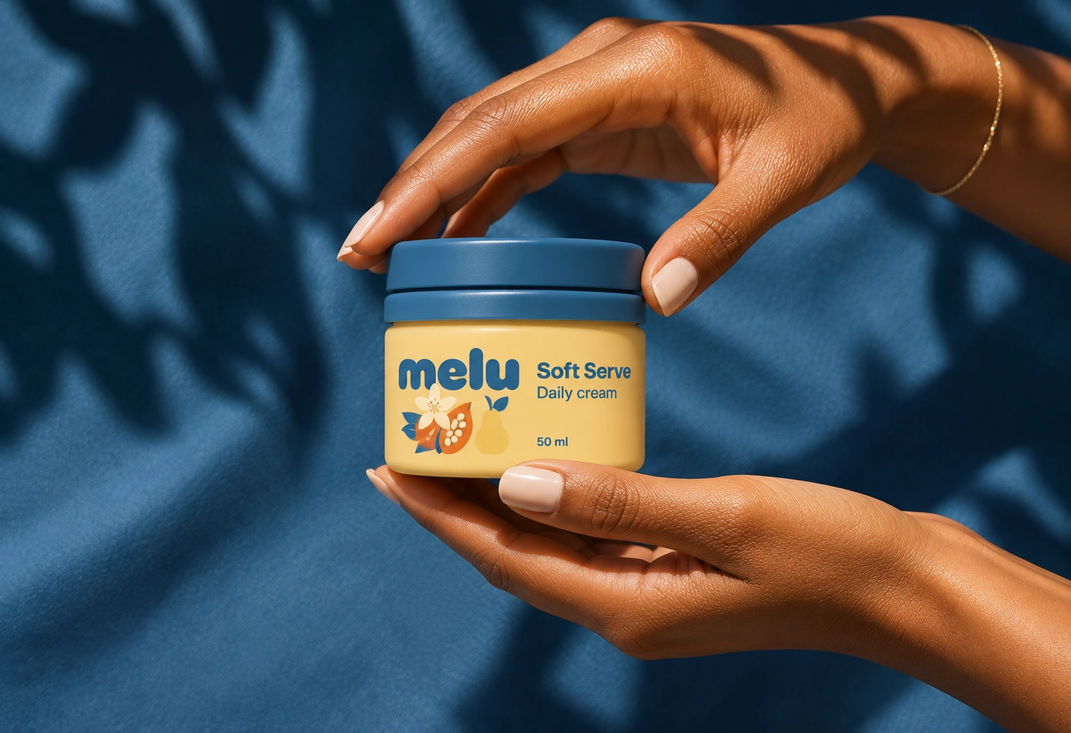
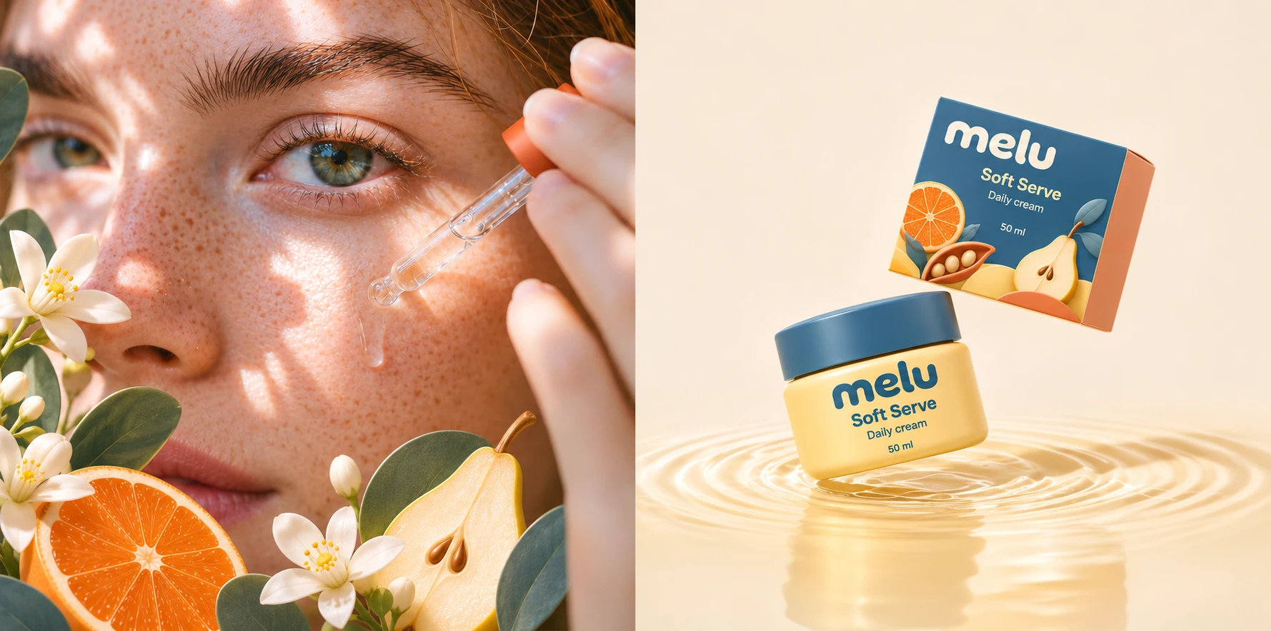
The art direction brings this world to life through sculptural sets, floating compositions, sunlit skin, and water reflections—balancing playful imagery with a clear focus on the products.
Scope: Brand identity · Logo concept · Packaging design · Product visualisation · Art direction
0 likes · 0 views · Nov 12, 2026
Playful skincare packaging and brand identity combining rounded typography, warm colours, and sculptural fruit imagery to brighten everyday care.


